10,000 search results
(0.043 seconds)
- Checkmark by Set Sail Studios,
$14.00 Make your mark with Checkmark; a slick, high energy signature-style script font guaranteed to make a big impression. Digitally hand-drawn, it's super-clean smooth flow and high-intensity pen strokes make an unmistakeable impact in logo/branding projects, large header text and product packaging. Checkmark is packed full of extra features to give you plenty of customization options. This includes; a full set of upper and lowercase alternate letters, 20 ligatures (double letters) to help the script lettering flow more naturally, 26 swashes and a full set of lowercase end forms to give your text that extra flair and finesse. Here's a run through everything in more detail; Checkmark • A smooth-edged signature style font containing upper & lowercase characters, numerals, and a large range of punctuation. Checkmark Alt • This is a second version of Checkmark, with a completely new set of both upper and lowercase characters. If you wanted to avoid letters looking the same each time to recreate a custom-made style, or try a different word shape, simply switch to this font for an additional layout option. Checkmark Swash • A third font containing 26 hand drawn swashes. Simply type any a-z or A-Z character in this font to generate a swash. Perfect for underlining your Checkmark text and adding a bit of extra flair! Ligatures • 20 ligatures (double-letters) are included to help your lettering flow more naturally. Many programs will automatically have this feature switched on for you, but if you need any help accessing them, please feel free to drop me a message. End forms • Are available for all lowercase characters when using the Checkmark font. Use these characters at the end of your word to add a stylistic 'end-swash'. These are accessible via software with opentype capability, by turning on 'Stylistic Alternates', or via a Glyphs panel. Language Support • Checkmark fonts support the following languages; English, French, Italian, Spanish, Portuguese, German, Swedish, Norwegian, Danish, Dutch, Finnish, Indonesian, Malay, Hungarian, Polish, Croatian, Turkish, Romanian, Czech, Latvian, Lithuanian, Slovak, Slovenian.
 - Emynam Crew by Alit Design,
$23.00 Introducing the Emynam Crew: A Funky Retro Display Typeface Dear Design Enthusiasts, Are you ready to groove to the rhythm of creativity and nostalgia? Say hello to the Emynam Crew, the font that's bringing back the funky retro vibes of yesteryears with a modern twist. With its unique blend of style, flair, and a whopping 705 glyphs, this typeface is a must-have for anyone looking to make a statement. Key Features: Retro Vibes: Emynam Crew captures the essence of the 70s and 80s with its bold, funky letterforms. It's like a blast from the past, perfect for adding a touch of nostalgia to your designs. Ligatures and Alternatives: Dive into the world of creativity with multiple ligatures and alternative characters. Mix and match to create stunning, one-of-a-kind typographic compositions. PUA Multilingual Support: Emynam Crew is not just about style; it's about substance too. With PUA multilingual support, you can use this font to communicate in various languages, making it a versatile choice for global projects. Endless Possibilities: With 705 glyphs at your disposal, the possibilities are endless. Whether you're designing posters, album covers, branding materials, or anything else, Emynam Crew gives you the freedom to express your unique vision. Stylish Display: Make a bold statement with Emynam Crew as your headline or display font. Its eye-catching style ensures that your message won't go unnoticed. Perfect for Retro Revival: Whether you're working on a retro-themed project or just want to infuse a touch of nostalgia into your designs, Emynam Crew is your go-to choice. Easy to Use: Emynam Crew is designed with user-friendliness in mind. It's compatible with popular design software and is easy to install and use. Unleash your inner artist and let Emynam Crew transport your designs to a bygone era. Embrace the funk, the retro, and the style with this one-of-a-kind typeface. Don't miss out on this opportunity to own the Emynam Crew – a font that's all about style, character, and endless possibilities. Get ready to turn back the clock and add a touch of funky nostalgia to your next project. Order your Emynam Crew Typeface today and start designing with retro flair!
 - Banks and Miles by K-Type,
$20.00 K-Type’s ‘Banks & Miles’ fonts are inspired by the geometric monoline lettering created for the British Post Office in 1970 by London design company Banks & Miles, a project initiated and supervised by partner John Miles, and which included ‘Double Line’ and ‘Single Line’ alphabets. The new digital typeface is a reworking and extension of both alphabets. Banks & Miles Double Line is provided in three weights – Light, Regular and Dark – variations achieved by adjusting the width of the inline. Banks & Miles Single Line develops the less used companion sans into a three weight family – Regular, Medium and Bold – each with an optically corrected oblique. Although the ‘Banks & Miles Double Line’ and ‘Banks & Miles Single Line’ fonts are based on the original Post Office letterforms, glyphs have been drawn from scratch and include numerous adjustments and impertinent alterations, such as narrowing the overly wide Z and shortening the leg of the K. Several disparities exist between the Post Office Double and Single Line styles, and K-Type has attempted to secure greater consistency between the two. For instance, a wide apex on the Double Line’s lowercase w is made pointed to match the uppercase W and the Single Line’s W/w. Also, the gently sloping hook of Single Line’s lowercase j is adopted for both families. The original Single Line’s R and k, which were incongruously simplified, are drawn in their more remarkable Double Line forms, and whilst the new Single Line fonts are modestly condensed where appropriate, rounded letters retain the essentially circular form of the Double Line. Many characters that were not part of the original project, such as @, ß, #, and currency symbols, have been designed afresh, and a full set of Latin Extended-A characters is included. The new fonts are a celebration of distinctive features like the delightful teardrop-shaped bowl of a,b,d,g,p and q, and a general level of elegance not always achieved by inline typefaces. The Post Office Double Line alphabet was used from the early 1970s, in different colours to denote the various parts of the Post Office business which included telecommunications, counter services and the Royal Mail. Even after the Post Office was split into separate businesses in the 1980s, Post Office Counters and Royal Mail continued use of the lettering, and a version can still be seen within the Royal Mail cruciform logo.
 - Duetto by ParaType,
$25.00 The letterforms of this face represent a "subtraction" of two different faces by weight, style, and shape -- one from another. The shapes of TM Miniature Italic are subtracted from FreeSet Bold with subsequent deconstruction. Though the spots may look amorphous they create images of both external and internal. At the same time none of them is explicit. The alphabet is lower case only. Designed by Boris Popov and licensed by ParaType in 2002 .
 - Cake Shop by Chank,
$20.00 Cake Shop has a lengthy history. Originally designed during the Eighties by Aussie artist David Art Wales, the font was inspired by the awkward but charming hand-lettered signs in a Maltese cake shop near his Sydney home. "These signs were hand-drawn by someone who clearly had no experience but who'd really put their heart and soul into the job. There was a real sincerity to the characters that I wanted to capture." For a brief time during the early Nineties, MTV used Cake Shop for all their on-air interstitials. Since then, it's become a go-to font for everything from children's books to album covers and ice cream branding. In a recent update, Wales added airier spacing to more closely resemble the original signs the font was based on.
 - RQND Pro V.2 by Tondi Republk,
$25.00 Introducing RQND Pro 2 - The Futuristic and Industrial Sans Serif Font Welcome to the world of RQND Pro 2, a cutting-edge sans serif font designed to elevate your designs to new heights. With its industrial aesthetic and futuristic appeal, this font is the perfect choice for projects seeking a bold and contemporary look. Key Features: 1,201 Glyphs: RQND Pro 2 boasts an extensive character set, offering you a vast array of design possibilities. Supports 123 Languages: No matter where your audience is, this font ensures that your message is conveyed clearly and effectively. 20 Font Styles: With 5 font weights and 5 font widths, RQND Pro 2 offers 20 unique styles to suit every creative vision. Expanded to Extra Condensed: Whether you need a spacious layout or a compact design, this font delivers unmatched versatility. 18 OpenType Features: Unlock the full potential of RQND Pro 2 with various OpenType features, including small caps, alternate characters, standard numerals, circled numerals, fractions, and more. All Caps Font: Embrace the power of uppercase letters with this font, enhancing the impact of your message. Full Character Set: From standard numerals to punctuation marks, mathematical symbols to special characters, RQND Pro 2 has everything you need for seamless communication. Latin and Cyrillic Support: Perfect for international projects, this font provides complete support for both Latin and Cyrillic languages. RQND Pro 2 empowers designers, creatives, and typographers to explore new design territories. Its sleek and modern appearance makes it ideal for tech branding, UI design, editorial projects, advertisements, web design, and more. Discover a font that combines sophistication with contemporary flair. Elevate your designs with RQND Pro 2 and leave a lasting impression on your audience. Explore the full range of styles and unleash your creativity today.
 - Milan In Paris by Mevstory Studio,
$25.00 Milan in Paris is a powerful and elegant display typeface, constructed to maximize use of horizontal space. Built from hand sketches drawn over several years, Milan in Paris eight weights span an elegant Thin to a vibrant Heavy, with accompanying obliques.Milan in Paris makes a strong impression in print, headlines, video, and social media – whether paired with a contrasting typeface or on its own.
 - Devil's Snare is an intriguing and enigmatic font that immediately grabs attention with its distinctive characteristics, making it a standout choice for a variety of projects that aim to leave an ind...
- New Wave Soho by Inumocca,
$25.00 New Wave Soho Display Font, inspiration from punk poster, full energy, rebel, anti mainstream and dare to take something different. you will feel like you are walking in the 70s era. New Wave Soho presenting more alternates glyphs to pour your wild ideas. simplel for access of Unique Alternates Exellent typeface to use for covering your Project, like Branding, Movie Title, Headline Letter, Bookcover or Book Content, Magazine cover, Poster, Quotes Lettering, Logos, and more your project design. - Unique glyphs - Multilingual Characters Support - UPPERCASE - Lowercase - Numeric - Symbol - Punctuation Character - Stylistic Set Alternates OTF, TTF inumocca type Studi0
 - Chunky Retro by HansCo,
$15.00 Chunky Retro is a modern, clean and smooth retro font style. This font comes with a unique shape where every corner is smoother and more rounded. You will also get extra shadow/outline fonts in this font pack to make your design projects perfect. Use this display font to add that special retro touch to any design idea you can think of!. Equipped with all complete characters ranging from uppercase letters, lowercase letters, numbers, punctuation marks and multi-lingual support, this font is ready to be used in any project. Very suitable for logotype, Stickers, Packaging design, Cricut Project, headlines, brand identity, t shirt or apparel industry, posters, magazines, books, YouTube, Instagram, websites, or any of your creative design projects. Enjoy!
 - TT Octosquares by TypeType,
$35.00 TT Octosquares useful links: Specimen | Graphic presentation | Customization options TT Octosquares is a fresh, revised, expanded, and significantly improved version of our first commercial typeface TT Squares and its narrow version TT Squares Condensed. With all our love for the original font family, it felt there was a lack of functionality, character composition, features, and design freshness, which prompted us to the idea of a complete restart. Now TT Octosquares can be safely called a superfamily consisting of 4 widths (Compressed, Condensed, Standard, Expanded), 72 faces (18 in each width), and 1 incredible variable font in which variability works jointly on three axes. In addition to working on the contours themselves and their design, we completely revised the composition of the typeface. First, we added two completely new widths: Compressed and Expanded. Secondly, we increased the number of weights in each of the subfamilies—while in the old versions there were 5 weights, now in each of the subfamilies there are 9 weights. At the stage of working with the contours of characters, we revised the roundings, changed the forms of shoulder and stem crossings, added noticeable shelves at the letters, removed the sharpness from the triangular characters and cut off all sharp endings. From the very beginning of work on TT Octosquares, we planned to make a variable 3-axis version of it sewn into 1 font file. This means that by installing just one variable font file, you get access to three axial adjustment of the font: by thickness, width and inclination. Thanks to this flexibility in settings, you can always choose a custom combination of thickness, width or inclination that best suits your tasks. Due to the increased language support and the appearance of a bunch of useful OpenType features, the number of glyphs in the typeface has increased from 480 to 825 in each style. Now you can use stylistic alternates, standard and discretionary ligatures, or use old-style figures, numbers in circles and even slashed zeros in your design. Full list of features: aalt, mark, mkmk, ccmp, subs, sinf, sups, numr, dnom, frac, ordn, lnum, pnum, tnum, onum, case, zero, dlig, liga, salt, ss01, ss02, ss03, ss04, ss05, ss06, ss07, ss08, ss09, ss10, ss11, ss12, calt, locl. To use the variable font with three variable axes on Mac you will need MacOS 10.14 or higher. For other software and browsers, you can check the support status here: v-fonts.com/support/.
 - Copperplate Script by CastleType,
$39.00 One of the more elegant script fonts available, this design is based on calligraphic handwriting called "Copperplate" because of the copper plates that it was etched into for reproduction. This face is not related to Copperplate [Gothic] by the American type designer, F.W. Goudy. The name Copperplate comes from the fact that writing masters used to hand-write their books and then send them to an engraver who recreated all the subtle details onto copper plates, which where then used to print the handwriting books.
 - Rift by Gassstype,
$25.00 Introducing Rift - All Caps Display Font latest display typeface called Rift a unique Fonts with vintage taste can make your logotype become more interesting. Best Vintage font with multilingual support. inspired by the decorative arts and architecture movement. Rift fonts is perfect for your project and allows you to create designs, headlines, posters, logos, badges, and many more that are beautiful. It is also best used for posts, posters, and more. Beautiful inspired by the famous minimalist logo, perfect for the purposes of designing templates, brochures, videos, advertising branding, and more. Perfect for adding a unique twist to word-mark , monograms or pull quotes.punctuation making it super fantastic,strong modern appearance, magazine's headers, signs or gift/post cards,cafe's and weddings.
 - PF Champion Script Pro by Parachute,
$125.00 PF Champion Script Pro is perhaps the most advanced and powerful calligraphic family ever made. It received an award for Excellence in Type Design from the International Type Design Competition ‘Modern Cyrillic 2009’ which was held in Moscow. Most recently, it received another award from the 3rd International Eastern Type Design Competition - Granshan Awards 2010. This typeface was first presented in June 2007 at the 3rd International Conference on Typography and Visual Communication (ICTVC) and was met with rave reviews. It is based mainly on the manuscripts of the 18th century English calligrapher Joseph Champion. Developed over a period of two and a half years, each one of the 2 weights is loaded with 4300 glyphs(!), offering simultaneous support for all European languages based on the Latin, Greek and Cyrillic scripts. Furthermore, a wide selection of alternate forms and ligatures is included for all languages, in order to accommodate diverse design aesthetics. These alternates are either applied automatically through an advanced programming scheme, or manually through several OpenType features. An attempt was made to design a contemporary script typeface with classic roots, by following certain guidelines, i.e. lowercase characters were designed so they are less inclined, have a higher x-height and are less condensed than the original. Several characters were stripped-off their connecting lines in order to enhance legibility. Four sets of alternate swashed capitals as well as a plethora of ornaments and frames (117) was included. Small caps and their alternate forms were designed to replace the capitals which disrupt the flow of text within a sentence with their extravagant swashes. All characters were carefully designed with the proper weight in order to sustain harsh printing conditions (on special papers), a situation which affects mainly the light connecting parts of calligraphic typefaces. Finally, it was programmed in such a way as to preserve handwriting qualities, by designing an extensive array of ligatures and alternate glyphs in all languages, never before released or incorporated within the same font.
 - Avenir Next Cyrillic by Linotype,
$49.00 The original Avenir typeface was designed by Adrian Frutiger in 1988, after years of having an interest in sans serif typefaces. The word Avenir means “future” in French and hints that the typeface owes some of its interpretation to Futura. But unlike Futura, Avenir is not purely geometric; it has vertical strokes that are thicker than the horizontals, an “o” that is not a perfect circle, and shortened ascenders. These nuances aid in legibility and give Avenir a harmonious and sensible appearance for both texts and headlines. In 2012, Akira Kobayashi worked alongside Avenir’s esteemed creator Adrian Frutiger to bring Avenir Next to life, as a new take on the classic Avenir. The goal of the project was to take a beautifully designed sans and update it so that its technical standards surpass the status quo, leaving us with a truly superior sans family. Since then, Monotype expanded the typeface to accommodate more languages. Akira’s deep familiarity with existing iterations of the Frutiger designs, along with his understanding of the design philosophy of the man himself, made him uniquely suited to lead the creation of different language fonts. Avenir Next World family, the most recent release from Monotype, is an expansive family of fonts that offers support for more than 150 languages and scripts that include Latin, Cyrillic, Greek, Hebrew, Arabic, Georgian, Armenian and Thai. Avenir Next World contains 10 weights, from UltraLight to Heavy. The respective 10 Italic styles do not support Arabic, Georgian and Thai, since Italic styles are unfamiliar in these scripts/languages. Separate Non-Latin products to support just the Arabic, Cyrillic, Georgian, Hebrew and Thai script are also available for those who do not need the full language support.
 - Avenir Next World by Linotype,
$149.00 The original Avenir typeface was designed by Adrian Frutiger in 1988, after years of having an interest in sans serif typefaces. The word Avenir means “future” in French and hints that the typeface owes some of its interpretation to Futura. But unlike Futura, Avenir is not purely geometric; it has vertical strokes that are thicker than the horizontals, an “o” that is not a perfect circle, and shortened ascenders. These nuances aid in legibility and give Avenir a harmonious and sensible appearance for both texts and headlines. In 2012, Akira Kobayashi worked alongside Avenir’s esteemed creator Adrian Frutiger to bring Avenir Next to life, as a new take on the classic Avenir. The goal of the project was to take a beautifully designed sans and update it so that its technical standards surpass the status quo, leaving us with a truly superior sans family. Since then, Monotype expanded the typeface to accommodate more languages. Akira’s deep familiarity with existing iterations of the Frutiger designs, along with his understanding of the design philosophy of the man himself, made him uniquely suited to lead the creation of different language fonts. Avenir Next World family, the most recent release from Monotype, is an expansive family of fonts that offers support for more than 150 languages and scripts that include Latin, Cyrillic, Greek, Hebrew, Arabic, Georgian, Armenian and Thai. Avenir Next World contains 10 weights, from UltraLight to Heavy. The respective 10 Italic styles do not support Arabic, Georgian and Thai, since Italic styles are unfamiliar in these scripts/languages. Separate Non-Latin products to support just the Arabic, Cyrillic, Georgian, Hebrew and Thai script are also available for those who do not need the full language support.
 - Avenir Next Hebrew by Linotype,
$79.00 The original Avenir typeface was designed by Adrian Frutiger in 1988, after years of having an interest in sans serif typefaces. The word Avenir means “future” in French and hints that the typeface owes some of its interpretation to Futura. But unlike Futura, Avenir is not purely geometric; it has vertical strokes that are thicker than the horizontals, an “o” that is not a perfect circle, and shortened ascenders. These nuances aid in legibility and give Avenir a harmonious and sensible appearance for both texts and headlines. In 2012, Akira Kobayashi worked alongside Avenir’s esteemed creator Adrian Frutiger to bring Avenir Next to life, as a new take on the classic Avenir. The goal of the project was to take a beautifully designed sans and update it so that its technical standards surpass the status quo, leaving us with a truly superior sans family. Since then, Monotype expanded the typeface to accommodate more languages. Akira’s deep familiarity with existing iterations of the Frutiger designs, along with his understanding of the design philosophy of the man himself, made him uniquely suited to lead the creation of different language fonts. Avenir Next World family, the most recent release from Monotype, is an expansive family of fonts that offers support for more than 150 languages and scripts that include Latin, Cyrillic, Greek, Hebrew, Arabic, Georgian, Armenian and Thai. Avenir Next World contains 10 weights, from UltraLight to Heavy. The respective 10 Italic styles do not support Arabic, Georgian and Thai, since Italic styles are unfamiliar in these scripts/languages. Separate Non-Latin products to support just the Arabic, Cyrillic, Georgian, Hebrew and Thai script are also available for those who do not need the full language support.
 - Hookshot by Callout,
$19.00 Hookshot is a quirky serif font font with a retro touch, inspired by an old Canon Word-mark. Hookshot works great for headlines, callouts, and illustrations. It is perfect for short words and even sentences!
 - Flirt by Canada Type,
$25.00It's a very happy day when we stumble upon beautiful alphabets that were never digitized. It is even a happier day when the beautiful alphabet finds its way to us through friends and people who like our work. Some two months ago, the forms of this gorgeous font were pointed to us by a friend who saw it in an old Dover Publications specimen book showcasing historical alphabets. It was there under the name Vanessa, with nothing else to go by. We looked and researched for further information but found nothing else. So this gem comes to you like a coal that winked its way out of the ashes because it wanted to shine again. Flirt is very authentic art deco with a noticeable element of artistic pride, swashy delicate majuscules and very aristocratic, fashionable and flirty minuscules. The majuscules can be used as every other capitals usually are, or as initial caps. The minuscules can very nicely stand on their own quite independently from the caps whenever desired. These letters are quite similar to the hand lettering used on of the kind of theater posters, specifically burlesque and opera entertainment, which are now considered very retro-chic and fashionable to see hanging on walls in home or office. The initial specimen we worked from showed a single basic art deco alphabet with numerals which seemed as they belonged to another font. That alphabet became the base Flirt font, the numerals were redrawn to fit much better with the minuscules, and the character set was greatly expanded to include punctuation, accented characters, and many many alternates, especially for the majuscules. Majuscules with a descending right vertical stroke were a common artistic touch in the high days of theater posters, so we thought they would be great additions to the character set. These alternates can be found all over the font. So to maximize the design fun, have a character map or glyphs palette handy when you use Flirt. After the base font was finished, we thought it would be a good idea to give it a bold treatment unlike anything seen out there, and the farthest thing from the mechanical bolds seen everywhere now. This bolding treatment consisted of thickening the lowercase's vertical strokes inwards, but leaving the horizontal stroke weight as is, and thickening only the thicker vertical strokes of the uppercase. The result is quite the visual feat. We encourage you to test both the regular and bold weights and see for yourself. - Black Drum by Coniglio Type,
$19.95 Black Drum is a rare revival typewriter face, made digital from analog samples gathered with great care by Coniglio Type. A time and place; type and life. Black Drum is contemporary designer type, made from the struck steel hammers of an Art Deco Period san serif face transferred from a mechanical 1926 custom editor Royal Portable typewriter. Anna Conroy of Type Heritage, LLC, Philadelphia comments on Black Drum and its new place in time today: “Wow! nice lookin’ face Joseph! —Perfect, somewhere between Cable; [Rudolph Koch, 1927] (which was about the first transatlantic telegraph cable) with its raised x-height; and Futura [Paul Renner, 1928]. Yup, it has that great “Monopoly Game” question mark -- and all on a period-piece typewriter! You should have no trouble grafting that sorely needed Euro symbol.” –And he very well did! Author: Joseph Coniglio Producer: Coniglio Type MyFonts debut: October 2021
 - P22 Albers by P22 Type Foundry,
$24.95 This set of typefaces was produced in conjunction with the Guggenheim Museum and the Josef Albers Foundation. Josef Albers was one of the most important artists and educators of the twentieth century. He was a member of the Bauhaus first as a student and then as a teacher from 1920 until its closing in 1933. He then moved to America, where he continued making art and teaching at numerous institutions until his death. Known principally as an abstract painter, he was also an accomplished designer, draftsman, typographer, and photographer. His works explore permutations of form, color, and perception using a restricted visual vocabulary. Created when he was at the Bauhaus, his Kombinationschrift alphabets exemplify the school's ethos. Using 10 basic shapes based on the circle and the rectangle, he created a system of lettering that was meant to be efficient, easy to learn, and inexpensive to produce. These 10 shapes in combination could form any letter or number. The letterforms of this computer version were taken directly from Albers' drawings and notes.
 - Glorious Easter by Selvia Design,
$14.00 "Glorious Easter" is a unique and cute display font with an easter theme. This font is decorated with cute bunny ears and also a carrot. "Glorious Easter" is equipped with uppercase, lowercase, lowercase alternates, numerals, punctuations, and also multilingual support.
 - Gamila by Romie Creative,
$15.00 Gamila is a modern classic style script font inspired by classic handwriting in books. This font comes with 110+ stylistic sets, Contextual Alternative, ligatures and also multi-language support which adds to the aesthetic that makes your work more attractive. This font is perfect for your creative projects like Logotype, printed quotes, invitations, cards, product packaging, headers, Letterheads, Clothing, Web design, Magazines, Books, etc. FEATURE: Total Glyphs: 322 Uppercase Lowercase Punctuation and Marks Symbol Contextual Alternative 110+ styles & Ligature sets If you have any questions or problems please contact email: sikemstudio@gmail.com. thank you and good job
 - Rangile by Gian Studio,
$16.00 Hi Everyone Rangile We are proud to present our new font. The new natural Rangile look with a classy and modern style makes this font look elegant, natural, stylish. Rangile will be perfect for invitations, logos & branding, photography, advertising, watermarks, social media posts, product packaging, product designs, labels, wedding designs, stationery, special events or anything else needed to create a theme. What does this font include: Rangile is built with OpenType features and includes initial and final language styles, alternative characters for most lowercase letters, numbers, punctuation marks, alternatives, ligatures, and also supports other languages. Enjoy!
 - Once upon a time in a design universe far, far away, there was a font named NHL Atlanta, skating across pages with the grace of a hockey player navigating through opponents on the ice. This font, muc...
- ITC Novarese by ITC,
$40.99 Novarese font is the work of designer Aldo Novarese. He created 218 typeface cuts but as he was writing his book, Alfabeta, he decided to include only those he considered indispensable. He divided his fonts into 4 categories and in the designing of Novarese, took the best characteristics of each group and combined them into this font. In the style of Latin stone scripts of the second century BC. Novarese is a well-balanced and relatively wide text font with classic forms. ITC Novarese™ font field guide including best practices, font pairings and alternatives.
 - Filistique by URW Type Foundry,
$39.99 Filistique is gracious, flexible, and stylish. In the first sketches of this typeface, the one-line drawing principle was the rule. This principal had to perish soon when more complex characters came up. But still the one-line rule was kept in tradition to maintain the behavior of the natural course of the drawing line. Once writing, the characters joined fluidly into words and slipped easily into sentences like they had always belonged there. They have these natural features maybe somewhat familiar on the first sight. Filistique approaches handwriting but likes to be straight up as well. Please, no Christmas card writing with this character! She is best in shape for finger licking good menus of classy restaurants, lyrics on an album cover of a renowned and utterly cool artist, for a letter to your precious loved one and of course for making a hell of an impression anyway!
 - Bintank by Twinletter,
$12.00 Bintank is a playful script font made in freehand and abstract nuances but still beautiful and elegant when used. This font is designed beautifully in each letter, there are alternate options in lowercase letters so that when written, it can produce words or sentences that are pleasing to the eye so that it automatically beautifies the visual appearance in your design project. this font also offers the beauty of abstract typography harmony for a wide variety of design projects, including digital natural handwriting for designs, wedding invitations, quote designs, for social media business designs, advertisements, trademarks, food and beverage promotion banners, text, posters, a signature, and all designs require handwriting or whatever design you want. This font is equipped with uppercase, lowercase, numbers, punctuation marks, swhases, and several variations on each character including multi-language. What's Included: Font file Web Fonts Standard glyph Binder Works on PC & Mac It can be accessed in Adobe Illustrator, Adobe Photoshop, Adobe InDesign, and even works in Microsoft Word. PUA Encoded Characters - Fully accessible without additional design software. Fonts include multilingual support for; Afrikaans, Albanian, Croatian, Czech, Danish, Dutch, English, Estonian, Finnish, French, German, Hungarian, Italian, Norwegian, Polish, Portuguese, Slovak, Slovenian, Spanish, Swedish
 - Rush Funky by HansCo,
$15.00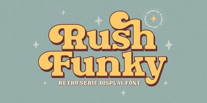 Rush Funky is a serif typeface with vintage and retro look!. Equipped with all complete characters ranging from uppercase letters, lowercase letters, numbers, punctuation marks and multi-lingual support, this font is ready to be used in any project. Uppercase & Lowercase Numbers & Punctuation Multilingual Alternate character & ornament How to access alternate / ornament ? : https://hanscostudio.com/tutorial/ Enjoy!
 - Ninth Century MF by Masterfont,
$59.00 OpenType Pro Excellent support for Niqqud (Vowels). All marks are programmed to fit each glyph's shape and width. OpenType Pro includes new advanced features like Dagesh Hazak, ShevaNa, Qamatz Katan, Holam Haser and wide letters. Best used with Adobe InDesign CC that support complex Hebrew text. Please check these advanced features in this link: tinyurl.com/2fbkuy95
 - Butter - Unknown license

- Ivoor by Cloveron Media,
$18.00 Meet Ivoor, a new sans serif typeface of the 21st century. It has distinct letter accents and comes with beautiful ligatures. It's a very versatile font that works as standalone or paired with other fonts. It is a great design choice for branding, logo, labels, packaging, magazine headers & so much more. Features: Weights - Regular & Bold Lowercase & Uppercase Classy Ligatures Numerals & Punctuation Multilingual Characters In .otf file Language Support: Western Europe Follow my shop for upcoming updates and new products that you might be interested in next time. Please message me for any suggestions and support. I would like to hear it. Thank you!
 - Golden Dance by Twinletter,
$12.00 Our newest Font, Golden Dance This font offers beautiful abstract typographic harmony for a wide variety of design projects, including natural handwriting in digital form for designs, quote designs, social media business designs, advertisements, trademarks, promotional banners, posts, posters, signatures, and all. the design requires handwriting or whatever design you want. This font is equipped with uppercase, lowercase, numbers, punctuation marks, swhases, and several variations on each character including multi-language. What’s Included : Standard glyphs Ligature Works on PC & Mac Simple installations Accessible in Adobe Illustrator, Adobe Photoshop, Adobe InDesign, even work on Microsoft Word. PUA Encoded Characters – Fully accessible without additional design software. Fonts include multilingual support for; Afrikaans, Albanian, Croatian, Czech, Danish, Dutch, English, Estonian, Finnish, French, German, Hungarian, Italian, Norwegian, Polish, Portuguese, Slovak, Slovenian, Spanish, Swedish
 - Neue Haas Unica by Linotype,
$53.99 The Neue Haas Unica™ family is an extended, reimagined version of the Haas Unica® design, a Helvetica® alternative that achieved near mythical status in the type community before it virtually disappeared. Originally released in 1980 by the Haas Type Foundry and designed by Team ’77 — André Gürtler, Erich Gschwind and Christian Mengelt— for phototypesetting technology of the day, the design was never successfully updated for today’s digital environments – until now. Toshi Omagari of Monotype Studio has given this classic a fresh, digital facelift with more weights, more languages and more letters to meet today’s digital and print needs. Available in 18 styles, the Neue Haas Unica family is remarkably appropriate for a wide range of applications, possessing a delicate gradation of weights and clear character shapes. The family's lighter weights are perfect for headlines and other large settings, as well as small blocks of copy at typical text sizes. The regular, medium and bold weights know no boundaries and the heavy and black designs are ideal for when typography needs to be powerful and commanding. Like the Neue Helvetica and Univers Next typefaces, the Neue Haas Unica family can be used just about anywhere – or for any project. In addition to its 9 tailored weights and complementary italics, the Neue Haas Unica family also possesses additional characters for Eastern and Central European, Greek and Cyrillic language support, which did not exist in the original design. A cosmopolitan typeface for today's modern, discerning design needs, the Neue Haas Unica collection is a new classic in the making—one that every designer should surely have at their disposal.
 - HWT Konop by Hamilton Wood Type Collection,
$24.95 HWT Konop is a monospaced (fixed-width) typeface that is also square! Designed by Mark Simonson (Proxima Nova) as square characters that can be arranged vertically or horizontally and in any orientation. To a traditional letterpress job printer, a font like this wouldn’t make much sense. But to a modern letterpress printer it is an unusual and creative design toolkit. The bold gothic style is reminiscent of gothic wood types but more geometric. Since the characters are meant to be used in any orientation, the usual optical adjustments, such as making verticals thicker than horizontals and making tops smaller than bottoms are set aside. This results in a quirky but charming design. To provide more design options, Simonson came up with a modular system consisting of three sizes: 12-line, 8-line, and 6-line. These three sizes can be used together like Lego® bricks, with endless arrangements possible. And the sidebearing match so that characters always align when different sizes are used together. The digital version of Konop replicates the wood type version as much as possible, including the three different size designs. It includes OpenType stylistic sets that allow most characters to be rotated in place, 90° left, 90° right, or 180°, just like the wood type version. Extra characters not available in the wood type version are included with the digital fonts. The set of 3 is priced just $5 more than one single font, so order via "Package Options" HWT Konop is named for Don Konop, a retired Hamilton Manufacturing employee, who worked from 1959 to 2003. In addition to serving on the Two Rivers Historical Society Board from 2004 to present-day, he was also instrumental as a volunteer in helping with the museum’s move to its current home in 2013.
 - Gorgeous Girl by Twinletter,
$12.00 Gorgeous Girl is our newest script font created with sweet and sweet hand strokes, with subtle touches and dramatic curves making this font unique. This bold calligraphy font is designed with a relaxed but elegant background, while still paying attention to the beauty of each letter, there are alternate options for lowercase letters, so that it automatically beautifies the visual appearance in your design project. besides that, this font also offers harmoniously beautiful abstract typography for your various design projects. This font is also perfect for wedding invitations, quote designs, for social media business designs, advertisements, trademarks, food and beverage promotion banners, text, posters, signatures, and any design that requires handwriting. This font is equipped with uppercase, lowercase, numbers, punctuation marks, swhases and several variations on each character including multi-language. ================================================== This font is best suited for open type friendly applications. How to get alternative glyphs from open type fonts: http://adobe.ly/1m1fn4Y PUA Character Code - Fully accessible without additional design software. we hope you enjoy this font. Feel free to send whatever message you want to convey.
 - Bank Sans EF by Elsner+Flake,
$35.00 With its extended complement, this comprehensive redesign of Bank Gothic by Elsner+Flake offers a wide spectrum for usage. After 80 years, the typeface Bank Gothic, designed by Morris Fuller Benton in 1930, is still as desirable for all areas of graphic design as it has ever been. Its usage spans the design of headlines to exterior design. Game manufacturers adopt this spry typeface, so reminiscent of the Bauhaus and its geometric forms, as often as do architects and web designers. The creative path of the Bank Gothic from hot metal type via phototypesetting to digital variations created by desktop designers has by now taken on great breadth. The number of cuts has increased. The original Roman weight has been augmented by Oblique and Italic variants. The original versions came with just a complement of Small Caps. Now, they are, however, enlarged by often quite individualized lower case letters. In order to do justice to the form changes and in order to differentiate between the various versions, the Bank Gothic, since 2007 a US trademark of the Grosse Pointe Group (Trademark FontHaus, USA), is nowadays available under a variety of different names. Some of these variations remain close to the original concept, others strive for greater individualism in their designs. The typeface family which was cut by the American typefoundry ATF (American Type Founders) in the early 1930’s consisted of a normal and a narrow type family, each one in the weights Light, Medium and Bold. In addition to its basic ornamental structure which has its origin in square or rectangular geometric forms, there is another unique feature of the Bank Gothic: the normally round upper case letters such as B, C, G, O, P, Q, R and U are also rectangular. The one exception is the upper case letter D, which remains round, most likely for legibility reasons (there is the danger of mistaking it for the letter O.) Because of the huge success of this type design, which follows the design principles of the more square and the more contemporary adaption of the already existing Copperplate, it was soon adopted by all of the major type and typesetting manufacturers. Thus, the Bank Gothic appeared at Linotype; as Commerce Gothic it was brought out by Ludlow; and as Deluxe Gothic on Intertype typesetters. Among others, it was also available from Monotype and sold under the name Stationer’s Gothic. In 1936, Linotype introduced 6pt and 12pt weights of the condensed version as Card Gothic. Lateron, Linotype came out with Bank Gothic Medium Condensed in larger sizes and a more narrow set width and named it Poster Gothic. With the advent of photoypesetters and CRT technologies, the Bank Gothic experienced an even wider acceptance. The first digital versions, designed according to present computing technologies, was created by Bitstream whose PostScript fonts in Regular and Medium weights have been available through FontShop since 1991. These were followed by digital redesigns by FontHaus, USA, and, in 1996, by Elsner+Flake who were also the first company to add cursive cuts. In 2009, they extended the family to 16 weights in both Roman and Oblique designs. In addition, they created the long-awaited Cyrillic complement. In 2010, Elsner+Flake completed the set with lowercase letters and small caps. Since its redesign the type family has been available from Elsner+Flake under the name Bank Sans®. The character set of the Bank Sans® Caps and the Bank Sans® covers almost all latin-based languages (Europe Plus) as well as the Cyrillic character set MAC OS Cyrillic and MS Windows 1251. Both families are available in Normal, Condensed and Compressed weights in 4 stroke widths each (Light, Regular, Medium and Bold). The basic stroke widths of the different weights have been kept even which allows the mixing of, for instance, normal upper case letters and the more narrow small caps. This gives the family an even wider and more interactive range of use. There are, furthermore, extensive sets of numerals which can be accessed via OpenType-Features. The Bank Sans® type family, as opposed to the Bank Sans® Caps family, contains, instead of the optically reduced upper case letters, newly designed lower case letters and the matching small caps. Bank Sans® fonts are available in the formats OpenType and TrueType.
 - Spirits Burner by Ditatype,
$29.00 Spirit Burner is a gothic-themed display font combining the gothic characteristics with uneven edge lines and unique details to show firm, lovely, dramatic impressions. The letter shapes follow the gothic characteristics with uneven soft lines and unique details such as ornaments and decorations to add uniqueness to the design. Dark and contrast colors add the dramatic, mysterious impressions to the font, and the uneven edge lines show your designs organic, experimental impressions, while the unique details show personal impressions. Therefore, designs with this font, which is suitable to apply for big text sizes for more legible letters, will be able to express strong, lovely impressions and will look distinct and impressive. In addition, you can enjoy the available features here. Features: Multilingual Supports PUA Encoded Numerals and Punctuations Spirit Burner fits best for various design projects, such as brandings, quotes, printed products, merchandise, social media, etc. The font’s unique, strong characteristics are perfect for designs requiring firm, dramatic impressions, for example, music bands and products with gothic-themed markets. Find out more ways to use this font by taking a look at the font preview. Thanks for purchasing our fonts. Hopefully, you have a great time using our font. Feel free to contact us anytime for further information or when you have trouble with the font. Thanks a lot and happy designing.
 - Ghora by Twinletter,
$18.00 Do you need a cyberpunk theme? Introducing our newest font called Ghora. A futuristic font that will mark your business as the most unique on the market. Designed with every detail in mind, this typeface has a very futuristic look. You can use this typeface for sci-fi-themed logos, games, movies, posters, designs, and promotional publications. What’s Included : - File font - All glyphs Iso Latin 1 - Alternate, Ligature - Simple installations - We highly recommend using a program that supports OpenType features and Glyphs panels like many Adobe apps and Corel Draw so that you can see and access all Glyph variations. - PUA Encoded Characters – Fully accessible without additional design software. - Fonts include Multilingual support
 - Pattern by Mauve Type,
$29.00 The Pattern Project is an ornamental display type family. It is inspired by medieval initials and transforms their mesmerizing rhichness of detail into cool state-of-the-art typography. All letter shapes and patterns are exclusively geometric, providing a very distinct and contemporary feel. Pattern is the new sexy – perfect for vodka labels, record sleeves and posters. For editorial design and packaging. With a special typographic impact. Some practical details: - Family consists of 9 diverse patterns + a blank version. - 3 weights available. - As with patterns in general: It is quite essential how far you zoom in to change the graphic impression. 3 pattern resolutions (Coarse, Medium + Fine) allow varying the pattern size independently from the font size. - Each pattern comes with diverse weights and/or pattern resolutions. - Use in display sizes only. The bigger – the better! - Fine pattern resolutions require even larger font sizes than coarse resolutions. - Fonts gain kind of ʺtransparencyʺ through the patterns - handy for use on top of images. - Characterset is caps only and supports Central, Eastern and Western European languages. - Entertaining 2 min movie explaining the basic concept: youtube.com/watch?v=wbuUkRDApzs
