6,515 search results
(0.119 seconds)
- Glaure by Slide Shoot,
$17.00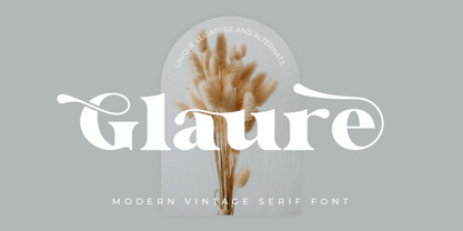 Glaure Vintage Serif is a balanced, smooth, elegant and stylish serif font. He has a beautiful character. It fits perfectly with invitation card designs, company logos, movie titles, movie names, business cards, book titles, brand names and various other designs. Glaure Vintage Serif is a subtle serif font that exudes sophistication and elegance. Its stylish alternations and ligatures make this font the perfect partner for any project.
 - Quartiel by Trustha,
$17.00 Quartiel is a casual handwritten brush font. Written by hand using a dry brush pen. With fast movements. But, keeping the height of each letter the same. Comes in two styles, regular and slanted also include swash as a sweetener. Suitable for all creative projects, especially in headlines, branding, advertising, packaging, and more. And will give a natural, and authentic touch to each of your projects.
 - Fartage by Slide Shoot,
$9.00 Fartage Sans Serif is a balanced, smooth, elegant and stylish serif font. He has a beautiful character. It fits perfectly with invitation card designs, company logos, movie titles, movie names, business cards, book titles, brand names and various other designs. Fartage Sans Serif is a subtle serif font that exudes sophistication and elegance. Its stylish alternations and ligatures make this font the perfect partner for any project.
 - Bite Chalk by Storictype,
$9.00 BiteChalk Still with a chalk concepts, This is good for projects like a menuboards it's specially designed cafe or restaurant ,background photoboots wedding, t-shirt, posters, etc and a touch of vector pack theme dessert, that allows you to mix and match pairs of ornaments to fit your design . Above the description of this font, I hope you're satisfied with what I have created. Thank You
 - 2 Quadro by Apostrof,
$50.00 This big family summarizes and develops the tradition of boldface squared-off 45° shear sanserifs. Known from the middle of 19th century and actively used in different times (1920s, 1970s) is still usable now, thanks to its brutal expression, monumentality and possibility to fully maximize the flatness without loss of readability. This font is especially good for filling letters with photos or to create geometrical “constructivist” compositions.
 - Kid Candy by Zeenesia Studio,
$12.00 Kid Candy is a sweet and friendly handwritten font. Kid Candy is a serif and sans font that can meet your design needs with funny and cheerful themes You can use it in your various designs, clothes, logos, posters, invitations, crafts, and more. Its natural and unique style makes it incredibly fitting to a large pool of designs. The only limit is your imagination!
 - Hungry Chalk by Storictype,
$9.00 HungryChalk Still with a chalk concepts, This is good for projects like a menuboards it's specially designed cafe or restaurant ,background photoboots wedding, t-shirt, posters,etc and a touch of vector pack theme dessert, that allows you to mix and match pairs of ornaments to fit your design . Above the description of this font, I hope you're satisfied with what I have created. Thank You
 - Ottocento by Eurotypo,
$39.00 Ottocento is an elegant chancery cursive, derived from XIXth century Italian calligraphy. Slightly inclined and with a fast and marked ductus, this font is well balanced between thick and thin strokes and shows marked ascendings and descendings. Ottocento is rich in stylistic variations with its elaborated upper cases, and stylistically different in traits and different ligatures are considered to make the most of the many OpenType features.
 - Milonga by Larin Type Co,
$15.00 Milonga This is a beautiful and elegant hand drawn font, will emphasize your individuality in any project. Its relaxed feel makes this font incredibly versatile, fitting a wide range of designs. You can also use them to create a logo or templates, invitations, blog, branding, marketing, book covers, magazines, advertising, stationery, logo design and much more. This font is easy to use has OpenType features
 - Vendya by Slide Shoot,
$15.00 Vendya Serif is a balanced, smooth, elegant and stylish serif font. He has a beautiful character. It fits perfectly with invitation card designs, company logos, movie titles, movie names, business cards, book titles, brand names and various other designs. Vendya Serif is a subtle serif font that exudes sophistication and elegance. Its stylish alternations and ligatures make this font the perfect partner for any project.
 - Manju by Eko Bimantara,
$19.00 Manju font family represents retro 70s styles which have soft and chewy characteristics. Designed to be fit for display, titling, good for logo, header, and large size usage. The light styles can be also used for short text. It consists of 10 styles from thin to heavy with matching obliques. It has several opentype features such as alternates and ligatures, it also supports broad latin languages.
 - Presswork JNL by Jeff Levine,
$29.00 Sheet music for the 1939 song “On the Paraña” featured Art Deco hand lettering in a classic “thick and thin” style, with many stylized characters. The publisher of the song was the Theodore Presser Company of Philadelphia, so the name “Presswork” aptly fit this typographic design. Presswork JNL is available in both regular and oblique versions. For trivia buffs, the Paraña is a river in Brazil.
 - CG Clarendon by Monotype,
$29.99The first Clarendon was introduced in 1845 by R. Besley & Co, The Fan Street Foundry, as a general purpose bold for use in conjunction with other faces in works such as dictionaries. In some respects, Clarendon can be regarded as a refined version of the Egyptian style and as such can be used for text settings, although headline and display work is more usual. - Twintale by Slide Shoot,
$19.00 Twintale Serif is a balanced, smooth, elegant and stylish serif font. He has a beautiful character. It fits perfectly with invitation card designs, company logos, movie titles, movie names, business cards, book titles, brand names and various other designs. Twintale Serif is a subtle serif font that exudes sophistication and elegance. Its stylish alternations and ligatures make this font the perfect partner for any project.
 - Masbrushy by Sesa Grafika,
$69.00 Masbrushy is a bold and Modern handwritten Lettering font. Clean and a little bit quirky, this font is the perfect fit for all of your logos, branding, social media, and crafty DIY projects. This font especially design for awesome logo project. You can use this font for Logomark Project. This font is PUA encoded which means you can access all of the glyphs and swashes with ease!
 - DF Zzzz by Dutchfonts,
$33.00 This typeface, in fact a bitmap font 'avant la lettre' is an interpretation of the Old Face condensed type. It is being used where space is scarce. Its skeleton is projected on the chain structure of a fly screen. Eventually your text lines fill the space as wide as hypothetical doors can be. In small sizes the text appears to be drawn with a pencil.
 - Weirdtopia by Invasi Studio,
$19.00 Weirdtopia - is retro, fun, and playful. It really ties together your piece to make it feel retro. Perfect for making any project like header, quote, layout magazine, and others. Even better if used on the 60s and 70s design projects. A mix of psychedelia and groovy, it came with open-type features such as stylistic alternates that you can modify to fit your own style.
 - Scary Scrimshaw NF by Nick's Fonts,
$10.00Fire up the incense and break out the love beads! A 1968 poster for a Doors concert by legendary artist Gary Grimshaw provided the inspiration for this wild, far-out and funky romp through the alphabet. Use it liberally to add a little trippy hippie charm to your next project. Both versions of the font include 1252 Latin, 1250 CE (with localization for Romanian and Moldovan). - Minou by Hanoded,
$15.00 Minou is a French cat’s name. There are more: you could name your cat Léo, Fripouille, Orion, Orphée or Tigrou, but I kind of like Minou. Minou font is a very cute, handmade affair, that started from some doodles I had drawn. Use it for children’s book covers, pyjama party posters, toy packaging and inspirational quotes. I am sure it’ll do the job purrfectly!
 - Mothiva by Slide Shoot,
$17.00 Mothiva Serif is a balanced, smooth, elegant and stylish serif font. He has a beautiful character. It fits perfectly with invitation card designs, company logos, movie titles, movie names, business cards, book titles, brand names and various other designs. Mothiva Serif is a subtle serif font that exudes sophistication and elegance. Its stylish alternations and ligatures make this font the perfect partner for any project.
 - Tabby by Attype Studio,
$10.00 Tabby is display font inspired by connection about human and cat. It has 3 font style, It's super easy to use 3D effect with Tabby family font. Three style Font: Regular, Display & Shadow Tabby perfectly match for any product like book cover, t-shirt, branding, promotion, social media post, quotes, crafting, photography and more. What's included: - Multilingual Support --- Hope you enjoy with our font! Attype Studio
 - Sinzano by Typodermic,
$11.95 Hey there, cats and kittens. Have you heard the news about the grooviest typeface in town? That’s right, I’m talkin’ about Sinzano—the typeface that’s cool, collected, and interlocking! Now, you might be asking yourself, “What’s so special about Sinzano?” Well, let me tell you, this typeface is a real wild one. It’s got some serious style, with letterforms that interlock like a bunch of jazz cats jammin’ on stage. And don’t even get me started on the ligatures—they’re fascinating, man! Sinzano comes in three different styles, so you can choose the one that’s right for you. Sinzano Regular is a slender, slightly flared headliner, perfect for making a statement. Sinzano Sans is a similar concept, but with straight, flat ends, for a more modern vibe. And if you’re looking for something a little more modest, Sinzano Display is a companion typeface that’s broader and rounder, with just a touch of interlocking. So, if you’re ready to add some serious style to your designs, head on over to Sinzano, baby! This typeface is the real deal, and it’s gonna knock your socks off. Most Latin-based European writing systems are supported, including the following languages. Afaan Oromo, Afar, Afrikaans, Albanian, Alsatian, Aromanian, Aymara, Bashkir (Latin), Basque, Belarusian (Latin), Bemba, Bikol, Bosnian, Breton, Cape Verdean, Creole, Catalan, Cebuano, Chamorro, Chavacano, Chichewa, Crimean Tatar (Latin), Croatian, Czech, Danish, Dawan, Dholuo, Dutch, English, Estonian, Faroese, Fijian, Filipino, Finnish, French, Frisian, Friulian, Gagauz (Latin), Galician, Ganda, Genoese, German, Greenlandic, Guadeloupean Creole, Haitian Creole, Hawaiian, Hiligaynon, Hungarian, Icelandic, Ilocano, Indonesian, Irish, Italian, Jamaican, Kaqchikel, Karakalpak (Latin), Kashubian, Kikongo, Kinyarwanda, Kirundi, Kurdish (Latin), Latvian, Lithuanian, Lombard, Low Saxon, Luxembourgish, Maasai, Makhuwa, Malay, Maltese, Māori, Moldovan, Montenegrin, Ndebele, Neapolitan, Norwegian, Novial, Occitan, Ossetian (Latin), Papiamento, Piedmontese, Polish, Portuguese, Quechua, Rarotongan, Romanian, Romansh, Sami, Sango, Saramaccan, Sardinian, Scottish Gaelic, Serbian (Latin), Shona, Sicilian, Silesian, Slovak, Slovenian, Somali, Sorbian, Sotho, Spanish, Swahili, Swazi, Swedish, Tagalog, Tahitian, Tetum, Tongan, Tshiluba, Tsonga, Tswana, Tumbuka, Turkish, Turkmen (Latin), Tuvaluan, Uzbek (Latin), Venetian, Vepsian, Võro, Walloon, Waray-Waray, Wayuu, Welsh, Wolof, Xhosa, Yapese, Zapotec Zulu and Zuni.
 - Interlaken by ROHH,
$20.00 Interlaken™ is a modern display & branding typeface allowing to design creative logotypes, posters and headlines with ease. It is an uppercase family of six OpenType fonts and one 2-axis variable font, packed with features such as stylistic alternates and tons of original ligatures. The family’s purpose is to make the creative process of designing logotype a blast. It has a wide set of OpenType features crafted especially to make your life easier, allowing you to accomplish your projects in less time. Interlaken has a powerful and very modern character, it comes in three width variants, making it a good fit in various design scenarios. Its cutout details make it look unique and create an impression of inner shadows when set on a dark background. Interlaken is a great typographic tool for such industries as sports, fitness, modern technology, fashion and gaming. It works perfect as a pairing typeface with Rothorn, Conthey and Conthey Inline and Axalp Grotesk.
 - XXII CoolScript by Doubletwo Studios,
$25.99 XXII CoolScript - The vibrant typeface with a ton of alternates MAJOR UPDATE This is a big update of XXII CoolScript. First of all, from now it’s a whole family with 7 new weights from ExtraThin to Black. It comes with more than hundred additional glyphs, some more alternates, ligatures, numerals and fitting opentype features for fractions and two extra ampersands. This lovely script font by Lecter Johnson is another, more soft and round one in the series of Doubletwo Studios’ script fonts (XXII YeahScript, XXII AwesomeScript). Its wonderfully designed letters, ligatures and alternates may bring a charming and individual handwritten look to your creation. This fonts are designed to easily create logos, headlines and text phrases within a blink of an eye. Just open your glyphs-palette* and simply chose, from up to 27 different alternates and variations per glyph, the one that fits best for your needs. *For further information visit the Behance Project.
 - Alien Alphabet by ParaType,
$25.00Alien Alphabet is inspired by the ideas of change, transformation, creative deconstruction and mutual penetration of various cultures, languages, and opposing cognitive systems, which seem to be prevalent in our 'globalized' civilization. It appears as various visual constructs -- archetypal symbolism, pieces of the world alphabets, socio-cultural icons, mathematical formulae, etc., -- broke down into pieces and were reassembled in a way that carried traces of previous meanings. However, this contradictory mutation invokes enigmatic meanings and emotions begging for further definition and interpretation. Alien Alphabet shapes arranged in linear sequential manner tend to evoke a sense of written language. The fact that a message cannot be understood does not really change its emotional appeal. Moreover, the less message can be deciphered, the more seems to be the appeal -- for it triggers our imagination. In fact, we may not want to know the actual meaning because deep inside we are afraid that this might be just another alien dry-cleaning receipt. - FS Albert by Fontsmith,
$80.00 The x factor How do you make a font like FS Albert unique, distinctive? “When designing a font I try to question every letter,” says Jason Smith, “but all you need is a few that have an x factor. With FS Albert, they’re the lowercase ‘a’ and ‘g’ and the uppercase ‘I’ and ‘J’. “I remember a friend saying, ‘Why on earth have you designed the ‘a’ like that? Isn’t it too friendly for this kind of font?’ And, in a way, that’s what I wanted – honesty and warmth, because a lot of big brands at the time really needed to show a more human side.” Range of weights and styles FS Albert is a charismatic type: a warm, friendly sans serif face with a big personality. Open, strong and amenable, and available in a wide range of weights and styles, FS Albert suits almost every task you put it to. Fontsmith has crafted five finely-tuned upright Roman weights and four italic weights, as well as a special Narrow version to provide the best coverage and give headlines and text an easy-going character. The chunky kid “FS Albert was inspired by – and named after – my son, who was a bit of a chunky kid,” says Jason Smith. “I designed an extra bold weight because I always felt that the really big font heavy weights had the most personality. “I recently told Albert this story. He laughed, and forgave me for thinking he was a fat baby. He liked the big personality bit, though.” 1000s of glyphs Not content with a character set that covered Europe and the whole of the Western world, the studio decided to go further afield. There are now FS Albert character sets that cover western and eastern European languages, including those of Russia, as well as Cyrillic, Arabic and Greek scripts. In fact, the font now covers more than 100 languages, making it ideal for bringing a consistent typographic style to the communications of global brands.
 - FS Albert Paneuropean by Fontsmith,
$90.00The x factor How do you make a font like FS Albert unique, distinctive? “When designing a font I try to question every letter,” says Jason Smith, “but all you need is a few that have an x factor. With FS Albert, they’re the lowercase ‘a’ and ‘g’ and the uppercase ‘I’ and ‘J’. “I remember a friend saying, ‘Why on earth have you designed the ‘a’ like that? Isn’t it too friendly for this kind of font?’ And, in a way, that’s what I wanted – honesty and warmth, because a lot of big brands at the time really needed to show a more human side.” Range of weights and styles FS Albert is a charismatic type: a warm, friendly sans serif face with a big personality. Open, strong and amenable, and available in a wide range of weights and styles, FS Albert suits almost every task you put it to. Fontsmith has crafted five finely-tuned upright Roman weights and four italic weights, as well as a special Narrow version to provide the best coverage and give headlines and text an easy-going character. The chunky kid “FS Albert was inspired by – and named after – my son, who was a bit of a chunky kid,” says Jason Smith. “I designed an extra bold weight because I always felt that the really big font heavy weights had the most personality. “I recently told Albert this story. He laughed, and forgave me for thinking he was a fat baby. He liked the big personality bit, though.” 1000s of glyphs Not content with a character set that covered Europe and the whole of the Western world, the studio decided to go further afield. There are now FS Albert character sets that cover western and eastern European languages, including those of Russia, as well as Cyrillic, Arabic and Greek scripts. In fact, the font now covers more than 100 languages, making it ideal for bringing a consistent typographic style to the communications of global brands. - Josef K Patterns by Juliasys,
$9.60 Franz Kafka’s manuscripts have always been a source of inspiration for designer Julia Sysmäläinen. At first she was just interested in literary aspects but later she noticed that content and visual form can not be separated in the work of this ingenious writer. Analyzing Kafka’s handwriting at the Berlin National Library, Julia was inspired to design the typeface FF Mister – by now a well known classic. Over the years, FF Mister K became a handsome typeface family and even produced offspring: the Josef K Patterns. Some of Kafka’s most expressive letterforms were the starting point for these decorative ornaments. How do the Patterns work? Outlines and fillings correspond to the uppercase and the lowercase letters on your keyboard. You can use them separately or layer them on top of each other. If you write a line of “pattern-text” in lowercase and repeat it underneath in uppercase you get a row of fillings followed by a row of outlines. Now you can color them and then set line space = 0 to get a single line of layered colored ornaments. Alternatively, activating OpenType / stylistic set / stylistic alternates will also unite the two lines to a single layered line. Further magic can be done with OpenType / contextual alternates turned on. On the gallery page of this font family is a downloadable Josef K Patterns.pdf with an alphabetical overview of forms. Hundreds of patterns are possible … we’d love to see some of yours and present them here on the website!
 - Cloister Open Face LT by Linotype,
$29.99Cloister Open Face was designed in 1929 by Morris Fuller Benton as one weight of the Cloister Old Style family. Cloister itself appeared from 1897 with American Type Founders, and later for the typesetting machines of the Linotype, Intertype and Monotype companies. At that time, it was the truest modern industrial revival of the Jensonian Roman. Benton stayed close to the style of his model in both design and spacing. Cloister Open Face has an old-world elegance, and it works well for titling in books and magazines. In 1458, Charles VII sent the Frenchman Nicolas Jenson to learn the craft of movable type in Mainz, the city where Gutenberg was working. Jenson was supposed to return to France with his newly learned skills, but instead he traveled to Italy, as did other itinerant printers of the time. From 1468 on, he was in Venice, where he flourished as a punchcutter, printer and publisher. He was probably the first non-German printer of movable type, and he produced about 150 editions. Though his punches have vanished, his books have not, and those produced from about 1470 until his death in 1480 have served as a source of inspiration for type designers over centuries. His Roman type is often called the first true Roman." Notable in almost all Jensonian Romans is the angled crossbar on the lowercase e, which is known as the "Venetian Oldstyle e."" - Lincoln Electric by Canada Type,
$30.00 Lincoln Electric started its life as an in-house experimental film type Thomas Lincoln drew shortly after concluding his work as part of Herb Lubalin’s famed crew in the late 1960s,. The master alphabet was drawn on illustration boards using pen and ink and press-type lines. The typeface was initially made for use in the branding and promotional material of Lincoln’s new design outfit. This alphabet’s forms are a spin on Bifur, the all-cap deco face designed by Adolphe Mouron (known as Cassandre) in 1929, and published by the Deberny & Peignot foundry in France. Lincoln Electric evolves Cassandre’s idea further by constructing new shapes more in line with minimalist principles rather than art deco geometry — something clearly evident in Lincoln’s minuscules, which exhibit a clear connection to Bauhaus ideas More than 50 years after the typeface’s design, Thomas Lincoln found the original film alphabet tucked away in his archives and brought it over to Canada Type for digital retooling. The result is a modern and thoroughly elaborate set of fonts that belonging prominently in a 21st century designer’s toolbox. The following features are included in Lincoln Electric: • Three fonts for chromatic layering. • More than 1900 glyphs in each font. • Expanded Latin and Cyrillic character sets. • Small caps and Caps-to-small-caps. • Six different sets of stylistic alternates. • Ordinals and case-sensitive forms. For a showing of the stylistic set variations and a sample of demonstration of chromatic layering, please consult this PDF.
 - Ghost Sign JNL by Jeff Levine,
$29.00 Ghost Sign JNL is a spurred serif type design based on the faded lettering of an antique brick wall sign for Homer Hardware [located in Homer, NY] and is available in both regular and oblique versions. From Wikipedia: “A ghost sign is an old hand-painted advertising sign that has been preserved on a building for an extended period of time. The sign may be kept for its nostalgic appeal, or simply indifference by the owner. Ghost signs are found across the world with the United States, the United Kingdom, France and Canada having many surviving examples. Ghost signs are also called fading ads or brickads. In many cases these are advertisements painted on brick that remained over time. Old painted advertisements are occasionally discovered upon demolition of later-built adjoining structures. Throughout rural areas, old barn advertisements continue to promote defunct brands and quaint roadside attractions. Many ghost signs from the 1890s to 1960s are still visible. Such signs were most commonly used in the decades before the Great Depression. Ghost signs were originally painted with oil-based house paints. The paint that has survived the test of time most likely contains lead, which keeps it strongly adhered to the masonry surface. Ghost signs were often preserved through repainting the entire sign since the colors often fade over time. When ownership changed, a new sign would be painted over the old one.”
 - Jantze by Fontosaurus,
$19.95The Jantze font is a project undertaken by Dan Bailey of Fontosaurus and Michael Jantze, creator of the nationally-syndicated comic strip, The Norm. All their royalties from the font will go to The Lance Armstrong Foundation. For those that have been living under a rock for the last five years, Lance is a professional bike racer that overcame advanced testicular cancer to not only come back to his sport, but to dominate its premiere event, the Tour de France. In climbing to the top of his sport, he has become a legend among cyclists and a beacon of hope for those battling cancer and their families. His foundation provides financial grants to researchers working to improve our odds against the disease, individuals stricken with cancer, and survivors of the disease that are advocates for survivorship issues in their communities. Michael Jantze and Dan Bailey would like you to consider the quote from Ralph Waldo Emerson that brought us to this project: "The purpose of life is not to be happy. It is to be useful, to be honorable, to have it make some difference that you have lived and lived well. We hope that you will help us help Lance Armstrong's legacy be more than that of just sports legend. We hope that you will help those that may someday help you as much as we hope that you will never have to suffer the ravages of cancer. We hope. - Fantastic ML by HiH,
$12.00 Fantastic ML is an exuberant Art Nouveau font. It was originally released as “Modern Style” by Fonderie G. Peignot & Fils, Paris, France sometime before 1903. Since “Le style moderne” was the generic French name for Art Nouveau, it is possible that someone decided a less generic name was needed. The typeface became known as Fantastic. Compared to conventional text letters, it is just that. Fantastic has a whimsical, architectural feel. The typeface reminds me of a cross between Hoffmann’s Palais Stoclet in Brussels and Gaudi’s Sagrada Familia church in Barcelona. The letterforms themselves are similar to those by Ludwig von Zumbusch on the cover of “Jugend” in March, 1896, but with the addition of serifs. Fantastic ML is a decorative, all-cap font intended for display use and functions best at 18 points or larger. There are a total of 306 glyphs. In addition to the standard 1252 Western Europe Code Page with character slots up to decimal position 255, there are glyphs for the 1250 Central Europe, the 1252 Turkish and the 1257 Baltic Code Pages. However, some older applications may only be able to access the Western Europe character set (1252). The zip package includes two versions of the font at no extra charge. There is an OTF version which is in Open PS format and a TTF version which is in Open TT format. Use whichever works best for your applications.
 - CEREAL KILLERZ - Personal use only

- Dienstag Variable by insigne,
$100.00 Introducing Dienstag Variable, the latest addition to insigne's popular Montag family of fonts! With its extended sans-serif style, Dienstag boasts a sleek and sophisticated look that's perfect for a wide range of projects. Whether you're designing a website, creating branding materials, or producing print publications, Dienstag's refined elegance is sure to make a lasting impression. Compared to Montag, Dienstag has a slightly more formal feel, thanks to its lack of rounded terminators. But that doesn't mean it's any less versatile – in fact, Dienstag's four original weights have now been expanded to ten, giving you even more flexibility in your designs. With OpenType features that include simplified versions of many characters, you can easily create unique and eye-catching titles that stand out from the crowd. But Dienstag is just one part of the larger Montag superfamily, which also includes Mittwoch, and Donnerstag. Each font in this collection offers its own unique style and flair, giving you a wealth of options to choose from when it comes to your next project. Whether you're looking for a bold and dynamic font or a more refined and understated style, you're sure to find the perfect fit in the Montag family. So why wait? Check out Dienstag and the rest of the Montag superfamily today, and start creating designs that are sure to captivate and inspire! With its elegant style and versatile functionality, Dienstag is the perfect choice for designers who demand the best.
 - Orto by LetterPalette,
$20.00 Orto is a type family of sans serif fonts in eight weights. It's a humanist typeface with real cursive, containing both Roman and Italic styles. The letters are designed to look good on screen, they have a bit narrower proportions and simple shapes. Their structure is based on flat horizontal and vertical strokes, which are emphasized wherever possible. That’s where the name comes from: Orto is an abbreviation of the word orthogonal. Thanks to its narrow width, the typeface is less space-consuming and adapts well to the screens of smaller devices. It is legible in small sizes, thanks to the larger x-height. The characteristic details, like bent ends of diagonal strokes, stand out when used in larger sizes. Orto can be used equally good in print and its overall neutral look fits different contexts. However, its character is pretty recognizable. Orto contains Latin and Cyrillic script and covers six codepages: Latin 1, Latin 2, Cyrillic, Turkish, Windows Baltic and MacOS Roman. It has basic OpenType features like ligatures, oldstyle numerals, proportional and tabular lining figures, fractions, superiors, etc. Capital German sharp S shows up when the lowercase is typed between two uppercase letters, and the Contextual Alternates feature is turned on. The Stylistic Set 01 changes the shape of the Cyrillic b. The Stylistic Set 02 is a shortcut for using Serban Cyrillic alternatives that differ from Russian in cursive.
 - ITC New Esprit by ITC,
$29.99Originally drawn in 1985, Jovica Veljović had intended to add a few kerning pairs and make some minor refinements to the letterforms. However, his work lead him to take a fresh look at the family. Veljović recalls, … I soon realized that some characters could benefit by more refined shapes and proportions. By the time I was done, I had worked on just about every character in the original design." In fact the end result is two systems: one optimized for extended texts; the other for display settings. The original elegance of the design is not lost, but the new design brings with it letterforms that are altogether more harmonious and balanced. The roman is dynamic and spirited, just oozing character. The italic by contrast is a little more restrained, but nonetheless an elegant and fitting accompaniment. The text-optimized fonts come with a generous x-height, and slightly less contrast; though its marginally wider proportions let in the light, making it very legible even at small sizes. ITC New Esprit ® is a versatile family, brought to you in four weights from regular to black. OpenType features like small caps, alternates, and a broad character set make this a welcome addition to everyone's font library. Whether you want elegant and legible text, or dynamic and personable headlines, then you'll want to click through to see more of ITC New Esprit. " - Berimbau by PintassilgoPrints,
$29.00 Berimbau is a whimsical narrow hand-drawn typeface. It’s stylish, versatile and loaded with amazing OpenType features that do their magic in OpenType savvy applications. Its sprightly swashes and twisting stylistic alternates (say that 3 times fast!) play together to deliver a really cool contextual feature that, in a push-button way, substitutes the first letter in a word with its left swash version and the last letter with its right swash version (please type a space before and after the words).The feature also applies stylistic variants to some of the intermediate letters. Which button to push? The Contextual Alternates one! If you're not a one-click-way-person you can pick your preferred glyphs through the glyphs palette. There you’ll find at least 4 variations for each letter: left swash, right swash and 2 regular forms that correspond to the upper and lower case keys. Some letters also have a 5th variation that acts as stylistic alternate. This font is conveniently packed with the ‘access all alternates’ functionality, so when you click on a glyph at the glyphs palette you’ll see all variations available for it, making it easier to choose the one that will fit better. A bold weight was made to provide that extra-strength when a bit of… boldness is needed. Please note that it doesn’t have the advanced OpenType features (but is still very charming!). Yet, both weights have a handy set of ornaments for added yumminess.
 - MINECRAFT PE - Personal use only

- Ghost Reverie - Personal use only


