10,000 search results
(0.016 seconds)
- Codeworld by Par Défaut,
$49.00 Codeworld is a geometrical sans serif font family (5 weight, italic and variable) It contains more than 800 characters including the Latin, Cyrillic and Greek alphabet. There are also 13 OpenType features (Superior; Inferior; Numerator; Denominator; Fraction ; Small Capital; Small Capitals from Capitals; Contextual Alternate; Case Sensitive; Access All Alternates; Stylistic Set; Standard Ligature; Discretionary Ligature).
 - Codeworld Mono by Par Défaut,
$49.00 Codeworld Mono is geometrical and monospaced sans serif font family (include 5 weight, italic and variable) It contains more than 800 characters including the Latin, Cyrillic and Greek alphabet There are also 11 OpenType features (Superior; Inferior; Numerator; Denominator; Fraction; Small Capital; Small Capitals from Capitals; Contextual Alternate; Case Sensitive; Access All Alternates; Stylistic Set; Standard Ligature; Discretionary Ligature).
 - Lonie by Par Défaut,
$35.00 Lonie is sans serif font family (include 5 weight, italic and variable) It contains more than 1200 characters including the Latin, Cyrillic and Greek alphabet There are also 15 OpenType features (Superior; Inferior; Numerator; Denominator; Fraction; Tabular Lining; ;OldStyle Figure; Small Capital; Small Capitals from Capitals; Contextual Alternate; Case Sensitive; Ordinals; Access All Alternates; Stylistic Set).
 - Vanio by Eko Bimantara,
$24.00 Vanio is a wedge serif font family that crafted with precision, focused on both aesthetic and legibility. The letterforms and other typographic elements are made in a way to achieve optical recognition and fit for various typesetting. Its have a strong serif and spacious width letterforms on the upright styles. Its shown a medium contrast and caligraphic strokes. Its have a moderate vertical heights either at the x-height, caps, ascender or descender. Vanio consist of 10 styles from regular to extrabold with each matching italics. Its contain more than 460 glyphs which support broad latin languages. Also contain several opentype features; Ligature, oldstyle figures, fraction, and other variation of figures.
 - Mohair Sam NF by Nick's Fonts,
$10.00A collision between some stylin' caps from legendary lettering artist Samuel Welo and a lowercase loosely based on ATF’s Romany Script yields this curious little wonder. Named after a 70s song which averred that all it took to be “the coolest guy what is what am” is to talk fast, walk slow and look good wearing that 'hair. Please note that, due to the exaggerated overhang of the many of the uppercase characters, this font has been optimized for upper- and lowercase uses. Both versions of this font contain the Unicode 1252 (Latin) and Unicode 1250 (Central European) character sets, with localization for Romanian and Moldovan. - Adams by Canada Type,
$24.95 Adams is a revival and major expansion of Dolf Overbeek's Studio typeface and Flambard, its bold counterpart, originally published by the Amsterdam Type Foundry in 1946 and 1954. This digital version adds small caps and a new light weight. Adams is a simple upright, flat brush script, with stroke angles carefully designed to give the same color in all sizes. It is reminiscent of the sign lettering commonly found in the 1930s and 1940s. The Adams fonts are available in all popular font formats, and the character sets cover a wide range of codepages, including Central and Eastern European languages, Esperanto, Turkish, Baltic, Celtic/Welsh.
 - JAF Mashine by Just Another Foundry,
$42.00 Although at first sight Mashine is a strict, "non-design" typeface, this display font is not as geometric as it seems. The use of serif-like terminals and unusual joints gives the design a unique look. This all-caps font provides stylistic alternates for most letters. If you type larger amounts of texts you should activate the Contextual Alternates OpenType feature to have the variants replaced automatically. By choosing best fitting letter pairs intelligently a fluid text composition is achieved. The fonts are provided in OpenType format. Each font contains 470 glyphs. Technically, they follow the Adobe Pro fonts and provide the same glyph set and OpenType functionality.
 - Cynthia June JF by Jukebox Collection,
$32.99 Cynthia June is an elegant and formal copperplate style script font from Jukebox. Perfect for weddings, dinners, holidays or any design that needs classic elegance, flair and femininity, this typeface will fit the bill! It includes an alternate set of swash caps and several alternate lowercase letters to expand its use. The font is named for a dear friend of the designer. Jukebox fonts are available in OpenType format and downloadable packages contain both .otf and .ttf versions of the font. They are compatible on both Mac and Windows. All fonts contain basic OpenType features as well as support for Latin-based and most Eastern European languages.
 - Bumpy Road - Unknown license

- Digital Sans Now by Elsner+Flake,
$59.00 Digital Sans Now combines and completes the many diverse requests and requirements by users of the past years. By now, 36 versions for over 70 Latin and Cyrillic languages have become available, including Small Caps. Digital Sans Now is also available as a webfont and reflects, with its simplified and geometric construction and its consciously maintained poster-like forms as well as with its ornamental character, the spirit of the decorative serif-less headline typefaces of the 1970s. The basic severity of other grotesque typefaces is here repressed by means of targeted rounds. Exactly these formal breaks allow the impression that it could be used in a variety of visual applications. Short texts, headlines and logos of all descriptions are its domain. It is because of this versatility that the typeface has become a desirable stylistic element, especially in such design provinces as technology, games and sports, and that, for many years now, it appears to be timeless. Additional weights designed on the basis of the original, from Thin to Ultra, the Italics, Small Caps and alternative characters allow for differentiated “looks and feels”, and, with deliberate usage, give the “Digital Sans Now” expanded possibilities for expression. The basis for the design of Digital Sans Now is a headline typeface created in 1973 by Marty Goldstein and the Digital Sans family which has been available from Elsner+Flake since the mid-1990s under a license agreement. The four weights designed by Marty Goldstein, Thin, Plain, Heavy and Fat, were originally sold by the American company Visual Graphics Corporation (VGC) under the name of “Sol”. Similarly, the company Fotostar International offered film fonts for 2” phototypesetting machines, these however under the name “Sun”. The first digital adaptation had already been ordered in the mid 1970s in Germany by Walter Brendel for the phototypesetting system Unitype used by the TypeShop Group, in three widths and under the name “Digital Part of the Serial Collection.” Based on the versions by VGC, Thin, Plain, Heavy and Fat, new versions were then created with appropriate stroke and width adaptations for data sets for the fonts Light, Medium and Bold as well as for the corresponding italics
 - Peking Duck by Hanoded,
$15.00 I used to be a tour guide and I traveled to China numerous times. Usually, the itinerary mentioned going to a restaurant in Beijing and eating ‘Beijing Roast Duck’ (北京烤鸭), a famous dish that has been prepared since the Imperial era. Typically, the whole duck is sliced at your table. The skin is crisp, glazed and thin and you should eat it with thin pancakes and thinly sliced spring onion. Of course, if I had to guide several ‘China tours’ in a row, I would often eat something else (there is only so much Beijing Duck you can eat). Peking Duck is a nice, handmade, Chinese Ink font. Use it for your restaurant menu, your book covers or your posters, advertising oriental food!
 - BeachBar by DearType,
$40.00 BeachBar is a modern bold script with a sunny mood. It is inspired by, well, Beach bars, the summer and the sea, the hot afternoons with a cocktail in your hand and the sound of splashing waves. Beachbar turns our love for summer into a dynamic and vivacious font that comes in three different styles to choose from: BeachBar (connecting small letters, disconnected basic caps, ideal for text), BeachBar Alt (all letters are disconnected) and last but not least BeachBar Script (connecting letters, script-like caps and a bold set of swash capitals for more eye-catching designs). All three styles come in six weights making the font versatile and useful both for web and print; think websites, posters, menus, logotypes, cards, signage, packaging and whatnot. BeachBar is friendly, sturdy and it makes a statement, but most of all, it is fun to play with.
 - ITC Berranger Hand by ITC,
$29.99Controlled casualness is the watchword in this new handwriting script from the prolific young French designer Éric de Berranger, who also designed the sans serif type family ITC Octone. ITC Berranger Hand has its roots in chancery calligraphy, yet its surface looks like contemporary informal lettering that was written quickly with a felt-tip pen on slightly absorbent paper. The counters of some letters appear to almost fill in from ink spread, yet Berranger Hand is admirably readable at small sizes. The capital letters are restrained, without swashes, so they can be used together in all-caps combinations. - Boudoir by Juraj Chrastina,
$29.00 Come into the boudoir. This simple hand-drawn sans tries to invoke the same feelings as its name - and not to be overluscious. Boudoir is sweet and sensual like women, but it’s at the same time uncluttered and masculinely straightforward. The font borrows some playful capital shapes from the all caps Baronessa and draws inspiration for others from old classics. Thanks to the bolder weights, it can also be used in smaller sizes, you can combine different weights for different sizes to obtain a more balanced look, or you can just give emphasis using different weights.
 - Shanks Antique 5 AOE Pro by Astigmatic,
$24.95 Shanks Antique 5 Pro is an iconic antique English typestyle rooted in tradition. It is the historical revival and elaboration of the “Antique No. 5” typeface created by Stevens, Shanks & Sons in 1865. What began as a basic character set of Capitals, lowercase, numerals, and a small handful of punctuation characters has been expanded to a full character set including unlimited fractionals, superiors & inferiors, ordinals, tabular & proportional figures, and an expanded language glyph set, all with a smallcaps and Caps to Smallcap set to match. Reviving history looks and feels good. Perfect for wedding invitations, historical ephemera recreations, and classically elegant text settings.
 - Bonbon by Fenotype,
$35.00 Bonbon is a delicious script family of three weights. With the total number of over 850 glyphs per font Bonbon is loaded with alternates: there are at least four alternates for each letter. Turn on Swash, Contextual, Stylistic or Titling Alternates to easily access the variants in any Open Type savvy program or manually select them from Glyph palette. Turn on Small Caps to activate a complete set of clear yet lively capital letters designed to go with the font. For the best results, combine Bonbon with Bonbon Ornaments, a set of 180 swooshes, swashes, ornaments and pictograms to complete your designs.
 - Baghadeer by Stephen Rapp,
$49.00 Baghadeer, from the hand of Stephen Rapp, is an upright connecting script brimming with personality. With its exuberant capitals, dashing crossover strokes, and rhythmic pulse; it retains the active spirit most associated with slanted scripts, but with the grounded presence of an upright. Baghadeer contains 780 glyphs featuring a plethora of swashes, ligatures, and alternate letters to individualize the look of your project. There is also a set of small caps and ornamental flourishes to add some finishing touches. It contains feature programming to make typesetting seamless and has all the language coverage you'd expect in a pro font.
 - Alkenyz by Aliptype,
$10.00 Intoducing Alkenyz, with a blackletter style, brings Alkenyz font more elegant, dense, and gothic. Complete by 2 Variation Family fonts with highly decorated caps. Alkenyz font sets come up with capital, lowercase letters, numerics, punctuation, and Multilingual Support. Alkenyz is perfect and suitable for logotype, Music Events, Tatto, Books title, Branding, Barbershops Lettering logos and many more can be discovered for stunning and gothic feels with this font. I really hope that you can work with this item and bring your design to the next level. Need any information or support about these items, please contact me : Thank you Aliptype
 - Hub by ParaType,
$25.00Designed by Gennady Fridman and released by ParaType in 2008. Hub represents so called block letter handwriting style, which becomes more and more usual and nowadays replaces traditional cursive handwriting. One of the reasons for these changes is an often requirement in official forms to write in block letters. Some forms contain even stricter rule – to write in capital letters. Hub was designed to meet these requirements and includes small caps instead of lower case letters. It’s recommended for use in advertising and display typography and especially when you need to show a sample of properly filled bureaucratic form. - Spitting Image by preussTYPE,
$25.00 SpittingImage is a font which speaks of mechanical exactness, cool and reserved. The SpittingImage font family is formed by two different weights (regular and bold), each one with uppercase and lowercase letters, numbers, punctuation marks and diacritic characters in regular and italic. The outline version included as a part of OpenType-Feature. There are in all styles numerous ligatures, alternate characters, small caps, and different sets of numbers that you can put both headlines and short texts without any problems. OpenType features: contains over 1.000 Glyhps Central European Glyhps Standard Ligatures Small Capitals Stylistic Alternates Discretionary Ligatures OldStyle Figures Ordinals Slashed Zero Feature
 - Praho Pro by Picador,
$29.00 Praho Pro is a part of Warsaw Types – a project based on Warsaw’s local typographic heritage. The project, presented at the Museum of Praga, is a collaboration of 12 young Polish typographers. Praho Pro is a multilingual family inspired by the unique, historical character of Praga district of Poland's capital - Warsaw. High contrast, thin serifs, sharp terminals and large x-height are key features for distinctive headlines. The whole family consist of 9 weights and real italics, small caps, superscript and subscript letters, oldstyle, tabular figures and fractions. It covers latin and cyrillic script. Every weight has almost 2000 glyphs.
 - Vidal by Blackmoon Foundry,
$24.00 The Vidal is a display typeface designed in 2016 by Elena Albertoni. It comes in three styles: Regular, Bold and Black. This wide sans-serif with low contrast is inspired by French and British Art Deco lettering and it is suitable for use in medium to large sizes, where it offers good legibility and all its friskiness. The attitude of Vidal when set in all caps derives from the models that inspired the design: mainly capital-only lettering pieces; the essential addition of lowercase letters distinguishes Vidal from similar revivals and makes it a great modern choice.
 - Advertiser JNL by Jeff Levine,
$29.00Advertiser JNL is a simple A-Z only font used to make retro-styled titles and names. Based on a popular style of retail signage from the 1950s and 1960s, alternating keystrokes will create a contrast of positive and negative letters. The capital letters have the alphabet in white on black boxes, the lower case have the black letters alone—with the white space conforming to the width of the black boxes. In a pinch, the boxed characters can also be used as initial caps. For a more complete character set with the same style of lettering, use DuBois Block JNL. - Contane by Hoftype,
$49.00 Contane is a new font with a classical character. It is high-contrasted and nobel in appearance, but still objective and clean. It is predestined for headlines, editorials and small text applications. All Italic weights also contain Swash Capitals for especially fancy occasions. Contane supports up to 80 languages and it’s OpenType format allows a wide range of typographic applications. 20 styles offer fine graduation of the weights. All weights contain small caps, ligatures, superior characters, proportional lining figures, tabular lining figures, proportional old style figures, lining old style figures, matching currency symbols, fraction- and scientific numerals, matching arrows and alternate characters.
 - Peralta Pro by Stiggy & Sands,
$29.00 Our Peralta Pro was inspired by egyptian slab serif letterforms, yet have a haywire disregard for classic balance. You'll find that Capitals and Lowercase have opposite weight distributions, as well as an all-around offbeat nature, and yet it all works to create a delightfully comic typeface. The SmallCaps and extensive figure sets help to offer a little more serious of a persona to this otherwise wild child typestyle. Opentype features include: - SmallCaps. - Full set of Inferiors and Superiors for limitless fractions. - Tabular, Proportional, and Oldstyle figure sets (along with SmallCaps versions of the figures). - Stylistic Alternates for Caps to SmallCaps conversion.
 - Zygo by Zang-O-Fonts,
$25.00A wide, square font, ZygoSE fits perfectly into a clean, dynamic design piece. - Bigfoot by K-Type,
$20.00 Bigfoot K-Type is a whole font based on the slab capitals used by Victor Moscoso in his 1960s psychedelic rock posters. Capital A alternatives can be found at keystrokes ± and §.
 - Lenda by Intellecta Design,
$28.90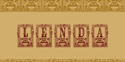 a ornamental capital font
 - Ardela Edge by EllenLuff,
$38.00 The altered cut glyphs feature as the capitals of the font; to sample the cuts and ligatures type in ALL CAPS in the Typetester. Ardela Edge is opentype in overdrive. Its a stylised geometric sans serif family with extreme cuts, sharp angles and multi-sensory interactive ligatures. Affected characters are spread into three upper-case only subfamilies, with distinct styles, and different personalities. The bold character breaks and considered ligatures create edgy, modern type that feels like bespoke typography. Ardella Edges three subfamilies appear as - X01, X02, X03 These three styles create thousands of combinations with options from super minimal to the more experimental. This is a hands on designer package, available in 9 weights, with italic and outline faces and as a variable font - each one containing over 550 glyphs. Full European latin based language support. Ardela Edge's three family concept means all character alternates are accessible to all, on any software. The cut glyphs feature as the CAPS of the font, whilst the unaffected letters appear as the lowercase. Many subtle ligatures are accessed by typing in all caps, however to access all ligatures requires software with opentype capabilities, such as Adobe Illustrator, Photoshop, InDesign or Inkscape.
 - Libertinas & co by deFharo,
$28.00 Libertinas & co. is a handwritten typeface, with a casual, elegant and sensual style, with many possibilities to compose different titles, flyers, publications or typographic posters for example. The font has an extra set of capital letters and another one of decorative lowercase for word end, also 3 stylistic set with more alternative letters and many other Open Type functions. Includes the Bitcoin symbol. The Commercial version includes - 734 glyphs. Latin Extended-A • OTF & TTF - Libertinas & co. can be used unlimited for both Commercial and Personal projects. - The download file includes a PDF with the specimen sheet of typography. - OpenType features compatible with: Photoshop, Illustrator, QuarkXpress, Indesign. - OpenType Functions: Scientific Inferiors, Swash, Terminal Forms, Titling alternates, Extended Fractions, Inferiors, All Alternates, Superiors, Contextual Ligatures, Denominators, Contextual Alternates, Contextual Swash, Discretionary Ligatures, Capital Spacing, Superscript, Additional languages, Superior letters, Oldstyle Figures, Historical Forms, Historical Ligatures, Kerning, Localized Forms, Numbers Small Caps, Numerators, Ordinals, Subscript, Ornaments, Slashed Zero, Standard Ligatures, Stylistic Alternates, Stylistic Set, Fractions. - Bitcoin symbol (ligatures): b#
 - Oman by Par Défaut,
$35.00 With five weights and four contrasts, all grouped in three version : sans-serif, slab, serif and all this doubled by a true italic, Oman regroup 120 different styles declined in four variables. Perfect from headlines to text, Oman will meet your needs with a many languages to support (Latin pro, Cyrillic), 14 OpenType features (Fraction, Numerator, Denominator, Tabular figure, Oldstyle figure, Small capital, Small capital from capital, Ordinal, Stylistic set, Case sensitive, Discretionary ligature, Contextual alternate and All access alternate). • Numerator and Denominator includes numerals and currency • Tabular Figure includes : numerals, currency, OldStyle numerals, small capital numerals, small capital currency. • Small Capital features includes the Latin & Cyrillic alphabet with the accents. • Ordinal feature includes the Latin & Cyrillic alphabet. • Two Stylistic set for “a” & “g” includes accents. • Discretionary Ligature includes “AE”, “AÉ”, “IJ”,“OE”, available in lowercase, small capital and ordinal. • Contextual Alternate includes ligatures for arrows : <-->^|v|<->v^|. Add n, d or +, for numerator, denominator or case arrows. All Case sensitive characters become after the uppercase and number.
 - Chaotic Circuit - Unknown license

- Funky Muskrat - Unknown license

- Static Cling - Unknown license

- Fire Wood - Unknown license

- Florania by Eko Bimantara,
$18.00 Florania is an elegant yet versatile font that shown beauty and classy look. It have lot of alternates and ligature choices with standard latin language coverage. Florania is fit for display, title, large sizes, and short text. Also fit for broad design project such as brand, web, logo, and others.
 - Lonie Soft by Par Défaut,
$75.00 Lonie Soft is sans serif font family with rounded corners (include 5 weight, italic and variable) It contains more than 1200 characters including the Latin, Cyrillic and Greek alphabet There are also 15 OpenType features (Superior; Inferior; Numerator; Denominator; Fraction; Tabular Lining; ;OldStyle Figure; Small Capital; Small Capitals from Capitals; Contextual Alternate; Case Sensitive; Ordinals; Access All Alternates; Stylistic Set).
 - ITC Gramophone by ITC,
$29.99ITC Gramophone is a work of Canadian designer Serge Pichii. The distinguishing feature is the large spiral which is part of the form of almost every capital letter as well as many other characters. The capitals can also be used as drop capitals. The forms of ITC Gramophone are perfect for displays and will surely catch the eye of any reader. - FS Siena by Fontsmith,
$80.00 Eclectic FS Siena is a typeface with history, and not just in the sense of having its origins in classical Roman lettering. Fontsmith founder Jason Smith first committed it to tracing paper while still at college, instinctively redrawing letterforms based on Hermann Zapf’s Optima according to ‘what felt right’. When Krista Radoeva took up the challenge to edit and extend the typeface, she and Jason were determined to preserve its subtly nonconformist and eclectic spirit. Like a great dish, there are individual components throughout the character set that all add flavour, and need to be balanced in order to work together. The smooth connection of the ‘h’ ‘m’ ‘n’ and ‘r’ contrasts with the corners of the ‘b’ and ‘p’. The instantly recognisable double-storey ‘a’ – the starting point of the design – contrasts with the single-storey ‘g’ and the more cursive ‘y’. And only certain characters – ‘k’, ‘w’, ‘v’ and ‘x’ in the lowercase and ‘K’, ‘V’, ‘W’, ‘X’ and ‘Y’ in the caps – have curved strokes. Transitional FS Siena is a contrasted sans-serif typeface, blending classical elegance and modern simplicity. Its construction and proportions are descended from classical broad-nib calligraphy and humanist typefaces, with a high contrast between the thick and thin strokes. The angle of the contrast, though, is vertical, more in the character of pointed-nib calligraphy and modernist typefaces. This vertical stress helps to give FS Siena a strong, cultured presence on the page. Idiosyncratic italics The italics for FS Siena were developed by Krista to complement the roman upper and lower-case alphabets first drawn by Jason. Many of the letterforms are built differently to their roman counterparts: there’s a single-tier ‘a’, a looped ‘k’ and connections more towards the middle of stems, such as in the ‘m’, ‘n’ and ‘u’. These distinctions, along with generally much narrower forms than the roman, give the italics extra emphasis within body copy, where the two are side-by-side. In editorial, especially, the combination can be powerful. To cap it all… In his original draft of the typeface, Jason found inspiration in Roman square capitals of the kind most famously found on Trajan’s Column in Rome. In keeping with those ancient inscriptions, he intended the capitals of FS Siena to also work in all-upper-case text, in logotypes for luxury consumer brands and property developments, for example. A little added space between the upper-case letters lets the capitals maintain their poise in a caps-only setting, while still allowing them to work alongside the lower-case letterforms. The caps-only setting also triggers a feature called case punctuation, which adapts hyphens, brackets and other punctuation to complement the all-caps text.
 - Samman by Eyad Al-Samman,
$- Samman is a Kufic simple Arabic typeface. It can be used to decorate public signs in streets, airports, hospitals, schools, malls, hotels, mosques, and other public places. My family's surname is "Samman" which stands for the person who sells fat especially the one produced by cows ("Samn" in Arabic). Consequently, "Samman" Typeface was designed for eternizing the memory of my family. The main characteristic of "Samman" Typeface is the leaf-shaped style for some of its Arabic characters such as "Dad", "Sad", "Faa", "Meem" and others. The distinguishing artistic design of its "Haa" character adds a unique feature to this typeface especially when connected with other characters. The shape of the characters' "dot", "dots", and "point" is innovative; a triangle with a semi-circle shape. "Samman" Typeface is suitable for books' covers, advertisement light boards, and titles in magazines and newspapers. Its characters' modern Kufic styles give the typeface more distinction when it is used also in posters, greeting cards, covers, exhibitions' signboards and external or internal walls of malls or metro's exits and entrances. It can also be used in titles for Arabic news and advertisements appeared in different Arabic and foreign satellite channels.


