10,000 search results
(0.016 seconds)
- Bat Liar by Sipanji21,
$16.00 Bat Liar is a spectacular decorative font with a Sharpness style and like a wings of bat for your design look awesome. It will elevate a wide range of design projects to the highest level, be it branding, headings, Movie Tittle, designs, invitations, signatures, logotype, wall art illustration, apparel, labels, and much more!
 - Fast Drift by Hatftype,
$15.00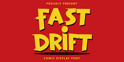 Fast Drift - Comic Display Font is a font with distinctive handwritten characters perfect for branding projects, logos, wedding designs, media posts, advertisements, product packaging, product designs, labels, photography, watermarks, invitations, stationery, and any project who need handwritten dishes. Features : • Character Set A-Z • Numerals & Punctuations (OpenType Standard) • Accents (Multilingual characters) • Ligature Multilingual Support : Afrikaans, Albanian, Asu, Basque, Bemba, Bena, Catalan, Chiga, Cornish, Danish, English, Estonian, Faroese, Filipino, Finnish, French, Friulian, Galician, German, Gusii, Icelandic, Indonesian, Irish, Italian, Kabuverdianu, Kalenjin, Kinyarwanda, Low German, Luo, Luxembourgish, Luyia, Machame, Makhuwa-Meetto, Makonde, Malagasy, Malay, Manx, Morisyen, North Ndebele, Norwegian Bokmål, Norwegian Nynorsk, Nyankole, Oromo, Portuguese, Romansh, Rombo, Rundi, Rwa, Samburu, Sango, Sangu, Scottish Gaelic, Sena, Shambala, Shona, Soga, Somali, Spanish, Swahili, Swedish, Swiss German, Taita, Teso, Vunjo, Zulu There it is! I really hope you enjoy it.
 - Hat Doodles by Outside the Line,
$19.00 Hat Doodles… from silly to sophisticated, a collection of 30 women’s hats. From a Summer Garden Party to the Kentucky Derby there is a hat for all occasions. Hat Doodles is another clip art doodle font in the Outside the Line picture font collection. Also take a peek at Diva Doodles for more women’s fashions in the same casual style.
 - Hyper Fatos by Bisou,
$15.00 Crafted with passion in La Chaux-de-Fonds, Switzerland, the Hyper Fatos typography was born in a moment of pure delight as the creator (Bisou) indulged in a delicious pizza. Inspired by the excitement and satisfaction that come from the most indulgent culinary pleasures, he designed this unique typography to capture the essence of gluttony and the irresistibility of the most appetizing dishes. Hyper Fatos was meticulously crafted to evoke an undeniable sense of indulgence. Its boldness and rounded forms bring to mind juicy hamburgers, crispy fries, and donuts overflowing with icing. It's the perfect typography for fast-food restaurant signs, tantalizing menus, or even advertising campaigns for giant burgers and decadent milkshakes. Picture Hyper Fatos in bright letters above a hot dog stand, and you'll see lovers of greasy food rushing to satisfy their most voracious cravings. This typography is the ultimate choice to whet your customers' appetites and encourage them to indulge in culinary delight.
 - Bat Ghost by Letterafandi Studio,
$14.00 Bat Ghost is a Halloween decorative font. Add it to your Halloween crafts, horror movie posters, t-shirts and other about Halloween.
 - Fast Lane by Gassstype,
$22.00 Here comes a New font,Introducing Fast Lane - Dynamic Handwritten Font with a natural style and dramatic movement. Crafted manually with love and passion, This font is great for your next creative project such as logos, printed quotes, invitations, cards, product packaging, headers, Logotype, Letterhead, Poster, Label, and etc. This handmade font will make your design has a beautiful natural touch for each details. It is perfect for any design project as Invitation,logo, book cover, craft or any design purposes,photos, photography overlays, signs, window art, scrapbooking, tags and so much more! This font is PUA encoded which means you can access all of ligatures glypsh.
 - Fast Food by Breauhare,
$35.00 Fast Food is a font based on the former (and now revived) logo of a hamburger chain. It has that look of the 1970s & 1980s, yet also has a futuristic, alienesque, sci-fi look about it. It can be used for projects aimed at consumers waxing nostalgic for their good old days, or for movie posters or books about the great final frontier, and much more. There’s an alternate uppercase E & F, both of which are really stylin'! You may even develop such an appetite that you'll want to supersize your order! Digitized by John Bomparte.
 - Far Fetch by Kijiji Hub,
$20.00 Farfetch is inspired by the serif typefaces used in editorial media and magazines. Farfetch is a contemporary typeface sans-serif typeface designed to give a fresh extended look. This typeface is ideal for display purposes like logos and big, bold headlines with extended language support (+ Cyrillic), fractions, tabular figures, arrows, ligatures and more. here are over 547 glyphs that allow you endless customizations It comes in 2 different weights with 1 styles in each weight (Standard & Slanted).
 - Funk Fact by Gassstype,
$23.00 Hello Everyone, introduce our new product Font Funk Fact is a Simple Graffiti Tag Typeface.This is a Textured Natural Style and classy style with a clear style and dramatic movement. This font Funk Fact is great for your next creative project such as logos, printed quotes, invitations, cards, product packaging, headers, Logotype, Letterhead, Poster, Design this font is great for your creative projects such as watermark on photography, and perfect for logos & branding, invitation,advertisements,product designs, stationery, wedding designs,label ,product packaging, special events or anything that need handwritting taste. That is has charming, authentic and relaxed characteristic more natural look to your text. You can activate Ligatures glyphs and Alternates glyphs OpenType panel.
 - Fab Figures by Letterwerk,
$10.00 Fab Figures is a numbers-only font. This high contrast display font family with curly terminals is a great choice for infographics and posters. The entire font family consists of 10 styles: 2 styles for big usage, 2 styles for normal usage, 2 styles for small usage and 3 patterned styles (fitting to the big styles). Character Set: 1 2 3 4 5 6 7 8 9 0 | % # • ~ { $ £ € } . , : ; + - = ÷ / ° * ' ’ (Arrows) (No-Symbol) (Nr-Symbol)
 - Nat Flight by ParaType,
$30.00 This elegant family of fonts, suitable for both text and display, is narrow in fit and characterized by a unique feature: in the capital B, P, and R, the stroke of the bowl does not quite meet with the stem. The design is noticeably calligraphic with a dynamic and delicate character, especially in the italics. Its subtleties can best be appreciated when set in large point sizes.
 - Bix Bats by Linotype,
$29.99The Bix Bats symbol family was developed in 2003 by Argentinean designer Victor Garcia to complement his display text font Bix Plain. Bix Bats contains four different symbol fonts. Most of the characters in these fonts have their lower halves reversed out. Typing a line of text in these symbol fonts, or mixing these symbol fonts with Bix Plain, will create a very interesting text effect: the bottom half of your lines of text will be reversed out, on top of a colored bar. Bix Bats Arrows contains numerous possible arrow combinations, from archery references to the American recycling symbol. Bix Bats Funny includes all of the symbols needed for a party, from beer steins to bunny rabbits! Bix Bats Shiny has enough starbursts to light up a night sky, and in Bix Bats Wired you will find all of the technological accessories needed to be in the now. All four fonts are included in the Take Type 5 collection from Linotype GmbH." - Fan Script by Sudtipos,
$99.00 A friend of mine says that sports are the ultimate popular drug. One of his favorite things to say is, “The sun’s always shining on a game somewhere.” It’s hard to argue with that. But that perspective is now the privilege of a society where technology is so high and mighty that it all but shapes such perspectives. These days I can, if I so choose, subscribe to nothing but sports on over a hundred TV channels and a thousand browser bookmarks. But it wasn't always like that. When I was growing up, long before the super-commercialization of the sport, I and other kids spent more than every spare minute of our time memorizing the names and positions of players, collecting team shirts and paraphernalia, making up game scenarios, and just being our generation’s entirely devoted fans. Argentina is one of the nations most obsessed with sports, especially "fútbol" (or soccer to North Americans). The running American joke was that we're all born with a football. When the national team is playing a game, stores actually close their doors, and Buenos Aires looks like a ghost town. Even on the local level, River Plate, my favorite team where I grew up, didn't normally have to worry about empty seats in its home stadium, even though attendance is charged at a high premium. There are things our senses absorb when we are children, yet we don't notice them until much later on in life. A sport’s collage of aesthetics is one of those things. When I was a kid I loved the teams and players that I loved, but I never really stopped to think what solidified them in my memory and made them instantly recognizable to me. Now, thirty-some years later, and after having had the fortune to experience many cultures other than my own, I can safely deduce that a sport’s aesthetic depends on the local or national culture as much as it depends on the sport itself. And the way all that gets molded in a single team’s identity becomes so intricate it is difficult to see where each part comes from to shape the whole. Although “futbol” is still in my blood as an Argentinean, I'm old enough to afford a little cynicism about how extremely corporate most popular sports are. Of course, nothing can now take away the joy I got from football in my childhood and early teens. But over the past few years I've been trying to perceive the sport itself in a global context, even alongside other popular sports in different areas of the world. Being a type designer, I naturally focus in my comparisons on the alphabets used in designing different sports experiences. And from that I've come to a few conclusions about my own taste in sports aesthetic, some of which surprised me. I think I like the baseball and basketball aesthetic better than football, hockey, volleyball, tennis, golf, cricket, rugby, and other sports. This of course is a biased opinion. I'm a lettering guy, and hand lettering is seen much more in baseball and basketball. But there’s a bit more to it than that. Even though all sports can be reduced to a bare-bones series of purposes and goals to reach, the rules and arrangements of baseball and basketball, in spite of their obvious tempo differences, are more suited for overall artistic motion than other sports. So when an application of swashed handlettering is used as part of a team’s identity in baseball or basketball, it becomes a natural fit. The swashes can almost be visual representation of a basketball curving in the air on its way to the hoop, or a baseball on its way out of the park. This expression is invariably backed by and connected to bold, sleak lettering, representing the driving force and precision (arms, bat) behind the artistic motion. It’s a simple and natural connective analysis to a designer, but the normal naked eye still marvels inexplicably at the beauty of such logos and wordmarks. That analytical simplicity was the divining rod behind Fan Script. My own ambitious brief was to build a readable yet very artistic sports script that can be a perfect fit for baseball or basketball identities, but which can also be implemented for other sports. The result turned out to be quite beautiful to my eyes, and I hope you find it satisfactory in your own work. Sports scripts like this one are rooted in showcard lettering models from the late 19th and early 20th century, like Detroit’s lettering teacher C. Strong’s — the same models that continue to influence book designers and sign painters for more than a century now. So as you can see, American turn-of-the-century calligraphy and its long-term influences still remain a subject of fascination to me. This fascination has been the engine of most of my work, and it shows clearly in Fan Script. Fan Script is a lively heavy brush face suitable for sports identities. It includes a variety of swashes of different shapes, both connective and non-connective, and contains a whole range of letter alternates. Users of this font will find a lot of casual freedom in playing with different combinations - a freedom backed by a solid technological undercurrent, where OpenType features provide immediate and logical solutions to problems common to this kind of script. One final thing bears mentioning: After the font design and production were completed, it was surprisingly delightful for me to notice, in the testing stage, that my background as a packaging designer seems to have left a mark on the way the font works overall. The modern improvements I applied to the letter forms have managed to induce a somewhat retro packaging appearance to the totality of the typeface. So I expect Fan Script will be just as useful in packaging as it would be in sports identity, logotype and merchandizing. Ale Paul
 - Fit Fleet by Maulana Creative,
$11.00 Fit Fleet is a casual script font, with a light felt-tip stroke, slanted and fun character. It has Opentype features ligatures of character, To give you an extra creative work. Fit Fleet script font support multilingual more than 100+ language. This font is good for logo design, Social media, Movie Titles, Books Titles, a short text even a long text letter and good for your secondary text font with sans or serif. Make a stunning work with Fit Fleet font. Cheers, MaulanaCreative
 - Far Kingdoms by Gleb Guralnyk,
$15.00 Hello! Presenting the Far Kingdoms vintage typeface. This font has an OpenType features, such as stylistic alternates.
 - Fast Lane by Supfonts,
$14.00 Fast Lane Script it is a Lettering chick font with exquisite accents. It is perfect for branding, wedding invitations and invitation cards and much more. It includes a full set of gorgeous uppercase and lowercase letters, numbers, a large selection of punctuation marks & ligatures. Includes: Latin languages support Uppercase and lowercase Numbers and punctuation Ligatures Check out my blog: https://www.instagram.com/di.zigner https://pinterest.com/dmitriychirkov7 Enjoy
 - Fast Messages by Gassstype,
$23.00 Hello Everyone, introduce our new product Font Fast Messages is a Fun Display Typeface .This is a Textured Natural Style and classy style with a clear style and dramatic movement. This font Fast Messages is great for your next creative project such as logos, printed quotes, invitations, cards, product packaging, headers, Logotype, Letterhead, Poster, Design this font is great for your creative projects such as watermark on photography, and perfect for logos & branding, invitation,advertisements,product designs, stationery, wedding designs,label ,product packaging, special events or anything that need handwritting taste. That is has charming, authentic and relaxed characteristic more natural look to your text You can activate 14 Alternate and 15 Ligatures OpenType panel.
 - Romeo Fans by Haksen,
$17.00 Romeo Fans is a natural brush script with texture and similar to hand written. I designed it by hand and I really hope you will enjoy using this font. I love using this one with layer masks in Photoshop, it really looks natural written. Romeo Fans Script includes a couple ligatures to make everything look totally hand-done, it also contains other additional features like swashes and spots. What's Included: - Ligatures - Numbers + Punctuation - Non-English support - Swashes - Spots Please contact me if anything question, I'm glad to help. Happy Designing!
 - KR Deco Caps One - Unknown license

- Corpulent Caps Shadow BRK - Unknown license

- Kremlin Synod (Display Caps) - Unknown license

- Lady Ice - Small Caps - Unknown license

- Alpha Flight Small Caps - Personal use only

- BM spiral Cap Cyr - Unknown license

- PR Uncial Alt Caps - Unknown license

- Tulipán Broken Caps Pro by Estudio Calderon,
$40.00 Tulipán Broken Caps Pro is new variable/complement of Tulipán Broken Caps, it includes 200 interesting ligatures, specially designed for games, apps, books, logos and packaging. Its bold structure is perfect to give great effects.
 - Albeit Grotesk Stencil Caps by Cloud9 Type Dept,
$20.00 Albeit Grotesk Stencil Caps is a graphic geometric stencil-style all caps display font family of four weights (Light, Regular, Medium and Bold) with slightly exaggarated diacritics for better readability making it ideal for headlines.
 - Groovy 3D Caps JNL by Jeff Levine,
$29.00 It all started with a simple idea back in 1998: do a digital version of a "lost" 70's typeface, and make up the missing letters that were not present in the only available example Jeff Levine had to work with. Jeff wasn't yet doing his own digital font creation, so he hooked up with Brad Nelson who owns a small foundry called Brain Eaters Fonts. Together, they collaborated on "Action Is"- a freeware font named after the source of the type example. This was a title page for a commemorative photo album of images from the 60's TV music show "Where the Action Is", formerly hosted by Jeff's employer at the time, singer-writer-producer Steve Alaimo. The free font took off like a rocket, being released just at the peak of the 60’s/70’s retro craze in the late 1990’s, and it was EVERYWHERE! It showed up on TV shows, packaging and web design -- and was even spotted on signage used on the side of a major amusement resort’s retro-themed hotel. From that point on, Jeff kept getting requests for a version with a lower case. Although they shared the copyright in the freeware version, Brad Nelson gave Jeff his blessing to re-work and take Action Is into the realm of commercial type. Newly improved and re-released as Groovy Happening JNL, it became one of Jeff's better selling type designs. A simplified, yet similar font was issued called Groovy Summer JNL. Now, after about a decade, Jeff had decided to clean up the 3-D (drop shadow) version that was originally freeware with many minute design flaws and re-release it commercially. Groovy 3D Caps JNL is an all-caps, limited character set font which ties in well with the previous releases, yet retains itís 1960s-1970s era charm. The font flag art is courtesy of Barbara D. Berney and is used by permission.
 - Albeit Grotesk Rounded Caps by Cloud9 Type Dept,
$40.00 Albeit Grotesk Rounded Caps is a graphic geometric rounded all caps display font family of four weights (Light, Regular, Medium and Bold) with slightly exaggarated diacritics for better readability making it ideal for headlines.
 - Mauro Poggi Ornamental Caps by Celebrity Fontz,
$19.99Ornamental caps with scrolls and flourishes inhabited by satyrs, mermaids, Medusa heads, birds, cats, dogs, snakes, and other creatures, inspired by designs from Italian Renaissance artists dating back to 1730-1750. Beautifully ornate and perfect for the beginning of paragraphs in publications and texts conveying the feel of the Italian Renaissance, your own fairy tale stories, or religious texts to grab the reader's attention. Includes one set of A-Z ornamental caps conveniently assigned to both the upper and lower case alphabet characters. - Monkey Messed Gutenberg Caps by Intellecta Design,
$22.90 A collection of fonts by the type foundry Intellecta Design. Distressed and antique, use these fonts in display purposes for a stylized type design. Contains a limited amount of letter designs.
 - Bank Sans Caps EF by Elsner+Flake,
$35.00 Based on Bank Gothic designed by Morris Fuller Benton in the 30th, Bank Sans Caps from Elsner+Flake offers a wide variety of weights from Light to Bold with Compressed, Semi Condensed and Condensed widths. All weights are also available with Cyrillic character sets.
 - Roma Initial Caps JNL by Jeff Levine,
$29.00Roma Initial Caps JNL is a set of alphabet caps drawn from elegant lettering found in an old sign painter's manual. The upper case keys have the letters in white on black backgrounds, while the lower case has the letters in black on a white background with a black border. - Keyden Drop Caps JNL by Jeff Levine,
$29.00 A set of slab serif framed capitals is displayed in the 1906 edition of the Keystone Type Foundry specimen book as “John Alden Initials”. Digitally redrawn as Keyden Drop Caps JNL, regular and reverse versions are available in one font file. Upper case keys contain the regular version, lower case keys have the reverse version. Blanks frames for each are on the parenthesis keys. The font’s name is a hybrid of both ‘Keystone’ and ‘Alden’. These vintage letters can easily be used as drop caps, monogram initials or for short novelty titles or headlines. Choose from either regular or oblique for your next print project.
 - Mac Key Caps Pi by Linotype,
$29.00 - Deco Drop Caps JNL by Jeff Levine,
$29.00 From the pages of the 1939 French lettering book “Modèles de lettres modernes par Georges Léculier” (“Models of Modern Lettering”) comes an attractive and unusual set of initial drop caps made from square letters adorned with multiple vertical lines. Originally designed as white letters on black backgrounds, an additional set with black letters on white backgrounds comprise Deco Drop Caps JNL; available in both regular and oblique versions.
 - Bigplace Caps ExtBd ExtCond - Personal use only

- Digital dream Fat Skew Narrow - Unknown license

- Famous Cars - Personal use only

- CAC Champagne - Unknown license


