4,852 search results
(0.032 seconds)
- Lansbury - 100% free

- Frames 1 by Intellecta Design,
$34.90Frames 1 consists of a series of frames scanned at a low resolution. The result when magnified is a bitmapped image that looks like a black and white mosaic. - Chisel by Linotype,
$29.99An inline version of the Latin bold condensed, and designed on the suggestion of Robert Harling. There is a double white line, which was originally engraved in Latin type. - Vianova Serif Pro by Elsner+Flake,
$59.00 The font superfamily Vianova contains each 12 weights of Sans and Slab and 8 weights of the Serif style. The design from Jürgen Adolph dates back into the 1990s, when he studied Communication Design with Werner Schneider as a professor at the Fachhochschule Stuttgart. Adolph started his carrier 1995 at Michael Conrad & Leo Burnett. He was responsible for trade marks as Adidas, BMW, Germanwings and Merz. He has been honored as a member of the Art Directors Club (ADC) with more than 100 awards. On February 26, 2014, Jürgen Adolph wrote the following: “I was already interested in typography, even when I could not yet read. Letterforms, for instance, above storefronts downtown, had an irresistible appeal for me. Therefore, it is probably not a coincidence that, after finishing high school, I began an apprenticeship with a provider of signage and neon-advertising in Saarbrücken, and – in the late 1980s – I placed highest in my field in my state. When I continued my studies in communications design in Wiesbaden, I was introduced to the highest standards in calligraphy and type design. “Typography begins with writing” my revered teacher, Professor Werner Schneider, taught me. Indefatigably, he supported me during the development of my typeface “Vianova” – which began as part of a studies program – and accompanied me on my journey even when its more austere letterforms did not necessarily conform to his own aesthetic ideals. The completely analogue development of the types – designed entirely with ink and opaque white on cardboard – covered several academic semesters. In order to find its appropriate form, writing with a flat nib was used. Once, when I showed some intermediate designs to Günter Gerhard Lange, who occasionally honored our school with a visit, he commented in his own inimitable manner: “Not bad what you are doing there. But if you want to make a living with this, you might as well order your coffin now.” At that time, I was concentrating mainly on the serif version. But things reached a different level of complexity when, during a meeting with Günther Flake which had been arranged by Professor Schneider, he suggested that I enlarge the offering with a sans and slab version of the typeface. So – a few more months went by, but at the same time, Elsner+Flake already began with the digitilization process. In order to avoid the fate predicted by Günter Gerhard Lange, I went into “servitude” in the advertising industry (Michael Conrad & Leo Burnett) and design field (Rempen& Partner, SchömanCorporate, Claus Koch) and worked for several years as the Creative Director at KW43 in Düsseldorf concerned with corporate design development and expansion (among others for A. Lange & Söhne, Deichmann, Germanwings, Langenscheidt, Montblanc.”
 - Vianova Slab Pro by Elsner+Flake,
$59.00 The font superfamily Vianova contains each 12 weights of Sans and Slab and 8 weights of the Serif style. The design from Jürgen Adolph dates back into the 1990s, when he studied Communication Design with Werner Schneider as a professor at the Fachhochschule Stuttgart. Adolph started his carrier 1995 at Michael Conrad & Leo Burnett. He was responsible for trade marks as Adidas, BMW, Germanwings and Merz. He has been honored as a member of the Art Directors Club (ADC) with more than 100 awards. On February 26, 2014, Jürgen Adolph wrote the following: “I was already interested in typography, even when I could not yet read. Letterforms, for instance, above storefronts downtown, had an irresistible appeal for me. Therefore, it is probably not a coincidence that, after finishing high school, I began an apprenticeship with a provider of signage and neon-advertising in Saarbrücken, and – in the late 1980s – I placed highest in my field in my state. When I continued my studies in communications design in Wiesbaden, I was introduced to the highest standards in calligraphy and type design. “Typography begins with writing” my revered teacher, Professor Werner Schneider, taught me. Indefatigably, he supported me during the development of my typeface “Vianova” – which began as part of a studies program – and accompanied me on my journey even when its more austere letterforms did not necessarily conform to his own aesthetic ideals. The completely analogue development of the types – designed entirely with ink and opaque white on cardboard – covered several academic semesters. In order to find its appropriate form, writing with a flat nib was used. Once, when I showed some intermediate designs to Günter Gerhard Lange, who occasionally honored our school with a visit, he commented in his own inimitable manner: “Not bad what you are doing there. But if you want to make a living with this, you might as well order your coffin now.” At that time, I was concentrating mainly on the serif version. But things reached a different level of complexity when, during a meeting with Günther Flake which had been arranged by Professor Schneider, he suggested that I enlarge the offering with a sans and slab version of the typeface. So – a few more months went by, but at the same time, Elsner+Flake already began with the digitilization process. In order to avoid the fate predicted by Günter Gerhard Lange, I went into “servitude” in the advertising industry (Michael Conrad & Leo Burnett) and design field (Rempen& Partner, SchömanCorporate, Claus Koch) and worked for several years as the Creative Director at KW43 in Düsseldorf concerned with corporate design development and expansion (among others for A. Lange & Söhne, Deichmann, Germanwings, Langenscheidt, Montblanc.”
 - Vianova Sans Pro by Elsner+Flake,
$59.00 The font superfamily Vianova contains each 12 weights of Sans and Slab and 8 weights of the Serif style. The design from Jürgen Adolph dates back into the 90th, when he studied Communication Design with Werner Schneider as a professor at the Fachhochschule Stuttgart. Adolph started his carrier 1995 at Michael Conrad & Leo Burnett. He was responsible for trade marks as Adidas, BMW, Germanwings and Merz. He has been honoured as a member of the Art Director Club (ADC) with more than 100 awards. On February 26, 2014, Jürgen Adolph wrote the following: “I was already interested in typography, even when I could not yet read. Letterforms, for instance, above storefronts downtown, had an irresistible appeal for me. Therefore, it is probably not a coincidence that, after finishing high school, I began an apprenticeship with a provider of signage and neon-advertising in Saarbrücken, and – in the late 1980s – I placed highest in my field in my state. When I continued my studies in communications design in Wiesbaden, I was introduced to the highest standards in calligraphy and type design. “Typography begins with writing” my revered teacher, Professor Werner Schneider, taught me. Indefatigably, he supported me during the development of my typeface “Vianova” – which began as part of a studies program – and accompanied me on my journey even when its more austere letterforms did not necessarily conform to his own aesthetic ideals. The completely analogue development of the types – designed entirely with ink and opaque white on cardboard – covered several academic semesters. In order to find its appropriate form, writing with a flat nib was used. Once, when I showed some intermediate designs to Günter Gerhard Lange, who occasionally honored our school with a visit, he commented in his own inimitable manner: “Not bad what you are doing there. But if you want to make a living with this, you might as well order your coffin now.” At that time, I was concentrating mainly on the serif version. But things reached a different level of complexity when, during a meeting with Günther Flake which had been arranged by Professor Schneider, he suggested that I enlarge the offering with a sans and slab version of the typeface. So – a few more months went by, but at the same time, Elsner+Flake already began with the digitilization process. In order to avoid the fate predicted by Günter Gerhard Lange, I went into “servitude” in the advertising industry (Michael Conrad & Leo Burnett) and design field (Rempen& Partner, SchömanCorporate, Claus Koch) and worked for several years as the Creative Director at KW43 in Düsseldorf concerned with corporate design development and expansion (among others for A. Lange & Söhne, Deichmann, Germanwings, Langenscheidt, Montblanc.”
 - Makika Sun by Andinistas,
$39.00 Makika Sun enhances the handwritten expressive possibilities of an architect mom and a graphic designer dad in Bogotá, Colombia. In other words, it is a versatile handwritten font family designed for writing short messages in children's contexts. Makika Sun shines for its conceptualization and logic, combining ideas from the American calligrapher Austin Norman Palmer and the Italian calligrapher Ludovico degli Arrighi. Makika Sun, a creative font family specializing in titles and paragraphs for children's books, emerged in 2009 and has developed over the years. Its essence lies in the simplicity of handwriting. In 2023, Makika Sun was applied in the book "Secret Files Tardigrades 1" for children ages 5-6 on Amazon from MyMicroSchool. The main goal of Makika Sun is to emulate handwriting that is legible and accessible to everyone. Makika Sun stands out for its readability and uncomplicated, artisanal style. It offers four typographic styles that simulate different calibers of markers: thick tip (Makika Sun Black), medium tip (Makika Sun Bold), normal tip (Makika Sun Regular) and Makika Sun Dingbats, a set of arrows and figures perfect to enrich your writing. . In short, Makika Sun's versatility and stylistic uniformity make it easy to create writing in various typographic settings. Its typographic heart communicates harmony in messages meticulously designed for spontaneous contexts that require high readability. Makika Sun offers a dynamic range of styles in 4 fonts notable for their outstanding performance in the field of children's book design and the creation of playful brand identities.
 - Karlo by The Northern Block,
$28.95 Karlo is a super family of several branches, originating in the same lightweight skeleton. The lightweights are based on a pen of an even stroke-width. Inspired by the writings of calligrapher Edward Johnston, the family moves on in two directions in the heavier weights. Johnston demonstrated that the broad nib pen can produce different writing styles. Following this, one heavy weight has a humanistic low stroke contrast (KarloSerifBold and KarloSansBold), and another has a high stroke contrast of vertical axis with references to the 19th century jobbing typefaces (KarloOpen). The latter is inspired by Johnston’s demonstration of the broad nib pen, where he suggested fastening two pencils together. With each pencil representing an edge of the pen, it becomes more evident how the pen works in writing. The friendly informal look makes KarloSans and KarloSerif usable for both running text and for display sizes. KarloOpen, on the other hand, is solely designed for display purpose showing few words at a time. In Denmark, a guy named Karlo would typically be an old fellow with a slick hairstyle that makes an effort with his appearance. He is a handyman who can do a bit of this and that when needed. He is a happy go lucky kind of guy that takes one day at a time. To me, the typeface family has some of the same qualities. Check out Pyke which is a great pair for Karlo.
 - AT Move Altera by André Toet Design,
$39.95 ALTERA a typeface based on a logotype André Toet made for a dutch broadcast company. This typeface is in fact carries a transformation in itself: it’s composed of three different weights and shapes. In our humble opinion the possibilities are endless ! So be a sport and use this typeface for logo’s and headings. Kick the can ! Concept/Art Direction/Design: André Toet © 2017
 - Airy by ParaType,
$25.00Airy is in fact a very light-minded summer font without any serious design concept. It is a collection of hand-drawn letters that with the help of OpenType features allow you to get a lace texture with mutable structure. Together with the font you also get a bonus — a set of naive pictures that you normally draw on the margins of your sketchbook. - AT Move Specx by André Toet Design,
$39.95 SPECX This is my #11/12 Font a slabserif typeface. In fact it’s a very, very basic and extreme strong typeface! We gave this new Font a special touch by adding an extra family-member: a stencil-version of the SPECX. My inspiration for the SPECX is based on the cover of a 1955 French School-Notebook. Concept/Art Direction/Design: André Toet © 2017
 - Isolde by Linotype,
$29.99There is not much I can tell about Isolde. It is a plain typeface, rather wide and with dominant serifs. Its italics are more slanted than usual. In fact only Caslon's italic can compete about that. Its width makes it more suitable for decorations than for larger amounts of text. The name comes from the medieval tale about Tristan and Isolde. Isolde was released in 1993. - AT Move Specx Stncl by André Toet Design,
$39.95 SPECX Stencil This is my #11/12 Font a slabserif typeface. In fact it’s a very, very basic and extreme strong typeface! We gave this new Font a special touch by adding an extra family-member: a stencil-version of the SPECX. My inspiration for the SPECX is based on the cover of a 1955 French School-Notebook. Concept/Art Direction/Design: André Toet © 2017
 - DF Zzzz by Dutchfonts,
$33.00 This typeface, in fact a bitmap font 'avant la lettre' is an interpretation of the Old Face condensed type. It is being used where space is scarce. Its skeleton is projected on the chain structure of a fly screen. Eventually your text lines fill the space as wide as hypothetical doors can be. In small sizes the text appears to be drawn with a pencil.
 - Sigmund Freud Typeface by Harald Geisler,
$29.00 “For those who regret what keyboards and touch screens have done to their penmanship, typographer Harald Geisler has an answer: Sigmund Freud.” — The Wall Street Journal Sigmund Freud was a neurologist who lived from 1856 to 1939. His research and studies led to the foundation of ‘Psychoanalysis’. When I first saw Freud’s century old letters, I was fascinated by the beauty of these historic manuscripts. It made me smile to imagine a person writing his or her shrink a letter set in Freud’s handwriting. I started to plan creating a font based on his manuscripts. I contacted the Sigmund Freud Museum Vienna and Freud Museum London. To start the creation I selected eight handwritten documents from the archive in Vienna – This selection of specimen was my orientation during the design process. The Samples were created between 1883 to 1938 and are of various character such as handwritten scientific papers, personal letters, notes and a telegram. A successful Kickstarter Campaign "The Sigmund Freud Typeface - A Letter to your Shrink" with over 1400 Backers enabled me to visit the archive in Vienna and study the original manuscripts of Sigmund Freud. After a year of preparation and design work, I finished four alphabets based on Freud’s handwriting. What are the different Versions PRO, Kurrent, #1, #2, #3 and #4 about? “This project gives people the convenience afforded by the computer while maintaining the romantic nostalgia, beauty, and character of letter writing with real handwriting.” — Daniel Vahab, The Huffington Post When you write with your hand, every letter looks a little different. When you write a text on your computer every letter looks exactly the same. In order to make type look like handwriting, I chose four different variations of each letter from Freud’s manuscripts, drew and stored them in the font. The font is then programmed to exchange letters while you are typing. This makes the rendered result on your screen or print look like unique handwriting. PRO While you are typing… the PRO Version actively combines all four alphabets and exchanges them automatically. Through this mechanism never the same two o’s will stand next to each other. With every touch a unique look is generated. This works in certain applications i.e. Word 2010(or newer), Pages, TextEdit, Editor(Pre-installed on Windows 7 or newer), InDesign, Illustrator… →Here you can see an animation of what this effect looks like in action. (Please Note: some applications like LibreOffice, OpenOffice do currently not support this feature. Date: December 2013) #1 #2 #3 and #4 The Sigmund Freud Typeface #1, #2, #3 and #4 each hold one individual lowercase alphabet based on Freud’s handwriting. Kurrent Most of Freud’s correspondence was written in German. Until the 1950′s a different handwriting was taught throughout German speaking countries (Switzerland, Austria, Germany). This style is called Kurrent. The name Kurrent and Cursive derive from the Latin word currere - to run, hurry - both styles were designed to write fast. As you can see in the samples above, Freud practiced both Kurrent and when writing english Cursive (Latin script or Joined-up). Kurrent has three significantly different letters (s,h,e). Use Kurrent to render the authentic look of an historic Sigmund Freud letter in German. Bundle On the Top of this page you can get all six fonts of the Sigmund Freud Typeface Family in a bundle. International Typeface All styles of the Sigmund Freud Typeface feature a wide range of accented letters so you can write to all your friends in Sweden (Bjørn) France (Chloé & Zoë), Ireland (Dáirine), Poland (Łucja), Germany (Jörg) and almost everywhere around the globe (Find a complete list in the tech specs). Usage recommendations I hope that this design will be valuable to you and most of all that you have fun with this typeface! 1. Point Size — To reproduce the size of Sigmund Freud’s handwriting adjust the type size between 18-24 point in your word processor. If you are using an imaging software like Photoshop set the resolution to 300dpi and adjust the point size between 18-24. 2. Line Spacing — Narrow the line hight until swashes of capital letters touch the baseline above. This also happens when you write a letter and gives the document a unique handwritten look. 3. Right Aligned — Freud had the habit to write towards the right edge of the page and start loosely on the left. Set your text alignment to ‘right’ to incorporate this dramatic expression also to your documents. What do other People say about the Sigmund Freud Typeface? “Wouldn’t you love to write a letter to your shrink using the Sigmund Freud typeface?” — Dorothy Tan, Design TAXI ''“JUST DON’T WRITE A LETTER TO YOUR MOTHER WITH IT… …until the reader looks a bit closer, and they see 70+ years of modern science weighing in on turn-of-the-century pop psychology."'' — Mark Willson, Fast Company “Doctor, what does it mean if you dream of creating a font of Freud’s handwriting?” — Ayun Halliday, Open Culture “…geekily romantic, at once artistic and scientific” — Edie Jarolim, Freud’s Butcher “…sympathisch” — Jürgen Siebert, Fontblog !WOW! Thank you for reading the complete font description! You are awesome! If you still have a question please contact me through MyFonts or my website haraldgeisler.com. Credits This project was made possible by the help of 1481 Backers on Kickstarter and the kind support of the Sigmund Freud Museum Vienna and the Freud Museum London. Thank you. All of Freud’s Manuscripts shown are © Sigmund Freud Museum Vienna. Poster Image: IN17 - Sigmund Freud, Germany 1932. © Freud Museum London. Flag Image: IN19 - Sigmund Freud 1930’s. © Freud Museum London.
 - Alien Alphabet by ParaType,
$25.00Alien Alphabet is inspired by the ideas of change, transformation, creative deconstruction and mutual penetration of various cultures, languages, and opposing cognitive systems, which seem to be prevalent in our 'globalized' civilization. It appears as various visual constructs -- archetypal symbolism, pieces of the world alphabets, socio-cultural icons, mathematical formulae, etc., -- broke down into pieces and were reassembled in a way that carried traces of previous meanings. However, this contradictory mutation invokes enigmatic meanings and emotions begging for further definition and interpretation. Alien Alphabet shapes arranged in linear sequential manner tend to evoke a sense of written language. The fact that a message cannot be understood does not really change its emotional appeal. Moreover, the less message can be deciphered, the more seems to be the appeal -- for it triggers our imagination. In fact, we may not want to know the actual meaning because deep inside we are afraid that this might be just another alien dry-cleaning receipt. - Sticky Fingers by Comicraft,
$19.00 LOOK OUT! It's kinda creepy, we know, but we're convinced that this font does whatever a spider can -- in fact, we believe it can actually spin a web of pretty much any size, and even catch thieves as if they were bugs of some sort -- let's say flies. In fact we'd almost go so far as to say that, in the chill of night (perhaps at the scene of a crime) this font may just arrive like a streak of light in the nick of time. We're releasing this font now not for wealth or fame, we ignore those things, action is our reward. Here at Comicraft we think of life as a great big bang up, and whenever there's a hang up, you won't find us climbing -- or crawling -- the walls... well, not without STICKY FINGERS anyway. Find yourself a pair of webshooters and this font is the perfect complement to any Halloween costume.
 - Compacta by ITC,
$39.00 Compacta is the work of Fred Lambert and is reminiscent of the extremely narrow, sans serif stencilled fonts of the 1920s, then intended as titles or headlines for magazines and posters. The characters of all cuts are narrow and the space between letters is very small. The white spaces between strokes are perceived almost as only small white stripes and dots which stand out from the black bands of the lines of text. Compacta is not meant for longer texts but is impressive in titles and headlines.
 - Compacta MT by Monotype,
$29.00 Compacta is the work of Fred Lambert and is reminiscent of the extremely narrow, sans serif stencilled fonts of the 1920s, then intended as titles or headlines for magazines and posters. The characters of all cuts are narrow and the space between letters is very small. The white spaces between strokes are perceived almost as only small white stripes and dots which stand out from the black bands of the lines of text. Compacta is not meant for longer texts but is impressive in titles and headlines.
 - Written By Hand by Trim Studio,
$14.00 Written By Hand, a handmade font that is taken from the real hand style of writting, its so realistic to used for many branding and personal identity style, especially for its messy stlye of writting Its perfectly suited for crafter and graphic artist to complete their design such as invitation, advertisement, poster, logo, birthday, product sign, and many more! Buttier also Lightweight, even so contains All Standard glyphs and punctuations
 - Hearthaliso by Maulana Creative,
$13.00 Hearthaliso is a fancy flourish script font. With thin high contrast stroke, fun character with a bit of ligatures and alternates. To give you an extra creative work. Hearthaliso font support multilingual more than 100+ language. This font is good for logo design, Social media, Movie Titles, Books Titles, a short text even a long text letter and good for your secondary text font with sans or serif. Make a stunning work with Hearthaliso font. Cheers, Maulana Creative
 - Testimoney by Maulana Creative,
$11.00 Testimoney is a Fancy Signature script font. With Regular Contrast stroke, slanted and fun character with a bit of ligatures. To give you an extra creative work. Testimoney font support multilingual more than 100+ language. This font is good for logo design, Social media, Movie Titles, Books Titles, a short text even a long text letter and good for your secondary text font with sans or serif. Make a stunning work with Testimoney font. Cheers, MaulanaCreative
 - Casey by 50Fox,
$15.00 Say hello to Casey Typeface! A fancy and beautiful editorial serif with luxury ligatures, alternates glyphs and multilingual support - with a complementary italic version. It's a versatile font that looks great in big and small sizes. This has a wide variety of uses, including editorial projects, logo design, clothing branding, product packaging, magazine headers, and so much more. It's ideal for any type of graphic design project or as a stylish text overlay to any image.
 - Clockerts by Maulana Creative,
$13.00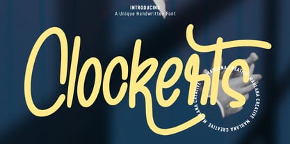 Clockerts is a fancy casual modern script font. With clean mono-line stroke, fun character with a bit of ligatures and alternates. To give you an extra creative work. Clockerts font support multilingual more than 100+ language. This font is good for logo design, Social media, Movie Titles, Books Titles, a short text even a long text letter and good for your secondary text font with sans or serif. Make a stunning work with Clockerts font. Cheers, MaulanaCreative
 - Spiceland by Maulana Creative,
$14.00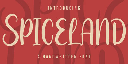 Spiceland is a fancy handwritten script font. With bold contrast stroke, fun character with a bit of ligatures and alternates. To give you an extra creative work. Spiceland font support multilingual more than 100+ language. This font is good for logo design, Social media, Movie Titles, Books Titles, a short text even a long text letter and good for your secondary text font with sans or serif. Make a stunning work with Spiceland. Cheers, Maulana Creative
 - Oplexys by Maulana Creative,
$14.00 Oplexys is a fancy handwritten script font. With medium contrast stroke, fun character with a bit of ligatures and alternates. To give you an extra creative work. Oplexys font support multilingual more than 100+ language. This font is good for logo design, Social media, Movie Titles, Books Titles, a short text even a long text letter and good for your secondary text font with sans or serif. Make a stunning work with Oplexys font. Cheers, Maulana Creative
 - Hellowanias by Maulana Creative,
$14.00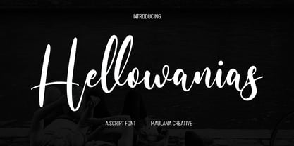 Hellowanias is a fancy handwritten script font. With regular contrast stroke, fun character with a bit of ligatures and alternates. To give you an extra creative work. Hellowanias font support multilingual more than 100+ language. This font is good for logo design, Social media, Movie Titles, Books Titles, a short text even a long text letter and good for your secondary text font with sans or serif. Make a stunning work with Hellowanias font. Cheers, Maulana Creative
 - Ginloops by Maulana Creative,
$14.00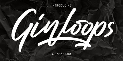 Ginloops is a fancy unique script font. With bold stroke, slanted and fun character with a bit of ligatures and extra swashes. To give you an extra creative work. Ginloops font support multilingual more than 100+ language. This font is good for logo design, Social media, Movie Titles, Books Titles, a short text even a long text letter and good for your secondary text font with sans or serif. Make a stunning work with Ginloops font. Cheers, MaulanaCreative
 - Rithmycs by Maulana Creative,
$14.00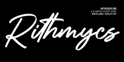 Rithmycs is a fancy handwritten script font. With medium contrast stroke, fun character with a bit of ligatures and alternates. To give you an extra creative work. Rithmycs font support multilingual more than 100+ language. This font is good for logo design, Social media, Movie Titles, Books Titles, a short text even a long text letter and good for your secondary text font with sans or serif. Make a stunning work with Rithmycs font. Cheers, Maulana Creative
 - Baldorty by Maulana Creative,
$12.00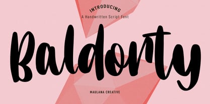 Baldorty is a fancy handwritten script font. With medium contrast stroke, fun character with a bit of ligatures and alternates. To give you an extra creative work. Baldorty font support multilingual more than 100+ language. This font is good for logo design, Social media, Movie Titles, Books Titles, a short text even a long text letter and good for your secondary text font with sans or serif. Make a stunning work with Baldorty font. Cheers, Maulana Creative
 - Callifroz by Maulana Creative,
$14.00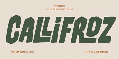 Callifroz is a fancy handwritten script font. With medium contrast stroke, fun character with a bit of ligatures and alternates. To give you an extra creative work. Callifroz font support multilingual more than 100+ language. This font is good for logo design, Social media, Movie Titles, Books Titles, a short text even a long text letter and good for your secondary text font with sans or serif. Make a stunning work with Callifroz font. Cheers, Maulana Creative
 - Mitoda Reels by Maulana Creative,
$12.00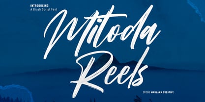 Mitoda Reels is a fancy brush script font. With rough brush stroke, fun character with a bit of ligatures and lowercase alternates. To give you an extra creative work. Mitoda Reels font support multilingual more than 100+ language. This font is good for logo design, Social media, Movie Titles, Books Titles, a short text even a long text letter and good for your secondary text font with sans or serif. Make a stunning work with Mitoda Reels. Cheers, MaulanaCreative
 - Elfashion by Maulana Creative,
$11.00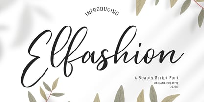 Elfashion is a Fancy Beauty casual script font. With high contrast stroke, slanted and fun character with a bit of ligatures. To give you an extra creative work. Elfashion font support multilingual more than 100+ language. This font is good for logo design, Social media, Movie Titles, Books Titles, a short text even a long text letter and good for your secondary text font with sans or serif. Make a stunning work with Elfashion font. Cheers, MaulanaCreative
 - Holeflow by Maulana Creative,
$13.00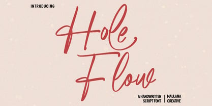 Holeflow is a fancy signature script font. With high contrast stroke, fun character with a bit of ligatures and alternates. To give you an extra creative work. Holeflow font support multilingual more than 100+ language. This font is good for logo design, Social media, Movie Titles, Books Titles, a short text even a long text letter and good for your secondary text font with sans or serif. Make a stunning work with Holeflow font. Cheers, Maulana Creative
 - Reingard by Maulana Creative,
$15.00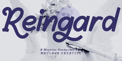 Reingard is a fancy handwritten script font. With medium contrast stroke, fun character with a bit of ligatures and alternates. To give you an extra creative work. Reingard font support multilingual more than 100+ language. This font is good for logo design, Social media, Movie Titles, Books Titles, a short text even a long text letter and good for your secondary text font with sans or serif. Make a stunning work with Reingard font. Cheers, Maulana Creative
 - Jillianson by Maulana Creative,
$11.00 Jillianson is a fancy modern signature script font. With high contrast stroke, fun character with a bit of ligatures and alternates. To give you an extra creative work. Jillianson font support multilingual more than 100+ language. This font is good for logo design, Social media, Movie Titles, Books Titles, a short text even a long text letter and good for your secondary text font with sans or serif. Make a stunning work with Jillianson font. Cheers, MaulanaCreative
 - Cityskypes by Maulana Creative,
$14.00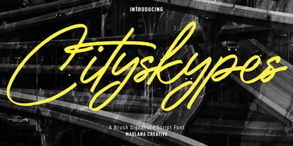 Cityskypes is a fancy signature script font. With regular rough stroke, fun character with a bit of ligatures and alternates. To give you an extra creative work. Cityskypes font support multilingual more than 100+ language. This font is good for logo design, Social media, Movie Titles, Books Titles, a short text even a long text letter and good for your secondary text font with sans or serif. Make a stunning work with Cityskypes font. Cheers, Maulana Creative
 - Ralph Brushes by Forberas Club,
$16.00 A fancy and elegant handcrafted font that create to impress your audience and make your branding shine. Make your projects dance with this elegant and wonderful font wherever you use it. Use it for your headings, logos, ads, printed quotes, packaging, and even your website or social media branding. every letter has unique and beautiful touch, which will make your design come alive! This is a smooth font - perfect for cut machines like Cricut and Silhouette!
 - Melly Hailey by Maulana Creative,
$12.00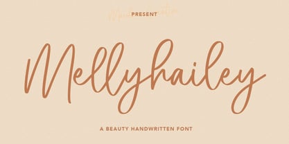 Melly Hailey Handwritten Font, With a high contrast quirk stroke clean and fancy characters. It has Opentype features of ligatures, makes it a perfect choice for branding and digital designs. Use this font for logos, social media, websites, blogs, instagram, social media, business cards, branding, and more! Melly Hailey font support multilingual more than 100+ language. and good pair for your secondary text font with sans or serif. Make a stunning work with Melly Hailey signature script font.
 - Capital Ideas NF by Nick's Fonts,
$10.00A new series of eclectic decorative initials, Capital Ideas 1 NF features numbers and uppercase letters rendered in nixietube displays, along with a whimsical walk through the alphabet patterned after Milton Glaser's Hologram. Capital Ideas 2 NF features K. H. Schaefer's eponynmous Versalien for Schriftguss AG in 1927, and Walter Haettenschweiler's Breitfette Unziale from 1958, along with a fancy nine-element box border. Dressing up your next projects with these snappy caps is, indeed, a capital idea.
