10,000 search results
(0.016 seconds)
- Fanatika One - Unknown license

- Fanatika Two - Unknown license

- Fanitiya by IM Studio,
$14.00 Fanitiya script - new, fresh, funny, interesting, cute calligraphy font with relatable heart. Great for greeting cards, branding materials, business cards, quotes, posters and more! Fanitiya script - includes many alternative characters. Coded with Unicode PUA, which allows full access to all additional characters without having any special design software. Mac users can use Font Book. Windows users can use the Character Map to view and copy any of the additional characters to paste into your favorite text editor. For people who have opentype-capable software: Alternatives can be accessed by activating the "Alternative Styles" and "Ligatures" buttons on Photoshop's Character panel, or via any software with a glyph panel, eg. Adobe Illustrator, Photoshop CC, Inkscape. Thank you for purchasing!
 - Rantika by Arterfak Project,
$15.00 Rantika is a cute brush font, created with additional bold on the strokes and mostly curved edges of the letterforms. This font comes from the manual brush stroke which has an informal stroke thickness that makes the font looks more natural. Bring the happiness with Rantika, make your design more cheerful because you can use this font for cards, apparel, merchandise, invitation, food or menu design, poster, cute quote, holiday design, and many more! Fonts featured : Uppercase Lowercase Numbers Punctuation Accented characters Stylistic set Ligatures Thank you for watching
 - Cantika by RahagitaType,
$14.00 Cantika is a beautiful font suitable for wedding invitations or souvenirs. Cantika is also suitable to use for other purposes that require an attractive appearance.
 - Antika by Letterara,
$12.00 Antika is a beautiful modern script font featuring flowing letters. It will add a romantic touch to any crafting project!
 - Thai One On by Emboss,
$24.95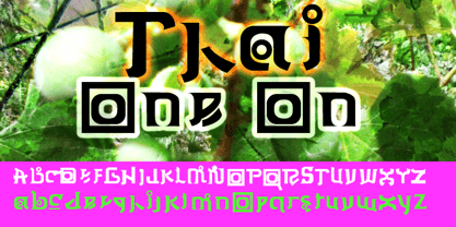
- Mantika News by Linotype,
$67.99 Mantika News™, from German designer Jürgen Weltin, was designed to expand the Mantika super family with text and display typefaces for setting newspapers and periodicals. The suite of typefaces is comprised of regular and bold designs, with italic counterparts, for setting continuous text, and light and extra bold versions for setting larger sizes in headlines, sub heads, pull quotes and decks. The typefaces intended for text copy were designed with shared character widths, so that changes can be made in typeface choice without disrupting line endings or column length. The display designs have a slightly smaller x-height and shorter ascenders creating a more elegant demeanor while ensuring compact multi-line display copy. In addition, fonts of Mantika News have a large Monotype W1G (World Glyph Set 1) character set enabling the setting of Greek, Cyrillic and over 20 Eastern and Western European Latin-based languages. Proportional figures are available, in the OpenType® fonts, as an alternative to the tabular designs.
 - Mantika Sans by Linotype,
$50.99 With its well-defined characters that are readily legible even in the small font sizes, Mantika Sans by Jürgen Weltin is ideal for typesetting. The elaborately designed and highly individual set of italics enhances the attractiveness of the font.Jürgen Weltin developed the Mantika™ Sans sans serif font using older designs for an serif font as his inspiration. Nothing more than the merest suggestion of the original serifs has survived. Bevelled line endings and the slight variation in thickness of verticals, in particular, provide Mantika Sans with a very dynamic character that evokes manuscript. Short ascenders and descenders give the font a compact appearance that is also underscored by its condensed proportions. Weltin has achieved his aim of producing a typeface with excellent legibility even in small sizes not just by means of the x-height, which is tall in comparison with the capital letters, but also by using clearly defined and well differentiated designs for critical letters, such as i", "I" and "l". Lower case "i", for example, has a serif while the "l" has a curved base.In addition to uppercase numerals, Mantika Sans also has lowercase or old style numerals that have been designed so that they can be used in both tabular and proportional settings. The uppercase numerals are slightly shorter than the uppercase letters, ensuring that the latter can be sympathetically incorporated within continuous text.The Mantika Sans italics are very unusual. They are inclined at only 4.5° (the usual angle for italics is 10 - 12°) and so appear to be almost upright. In addition, they also have quite distinctive forms. The overall effect calls attention to their curvilinear, manuscript character, enhances contrasts and further emphasizes the terminals. Weltin explains: "Within the variety of forms of the italics there are many contrasting terminal elements that create dynamism. The result is a diversity of interaction between the rounded and angular forms". Mantika Sans Italic thus has all the features of a display typeface, but can also be happily used on its own to set longer text passages. Mantika Sans is available in two weights; Regular and Bold, both of which have corresponding italics sets. Mantika Sans has been designed so that the widths of the four related cuts are identical, meaning that a change of font within a single layout will have no effect on justification. In addition, the members of the Mantika Informal font family, designed by Jürgen Weltin in 2010, also have the same thickness. Other font families having weights with equal thickness can be found in the "Linotype Office Alliance series".The Mantika Sans character sets are paneuropean. There are characters for setting texts in Eastern European languages, Greek and Cyrillic. There is also a range of special symbols, including right-angled brackets, subscript and superscript lower case letters, together with numerals, arrows and many different bullet points.As a vibrant and highly legible text font, Mantika Sans has a broad spectrum of potential applications. Its unusual italics are not just perfect for use in display text. The fact that it has only four cuts means that Mantika Sans is particularly suitable for office use or for the setting of business reports. Its excellent legibility even in the small font sizes also makes it ideal as a text for electronic reading devices; this also applies to Mantika Informal.At the 3rd International Eastern Type Design Competition Granshan 2010, Mantika Sans was awarded in the category Greek text typefaces."
 - Mantika Book by Linotype,
$50.99 Mantika Book was originally conceived and drawn parallel to the first Agilita drawings. *[images: pencil drawings] It took several years before having a chance looking at these designs again. But then, my first impulse was to turn this alphabet into a new sanserif, which was to become Mantika Sans. This was the starting point to conceive a super family consisting of different design styles and corresponding weights. The initial drawings of Mantika Book were refined and an Italic was developed to go with it. The aim was to create a modern serif typeface which is reminiscent of humanistic Renaissance typefaces, yet without following a particular historic model. Its large x-height for one is far away from original Renaissance models. Mantika Book was designed as a companion serif typeface to Mantika Sans that can be set for lengthy texts as in books, hence its name. It shares the same x-height with Mantika Sans but has longer ascenders and descenders, making for better word shapes in long, continuous reading. The approach of an ›old-style‹ looking typeface with large minuscules makes Mantika Book also a choice for magazine text settings where one often needs smaller point sizes to fit in a multiple columns layout. The unique details of Mantika Book are the asymetric bracketed serifs in the upright font and its higher stroke contrast than usual in a Renaissance style. The stems are slightly curved inwards. Also, the Italics have a low degree of inclination, which makes longer passages of text set in Italic rather pleasing to read. Another feature Mantika Book shares with Mantika Sans is that all four weights take up the same line length. It covers all European languages plus Cyrillic and Greek, is equipped with lots of useful scientific symbols [double square brackets, angle brackets, empty set, arrows] and the regular weight has small caps. There is a kind of an old-style feeling to Mantika Book, yet these citations were turned into a contemporary serif typeface with a soft but sturdy character.
 - Santika Script by Pista Mova,
$12.00 Santika Script with 172+ glyphs. Alternative characters are divided into several Open Type features such as Swash, Stylistic Sets, Stylistic Alternates, Contextual Alternates. The Open Type feature can be accessed using Open Type savvy programs such as Adobe Illustrator, Adobe InDesign, Adobe Photoshop version of Corel Draw X, and Microsoft Word. And this Font has provided PUA unicode (custom coded font). so that all alternative characters can be easily accessed in full by a craftsman or designer. Santika Script Santika Script Italic Happy Designing
 - Mantika Informal by Linotype,
$50.99 Jürgen Weltin's Mantika Informal is pretty difficult to categorize, but very easy to like. This particularly reader-friendly typeface in regular and bold weights, brings to the table the informal fluidity of a script, the consistency of an inclined italic, and the open and airy forms and contrast of a humanist sans. The result is a warm, approachable, and very legible typeface that is never static and staid, but rather invites an attentive, reading eye. The original idea behind Mantika Informal lay in the challenge to create a typeface for setting children's books. German designer Jürgen Weltin aimed to create a reading typeface for those just starting to learn how to read. On the one hand, it should help create clear word-images; on the other, its letterforms should remain uncomplicated but resist mechanical and industrial sterility. Mantika?s subtle cursive lines stress the printed word's connection with handwriting, in addition to making the transition from school writing exercises to printed texts seamless and effortless. The resulting slightly organic and cursive forms that developed during the design process are so captivating that Mantika Informal may be used for a multitude of unintended applications - anywhere a friendly and informal yet sophisticated character could lend a helping hand, Mantika is there, giving a fresh accent to anything from packaging design to food products. With a broad character set encompassing support for Cyrillic and Green, Mantika Informal's two fonts make for a versatile and dynamic typeface that surely will find its place in a broad range of applications.
 - Nine One One BA by BA Graphics,
$45.00A heavy serif grunge font with a western feel, great for that extreme look for today.. - Odisean One - Personal use only

- Flame on! - Personal use only

- Escobeta One - Personal use only

- Caminata One - Personal use only

- One-Eighty - Unknown license

- Zeroes One - Unknown license

- Later On - Unknown license

- Airstrip One - Unknown license

- Fantasy One - Unknown license

- DIY One - Unknown license

- Snake one - Unknown license

- Fazings one - Unknown license

- Toons One - Unknown license

- BitDust One - 100% free

- GemFont One - Personal use only

- Obtuse One - Unknown license

- Just One by Supersemarletter,
$11.00 Just one is a fun and friendly handwritten font. Its casual charm makes it look very simple, easy to read and, ultimately, very versatile. This font will look amazing in any context, whether it’s used on a DIY, outdoor project or as a main title!. Honestly it works perfectly for headlines, logos, posters, packaging, T-shirts and much more. Font Features : • Regular version • Character set A-Z in uppercase and lowercase • Numerals & Punctuation • Accented Characters • Multiple Languages Supported Recommended to use in Adobe Illustrator or Adobe Photoshop with opentype feature. If you have questions, just send me a message and I'm glad to help.
 - One Mith by AZCRTV Studio,
$14.50 One Mith is a combination of two languages namely One (English) and Mith (Albanian) which means a myth which is a hope of the creation of this font which is no longer a myth anymore that we can make serif fonts. This font is included with a style signature font that will complement your design. This font is also very suitable in various types of designs especially designs that require feminine signature fonts such as designs for brand perfume, cosmetics, fashion, as well as women's magazines. Thankyou Abdul Azis
 - One AM by T-26,
$29.00 - Ruina One by RodrigoTypo,
$25.00 Ruina One is a Rough and distressed font, but at the same time very gestural. It is especially great for youth and child graphics, but can be applied in many other domains too. Ruina One contains various ligatures.
 - Beauty One by Attype Studio,
$15.00 Introducing Beauty One, a stylish monoline script style font. This beautiful script font offers your personal touch to your latest art project with fresh, curvy and beautiful look. Beauty One offers is perfect for many different project such as logo, branding, invitation, flyer, posters, social media posts, advertisements, product packaging, product designs, label, photography, special events or anything that need monoline script taste.
 - Tape One by Volcano Type,
$29.00 - One Code by Letterhead Studio-VG,
$15.00 One Code was made in the end of 1998. Original naive character was specially created for an unique design project, but now it is ready for use as an ordinary typeface.
 - Schism One by Alias,
$55.00 Schism is a modulated sans-serif, originally developed from our Alias Didot typeface, as a serif-less version of the same design. It was expanded to three sub-families, with the thin stroke getting progressively heavier from Schism One to Schism Three. The different versions explore how this change in contrast between thick and thin strokes changes the character of the letterforms. The shape is maintained, but the emphasis shifts from rounded to angular, elegant to incised. Schism One has high contrast, and the same weight of thin stroke from Light to Black. Letter endings are at horizontal or vertical, giving a pinched, constricted shape for characters such as a, c, e and s. The h, m, n and u have a sharp connection between curve and vertical, and are high shouldered, giving a slightly square shape. The r and y have a thick stress at their horizontal endings, which makes them impactful and striking at bolder weights. Though derived from an elegant, classic form, Schism feels austere rather than flowery. It doesn’t have the flourishes of other modulated sans typefaces, its aesthetic more a kind of graphic-tinged utility. While in Schism Two and Three the thin stroke gets progressively heavier, the connections between vertical and curves — in a, b, n etc — remain cut to an incised point throughout. The effect is that Schism looks chiselled and textural across all weights. Forms maintain a clear, defined shape even in Bold and Black, and don’t have the bloated, wide and heavy appearance heavy weights can have. The change in the thickness of the thin stroke in different versions of the same weight of a typeface is called grading. This is often used when the types are to used in problematic print surfaces such as newsprint, or at small sizes — where thin strokes might bleed, and counters fill in and lose clarity, or detail might be lost or be too thin to register. The different gradings are incremental and can be quite subtle. In Schism it is extreme, and used as a design device, giving three connected but separate styles, from Sans-Didot to almost-Grotesk. The name Schism suggests the differences in shape and style in Schism One, Two and Three. Three styles with distinct differences, from the same start point.
 - One Day by Typehill Studio,
$10.00 One Day is a new modern script font with an irregular baseline. A contemporary approach to design, handmade natural, suitable for use in title design such as clothing, invitations, book titles, stationery designs, quotes, branding, logos, greeting cards, T-shirts, packaging designs, posters, and more. Complete with uppercase and lowercase letters, as well as multi-language support, numbers, punctuation. Also provide some ligatures and swash. Thanks so much for looking and please let me know if you have any questions.
 - Magelove One by Garisman Studio,
$15.00 Magelove a handlettering font is a natural & beautyful handwritten font to get natural and natural writing. I'ts Perfect for logo, invitation, stationery, wedding designs, social media posts, advertisements, product packaging, product designs, label, photography, watermark, special events or anything INCLUDED FEATURE: - Stylistic Sets (SS01-SS08) & Ligature - PUA Encoded open - Support for MAC or PC - Simple installation for Adobe Illustrator, Corel Draw, Photoshop, or Procreate (New Updated) Thanks and Regards Garisman Studio
 - On Melody by Hatftype,
$15.00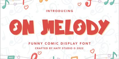 Is a comic display font with distinctive handwritten characters perfect for branding projects, logos, clothing designs, media posts, advertisements, product packaging, product designs, labels, photography, watermarks, invitations, stationery, and any project who need handwritten dishes. Feature : Symbol Number Punctuation Multilingual support Support in Mac and Windows OS Support in design application (photoshop, illustrator, and more) I really hope you enjoy it.


Page 1 of 250Next page