10,000 search results
(0.03 seconds)
- Avone by Almarkha Type,
$29.00 Introducing AVONE is a Stylish modern serif font with a stylish touch inspired by the famous minimalist logo and AVONE has 2 Regular and Stencil styles is perfect for the purposes of designing templates, brochures, videos, advertising branding, logos and more. What’s Included : Standard glyphs Web Font Multilingual Accent Works on PC & Mac , Simple installations Accessible in the Adobe Illustrator, Adobe Photoshop, Adobe InDesign, even work on Microsoft Word. PUA Encoded Characters – Fully accessible without additional design software. Fonts include multilingual support Image used : All photographs/pictures/vector used in the preview are not included, they are intended for illustration purpose only. Thank’s Cheers!
 - Intruder Alert - Unknown license

- Bulgari by Slex Studio,
$15.00 Bulgari is an organic handwritten font suitable for branding, wedding invitations, promotions, product packaging and other necessities. This font is modern, simple, but still authentic. You'll get a full set of lowercase and uppercase letters, numbers and punctuation, multilingual symbols, lowercase start and end swashes, and ligatures.
 - Nikaia by Miller Type Foundry,
$- Nikaia started as an experimental typeface (the script weights) and was then expanded to its logical conclusions (italic & regular), producing the fastest look typeface in the world. Nikaia looks clean and sharp at any size, with 5 weights for contrast.
 - Moliere by Eurotypo,
$44.00 The life of Molière is a story of struggle, hard work, domestic unhappiness, death and burial in obscurity and almost in shame. Molière left behind a body of work that not only changed the face of French classical comedy, but has also come to influence the work of other dramatists from around the world. Despite his own preference for tragedy, which he had tried to further with the Illustre Théâtre, Molière became famous for his farces, which were generally in one act and performed after the tragedy. Both the comic and the serious drama were powerfully affected by the work of Molière, not only in his own age and country but everywhere and up to the present time. Didot is a name given to a group of typefaces named after the famous French printing and type producing family. The classification is known as modern, or Didone. The typeface we know today was based on a collection of related types developed in the period 1784–1811. Firmin Didot cut the letters, and cast them as type in Paris. Along with Giambattista Bodoni of Italy, Firmin Didot is credited with establishing the use of the "Modern" classification of typefaces. The types that Didot used are characterized by extreme contrast in thick strokes and thin strokes, by the use of hairline serifs and by the vertical stress of the letters. As in the extreme contrasts of the literature of Molière, in Didione's typefaces, thick and thin strokes, straight and curved, are the most relevant characteristic for an era marked by the changes.
 - Another Monday by Hanoded,
$15.00 I started this font on a Monday and I finished it the Monday after, so I guess the name is right! Another Monday started off as a bit of doodling (with a Sharpie pen) on a piece of paper. Before I knew it, I had a complete glyph set and it looked nice. Another Monday is a bit messy, uneven and maybe even a little weird, but it will look good on postcards, packaging and labels.
 - BAR SADY by Borutta Group,
$- BAR SADY is a revival of a typeface based on famous lettering from "BAR SADY". The project was implemented as part of the Warsaw Participatory Budget 2023. Mateusz Machalski & Małgorzata Bartosik were responsible for the new digital version of the typeface. In the first phase, the original lettering was lifted, then extended to a full set of characters (A-Z). Finally, the bold style was created. The whole family is available under a free license.
 - Meso America by Intellecta Design,
$9.00Meso America is a native dingbat face inspired in meso-american culture containing funny characters and flowers created starting a geometric forms. - Qualion Text by ROHH,
$39.00 Qualion Text™ is a modern geometric sans serif typeface with humanist and calligraphic inspirations. It is a text family designed for excellent legibility. Qualion Text™ is a sibling of Qualion™ & Qualion Round™, geometric family with lots of swashes and ornaments. Letter shapes and proportions has been adjusted to fit paragraph text and small sizes: - typeface is narrower now in order to fit more text in the design space - larger stroke contrast - pronounced ink traps and tapering - elegant true italics made even more calligraphic - adjusted spacing and kerning - adjusted font weights The main purpose of the family is clean and legible paragraph text, however it is very attractive choice for branding, headlines and display use, too. The italic styles as well as thin, bold and black upright styles have very strong character and look great in display sizes. Italics are very fluent, calligraphic, subtle and elegant, from the other side bold and black uprigths are very modern, powerful and unique thanks to the pronounced ink traps. Qualion Text™ family consists of 20 styles - 10 weights with corresponding true italics. Both have extended language support, as well as broad number of OpenType features, such as small caps, case sensitive forms, standard and discretionary ligatures, swashes, stylistic sets, contextual alternates, lining, oldstyle, tabular and small cap figures, slashed zero, fractions, superscript and subscript, ordinals, currencies and symbols.
 - VTC Elmwood by Vintage Type Company,
$12.00 VTC Elmwood is a modernized blackletter font family from Vintage Type Company. What's old is new again. Elmwood comes in 4 styles, including regular, 8-bit, outline, and spurred. Drawing inspiration from calligraphic techniques of the past, Elmwood strips away any flourishes that would typically be found in a similar textura typeface, and offers a more modern, stylized old english font. The styles that come included save you a bit of time from having to stylize the regular version yourself, and allow you to tailor the font to more niche and customized projects. Saving time is good, and you're sure to love these options. VTC Elmwood makes the perfect font for branding & logo projects, package design, title design, print & e-publications, and the list goes on.
 - Zan Zan by Pitt's Hand,
$20.00 A fun font to create pop and young graphics, with a non-obvious font created starting from a handcrafted line. For an urban, snappy and fresh result.
 - Well Done by Letterara,
$16.00 Well Done is a flower calligraphy font with an incredibly luxurious feel. It will add a romantic touch to any crafting project! Get inspired by its unique look! To stay up to date for my latest job, follow me and let’s be friends because there will be many promos.
 - Goosebumps by Comicraft,
$19.00 Here's a font that'll send shivers down your spine, stand your hair up on end and turn your skin into gooseflesh. Hand lettered by rotten old Richard Starkings after we locked him up in the attic one dark, stormy night, these stressed out characters are a real scream!
 - Kage Pro by Balibilly Design,
$25.00 Greetings: We are introducing an advanced version of the Kage font released and received great exposure from users and worldwide font enthusiasts. The massive development puts forward experimentation on the alternate letters. We redesign each shape to make it more functional and comfortable when text size escalation occurs. In addition to rejuvenating the letterform, we also apply an oblique style to provide diverse style choices. Learn more about Kage Pro here: Graphics presentation | Type Specimen | The Inspiration: The radical exploration world of fashion inspires us. It leads our minds to the Neo-classical type style created during the age of enlightenment in the 18th century. It has a reasonably extreme contrast from the previous serif style, making the impression that it is emitted more expensive and classy. Organically, this Neo-Classical typeface is closely related to the fashion world, especially in Europe, and even spread across the globe. Fashion and this typeface reflect each other. After, we boldly observed Japanese fashion designer Rei Kawakubo. Famous for radical & deconstructive fashion, which makes the world of fashion more flexible and dynamic. The Design: As well as the typeface that we made, we started it with a cultural foundation of the Didone typeface. We tried to deconstruct the appearance. The decoration that better reflected the dynamic of fashion implemented in the fashionable alternate and calligraphical stylistic set ended with ball terminals. The versatile impression created is like taking off a scarf on the model's hair during a fashion show. The deconstructive image is combined with a legibility structure like the appearance of the Neo-Classical style. Kage Pro is designed to visualize a costly and exclusive image of a thing, product, world clothing brand, famous fashion magazine, etc. The modern transitions of each letterform are softer, so when repositioning and escalating the size of this font, it will remain beautiful without injuring other elements. So, Kage Pro is a bold choice on headlines and more prominent media with a portion of 50% even more. The Feature: Kage Pro has 11 upright and 11 oblique styles from thin to black; all family-style consist of one variable font with 2 axes. The total number of glyphs is 1,665 in each style. She comes with tons of swirly ligatures and stylistic alternates in Advance OpenType features, including: Case-sensitive forms, small caps, standard and discretionary ligatures, stylistic alternates, ordinals, fractions, numerator, denominator, superscript, subscript, circled number, slashed zero, old-style figure, tabular and lining figure. Support multi-language including Western European, Central European, Southeastern European, South American, Oceanian, Vietnamese.
 - Austragen by Almarkha Type,
$35.00 Introducing Austragen - Beautiful Bold Serif inspired by the famous minimalist logo, perfect for the purposes of designing templates, brochures, videos, advertising branding, logos and more. Perfect for adding a unique twist to word-mark logos, monograms or pull quotes. Austragen has 11 unique ligatures and 50 Alternate Glyphs as well as numbers and punctuation making it super fantastic. Like all of my fonts it is inspired by lettering from the good old past, but it still has a strong modern appearance. Its wide range of stylistic alternates allows versatile design options and works perfectly for headlines, logos, posters, packaging,,coffee shops, restaurants, magazine's headers, signs or gift/post cards,cafe's and weddings.
 - Catherova by Mokatype Studio,
$25.00 Hello Introducing, Catherova - Elegant and luxurious serif display inspired by the famous Elegant Luxury logo, suitable for designing logos, templates, brochures, videos, advertising branding, and more. Perfect for adding a unique touch to word mark logos, the monogram comes with 31 ligatures that create lots of choice and uniqueness for your designs. What's Included: + Standard glyphs + Ligatures + Web Font + International Accent + Works on PC and Mac + Simple installations accessible in Adobe Illustrator, Adobe Photoshop, Adobe InDesign, and even works on Microsoft Word. PUA Encoded Characters: Fully accessible without additional design software. Fonts include multilingual support. + Image used : All photographs/pictures/vector used in the preview are not included, they are intended for illustration purpose only. Thank you
 - Freewill by Gassstype,
$27.00 Freewill - Handmade Rough Brush Font with ligature and Multilanguage support.inspired by the famous minimalist logo, perfect for the purposes of designing templates, brochures, videos, advertising branding, logos and more. Perfect for adding a unique twist to word-mark logos, as well as numbers and punctuation making it super fantastic. Like all of my fonts it is inspired by lettering from the good old past, but it still has a strong modern appearance. Its wide range of stylistic alternates allows versatile design options and works perfectly for headlines, logos, posters, packaging,,coffee shops, restaurants, magazine's headers, signs or gift/post cards,cafe's and weddings.Best for halloween poster, horror poster, childrenbook, cartoon, comic etc
 - SK Barbicane by Salih Kizilkaya,
$9.99 SK Barbicane is a family of typefaces named after Jules Verne's famous book, From the Earth to the Moon. Inspired by Jules Verne's foresight, it was designed with a synthesis of the future and the past. While it carries sharper and futuristic lines than the future, it also incorporates the organic structure of the past. All characters have equal dimensions in this font with mono weight and mono space. In this way, you can create regular typographic layouts in your designs. Consisting of two different families, Normal and Unicase, this font has a total of 12 different fonts and 5088 glyphs. In this way, it contains many typographic elements that you will need in your designs.
 - 1715 Jonathan Swift by GLC,
$42.00 The famous Irish poet and novelist Jonathan Swift (Dublin 1667-1745) has a large personal library of which he noticed carefully the book list by himself. We have used a facsimile from this catalogue to reconstruct this present font, as one example of the poet’s personal hands but also as a typical example of the British quill pen handwriting from about mid 1600’s to the beginning of 1700’s . It is a “Pro” font containing Western (including Celtic) and Northern European, Icelandic, Baltic, Eastern, Central European and Turquish diacritics. The numerous alternates and ligatures allow to made the font looking as closely as possible to the real hand. Using an OTF software, the features allow to vary automatically almost each character of a word without anything to do but to select contextual alternates and standard ligatures and/or stylistic alternates options.
 - Decima Mono by TipografiaRamis,
$39.00 Decima Mono – condensed geometric monospaced Sans Serif typeface, released back in 2009 and quite successful ever since (MyFonts Rising Star, February 2009). This new edition is an upgraded version of Decima Mono and Decima Mono X, combining both into one edition. New version supports more Latin languages with an extension to glyph amounts. Also, six more alternate styles have been added to the original six styles.
 - Stenographer JNL by Jeff Levine,
$29.00 Sheet music for the song “The Little Thing You Used to Do” (from the 1935 motion picture “Go into your Dance” starring Al Jolson and Ruby Keeler) had its title set in what closely resembled Bank Gothic Condensed. [Bank Gothic was originally designed by Morris Fuller Benton for American Type Founders circa 1930.] This reinterpreted version is now known as Stenographer JNL, and is available in both regular and oblique versions.
 - Guile by Bunny Dojo,
$10.00 A timeless and mighty sans-serif, Guile's chiseled forms make the font ideal for reaching into history, while its minimalism and balance are fit for propelling into the future. Guile voraciously absorbs and enhances the style of its surroundings. In sports, it's a true team player, from the jerseys to the on-air presentation. In film, it's a blockbuster star, from the title treatment to the billing block.
 - Astromonkey by Hanoded,
$15.00 Astromonkey - here he is, all new, all excited to be alive! Astromonkey comes from outer space, where he has rubbed shoulders with the Star Trekkers, the aliens and Major Tom, who is still floating in his tin can. The font is a squarish all caps, with a different set of glyphs for upper and lower case (so they mingle quite well) and Astromonkey himself - disguised as the paragraph glyph. Enjoy.
 - Metalworker JNL by Jeff Levine,
$29.00Metalworker JNL is Jeff Levine's take on a perennial favorite originally known as Eagle, but available under different names over the years. This bold, clean Art Deco font was the basis for Jeff's star-studded National Spirit JNL. - TE Start2 by Tharwat Emara,
$30.00 Start 2 is a mixture of modern style with traditional functionality. It is flexible and has many beautiful and wonderful features. This font will work for modern and important designs.
 - Aretino by Eurotypo,
$24.00 Pietro Aretino (1492 – 1556) Was an Italian author, playwright, poet, satirist and blackmailer, who wielded influence on contemporary art and politics. The most vigorous and versatile vernacular writer of the 16th century He was a very versatile writer, famous for his Lascivious Sonnets – which caused great scandal at the time – but also for his satirical verses, addressed to all the powerful people in Italy, without forgetting the many plays that he wrote for the theatre. Part of the charm of his letters is that through them you may know the whole of Venetian society from the top to the bottom. The little-known church of San Luca in Venice (in St Mark's district) has been a place of pilgrimage for centuries for people who are decidedly not devout: journalists, writers, free thinkers. In 1556 Pietro Aretino, a unique character of the Italian and Venetian Renaissance period was buried there. Such strong of personality, has contributed to generate the powerful wind of change that emerged from the italian renaissance. We have inspired on that talent searching for a new sight the famous Venetian typefaces. Probably looking for more vigour and contemporary digital style. This typeface is slightly condensed, lighter and has more contrast between the thick and thin letter-strokes, it has concave bracketed serif. Their ascender and descenders strokes are very shorts. Aretino family is completed by four weigh: Regular, SemiBold, Bold and ExtraBold, while Italics has three weighs. These fonts came with a full OpenType features and CE languages.
 - FF Bauer Grotesk by FontFont,
$50.99 FF Bauer Grotesk is a revival of the metal type Friedrich Bauer Grotesk, released between 1933 and 1934 by the foundry Trennert & Sohn in Hamburg Altona, Germany. The geometric construction of the typeface, infused with the art déco zeitgeist of that era, is closely related to such famous German designs as Futura, Erbar, Kabel and Super Grotesk that debuted a few years earlier. However, Bauer Grotesk stands out for not being so dogmatic with the geometry, lending the design a warmer, more homogenous feeling. The oval “O” is a good example of that, as well as characteristic shapes like the capital M or the unconventionally differing endings of “c” and “s” which make for a less constructed look. Watch the FF Bauer Grotesk introduction video on Vimeo
 - Little Miss - Personal use only

- Bronc Stomper by FontMesa,
$20.00 Introducing Bronc Stomper; Bronc Stomper got its start from an old logo design used by the New York and Harlem Railroad in 1904.
 - HWT Catchwords by Hamilton Wood Type Collection,
$24.95 Catchwords have always been offered alongside standard alphabets in wood type catalogs and so often appear on posters as a decorative punch that they have become part of the wood type vernacular. Words like 'The', 'And', 'To', 'For', and less common abbreviations could be inserted into a design along with decorative ornaments or stars when space was tight or to add variety in the design. HWT Catchwords features over 80 words based directly on designs offered by Hamilton and other wood type manufacturers of the 19th and early 20th Century.
 - Tengwar Transliteral by Zephyris,
$- You can read more about how to use this font and how it works here. This font lets you write in accurate Tengwar (elvish) quickly and easily. While writing his Middle Earth books, JRR Tolkein invented an entire alphabet for the elves called Tengwar. His attention to detail was incredible, Tengwar is a fully functioning writing system. This is the famous Elvish writing seen all through Lord of The Rings and the Hobbit. Tengwar is an alphabet, not a language, and can be used to write many languages. Tolkein gave detailed notes on how to write English in the Tengwar alphabet. This font uses advanced font features (contextual alternates, ligatures and kerning) to automatically convert any English text, as you type, into an accurate representation in the elvish Tengwar alphabet.
 - Melisa Script by Lucky Type,
$18.00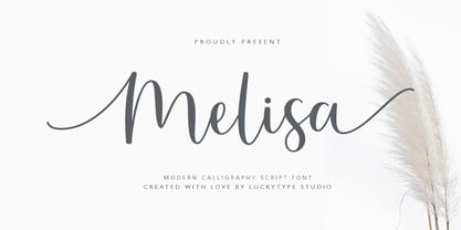 Introduce the latest modern calligraphy font Melisa Script which features a starting and ending swashes. Melisa Script has some beautiful ligatures for your pretty designs. Melisa Script is perfect for wedding stationery, feminime logos, branding and more! Thank you so much for watching.
 - Sunkiss by Garisman Studio,
$20.00 Sunkiss font starts from a brush stroke with a script style and also follows the times. Sunkiss is very suitable for use in various media such as: packaging, logo, label, poster, shirt design, quotes of wisdom, hand-lettering, typography and many other media.
 - Yuletide Doodles by Outside the Line,
$19.00 Yuletide Doodles is the perfect font for that quickie Christmas party flyer, menu, or invitation. Or make your own gift tags. The uses are endless. This font includes gifts, ornaments, snow globe, snow man, holly, olive branch, lots of trees and stars, a light bulb, deer, moose, wreaths, pine boughs, skate, stocking and crown. This font works well with Christmas Doodles and Christmas Doodles Too . Mix and match to your heart's desire.
 - MMC Insignia by MMC-TypEngine,
$30.00 MMC Insignia, is an Iconic & Emblematic Neogothic Geometric Capitals Display… Assembled by Trivial Squares and Diagonals Symbols Pattern from a puzzled grid Aftermath!! Includes Stylistic Alternates!! +Extra Monospaced Figures. In 22 styles, with Obliques, both for single display and layer Typesetting, plus OpenType Features & Bonus Blocks Fonts! MMC Insignia is a Small Caps Typeface, which default lowercases character set is included in the Pro family, its cursive version, apart from it, has also Exclusive Stylistic Alternates… Its atmosphere stands by on both Corporative to Decorative, Modern, Fashion, Federalist, Bohemian, Romantic, Ludic, Treasured Look, Etc. This Display font-family is the result of the repeated applications of this unique infamous Icon or Symbol, of two counterpointed triangles, implicit as hourglasses, in order to compose an innovative and unprecedented typographic pattern and modulation concept through the letterforms, in an extremely Geometric style. The Graphic Sign used throughout this type, is a remarkable trend used already in Logos of different businesses, whose most famous case refers to a famous International Bank, which doesn’t need to be mentioned, as it is instantly associated! This characteristic innovation was the main motivation while creating this type. Usage Suggestions: Type Fancy Titling texts, Display Remarkable Logos, Branding Projects, Labels, Emblems, Fashion Patterns, or in everything Noble and designed for Excellence as a type of Insignia, or distinguished marks and attributes of Royalty and Power!! That’s also forwardly, the reason why it was named MMC Insignia… TIPS: 1-Combine styles into innumerous possibilities of Chromatic Typesetting, by ‘central pasting’ layers… You may dislocate layers for improvisations! 2-USE BLOCK “FREE-STYLES” 1 & 2 also to add default 3D! Change 3D directions by switching Block 1 to Block 2, that way you can Zig-Zag words and lines. *Also shift the block layer up to bottom limit, it makes the 3D direction turn upside down. Greetings! André, MMC-TypEngine.
 - Brogue by The Type Fetish,
$29.00 Brogue was designed to be a display typeface, but it can be used for a small body of text. At its core it is an uncial influenced typeface that has been allowed to stray from its roots. Embracing other alphabets, Brogue mixes in some unexpected letterforms that really give it a quirky and unusual look. Because Brogue is unicase it allows the designer to mix and match the roman, italic, upper and lowercase letters together for a truly unique design. Brogue's character set will support the following languages: Azerbaijani (Latin), Belarusian (Latin), Czech, Danish, Dutch, English, Esperanto, Finnish, French, German, Hungarian, Iclandic, Italian, Polish, Portuguese, Romanian, Slovac, Spanish, Swedish, and Turkish
 - Cartoon Family by Ake,
$12.00 Cartoon Family Font is a cool and friendly display font that brings a playful and authentic vibe to your designs. This fun font is perfect for children activities, school projects, storybooks, posters, and more. With its chunky letter style, Cartoon Family Font adds a touch of liveliness and personality to any design. Let your creativity soar and watch your designs come alive with this captivating font.
 - Geis by Galapagos,
$39.00In 1978 I went to work at Mergenthaler as a letter drawer. Being an inquisitive sort I decided that I should take a stab at this type design 'stuff'. I drew 25 or 30 glyphs before the work found its way to a high shelf in a dark corner of my apartment. Just 23 years later I found the drawings on a different shelf, in a different home, in a different city and decided to finish what I had started. I'm still trying to deal with my predisposition toward procrastination but I've finished the font. The name of the font is the last name of somebody I played softball with before I moved to Beantown. Ronnie Geis was one of the courageous firefighters we lost on September 11th when the WTC collapsed. - Opal Bulgarian by Context Foundry,
$6.00 Opal Bulgarian is a humanistic sans serif typeface of a modern type, inspired by the famous Optima typeface (designed by Hermann Zapf). Opal Bulgarian consists of 2 weights and corresponding italics. Opal Bulgarian is suitable for body texts; for titles; for corporate identity. Opal Bulgarian continues the design of Opal BulgarianCYR, designed in 1992 by Zhivko Stankulov. In compare to Opal BulgarianCYR the new font family Opal Bulgarian has more glyphs and cover more languages. A number of shortcomings in the construction of the glyphs have been eliminated, and the design as a whole has been updated. Opal Bulgarian is available with active support and upgradeability. Licensees will receive all new versions of the font free of charge.
 - Ulga Grid Solid by ULGA Type,
$19.00 ULGA Grid Solid is the sharp, blockier sibling of ULGA Grid and ULGA Grid Rounded. The typeface consists of three weights, regular, medium and bold, with corresponding oblique styles. Every character in the extended ULGA Grid family shares the same width. Forged from a box full of ninja throwing stars – props from the now-forgotten 1976 Japanese film, Gridzilla, Revenge of King Gridorah – the solid shapes and sharp, chamfered corners give the characters a hard, cut-from-metal feel. A versatile display typeface that can be used for a wide range of purposes including CD covers, posters, packaging, advertising, nameplates for tractors, brochures and film titles. Mix and match with ULGA Grid and ULGA Grid Rounded, use the alternatives, sneak in an oblique style to spice things up, but most of all this is a fun typeface family. But, please, don’t use the characters as throwing stars. That’s just dangerous, someone will get hurt and you’ll regret it. The character set supports Western Europe, Vietnamese, Central/Eastern Europe, Baltic, Turkish and Romanian.

