10,000 search results
(0.273 seconds)
- Havard by Adam Fathony,
$12.00 Started with a base of geometric shape, Havard is a Strong and Sturdy display font with an industrial feeling, college style, vintage look, and sporty and athletic theme. Best use for this family is for headlines, display, logotype, clothing, or any short text. Havard includes 12 styles, starting with a regular, regular with inline, shadow, bevel. All of the style also have rough version. Since some of them are connected you can mix and match to use it for a layered fonts, just combine what you like as I created on a design sample above.
 - Back To School by MDF,
$4.00 The Back to School Doodle font is a delightful and imaginative typeface that captures the essence of the back-to-school season with its playful doodles and vibrant charm. Each letter is adorned with whimsical illustrations, reminiscent of a child's doodles on a classroom desk. This font features hand-drawn characters filled with fun and colorful details. From doodled stars, pencils, and books to playful arrows, apples, and globes, every letter is an artwork in itself. The doodles add a sense of excitement and creativity to the font, making it perfect for capturing the spirit of going back to school.
 - Goudy Initialen - Personal use only

- After 5 by Our House Graphics,
$17.00 From the basement labs and after hours lounge of R?U?S?S?T Institute, we present After 5. With a somewhat formal (ha ha) yet warm, friendly feel, its normally calm, even tempered and sensible rhythm takes on the syncopated, jazzy beat that goes along with too many martinis when discretionary ligatures are turned on. A friend once asked, was I trying to design a font that looked sort of �Korean?� I said no, I was trying to mess up the Latin alphabet. So, here it is: After 5, a bold, upright condensed slab-serif display typeface with a mixed-up attitude. Complete with bold roman and matching italics. This attention getting font is ideal for Posters, headlines, Packaging and logos.
 - Asheboro by Parker Creative,
$18.00 Introducing Asheboro, a groovy retro font with modern style! Asheboro pairs the elements of groovy psychedelic lettering of the 1960's and 70's with the clean lines found in a modern geometric sans-serif. This combination creates a completely new aesthetic without losing the familiarity of the iconic typography of the past. With its iconic retro look, Asheboro is a great typeface selection for special branding projects, themed events, websites, even comic books and graphic novels. The Asheboro font family includes nine font weight variations for the ultimate font styling versatility. Each font weight is meticulously balanced and well-kerned for the optimal look. In addition, Asheboro includes a beautifully crafted number set, an expanded symbols set, and a large library of multilingual characters.
 - Pompeian Cursive by Wordshape,
$30.00 Pompeian Cursive is a calligraphically-inspired display typeface featuring a limited number of alternate characters and a handful of graceful ligatures. A lively set of non-lining numerals accompanies, as well as a few calligraphically-inspired flourishes for ornament. The history of this typeface: Oswald Cooper’s relationship with the Barnhart Brothers & Spindler foundry was one instigated under the auspices of creating new styles of type in lieu of following stylistic trends. In 1927, BB&S requested that Cooper create a script-like cursive typeface design in step with Lucien Bernhard’s Schoenschrift and ATF’s similarly-styled Liberty typeface. In response to BB&S’s desire to emulate instead of innovate, Cooper wrote to Mcarthur, “I am desolated to see Barnhart’s hoist the black flag. Your own efforts through the years to boost the foundry into a place in the sun as an originator seem wasted.” Still, Cooper took up the task at hand, creating a delicate, sophisticated type design which he named Pompeian Cursive. The typeface featured a limited number of alternate characters and a handful of graceful ligatures. A lively set of non-lining numerals accompanied, as well as a few calligraphically-inspired flourishes for ornamenting the end of lines of type accompanied the typeface, as well. By reviewing the few remaining original drawings for the type, as well as copious samples of Pompeian Cursive from both Cooper & BB&S' proofing process and period-specific type specimens, Wordshape presents the first digital version of this classic hybrid script/sans typeface, complete with all original alternate characters and ornaments. Pompeian Cursive has been intensively spaced and kerned for the finest setting for weddings, announcements, and general display work. - What was the inspiration for designing the font? While researching a biographic essay for Japan’s IDEA Magazine, I came across the original proofs and drawings for Pompeian Cursive. While a number of foundries have released interpretations of Cooper’s assorted typefaces, they stray from the original rather dramatically in parts. Cooper is without a doubt my favorite type and lettering designer, and to bring a refined return to his original intentions is an immense gift. - What are its main characteristics and features? Pompeian Cursive is a typeface which functions as both a display face and a limited text face. It features classy, thoughtful, and delicate swash capitals and rugged lowercase characters with a low x-height and gracefully long ascenders and descenders. - Usage recommendations: Display type or text-setting. Perfect for newspaper work, editorial design, materials intended to invoke an "old-timey" flavor, or just about anything in need of personality.
 - 1871 Victor Hugo by GLC,
$42.00 The famous French poet and novelist Victor Hugo (1802-1885) used several handwriting styles, sometimes almost illegible. His manuscripts designated to be published was written using a script style, to be legible clearly. We have used script style manuscripts from the final part of his life (from 1859 to 1881) to reconstruct this present font, as one exemple of the Victor Hugo's hands. It is a "Pro" font containing Western (including Celtic) and Northern European, Icelandic, Baltic, Eastern, Central European and Turquish diacritics. The numerous alternates and ligatures allow the font to look as close as possible to a real hand. Using an OTF software, the features allow to vary automatically, almost every character of a word without anything to do but to select contextual alternates and standard ligatures and/or stylistic alternates options.
 - VLNL DBXLZX by VetteLetters,
$9.00 DBXLZX was inspired by the logo of the ZX Spectrum home computer, released in 1982 by Sinclair Research. For many designers the 8-bit pixel grid of the ZX Spectrum was one of the first steps into the realm of digital design. DBXLZX was initially developed by DBXL into a three weight family for use on the Armind record label of world famous trance deejay Armin van Buuren.
 - P22 Bauhaus by P22 Type Foundry,
$24.95 The P22 Bauhaus Set includes three type faces designed by Herbert Bayer, including the famous Universal font most commonly associated with the Bauhaus school. A collection of 72 graphic elements inspired by various Bauhaus works rounds out this collection. This set is authorized by the Herbert Bayer Estate. For more typefaces from the Bauhaus, see our Josef Albers set. © 2021 Artists Rights Society (ARS), New York / VG Bild-Kunst, Bonn
 - Emilia Gotisch by RMU,
$25.00 Weiss' gothic-style blackletter font completely redrawn and redesigned for present-day use. This font contains a bunch of useful ligatures, and by typing 'N', 'o' and period plus activating the OT feature Ordinals you get an oldstyle numbersign. As usual in my blackletter fonts, the # key is occupied by the round s.
 - RMU Trifels by RMU,
$35.00 RMU Trifels is a revival of Heinrich Wieynck’s great design which was released by Bauer in 1905. This beautiful Art Nouveau font comes with a long s and a historical form of the letter H. Border and adorning elements were added which you can reach by typing [alt] + P and [alt] + p.
 - FourJuly by Ingrimayne Type,
$7.95 FourJuly contains three patriotic fonts that might be fun to use in July. They are also very hard to read, but perhaps not as hard as the somewhat similar letters in the fonts of FlagDay. FourJuly A has square, blocky letters with star interiors. FourJuly G and FourJuly H add diagonal stripes. FourJuly G and FourJuly H can be layered on top of FourJuly A to create bicolored letters. See the example here.
 - The font "KR Star Struck" is an enchanting and playful typeface created by Kat Rakos. Its design seems to capture the whimsical essence of staring up at a starry night sky, filled with wonder and pos...
- AJ Quadrata by Adam Jagosz,
$25.00 Once, Blackletter was a calligraphy style. Full of ligatures, with letters bumping into each other to create an unapologetic picket-fence pattern. Some even claimed that the regularity improved legibility! But then Blackletter was cast into metal, and only a handful of established ligatures survived, while most interletter connections were disentangled. Everyone since followed suit, and hundreds of years later, digital Blackletter fonts were modelled mostly on the metal fonts that prevailed rather than the original handwriting. Up until now! AJ Quadrata is an authentic revival of the textura quadrata hand, and its major inspiration is a 15th-century Latin manuscript of the Bible from Zwolle, the Netherlands. The typeface is delivered in two flavors. The default cut is a modern take on textura quadrata that can be useful for today and tomorrow. The standard ligatures feature employs nearly all letters. The tittle of i retains its original, hasty squiggle form (except for the Turkish localization). Discretionary ligatures include medieval ligatures da, de, do, pa, pe, po (and their mixed-case counterparts!). Stylistic sets allow to use historic letter variants such as long s and rotunda r, closed-counter a, and alternate capitals. AJ Quadrata Medieval is perfect for setting Latin. Default forms of capital F, H and O are swapped with the alternates. The squiggles above i only appear for disamibiguation nearby m, n or u, as in original manuscripts. Discretionary ligatures and historic variants are promoted to the standard ligatures feature to make room in the discretionary ligatures feature for a variety of scribal abbreviations. Dedicated stylistic sets include medieval punctuation and justification alternates — glyphs with elongated terminals used for lengthening lines that end up too short. The Rubrum styles can be layered and colored to create the illuminated effect on the capital letters. Besides a faithful rendition of extended Latin including Vietnamese, numerous synthetic additions are included: polytonic Greek, Armenian, and Cyrillic (with Bulgarian and Serbian/Macedonian localizations). Both flavors of the typeface can be considered a starting point that can be further customized using OpenType features, including Stylistic Sets (some features differ between AJ Quadrata and AJ Quadrata Medieval): ss01 Alt E ss02 Descending F / Roman F ss03 Uncial H / Roman H ss04 Angular O / Round O ss05 Contextual closed-counter a ss06 Diamond-dot i j / Always dotted i, j ss07 Contextual rotunda r / No r rotunda ss08 Contextual long s / No long s ss09 Dotless y ss10 Serbian Cyrillic ss11 Alt Cyrillic de ss12 Alt Cyrillic zhe ss13 Alt Cyrillic sha ss14-ss17 [reserved for future use] ss18 Scribal punctuation ss19 Alt linking hyphen ss20 Justification alternates
 - Rebel Train Goes by Dharma Type,
$14.95 Based on retro vinyl records in the middle of 20th century. There are three other fonts designed by in the same concept. -Word From Radio -African Elephant Trunk -Moon Star Soul -Rebel Train Goes
 - Two Sugars by Set Sail Studios,
$16.00 Introducing the Two Sugars Script Font! Two Sugars is a playful yet striking clean monoline script font, available in 2 weights and includes bonus extra stars & underlines. It's chunky, hand-drawn letterforms are guaranteed to stand out whether that be on light hearted merchandise designs or more impactful quote designs. The Two Sugars family consists of; Two Sugars Regular • A clean, connecting script font containing upper & lowercase characters, numerals, and a large range of punctuation. Two Sugars Extras • A set of 26 hand-drawn stars & underlines designed to compliment your Two Sugars script fonts. Simply install this as it's own separate font, and type any A-Z character to generate one of the extras. Two Sugars Bold & Two Sugars Extras Bold • If you're looking for a chunkier version of the Two Sugars & Two Sugars Extras fonts, simply switch to the bold versions! Alternates • Are available for lowercase descenders g, j, z, & y. These have elongated tails to add some extra flair to your text, and are accessible by switching on 'Stylistic Alternates' or via a Glyphs panel. Language Support • Two Sugars supports the following languages; English, French, Italian, Spanish, Portuguese, German, Swedish, Norwegian, Danish, Dutch, Finnish, Indonesian, Malay, Hungarian, Polish, Croatian, Turkish, Romanian, Czech, Latvian, Lithuanian, Slovak, Slovenian
 - Anza by Surplus Type Co,
$16.00 Anza is a tall condensed sans serif display font with exaggerated ink trap stylings. This typeface could be perfect for use in large titles, headlines, branding projects, editorial layouts & so much more! It includes a handful of alternate characters as well as some ligatures to optimize the appearance in awkward pairings. You'll get the regular & oblique styles, each with a full set of multilingual characters.
 - Arachnology by Ortho,
$19.99 If you're looking for a sci-fi inspired, retro-futuristic display font with limitless applications, look no further than Arachnology. Arachnology is a stylish, confident, and versatile display font inspired by the neo-futuristic graphic design movements of the late 90's & early 2000's; and takes cues from the extremely prevalent Japanese and European design influence of that time period. All while refreshing it for a new generation of creatives. Featuring an extensive set of Western alphabetical characters, numbers, special characters, and punctuation; Arachnology includes everything creatives (professional and hobbyist alike) demand from a modern, creative display font. "Arachnology Standard" provides highly-stylized glyphs, apt spacing, weight, and contrast for high legibility in any use-case! "Arachnology Heavy Titling" provides all those benefits, with an additional feature! All its characters (both upper and lowercase) share a single height. Experiment with mixing upper and lowercase glyphs to find the combination that best suits your titles, and especially your personal taste!
 - Chubiy by RGB Studio,
$19.00 Chubiy is a retro bold script style font, come with clean and rough font version. Inspired from retro typography and lettering in the 60's and 70's combine with bold typography style. This font perfect for vintage and retro design, badge, logos,t-shirt, poster, branding, packaging, signage, book coverand so much more! it has an extensive lingual support, covering European and Asian Latin scripts. The font contains all characters you'll ever need, including all punctuation and numbers. What you get, darling? Files Include : Basic Latin A-Z and a-z Numbers Symbols PUA Encode Multi-language Support In order to use the beautiful swashes, you need a program that supports OpenType features such as Adobe Illustrator CS, Adobe Photoshop CC, Adobe Indesign and Corel Draw. but if your software doesn't have Glyphs panel, you can install additional swashes font files: Thanks and have a wonderful day, If you have any questions, please get in touch with us Don't forget to check out our other products.
 - Digitany by Zealab Fonts Division,
$10.00 Digitany is a multipurpose display font, its a combination between luxury serif font and 8bit/pixel art style. Effortlessly re-create the classic fun vibes of the 80's using this display typeface that goes well with retro t-shirt designs, posters, illustrations, logos, and more. Digitany include uppercase and lowercase, ligature and alternate style, and also multilingual support.
 - Mane by BaronWNM,
$14.00 Mane is a display font with a slant block shape. thick on the vertical line and thin on the horizontal line. have a firm and solid impression. Suitable for writing titles, posters, games, ad taglines, sports, space, etc. has an alternate start and end on each capital letter and several ligatures in order to add variations to each usage.
 - Terror JNL by Jeff Levine,
$29.00Creepy...crumbly...spooky... that's Terror JNL. Originally an experimental outline font made in the early days of Jeff Levine's typographic work, it's been revised and properly spaced for the design professional. The font is based on Ray Larabie's 1990's freeware release Foo - and a hand-traced, weathered-look was applied to the letter shapes. There's no kerning and a limited character set - but Terror JNL is still perfect for any headline that depicts "things that go bump in the night"... - Hoelderlin by RMU,
$25.00 In 1938 the Frankfurt-based foundry Ludwig & Mayer released Eugen Weiss’ beautiful fraktur ‚Hoelderlin‘. Carefully redrawn and redesigned, this digitized version is intended to add another gem to the enthusiasts’ treasure drove of blackletter types. The font contains the historical long s which can be reached by the OpenType feature historical forms or by typing the integral sign [ ∫ ].
 - Deco Pen JNL by Jeff Levine,
$29.00 Hand lettering found across the sheet music cover of 1931's "Bend Down, Sister" [from the Eddie Cantor film "Palmy Days"] covered a couple of varying Art Deco styles; both made with a round-tipped pen nib. Deco Pen JNL combines the best of both styles into one design that's available in both regular and oblique versions.
 - Lenox Avenue by Hanoded,
$15.00 I came across an old book called ‘Studio Handbook Letter And Design For Artists And Advertisers’ by Samuel Welo. Samuel Welo was an American advertising calligrapher, typographer and lettering artist, who was most active during the roaring twenties. Lenox Avenue is my version of a set of letters in that book. It was handmade (just like Welo had done). I only had an ABC/abc to work with, so I designed all the remaining glyphs myself. I changed some of the original (and quite quirky) letters to a more contemporary form. The font is named Lenox Avenue, once home of the famous Savoy Ballroom. Comes with all the bells & whistles.
 - JSL Ancient - Unknown license

- Skull Salad - Unknown license

- Junius Rough - Unknown license

- Ol' 54 - Unknown license

- VELVET - Unknown license

- Thannhaeuser Fraktur by RMU,
$25.00 A redesign of Typoart's Thannhaeuser Fraktur. You can access the long s either by typing the integral sign [∫] or activating the OpenType feature historical forms.
 - Tight Spot BB by Blambot,
$12.00 Based on the feedback provided by manga letterers and translators, Blambot's new comic book dialogue font meets their specific needs for condensed type, unique manga-related glyphs like stars, wavy dashes, and hearts. In addition, Blambot has included contextual alternates to cycle through six sets of alphabets, three sets of numerals, and various punctuation for a more organic, "hand lettered" look. The set includes for fonts: Regular, Italic, Bold, and Bold Italic, each with extensive diacritical letters for multi-language support.
 - Parmesan Revolution by RM&WD,
$30.00 This font take inspiration by the Parmesan ( Parmesan means "born in the city of Parma" like Me, and not the chees of course) famous typographer Giambattista Bodoni from 1700s. Is a font designed to perform better when used in high dimension like Headline in Ad, Titles in Magazines or Blogs, Logos, Naming, Packaging... Is easy to have great result using contextual & stilistic alternatives, ligatures and other SS alternatives, as show in the posters. Is highly raccomended graphic applications with OpenType tab, such Adobe Illustrator or Photoshop or Quark Xpress InDesign, for the use of OpenType Features.
 - Eventyr by PizzaDude.dk,
$17.00 Eventyr is danish and means fairytale. You may know the name of the famous danish author, HC Andersen, who was well known for his fairytales. Actually I finished this font while listening to one of his fairytales, and that inspired me to call this font Eventyr. Most fairytales include the number 3 (3 choices, 3 wishes ... etc) but this font has the number 4 - because you have 4 slightly different versions of each letter to choose from. Enough to make your project look magical! Of course, the font has multilingual support, because fairytales are well known all around the world! :) Caps only Fonts.
 - Yada Yada Yada by Comicraft,
$49.00 Y'know the real trouble with Spider-man, Superman and the rest of the soulful superheroes, gloating supervillains and musing muckmonsters is They Just Don't Shut Up! For Crying Out Loud, give those iron jaws a REST willya?!? Yak Yak Yak! Blah Blah Blah! Yada Yada Yada... "With Great Power Comes Great Responsibility!" "You won't get away with this, Luthor!" "I'm the best there is at what I do!" SHUT UP!!! Letterers don't get paid by the WORD you know! QUIT YER WHINING! Yeah, yeah, yeah this font IS the much requested typeset -- featuring upper AND lower case characters -- created by Starkings & Roshell for the X-Men back in the Age of Apocalypse. Hell's Squakkin' Teeth -- The X-MEN... don't even get me started on THOSE guys! What THEY need is the mutant ability to put a freakin' sock in it!
 - Thinking by Graphicxell,
$19.00 Thinking Modern Bold Sans Font Typeface inspired by the famous minimalist logo perfect for the purposes of designing templates, brochures, videos, advertising branding, logos, invitation, layout design, elegant crafting, beauty design and other What's Included : + Standard glyphs + International Accent + Works on PC & Mac + Simple installations Accessible in the Adobe Illustrator, Adobe Photoshop, Corel Draw. PUA Encoded Characters - Fully accessible without additional design software. Fonts include multilingual support Image used : All photographs/pictures/vector used in the preview are not included, they are intended for illustration purpose only. Thank You
 - Balinese Culture by Graphicxell,
$19.00 Balinese Culture Condensed Sans Font Typeface inspired by the famous minimalist logo perfect for the purposes of designing templates, brochures, videos, advertising branding, logos, invitation, layout design, elegant crafting, beauty design and other What's Included : Standard glyphs International Accent Works on PC & Mac Simple installations Accessible in the Adobe Illustrator, Adobe Photoshop, Corel Draw. PUA Encoded Characters - Fully accessible without additional design software. Fonts include multilingual support Image used : All photographs/pictures/vector used in the preview are not included, they are intended for illustration purpose only. Thank You
 - Freibeuter NR by Otto Maurer,
$23.00 FREIBEUTER NR is a typical Western font but this is based on a FAMOUS Motorcycle Club from the television that everyone knows. The word FREIBEUTER is the German version of pirate. FREIBEUTER did in earlier times what pirates do, but they do it with the government togetherness. NR stands for NIEDERRHEIN, this is the area where I live and work. The PATCH Version is the best way to make fast a nice Banner or Patch with this font. You can use the WrapTEXT tool in Illustrator or Photoshop to wrap the banner in al forms!
 - Working by Graphicxell,
$19.00 Working Condensed Sans Font Typeface inspired by the famous minimalist logo perfect for the purposes of designing templates, brochures, videos, advertising branding, logos, invitation, layout design, elegant crafting, beauty design and other What's Included : Standard glyphs International Accent Works on PC & Mac Simple installations Accessible in the Adobe Illustrator, Adobe Photoshop, Corel Draw. PUA Encoded Characters - Fully accessible without additional design software. Fonts include multilingual support Image used : All photographs/pictures/vector used in the preview are not included, they are intended for illustration purpose only. Thank You
 - Wonderful Wostered by Graphicxell,
$19.00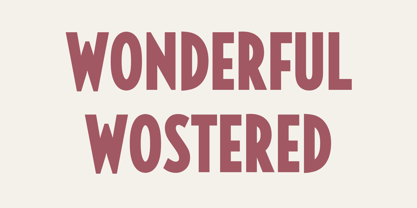 Wonderful Wostered Display Sans Font Typeface inspired by the famous minimalist logo perfect for the purposes of designing templates, brochures, videos, advertising branding, logos, invitation, layout design, elegant crafting, beauty design and other What's Included : + Standard glyphs + International Accent + Works on PC & Mac + Simple installations Accessible in the Adobe Illustrator, Adobe Photoshop, Corel Draw. PUA Encoded Characters - Fully accessible without additional design software. Fonts include multilingual support Image used : All photographs/pictures/vector used in the preview are not included, they are intended for illustration purpose only. Thank You


