10,000 search results
(0.05 seconds)
- Panton by Fontfabric,
$47.00 NEW! Update 3.0 What’s New: • New Narrow version of 18 weights • Bulgarian Localization Support • Tabular Figures • Case-Sensitive Punctuation • Extended Glyph Case • Icon Sets PDF Specimen available: http://myfonts.us/suAc3K Panton has been expanded with Panton Narrow! It has 9 uprights and 9 matching italics ranging from Thin to Heavy. The Panton font family includes 54 fonts - 19 uprights with 19 matching italics and 16 icon sets as a bonus! It is characterized by excellent legibility in both web & print design areas, well-finished geometric designs, optimized kerning, excellent web-font performance and legibility etc. Inspired by the classic grotesque typefaces - Panton has his own unique style, expressed in perfectly softened geometric forms. The font family is most suitable for headlines of all sizes, as well as for text blocks that come in both maximum and minimum variations. Panton font styles are applicable for any type of graphic design in web, print, motion graphics etc and perfect for t-shirts and other items like posters and logos.
 - Undulated by Ingrimayne Type,
$10.00 Undulated is another typeface family from IngrimayneType that explores the possibilities of alternating letters sets. Undulated is similar to the typeface Undulate. Both alternate two sets of characters to form a wavy line of text. This alternating is done automatically in applications that support the OpenType feature contextual alternatives (calt). However, the peaks and valleys of the wave are in the middle of the characters in Undulate while in Undulated the peaks and valleys are at the right and left edges of each character. The waves in Undulated seem more chaotic and less soothing than the waves in Undulate. Undulated has monospaced and monoline letters. The letter spacing is tight to accentuate the ripple pattern. The family includes an outline style that can be used in a layer above the regular style to add color. The unusual patterns that Undulated gives are eye-catching and may be useful for advertising or signage and in other places where one wants attention-grabbing lettering.
 - Biotrip Sans — a typeface that breathes. I've brought to life a friendly typeface family that is, above all, a journey. A journey (Trip) from the purity of geometry to the warmth of the organic (Bi...
- Griggs by Seniors Studio,
$140.00 Griggs is a variable type family with six-axis. Available as both static and variable font built to maximize versatility. This is a single variable font that can morph between a wide range of stylistic variations with each of its axes: Weight, Serif, Grade, Stylistic Set 1, Stylistic Set 2 and Slant. Also offer a variable subtle grade axis for slight weight adjustments, to user different preferences. For slant axis will automatically apply stylistic set 2 or set custom values on each axes for more options. A multi-purpose sans serif and serif typeface with high contrast, inktraps, sharp form, clean cuts and playful details, to convey the impression of opulence, elegance with a distinctive look. It comes in 3 distinct individual cuts within the Sans, Flare, and Serif subfamilies. Allows for many variations across its subfamilies, weights and styles. Each typeface contains with a warm personality and contemporary look. With different stylistic sets, you can choose the best-desired result for your design. You can change the feel of your design from more delicate, to bold to its sharpest most style. Griggs family with various styles will be an handy tool for a wide variety of designs. Excellent for text large and small. It’s a brilliant choice for branding, identity design, editorial design, logo design, display and packaging design etc. Typeface Features: * 325 Glyphs * 3 Subfamilies: Sans, Flare, Serif ( Each 8 Styles + Slant ) * 6 Weight: Thin, Light, Regular, Semi Bold, Bold, Black * Complete Collection: 144 Styles + Variable Font * Opentype Features: Stylistic Set 1, Stylistic Set 2 * Latin Language support including * Kerning * Autohinted Thank You.
 - Aire by Lián Types,
$37.00 Aire is what Sproviero would call a < big display family >. We recommend seeing its user’s guide. After his success with Reina, Sproviero comes out with this big family of 7 members: Each of them loaded with lots of sophisticated ligatures, alternates and the entire cyrillic alphabet. The overall impression that the font gives is lightness and delicateness; that’s the reason the designer chose to call it Aire, or Air, in English. "Aire was somehow having a rest from my fat face Reina [...] It started as a really thin style of Reina, but it rapidly migrated from it and grew up alone. And how it grew..." The inspiration came from his own past creations: “The heavy strokes of Reina were shouting for a more delicate thing. Something more feminine. More fragile. Something which had a lot of elegance and fresh air inside”. Aire responds to this: Sproviero found that many of the typefaces of nowadays which are used for headlines (best known as display fonts) have almost always just one, maybe two weight styles. This was his opportunity to try something new. Aire makes it easier for the user to generate different levels/layers of communication thanks to its variety of styles. With this font you can solve entire decorative pieces of design with just one font, and that was the aim of it. Aire was designed to be playful yet formal: While none of its alternates are activated it can be useful for short to medium length texts; and when the user chooses to make use of its open-type decorative glyphs, it can be useful for headlines with dazzling results. On March of 2012, Aire was chosen to be part of the most important exhibition of typography in Latinoamerica: Tipos Latinos 2012. TECHNICAL Aire is a family with many members. In total, the user can choose between almost 6,000 (!) glyphs (1,000 per style). Each member has variants inside, which are open-type programmed: The user decides which glyph to alternate, equalizing the amount of decoration wanted. Every decorative glyph has its weight adjusted to the style it belongs to. Exclusively for decoration, Aire Fleurons Pro is an open-type programmed set of ornaments. And last but not least, remember Aire is delicate. What’s my point? It is not recommended to activate all the alternates at the same time. It is typo-scientifically proved: A maximum of 3 or 4 alternates per word would be more than enough.
 - Arupala Grotesk by Jetsmax Studio,
$15.00 Arupala Grotesk is a Grotesk font this versatile typeface will grab readers’ Attention. This font was inspired by a character named H. Aroepala. This font is suitable for both formal and informal events and is also suitable for various types of print and digital media.
 - Kerad by Lemonthe,
$12.00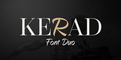 Kerad Font Duo is a captivating combination of modern serif and handwritten font, both seamlessly mixable to create a unique and appealing impression. It is suitable for various design projects such as logos, branding, packaging design, web design, titles, posters, printing, advertising, and much more.
 - Slenco by Patria Ari,
$20.00 Slenco Font Family is suitable for headlines of all sizes, editorial design, branding, packaging, web and broadcast use, etc. This font designed with modern forms, so each individual character is quickly and easily recognized. Such distinctness makes it good for signage and display work.
 - Znak Symbols by Tour De Force,
$10.00 The Znak Symbols family includes 2 fonts (Znak Symbols 1 and Znak Symbols 2) each with set of 94 strictly geometric symbols. The original concept and highly applied graphics from Znak Symbols recommend it for miscellaneous purposes, from ornamental and vignette use to visual communications.
 - SF Mada by Sultan Fonts,
$19.99 Mada is An Arabic typeface for desktop applications, for websites, and for digital ads. Mada font family contains two weights: regular and bold. The font includes a design that supports Arabic and Latin languages. Mada typeface comes with many opentype features including stylistic sets.
 - Fat Albert BT by Bitstream,
$50.99 Ray Cruz releases another typeface family, this time inspired by 1970's pop culture. Fat Albert Regular, Outline and Shadow are bold poster types that evoke the fun and funk of an era gone by. Go on bro, get Fat Albert and get down.
 - Quero by Eotype,
$16.00 Quero is a decorative sans serif font that has thin,elegance and versatility. This unique font is perfect for creating beautiful logotypes, stunning magazine designs and more. This font can be your solution in completing projects that are equipped with various alternate and ligature collections.
 - FF Motive by FontFont,
$29.99 German type designer Stefan Hägerling created this display FontFont in 1995. The family contains 3 weights: Light, Regular, and Bold and is ideally suited for music and nightlife. FF Motive provides advanced typographical support with features such as ligatures. It comes with proportional oldstyle figures.
 - FF Craft by FontFont,
$41.99 Slovakian type designer Peter Bil'ak created this display FontFont in 1994. The family contains 4 weights and is ideally suited for festive occasions and music and nightlife. FF Craft provides advanced typographical support with features such as ligatures. It comes with proportional lining figures.
 - Barnaul Grotesk by ParaType,
$25.00 A text sans serif type family of 8 styles was designed by Natalia Vasilyeva and released by ParaType in 2007. It has narrow proportions, open shapes and can be used in a wide variety of applications — for text setting, for headlines and for display matters.
 - FF Voodoo by FontFont,
$30.99 German type designer Klaus-Dieter Lettau created this display FontFont in 1995. The family contains 2 weights and is ideally suited for music and nightlife. FF Voodoo provides advanced typographical support with features such as ligatures. It comes with proportional oldstyle and proportional lining figures.
 - Agrokiz by limitype,
$20.00 Agrokiz is a typeface designed for display and design needs that require large text such as magazine headlines, banners, etc. With its modern form, this typeface is quite applicable for various media and design styles. Agrokiz is equipped with: - uppercase - lowercase - symbols - numbers - and multilingual
 - Estandar Rounded by Latinotype,
$- Estandar Rounded is a retro and vintage wayfinding sans serif font, inspired by old signals in central park and Europe. It is a Condensed sans with their tall x-height. The family has 6 Weights, italics and dingbats. It is an extension of Estandar font.
 - FF Chemo by FontFont,
$41.99 German type designer Critzla created this display FontFont in 1997. The family has 11 weights, and is ideally suited for music and nightlife. FF Chemo provides advanced typographical support with features such as ligatures and case-sensitive forms. It comes with proportional oldstyle figures.
 - Novera by René Bieder,
$29.00 The Novera family is a sharp geometric sans in ten weights plus matching italics, available in two versions – Modern and Classic. It has a contemporary, approachable and multifunctional yet characteristic design, that comes with an extensive glyphs set of 1000+ glyphs per font, meeting all typographic demands. The Design Vertical terminals, circular shapes and angular apexes – Novera truely breathes geometry! But the concept goes beyond the application of rational geometry. The intension was to create a highly legible family suitable for every day usage inspired by the work of Paul Renner, Eric Gill or Jakob Erbar, combining the geometric with the human and the functional with the unconventional. Although Novera is inspired by the past, its appearance is unmistakingly modern. Modern vs Classic Novera is available in two versions - Modern and Classic - born from the same source file but with different characters set as default. This creates subtle but effective distinctions such as the double-storey a (Novera Modern) which is optimized for legibility in longer text paragraphs, as opposed to the single-storey a (Novera Classic) which allows a purely geometric appearance. Another distinguishing feature are the ascenders on Novera Mondern, which extend above the cap height for an elegant presence, compared to the ascenders on Novera Classic, ending at the cap height, for a compact and helvetica-flavored look. Novera Modern was intended for usage in body copy, whereas Novera Classic was planned for headlines, short paragraphs or logos, but both versions can be used vice versa too, of course. Alternate Characters To maintain neutrality and a modern appearance, the standard character set largely dispenses with idiosyncratic forms. This is in contrast to the alternative forms with the gill-like lowercase letters g and t as well as a traditional shape of S and the German ligature t/z, which traces back to old German spellings. Also inspired by German poster designs from the early 20th century are the elongated i-dots and dieresis-dots that can create eye-catchers in headlines or logos. By the way, both versions, Novera Modern and Classic, can be created via stylistic set 1, 17 and 18. Opentype Features and Symbols The family comes with many opentype features to support modern typesetting. This includes ligatures, different number sets or alternative shapes for texts set in all caps. If you like arrows and other shapes, you will love Novera! The family has a built-in extensive symbols-set including 48 different arrows and various geometric shapes or icons. Weights With its 40 styles and 1000+ glyphs per font, the Novera family covers all thinkable design scenarios from branding to web, app or editorial usage. It blends in perfectly in text heavy paragraphs with its mid-weights like Light, Regular, Medium or Bold or stands out like a monument in headlines and posters with its extreme weights like Thin, ExtraLight, Black or Ultra. Testfonts If you like to test the fonts before buying the full version, please follow the link below. Please note, all test fonts are available for evaluation purposes only and contain a limited character set! A commercial license for the full version must be purchased separately. Please send a mail to contact@renebieder.com for more information. Download the test fonts here: https://www.renebieder.com/test-fonts
 - Phoenica Std by preussTYPE,
$29.00 PHOENICA is a contemporary humanistic typeface family suitable for traditional high-resolution print purposes, office application and multi-media use. Of the creation formed the basis an idea which was developed for the first time by Lucian Bernhard approx in 1930 with the Berhard Gotic and was taken up in the last time by different written creators repeatedly: the repeated elimination anyway (in comparison to a Antiqua, e.g. Garamond) already very much diminished form Grotesque (as for example Helvetica) by systematic leaving out of the serifs. The horizontal direction of the writing is thereby stressed remarkably by which so-called »Rail effect« originates. The eyes can grasp the line to be read very well what is ordinarily left to a Serif-stressed font. By this desired effect is suited PHOENICA also for big text amounts. In numerous test runs Stems and tracking was compared to experienced fonts and was adapted. The experienced was taken over without renouncing, nevertheless, the modern and independent character PHOENICA. PHOENICA offers to you as a welcome alternative to the contemporary humanistic Sansserif. It is a very adaptable family for text and Corporate design uses. Several companies have discovered PHOENICA meanwhile as a Corporate font for themselves and use them very successfully. She provides a respectable typeface combined with refinement and elegance. Every PHOENICA family has at least six weights in each case in regular and italic. In addition more than three fine Haarline weights (Hairline 15, 25, 35). These are a total of 27 possibilities. Phoenica as well as Phoenica Condensed are excellently readable fonts, because they were optimised especially for amount sentence. Both basic styles (Regular and Condensed) are tuned on each other and follow the same form principle. The family is neither exclusively geometrical nor is constructed humanistically, the forms were sketched on quick and light Recognition effect of every single letter. The PHOENICA family design and logo is suited for all only conceivable uses like newspapers and magazines, for the book typography and Corporate Design.
 - Avram Sans by Tour De Force,
$25.00 Avram Sans is modern, legible and universal sans serif family designed to accomplish best performances in very wide range of situations. By it's design, it flirts with traditional Geometrical and Humanist typefaces, but also contain contemporary characteristics that joined together results simple, elegant, unique sans serif family in 5 weights. Avram Sans performs well in very small sizes. Beside Tabular Lining Numerals, contains SmallCap letters for basic Latin characters. All together, Avram Sans comes with 425 glyphs, fully covering Latin written languages.
 - Calluna Sans by exljbris,
$- Calluna Sans was designed by Jos Buivenga of exljbris font foundry. The Calluna Sans typeface family is a humanist sans based on the popular Calluna serif fonts. It has true italics and OpenType typographic features including small caps, figure styles, ligatures and more. There are 716 glyphs in each font, with extensive language coverage. The Calluna Sans family has 10 fonts: 5 weights each with a matching italic. Check out Calluna™ which is a great pair for Calluna Sans™.
 - Aplikazia MF by Masterfont,
$59.00 A practical font family with 11 weights for all your needs: headlines, body text, signage etc. This font family is a working horse with high legibility at small sizes. OpenType Pro Excellent support for Niqqud. All marks are programmed to fit each glyph's shape and width. OpenType Pro includes new advanced features like Dagesh Hazak, ShevaNa, etc and wide letters. Best used with Adobe InDesign CC that support complex Hebrew text. Please check these advanced features in this link: tinyurl.com/2fbkuy95
 - OffBit by Power Type,
$15.00 OffBit is a font type derived from Bitmap with various variations from each box. The term bitmap comes from computer programming terminology, which means simply a bit map, a spatially mapped array of bits. Now, together with PowerType, it usually refers to a similar concept of an array of pixels that are mapped spatially and into various shapes such as dots and other models. This font matches the theme of computing, graphic design, posters or other media, all of which can be combined.
 - Litto by VladB,
$12.00 The name of the font is taken from the concept "Littoral zone" - this is the part of the sea that is close to the shore. The width of the shore varies as a result of the tides. Hence the idea of my font family — changing the width of a character from condenced to extra expanded. Litto is a modern sans serif geometric font, includes upper and lower case characters, Latin and Cyrillic. Graphically, the characters have uniform thickness for all family.
 - Estimo by Karandash,
$28.00 Estimo is an unusual, yet elegant type family of three styles in five weights. Originally developed as upper-case-only family, Estimo was inspired by the works of Bulgarian type and graphic designers in 1980’s. It is characterized by its lack of diagonal strokes (wherever possible), thus experimenting with letterforms without losing legibility. This unique typeface is suitable for all kinds of creative and editorial works, creating impact for headlines of all sizes, as well as readability for text blocks.
 - Tomkin by Typesketchbook,
$55.00 Tomkin font is an extra large super family of 54 fonts! Tomkin have such a big abundance of contrast, styles, weights, width. Typesketchbook consists of a very usable, clean and modern sans typeface with Semi-square struture. The complete Tomkin type family includes 9 weights with italic and 3 width (normal, narrow, condense) versions for each of them all in all 54 fonts for a multifunctional usage, especially for cooperative work, such as website, magazine, editorial, publishing , as well as packaging.
 - Nanami Pro by Thinkdust,
$19.00 Nanami Pro is the heavily engineered follow up to the hugely successful Nanami and Nanami Rounded font families. Nanami Pro contains all the wonder of the original Nanami families, but with vastly extended language support including Cyrillic and Extended Latin, leading to a total of 458 carefully crafted glyphs. The original Nanami was a key font in many a typography collection, but with these new multi-lingual credentials, Nanami Pro has become a true must-have font for anyone who’s serious about design.
 - The Deathstar IV font is a visually impactful display sans-serif typeface. It is immediately recognizable as being highly futuristic and appropriate for science fiction or space t...
- Mahardika by Lemon Studio Type,
$10.00 Mahardika is a Retro Sport sans Serif family with variable font technology, and its axis weight range spreads from Light to black forms. Flexible and adaptable, it is 100% Latin Plus, Supporting 219 Latin-based languages, which are spoken in different 212 countries. This font is suitable for any project. Great for graphic design and any display use. It can easily work for web, signage, corporate as well as editorial designs. Jantur Type has 9 weights with a total of 9 styles. and legibility makes it suitable for any kind of text application, from brand design to extensive text layouts.
 - Pepper Sans by VIDI Visual Design Studio,
$17.99 The core design of Pepper family, designed by VIDI Visual Design Studio, is the fingertip handwriting style inspired by children’s writings on windows. This distinctive low-contrast typeface combines characteristics from neo-grotesque and organic models. Warmer than most Helvetica inspired typefaces, Pepper has organic shapes, playful strokes, rounded endings, and a generous x-height which makes Pepper easy to read. This family could be used well for food packagings, content aimed for children, book covers, branding, high-impact titles and small body texts, advertising, editorial design and more. What makes Pepper Sans Vol.1 competent and more spicy then some other fonts is that it contains a set of more than 900 characters for each of 5 weights that support many Latin-based languages, Greek and Cyrillic. As the weight decreases, the typeface gains impact with becoming elegant, giving titles in (Hair, Thin or Light) a breath of fresh air. We derived a typeface family consisting of Hair, Thin, Light, Regular, Semi Bold in this Vol.1 edition. Typeface features: • 5 weights: Hair, Thin, Light, Regular, Semi Bold • Latin, Greek & Cyrillic multilingual support • More than 900 characters for each of 5 weights Font Specs: • Created: August 2020 • Files type: .ttf
 - California Starlight by Cititype,
$17.00 California Starlight is a monoline signature font. Look like natural strokes using a roller pen. This is an upright font with a gently stroke follows the flow of the text. The uppercase size is higher, it's intended for a unique and prominent impression when used for 'branding', Tall and prominent yet integrated in the gentle flow of the lowercase. We propose this font for branding, logotype, photography caption, wedding invitation cards and merchandices, quote writing, craft projects, and various other unique prints. Stylistic Set Alternate (SS01 and SS02) is a swash at the beginning and end of the lowcase, also equipped with ligatures to add a unique impression and natural strokes. modern, sophistics and natural make this font a must have.
 - Angelliey by Cocodesign,
$10.00 Angelliey is a beauty script based on a modern calligraphy with natural hand writing look and feel. It can be used as digital signature as well. It has many alternates and ligatures which contain many swashes that you can play with. This type of font perfectly made to be applied especially in logo, and the other various formal forms such as invitations, labels, logos, magazines, books, greeting / wedding cards, packaging, fashion, make up, stationery, novels, labels or any type of advertising purpose. Features : uppercase & lowercase numbers and punctuation multilingual alternates and ligatures PUA encoded We highly recommend using a program that supports OpenType features and Glyphs panels like many of Adobe apps and Corel Draw, so you can see and access all Glyph variations.
 - Nazari by RodrigoTypo,
$25.00 Nazari is a typeface for titles with personality, character and multiple alternatives to design. Nazarí is inspired by Arabic lettering and calligraphy, but updates its shapes through games of high contrast, geometric design and rounded terminals. The family has 4 styles: Regular, Regular Inline, Sans and Sans Inline. In turn, Nazari is divided into a basic set and an extended set. The basic set supplies all the essential characters to design any graphic piece. The extended set also contains different contextual alternatives, ligatures and swashes.
 - Amonos display by Brenners Template,
$19.00 Amonos Display Font Family aims for a modern and simple lifestyle. Sleek and stylish skeletons boast a unique style from thin to black weights. Regardless of weights, 18 styles have special talents related to headings, subtitles and logos. The understated metaphor and sense of stability is the best alternatives for creative typography. Therefore, it supports stable dynamics beyond the biased simplicity of geometric fonts. And some different Glyphs of oblique typefaces add to the delightful fun. Enclosed Glyphs and Symbols will be so useful for editorial design.
 - Pleuf Pro by Polytype,
$15.00 Friendly, warm and quirky, yet with a certain elegance, Pleuf Pro is a hand-drawn rounded serif family with extensive language support and a bunch of OpenType features. Great for projects which need a handcrafted, homemade, friendly, warm, personal vibe; it's individualistic without being overly eccentric, and quirky without being illegible. The clean, delicate lines of the lighter weights convey a graceful elegance without losing warmth. Ideal uses would include bar and café menus, greetings cards, food and drink packaging, and anything aimed at kids.
 - Dulcinea Serif by JVB Fonts,
$29.50 The aim of this typeface is to merge two historical moments in the form and style of writing, on the one hand calligraphy uncial, and on the other Roman serif was established as a universal standard for type fonts continuous text at the time. Is intended in terms of their functionality as a font for titles. The family includes some extended range glyphs as several Caps swashes and stylish alternatives for upper and lower case, standard and discretional ligatures, old numerals and other OpenType features.
 - Torcao by insigne,
$24.00 Torcao is one of the sporks of the font universe, a useful and functional outlier. Half square, half circle, this uncommon squircle of a family with its asymmetry of curved and angular shapes drives through headlines and body copy with forward velocity. The robust, technical appearance is light-hearted and inviting, and its organic nature plays off of its one-of-a-kind kinks and hybrid forms. Torcao is not merely an experimental font, though. The figures have been crafted and refined into a functional, hard-working typeface that lends itself to many sizes and environments. The font family features a tall x-height and light modulation, which give the typography its unique color highly effective in headlines but still quite legible in longer text. This family contains a comprehensive range of nine weights--slender to black--and features condensed and extender selections for a complete set of forty-eight fonts. The font has been decked out for experienced typographers, together with swash alternates and simplified titling. The typeface also contains a range of numeral sets, together with fractions and old-style figures. OpenType-capable programs including Quark or the Adobe suite allow quick changes to ligatures and alternates. Previews of these options can be found in the .pdf brochure. Torcao also features the glyphs to enable all Central, Eastern, and Western European languages. In all, the font supports around forty languages that utilize the prolonged Latin script, making it an excellent option for multi-lingual publications and packaging. Simple, technical, and open, the Torcao type family could just be the perfect choice for your web type or print project.
 - Larky by Alterspieler,
$17.00 Larky is a beautiful and unique modern calligraphy. This font has simple and interesting characters for various design needs. You can use it for embroidery, screen printing, business cards, cutting, branding, and more. Larky has all uppercase and lowercase letters, also has alternatives, multi languages, ligatures, numbers, punctuation.