10,000 search results
(0.041 seconds)
- Pacmania - Unknown license

- COnsume - Unknown license

- Thundercats - Unknown license

- FS Silas Slab by Fontsmith,
$80.00 Slab-like sibling Why stop at sans? Rather than leave FS Silas Sans as an only child, the team wanted to extend the family, and create a complete system for brands and editorial. Unsure what the result would be, the team started experimenting with a slab serif version. ‘We didn’t know how it would turn out, but we really liked it and wanted to take it further. A fresh angle ‘We stuck with the angular theme of the sans by drawing angled slab serifs,’ says Phil Garnham, ‘as opposed to the square serifs that slab fonts usually have. That created an inner dynamism in words and sentences on the page, and a very distinctive, crafted character, like a Victorian soul in a contemporary body.’ These crafted touches include details such as the angled ascenders on the ‘i’ and ‘l’, while characters such as the ‘y’, with its abruptly-ending descender, add a mark of distinction. A perfect pair Silas Slab, like its sibling, offers a clear-cut range of five weights, from the elegant Thin to the monumental ExtraBold. Put it together with Silas Sans and you have the full complement, capable of performing the full range of tasks, above the line and below, in headlines, body copy and logotypes, B2B and B2C. Keep them together; they don’t like it when they’re apart.
 - Geometry Soft Pro by CheapProFonts,
$10.00 The Geometry Pro family has been designed to be the final word in purely geometric fonts, and this rounded “Soft” sub-family is the ultimate web 2.0 style font collection. Even though it is strictly geometric (as drawn with a compass and a ruler fixed to 90 and 45 degree angles) it is not slavishly modular: letters have differing widths, and the sidebearings, spacing and kerning has been finely adjusted to create smooth text. The Soft family contains three weights each with 6 variants: A is the basic form and the starting point B has more dynamic and modern shapes C has open and swirly shapes X is the serious text version Y has a very horizontal look Z is a collection of all the remaining more funky shapes Mix and match to your heart’s desire! Please enjoy the free “Bold N” version - this “notched” variant lets you test out the quality of the outlines and the language support. ALL fonts from CheapProFonts have very extensive language support: They contain some unusual diacritic letters (some of which are contained in the Latin Extended-B Unicode block) supporting: Cornish, Filipino (Tagalog), Guarani, Luxembourgian, Malagasy, Romanian, Ulithian and Welsh. They also contain all glyphs in the Latin Extended-A Unicode block (which among others cover the Central European and Baltic areas) supporting: Afrikaans, Belarusian (Lacinka), Bosnian, Catalan, Chichewa, Croatian, Czech, Dutch, Esperanto, Greenlandic, Hungarian, Kashubian, Kurdish (Kurmanji), Latvian, Lithuanian, Maltese, Maori, Polish, Saami (Inari), Saami (North), Serbian (latin), Slovak(ian), Slovene, Sorbian (Lower), Sorbian (Upper), Turkish and Turkmen. And they of course contain all the usual “western” glyphs supporting: Albanian, Basque, Breton, Chamorro, Danish, Estonian, Faroese, Finnish, French, Frisian, Galican, German, Icelandic, Indonesian, Irish (Gaelic), Italian, Northern Sotho, Norwegian, Occitan, Portuguese, Rhaeto-Romance, Sami (Lule), Sami (South), Scots (Gaelic), Spanish, Swedish, Tswana, Walloon and Yapese.
 - Ronet by yasireknc,
$10.00 It can be tricky to find typefaces that can convey the feeling of personal warmth that comes from a handwritten note, custom brandings, special series of products, especially as we type more and more and write with a pen or pencil less and less. To add some more of that warmth to a font, I’ve made Ronet. A duo font based on the my handwriting. Double eponymous styles of the font —Ronet and Ronet Alternative— each have a unique flavor with its own rhythm and character. It can be used on branding designs, product labels, invitation cards, social purposes which is bloggers, influencers but they were capable of so much more, and I’m happy to share them for general use. Ronet has extraordinary alternative characters, that makes these fonts so impressive. These two styles have dynamic substitution, alternates, and beautiful kerning! Nevertheless, they each support an impressive range of languages using the Extended Latin alphabets and because they were designed to work well in a simple tool, a rare feature of these fonts is that they look just as good no matter where you use them. LOTS of writing, and then even more care once I developed and refined digital outlines from the samples. Ronet and Ronet Alternative each wrote pages and pages of letters to produce lots of examples for comparison and selection, in order to get the most authentic overall texture that captured the spirit of my left hand.. Ronet feels friendly and personal, like a neighbor or local shopkeeper who always seems happy to see you. This will perk up your social feeds in a snap. Start with Ronet and just add in your design to make it perfect. What started with a simple pen and paper has become a diverse and ever-expanding creative outlet that blends hand-drawn creativity with cutting-edge technology — and the end results are popping out everywhere, from advertising to design and decor to art and DIY.
 - Ugroh Black by Saffatin.co,
$12.00 Get ready to jazz up your design game with the brave Ugroh Display Black font include Italic! Armed with a whopping 260 glyphs, it's got all the languages covered and comes with a bonus of ligatures and alternative glyphs. So, whether you want to add a fancy twist or a subtle tweak, it's got you covered and will make your designs shine like a star! With its bold and modern look, Ugroh Display Black font is a perfect choice for any design project that requires a touch of elegance. Its clean lines and sharp edges will give your designs a professional look that will impress any audience. Whether you're creating a logo, a poster, or a website layout, Ugroh display black font will give your project a unique and stylish look. Its versatile character set makes it a great choice for a variety of design styles, from minimalistic to ornate. And with its extensive language support, you can be sure that your message will be heard loud and clear, no matter where your audience is located. So, why settle for a dull and uninspired design when you can jazz it up with Ugroh display black font? Try it out today and see your designs shine like never before!
 - Berndal by Linotype,
$29.99Bo Berndal, the master Swedish typographer, is the eponymous designer of Berndal, a contemporary text family with five different styles. This family represents a new achievement for Bo Berndal, who has spent many years working to optimize text legibility in the printed media. Several small tricks make the Berndal family an interesting milestone in legibility. Berndal's letterforms contain large x-heights. Large x-heights open up the counterforms of letters, making text appear lighter on a page, but their correspondingly shorter ascenders and descenders can hinder legibility. This does not occur in Berndal at all! Coupled with this experiment, Berndal's various font weights display a certain softness and roundness. The letterforms themselves are relatively wide, with an overall consistency in width. The calligraphic nature of the strokes has been minimized, yet a contrast stroke-thickness is still to be noticed within the alphabet. Berndal's five styles offer almost everything that one could want from a good text family. The Regular weight may be paired with Small Caps, Italic, Bold, and Bold Italic. All styles ship in the OpenType format, and include tabular and old style figures. The two italic weights are made up of true italics, not obliques. The Berndal family is a part of the Take Type 5 collection from Linotype GmbH." - Calarosta by Chunlettering,
$10.00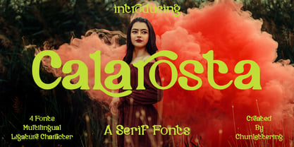 Calarosta - is a versatile unique, beautiful and clean serif font family, created with precision in each glyphs character. This font is perfect for logo branding, product designs, quotes, posters, display, website, invitation card, greeting card, headline, website, magazine, and your various other design projects with an outstanding style. Calarosta includes 4 weight styles which each include 225 glyphs. Features: 4 Font Weight Uppercase & Lowercase Multilingual Support Number & Punctuation Alternatives & Ligatures Thank you, for supporting us.
 - Burgs by Putracetol,
$16.00 Burgs - Multistyle Font is a versatile typeface that starts as a modern sans-serif font and expands into a diverse collection of eight alternative font styles. These variations include slab, stencil, display, sport, classic, serif, and decorative, offering a wide range of design options. Each font style can be combined with others or used individually, making it adaptable for a multitude of design purposes. Whether it's for logos, posters, packaging, branding, business names, stickers, headlines, or any creative endeavor, Burgs provides a wealth of options for your projects.
 - Apex Brush by Hanoded,
$15.00 I like playing around with brushes and Chinese ink. I always have some kind of idea of what the final design should look like, but once it’s done, it never ever looks like what I had in mind. Apex Brush is one of those designs: it started off as a few brush strokes, but before I knew it, I had a really nice set of matching brush fonts! Use it for any design that needs a bit of rough, a splash of ink and a pinch of rebel.
 - MFC Chaoxiang Monogram by Monogram Fonts Co.,
$269.00 The inspiration source for Chaoxiang Monogram is another hand-drawn treasure from a vintage embroidery publication which plays on the anglo-version of chinese letters with stabbing strokes and the charm of the orient. While the original intent of this monogram style is uncertain, the possibilities of its use are up to your imagination. This is one of many monogram designs from the early 1900’s which fall into a two letter format bound within a framing element. Download and view the MFC Chaoxiang Guidebook if you would like to learn a little more.
 - Galiano by DearType,
$49.00 Galiano is an elegant combination of a script and a narrow modern serif. It is slender, feminine and classy, while still maintaining a friendly feel. Galiano is versatile and will work perfectly for fashion, e-commerce brands, trend blogs, wedding boutiques or any business that wants to appear upscale and chic. With its 1500+ glyphs the Galiano Script is perfect for creating original and functional designs. It has extensive language support and tons of ligatures, alternates, stylistic sets and swashes that add visual interest to every letter. The Galiano Font Family in a nutshell: - Galiano - a dancing baseline script with signature loops for ascenders and descenders - Galiano Inline - similar feel to Galiano, notably featuring a standartized x-height - Galiano Text - a simpler version of the script with no fancy loops for ascenders and descenders and no swashes and alts. - Galiano Serif + Italics - perfect for headlines - Galiano Ornaments - a set of 80 beautiful ornaments to embellish your typography. You can use the Galiano Family for high-end logotypes and magazine headlines, but let’s not forget greeting cards, invitations, posters, book covers, ads and the various web and screen usages. The overall feel of the font is elegant, sophisticated with a touch of informal and it is ideal if you want to convey a sense of class and style.
 - Carpe Noctem by Hanoded,
$20.00 Carpe Noctem (Latin for ‘Seize The Night’), was a bit of a surprise. Someone asked me if I could create a lower case for my Closet Skeleton font. I began working on it and lo and behold, a beautiful font started taking shape. So, if you’re in need of a slightly scary fairytale font, complete with angled edges, swirly bits, a couple of alternate - even more curly - glyphs and an alternate medieval ampersand, then Carpe Noctem is your typeface!
 - Benton Sans Std by Font Bureau,
$40.00 In 1903, faced with the welter of sanserif typefaces offered by ATF, Morris Fuller Benton designed News Gothic, which became a 20th-century standard. In 1995 Tobias Frere-Jones studied drawings in the Smithsonian and started a redesign. Cyrus Highsmith reviewed News Gothic, and with the Font Bureau studio expanded it into Benton Sans, a far-reaching new series, with matched weights and widths, offering performance well beyond the limits of the original; FB 1995-2012
 - Zholud's Modern Ghotic by Vladzh,
$30.00The first ideas about creation this font appeared in spring 2005. I took gothic fonts and a technique of feather as the base and create something unusual. Zholud's Modern Ghotic font has only A-Z, a-z, 0-9 and . , : ; ' " ! ? - characters. I recommed you to use this font in headers. It looks better if you'll start each word with Caps. Please use an application that supports kerning in order to display the spaces between characters correctly. - Wascally Wabbit by Comicraft,
$49.00 This cunning, conniving, chattering font is devious, devilish and dashing! It's a toon town tattler that will lend a flippant insouciant personality to your comic books and animated features. These handsome letterforms will nab you, jab you, grab you and may even stab you with their sly wily guile. Our advice: Be Very Very Qwiet when tracking down this Wascally Wabbit. Features: Automatic alternate uppercase alphabets Western & Central European language support Manga characters & Crossbar I Technology™
 - Empire State Gothic by Comicraft,
$19.00 Empire State Gothic is, from basement to spire, an exultant, soaring skyscraper of a font, distinguished by its high arches, steel-framed construction and the glory and pride of Comicraft's fine woodwork and stonework! You might find it surprising, then, that this tall, lanky font was something of a loner during its teenage years, mingling with others of its kind in the shadowy corners of coffeehouses, nurturing feelings of belittlement while craving attention it may not have rightly deserved.
 - Jeenull by Twinletter,
$15.00 Jeenull is a distinctively appealing typeface with a thick character that gives a distinct impression ideal for a variety of serious and casual applications. What are you waiting for? Get this font and enjoy the beauty of letter combinations in words that you may use in a variety of projects. This font is perfect for games, sporting events, branding, banners, posters, movie titles, book titles, quotes, logotypes, and more. Start using our fonts for your amazing projects.
 - Zimric by Ingrimayne Type,
$5.00 Zimric is a family with 28 styles. It has the look of neat hand printing. It is monoline and sans-serif, friendly and legible. The Zimric family has three widths, each width has four or five weights, and each weight comes in both upright and italic styles.
 - Halla by Wilton Foundry,
$19.00 Creating Halla was a bit unusual for me since I started out creating the italic version first and that inspired the name Halla, meaning to tilt in Icelandic. It is also a fairly common female name in Iceland. “Halla” is derived from old Norse word “hallr” = 'flat stone, rock' or 'sloping, leaning to one side' Halla is a true italic inspired by handwriting and mechanical type. The combination of Light and Italic makes Halla ideal for advertising, branding, signage, packaging and editorial design.
 - Piedra Pro by Sudtipos,
$29.00 The world may seem cartoonish to you, pilgrim, but the funnies ain't really that funny. The Flintstones are so last century. The Hulks are in, and they're here to stay. Piedra is the rocky, fear-inducing face of galvanized triceps and überchiseled jawlines. Be intimidated, be very intimidated. You don't believe it? Just push the stylistic alternates button and see it disregard the laws and spit pebbles on the sidewalk. Then run to the hills if you want to live.
 - Lateman by Dumadi,
$25.00 Lateman is a casual font built with apps. with freestyle and natural make this font look friendly to the project you are working on. Lateman only consists of uppercase letters, but if it collaborates with other fonts, it will feel more striking like the preview example above. This font was created for superhero movie titles and is perfect for movie titles, superheroes, action, animation, war, and more. You can see the sample preview above for comparison, stay the center of attention and classy!
 - SF Liberty by Sultan Fonts,
$9.99 It is a big work that started with Windows in Aden and was redesigned and tuned on an Apple device in Cairo. Liberty is an active contemporary variable font, complete with a flexible range of cases tailored to responsive layouts. The font is clear and legible in small sizes, suitable for printing for large texts, web pages, and other visual uses. Language: Latin default Latin Azerbaijani Latin Catalan Latin Crimean Tatar Latin Kazakh Latin Marshallese Latin Dutch Latin Tatar Latin Turkish
 - Letterpress Text by Chris Costello,
$22.75 This font is based on the popular and timeless Caslon design and was carefully digitized from the pages of an early 19th century book. I was excited to see some unique design treatments of characters such as the lower case italic 'p', the question mark, and various swash caps that I had never seen before. During the conversion process, I made sure to preserve the worn look of faded ink on old paper by maintaining a subtle level of decay and opacity with each character. For missing characters not found in the book, I created new characters that were faithful to the style of the rest of the family. Used as a text font, The Letterpress Text Family successfully reproduces the appearance of old letterpress lithography.
 - Hattori by Zane Studio,
$15.00 Elegant, graceful and timeless. Hattori is a versatile font with timeless classic appeal, over 50 alternatives & ligatures, multilingual support, (And we think this is our best work so far!) Each letter has been hand-drawn and made with great care. The variety of weights provides a variety of options that will help you find the best typographic character for your project. All 3 weights are perfect for big screen use and high impact headlines. The available binding and style alternatives offer a number of different options that give your logo or business card a unique look. This high-contrast serif typeface has a glyph and offers comprehensive language support. If you have any questions, just send us a message and we'll be happy to help! Stay sweet, Sweetest Stuff
 - Ysobel by Monotype,
$29.99 The Ysobel™ typeface family is not only elegant; it is also exceptionally legible and space economical. A collaborative design effort between Robin Nicholas, as lead designer and project director, Delve Withrington and Alice Savoie of Monotype Imaging, the project had the primary design goal of creating a typeface family for setting text in newspapers and periodicals. The result, however, is also ideal for any application that requires quick and easy assimilation of text. According to Nicholas, “The idea for the design started when I was asked to develop a custom version of Century Schoolbook. I wanted to give the design a more contemporary feel, although the client ultimately decided to keep their typeface closer to the original. The project nevertheless gave me ideas for a new design. Since designing Nimrod, some 30 years ago, I had wanted to make a more modern typeface family for newspapers and magazines – this seemed the ideal candidate.” Ysobel (pronounced “Isabel”) has the soft, inviting letter shapes of Century Schoolbook but contrasts these with more incised serifs and terminals. Its capitals are also narrower than those of Century Schoolbook, and care was taken to ensure that they harmonize perfectly with the lowercase. Ysobel’s x-height is full-bodied without disrupting lowercase proportions. In addition, curved terminals, such as those in the “C,” “c” and “e,” were drawn more open as an aid to legibility and readability in text copy. Weight stress is near vertical, and hairlines are robust to ensure character fidelity in small point sizes. Development began with the text version of the family, which has four weights, each with an italic companion. All weights feature lining and old style numerals, fractions, superiors and extended Latin language coverage. Small caps are also available in the Roman Regular design. Ysobel Display is a completely redrawn version of the typeface; it is narrower, and has a slightly smaller x-height, thinner hairlines and subtle design changes to improve its appearance when set at large sizes. The Display Italic received particular attention to make it ideal for setting headlines, subheads and short blocks of copy. Changes include a slightly greater italic angle and more cursive treatment of some letter shapes. Alternative styles of capital “J” and “Q,” to provide variation, are available in all weights.
 - Coliseum Pro by Red Rooster Collection,
$60.00 Coliseum Pro is a five-weight compressed spur serif font family. ITF’s original Coliseum family, released in 1992, was designed by Julie Hopwood and Pat Hickson. Steve Jackaman completely redesigned, redrew, and improved the Coliseum family over a two-year period, and two additional lighter weights have emerged: Light and Book. Coliseum Pro is inspired by Roman display typefaces, and is powerful and eye-catching at any size. Two sister typefaces, Clydesdale and Torpedo, were born from Coliseum’s redesign.
 - Kids Place by Sabrcreative,
$10.00 Introducing Kids Place, a delightful and vibrant display sans serif font designed to bring joy and playfulness to your designs. This font is perfect for adding a touch of whimsy to children's books, nursery decor, party invitations, and more. Let your creativity soar with Kids Place and create designs that capture the imaginations of both young and young-at-heart. With its charming combination of uppercase and lowercase letters, Kids Place offers versatility and adds a sense of fun to your typography. The extensive set of numbers and punctuations ensures consistency and usability in various design projects. Kids Place goes beyond language barriers with its multilingual support, allowing you to express your messages in different languages and connect with a global audience. From English to Spanish, French to German, Kids Place provides a seamless experience. Unlock the full potential of Kids Place with its PUA encoding, which grants easy access to additional glyphs and characters. This feature enables you to add playful elements and unique touches to your designs, making them truly stand out. Let your imagination run wild with Kids Place, the perfect font for all your whimsical and playful projects. Whether you're designing for children or simply embracing your inner child, Kids Place is the font that will bring a smile to your face.
 - Plausible by Create Big Supply,
$17.00 Introducing Plausible, a captivating stylized handwritten font that adds elegance and charm to your designs. With its beautiful style and versatile features, Plausible is perfect for creating exquisite wedding invitations, stunning stationery art, eye-catching social media posts, and more. Let your imagination soar as you explore the creative possibilities with this remarkable font. Plausible offers a comprehensive set of features, including both uppercase and lowercase letters, numbers, and punctuations. Its multilingual support ensures seamless integration of various languages, allowing you to connect with a diverse global audience and communicate your message effectively. Whether you're designing for personal projects or professional endeavors, Plausible provides the tools you need to create visually striking and impactful compositions. With PUA encoding, accessing the amazing glyphs and ligatures of Plausible is a breeze. These special characters add unique flourishes and connections, elevating the visual appeal of your text and giving it a personalized touch. The monoline style of Plausible enhances its sophistication, making it a versatile choice for a wide range of design applications. Unleash your creativity and make a lasting impression with Plausible. This font combines elegance and handcrafted beauty, allowing you to create designs that stand out from the crowd. Whether you're a graphic designer, a creative professional, or an enthusiast, Plausible is the perfect addition to your font collection, offering endless possibilities for captivating and memorable designs.
 - Evoque by Monotype,
$40.00 Evoque is a humanist serif type family designed for both text and display purposes. Its appearance is crisp and modern while echoing a classical Garamond heritage. The inspiration for Evoque came after reminiscing over Apple’s advertising of the eighties and nineties that utilised incredibly tightly-spaced headlines set in Apple Garamond. I wanted to create a typeface that evoked nostalgia of those times and that distinctive typographic style. A number of swash alternates and discretionary ligatures enhance Evoque, giving you the opportunity to add more flair and personality to your title and branding designs. Simply activate Stylistic Sets to start adding these flourishes to your typography. Other useful features include Small Caps at the click of a button, and Old Style Figures are an option to the default proportional figure style. There are 36 fonts altogether, with 6 weights in roman and italic from Thin to Heavy weights across Condensed, Narrow, and Regular widths. Evoque has an extensive character set (900+ glyphs) that covers every Latin European language. Please also take a look at Evoque Text which is specifically designed for the publishing sector. Key features: 6 weights in both roman and italic 3 widths – Regular, Narrow, Condensed 80 Alternates 26 Ligatures Small Caps Full European character set (Latin only) 900+ glyphs per font.
 - Carin by Nine Font,
$20.00 Carin is a hand-lettered uppercase type family with both sans-serif and serif styles, including ornaments and symbols. Its characters have been drawn by hand to give them a natural and friendly look. Each style has one basic font with two weights and three decorative fonts (A, B, C). Carin is an emotional type family.
 - somalove - Personal use only

- Harmona by Locomotype,
$19.00 Harmona Font Family comes from a romantic feeling and a strong desire to unite in harmony. Harmona Script presents a simple yet beautiful and elegant typeface while still prioritizing readability on various sizes and media. For those of you who love signature fonts, this font is suitable for you to capture beautiful poems and quotes, invitation design, posters, logotype etc. To complement Harmona Script, we also provide Harmona Sans with a classic and luxurious touch to make it easier for you to combine the design into a more fun and attractive.
 - Mirador by René Bieder,
$30.00 Mirador is a powerful neoclassical font family designed for various usages — ranging from editorial and corporate design to web, interaction and product design. It is a contemporary take on high contrast typefaces that have never gone out of style — defined by elegance, tradition and timelessness. Although Mirador seems to be a display font at first glance, its proportions and design reveal a powerful and characteristic workhorse when set in smaller sizes. Mirador comes in 10 weights with matching italics. It is equipped with ligatures, a large set of alternative glyphs and many more opentype features.
 - Frutiger Serif by Linotype,
$42.99 Frutiger® Serif is a re-envisioning of Meridien,a typeface first released by Deberny & Peignot during the 1950s. Working closely with Adrian Frutiger, Linotype's Type Director Akira Kobayashi expanded the original metal type version of Meridien into a new digital family of 20 variants. Renamed Frutiger Serif, this up-to-date Meridien has new weights, widths, and styles that correspond better with several other of Frutiger's designs. Just as Meridien has always been a fine choice for text settings, Frutiger Serif works brilliantly for large amounts of text & also at small point sizes. With its many weights and styles, this family is strong enough for most typographic projects. However, its added versatility is revealed when used in combination with other fonts. Frutiger Serif works well with the original Frutiger, Frutiger Next, and Univers - just to name a few. Paring these serif and sans serif families together is perfect for creating complex hierarchies and clear information design. Working with complicated typographic systems - involving elements such as headlines, captions, pull quotes, multilingual text, etc - is made easy by selecting Frutiger Serif and another of Frutiger's sans serif families. The designer needs simply to mix and match different weights and styles for the various textual elements to create smart and innovative layouts.
 - Elcatraz by Almarkha Type,
$25.00 Elcatraz Family is a Fancy and Retro Sans full of charm. It will take any DIY-project to the next level! Elcatraz Family is perfect for Craft , product packaging, product designs, label, branding projects, logo, vintage social media posts, advertisements, watermark, invitation, stationery and any projects .
 - Cyan by Wilton Foundry,
$29.00The design of Cyan was inspired by features found in classic Roman and styles like Trajan and Bodebeck. It shows the designer's personal preference for geometric Roman proportions while incorporating open centers (B,P,R) and compact serifs. Unlike Trajan, Cyan has lowercase characters in the regular version. The characters stay true to the same features as the capitals, resulting in an unusually distinctive style. The Regular Capitals version contains Roman numerals. Cyan's weight is similar to Trajan's but the horizontal strokes are slightly bolder resulting in better legibility for small sizes, especially for lowercase characters. There are many subtle details in Cyan that become more interesting in larger sizes, for instance the subtle curves in the serifs and the overall smoothness as a result of the mostly rounded angles. Cyan is a robust font that will exceed expectations in areas never explored before. The name is inspired by the Greek word cyan, meaning "blue". The color cyan can have many different variations. One definition is a color made by mixing equal amounts of green and blue light (it also is a pure spectral color). As such, cyan is the complement of red: cyan pigments absorb red light. Cyan is sometimes called blue-green or turquoise and often goes undistinguished from light blue. Obviously the Cyan family is a perfect companion to the Cyan Sans family. - K haus 105 by Talbot Type,
$19.50 K-haus 105 is inspired by the work of graphic designer and typographer, Herbert Bayer, during his time at the Bauhaus around 100 years ago — work that kick-started graphic design as we know it, to this day. It owes something to the simple geometry of Bayer’s hand-drawn, ‘universal typeface’, updated and expanded to deliver a clean, balanced, geometric sans for today. Also available as K-haus 205 , featuring a few, more 'daring' characters here and there, chiefly in the lower case set. Both variations include an extended character set, featuring accented characters for Central European languages.
 - Handwritten Note JNL by Jeff Levine,
$29.00 The movie poster promoting the 1962 James Cagney comedy "One, Two Three" had it's text done in free-style hand lettering. Starting with an auto-trace in order to have an isolated version of the black letters separated from the red poster background, the tracing kept the basic forms intact, but with limited accuracy. Cleaning up and digitally reshaping the letters manually to form a more correct version [closer to the original movie poster], additional figures, foreign characters, accents and punctuation were drawn from scratch. This is now available as Handwritten Note JNL in both regular and oblique versions.


