945 search results
(0.009 seconds)
- 101! SWAK - Unknown license
- Godfrey Sykes Initials by Celebrity Fontz,
$24.99This illustrative alphabet was inspired by the decorations of Godfrey Sykes, whose work was greatly influenced by that of Raphael and Michelangelo. This tile alphabet follows a Venetian 16th-century tradition of letters decorated with figures symbolizing each initial, a High Renaissance style. Includes one set of A-Z ornamental initials conveniently assigned to both the upper and lower case alphabet characters. Perfect for artistic publications, storybooks, fairy tales, and texts conveying the feel of the apogee of the visual arts in the Italian Renaissance. - Brownie Fox by IKIIKOWRK,
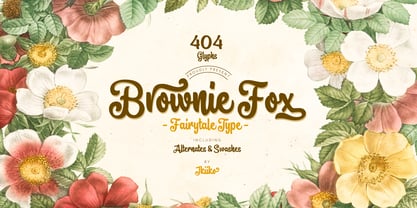
$17.00Introducing Brownie Fox - Fairytale Typeface, created by ikiiko. A vintage & classy decorative type that reminds us of fairy tale books when we were kids. This typeface is perfect for an books cover, illustration for kids, vintage poster, vintage product, packaging design, magazine header, poster, quotes, and so much more.. What's included? Uppercase & Lowercase Number & Punctuation Alternates & Swashes Multilingual Support Get also a good offer & FREEBIE at our site : www.ikiiko.com Enjoy our font and if you have any questions, you can contact us by email : ikiikowrk@gmail.com - Nursery Rhyme Initials by Celebrity Fontz,
$24.99High-quality ornamental initials superimposed on nursery rhyme backgrounds such as Humpty Dumpty, Ride a Cock Horse, Baa Baa Black Sheep, Tom Tom the Piper's Son, Rub-A-Dub-Dub, the Queen of Hearts, Old King Cole, and many others. Includes one set of A-Z ornamental initials conveniently assigned to both the upper and lower case alphabet characters. Ornate and accurate renderings that can be used for the beginning of paragraphs in any children's publication or texts relating to nursery rhymes and fairy tales. - Lubok by Linotype,
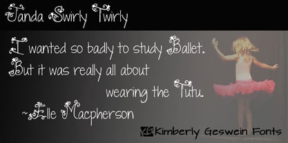
$29.99Moscow-based designer Julia Borisovna Balasheva created her Lubok face as a pictogram-based font. The term "lubok" refers to a popular style of Russian folk art printing, which dates back to the 18th Century. In Lubok, Bakasheva has digitised several whimsical characters and animals, which were common in these prints. She suggests that you use Lubok's symbols to illustrate fairy tales; we suggest that you use Lubok to decorate everything: from your next office party invitation to comic books of your own design! - Janda Swirly Twirly by Kimberly Geswein,
$5.00 - Lovelope by Ridtype,
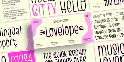
$10.00Lovelope is a cute handwriten font sans serif style. This font is inspired by the expression of happiness from the activities carried out by a little girl in the expression of joy. So we created these fonts to get and feel what they feel. This font is perfect for stickers, printing, logos and other purposes. Thanks for your support of our product, and using it in your project. - Demigrunge by Aah Yes,
$9.95Just a hint of grunge in this font, one side fairly clean and one side with subtle grunge. Demigrunge lends itself readily to display, headlines and writing sentences without verbs in them. Just one style in this family. Lots of accented characters and extensive punctuation. Great for goth titles. - Pilgrim by Linotype,
$29.99Pilgrim is a re-cut of a Linotype face that Eric Gill originally designed for a book published by the Limited Edition Club of New York. Admired for its tranquil dignity, the Pilgrim type is both firm and elegant. Its general appearance resembles that of Gill’s Joanna font family. The contrast of the font is not very strong. The serifs are bracketed. Eric Gill, who designed the type on which Pilgrim is closely based, observed one sort of model for his lettering - the incised monumental letter of Roman origin. This is clearly seen in his capitals, but is also true of his lowercase letters, which have little of the calligraphic or engraved qualities of most other type designs. Gill’s types are Roman in the classic sense, yet also particular to Gill himself. - Fairgrounds JNL by Jeff Levine,
$29.00Fairgrounds JNL is the direct descendant of Twelve Oaks JNL, complete with a field of stars to draw attention to your layout for political posters, holiday events, charity bazaars, local fairs or any project that needs extra emphasis in its headlines. - Performer JNL by Jeff Levine,
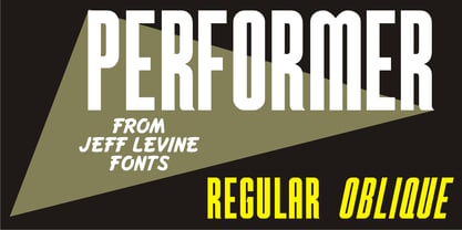
$29.00 - Italian Gothic by Celebrity Fontz,
$24.99The Italian Gothic font is a full set of decorative initials inspired by 16th-century Italian Calligrapher Giovanni Battista Palatino, containing beautiful loops, flourshes, and parallel calligraphic strokes. This lovely calligraphic font includes one set of A-Z ornamental initials conveniently assigned to both the upper- and lower-case alphabet characters, as well as many foreign language accented characters. It is ideal for starting off the beginning of paragraphs in artistic publications, storybooks, fairy tales, religious publications, and any written work conveying the calligraphic style of the 1500s. - Alice by Mirror Types,
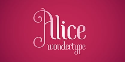
$25.00Alice is a formal fantasy font. It’s inspired in the fairy tales and magical lands that my mother used to tell me as a child when I went to sleep. The capitals are really nice and complex, while the minuscules are cleaner for easier reading. The style Curly uses some features of the normal uppercase letters in the lowercase ones. There are some minor, yet noticable, flaws in a number of characters that will need correction for signage/vinyl letter cuts (characters appx. 2-1/2" and larger). - Faber Sans Pro by Ingo,
$42.00A classic-modern sans serif appearing in two forms — ”standard“ and a ”stylistic alternate“ with uncial script-orientated characters which give the font a completely different ”look.“ Faber Sans is a sans serif in the classic-modern style of type creations of the early 20th century — godfathered by Futura from Paul Renner and Gill Sans from Eric Gill. Unlike classic sans serifs, Faber Sans includes a ”true“ italic. Faber Sans Pro will perfectly pair with the accompnying Roman Faber Serif Pro. - Messcara by SparkyType,
$19.00Drawn very small with a brush-tipped felt pen, Messcara has qualities of freedom, toughness, with a few girly loops thrown in for good measure. A true handwriting workhorse. - Bronwen by Hanoded,
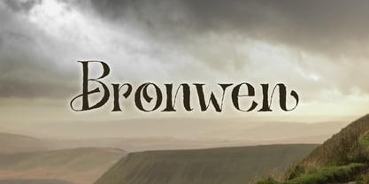
$15.00In Welsh mythology, Bronwen was the daughter of Llyr, the god of the sea. It is a popular girls name in Wales and it apparently means "white breast" or "pure heart". I really like this name and I think it fits the font. Bronwen is a fantasy font with a bit of roughness to it. It comes with some curly swashes and a handful of alternates. Use it for your books, cards and products! - Cartoon Nouveau JNL by Jeff Levine,
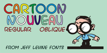
$29.00Most of the lettering on a piece of sheet music for a song from the 1921 George M. Cohan musical comedy entitled “The O’Brien Girl” was hand lettered in a playful, casual Art Nouveau design with rounded ends. The characters on that page took on a look reminiscent of cartoon or comic strip wording, and the result is a digital typeface named Cartoon Nouveau JNL, which is available in both regular and oblique versions. - Mile High by Letters by Wordsworth,
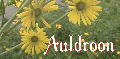
$29.00 - Auldroon by Ingrimayne Type,
$12.00Auldroon was inspired by the pseudo-medieval fonts that were fairly popular in the late 19th century. Auldroon comes in two variants. Auldroon-Eld was designed first and is a bit more compact than the regular version. Both are decorative and distinctive and neither was created with a specific use in mind. - Bylum by Adam B. Ford,
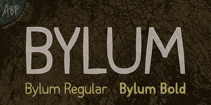
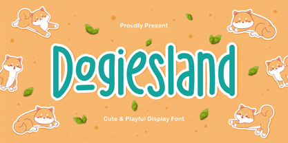
$16.00 - Dogiesland by Fype Co,
$14.00Dogiesland! A cute and playful display font was created to bring a playful and little bit infantile feeling to any design. cute clean letters look simple and modern. All node was cleaned in fairly natural shape. Its friendly feel makes this font incredibly versatile, fitting a wide range of kids' design projects. - Creepy Crawly by Comicraft,
$19.00There are worms in the earth, hairy bugs under the bed and strange bloodshot eyeballs peering at you from out of the closet. Lilou's Creepy Crawly font is perfect for scaring away Trick-or-Treaters, just install our font and print out your signs with the legend: WE EAT LITTLE CHILDREN HERE! - Pink - Unknown license
- 1470Jenson - Personal use only
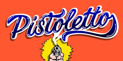
- Pistoletto by Etewut,
$22.00Introducing Pistoletto script. I was inspired by works of Roy Lichtenstein and Michelangelo Pistoletto. There are 4 fonts that in different combinations make interesting results: Background, Black, Highlight, Regular. Each style supports European languages. Basic latin has uppercase alternates, two lowercase alternates, many ligatures and swashes. I used for display pictures following works of Roy Lichtenstein: Pistol (1964), Engagement Ring (1961), Oh, Jeff...I Love You, Too...But... (1964), Seductive Girl, Yellow Brushstroke I (1965), Brushstroke (1965). - PharmaCare - Unknown license
- Skie by Adam Ladd,
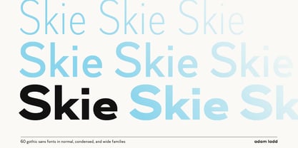
$25.00Skie is a simple gothic sans serif with normal, condensed, and wide widths. Its distinguishing characteristics are the small x-height with tall ascenders and a minimal amount of contrast, while the apertures are semi-open to help in readability. The simple design keeps the appearance fairly neutral and presents a blend of modern and vintage qualities. - Lion and Hare by Rook Supply,
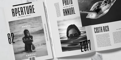
$14.00Lion & Hare is an ultra compressed, tall font family that portrays strength and power. The condensed characters maintain fairly square edges to give a more consistent geometric & industrial look to the font. The font family supports 27 languages and comes in 6 styles. Lion and Hare works fantastic for website headers, magazine layouts, logos, branding and much more. - 1492_Quadrata_lim - Unknown license
- Spring Fashion JNL by Jeff Levine,
$29.00Spring Fashion JNL was modeled after an example of hand lettering from an old book displayed on an online auction. Rendered in lower case only with basic punctuation, this type design was made specifically for headlines. Its light, airy personality adds charm to simple ad copy or titles. - Raleigh by Linotype,
$29.99The Raleigh typestyle is based on Carl Dair's original 1967, Cartier typeface. which was designed for the Canadian Centennial and the 1967 Montreal World's Fair. It was renamed Raleigh after Dair's death. Adrian Williams added three weights for a display series, and Robert Norton designed the text version. - Intense Eve by PizzaDude.dk,
$20.00Intense Eve is a crunchy, girly font with jumpy letters. Romantic indeed, and comes with extra heart swashes to jazz up your text! You will need to use OpenType supporting applications to use the autoligatures - Maryland JNL by Jeff Levine,
$29.00The 1913 sheet music for "There's A Girl in the Heart of Maryland (with a Heart That Belongs to Me)" may have had no shortage of words in the title - fifteen to be exact, but it also offered some nice hand lettering in the Art Nouveau style. Maryland JNL is a condensed typeface with an unusual twist. The "S" and "G" both have spurs on them, which is reminiscent of the preceding Victorian period and the popular spurred Tuscan alphabets of the time. - Diva Doodles by Outside the Line,
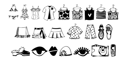
$19.00Diva Doodles is a picture font from Outside the Line. It has 40 little icons... of girl things such as lipstick, nail polish, perfume, shoes, hats, camera, phone, iPod, purses, shirts, skirts and a pair of PJs. If you liked the font Doodles, Doodles Too, Holiday Doodles or Holiday Doodles Too you should love Diva Doodles as it is more of the same style. It can be found in the book "Indie Fonts 3, a Compendium of Digital Type from Independent Foundries". - Tiamaria by Galapagos,
$39.00In the 70's I went out with a girl whose father was a card-carrying member of 3 of the biggest unions in the printing arts. He gave me 2 things, a pre-war Linotype specimen book and an ancient 'how to' lettering book that contained 30 or 40 script specimens from lettering artists of the time. Tiamaria is the developed glyphs of one of these specimens. Tiamaria is the name of one of the islands in the Galapagos chain. - Eloisa by StuArt,
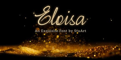
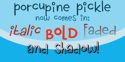
$9.00Eloisa is based on the penmanship of Andrea Stuart's eponymous aunt. The slow, meticulous strokes with which Eloisa writes is the result of formal (and meticulous) instruction in cursive writing back in her secondary education in an exclusive all-girls school. The interesting mix of smooth curves and sharp strokes combined with the slanted orientation make for an elegant yet dynamic visual appeal. Eloisa is perfect for branding, invitations, greetings, or any classy rendering of text you may imagine. Be classy! - Porcupine Pickle by Hanoded,
$20.00 - Picture this: If fonts were a party, Crushed Out Girl would be the one that arrived on a vintage Vespa, wearing a polka-dot dress and oversized sunglasses, effortlessly becoming the life of the party...
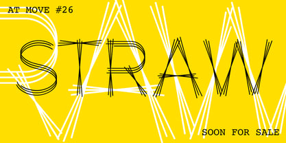
- AT Move Straw by André Toet Design,
$39.95STRAW The inspiration for this capital alphabet came from those beautiful haystacks you see in summer and the old fashioned Mikado game! We wanted to create a light, fragile and airy typeface with an optical effect. And here it is ... it’s just STRAW ! Concept/Art Direction/Design: André Toet © 2017 - Highlight by ITC,
$29.99Highlight is the work of British lettering designer Tony Watson, an airy, three-dimensional typeface based on a refined brush stroke style. Capitals can be used alone or in combination with the complementing lowercase and letters should be spaced closely. Highlight is ideal when a restrained, informal look is required.

