10,000 search results
(0.025 seconds)
- VTC Tribal - 100% free

- Fudd - Unknown license

- Bulka - Unknown license

- Refrigeration - Unknown license

- ! Jamiroquai ! - Unknown license

- Psycnosis - Unknown license

- Degrading Morals - Unknown license

- Office Typewriter by Ana's Fonts,
$16.00 Office Typewriter SVG font is a monospaced typewriter font in two styles: Regular and Underlined, and two weights: Regular and Bold. It is a SVG font in which each glyph is an image (instead of a vector). This means the typewriter texture could be captured in an extremely realistic way. In addition, each glyph has 3 variations that appear "randomly" via contextual alternates. This makes it versatile and fun to use in modern and vintage designs alike. This font is also very legible at a wide range of sizes (although it looks better at small and medium sizes, as the image can become blurry at larger font sizes), and looks great in both long or short texts, in digital collages, branding and packaging, social media posts, logotypes, etc. The Office Typewriter SVG font family includes: Office Typewriter font, in Regular and Bold weights Office Typewriter Underline, in Regular and Bold Office Typewriter Misprints, with assorted misprints, doodles, circles and underlines Software requirements for the SVG font: Photoshop CC2017+ // Illustrator CC2018+
 - Cervo Neue by Typoforge Studio,
$29.00 Cervo Neue is the new perfected and extended version of Cervo, containing 18 variants. It differs from the previous version with the higher accents over glyphs, enlarged punctuation, old-style numerals and the newly added varieties Semi Bold, Bold, Extra Bold and Black. Additionally, there is the variety of grotesque. Font Cervo is inspired by a “You And Me Monthly” published by National Magazines Publisher RSW „Prasa” that appeared from Mai 1960 till December 1973 in Poland.
 - Randu Sans by Yukita Creative,
$14.00 Randu Sans Serif Display Font Family is a sleek, modern font family with an elegant typography style. Created with clarity and boldness in mind, this font offers a variety of bold and italic styles, providing flexibility in its use. Whether used for titles, headings, or poster designs, the Candied Sans Serif Display Font Family provides the clarity and appeal needed to hold an audience's attention.
 - Hooptie Script by FDI,
$25.00 Two typefaces inspired by the car lettering of the Motor City. In contrast to other car script fonts, the Hooptie Script fonts make full use of modern OpenType technology. Just turn on contextual alternates and ligatures and watch how each letter pair always connects perfectly. The full package includes seven bonus vector images of vectorized hooptie cars. Check out the type specimen for more details.
 - ClerestorySSK - Unknown license

- Walk Da Walk One - Personal use only

- Buckle by Wilton Foundry,
$29.00Keep up that great western tradition with Buckle Bold! Buckle was created to be a contemporary twist to old "cowboy" fonts. It is bold while retaining a narrow width. When reduced down, it has a slightly worn look caused by the reduced double diamonds inside the capitals - which does not look out of place at all. - Roncial by Fontron,
$35.00Roncial is an Ultra Bold font with a hint of serif. This is one of the fonts originally designed before the advent of digital and started out being a bolder, slightly serifed version of Folio Extra Bold which was one of the boldest fonts at the time (old metal set). It is available as Roman and Italic. - Apparata by Xavier Lanau,
$50.00 Apparata is a versatile display and text typeface suitable for identities or magazines. With a rounded finish, some characters have a combination of diagonal and curve strokes. Currently includes 4 styles: Light, Light Italic, Bold and Bold Italic. With more than 700 glyphs in each font, smallcaps, tabular and old style figures, fractions, ligatures, punctuation and symbols.
 - Teorema Sans by FSdesign-Salmina,
$39.00 Teorema. Well balanced Reading. Looking for a geometric yet flexible character? Teorema typeface combines different geometric shapes, according to a pragmatic approach that favors flexibility and ease of use. The font is distinguished by the contrast between perfectly circular shapes, and other, more angular ones in search of a formal balance aimed at optimizing the recognizability of the characters and finally the legibility of the text. Worthy of a geometric “theorem”? Try Teorema for free. Download a free version of Teorema Regular and Bold with a reduced character set. Check it out!
 - Magendfret by sugargliderz,
$24.00 Magendfret is a typeface that was designed very mechanically. However, it is also the optimal typeface for expressing soft warmth. Magendfret was designed by constructing a "line." That is: it is based on the concept "it is the combination of a straight line and a curve with a character." I made the character from the act of using and constructing a vector graphics editor, a mouse, and a keyboard. That, I thought when constructing it, should make neither a roman type nor italic type into a novel form, and a very general form. Once those characters were bit-map-ized, they traced again mechanically by the vector graphics editor. It became a soft impression by this work. The very mechanical act of changing the thickness of a line uniformly constitutes the family. The thickness of seven patterns was created first and, finally it results in four patterns. Respectively, styles called Light, Regular, Medium, and Bold are attached as usual. The name Magendfret is meaningless. It is an anagram of a certain words selected very arbitrarily.
 - Mandrel by insigne,
$39.99 From the realm of insigne, a new family has risen. By name, Mandrel. Courtly in character and elegant in appearance, the face finds great favor among those with whom it seeks audience. With confident air, Mandrel carries itself gracefully before each pair of eyes, never faltering or stumbling in its refined step. But while dressed with gentility, this elegant family is not faint of heart when challenged. Crafted well for high-impact resistance, Mandrel steps boldly and prominently into the arena of the reader’s eye, boasting its tall x-heights, high contrast, confident bends, and sharp serifs. Skillfully, it wields its sharp serif endings, cutting swiftly through opponents’ crude clutter, which fights for the reader’s attention. From Thin to Black, nine weights and their matching italics make up this noble family. Mandrel furthermore includes an abundant treasury of OpenType variables to adorn your text. Ligatures, old-style figures, and stylistic sets are available to accompany the family’s 500 glyphs and its support for more than 70 languages. Raise your cup to this new Mandrel! With strong serifs and high contrast, you’ll find this champion ready to take up your challenge in many a test ahead.
 - Metro New Two by JAB'M,
$15.00The main inspiration is from Art Nouveau which flourished in Europe at the end of the 19th and beginning of the 20th centuries. This design included furniture (Majorelle, Lalique) and architecture (Victor Horta, Henry Van de Velde, Gaudi, Alfons Mucha). But Hector Guimard remains the favorite for all aspects of its art and, of course, its typefaces used on the Parisian Metropolitan posters. In particular, the various kerning of the various letters he used to make the poster a whole design from singular designs, leading to numerous variations. As a designer, I initially worked a first version, called Metro New One, which is more geometric and traditional. This design "Two" has more flexible shapes and long vertical hooks. It can be used to enhance specific parts in letters and books in the context of Art, specially Art Nouveau and Art Deco of course, posters of any kind. - Rotation by Linotype,
$29.99After the Second World War, the Ionic style replaced Modern Face as the favored typeface for newsprint. A couple decades later, it was in turn replaced by the next generation of newspaper fonts, a mix of Old Face, Transitional and Modern Face forms. Rotation was designed by Arthur Ritzel and presented by Stempel/Linotype in 1971 and named for the rotation newsprint machine for which is was particularly suited. The font displays the influence of Old Face design and gives newsprint a feeling of lightness and elegance. - Clarenwood JNL by Jeff Levine,
$29.00 Based on some examples of a Clarendon-inspired wood type design, Clarenwood JNL is a bold and effective titling font which harkens back to old times and advertising on a grander scale.
 - Striptease JNL by Jeff Levine,
$29.00 Striptease JNL is the bold, brash, "your-name-in-lights" companion to Showgirl JNL, and was inspired by a scene in an old television show depicting a burlesque house of the 1930s.
 - McGarey - Unknown license

- Harsh language AC - Unknown license

- Greek House Fathouse - Unknown license

- LeKing by Misprinted Type,
$39.00 LeKing is a Frankenstein of vintage ornamental typefaces of the past centuries. Each character is a collage of different bits of different letters. The font has the classic elegant feel of the old ornamental typefaces, combined with a modern and edgy feel. It has 2 uppercase variations, so you can mix letters without repeating them or find the exact type that suits your needs. Le King also comes with an EPS file with 24 vector ornaments! Enjoy!
 - Merisk by Imoodev,
$20.00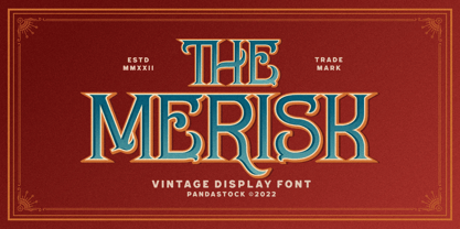 Merisk is old fonts with visual elegance, smooth curves, and beautiful ligatures clear, making your work look true and attractive. A very versatile font that works in both large and small sizes. This font is suitable for a wide variety of projects such as invitations, logos, branding, magazine, photography, card, product packaging, mugs, quotes, poster, labels, signatures, and more. Font which is perfect for all business sectors including personal projects, studio, corporate, creative agency, industrial, company, etc.
 - Buum by Ondrej Chory,
$70.00 The Buum typeface evolved from the explosive lettering originally designed as part of a house style for an interactive science centre for kids. Beside its usual application as a strong display font in print and on screen, the bold angular shapes of glyphs are adapted for negative machine- or laser-cutting into structural materials such as iron sheets, plywood, or stone ... and for creating tactile expressive surfaces and 3D objects. This pictogrammic and dazzling font remotely echoes the morphology of the lettering of futurism and constructivism, when avant-garde typography was once an exciting adventure. It is a lettering building kit with a number of stylistic alternatives of glyphs that enable a user to shape the same word differently each time. Buum is recommended by nine out of ten old school futurists, favored by steampunk CNC operators and respected by the majority of infantile anarchists.
 - Fimfarum by Juraj Chrastina,
$39.00 Fimfarum is a word that the Czech actor and writer Jan Werich created for one of his magical fairy tales for children and adults. Fimfarum is also the name of this playful typeface equipped with various styles simulating the randomness of handwriting. You can choose to select and combine different styles either using an all-in-one pro font in an OpenType-savvy application, or with a 10 fonts family pack. Fimfarum Pro also offers an automatic random effect. The OpenType contextual alternates feature can randomly mix narrow, wide and bold characters. You can specify how through various stylistic sets. For more details, check the Fimfarum Typeface Manual. With this versatile tool your designing possibilities are immense. Well, this is Fimfarum. You can download the instruction PDF here.
 - Walking Broadway by IKIIKOWRK,
$17.00 Introducing Walking Broadway - Bold Type, created by ikiiko. Walking Broadway is a serif bold type, that inspired by typography from a vintage movie & newspaper at that era. This typeface is designed to give a formal yet old style look. Walking Broadway has a distinctive bold to light contrast shape. A style commonly used in movie, magazines, and signage in that era. This typeface is perfect for an formal layout, old movie poster, newspaper, magazine cover, and also good for vintage product, food & beverages, quotes, or simply as a stylish text overlay to any background image. What's included? Uppercase & Lowercase Number & Punctuation Alternates & Swashes Multilingual Support Works on PC & Mac Enjoy our font and if you have any questions, you can contact us by email : ikiikowrk@gmail.com
 - Tribal Tattoos III by Otto Maurer,
$18.00 Tribal Tattoos comes from the German tattoo artist Otto Maurer. This clean vector Tribal art is best for making good plott or printed art.
 - Brogado JNL by Jeff Levine,
$29.00Make room for Brogado JNL! This bold, yet squat slab serif font takes command when set into headlines. Although not thoroughly in the Western mold, Brogado JNL can still exude enough macho appeal to make its point strongly, yet clearly. - Mortice by ArtyType,
$24.00 I set out to create a solid, bold, strong, rugged font, one that would lend itself to any industrial type of use, and by that I mean industry in general, but probably sectors that would still be considered male preserves such as carpentry or metalwork. I thought specifically of mortice & tenon joints, whilst toying with shape and form for this self imposed challenge. I was also visualizing a router tool used for producing most wood joints nowadays. I think the general premise worked out well; in the end I settled on the name Mortice, referring to the slots or negative spaces that the matching part, or tenon would fit into.
 - Salvation by Device,
$39.00 Rough and ready, bold and urgent. Or playful and fun in bright colours. The original letters were cut from actual potatoes, then scanned in and converted to vector outlines. Lighter and more heavily inked versions were used for the three variants. Using Opentype character-substitution technology, Salvation rotates through three versions of each letter to create a naturally uneven printed effect. Unlike hot metal type, the potatoes were cut the right way around. This produced reversed prints, which were then flipped back in Photoshop. Originally produced for Hughes' Get Lettering activity book, the font was then extended to cover numbers, punctuation and full European language support.
 - Peckham Press by EllenLuff,
$28.00 Peckham Press is a bold hand-pressed typefamily, with a raw aesthetic and solid industrial style. The font brings a spirit of street culture, with its defiant shapes, rough edges and unadulterated imperfections. It works best in strong design, and situations that require an authentic voice. This font is handmade and includes full original texture with density variants and original nicks and grit, with access options to suit different needs. The vector format allows the textured affect show up on any program, no additional software or updates required.Peckham Press supports a wide range of latin languages and paired with it's diverse flexibility allows it to handle projects of any size.
 - Johnstemp by Linotype,
$29.99As a spinoff to his Tagesstempel™ design, Georg John created Johnstemp™ in 2008. The Johnstemp family has four weights, as well as a special Mix" variant. Each of the basic fonts (Light, Medium, Bold, and Heavy) contain many alternate glyphs, allowing users to set text that realistically simulates stamped impressions. For even faster design, Johnstemp Mix is the perfect choice; it contains letters with far more stylistic and weight variation out-of-the-box, and was developed to create even livelier impressions. Here as well, many alternates are included in the character set to prevent too much repetition of the same glyphs. " - Dream Miracless by Zeenesia Studio,
$12.00 Introducing Dream Miracless Font Dream Miracless is a Monoline Lettering Font. Its came with three weight, Thin, Regular, and Bold. Dream Miracless is perfect for product packaging, branding project, megazine, social media, wedding, or just used to express words above the background. What’s Included : - Standard glyphs - Multilingual - Web Font - Works on PC & Mac Simple installations Accessible in the Adobe Illustrator, Adobe Photoshop, Adobe InDesign, even work on Microsoft Word. PUA Encoded Characters – Fully accessible without additional design software. Fonts include multilingual support Image used : All photographs/pictures/vector used in the preview are not included, they are intended for illustration purpose only. Cheers! Thank You
 - Auriol by Linotype,
$29.99Auriol and Auriol Flowers were designed by Georges Auriol, born Jean Georges Huyot, in the early 20th century. Auriol was a French graphic artist whose work exemplified the art nouveau style of Paris in the late 19th and early 20th centuries. In 1900, Georges Peignot asked Auriol to design fonts for Peignot & Sons. The resulting Auriol font was the basis for the lettering used by Hector Guimard for the entrance signs to the Paris Metro. It was re-released by Deberny & Peignot in 1979 with a new bold face, designed by Matthew Carter. These decorative fonts with a brush stroke look are well-suited to display settings. - Tracking by Sensatype Studio,
$15.00 Faster Racing Modern Logo Font is a Modern Logo Racing Font that Modern, Racing and unique characters are ready for Race event, that you can combine to get any variations and unique shapes easily just in seconds with great characters. What's Included: FASTER (Regular & Italic) Character set A-Z All Uppercase Numerals & Punctuation Accented Characters (West Europe) Works on PC & Mac Recommended using Adobe Illustrator or Adobe Photoshop. Wish you enjoy our font. :)


