4,232 search results (0.055 seconds)
  1. Vtks Sonho - 100% free
  2. Bastardilla - Personal use only
  3. Mayonaise - Personal use only
  4. Belta Regular - Personal use only
  5. Fh_Obscene - Personal use only
  6. Andrew Ward - 100% free
  7. peach sundress ~ - Unknown license
  8. Volga - Personal use only
  9. !Sketchy Times - Unknown license
  10. 3Dumb - 100% free
  11. Punkstoric - Personal use only
  12. stiff neck - Personal use only
  13. Grenouille - Personal use only
  14. Milkmoustachio - 100% free
  15. Iloveyou - Unknown license
  16. Umberette - 100% free
  17. Gaitera Ball - Personal use only
  18. Adry of Hanabi - Personal use only
  19. bearerFond - Personal use only
  20. Radium J - Unknown license
  21. Skinner AOE - Unknown license
  22. Savia Regular - Personal use only
  23. andregestauchtbold - Unknown license
  24. Geefium Serif - Personal use only
  25. To forgive - Unknown license
  26. OPN Malatashito - Unknown license
  27. Tweedy_Erc_01 - Unknown license
  28. Quickie - 100% free
  29. 6th Aniversario - Personal use only
  30. Fh_Ugly - Personal use only
  31. TETARIA - Unknown license
  32. Uneasy - Unknown license
  33. Fannys Treehouse - Unknown license
  34. Shredder - Unknown license
  35. Midnightman - Personal use only
  36. Angelica Personal Use - Personal use only
  37. Sincerely by Canada Type, $24.95
    Whether with pen on paper, or in digital, realistically connecting vertical handwriting is never an easy task to accomplish. After working with many handwriting fonts, and after intently dissecting so many different handwritings, one tends to expect such things to be quirky, disconnected, and almost never upright. In fact, in spite of vertical handwriting’s academically-sung virtues of rationality, efficiency, clarity and logic, very few people manage to deviate from the natural slant when writing. Even fewer manage to make the vertical handwriting connect and keep its natural flow. Calligraphy and upright cursive aside, it is almost impossible to make a vertical letters connect and maintain a real handwriting appearance. This is where the genius of this design comes in to bridge the gap between upright handwriting and calligraphy. Sincerely is based on one of the most fascinating handwriting designs to ever come out of Germany: Karlgeorg Hoefer’s 1968 Elegance for the Ludwig & Mayer foundry. It is a handwriting with the full meaning of the word, yet it possesses the rare, very commanding and appealing trait of being both vertical and connected while managing to remain realistic. It is the ultimate branding iron of handwriting fonts. When set and printed, Sincerely simply cannot be ignored. Ideal for humanity-asserting poster designs, lettering of short wording with plenty of space, poetry, notes, greeting cards, craft literature, book covers, history-related designs, and a whole range of other applications.
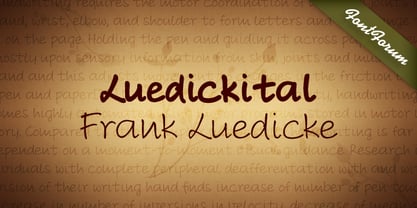
  38. Luedickital by URW Type Foundry, $39.99
    Lüdickital is a handwriting script design. Lüdicke wasn´t satisfied with existing scripts which he though of too stylish and uneven. He simply digitized his own handwriting and developed a regular and a bold.
  39. KG Beneath Your Beautiful by Kimberly Geswein, $5.00
    Quirky teen unicase handwriting with personality.
Looking for more fonts? Check out our New, Sans, Script, Handwriting fonts or Categories
abstract fontscontact usprivacy policyweb font generator
Processing