1,074 search results
(0.018 seconds)
- Toffee Display by Vástago Studio,
$20.00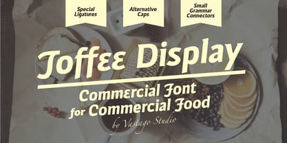 Toffee Display is a sans serif project inspired on Gill sans, Helvetica and Eurotstile italics. This project is designed for food packaging, candies, commercial, and fast food. I recommend combining it with a light and calligraphy font to get absolute contrast. That is it, Thanks for buy it and work with it!
 - Astronaut - Personal use only

- Zeppelin 2 - Unknown license

- PAss the CheX - Unknown license

- Idealist Sans - 100% free

- Love Letters - Personal use only

- spanky 20 second version - Unknown license

- Remington - Unknown license

- Blandford Woodland NF by Nick's Fonts,
$10.00The chapbook Pen & Brush Lettering and Practical Alphabets, published by Blandford Press, Ltd., London, in 1929 averred that these letterforms suggested a lightface version of Neuland. And so they do, with the added bonus that this typeface, unlike its inspiration, includes lowercase characters. - Portsilk by Maulana Creative,
$12.00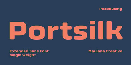 Portsilk is wide clean round sans display font, inspired by legendary Eurostile. Bold stroke, fun character with a bit of ligatures and alternates. To give you an extra creative work. Portsilk font support multilingual more than 100+ language. This font is good for logo design, Social media, Movie Titles, Books Titles, a short text even a long text letter and good for your secondary text font with script or serif. Make a stunning work with Portsilk font. Cheers, Maulana Creative
 - Eskander Arabic by Protype,
$40.00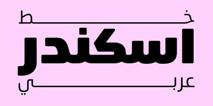 Eskander the first version designed at 2018, and re-designed at 2021. Eskander is Arabic typeface with rounded edges and friendly. For web, digital applications and prints, supported languages (Arabic, Persian and Urdu). Eskander is a trademark of Protype Foundry Ltd, Design by Ibrahim Hamdi.
 - Trailer Park Numerals by Coniglio Type,
$9.95Trailerpark numbers 0-9 were rather old fashioned 1950's cut aluminum numbers, you've seen digitized nowhere else but here! Part of Market LTD, a collection of limited faces, mostly alpha-numeric and some just plain numeric, used primarily in retail and display situations and titling. - Snooty Fox NF by Nick's Fonts,
$10.00This casually elegant typeface is based on an unnamed offering from Pen & Brush Lettering and Practical Alphabets, published by Blandford Press, Ltd., London, in 1929. Good taste dictates that, because of the ornate and unusual letterforms of the uppercase letters, the font never be used as all caps. - Cubenzis by Illuminaut Designs,
$12.00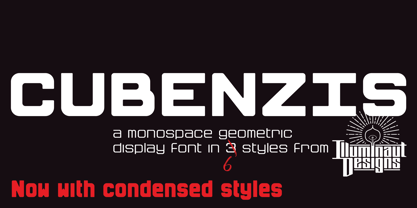 Attempting to marry the warm friendliness of the Cubano typeface with the versatility, functionality, and geometry of Eurostile has resulted in Cubenzis. After finishing the regular weight, I realized that it reminded me of old Soviet military hardware, something you might see on the outside of a tank or rocket, so i made the decision to include a full Cyrillic alphabet as well. It feels very sci-fi to me and i can imagine it being used as signage on a ship or as a warning label on machinery.
 - Frio by Lamatas un Slazdi,
$28.00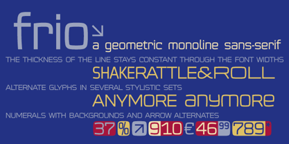 Frio is a geometric monoline sans-serif typeface consisting of 15 styles: 5 weights and 3 widths plus italics. Clean, neutral and technical, Frio was inspired by the form of super ellipse and Eurostile by Aldo Novarese. The font contains stylistic and contextual alternates, ligatures, discretional ligatures for use in German, ornaments and other OpenType features. It supports all the European languages using Latin alphabets. The main thing that sets it apart from the other typefaces is a possibility of using simple typing combined with stylistic sets to add colored backgrounds to numerals.
 - Magistral by ParaType,
$30.00The first three weights of the family were designed at ParaType (ParaGraph) in 1997 by Dmitry Kirsanov . They were based on the artworks of Moscow graphic designer Andrey Kryukov (1923-1997). The original version was developed by Kryukov at the end of the sixties for Russian railways. The proportions and elements of construction were inspired by Eurostile (1962) by Aldo Novarese. It is intended for use in advertising and display typography. In 2009, Dmitry added the new styles, corrected the old ones, and enhanced them with extended character sets. - Ponzastura by Matyáš Bartoň,
$39.99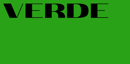 Ponzastura typeface was inspired by Aldo Novarese's Eurostile, but in this case, monolinear strokes took on contrast and stress. The classical appearance of Ponzastura, whose name is inspired by the Italian city Pontestura where A. Novarese was born, is more of a reaction and interplay. The character set supports most European languages and contains ligatures as well as symbols, figures and alternative characters. Its strength is in a simplicity and format; recommended for use in headlines or short sentences. Ponzastura typeface can fill in a gap of high-contrasted fonts of nowadays.
 - Dited - 100% free

- KleinsAmazon - 100% free

- Geom Graphic by Dharma Type,
$19.99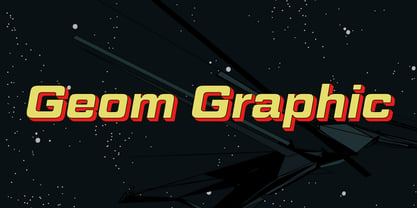 Inspired by Japanese robot animations in 80s such like Gundam and Ideon, Geom Graphic is a square geometric sans serif for wide range of usage. The family give an impression similar to Eurostile but is more squared and geometric. The letterforms of Geom Graphic are designed slightly rounded to appear natural, warm and retro. This family consisting of 4 weights with matching Italics. The wide range of languages is designed targeting use for futuristic product of game, movie, logo and so on. We released 4 big Sci-Fi families in 2013. Check it out! Clonoid Controller Geom Graphic Space Colony
 - KAH by MADType,
$21.00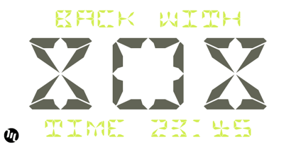 KAH is a font which is based on a strict LCD-style grid. KAH is perfect for mocking up LCD screens or to create a technological/futuristic aesthetic in your design.
 - Keynote Speaker NF by Nick's Fonts,
$10.00This curious little gem is patterned after a typeface named "Bloomsbury", released by P. M. Shanks & Sons, Ltd. of London in the 1920s. Its gentle curves and somewhat quirky construction combine to create a warm and friendly, if slightly offbeat, antique charm. Both versions of the font include 1252 Latin, 1250 CE (with localization for Romanian and Moldovan). - Watchmaker by Ingrimayne Type,
$5.95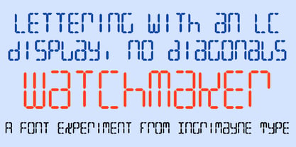 Watchmaker was designed with the limitations imposed by a simple LCD that is meant only to display numbers. Most LCD typefaces use some diagonals to make the letters look better. This one does not and from it you can see why a few diagonals are needed to display letters on a LCD. Watchmaker is monospaced and comes in plain and bold weights.
 - INDG Actio by Iñigo Uriarte,
$5.00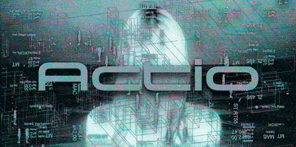 INDG Actio is the result of a several years long exploration. In it, a minimum amount of shapes are assembled into an alphabet of sci-fi feel. It is my personal Eurostil. Inspired by hope of a brighter future, INDG Actio is a great fit for spatial fantasy material, music gear interfaces or forward-looking tech ventures, as an example. Though designed mainly to be a display font for titles, short texts and logos, it is versatile. Have fun with it and adapt it to the specific needs you may have. INDG Actio is a family consisting of 5 weights of 208 glyphs each, including 12 stylistic alternates.
 - Magnitudes Variable by DuoType,
$90.00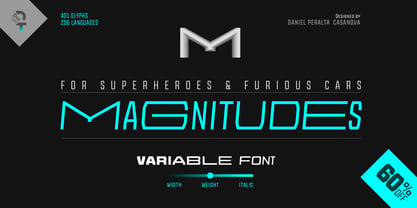 Magnitude is a font inspired by classics like Eurostyle and Bank Gothic, with geometric characteristics and dynamics style. Designed to be used in a wide variety of applications such as advertising, corporate projects, branding and retail product design. The font is well-suited for headings, display use and short text. The Magnitudes family is available in 36 weights, ranging from light to heavy, to condensed and expanded with matching italics. The font contains a character set of 401 characters supporting 206 different languages.
 - Yardbird Numerals by Coniglio Type,
$9.95Yardbird, insinuating prison numerals, was lifted from a wooden block print poster press, that would have indeed besides providing dates for the local carnival would have just as easily ink-chucked them over the backs of those denim blues. Part of Market LTD, a collection of limited faces, mostly alpha-numeric and some just plain numeric, used primarily in retail and display situations and titling. - Italienne by Linotype,
$29.99Inspired by the large American wood type of the Wild West, Richard Yeend created Italienne Std in 2002. Italienne Std is both very condensed and very decorative. It sports heavy, band like serifs, reminiscent of other italienne-style fonts, like Westside. Italienne-style fonts rose in popularity during the early 19th Century, when designers were first beginning to experiment with extreme contrast within letterforms, and across lines of text. Interestingly enough, letterforms with similar designs were just as common during the 1970s as during the 1870s, so you may use Italienne Std for applications ranging from country music concerts to disco parties. Italienne Std is part of the Take Type 5 collection from Liinotype GmbH." - Magnitudes by DuoType,
$29.00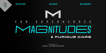 Magnitude is a font inspired by classics like Eurostyle and Bank Gothic, with geometric characteristics and dynamics style. Designed to be used in a wide variety of applications such as advertising, corporate projects, branding and retail product design. The font is well-suited for headings, display use and short text. The Magnitudes family is available in 36 weights, ranging from Extra light to heavy, to condensed and expanded with matching italics . The font contains a character set of 401 characters supporting 206 different languages.
 - Munchkin Land NF by Nick's Fonts,
$10.00This typeface bears a superficial resemblance to Belwe Extrabold, but is based on a work called Thor, issued by Frederic Wesselhoeft Ltd of London in the 1930s. The characters in this font are loosely spaced for use in attention-getting subheads, but you can tighten the tracking to get spectacular headlines, should you wish. Both versions of the font include 1252 Latin, 1250 CE (with localization for Romanian and Moldovan). - EFCO Boldfrey by Ilham Herry,
$20.00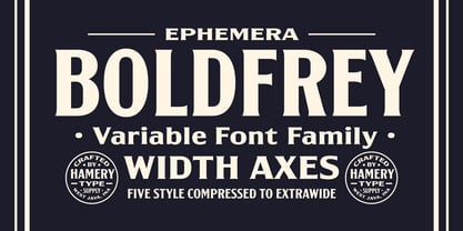 Inspired by vintage labels where there are many types of style in one design label, that's why Boldfrey came up with 6 styles, compressed to superwide for mixing and match each other for design needs. Boldfrey is also available in variable font format. Opentype features with stylistic character, lining figure, and ligature in Co. and LTD. Suitable in display needs, such as headline, logo, T-shirt, signage, poster, etc
 - Mofid Mahdi by Linotype,
$187.99Mofid Mahdi is a distinctive, bold Arabic display face, suitable for heading and titling work in Arabic newspaper and magazine composition. In this typeface the rounded internal counters and dots contrast with the angular and more robust outlines of the letterforms to give a decorative, harlequin-like appearance. The design was originally developed for use in dry-transfer format, and was first produced as a digital font by Linotype-Hell Ltd. in the early 1980s. Initially a simplified face, with its inherent limited range of letterforms, Mofid Mahdi was enhanced during the late 1980s by the introduction of medial letterforms to improve character spacing and balance. The recent advent of OpenType has led to the release of Mofid Mahdi. This OpenType font includes Latin glyphs from Memphis Extra Bold, allowing users to set text in both most Western European and Arabic languages without switching between fonts. Mofid Mahdi incorporates the Basic Latin character set and the Arabic character set, which supports Arabic, Persian, and Urdu. The font also includes tabular and proportional Arabic, Persian, and Urdu numerals, as well as a set of tabular European (Latin) numerals. - Thik by Zang-O-Fonts,
$25.00I've heard it described as "Copperplate Gothic" on LSD. It's broad, funky and dangerously pointy. - BD Schablone by Typedifferent,
$25.00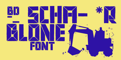 BD Schablone is a bold, human stencil with an anticipation of the digital lcd display.
 - Taca by Rúben R Dias,
$42.00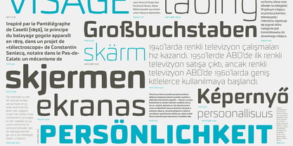 Taca is a typeface built around a shape that Portuguese designer Rúben R Dias calls a “squircle” — neither square nor circle. We usually associate the rounded, convex box with the television screens of the 1960s and Aldo Novarese’s classic typeface, Eurostile. But whereas Eurostile is cold and machined, Taca is warm and rugged, as if it was molded from clay or carved from stone. Taca’s organic nature is also derived from another unique feature: rounded crotches at the right angles where perpendicular strokes meet. This subtle finish, along with blunt stroke endings, softens the otherwise rigid skeleton. With such a strong conceptual vision, Taca could be relegated to the bin of experimental designs, severely limited in their application. But that fate is usually born of a less experienced maker. As a teacher, designer, and letterpress printer, Dias is a type user, keenly aware of the functional requirements of good type. Taca is therefore not a slave to its concept, but a working font family, effective in various sizes and environments. Its lettershapes break away from the base shape whenever it makes sense for legibility, while still maintaining the flavor of the design as a whole. That said, a set of squircle-shaped alternates give the user the flexibility to get more stylized if the situation calls for it. Fitting to its functional aims, Taca has many of the features one expects of a proper text font: upper and lowercase figures, case-sensitive punctuation, and Extended Latin language support. The simplicity, openness, and squareness of Taca’s forms also make it an ideal design for the pixel grid of screen displays.
 - Rebellion Knight Personal Use O - Personal use only

- Ned by Linotype,
$29.99Ned Std. is part of a series of typographic experiments from the young Swiss designer Michael Parson. Using a wide, horizontal hexagonal grid, Parson created the system of letters that make up this font. Text set in Ned Regular takes on a modular, honeycomb-like appearance. For an interesting effect, try overlapping individual letters, or use a few letters together as elements in a logo. A great companion face to Ned Std. is Linotype's Hexatype Bold. Both Ned Std. and Hexatype Bold have been included in the Take Type 5 collection, along with eight further constructions from Parson." - Else NPL by Linotype,
$29.99At first glance, Else may seem to be similar to many of the Century typefaces, with its prominent figures and sturdy alphabet. But when Robert Norton, of Norton Photosetting Ltd., designed Else in 1982, he added a bit of flair to that basic model. Note the bowl of the g, the splayed legs of the M, the sharply curved G and J, as well as the leading strokes of v and w and both of the graceful ampersands. - Vrångö - 100% free

- 1st Ave by Design is Culture,
$39.00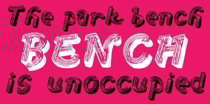 1st Ave is the most experimental of my typefaces. I took a picture of a metal and neon sign in the East Village of New York City. These signs are slowly being replaced by LED and LCD displays, but if you look hard, you can still find quite a few in the city. The signs give a mid 20th century feel to the city. To design 1st Ave, I took a picture of the sign, scanned it and increased the contrast in Photoshop so that the photographic forms became line art. There weren't enough letterforms in the sign to create the whole alphabet, so I cut up the strokes and collaged them back together to finish the entire alphabet. Important Note: 1st Ave is an experimental typeface and is not compatible with certain software such as Microsoft Word.
 - schizophrenia Queue - Unknown license



