1,074 search results (0.017 seconds)
  1. Lingonvecka - Unknown license
  2. PointerSistersSeparated - Unknown license
  3. 3x3 dots - 100% free
  4. Drid Herder Outline - Unknown license
  5. 3x3 dots - 100% free
  6. LotsOfDotz - Unknown license
  7. CYBE - Unknown license
  8. ticker - Unknown license
  9. Z001-ROM™ - Unknown license
  10. PostIndexHand2 - Unknown license
  11. BERLIN REDRAIN - Unknown license
  12. edgarpiramide - 100% free
  13. Drid Herder Italic - Personal use only
  14. 3x5 - Personal use only
  15. Digital dream Skew Narrow - Unknown license
  16. Radioland Slim - Unknown license
  17. Digital dream Fat Skew - Unknown license
  18. Alphabet_2 - Unknown license
  19. Digital dream Skew - Unknown license
  20. 32 pages - Unknown license
  21. Barf At The Supermarket - Unknown license
  22. Konector O1 BRK - Unknown license
  23. Styl=0 - Personal use only
  24. Digital dream Narrow - Unknown license
  25. Failed Attempt - Unknown license
  26. Digital dream Fat Narrow - Unknown license
  27. Citaro Zij DS - 100% free
  28. Atomic Clock Radio - Unknown license
  29. Diskoteque - Unknown license
  30. Digital Readout Condensed - Unknown license
  31. TaitDemo - Unknown license
  32. Berliner - Unknown license
  33. GhostTown - Unknown license
  34. Argonaut - Unknown license
  35. BarbedWire - Unknown license
  36. M XiangHe Hei SC Std Variable by Monotype, $1,049.99
    The M XiangHe Hei Simplified Chinese typeface merges traditional brush strokes with modern letterforms to carefully balance traditional calligraphy with humanist design. Named for the smooth movements of a flying crane, the M XiangHe Hei typeface is designed to glide across the page, and features strokes that are partly derived from the Kaishu calligraphic style – an everyday script which dates back hundreds of years. Seol Sans features Neue Frutiger for its Latin glyphs, and works harmoniously with Neue Frutiger World and Monotype’s CJK typefaces Tazugane Info (Japanese) and Seol Sans (Korean). M XiangHe Hei is a great choice for global brands using sans serif Latin typefaces looking to maintain their visual identity, and communicate with a consistent tone of voice with Simplified Chinese.
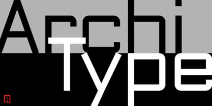
  37. ArchiType by Archiness, $10.00
    With the famous and much used Eurostile and Bank Gothic in my mind I wanted to design a mono-line font as simple and legible as possible. A square with rounded corners, i.e., the letter ‘o’ as its basis. From there on back to basics, so straights remained simple straights with 90° endings, whatever the angle. Numbers are monospaced. The result seems to be a pleasantly balanced and neutral font. Excellent for display purposes and surprisingly legible in even small sizes. This perhaps typical approach by an architect led to the name of the font: ArchiType.
  38. Thomas Paine - Unknown license
  39. Red October - Personal use only
Looking for more fonts? Check out our New, Sans, Script, Handwriting fonts or Categories
abstract fontscontact usprivacy policyweb font generator
Processing