10,000 search results
(0.026 seconds)
- Dash To School by Comicraft,
$15.00 One of the more popular pupils in the Comicraft Academy of Lettering Arts, Dash Decent, has been working on his penmanship, thanks to a grant from those lovely learning specialists at Brainzy and Education.com. Developing learning games for Pre K, K and 1st grade, Brainzy requested a font that was fun and clean to help children learn to print. Dash to School is an all new revision and expansion of the Dash Decent family and features fun bold/heavy/outline and drop shadow weights for display, guidelines and dashed lines to assist learning and understanding and a healthy dose of decency! Dash Decent has graduated 1st Grade and with Dash to School’s help, so can you! See the families related to Dash To School: Dash Decent Features: Nine fonts (Regular, Bold, Heavy, Outline, Shadow, Guides, GuidesDashed & GuidesSolid) with upper and lowercase alphabets.
 - Dream to Berich by Zeenesia Studio,
$19.00 Dream To Berich is a Bold vintage style serif font with strong character and soft features. modern and classic serif font with a clear and bold look. It’s a very versatile font that works great in large. Its comes with two style regular and italic / slant, Dream To Berich was built with openType features, stylistic Alternate and Ligature makes your project will be awesome!! Perfect for editorial projects, Logo design, web font, clothing branding, product packaging, magazine headers, or simply as a stylish text overlay to any background image.
 - Zero To Hero by Olivetype,
$18.00 Zero To Hero is a bold handwritten font, carefully handcrafted to become a true favorite. Its casual charm makes it appear wonderfully down-to-earth, readable, and ultimately, incredibly versatile. Zero To Hero will look outstanding in any context, whether it’s being used on busy backgrounds or as a standalone headline! This font is supporting Multi-Languages, which includes: Afrikaans Albanian Catalan Danish Dutch English Estonian Finnish French German Italian Norwegian Portuguese Spanish Swedish Zulu. You will get : Zero To Hero OTF Thank you
 - Time To Play by Vozzy,
$10.00 Introducing vintage label font named Time To Play. This font has a wide languages support with west european and cyrillic characters (check out all available characters on previews). The font family has four styles: Base, Grunge, Volume and Texture. All styles have the same metrics and kerning. This font will look good on any vintage styled designs like a poster, T-shirt, label, logo, etc.
 - Dot To Dot by A New Machine,
$9.00 This font is for parents and educators that want to easily be able to print out the alphabet in order to have their child or student then trace them. This eliminates the need for creating the dotted lines by hand and lets the user type out exactly what letters they need instead of relying on pre-made charts. The font is upper and lowercase letters and numbers only - no punctuation. Comes in Regular and Guides (get both for the same price as one) which draws guidelines with the letters. Best when used at a large point size.
 - Aspire to Inspire by Tlatous Type,
$19.00 Introducing Aspire to Inspire Font by Tlatoustype Aspire to Inspire is a cursive display Font. This font is perfect for book cover, product packaging, branding project, megazine, social media, wedding, or just used to express words above the background.This font includes TTF and OTF, This font also multilingual support.
 - Race To Space by Vozzy,
$10.00 Introducing a vintage look label font named Race To Space. All available characters you can see at the screenshot. This font have 7 styles - Regular, Shadow, Texture, Shadow FX, Texture FX, Full and Aged. This funny style font will good viewed on any retro design like poster, t-shirt, label, logo etc.
 - Born To Ride by Gassstype,
$25.00 Here comes a New font, Introducing BORN TO RIDE It's Weird Display Typeface is a Natural Brush Style and Authentic classy style, this font is great for your creative projects such as watermark on photography, and perfect for logos & branding, invitation,advertisements,product designs. It also features a wealth of special features including You can activate 22 Ligatures OpenType panel.
 - Home To Rome by Typefactory,
$14.00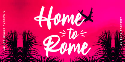 Home to Rome is a classy and lovely script font. It has a elegant style and is perfect for creating original designs. This lovely casual brush font is really great for a logo, clothing, quotes, headings, wedding invitations, posters, and many others.
 - Going to School by Tlatous Type,
$19.00 Introducing Going to School Font by Tlatoustype Going to School is a Fun Modern Handwritten Font. Going to School is perfect for Book Cover, product packaging, branding project, megazine, social media, wedding, or just used to express words above the background. Going to School also multilingual support.
 - Back To School by MDF,
$4.00 The Back to School Doodle font is a delightful and imaginative typeface that captures the essence of the back-to-school season with its playful doodles and vibrant charm. Each letter is adorned with whimsical illustrations, reminiscent of a child's doodles on a classroom desk. This font features hand-drawn characters filled with fun and colorful details. From doodled stars, pencils, and books to playful arrows, apples, and globes, every letter is an artwork in itself. The doodles add a sense of excitement and creativity to the font, making it perfect for capturing the spirit of going back to school.
 - Jungle to jungle by Aminmario Studio,
$20.00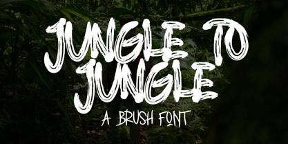 This is a supercharged font, with natural brush, quick strokes and sharp details. Perfect for challenging jobs, titles, movie,logos, apparel, t-shirts, hoodies, quotes, product packaging, or anything that needs a typographic turbo-boost and a typographic unique style. Thanks for checking out this font. I hope you enjoy it!
 - Things To Remember by Orenari,
$14.00 Things To Remember is a chill and friendly display font. Its natural and unique style makes it incredibly fitting to a large pool of designs. Level up your creative project with this thin yet memorable font.
 - Mono To Go by buero bauer,
$20.00 Mono To Go is a monospace typeface with a constructed, grid-based body and a playful and quirky spirit. Built from circles and other simple geometric shapes, it sees itself as a contemporary interpretation of the early, consistently reduced typefaces of modernism. With its modular concept, the typeface invites you to "build" individually combined word pictures. Depending on your preference for the type of composition, stylistic alternatives and open typeface features offer you a wide range of possibilities. The rhythm of the glyphs and their distinctive ascenders and descenders give the typeface a confident character for bold designs. The typeface works best in larger sizes, e.g. for brands, poster and cover designs, film titles, exhibition displays or generally for striking headlines. The character set contains 600 glyphs, including full language support for Western, Central and Eastern Europe, digits and oldstyle figures, punctuation, currency and mathematical symbols, and the entire set as small caps. mono to go was designed by buero bauer (2019–2021). Special thanks to Franziska Weitgruber for her support.
 - BACK TO SCHOOL - Personal use only

- Ex Kata Damaged - Unknown license

- Noir et Blanc by Pelavin Fonts,
$25.00 Noir et Blanc began as a proposed logo for a new Broadway production of Moulin Rouge and ended up as a challenge to find how bold a stroke weight could still be beautifully legible. Now that it is complete, we hope it will have the chance to become noir et blanc et rouge partout.
 - Paul Maul XT by !Exclamachine,
$9.99 PaulMaul XT is a lighthearted typeface made for energetic expression. Bold and casual, PaulMaul jumps at the reader with distinct punctuation and style in headers, captions, sidebar quotes and fun interfaces. PaulMaul has been greatly expanded and now features a rich set of accents for European and Asian applications!
 - PR Ex Cathedra by PR Fonts,
$10.00 This font is closely based on classical proportions, with flared terminals. Small Capitals are 7/8 the size of the capitals
 - Joules et Jacques by Nicky Laatz,
$18.00 Say hello to Joules et Jacques! A stylish modern font duo consisting of a natural handwritten script and a refined, elegant serif font. Perfect for making bold stylish statments - or adding a touch of class to your designs. The script has a multitude of natural looking ligatures in its OpenType features - making the font look as close to natural handwriting as possible. The Serif includes two weights - regular and bold - and built-in OpenType kerning features for a professional touch.
 - Quebra Ex Condensed by Vanarchiv,
$55.00 Quebra Ex Cn (Extra Condensed) is an extend display sans-serif font family, available with four widths (Extra Condensed, Condensed, Normal and Expanded) and ten weights, italics versions are available. The main strokes contain small breaks simulating modulated variations on the letterforms, these details are more present on large body sizes. All font versions contain Latin and Cyrillic encoding characters and also ligatures, case-sensitive forms, fractions, oldstyle and finally tabular figures.
 - Do not eat this Italic - Unknown license

- You are what you eat - Unknown license

- Do not eat this Skew - Unknown license

- Do not eat this Fat - Unknown license

- Yoshi's Story (game text) (BRK) - Unknown license

- Exit font (for a film) - Unknown license

- Yoshi's Story game text BRK - Unknown license

- Linotype Syntax Lapidar Serif Text by Linotype,
$29.99Modeled on the writings chiseled in stone in the second century B.C., Syntax™ Lapidar is an energetic, spirited typeface designed by Hans Eduard Meier in 2000. Linotype Syntax Lapidar Text and Linotype Syntax Lapidar Serif Text have five weights each, with both cap and lowercase letterforms. Lapidar Display and Lapidar Serif Display also have five weights each, with mostly all cap letterforms and many alternates. It's a terrifically fun and inventive family, and if you look closely, you can see the resemblance to the more modern and restrained Syntax™ relatives. Great for menus, artist books, travelogues, or advertising - and if used very sparingly, it could add just the right element of lapidary significance to corporate documents. - Times New Roman Small Text by Monotype,
$67.99In 1931, The Times of London commissioned a new text type design from Stanley Morison and the Monotype Corporation, after Morison had written an article criticizing The Times for being badly printed and typographically behind the times. The new design was supervised by Stanley Morison and drawn by Victor Lardent, an artist from the advertising department of The Times. Morison used an older typeface, Plantin, as the basis for his design, but made revisions for legibility and economy of space (always important concerns for newspapers). As the old type used by the newspaper had been called Times Old Roman," Morison's revision became "Times New Roman." The Times of London debuted the new typeface in October 1932, and after one year the design was released for commercial sale. The Linotype version, called simply "Times," was optimized for line-casting technology, though the differences in the basic design are subtle. The typeface was very successful for the Times of London, which used a higher grade of newsprint than most newspapers. The better, whiter paper enhanced the new typeface's high degree of contrast and sharp serifs, and created a sparkling, modern look. In 1972, Walter Tracy designed Times Europa for The Times of London. This was a sturdier version, and it was needed to hold up to the newest demands of newspaper printing: faster presses and cheaper paper. In the United States, the Times font family has enjoyed popularity as a magazine and book type since the 1940s. Times continues to be very popular around the world because of its versatility and readability. And because it is a standard font on most computers and digital printers, it has become universally familiar as the office workhorse. Times?, Times? Europa, and Times New Roman? are sure bets for proposals, annual reports, office correspondence, magazines, and newspapers. Linotype offers many versions of this font: Times? is the universal version of Times, used formerly as the matrices for the Linotype hot metal line-casting machines. The basic four weights of roman, italic, bold and bold italic are standard fonts on most printers. There are also small caps, Old style Figures, phonetic characters, and Central European characters. Times? Ten is the version specially designed for smaller text (12 point and below); its characters are wider and the hairlines are a little stronger. Times Ten has many weights for Latin typography, as well as several weights for Central European, Cyrillic, and Greek typesetting. Times? Eighteen is the headline version, ideal for point sizes of 18 and larger. The characters are subtly condensed and the hairlines are finer." - Trade Gothic Next Soft Rounded by Linotype,
$53.99 In 1948, Mergenthaler Linotype released the first weights of Trade Gothic, designed by Jackson Burke. Over the next 12 years, Burke, who was the company’s Director of Typographic Development from 1948 through 1963, continued to expand the family. Trade Gothic Next is the 2008 revision of Jackson Burke’s design. Developed over a prolonged period of time, the original Trade Gothic showed many inconsistencies. Under the direction of Linotype’s Type Director Akira Kobayashi, American type designer Tom Grace, a graduate of the MA Typeface Design in Reading, has redesigned, revised and expanded the Trade Gothic family. Many details were improved, such as the terminals and stroke endings, symbols, and the spacing and kerning. Moreover, there are newly added compressed widths and heavy weights perfect for setting even more powerful headlines. Trade Gothic Next brings more features and better quality for today’s demanding typographers. Trade Gothic Next Soft Rounded introduces a new friendliness and warmth to the family.
 - Astor by Lab-Dot,
$24.99 New Eurostile! A redesigned Eurostile font, Astor font, was created inspired of one of most used fonts in the world. Idea was to make new, contemporary design of old Eurostile font which was created 1962. by designer Aldo Novarese. Main characteristics and features of Astor font are: beautiful design and contemporary font. May be used like display font, cargo font, OCR font. Most of glyphs have same thickness and high modularity in combining 2 or more glyphs. Good for architect’s projects, labeling, making environmental typography installations, for use of some interior or exterior designs, furniture designs etc.
 - Dic Sans by CAST,
$70.00 DicSans is a square sans-serif typeface, inspired by Aldo Novarese’s Eurostile, it was meant as a sort of contemporary "open" Eurostile. It is a semi-custom font, designed and expanded according to costumers’ requests, since 2004 up to 2013. For this reason it has many glyph variants (up to three variants per lowercase glyphs and numbers, special smallcaps etc.) and wide language coverage.
 - Talking to the Moon - Personal use only

- Janda Closer To Free - Personal use only

- KR Off To Work! - Unknown license

- Talk to the hand - Unknown license

- An ode to noone - Unknown license

- Balls to the Wall - Unknown license

- KR Coffee To Go - Unknown license


