10,000 search results
(0.031 seconds)
- Hero Sandwich Ingredients by Comicraft,
$19.00 As comic book readers know all too well, team ups are every super hero’s bread and butter... when the brave and the bold are in a pickle, and super villains are running onion rings around them, here’s how they roll: They Meat! They Team-Up with your taste buds! They Fight Hunger! Yes, some hero combos may get along better than others, but they are always more powerful together. So take a footlong bite out of crime, and make the subways safe again with our mouthwatering HERO SANDWICH! Prepared with plastic gloves on by those awfully nice chaps at the Comicraft deli. Anyway you slice it, these five Ingredients can be layered to generate a Hero Sandwich with the carbs and protein you need to deliver a knuckle sandwich to the bulking agents of your deadliest foes! See these families related to Hero Sandwich Ingredients: Hero Sandwich Combos Hero Sandwich Pro
 - Museum Ornaments by T4 Foundry,
$7.00Museum Borders and Ornaments is part of a typographical treasure, the Norstedts type collection in Sweden. Type designer Torbjörn Olsson has painstakingly translated the original 34 Ornament matrices in the collection to Open Type. Among them are several of Granjon's arabesques, as well as symbols from both Swedish and Danish typefoundries. The signs were cut in the 16th, 17th and 18th centuries. The old Swedish name for these "type trademarks" were "rössjor". Museum Borders and Ornaments is an OpenType creation, for both PC and Mac. Swedish type foundry T4 premiere new fonts every month. Museum Borders and Ornaments is our tenth introduction. Museum Borders and Ornaments is part of the growing Museum type family. Museum also includes Museum Tertia Cursive, an exquisite 1700's typeface with modern additions, and Museum Fournier, a set of Rococo capitals designed by Pierre Simon Fournier le Jeune circa 1760. - P22 Graciosa by IHOF,
$29.95 P22 Graciosa is a five font family based upon designs for a metal type by Carlos Winkow (1882–1952), a German type designer who lived and worked in Spain in the early 20th Century. Graciosa is a sort of hybrid blackletter/text font, with simplified blackletter caps and a serifed lowercase with subtle script flare. There is a Regular, Black, an open version called White, and an engraved version called Gris. The version called Multi serves as a fill font to allow for multi-colored layering options. A revival of these designs was initiated by Matthias Beck in 2015. The character set was expanded for use in 21 languages (OpenType Standard). The digitization and reintroduction of these old fonts—created in Spain and practically forgotten—makes them regain a new life. This project was subsidized by the Spanish Ministry of Education, Culture and Sport.
 - Granelly Script by Solidtype,
$15.00 Granelly is a modern, feminine handwritten font, with a variety of beginning and ending swashes, I hope you're drawn to a beautiful and aesthetic font to perfect your extraordinary project. This font can be used easily and simply because there are many features in it which contain a complete set of uppercase and lowercase letters, large variety of punctuation marks, numbers, and multilingual support. The font also contains several binders and alternative styles of Stylistic Sets for those of you who have OpenType capable software (Photoshop / Illustrator / InDesign). Granelly script is suitable for today's growing market designs, this font has a trendy, natural and soft style, with this font you can use. opportunities in every moment of one of the extraordinary ways to highlight your best party celebration, because this font will be a support for purposes such as wedding invitations, parties, graduations, birthdays, meetings, etc.
 - MIR Next by Juliasys,
$22.00 MIR Next is a growing multi-script type family best described by the terms “humanist–semi–slab-serif”. Its character set contains Latin and Cyrillic, both extended, as well as Greek, covering more than 100 languages. Strong personality along with consistency between language systems were a basic aim when designing the family. As a result MIR has become a great tool for branding and international identities. A wide choice of symbols and numbers makes it also very useful for statistics, texts about mathematics and the sciences. Serious things are best be said in an unpretentious, relaxed way. MIR gives typography exactly that kind of appearance. Its texts emit a sense of authority but stay easily accessible at the same time. MIR’s name comes from the old Russian word Мир meaning both “world” and “peace” – a unity we will hopefully take for granted sometime in the future.
 - Moonlight And Wine by The Gelato,
$12.00 The Moonlight & Wine Font is a Handwritten Monoline Font that is perfect for the Neon effect! It can be used as a Neon Handwritten Script Font, Monoline Script Font, Signature Script Font, Summer Handwriting Font, Neon Party Font, Neon Signboard Font, Neon Banner Font, Neon Font for Party Invitations, DJ Logo Font, Y2K Neon Font, Neon Sign Font, Neon Light Font, Neon Wedding Font Perfectly suitable for numerous use such as quotations, banners, logos, product packaging, titles, headers, Business cards, menu lists, and invitation cards! _________________________________ Language Support: Multilingual Support _________________________________ **The preview images are to showcase fonts only and are NOT included.** **The Font comes with a solid version. To add a NEON effect, You can use programs like Canva, Illustrator, Photoshop etc.** _________________________________ 🍦COMPATIBLE PROGRAMS (NOT LIMITED TO): Canva Pro, GoodNotes, Notability, Keynote, Pages, Numbers, Procreate, Photoshop, Illustrator, Cricut, Silhouette, InDesign, Microsoft Word, and more! ++ _________________________________
 - Opal by Linotype,
$29.99 Opal Pro is a text family designed by Hannes von Döhren in 2008. It gives every text a noble character. The typeface has long ascenders that clearly rise above the capital letters and a low x-height. Opal’s letters sport inktraps at stroke junctions, which on one hand create a cutout feeling and on the other hand strengthens the image in larger point sizes. In total, the letterforms have clear emphasis on their verticals and horizontals; they do not fear the weight on their curves. In addition to the Italic and Bold, the Opal type family includes a Script face, whose letterforms include connections, similar to handwriting. On top of that, the typeface possesses swash letters for italic and script, small caps, many ligatures and borders & ornaments. With a little bit of care, designers will be able to create the finest of traditional, elegant work with this family.
 - Servus Slab by Dada Studio,
$29.00 This family is very special to me. I started working on it right after my first son was born. I decided to name the typeface "Servus" which means "Hello" in my country. The whole idea of the family symbolizes a child’s growth. It starts with Thin and Narrow weights - just like a newborn baby - then it slowly grows to Black and Wide. As You can guess, my son is quite chubby now! And I can assure You that I put all my love into details. Servus consists of 9 weights which gives us 18 fonts with matching italics. Lights and Bolds, due to their strong personality, are perfect for display uses. At the same time, Regulars create a harmonious structure that provides good legibility in long texts. Servus covers all latin languages. It contains a wide set of numerals, small capitals, fractions, ligatures and other OpenType goodies.
 - Museum Fournier by T4 Foundry,
$16.00Museum Fournier is inspired by a set of Rococo capitals designed by Pierre Simon Fournier le Jeune circa 1760. The matrices are part of a set imported to Sweden by J.P. Lindh in 1818 from Breitkopf & Härtel in Leipzig, Germany. They are now in the Nordiska Museum in Stockholm. Type designer Torbjörn Olsson has expanded the original 31 lead matrices in the collection to 55 characters. Please note that the font contains capitals only, no lower case letters and no figures either. Museum Fournier is an OpenType creation, for both PC and Mac. Swedish type foundry T4 premiere new fonts every month. Museum Fournier is our ninth introduction. Museum Fournier is part of the growing Museum type family. Museum also includes three different border fonts, an ornament font with some of Granjon's arabesques and Museum Tertia Cursive, an exquisite 1700's typeface with modern additions. - Gill Hebrew by Lerfu,
$55.00Near the end of his life, legendary type designer Eric Gill lived in Jerusalem, and became interested in the typesetting of the Hebrew alphabet and the challenges it entailed. He designed his own Hebrew font which has not (to my knowledge) been digitized before. It is sometimes held up as an example of how not to do a Hebrew font: Gill introduced strange serifs and shapes that were jarring to readers used to more traditional fonts. But it is quite readable, and does start to grow on you after a while; extended text in Gill Hebrew is possible. I've added a set of alternate digits that are based on the shapes of the letters (Gill's digits are pretty standard text figures). I've also made some of the Unicode Hebrew symbols that Gill didn't (e.g. New Sheqel Sign, Alef-Lamed ligature, etc.) and also included vowel-points. - "VladTepesII (Vlads Dad)" designed by Bolt Cutter Design, conjures an image of a font that is deeply rooted in historical grandeur and mystery, much like the legacy of Vlad the Impaler, the inspirati...
- Fette Trump-Deutsch, designed by Dieter Steffmann, is a typeface that captures the essence of traditional German craftsmanship in typography. This font stands out for its bold and robust character, r...
- Boldini by Luxfont,
$18.00 Introducing the unique family of COLORED fonts "Boldini" with minimalistic clean letters of a harmonious form in the style of modern POP culture. You no longer need to adjust the gradient for each letter, letters are immediately printed in gradient! Gradient fonts is perfect for headlines for fashion websites, magazines, and print design, and the basic solid font is suitable for branding boutique signs as well as for large amounts of text, because the font is very readable in a small size. Font family has two thicknesses - bold & regular, 6 gradient directions, gradient fonts also 2 type - with transparency and without transparency, as well as 2 basic monochrome fonts. Font consists of letters of the same height without division into uppercase and lowercase glyphs. *See also these fonts, which based on this family: Culoare & Anaglyph. Which means that if necessary you can combine these families and they will be absolutely stylistically identical and complement each other. Check the quality before purchasing and try the FREE DEMO version of the font to make sure your software supports color fonts. Features: Such color combinations in gradients are universal and very convenient for repainting. IMPORTANT: - OTF SVG fonts contain vector letters with gradients and transparency. - Multicolor OTF version of this font will show up only in apps that are compatible with color fonts, like Adobe Photoshop CC 2017.0.1 and above, Illustrator CC 2018. Learn more about color fonts & their support in third-party apps on www.colorfonts.wtf - Don't worry about what you see all fonts in black and not in multicolor in the tab “Individual Styles” - all fonts are working and have passed technical inspection, but not displayed in multicolor they, just because the website MyFonts is not yet able to show a preview of colored fonts. Then if you have software with support colored fonts - you can be sure that after installing fonts into the system you will be able to use them like every other classic font. Question/answer: How to install a font? The procedure for installing the font in the system has not changed. Install the font as you would install the classic OTF | TTF fonts. How can I change the font color to my color? · Adobe Illustrator: Convert text to outline and easily change color to your taste as if you were repainting a simple vector shape. · Adobe Photoshop: You can easily repaint text layer with Layer effects and color overlay. Try to experiment, it is so interesting and very easy! ld.luxfont@gmail.com
 - We The People by K-Type,
$20.00 This typeface is extrapolated from the ‘We the People’ calligraphy of the handwritten US Constitution Preamble which employed a style based on German Text and Square Text exemplars from George Bickham’s penmanship copy-books, the most celebrated being The Universal Penman published in 1743. The original Constitution document was transcribed onto parchment by Jacob Shallus, a Pennsylvania Assistant Clerk, over a weekend in 1787. Shallus’s biographer, Arthur Plotnik (The Man Behind the Quill, 1987), notes that he was paid $30, a modest monthly wage at the time. He also suggests that the calligraphic headings, ‘We the People’ and ‘Article’, may have been inserted by Shallus’s 14 year old trainee son, Francis, “The manner in which the ‘Article’ headings are squeezed into the space Shallus allowed for them suggests a second hand—and perhaps not a very experienced one.” The unconventional backslant of the headings would seem to support this contention, and at the end of the document there is perhaps a novice’s inconsistency in the structure of the letter n between that used for ‘done’ and those used for ‘In Witness’. However, one has to admire the elegant swagger of the wavy t, h and l which the K-Type font extends to the b, f and k. Also, the simpler, Schwabacher-style W, an enlarged version of the lowercase w, is a little less flamboyant than the capital W from the German and Square texts in Bickham’s manuals. For designers using OpenType-aware applications, the typeface includes some Alternates, including a Bickham-style W, the letters t, h and n with added flourishes, two simpler forms of the A, and a few roman numerals for numbering articles. Also some ornamental flourishes and a round middle dot/decimal point. Punctuation marks are drawn in square, calligraphic style, but an alternative round period/full stop, for use with currency and numerals, is available at the period centered position (though placed on the baseline), accessed by Shift Option 9 on a Mac, or Alt 0183 on Windows. The full phrase, ‘We the People’, has been placed at the trademark keystroke and can be accessed by Option 2 (or Shift Option 2) on a Mac, or Alt 0153 on Windows. For designers who find the backslant awkward or unpleasant, the licensed typeface also includes two additional fonts which have a vertical aspect that may be more conducive to graphic design layouts. ‘We The People Upright’ and ‘We The People Upright Bold’ both retain the distinctive style, and the heavier weight is only slightly emboldened, just enough to add some punch.
 - PythonianDeluxe - Unknown license

- DraftWerk by The Northern Block,
$16.70 A minimal rounded typeface inspired by architecture and furniture detail drawings. The idea was to develop a font that would showcase precise radius corners at large formats and would also downsize to produce stylish body text. Details include 4 weights, a complete character set, manually edited kerning and Euro symbol.
 - Autoradiographic by Typodermic,
$11.95 Ahoy there, folks! Have we got a typeface for you! It’s called Autoradiographic, and it’s inspired by those trusty old warning signs from back in the day. You know the ones…“Inflammable! Stay away!” And boy oh boy, does it have personality! Back in the post-WWII era, low waistlines were all the rage—but let me tell you, strict waistline alignment was not. No, sir! That’s where Autoradiographic comes in. It’s informational, sure, but it’s also neat as a pin and chock full of personality. And listen to this—Autoradiographic has everything you need to crunch those numbers like a pro. Mathematical symbols? Check. Fractions? Check. Currency symbols? Check, check, and check. And for those times when you really want to make an impact, Autoradiographic’s italics are narrow and loosely spaced. Now that’s what I call a typeface with some serious sass! So what are you waiting for? Grab a copy of Autoradiographic today—it comes in five weights and italics, so you’re sure to find just the right fit for your project. Don’t miss out on the chance to add some mid-century flair to your work—you won’t regret it! Most Latin-based European, and some Cyrillic-based writing systems are supported, including the following languages. A Afaan Oromo, Afar, Afrikaans, Albanian, Alsatian, Aromanian, Aymara, Bashkir (Latin), Basque, Belarusian (Latin), Bemba, Bikol, Bosnian, Breton, Bulgarian, Cape Verdean, Creole, Catalan, Cebuano, Chamorro, Chavacano, Chichewa, Crimean Tatar (Latin), Croatian, Czech, Danish, Dawan, Dholuo, Dutch, English, Estonian, Faroese, Fijian, Filipino, Finnish, French, Frisian, Friulian, Gagauz (Latin), Galician, Ganda, Genoese, German, Greenlandic, Guadeloupean Creole, Haitian Creole, Hawaiian, Hiligaynon, Hungarian, Icelandic, Ilocano, Indonesian, Irish, Italian, Jamaican, Kaqchikel, Karakalpak (Latin), Kashubian, Kikongo, Kinyarwanda, Kirundi, Komi-Permyak, Kurdish (Latin), Latvian, Lithuanian, Lombard, Low Saxon, Luxembourgish, Maasai, Macedonian, Makhuwa, Malay, Maltese, Māori, Moldovan, Montenegrin, Ndebele, Neapolitan, Norwegian, Novial, Occitan, Ossetian, Ossetian (Latin), Papiamento, Piedmontese, Polish, Portuguese, Quechua, Rarotongan, Romanian, Romansh, Russian, Sami, Sango, Saramaccan, Sardinian, Scottish Gaelic, Serbian, Serbian (Latin), Shona, Sicilian, Silesian, Slovak, Slovenian, Somali, Sorbian, Sotho, Spanish, Swahili, Swazi, Swedish, Tagalog, Tahitian, Tetum, Tongan, Tshiluba, Tsonga, Tswana, Tumbuka, Turkish, Turkmen (Latin), Tuvaluan, Uzbek (Latin), Venetian, Vepsian, Võro, Walloon, Waray-Waray, Wayuu, Welsh, Wolof, Xhosa, Yapese, Zapotec Zulu and Zuni.
 - P22 Operina by IHOF,
$24.95 Operina is based on a 16th-century lettering model of the scribe Ludovico degli Arrighi (Vicentino Ludovico degli Arrighi) used in his 1522 instructional lettering book, "La Operina da Imparare di scrivere littera Cancellarescha." This book contains what is considered to be the earliest printed examples of Chancery Cursive. Rather than try to reproduce a perfect, smooth, type-like version of Ludovico's hand, which has been attempted in the past, the designer opted to leave in some rough edges and, thereby, create a look that mimics the endearing artifacts of quill and ink lettering on parchment. When reviving an old style, a designer is faced with many challenging decisions, such as whether to aim for ultimate authenticity or to modify the alphabet for modern use. The decision here was to create a font that resembles the 16th-century Italian hand-lettering master's, but is also useful to the contemporary user. Because the letters U u W w J j and our modern Arabic numerals were not in use during the advent of these original letterforms, these had to be interpolated. To make a complete and useable font set, we also had to fashion many of the extra and diacritical characters to match the look of the alphabet. There are three fonts in this set: Romano(simple), Corsivo(more complex), and Fiore(swash). Romano is the most subdued, it contains Roman looking caps and has lining figures. Corsivo is more elaborate, it has more decorative capital letters and an alternate version of the lowercase with longer ascenders and descenders, and old style figures. Fiore, the swash font, is the most elaborate with the longest ascenders and descenders. You may not wish to use the Fiore version on its own, especially as all caps; it is meant to enhance the other two alphabets because it contains the most elaborate capitals and has many extra ligatures. P22 Operina Pro is an OpenType version that contains over 1200 characters. It features Small Caps, Old Style Figures, full European, Cyrillic and Greek character sets and a new OpenType first with automatic Roman Numerals. Just type any number and with the feature, it will convert to Roman Numerals!
 - Carnero Variable by Monotype,
$209.99Carnero™ is a feisty hybrid of precise geometry and calligraphic flair; a design that walks that fine line between being sensible and a standout. In an increasingly monotone typographic landscape – Carnero has a unique pulse that moves the reader along with a new energy. Carnero gives life to simple utility with kinetic letter shapes, open apertures, and generous counters Drawn by Steve Matteson for the Monotype Studio, Carnero’s versatility is its strength. From digital ads and applications to packaging and branding, Carnero is comfortable and contemporary. The lightest and boldest weights create inviting headlines, while the middle weights read well for body copy. Used together, they build a lively brand and a clear hierarchy. Matteson infused Carnero with a modernist exterior resting on a 10th century calligraphic foundation. Delightful flourishes on the capital R and K, and lowercase a, k and l, give the design a distinctive demeanor; while the alternate italic swash caps are a saucy nod to the scribes. The result is a design that is warm, approachable – and a bit lighthearted. Matteson describes Carnero as, “transcending the static posture of the geometric sans genre.” The Carnero family is a compact collection of six distinct weights, ranging from an engaging light to an authoritative black, each with an italic counterpart. Its extended Latin character set ensures worry-free localization for eastern/western European languages. This is a design that will prove its value many times over. Matteson has drawn over 80 distinctive typeface families for major corporations, branding firms and retail sales. His passions for the outdoors and performing music balances an intense focus on work – and subtly finds its way into typefaces like Carnero. Matteson has designed custom fonts for three generations of the Microsoft Xbox® game console, the original core fonts for the Android® mobile-phone platform, in addition to branding typefaces for Toyota®, Rocket Mortgage®, and Google®. He also drew the Kootenay™ family, Monotype’s proprietary branding typeface. Matteson’s retail designs range from the elegant and utilitarian Open Serif™ (a companion to Google’s Open Sans), to a growing series of Frederic Goudy revivals. Carnero Variables are font files which are featuring one axis and have a preset instance from Light to Black. - Carnero by Monotype,
$50.99 Carnero™ is a feisty hybrid of precise geometry and calligraphic flair; a design that walks that fine line between being sensible and a standout. In an increasingly monotone typographic landscape – Carnero has a unique pulse that moves the reader along with a new energy. Carnero gives life to simple utility with kinetic letter shapes, open apertures, and generous counters. Drawn by Steve Matteson for the Monotype Studio, Carnero’s versatility is its strength. From digital ads and applications to packaging and branding, Carnero is comfortable and contemporary. The lightest and boldest weights create inviting headlines, while the middle weights read well for body copy. Used together, they build a lively brand and a clear hierarchy. Matteson infused Carnero with a modernist exterior resting on a 10th century calligraphic foundation. Delightful flourishes on the capital R and K, and lowercase a, k and l, give the design a distinctive demeanor; while the alternate italic swash caps are a saucy nod to the scribes. The result is a design that is warm, approachable – and a bit lighthearted. Matteson describes Carnero as, “transcending the static posture of the geometric sans genre.” The Carnero family is a compact collection of six distinct weights, ranging from an engaging light to an authoritative black, each with an italic counterpart. Its extended Latin character set ensures worry-free localization for eastern/western European languages. This is a design that will prove its value many times over. Matteson has drawn over 80 distinctive typeface families for major corporations, branding firms and retail sales. His passions for the outdoors and performing music balances an intense focus on work – and subtly finds its way into typefaces like Carnero. Matteson has designed custom fonts for three generations of the Microsoft Xbox® game console, the original core fonts for the Android® mobile-phone platform, in addition to branding typefaces for Toyota®, Rocket Mortgage®, and Google®. He also drew the Kootenay™ family, Monotype’s proprietary branding typeface. Matteson’s retail designs range from the elegant and utilitarian Open Serif™ (a companion to Google’s Open Sans), to a growing series of Frederic Goudy revivals. Carnero Variables are font files which are featuring one axis and have a preset instance from Light to Black.
 - Bibliophile Script by Sudtipos,
$79.00 A friend once jokingly told me that what I really do is mine extinct arts for parts to use in modern things, like going to the scrapyard to pick up bumpers, quarter-panels and dashboards off of Datsuns and Ponies to build a shiny new Ferrari. I still kind of grin at that, but I certainly do spend a lot of time looking at old things and imagining ways they would work today. This shiny new Ferrari here is called Bibliophile, and it contains scrap heap parts from various pages by Louis Prang, the Prussian-American printer and publisher who inspired my Prangs fonts. This is my second engagement with the late 19th century man, and it’s quite a bit more intricate than just an italic Didone with a connected lowercase. Bibliophile marries Round Hand calligraphy with Italian capitals, two styles not often relayed in the same alphabet, but work together beautifully when combined well. When you combine them well with a few long-practised tricks of the trade, then mix in a few trusted features from my previous work over the years, you get my usual crazy exuberance, like 17 different shapes for the d, 21 different forms for the y, endings, beginnings, swashes, ornaments, and so on. It’s no secret that I can get carried away when I’m so consumed by an idea. — Bibliophile comes in 2 weights, each of them with over 900 glyphs covering all the latin languages. Bibliophile also comes with a bold weight, something I’m always reluctant to do with something as adventurous and complex as the structure of this historical mashup. But I couldn’t chase away the idea of increasing the contrast while maintaining the hairlines in a lowercase this narrow. Part of it was the curiosity about the outcome, and part was the sheer challenge of it. I think it turned out OK. Words set in either weight will show delicateness and elegance, and the more time you spend inside the font and micro-manage the setting, the more ways you will find to magnify either. Bibliophile can be as muted or luxurious as you want it to be. This is the kind of alphabet that fits well in fashion marketing and high-end packaging, from the very subdued to the super-exquisite. Enjoy the gleaming new vehicle made with freshly polished old parts.
 - Christmas Cypher by Mans Greback,
$79.00 Christmas Cypher is a street Xmas font. It merges the rebellious spirit of street art with the nostalgic cheer of the holiday season. This graffiti-inspired font embodies a dash of urban flair, perfect for designs that aim to stand out. Its bold strokes and sharp attitude, infused with a whimsical twist of Christmas elements, make it ideal for youthful and energetic designs. The font dances between traditional cheer and contemporary cool, bringing a fresh perspective to the visual language of Christmas. Use the included Icon font to make Christmas symbols. Use parenthesis symbols () [] {} to make stars around any word. Example: {Hiphop}[Style] The font is built with advanced OpenType functionality and guaranteed top-notch quality, containing stylistic and contextual alternates, ligatures and more automatic and manual features; all to give you full control and customizability. It has extensive lingual support, covering all Latin-based languages, from North Europa to South Africa, from America to South-East Asia. It contains all characters and symbols you'll ever need, including all punctuation and numbers. Designed by Mans Greback, a typographer known for his attention to detail and passion for blending tradition with modern design trends, Christmas Cypher is more than a font – it's a declaration of celebration and creativity.
 - Biblia by Hackberry Font Foundry,
$24.95 This all started with a love for Minister. This is a font designed by Carl Albert Fahrenwaldt in 1929. In the specimen booklet there’s a scan from Linotype’s page many years ago. They no longer carry the font. I’ve gone quite a ways from the original. It was dark and a bit heavy. But I loved the look and the readability. This came to a head when I started my first book on all-digital printing written from 1994-1995, and published early in 1996. I needed fonts to show the typography I was talking about. At that point oldstyle figures, true small caps, and discretionary ligatures were rare. More than that text fonts for book design had lining OR oldstyle figures, lowercase OR small caps—never both. So, I designed the Diaconia family (using the Greek word for minister). It was fairly rough. I knew very little. I later redesigned and updated Diaconia into Bergsland Pro —released in 2004. It was still rough (though I impressed myself). In 2006, I found myself needing a readable sans serif. So I went to Bergsland Pro, and eliminated the serifs. I named the font Brinar. I kept a flare in place for the serifs and cupped the ends. I was stunned. People loved it. It’s remained my bestseller until very recently. So, at the end of 2016 I decided that Brinar really needed some help. The flares were basically random. The stem width and modulation variances all needed to be fixed. My old OpenType feature code was quite limited and clumsy. So, I created the 6-font Biblia family. I cleaned up or redesigned all the glyphs. I updated the fonts to the 2017 set of features: small caps, small cap figures, oldstyle figures, fractions, lining figures, ligatures and discretionary ligatures. These are fonts designed for book production and work well for text or heads.
 - Avenir Next by Linotype,
$97.99 Avenir Next Pro is a new take on a classic face—it’s the result of a project whose goal was to take a beautifully designed sans and update it so that its technical standards surpass the status quo, leaving us with a truly superior sans family. This family is not only an update though, in fact it is the expansion of the original concept that takes the Avenir Next design to the next level. In addition to the standard styles ranging from UltraLight to Heavy, this 32-font collection offers condensed faces that rival any other sans on the market in on and off—screen readability at any size alongside heavy weights that would make excellent display faces in their own right and have the ability to pair well with so many contemporary serif body types. Overall, the family’s design is clean, straightforward and works brilliantly for blocks of copy and headlines alike. Akira Kobayashi worked alongside Avenir’s esteemed creator Adrian Frutiger to bring Avenir Next Pro to life. It was Akira’s ability to bring his own finesse and ideas for expansion into the project while remaining true to Frutiger’s original intent, that makes this not just a modern typeface, but one ahead of its time. Complete your designs with these perfect pairings: Dante™, Joanna® Nova, Kairos™, Menhart™, Soho® and ITC New Veljovic®. Avenir Next Variables are font files which are featuring two axis, weight and width. They have a preset instance from UltraLight to Heavy and Condensed to Roman width. The preset instances are: Condensed UltraLight, Condensed UltraLight Italic, Condensed Thin, Condensed Thin Italic, Condensed Light, Condensed Light Italic, Condensed, Condensed Italic, Condensed Demi, Condensed Demi Italic, Condensed Medium, Condensed Medium Italic, Condensed Bold, Condensed Bold Italic, Condensed Heavy, Condensed Heavy Italic, UltraLight, UltraLight Italic, Thin, Thin Italic, Light, Light Italic, Regular, Italic, Demi, Demi Italic, Medium, Medium Italic, Bold, Bold Italic, Heavy, Heavy Italic. Featured in: Best Fonts for PowerPoints
 - Archive Garamond by Archive Type,
$59.99Archive Garamond is a typeface roughly based on the designs of Claude Garamond (ca. 1480 – 1561), a French publisher and a leading typeface designer of that period. Garamond’s influence on type design is reflected in many typefaces that are today known under different commercial names. While the majority of contemporary digital interpretations of the “Garamond types” are cleaner and more polished versions of that genre, Archive Garamond tries to keep the rough nature which was typical in the early days of printing. Archive Garamond has a rather unique, distinctive temperament which is even more emphasised with the preserved non-uniformity, such as irregular glyph shapes or a variable baseline. Although Archive Garamond was clearly made to be used for display sizes it works surprisingly well in text. Archive Garamond is availale in three versions, each containing approximately 600 glyphs (in Pro versions). Archive Garamond Pro A Professional version of the typeface contains all glyphs, including the advanced typographic forms, such as different sets of figures, small caps, swashes, historical forms, etc. The font also enables full use of the OpenType features. It fully supports the languages listed in the language list. Archive Garamond Std A Standard version of the typeface is meant to be used for the basic typographic work. It typically contains the most common glyphs. The standard figures are proportional lining. Besides kerning this version does not contain any advanced OpenType features. A Standard file type fully supports the languages listed in the Language list. Archive Garamond Exp An Expert version contains glyphs that are supposed to be used in advanced typographic works. This type of file contains uppercase and small cap glyphs with the proportional oldstyle figures as the default set. Besides kerning this version does not contain any advanced OpenType features (all OTF features have to be replaced manually). An Expert file type fully supports the languages listed in the Language list. - SAVE THE HONEYBEE - Personal use only

- Grand Haven by pentagonistudio,
$21.00 Grand Haven Is An Vintage Display Font Inspired By Nostalgic Characters. SOFTWARE REQUIREMENTS : Fonts and alternate : No special software required they may be used in any basic program /website apps that allows standard fonts That's it folks! You can go ahead and get cracking :) Follow My Shop For Upcoming Updates Including Additional Glyphs And Language Support. And Please Message Me If You Want Your Language Included or If There Are Any Features or Glyph Requests, Feel Free to Send me A Message. Have a Good Day !
 - Jaque PS by pentagonistudio,
$19.00 Jaque Is A Vintage Serif Character Inspired By Stylish and Retro Style. SOFTWARE REQUIREMENTS : Fonts and alternate : No special software required they may be used in any basic program /website apps that allows standard fonts That's it folks! You can go ahead and get cracking :) Follow My Shop For Upcoming Updates Including Additional Glyphs And Language Support. And Please Message Me If You Want Your Language Included or If There Are Any Features or Glyph Requests, Feel Free to Send me A Message. Have a Good Day !
 - Kuano by pentagonistudio,
$19.00 Kuano Is Classy Display Serif Character Inspired By Modern and Ligature Characters. SOFTWARE REQUIREMENTS : Fonts and alternate : No special software required they may be used in any basic program /website apps that allows standard fonts That's it folks! You can go ahead and get cracking :) Follow My Shop For Upcoming Updates Including Additional Glyphs And Language Support. And Please Message Me If You Want Your Language Included or If There Are Any Features or Glyph Requests, Feel Free to Send me A Message. Have a Good Day !
 - Marlone PS by pentagonistudio,
$19.00 Marlone PS Is A Display Typeface Inspired By Retro and Vintage Style. SOFTWARE REQUIREMENTS : Fonts and alternate : No special software required they may be used in any basic program /website apps that allows standard fonts That's it folks! You can go ahead and get cracking :) Follow My Shop For Upcoming Updates Including Additional Glyphs And Language Support. And Please Message Me If You Want Your Language Included or If There Are Any Features or Glyph Requests, Feel Free to Send me A Message. Have a Good Day !
 - Joyfish by pentagonistudio,
$19.00 Joyfish Is An Lovely Serif Font Inspired By Luxury and Feminine Character. SOFTWARE REQUIREMENTS : Fonts and alternate : No special software required they may be used in any basic program /website apps that allows standard fonts That's it folks! You can go ahead and get cracking :) Follow My Shop For Upcoming Updates Including Additional Glyphs And Language Support. And Please Message Me If You Want Your Language Included or If There Are Any Features or Glyph Requests, Feel Free to Send me A Message. Have a Good Day !
 - Along Sans Rasoe by Brenners Template,
$19.00 Along Sans Rasoe is a pretty unique font family. It only tried to connect with lines, and it didn't use curves at all. And the equalization of stems was arranged irregularly. Various attempts have been applied to the glyphs to showcase the designer's feeling more sensibly. 9 Weights, 18 Styles Discretionary ligatures (Ac, Ad, Ae, Am, At, Ca, Ce, Ch, Co, Cr, Ra, Re, Ro, cc, ee, ll, mm, nn, oo, pp, rr, ss) Stylistic Sets Circled Glyphs. Multilingual support And various OpenType Features.
 - Alloca Mono by Daniel Gamage,
$29.99 To break from the rigidity of a typical monospaced font, Alloca includes weights that go above and beyond. From the wire-thin to the ultra-bold, you’ll be able to do a lot with one monospaced family. With OpenType features like slashed zeros, old style numerals, and case-sensitive forms, Alloca is versatile. It's great for displaying code, showcasing data, or even flowing your body copy. It has broad language support, too, with localized forms for Vietnamese, Polish, Catalan, and Dutch, to name a few.
 - Gracias PS by pentagonistudio,
$19.00 Gracias Is A Vintage Display Typeface Inspired By Blackletter Characters. SOFTWARE REQUIREMENTS : Fonts and alternate: No special software is required they may be used in any basic program /website app that allows standard fonts That's it, folks! You can go ahead and get cracking :) Follow My Shop For Upcoming Updates Including Additional Glyphs And Language Support. And Please Message Me If You Want Your Language Included or If There Are Any Features or Glyph Requests, Feel Free to Send me A Message. Have a Good Day!
 - Kugile by pentagonistudio,
$19.00 Kugile Is An Classy Serif Font Inspired By Luxury and Elegant Character. SOFTWARE REQUIREMENTS : Fonts and alternate : No special software required they may be used in any basic program /website apps that allows standard fonts That's it folks! You can go ahead and get cracking :) Follow My Shop For Upcoming Updates Including Additional Glyphs And Language Support. And Please Message Me If You Want Your Language Included or If There Are Any Features or Glyph Requests, Feel Free to Send me A Message. Have a Good Day !
 - Beth Harmone by MotionTail,
$18.00 Based on our experience as a graphic designer who works for a lot of companies, we often are requested to design a logo in a unique style but with an elegant shape. So, we try to brainstorming and create this font to make the idea is going out. This is perfect for BRANDING and LOGO DESIGN. You will get classy, elegant, and certainly unique logos with this font. Beth Harmone is also included full set of: · uppercase letters · multilingual symbols · numerals · punctuation Wish you enjoy our font. :)
 - Quaro by pentagonistudio,
$19.00 Quaro Is Modern Display Sans Inspired By Stylish Round Font. SOFTWARE REQUIREMENTS : Fonts and alternate : No special software required they may be used in any basic program /website apps that allows standard fonts That's it folks! You can go ahead and get cracking :) Follow My Shop For Upcoming Updates Including Additional Glyphs And Language Support. And Please Message Me If You Want Your Language Included or If There Are Any Features or Glyph Requests, Feel Free to Send me A Message. Have a Good Day !
 - Glister PS by pentagonistudio,
$19.00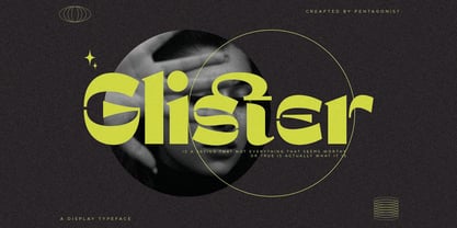 Glister Is An Stylish Display Character Inspired By Cheek Style. SOFTWARE REQUIREMENTS : Fonts and alternate : No special software required they may be used in any basic program /website apps that allows standard fonts That's it folks! You can go ahead and get cracking :) Follow My Shop For Upcoming Updates Including Additional Glyphs And Language Support. And Please Message Me If You Want Your Language Included or If There Are Any Features or Glyph Requests, Feel Free to Send me A Message. Have a Good Day !
 - Lovely Emily by Olivetype,
$18.00 Lovely Emily is a simple, quirky and adaptable handwritten font. Its informal style and casual vibe will make this font a go-to choice for each of the creations that require a relaxed touch. The font Lovely Emily contains 194 glyphs, supporting 66 languages, which include: Afrikaans Albanian Catalan Danish Dutch English Estonian Finnish French German Italian Norwegian Portuguese Spanish Swedish Zulu, and more. So what's included: Basic Latin A-Z & a-z. Numbers, symbols, and punctuations Multilingual Support. Accented Characters : ÀÁÂÃÄÅÆÇÈÉÊËÌÍÎÏÑÒÓÔÕÖØŒŠÙÚÛÜŸÝŽàáâãäåæçèéêëìíîïñòóôõöøœšùúûüýÿžß Thank You.
 - Tabac Big Glam by Suitcase Type Foundry,
$39.00 Tabac Big Glam probably stretches the Tabac super-family’s boundaries the furthest. While it’s based on the serif version, it achieves an especially surgical cleanliness and extremely sharp typesetting by completely letting the serifs go. Despite this, the text isn’t boring for a moment — the angled cut of the stems on b, d, h, k, l, the open loop on g or the rounded variant of the italic y, which can be called by turning on the stylistic set, reliably banishes any suspicions of the letters’ monotony.

