10,000 search results
(0.152 seconds)
- Third Reign by Mans Greback,
$59.00 Third Reign is a decorative medieval typeface. With braids and pearls, this swirly typeface of extreme variability brings us to the golden times of epic knight sagas. Third Reign is the typeface of a Middle Age queen or a viking ruler. Use it for a Middle Ages game, a fantasy headline, or as a logotype for anything of historical theme. With usage in any modern software, the letters will automatically overlap and embrace in an elegant way. To make heraldic symbols, copy these icons: 🐉 🐎 👑 🗡 🦁 🦅 🦌 + ♖ × ✝ ⚓ * ⚔ † ‡ Alternatively write %A %B %C ... etc to create the heraldry. (Download required.) Dragon, Horse, Crown, Sword, Eagle, Deer, Cross, Anchor are some of the logos. Use [ ] for side borders. Example: [Magic⚔Thrones] The Third Reign font family consists of two styles: The decorative Border style, and the plain Regular style. The font is built with advanced OpenType functionality and has a guaranteed top-notch quality, containing stylistic and contextual alternates, ligatures and more features; all to give you full control and customizability. It has extensive lingual support, covering Greek and Cyrillic, as well as all Latin-based languages, from North Europe to South Africa, from America to South-East Asia. It contains all characters and symbols you'll ever need, including all punctuation and numbers.
 - First Reign by Mans Greback,
$49.00 First Reign is a decorative medieval typeface. With borders and ornaments, this swirly uppercase typeface of extreme variability brings us to glorious worlds in the golden times of epic knight sagas. First Reign is the typeface of a Royal House, of vikings, kings and queens. Use it for a Middle Ages game, a fantasy headline, or as a logotype for anything of historical theme. With usage in any modern software, the letters will automatically overlap and embrace in an elegant way. To make heraldic symbols, copy these icons: 🐉 🐎 👑 🗡 🦁 🦅 🦌 + ♖ × ✝ ⚓ * ⚔ † ‡ Alternatively write %A %B %C ... etc to create the heraldry. (Download required.) Dragon, Horse, Crown, Sword, Eagle, Deer, Cross, Anchor are some of the logos. Use [ ] for side borders. Example: [Magic⚔Thrones] The First Reign family consists of four beautiful styles: Decorated capital font provided in Thin, Medium and Bold, plus a Border style. The font is built with advanced OpenType functionality and has a guaranteed top-notch quality, containing stylistic and contextual alternates, ligatures and more features; all to give you full control and customizability. It has extensive lingual support, covering Greek and Cyrillic, as well as all Latin-based languages, from North Europe to South Africa, from America to South-East Asia. It contains all characters and symbols you'll ever need, including all punctuation and numbers.
 - Palo Slab by TypeUnion,
$30.00 Palo Slab is an epic font family made up of 9 weights in four widths, along with italic & oblique options to total a massive 108 styles. Using our 2020 release Palo as the base, the slab version began to take on its own life and personality to become a unique entity in its own right. From super punchy heavy weights to the delicate lighter weights, the Palo Slab super family is a versatile beast that offers you ultimate flexibility. The heavy weights ranging from Compressed Black to Wide Black are built with super tight spacing and love to be big and bold, so perfect for showing off your brand. The Italic styles add curves to the slab feel, providing a beautiful flow, but we've also included an oblique option if you want to use the blockier version. Palo Slab features extensive latin language support as well as OpenType features such as case sensitive punctuation, old style figures, scientific numbers and ligatures, + arrows. You can check out our 2020 release Palo here.
 - Top Speed - Unknown license

- Top Speed Outline - Unknown license

- Top Speed Heavy - Unknown license

- Gemsea by Product Type,
$17.00 With Gemsea Fonts, you open the door to a world of limitless creativity. A display theme that celebrates the power of the ocean, bringing a strong, bold, and fun touch to any of your projects. Gemsea is the perfect solution for projects that require a unique theme. From epic films to stunning games and unforgettable streaming events, this font offers durability and appeal in various languages. Stunning Features: Five different family styles: Regular, Blur, Engrave, Outline, and 3D. This gives you the flexibility to create a variety of nuances in your designs. It supports multilingual so that you can connect with a global audience without restrictions. Gemsea creates not just projects, but unforgettable works of art. Get the Gemsea Font now and bring the magic of the ocean into your designs!
 - Marian Churchland Journal by Comicraft,
$39.00 Tall, thin and elegant, Marian Churchland’s fonts are very much like her.. and now available from those awfully nice chaps at Comicraft to allow you to pretend that you are too! Marian Churchland was born in Canada in 1982, and was raised on a strict diet of fine literature and epic fantasy video games. She has a BA in Interdisciplinary Studies (English Literature and Visual Arts) from the University of British Columbia, and has been doing professional illustration work, including book covers and magazine articles, since she was 17. Last year, she became the first woman to solo-illustrate a CONAN story, and this year she’s illustrating three issues of ELEPHANTMEN for Image Comics. Artwork by Marian Churchland from Elephantmen #20. See the families related to Marian Churchland Journal: Marian Churchland .
 - FF Info Display by FontFont,
$72.99 German type designers Erik Spiekermann and Ole Schäfer, and German design agency MetaDesign created this sans FontFont between 1996 and 2000. The family has 18 weights, ranging from Regular to Bold (including italics) and is ideally suited for advertising and packaging, book text, editorial and publishing, logo, branding and creative industries, small text, wayfinding and signage as well as web and screen design. FF Info Display provides advanced typographical support with features such as ligatures, alternate characters, case-sensitive forms, fractions, super- and subscript characters, and stylistic alternates. It comes with proportional lining, proportional oldstyle, and tabular lining figures. In 1998, FF Info Display received the The Big Crit award. This FontFont is a member of the FF Info super family, which also includes FF Info Correspondence and FF Info Text.
 - Quality Times by Gilar Studio,
$16.00 Quality Times is a stylish modern calligraphy font with casual chic flair. It is perfect for branding, wedding invites and cards, and maybe for red wine label. Quality Times includes full set of gorgeous uppercase and lowercase letters, numerals, a large range of punctuation and ligatures. All lowercase letters include beginning and ending swashes, giving realistic hand-lettered style. What you get, darling? In order to use the beautiful swashes, you need a program that supports OpenType features such as Adobe Illustrator CS, Adobe Photoshop CC, Adobe Indesign and Corel Draw. Check my other Font here : https://gilarstudio.com/
 - Consistance by Haksen,
$15.00 Consistance is a stylish modern and natural handwritten script font with casual bold signature script type. It is perfect for branding, wedding invites and cards, and maybe for red wine label. Consistance includes full set of gorgeous uppercase and lowercase letters, numerals, a large range of punctuation and ligatures. In order to use the beautiful ligatures, you need a program that supports OpenType features such as Adobe Illustrator CS, Adobe Photoshop CC, Adobe Indesign and Corel Draw. but if your software doesn't have Glyphs panel, you can install additional swashes font files. Thanks and have a great day, Haksen Studio
 - Nami by Linotype,
$29.99Nami, the Japanese word for wave," is the latest collaboration between Adrian Frutiger and Linotype's Type Director, Akira Kobayashi. This typeface family is the most humanistic sans serif design ever to come from Adrian Frutiger, and it has an interesting twist: lapidar alternates that may be surfed through with the help of OpenType-savy applications. Adrian Frutiger began the design that would blossom into Nami during the 1980s. Although it would not be produced during the 20th century, it was quite forward thinking. The typeface included several seemingly avant garde alternates; these were "lapidary" versions of common letterforms. Revisiting the project in 2006, Akira Kobayashi reworked the concept into a working family of three typefaces. Each font contains 483 glyphs, including 11 alternates-two extra forms of the lowercase g, as well as new forms for a, e, h, l, m, n, r, t, and u." - ITC Oldbook by ITC,
$29.99For some time, Eric de Berranger had wanted to create a distressed typeface design - one that gave the appearance of antique printing and showed signs of wear, yet was still highly readable. He was busy designing a new face called Maxime, when an idea struck: I realized that I could use these lettershapes as the basis for my antique typeface," he says. The two faces ended up being designed in tandem. While ITC Oldbook clearly captures the flavor of aged, uneven and imperfect printing, it also meets de Berranger's goal of being exceptionally readable in text sizes. Beginning with well-drawn characters was the key, and these were carefully modeled into the distressed forms. "The process was more difficult than I originally thought," says de Berranger. "The antique letters had to be tested and modified several times to work correctly." ITC Oldbook elegantly simulates antique printing in both text and display sizes. And while stroke weights are uneven and curves are irregular, the design has remarkably even color when set in blocks of text copy. Add to this the design's inherent legibility, and ITC Oldbook acquires a range far beyond replication of things old; it's suitable for any project that calls for warm and weathered typography. ITC Oldbook is available in roman and bold weights with complementary italic designs. Small caps, old style figures and a suite of alternate characters and ornaments provide additional flexibility and personality to the design." - This Notes by Afkari Studio,
$13.00 Introducing This Notes - Handwritten Marker Note Font is a delightful testament to the artistry of handwriting, meticulously crafted to infuse your designs with an authentic, hand-drawn aesthetic. With a distinctive yet versatile style, This Note is poised to enhance a diverse array of design projects, serving as a conduit for creativity and expression. At its core, This Note embodies the charm of handwritten notes, capturing the nuances and imperfections that make each stroke unique. It's a natural flow and effortless elegance make it an ideal choice for a multitude of graphic endeavors, ensuring its relevance across various platforms and applications. Highlighted Features: - Complete set of uppercase and lowercase letters, numerals, and punctuation marks - Unique alternates and ligatures for added character variation - Compatible with both PC and Mac platforms - Hassle-free installation process - Seamless integration with Adobe Illustrator, Adobe Photoshop, Adobe InDesign, and Microsoft Word - No additional design software is required for full accessibility - Multilingual support encompassing characters such as ä, ö, ü, Ä, Ö, Ü, ß, ¿, and ¡ This Note transcends mere functionality; it becomes a catalyst for innovation and inspiration. Its versatility knows no bounds, seamlessly integrating into digital notes, quote designs, book covers, logos, posters, menu layouts, apparel designs, scrapbooks, comic illustrations, magazine headers, and numerous other creative avenues. The font’s adaptability is matched only by its ability to breathe life into every project it graces. Whether adorning a playful children's illustration or adding a touch of personality to a sophisticated magazine title, This Note lends an air of authenticity that captivates audiences. In conclusion, This Note Handwritten Marker Note Font isn’t merely a font; it's a conduit for creativity, a bridge between imagination and realization, poised to elevate your projects to new heights. Embrace its charm, leverage its versatility, and allow it to become the catalyst for your creative journey. Unlock the boundless potential of This Note, where each stroke tells a story and every design bears the mark of authenticity.
 - Salting by Goodigital13,
$20.00 Suitable for design, element design, wedding, event, t-shirt, logo, badges, sticker, and awesome work, etc…This font is suitable for use on business cards, weddings, t-shirt designs, logos, magazines, quotes, fashion, watermarks, invitations, signatures.
 - Hebrew Julit by Samtype,
$39.00 Beautiful and elegant typeface, excelent using in wedding invitations, arts, posters and small texts.
 - Hebrew Provence Std by Samtype,
$39.00 Beautiful and elegant typeface, excelent using in wedding invitations, arts, posters and small texts.
 - Hebrew Juless by Samtype,
$39.00 Beautiful and elegant typeface, excelent using in wedding invitations, arts, posters and small texts.
 - Lovely Hydrillas by Letterhanna Studio,
$19.00 Lovely Hydrillas Font is a modern handwritten font loaded with 55 ligatures for that handwriting look. Lovely Hydrillas Script Font can be used for wedding invitations and wedding calligraphy, feminine or organic logos, small business branding, packaging, and more!
 - The Julayna by Reyrey Blue Std,
$19.00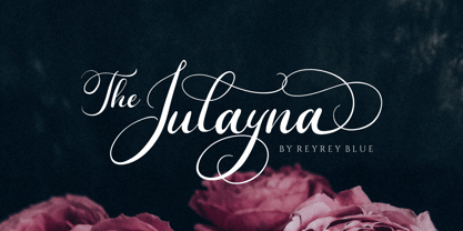 Introduce - The Julayna a luxurious wedding calligraphy font. It will add a luxury spark to any design project that you wish to create! The Julayna script font can be used for your next design, such as wedding invitations and wedding suites, stationery, packaging, feminine branding, logos, quotes, and prints. Includes: Uppercase and Lowercase, numbers, symbols, and punctuation Stylistic Alternate Ligatures Multilingual Characters
 - Gill Sonos is not a conventional font available to the public as of my last update in 2023. However, from the name, it would seem to draw inspiration or connection from two distinctive sources: Eric ...
- DS Comedy Cyr - Unknown license

- AidaSerif - Unknown license

- Hebrew Mairi by Samtype,
$39.00 The beautiful and elegant typeface, excellent use in wedding invitations, arts, posters, and small texts.
 - Hand Scribble Sketch Rock by TypoGraphicDesign,
$19.00 U-P-D-A-T-E (more glyphs, bug fixed, MAC (Desktop) + WIN (Office) Version) CHARACTERISTICS An own interpretation of a classic egyptienne/slab serif typeface with modern and fancy handmade haptics/hatching. The 3 styles/weights fits perfectly in each font size. From light till bold. All 3 styles are handemade sketched for diverse display size. APPLICATION AREA This heavy, sketched, scribbled, handmade slab serif font “Hand Scribble Sketch Rock” with many language support would look good in headlines. Magazines or websites, party flyer, movie posters, music Poster, music covers or webbanner. TECHNICAL SPECIFICATIONS ■ Font Name: Hand Scribble Sketch Rock ■ Font Weights: Regular, Bold, Light ■ Fonts Category: Display for Headline Size ■ Font Format: OpenType OTF + Windows TrueType TTF ■ Glyph Set: 361 glyphs ■ Language Support: Basic Latin/English letters, Central Europe, Baltic, Romanian ■ Specials: alternative letters and ligatures (with accents & €) ■ Design Date: 2013 ■ Type Designer: Manuel Viergutz ■ Font License: Desktop license, Web license, App license, eBook license, Server license
 - Vida Pro by Storm Type Foundry,
$55.00 The new typeface family Vida was specifically designed for Czech Television in the framework of a competition for a new logo in summer 2006. The drawing of each letter form differs finely in its logic, which is a feature invisible at first. It is constructed on a puristic base, but it doesn't reject the natural anomalies already known from ages of experience with latin alphabet. That's why e. g. upper left section of 'n' is constructed differently from that of 'r', similarly as 'd' doesn't repeat right-bottom ending after 'u', '9' is not inverted '6'. Such details improve reading in continuous text. The behavior of all weights is consistent on CRT, plasma or LCD screens due to monolinear design; the lightest weight doesn't fade, the darkest isn't blurred, all is legible and clear in smallest sizes. Stem connections and endings were adjusted to avoid undesirable optical darkening. The goal we desired was to achieve balance appearance in both electronic and printed form.
 - Remsen Script by Three Islands Press,
$39.00 The 1765 Stamp Act ignited in American colonists a simmering distrust of the distant British Parliament, whose oppressive trade duties they deemed unfair assaults on their rights as English subjects. Before long, of course, this little dustup spawned The Boston Tea Party, the American Revolution, and the birth of the U. S. of A. But before the Battles of Lexington and Concord, a group of Philadelphia merchants made one last-ditch call for commercial cooperation across the Atlantic. This futile appeal survives to this day on a three-page broadside, finely engrossed by a penman of the period and passed down through the generations of a family named Remsen. Remsen Script is an interpretation of that penman’s neat, formal cursive—from its broad antique flourishes to its subtle unevenness and gently ragged strokes. Perfect for event announcements, fine product packaging, recreations of historical documents, or anywhere you wish to offer a whiff of a bygone era.
 - Houschka Alt Pro by G-Type,
$72.00 Houschka Alt Pro is a carbon copy of the Houschka Pro family with one key difference: the rounded signature glyphs A & W on the default positions swap places with their straight alternates. Houschka was named after Georg Houschka, a sadly defunct confectioner’s shop in Salzburg, Austria, which had a wonderful 1930s frontage and distinctively rounded letterforms in the sign above the door. Houschka Pro is the follow up to the original Houschka type family which first appeared back in 1999. Character shapes have been improved, kerning and spacing refined, and OpenType features include CE, Baltic, Turkish & Cyrillic language support plus small caps, 3 stylistic sets, contextual alternates, ligatures and 4 sets of numerals. Houschka is a clean and legible modern sans serif typeface which shares the humanist qualities of Gill Sans and Johnston but retains a uniquely charming character of its own (particularly in signature glyphs A, G, Q, W, u & w). The monolinear structure, rounded corners and rolling curves give Houschka a soft and friendly appearance.
 - FF Unit Slab by FontFont,
$104.99 German type designer Erik Spiekermann, American type designer Christian Schwartz, and New Zealand type designer Kris Sowersby created this slab FontFont in 2009. The family has 14 weights, ranging from Thin to Ultra (including italics) and is ideally suited for editorial and publishing, logo, branding and creative industries as well as web and screen design. FF Unit Slab provides advanced typographical support with features such as ligatures, small capitals, alternate characters, case-sensitive forms, fractions, and super- and subscript characters. It comes with a complete range of figure set options – oldstyle and lining figures, each in tabular and proportional widths. As well as Latin-based languages, the typeface family also supports the Cyrillic and Greek writing systems. This FontFont is a member of the FF Unit super family, which also includes FF Unit and FF Unit Rounded.
 - Hebrew Maran by Samtype,
$49.00 The beautiful and elegant typeface is excellent use in wedding invitations, art, posters, and small texts.
 - Interceptor by Device,
$29.00 Interceptor should be used on cherry-red jacked up Ferraris and brainless summer blockbuster action movies.
 - Hebrew Sefirot by Samtype,
$49.00 The beautiful and elegant typeface is excellent use in wedding invitations, art, posters, and small texts.
 - Polias by Esintype,
$23.00 Polias is an all-caps uniwidth typeface inspired by an ancient inscription carved on a monoblock stone in hybrid characters — between no-contrast linear sans to low-contrast flared serif. The inspiring inscription is the dedication by Alexander the Great, discovered in the Temple of Athena Polias in the ancient Ionian city of Priene. Stanley Morison mentioned this inscription in one of his lectures: “The distinctive feature of this inscription consists of a consistent thickening towards the ends of perpendiculars and horizontals.” … “We have not the right to say that the serif was invented for Alexander the Great's inscription, only that this is its first datable appearance.” The letter proportions are almost identical to the original, but the stroke features have been reinterpreted and characterized. Serif-like nodes at the end of the strokes are subtle extensions that serve to accentuate rather than break its monoline elegance. With an analogy, they are not flowers, but like blooming buds. Polias is a flared sans typeface which is closer to sans-serif forms on the spectrum between sans and serif. It’s especially light looking by design to convey rather thin and white typographic color of its original monumental look. It comes in eight weights and a variable font, scaled from Thin to Bold. It is multiplexed, so the weights do not affect text lengths. Light weights are closely based on the actual carving of the inscription. Thicker weights can be used on smaller typesettings to compensate for the weight difference of larger letters’ strokes, and to keeping the monoline appearance of the entire text block intact. This method can be used for any purpose, such as setting a hierarchy between the lines or to justify their lengths. Some of the original letterforms have been preserved and stylistic alternatives such as Ionic four-bar Sigma, dotted Theta, palm Y are provided as open type feature. Some of the other ancient forms, such as the three-bar Sigma (S), the pointed U, were also added for both the Greek and Latin scripts. Polias is preferable for big type settings such as logos and headlines as a modern representation of perennial classical forms. Its a fine fit for product branding, movie posters, book covers, packaging materials, and more, which require an epic look to attracting attention with a distinctive elegance. Polias can be considered for distinctiveness wherever Roman Capitals work. As a noun, Polias is one of the epithets of Athena / Minerva, and in this case referring to her role as the protector of the city of Priene. Polias is one of the seven typeface designs in Esintype's ancient scripts of Anatolia project, Tituli Anatolian series.
 - Polias Varia by Esintype,
$140.00 Polias Varia is an all-caps uniwidth variable weight typeface inspired by an ancient inscription carved on a monoblock stone in hybrid characters — between no-contrast linear sans to low-contrast flared serif. The inspiring inscription is the dedication by Alexander the Great, discovered in the Temple of Athena Polias in the ancient Ionian city of Priene. Stanley Morison mentioned this inscription in one of his lectures: “The distinctive feature of this inscription consists of a consistent thickening towards the ends of perpendiculars and horizontals.” … “We have not the right to say that the serif was invented for Alexander the Great’s inscription, only that this is its first datable appearance.” In Polias Varia, the letter proportions are almost identical to the original, but the stroke features have been reinterpreted and characterized. Serif-like nodes at the end of the strokes are subtle extensions that serve to accentuate rather than break its monoline elegance. With an analogy, they are not flowers, but like blooming buds. Polias Varia is a flared sans typeface which is closer to sans-serif forms on the spectrum between sans and serif. It’s especially light looking by design to convey rather thin and white typographic color of its original monumental look. It comes in eight weights and a variable font, scaled from Thin to Bold. It is multiplexed, so the weights do not affect text lengths. Light weights are closely based on the actual carving of the inscription. Thicker weights can be used on smaller typesettings to compensate for the weight difference of larger letters’ strokes, and to keeping the monoline appearance of the entire text block intact. This method can be used for any purpose, such as setting a hierarchy between the lines or to justify their lengths. Some of the original letterforms have been preserved and stylistic alternatives such as Ionic four-bar Sigma, dotted Theta, palm Y are provided as open type feature. Some of the other ancient forms, such as the three-bar Sigma (S), the pointed U, were also added for both the Greek and Latin scripts. Polias Varia is preferable for big type settings such as logos and headlines as a modern representation of perennial classical forms. Its a fine fit for product branding, movie posters, book covers, packaging materials, and more, which require an epic look to attracting attention with a distinctive elegance. Polias Varia can be considered for distinctiveness wherever Roman Capitals work. As a noun, Polias is one of the epithets of Athena / Minerva, and in this case referring to her role as the protector of the city of Priene. Polias (family) is one of the seven typeface designs in Esintype’s ancient scripts of Anatolia project, Tituli Anatolian series.
 - Fifa Cup by Rezastudio,
$10.00 Fifa Cup is a stylish modern calligraphy font with casual chic flair. It is perfect for branding, wedding invites and cards, and maybe for red wine label. Fifa Cup includes full set of gorgeous uppercase and lowercase letters, numerals, a large range of punctuation. All lowercase letters include beginning and ending swashes, giving realistic hand-lettered style. What you get, darling? In order to use the beautiful swashes, you need a program that supports OpenType features such as Adobe Illustrator CS, Adobe Photoshop CC, Adobe Indesign and Corel Draw. but if your software doesn't have Glyphs panel, you can install additional swashes font files: Thanks and have a wonderful day.
 - Boster by Rhd Studio,
$20.00 Boster is a stylish modern calligraphy font with a chic casual style. It's perfect for branding, wedding invitations and cards, and maybe for red wine labels. The booster includes a beautiful full set of upper and lower case letters, numbers, assorted punctuation marks. All lowercase letters include start and end strokes, providing a realistic handwriting style. What did you get, honey? To use beautiful strokes, you need a program that supports OpenType features such as Adobe Illustrator CS, Adobe Photoshop CC, Adobe Indesign, and Corel Draw. but if your software doesn't have Glyphs panel, you can install additional font swash file: Thank you and have a nice day, Gulya
 - MARK Quincy by Sesa Grafika,
$16.00 Mark Quincy is a beautiful handwritten font ideal for logos, wedding stationery, photography watermarks, modern websites, and more. Fall in love with its incredibly distinct and timeless style, and use it to create spectacular designs! Fall for its ravishing style and use it to create gorgeous wedding invitations, beautiful stationary art, eye-catching social media posts, and much more!
 - As of my last update in April 2023, "Slurp" is a distinctive font created by Eric Djengué, embodying a unique blend of artistic flair and functional design. Eric Djengué, known for his creative prowe...
- Razumec by Igor Petrovic,
$29.00 Razumec is a carefully crafted display serif typeface with a highly unique personality. Its epic yet warm sentiment is established by a skillful blend of slab and wedge serifs, tapered stems, curves with raised center, and creative weight distribution. Proper pronunciation of these style elements influenced wide proportions and medium-to-high contrast. Besides its main typology, it incorporates subtle allusions to a spectrum of typographic and visual traditions, from calligraphy, ordinary handwriting, blackletter, and medieval uncial script to the neoclassical Didone and industrial typefaces. All of these flavors are combined tastefully and consistently throughout the whole set. With its rich visual identity, Razumec is primarily intended for display usage, as shown in the promo images. It's perfect for branding and packaging. Fantastic for projects focusing on storytelling like fairy tales, epic fantasy books, board and video games with historic or adventurous themes. Superb for theme magazines, quotes, headlines, museum and concert brochures. On the other side, its authentic historical voice works great as a strong counterpart point in ultra-modern contemporary designs for print and screen. Web design, motion graphics, conceptual art, posters, and social media material are just the first few ideas. The laborious production process focused on achieving a high level of classical typographic virtues rather than having an extensive character set. Beautiful stylistically consistent characters with balanced weight and width, high-quality curves, meticulous spacing and kerning, well-articulated diacritics, and punctuation were priorities. Special attention is given to solving problematic letter pairs through contextual alternates, which enable better spacing and smooth joints (hence the recommendation to always keep the Contextual alternates feature on for this font. Learn more about it HERE). Razumec is a small but well-executed and thoroughly tested font. Font family comprises nine weights plus variable font.* * Variable font lets you access all the weights through the single font file. In apps that support it, you will find a slider where you can pick any number from 100 to 900 corresponding to 800 possible font weights. Learn more about variable fonts and their support on the following two links: VF ABOUT and VF SUPPORT.
 - FF Cocon by FontFont,
$65.99 FF Cocon’s designer, Evert Bloemsma (1958—2005) described it as a “serious typeface”. Despite first impressions, the description holds up well. Since its 2001 release, FF Cocon has been used in an astoundingly wide variety of design applications. At large sizes, FF Cocon works as a display face, with beautiful detailing. And at small sizes, it remains surprisingly readable. The lowercase letters a, b, d, g, h, m, n, p, q, r and u, were drawn without spurs, as Bloemsma made an attempt to erase every trace of handwriting; even “normal,” neutral sans serif typefaces still retain elements in their letterforms like this. Bloemsma wanted none of it. Although a difficult starting point for a typeface, this proved successful. Bloemsma’s design is a family of rounded yet rather asymmetrical forms with details reminiscent of brush-strokes, but that were not made with a brush in hand. In spite of its claim to seriousness, FF Cocon is a family of seductive, voluptuous styles. The original FF Cocon had two widths—normal and condensed. Later, a more compact Extra Condensed version was introduced, as well as italics.


