10,000 search results
(0.047 seconds)
- Smashing by PintassilgoPrints,
$26.00 Smashing is a stout typeface, with a twist. It’s a massive all-caps font with bouncing glyphs, positively bold yet quite good-humored. Its upper and lower case slots stores different lettershapes, providing handy options to choose from. When working with OpenType savvy applications you can turn on the contextual alternates feature to instantly get alternating glyphs, which add spontaneity to your artwork and prevent neighbor double letters from using the same glyph. Also try the discretionary ligatures feature to get some cool interlocking pairs. A smashing font for truly smashing designs!
 - FF Good by FontFont,
$72.99 FF Good is a straight-sided sans serif in the American Gothic tradition, designed by Warsaw-based Łukasz Dziedzic. Despite having something of an “old-fashioned” heritage, FF Good feels new. Many customers agree: the sturdy, legible forms of FF Good have been put to good use in the Polish-language magazine ‘Komputer Swiat,’ the German and Russian edition of the celebrity tabloid OK!, and the new corporate design for the Associated Press. Although initially released as a family of modest size, the typeface was fully overhauled in 2010, increasing it from nine styles to 30 styles, with an additional 30-style sibling for larger sizes, FF Good Headline. In 2014, the type system underwent additional expansion to become FontFont’s largest family ever with an incredible 196 total styles. This includes seven weights ranging from Light to Ultra, and an astonishing seven widths from Compressed to Extended for both FF Good and FF Good Headline, all with companion italics and small caps in both roman and italic. With its subtle weight and width graduation, it is the perfect companion for interface, editorial, and web designers. This allows the typographer to pick the style best suited to their layout. As a contemporary competitor to classic American Gothic style typefaces—like Franklin Gothic, News Gothic, or Trade Gothic—it was necessary that an expanded FF Good also offers customers both Text and Display versions. The base FF Good fonts are mastered for text use, while FF Good Headline aims for maximum compactness. Its low cap height together with trimmed ascenders and descenders give punch to headlines and larger-sized copy in publications such as newspapers, magazines, and blogs. There is even more good news about FF Good: it has something of a serif companion. Łukasz Dziedzic built FF Good to work together with FF More, creating in a powerhouse superfamily that is versatile in both its function and aesthetic.
 - Monema by ArimaType,
$18.00 Monema is a modern serif font with a unique, high-contrast binding style. The letterform morphology makes this typeface ideal for display purposes such as large bold logos and titles. Also, thanks to its large x-height, it works flawlessly in headlines with tight prefixes. On the other hand, its high contrast and very simple and easily recognizable form makes it very easy to read, so it also works with small and long text.
 - Yukura by CONNECRE,
$10.00 Yukura is a charming and approachable sans-serif font that combines cuteness and friendliness. This font features a plump shape that is perfect for designs aimed at children or with a cute aesthetic, and its bold lettering makes it especially suitable for logos and headlines. With its endearing and approachable qualities, Yukura can effortlessly infuse your designs with an irresistible charm. Don't hesitate to incorporate it into your designs and showcase its adorable personality.
 - His Embrace by SSI.Scraps,
$27.00 The His Embrace is hand brush font with scratch bold natural textures. it is a rough texture script. your design will look brave, great and powerful. Fall in love with its incredibly versatile style and use it to create gorgeous and timeless designs with Dry Brush, an interesting and unique handwritten brush font. Fall in love with its incredibly stylish look and use it for logos, quotes, invitations, business cards, power point presentations, and more!
 - Amitale by Hackberry Font Foundry,
$24.95 Amitale (A-mi-tah'-lay) is the union of Amitale Book and Amitale Wide into a new 8-font book family in my continuing objective of designing a better font family for readability in booklets. My goal here is for a full range of styles from light, regular, bold, and black without the plugged counters and clunky feel of most bold fonts. In my use, personally. I do not use Amitale Book Bold. I use Wide for the bold and Wide-Bold for the black style. In many ways, Amitale is Brinar with bracketed serifs. Many people find Brinar to be an exceptionally readable and beautiful humanist sans. This new serif font family has many of the same characteristics. This is also the debut of my new OpenType features set for 2009. There are more and more ligatures for your fun and enjoyment: bb gg ff fi fl ffi ffl ffy fj ft tt ty Wh Th and more. Like all of my fonts, there are: caps, lowercase, small caps, proportional lining figures, proportional oldstyle figures, & small cap figures, plus numerators, denominators, superiors, inferiors, and a complete set of ordinals 1st through infinity.
 - Psychotropic Experience by Mysterylab,
$12.00 Here's a unique and unusual font pack in the tradition of late 1960s psychedelic poster and album cover styles. Perfect for that flaming psychedelia vibe from the Haight-Ashbury scene in the Summer of Love era. Combine Regular and Fill versions to create a two-toned design for a super offbeat and eye-catching look. Once loaded on your system, the three versions of the font show in your menu as the following three "weights": Psychotropic Experience Regular, Psychotropic Experience Fill, and Psychotropic Experience Solid. The 3-alphabet collection works together seamlessly to allow you to assign one color to the body of the letter, and a second color to the inset fill areas. Just copy your text block, paste in place, reassign the font to the Fill version, choose a complimentary color, and off you go. All caps Fonts.
 - Bourgeois Slab by Barnbrook Fonts,
$75.00 Bourgeois Slab is built upon the framework of Bourgeois, our popular geometric type family. As with the sans-serif Bourgeois, Slab’s letter forms are thoroughly contemporary in look and feel. Echoing mid-century modernism in style, Slab’s overall look is friendly and businesslike, more expansive and expressive than Bourgeois’s pared-down asceticism. The slab-serif’s development and vigorous uptake during the early-Victorian-era Industrial Revolution, means that we endow slab-serif faces with characteristics of sturdiness, durability and trustworthiness. At the same time, we appreciate the slab-serif’s raison d’etre: They’re made to grab your attention. Bourgeois Slab and Slab Condensed when combined, offer 24 styles suited for text of all kinds and sizes. Both are particularly good for for text-heavy projects and for designers seeking a robust, authoritative-but-genial voice for branding and logo work.
 - Jetlab by Swell Type,
$15.00 Jetlab is a typographic time machine that drops you squarely into the techno-futuristic optimism of the 1960s, 1970s and 1980s! While certain weights may conjure familiar space race-era logos from the sci-fi movies, board games, sports teams, new wave bands and sneaker brands of the late 20th century, the complete 45-weight Jetlab font family is loaded with modern features to power your retro-futuristic designs with near-infinite versatility. Features: 45 weights provide widths from squeezed to stretched and weights from light to heavy, plus reverse-stress (that's thick horizontal strokes with thin verticals) high, medium and low crossbar options upper and lowercase letters provide two distinct styles a four-axis variable font provides precise control of width, vertical & horizontal weight, and crossbar height 500 glyphs support 223 languages, including Western & Central Europe and Vietnamese
 - Waite Park JNL by Jeff Levine,
$29.00Waite Park JNL is based on the smallest of the die-cut letters and numbers contained in the Webway Sign Cabinet - once manufactured by the Holes-Webway Company of Minneapolis, Minnesota. The largest of the set's sizes (2 inch) was the model for Sign Kit JNL, the medium size (1-1/8 inch) was used to make Sign Production JNL and this font is a version from the 3/4 inch size. Each size of alphabet and numerals have their own unique characteristics, although they all follow the same basic font style, which is reminiscent of classic Art Deco-era sanserif typefaces. The name Waite Park JNL was derived from a division of Holes-Webway that (for some reason lost to time) distributed their sign kits under the name Waite Park Sign Company, located in the Minnesota city of the same name. - Nefilt by Sarid Ezra,
$17.00 Introducing, Nefilt, a bold font with unique looks! Nefilt is a bold and trendy font that have unique and modern looks. This font contains uppercase, lowercase, number, symbol, and also ligatures. You can use this font for the magazine, poster, and suitable for headline. With stylish looks, this font will make your design more stand out. This font also support multi language.
 - Magide by Issam Type,
$20.00 Magide is a retro and bold serif font typeface. This font perfect for branding, Headlines, Retro designs, logos, invitation, watermark and so much more. Magide typeface comes with Regular, Thin, bold, Black and 2 Outline font styles. Uppercase & lowercase letters, numbers, punctuation, ligatures, alternates and multilingual support. If you have any questions, please feel free to get in touch. Thank you
 - Cleodify by Namara Creative Studio,
$15.00 Inspired by bold & retro typefaces in the ’90s, Cleodify comes with a retro-ish style. The bold design combined with classical proportions gives a choice for creative work. Cleodify Sans is available in two style : Regular and Rounded. Features : Full Set of standard characters and punctuations. Alternates, ligatures and multilingual support characters. PUA Encoded | no special software needed to access extra characters.
 - Quegos by ZetDesign,
$15.00 Quegos is a display font with a sleek yet bold look. make a strong impression. comes in the iconic bubble style with strong outlines and fat strokes. very suitable to create a big, bold logo for your business, work on a poster for an event, or whatever your project, and Perfect to create amazing headings, logos, menus, social media graphics, and many more.
 - Thickline by Putracetol,
$12.00 Introducing Thickline, a classic bold monoline typeface. Thickline is bold, strong, and classy. You can use this font for making awesome logos, branding, letterhead, invitations, quote, print, card clothing brand, vintage looks, and so much more!. Comes with open type feature and a lot of alternates that helps you to make great lettering. This font also has multi language support.
 - Asteru by Gatype,
$14.00 ASTERU An elegant font designed when in a creative mood and perfect shape, inspired by the bold, natural look of serifs so beautiful for today's fashion. bold, balanced and varied, born for luxury and beauty. including uppercase letters, numbers, and various kinds of punctuation ASTERU is perfect for invitations, logos & branding, photography, advertising, watermarks, social media posts, product packaging, product designs.
 - Epic Miracle by Prestige Artsy Studio,
$29.99 Epic Miracle is beautiful rounded bold retro serif with a 90s touch. A great serif that works beautifully in modern designs. You can definitely create amazing logos, headings, apparel designs and more. Epic Miracle is an essential font for branding as well if you want to go BOLD. I can't wait to see what you can create with Epic Miracle!
 - Nexomuki by Java Pep,
$17.00 Proudly present the fresh from the oven, modern bold sans serif font. Nexomuki made with rising feel modern, bold, but still looks elegant too. Perfect pairing among uppercase and lowercase characters is suitable for your project design such as logotype, branding, headline text, advertising, slogan, qoute, magazine, publishing, and more. This font is already with multilingual support more than 20 leanguanges too.
 - The Tiresome by Create Big Supply,
$15.00 The Tiresome is a sans serif brush font that has bold, strong, bold characters. This will add a very unique and powerful touch to your design. This font is PUA encoded which means you can access all the glyphs and sweeps easily Features: All Uppercase Numbers and punctuation Multilingual Ligatures Alternates PUA Encoding Full Character Set !"#$%&()*+,-./0123456789?@ABCDEFGHIJKLMNOPQRSTUVWXYZ[]^_abcdefghijklmnopqrstuvwxyz{}~ ¡¢£¤¥§©«®°±»¿ÀÁÂÃÄÅÆÇÈÉÊËÌÍÎÏÑÒÓÔÕÖØÙÚÛÜÝÞßàáâãäåæçèéêëìíîïñòóôõö÷øùúûüýþÿıŒœŠšŸŽž–—‘’‚“”„†‹›€−
 - Aloha Obelic GT by Gartype Studio,
$10.00 Inspired by a bold, script, chill, and handwritten style character, we present to you Aloha Obelic, a Display font with bold and Script characters that was comes with alternates and multilingual glyphs to help people around world with that unique accent. Aloha Obelic is very suitable for T-Shirt Designs, Birthday invitation, Product packaging, YouTube Thumbnail, Posters, Advertising Projects, Logos and more.
 - Disassembler by Typodermic,
$11.95 Introducing Disassembler—the ultimate simulated bitmap typeface that will transport your message straight back to the 8-bit era. With its distinctive letterforms and retro computer theme, Disassembler will add an extra level of authenticity to your designs, giving them that low-resolution voice that was so iconic of the time. The unique effects available with Disassembler mean that your text will stand out like never before. Whether you want to create a glitch effect, add a bit of distortion, or just give your letters a more vibrant color scheme, Disassembler has you covered. But it’s not just the effects that make Disassembler so special—it’s the attention to detail. To achieve the original pixel font look, kerning is limited to full pixel increments. This means that each letter is placed perfectly to give your text that authentic, vintage feel. So if you’re looking to take your design projects back to the good old days of low-res graphics and 8-bit soundtracks, Disassembler is the typeface for you. Don’t settle for ordinary—make your designs extraordinary with Disassembler. Most Latin-based European writing systems are supported, including the following languages. Afaan Oromo, Afar, Afrikaans, Albanian, Alsatian, Aromanian, Aymara, Bashkir (Latin), Basque, Belarusian (Latin), Bemba, Bikol, Bosnian, Breton, Cape Verdean, Creole, Catalan, Cebuano, Chamorro, Chavacano, Chichewa, Crimean Tatar (Latin), Croatian, Czech, Danish, Dawan, Dholuo, Dutch, English, Estonian, Faroese, Fijian, Filipino, Finnish, French, Frisian, Friulian, Gagauz (Latin), Galician, Ganda, Genoese, German, Greenlandic, Guadeloupean Creole, Haitian Creole, Hawaiian, Hiligaynon, Hungarian, Icelandic, Ilocano, Indonesian, Irish, Italian, Jamaican, Kaqchikel, Karakalpak (Latin), Kashubian, Kikongo, Kinyarwanda, Kirundi, Kurdish (Latin), Latvian, Lithuanian, Lombard, Low Saxon, Luxembourgish, Maasai, Makhuwa, Malay, Maltese, Māori, Moldovan, Montenegrin, Ndebele, Neapolitan, Norwegian, Novial, Occitan, Ossetian (Latin), Papiamento, Piedmontese, Polish, Portuguese, Quechua, Rarotongan, Romanian, Romansh, Sami, Sango, Saramaccan, Sardinian, Scottish Gaelic, Serbian (Latin), Shona, Sicilian, Silesian, Slovak, Slovenian, Somali, Sorbian, Sotho, Spanish, Swahili, Swazi, Swedish, Tagalog, Tahitian, Tetum, Tongan, Tshiluba, Tsonga, Tswana, Tumbuka, Turkish, Turkmen (Latin), Tuvaluan, Uzbek (Latin), Venetian, Vepsian, Võro, Walloon, Waray-Waray, Wayuu, Welsh, Wolof, Xhosa, Yapese, Zapotec Zulu and Zuni.
 - Palm Sunday by Putracetol,
$22.00 Palm Sunday - Quirky Easter Day Theme Font is a unique typeface designed to capture the playful spirit of Easter and Palm Sunday. This font is characterized by its quirky, chaotic, and variable thick-thin letterforms, which add an element of fun and intrigue to your designs. It can be used effectively either on its own or in combination with its ten charming variations. With ten distinctive variations inspired by Easter day, including eggs, bunnies, carrots, bunny ears, and flowers, Palm Sunday is the ideal choice for projects related to Easter, Pascha, and the joyous celebrations associated with the holiday. It perfectly suits children's themes, crafting projects, and any design that seeks to evoke a sense of fun, playfulness, and a vibrant, colorful aesthetic.
 - Alderney by Fontelan,
$18.99 Alderney is a friendly font family in three weights, Light, Regular and Bold, designed by Stephen E Rowe for the foundry Fontelan. It is a gentle script crafted for more relaxed display needs, but, being oblique in character, it gives an air of excitement to many projects, especially in all caps situations. Unlike many scripts, the capitals can be successfully used as a great display option. All glyphs have a smooth curve and a broad, flowing, low aspect. The light version lends itself to airy design possibilities, again, especially when the caps are used for display purposes. The regular version is a well balanced script that remains spacey and elegant, and the bold version is excellent for a display that suggests excitement.
 - Gridiron Glory by Hipfonts,
$17.00 Gridiron Glory is a modern and elegant font that stands tall as a tribute to the world of sports. This dynamic display typeface captures the power and energy of athletic competition with its strong, bold letterforms and sharp angles. Inspired by the lines and precision of a football field, Gridiron Glory exudes a sense of strength and determination. Its clean and structured design, reminiscent of a gridiron play, brings a sense of order and professionalism to sports-related designs. Whether used for team logos, jerseys, or sports event promotions, Gridiron Glory makes a bold statement and evokes a sense of excitement and anticipation. Embrace the spirit of the game with this font that embodies the glory and fierce competition found on the field.
 - Bernhard by Linotype,
$29.99 The German typeface artist Lucian Bernhard designed Bernhard Antiqua as the first of his many text typefaces. The first weights were produced in 1912 by the foundry Flinsch in Frankfurt am Main. Further weights followed in the 1920s, produced by the Bauersche foundry, which had acquired Flinsch in the meantime. Bernhard font is an alphabet with a marked historical influence. It brings the viewer back to the early 20th century, when the bold forms of this typeface graced advertising displays and posters. Distinguishing characteristics of this typeface are the cross of the capital W and the rounding of the capital R. Linotype's Bernhard condensed bold, with its narrow, robust forms, is best for headlines in medium and larger point sizes.
 - Ink In The Meat - Personal use only

- FS Albert by Fontsmith,
$80.00 The x factor How do you make a font like FS Albert unique, distinctive? “When designing a font I try to question every letter,” says Jason Smith, “but all you need is a few that have an x factor. With FS Albert, they’re the lowercase ‘a’ and ‘g’ and the uppercase ‘I’ and ‘J’. “I remember a friend saying, ‘Why on earth have you designed the ‘a’ like that? Isn’t it too friendly for this kind of font?’ And, in a way, that’s what I wanted – honesty and warmth, because a lot of big brands at the time really needed to show a more human side.” Range of weights and styles FS Albert is a charismatic type: a warm, friendly sans serif face with a big personality. Open, strong and amenable, and available in a wide range of weights and styles, FS Albert suits almost every task you put it to. Fontsmith has crafted five finely-tuned upright Roman weights and four italic weights, as well as a special Narrow version to provide the best coverage and give headlines and text an easy-going character. The chunky kid “FS Albert was inspired by – and named after – my son, who was a bit of a chunky kid,” says Jason Smith. “I designed an extra bold weight because I always felt that the really big font heavy weights had the most personality. “I recently told Albert this story. He laughed, and forgave me for thinking he was a fat baby. He liked the big personality bit, though.” 1000s of glyphs Not content with a character set that covered Europe and the whole of the Western world, the studio decided to go further afield. There are now FS Albert character sets that cover western and eastern European languages, including those of Russia, as well as Cyrillic, Arabic and Greek scripts. In fact, the font now covers more than 100 languages, making it ideal for bringing a consistent typographic style to the communications of global brands.
 - FS Albert Paneuropean by Fontsmith,
$90.00The x factor How do you make a font like FS Albert unique, distinctive? “When designing a font I try to question every letter,” says Jason Smith, “but all you need is a few that have an x factor. With FS Albert, they’re the lowercase ‘a’ and ‘g’ and the uppercase ‘I’ and ‘J’. “I remember a friend saying, ‘Why on earth have you designed the ‘a’ like that? Isn’t it too friendly for this kind of font?’ And, in a way, that’s what I wanted – honesty and warmth, because a lot of big brands at the time really needed to show a more human side.” Range of weights and styles FS Albert is a charismatic type: a warm, friendly sans serif face with a big personality. Open, strong and amenable, and available in a wide range of weights and styles, FS Albert suits almost every task you put it to. Fontsmith has crafted five finely-tuned upright Roman weights and four italic weights, as well as a special Narrow version to provide the best coverage and give headlines and text an easy-going character. The chunky kid “FS Albert was inspired by – and named after – my son, who was a bit of a chunky kid,” says Jason Smith. “I designed an extra bold weight because I always felt that the really big font heavy weights had the most personality. “I recently told Albert this story. He laughed, and forgave me for thinking he was a fat baby. He liked the big personality bit, though.” 1000s of glyphs Not content with a character set that covered Europe and the whole of the Western world, the studio decided to go further afield. There are now FS Albert character sets that cover western and eastern European languages, including those of Russia, as well as Cyrillic, Arabic and Greek scripts. In fact, the font now covers more than 100 languages, making it ideal for bringing a consistent typographic style to the communications of global brands. - Familiar Pro - 100% free

- Dansburg by Uncurve,
$30.00 Dansburg is an aesthetic vintage font, inspired from the past typography , elegant signage, gold leaf , sign painting and old label product. Dansburg comes with tons of alternates characters to make more eye cacthy . Dansburg Font is suitable for authentic logos, headings, sign painting, posters ,letterhead, branding, magazines, album covers, book covers, movies, apparel design, flyers, greeting cards, product packaging, and more. Finally BOOM..!! you get a great design for your project.
 - Biblia Serif Display by Hackberry Font Foundry,
$12.95 What I needed in my projects was a solid oldstyle serif typeface with impact for heads. I had an old engraving font, which I’d never really finished. It happened to be built on the Minister/Diaconia base drawings I used to create Biblia Serif, so I took a shot at it. It’s wide enough to minimize the large solid ink shapes of many of the bolder display headline faces. It’s not readable, but it’s very legible. This is exactly what I needed for headlines, callouts, and special subheads. It uses the same vertical metrics of the Biblia Serif book Production Group It helps keep fiction designs comfortable
 - La Jolla ES - 100% free

- Shelter_PersonalUseOnly - Personal use only

- Hitalica - Personal use only

- AnglosaxOblique - 100% free

- Tooth & Nail by Set Sail Studios,
$12.00 Introducing Tooth & Nail; a rustic & hearty hand-painted dry brush font, designed to work in both all-caps as well as lowercase. It also includes a bonus vector pack, featuring 24 elements designed to boost your text and reaffirm it's hand-made style. With rough bold strokes and high quality textures throughout, Tooth & Nail is the perfect workhorse font for product packaging, promotional messages, handwritten quotes, home decor and branding projects. Tooth & Nail is reliable and familiar, like meeting someone for the first time and feeling like you've been reunited with an old friend. Tooth & Nail consists of 2 styles: 1. Tooth & Nail • A handwritten brush font containing upper & lowercase characters, numerals and a large range of punctuation. 2. Tooth & Nail Alt • This is a second version of Tooth & Nail, with a completely new set of lowercase characters. If you wanted to avoid letters looking the same each time to recreate a custom-made style, or try a different word shape, simply switch to this font for an additional layout option.
 - Raclette by Linotype,
$29.99Raclette grills are an ingenious Swiss invention. This tabletop grill is used to cook raclette cheese, a unique sort of cheese produced by the happy cows of Valais. Swiss designer Michael Parson created a typeface in 2002 that speaks endearingly to his hearty homeland tradition - endearingly enough, he named it Raclette. Raclette most likely started out as a bold, condensed sans serif. But then, just as one pulls little trays off of a raclette grill, Parsons quickly removed many rectilinear bits from the edges of each letter. Text set in Raclette looks like an old brick wall, or perhaps like a raclette party for several hundred people, that ended an hour ago! Raclette is one of ten of Michael Parson's experiments in type design featured in the Take Type 5 collection from Linotype GmbH." - Espander by Great Studio,
$16.00 Espander is a rough brush script font with a clear style and dramatic movement this font is great for your next creative project such as logos, printed quotes, invitations, cards, product packaging, headers, Logotype, Letterhead, Poster, Apparel Design, Label, and etc. Espander has two Espander Regular and Espander Italic letters, complete with uppercase and lowercase letters, as well as multi-language support, numbers, punctuation. also provide some ligatures and extra swash. Mail Support: If you have any question, please contact : greatstudio92@gmail.com
 - Yotin by Stawix,
$40.00 Yotin is a contemporary half-serif inspired by summer days vibe. Vibrant, round with a little bit of contrast makes the design of Yotin unique, friendly and flexible at the same time, suitable for text, headlines, display and other design needs such as layouts, branding and anything in between. Yotin is here to serve your creativities. Yotin comes in 9 weights from Thin to Black, each equipped with Italic plus many OpenType features; tabular numerals, inferiors & superiors, numerators & denominators, fractions, ligatures etc.
 - Calestic by Flawlessandco,
$9.00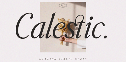 Calestic is a Serif Italic Typeface with Elegant vibes in each character with some alternate. There's some connected letters and some alternates that suitable for any graphic designs such as branding materials, t-shirt, print, business cards, logo, poster, t-shirt, photography, quotes .etc This font support for some multilingual. Also contains uppercase A-Z and lowercase a-z, alternate character, numbers 0-9, and some punctuation. If you need help, just write me! Thanks so much for checking out my shop!


