8,288 search results
(0.035 seconds)
- Hundo - Personal use only

- Bebas Neue Pro by Dharma Type,
$14.99 Thank you for waiting. Finally, Bebas Neue has got lowercases! Bebas Neue is a world wide, the most popular font family with all caps released in 2010. Bebas Neue has been used from by big companies to by startup designers for many projects. In spite of the fact that Bebas Neue has only Uppercases, it became very popular font for these 10 years. At the same time, we received many requests for adding lowercases. To be honest, we had been developing whole new Bebas Neue with lowercases secretly for long time. Thinner Uppercase from thin to regular weights were redesigned for Pro. New lowercases were designed to match the Uppercases very carefully. You can access Tabular figures by using OpenType tnum features. Almost all European languages are supported by Pro. One more big thing is... Bebas Neue Pro has Italics! Please don't use sloped Bebas Neue. Pro has proper Italics! Bebas Neue “Pro” can extend your possibilities. Be the first to use this professional and premium Bebas Neue!
 - Typewriter 1950 Tech Mono by TypoGraphicDesign,
$29.00 The typeface Typewriter 1950 Tech Mono is designed for the Typo Graphic Design font foundry in 2017 by Manuel Viergutz. A display slab serif type for headlines. Based on an old typewriter machine from 1950. Plus state-of-the-art OpenType-features like contextual alternates (calt), decorative ligatures e. g. type the word “LOVE” for ❤ and the word “SMILE” for ☺ and Versal Eszett (German Capital Sharp S). For use in magazines, posters, headlines and advertisement, plus as webfont for decorative headlines. Character Set: Latin Extended (Adobe Latin 3). 1490 glyphs with 5× A–Z, 5× a–z, 5× 0–9 and 290+ extra icons like arrows, dingbats, symbols, geomatric shapes, catchwords and many alternative letters. Have fun with this font & use the DEMO-FONT (with reduced glyph-set) FOR FREE! How To Use – OpenType-Features ■ In Adobe Photoshop and Adobe InDesign, font feature controls are within the Character panel sub-menu → OpenType → Discretionary Ligatures … Checked features are applied/on. Unchecked features are off. ■ In Adobe Illustrator, font feature controls are within the OpenType panel. Icons at the bottom of the panel are button controls. Darker ‘pressed’ buttons are applied/on. ■ Additionally in Adobe InDesign and Adobe Illustrator, alternate glyphs can manually be inserted into a text frame by using the glyphs panel. The panel can be opened by selecting Window from the menu bar → Type → Glyphs. Or use sign-overview of your operating system. ■ For a overview of OpenType-Feature compatibility for common applications, follow the myfonts-help http://www.myfonts.com/help/#looks-different ■ Font Name: Typewriter 1950 Tech Mono ■ Font Weights: Regular + Negative + Black + Mono + Icons + DEMO (with reduced glyph-set) ■ Font Category: Slab Serif Display for Headline Size ■ Font Format:.otf (OpenType Font for Mac + Win) + .ttf (TrueType Font) ■ Glyph Set: 1490 glyphs ■ Language Support: 28+ for Latin Extended (Adobe Latin 3). Afrikaans, Albanian, Catalan, Croatian, Czech, Danish, Dutch, English, Estonian, Finnish, French, German, Hungarian, Icelandic, Italian, Latvian, Lithuanian, Maltese, Norwegian, Polish, Portugese, Romanian, Slovak, Slovenian, Spanisch, Swedish, Turkish, Zulu ■ Specials: 290+ decorative extras like icons for arrows, dingbats, emojis, symbols, geometric shapes, catchwords + German Capital Eszett. ■ Open Type Features: Kerning (kern), Stylistic Set 1 (ss01) … Stylistic Set 6 (ss06), Ornaments (ornm), Titling (titl), Localized Forms (locl), Subscript (subs) Superscript (sups), Ordinals (ordn), Oldstyle Figures (onum), Lining Figures (lnum), Fractions (frac), Denominators (dnom), Numerators (numr), Standard Ligatures (liga), Contextual Alternates (calt) e. g. Stylistic Set-Loop and Decorative Ligatures (dlig) e. g. type the word “LOVE” for ❤ or “SMILE” for ☺ ■ Design Date: 2017–2018 ■ Type Designer: Manuel Viergutz
 - Baskerville No. 2 by Bitstream,
$29.99This redesign is made from proofs, rather than the metal, and so is heavier, with particular attention to the Harris and the Monotype revision, which was made from proofs of Baskerville’s Great Primer (16pt). - Dracula by Storm Type Foundry,
$37.00 The best way to radicalize your typographic expression is to use Blackletter! Gothic calligraphy had been used throughout all historical periods without much of the principal development the Latin typefaces underwent. However, since the invention of movable type, even now its slight variations over time can be seen. Blackletters are always used where emotions are required, be it spiritual literature, romantic novels, decadent poetry or extreme music. Dracula is a typeface dedicated to classical horror. I started to draw its letters along with my illustrations for Argo publishers in spring 2017. I needed a specific typeface for book cover and chapter titles to emphasize the mysterious atmosphere of the text. Sharp teeth and claws on a thin blackletter skeleton shall remind of the early vampirism in literature. Its slightly narrowed face enhances a thrilling feel of anguish and despair, whereas the darkest cut may work well on funeral announcements.
 - Provincia by Goodigital13,
$20.00 Perfect for wall displays, wedding invitations, social media post logos, advertisements, product packaging, product designs, labels, photography, watermarks, invitations, quotes, stationery, and another project that requires taste handwriting. The mockups and images are for preview purposes only and not included in the download file
 - Takidos by Prioritype,
$15.00 A bold and unique font is here to accompany your project, it can be applied to t-shirts, logos, video covers, book covers, food labels, and much more. See some of the previews above for an illustration. Features: -Uppercase -Lowercase -Numeral -Punctuation -Multilingual -Alternate Thanks.
 - Outdoors by Vozzy,
$10.00 Introducing a vintage label layered font named Outdoors. A lot of punctuation and multilingual symbols. Also alternates for all lowercase. All set you can see at the preview. This strong typeface is perfect for lettering on vintage style labels, posters, t-shirts, logo etc.
 - Lazy Dude by Gleb Guralnyk,
$14.00 Hi, introducing a creative bold font Lazy Dude. It's an all caps typeface with smooth curvy shape. Lazy Dude has a wide languages support with west european and cyrillic characters (check out all available characters on previews). Thank you and have a nice day!
 - Caligendings by Prioritype,
$15.00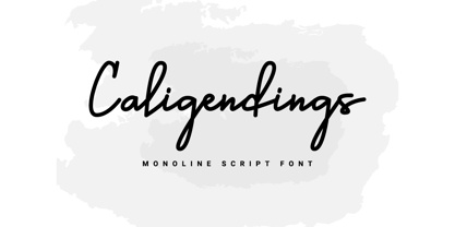 An elegant looking font that's perfect for your project and supports multilingualism. Can be applied to brochures, creative posts, boutiques and salons, women's jewelry, wedding invitations, business cards, photographer watermarks, clothing, and more. For reference, see preview. Features: -Uppercase -Lowercase -Numeral -Punctuation -Ligature -Multilingual
 - Cosmic Lager by Vozzy,
$5.00 A vintage look label font named "Cosmic Lager".Typeface includes four styles for clean version and four styles for rough version, for sample look at 4th preview. This font will good viewed on any retro design like poster, t-shirt, label, logo etc. Thank you!
 - Custard by Device,
$39.00 Playful and funky. The ideal choice for candy wrapping, teen magazines, toy packaging and the like. The reweighted condensed is useful where space is at a premium, and mixing the two weights freely leads to intriguing results. Use with bright fresh colors for added "bounce".
 - Mensa by AVP,
$19.00 A large x-height, open forms and colorful weight variations make Mensa an extremely legible body face particularly where space is at a premium. The three widths and six weights together with italics provide plenty of options for setting magazines, books and web pages.
 - Andrew Ward - 100% free

- Hendrix Demo - Unknown license

- Hesperides Demo - Unknown license

- Ithuriel Demo - Unknown license

- Hamilton Demo - Unknown license

- Suchow Demo - Unknown license

- JI Tracks - Unknown license

- NataliScript by ParaType,
$30.00PT Natali Script™ was designed by Natalia Vasilyeva and licensed by ParaType in 2002. An original calligraphic script. For use in advertising and display typography. - Flute by Typotheticals,
$5.00 Flute was a font that was released in 2006 now, in 2022, it has been updated to increase the number of faces, including a bold version.d.
 - Mr. Quincy - Personal use only

- Albertsthal Typewriter - Personal use only

- Loxley by Canada Type,
$24.95 Drawn shortly before Jim Rimmer's passing in 2010, Loxley was designed to be used in a fine press edition of the folklore story of Robin Hood. It was named after the cited birthplace of the story's classic hero. Loxley's shapes were inspired the same early Roman faces (such as Subiaco from the late 1400s) that influenced Frederick Goudy's Aries, Franciscan and Goudry Thirty types. It exhibits the preculiarities of Jim's left-handed calligraphy, as well as his outside-the-box thinking with exit strokes and serif variations. Loxley was remastered for the latest technologies in 2013. Now it comes with a character set of over 450 glyphs, including plenty of stylistic alternates, a full compliment of f-ligatures, a Th-ligature, basic fractions, ordinals, a long s for historic setting, comprehensive class-based kerning, and extended Latin language support. 20% of this font's revenues will be donated to the Canada Type Scholarship Fund, supporting higher typography education in Canada.
 - Sharplion by Zeki Michael,
$30.00 Sharplion is a typeface family designed by Zeki Michael and Leyla Melis Aslan. It’s a simple, but sharp display typeface with a clear yet powerful personality, created to not only optimize space, but also build contrast on the printed page and on the screen. Sharplion, coming in two weights and a matching slanted version, is designed to give that neo-vintage industrial feel in 'titles and hierarchic subheadings, logotypes and cases of short and simple copywriting for the artisan, hand-made and small batch look.’ The first 4 letters for what is now Sharplion, were designed in 2018 by Zeki Michael to be used as a logotype for Depo Coffee Roasting’s branding project. In early 2019 after Zeki designed all the letters, numbers and glyphs, he teamed up with talented designer, Leyla Melis Aslan to add strength to the project. The full Sharplion type system includes Regular, Black and Slanted styles – providing a simple but sharp contrast type solution for digital and print design work.
 - Kuenstler 480 by ParaType,
$30.00 The Bitstream version of Trump Mediaeval of Linotype, 1954-60, by Georg Trump, a prolific German type designer. It seems to be his best typeface. It has a vigorous and assumed oldstyle roman and italic that is the sloped roman, except for the letters a, e, f. With its crisp angularity and wedge-shapes serifs, Trump Mediaeval appears carved in stone. It is a strong text typeface that is highly legible and especially useful for low-resolution output. It is useful in display work too. Cyrillic version developed for ParaType by Vladimir Yefimov and Isabella Chaeva and released in 2010. Cyrillic italics maintain the main feature of Trump Mediaeval to be the sloped roman, except for the letters г, д, и, й, n, т. There are old style figures, additional ligatures and fractions available at all styles and small caps at the Roman 55. Black style was added in 2011 by Vladimir Yefimov.
 - Carrig Pro by Monotype,
$31.99 Carrig Pro is a refined and elegant serif. Classed as an Antiqua, Carrig Pro is born from [or borne by] a hybrid of influences that range from early Roman inscriptions to type of the Pre-Modern era, giving Carrig Pro a distinctive character all of its own. Carrig Pro will appear instantly familiar and friendly and could well be the perfect typeface for designers seeking to convey a message with a distinctive and prestigious air. Now a 12-font family, Carrig Pro (2017) is an extended version of Carrig (2015), it has been completely redrawn, revised and improved. Carrig Pro has many useful features for typographers to exploit, such as easily accessible small caps, discretionary ligatures, gadzooks and stylistic alternates, as well as a number of ornamental glyphs. See more here. Key features: 6 weights in roman and italic Small Caps, Ornaments, Alternates, Historic Characters, Ligatures and Gadzooks Full Latin character set 750 glyphs per font.
 - AW Conqueror Std Slab by Typofonderie,
$59.00 Slab serif with a 70’s aesthetic A version of AW Conqueror Sans, AW Conqueror Slab draws inspiration from geometrical slab serifs of the 1930s, of which Rockwell is a perfect example. Lubalin Graph, a reworking of the genre, came out in the wake of the Avant Garde wave of the early 70s. In recent years, ‘slabs’ have made a comeback in the graphic design world. AW Conqueror Slab advances the cause quite happily. AW Conqueror superfamily AW Conqueror Didot is part of a larger family, who include 4 others subfamilies with great potential: They’re but based on same structure, with some connection between them (width for example), to offer a great & easy titling toolbox to any designers, from skillful to beginner. Each of the members try their best to be different from the others because of their features. They should work harmoniously in contrast. Club des directeurs artistiques Prix 2010 European Design Awards 2011
 - Lindage Script by Josstype,
$14.00 Lindage Script is a handwritten typeface with classic roots, a beautiful formal script with an elegant touch. It works perfectly in the world of weddings, logos, greeting cards, branding, print ads, quotes, signage, magazines etc. Lindage Scrip features 346+ glyphs and 116 alternate characters, including initial and terminal letters, alternates, swashes, ligatures and multiple language support. To enable the OpenType Stylistic alternates, you need a program that supports OpenType features such as Adobe Illustrator CS, Adobe Indesign & CorelDraw X6-X7, Microsoft Word 2010 or later versions. There are additional ways to access alternates/swashes, using Character Map (Windows), Nexus Font (Windows), Font Book (Mac) or a software program such as PopChar (for Windows and Mac). How to access all alternative characters: http://youtu.be/iptSFA7feQ0nn http://cuttingforbusiness.com/2016/01/28/how-to-use-opentype-fonts-in-silhouette-studio-or-cricut- design-space/ https://www.youtube.com/watch?v=Go9vacoYmBw Thank you for your purchase! And please let me know if you have any questions via email: joelpopon@gmail.com
 - Woodford Bourne by Monotype,
$20.99 Woodford Bourne is a brand new 19th century grotesque typeface. The design is a tribute to the historic stone cast type in the building façades of the former Woodford, Bourne & Co. in Cork City, Ireland. For many years I had admired the type’s simplicity and strength, so I decided to faithfully reproduce those letters and expand them to a fully working font with 500 glyphs per case. A key feature of Woodford Bourne is the ability to change the feel of your typography with just one click. Switch from contemporary to vintage style by selecting “Stylistic Set 1” – this gives Woodford Bourne a unique versatility which I am sure you will enjoy playing with in your designs. It is a solid, reliable “workhorse” font family that reproduces well at all sizes… it’s also great for branding and identities. These font files (v2) were redrawn and updated in April 2021 (v1 created 2015).
 - Chilead by Groteskly Yours,
$12.00 Chilead is reminiscent of the early days of magazine publishing. Its elegant curves, high contrast and all-round heartwarming feel are perfect for art projects and typography across all mediums. Chilead is a sans serif font that looks great in titles, when used in larger sizes – but is not out of the place in a text either, which makes it a perfect choice for artists and designers who pursue not only the aesthetic qualities of the font, but also its functionality. Originally designed in 2019 and fully updated and expanded in 2022, Chilead offers users a large set of ligatures (both standard and discretionary) and a number of alternative forms for letters (such as a, v, w, y, etc). Chilead comes equipped with 600+ glyphs, which covers most of Latin-based scripts. Carefully kerned, Chilead is ready to be used in any project that requires a typeface that combines unique and stylish letterforms with a modern feel.
 - AW Conqueror Std Didot by Typofonderie,
$59.00 Homage to 70s phototype typography in 3 styles The AW Conqueror typeface family is a nod to the spirit of phototype typefaces and transfer lettering from the early 70’s. Founded by Ed Rondthaler, Photo-lettering catalogs swarmed with more daring typefaces than the others. Both transfer letter and phototitling have liberated the principle of letter-to-letter spacing, previously impossible with metal type. Phototype allowed operators to position millimeters, on the fly, letter after letter: words, sentences according to the specifications of the art director. AW Conqueror superfamily AW Conqueror Didot is part of a larger family, who include 4 others subfamilies with great potential: They’re but based on same structure, with some connection between them (width for example), to offer a great & easy titling toolbox to any designers, from skilful to beginner. Each of the members try their best to be different from the others because of their features. They should work harmoniously in contrast. Club des directeurs artistiques Prix 2010 European Design Awards 2011
 - Modar by SAMUEL DESIGN,
$29.00 MODAR means Modern and Artistic. A good font must be enduring and of high quality. This typeface is beautiful and noble, like an elegant sculpture, both historical and modern. This font is great for fashion, magazines, premium services, publishing, and also great for premium brands. MODAR is paired with a sans-serif typeface for a simple yet elegant visual effect. The font is very straight and has high-quality details, combining Eastern and Western aesthetics in one typeface. Designers borrowed classic fonts such as Didot and Canela in this font, combined with the elegant style of personal advocacy, to create 350 characters. I hope this font will help your brand be more visible.
 - Lincoln Road by District 62 Studio,
$29.00 Introducing our new Lincoln Road Font Collection. Deco, but not too Deco. A Lincoln Road is a family of 9 fonts including 2 weights of Deco and 6 weights of a coordinating Sans and an Elements font that contains the frames and elements you see used in the previews. Each Deco weight has a corresponding Sans weight. Lincoln Road was inspired by art Deco styles, but is a modern interpretation - in other words - not too deco. It works for modern projects that need a hint of a decorative look and can also be used for a more vintage vibe. Check out the previews to see some of the ways you can use this family.
 - Text Book by ParaType,
$30.00 Designed at Polygraphmash in 1958 by Elena Tsaregorodtseva; Latin characters and italic were added in 1987 by Emma Zakharova. An early sans serif ('Grotesque'), it was developed for primers and the first level school textbooks.
 - Akademie Alte - 100% free

- Digital tech - Personal use only

- Club - Personal use only

- Holitter Halfimp - 100% free


