10,000 search results
(0.077 seconds)
- Magoat by Fikryal,
$25.00 Magoat – Modern Clean Bold Font is the perfect choice to infuse a contemporary and bold touch into your graphic design projects. With its distinctive All Caps style, Magoat has the ability to capture attention with clarity and courage. Each character is designed with precision, showcasing the cleanliness and modernity that define this font. With its bold shapes, Magoat is well-suited for titles, logos, and other design elements that require a strong and clear presence. Despite its bold appearance, the clarity of each letter is maintained, ensuring that your message is conveyed with precision and readability. With Magoat, your design projects will gain a fresh, contemporary, and professional touch, bringing a clean and bold look to various visual platforms. If you have any questions please don’t hesitate to contact me Follow my Instagram: @fkryall Thank you
 - Typist Slab Prop by VanderKeur,
$25.00 The Typist SlabSerif is part of a big family, the Typist Family. The family consists of a monospaced, a SlabSerif and a SansSerif version. The idea behind this family originated from the research into the design of typewriter typestyles, which is also the reason why the monospaced version was released first. Since it was decided from the start to make a SlabSerif and a SansSerif version of these monospaced fonts, it was also a logical consequence that the proportional variants also became available in these versions. The monospaced SansSerif fonts have been given the name 'Code' since they are designed to be used while writing code for a software program, for example. The proportional variants with each 6 weights of the Typist Slab Serif and Code (SansSerif) are now available. Although the name may seem a bit strange, it is a logical consequence from the monospaced variant. The SlabSerif variant therefore has Typist Slab Prop, written in full the Typist SlabSerif Proportional. After all, who wants to be bothered with long font names in their font menu. The entire Typist family is designed as a font for use in editorial and publishing publications. A lot of attention has been paid to the spacing and kerning of the fonts. Due to the many variants and weights, this font is versatile. Typist Font Family was designed by Nicolien van der Keur and published by vanderKeur design. Typist Slab Prop and Typist Code Prop contains each 6 styles (Thin, Light, Regular, Medium, SemiBold and Bold, each weight also designed as a true italic) and has family package options. The links to the monospaced version of The Typist are here: https://www.myfonts.com/collections/typist-slab-font-vanderkeur https://www.myfonts.com/collections/typist-code-font-vanderkeur
 - Typist Code Prop by VanderKeur,
$25.00 The Typist Code SansSerif is part of a big family, the Typist Family. The family consists of a monospaced, a Slab Serif and a SansSerif version. The idea behind this family originated from the research into the design of typewriter typestyles, which is also the reason why the monospaced version was released first. Since it was decided from the start to make a SlabSerif and a SansSerif version of these monospaced fonts, it was also a logical consequence that the proportional variants also became available in these versions. The monospaced SansSerif fonts have been given the name 'Code' since they are designed to be used while writing code for a software program, for example. The proportional variants with each 6 weights of the Typist Slab Serif and Code (SansSerif) are now available. Although the name may seem a bit strange, it is a logical consequence from the monospaced variant. The SansSerif variant therefore has Typist Code Prop, written in full the Typist Code Proportional. After all, who wants to be bothered with long font names in their font menu. The entire Typist family is designed as a font for use in editorial and publishing publications. A lot of attention has been paid to the spacing and kerning of the fonts. Due to the many variants and weights, this font is versatile. Typist Font Family was designed by Nicolien van der Keur and published by vanderKeur design. Typist Slab Prop and Typist Code Prop contains each 6 styles (Thin, Light, Regular, Medium, Semi-Bold and Bold, each weight also designed as a true italic) and has family package options. The links to the monospaced version of The Typist are here: https://www.myfonts.com/collections/typistslabfont-vanderkeur https://www.myfonts.com/collections/typist-code-font-vanderkeur
 - Rauda by Graviton,
$12.00 Rauda font family has been designed for Graviton Font Foundry by Pablo Balcells in 2017. It is a display, sans serif, geometric typeface, with sharp angles that provides a strong and solid appearence. Rauda consists of 8 styles. Each containing glyph coverage for several languages.
 - Cross Boxed by Namara Creative Studio,
$14.00 Bold modern sport font with rounded corners in consistent angles. A strong and unique style instantly adds power of movement to your creative projects. It's perfect for logotypes, headlines, game covers, sports events, posters, magazine covers, branding, product design, labels, and other suitable projects.
 - Ellisea by cm5dzyne,
$10.00Ellisea (pronounced L-S-E) blends traditional letter shapes with straight lines to project a strong, unique image perfect for display purposes or medium-length text blocks. Ellisea is best used in printed material but is attractive in small sizes on screen as well. - Tropea by Larin Type Co,
$18.00 Tropea is a elegant ligature serif font This font has a regular weight and looks amazing in logos, branding, arranging wedding invitations, business cards, packaging, titles and much more, it is very readable and recognizable. This font includes alternates for Uppercase and Lowercase, with them you can make your project more elegant and originality. Also, this font has many ligatures for upper and lower case, they will add charm and uniqueness to your project This font is easy to use has OpenType features. Font includes: Full alphabet with Uppercase and Lowercase A-z Numbers, fractions Punctuation and symbols Alternates for Uppercase and Lowercase Ligatures for Uppercase and Lowercase
 - Jefith by Twinletter,
$10.00 Jefith is a family of san serif fonts that are designed with great care by paying attention to the combination of each letter to create a beautiful impression and appearance, making it easier to answer your needs, both formal and non-formal needs. All Capital sans is charming and brave in its application, a font with a bold style and strong character makes your design look bold and bold to convey a message to consumers in every design, this font is equipped with rough and stamp variations This font is perfect for a wide variety of vintage, retro and various outdoor events, sporting events, branding, banners, posters, movie titles, food and drink, technology, quotes, clothing, and more.
 - Marleone Brando by IKIIKOWRK,
$13.00 Introducing Marleone Brando - Condensed Sans, created by ikiiko. Marleone Brando is a bold-sturdy font with strong character, inspired by the typeface in mafia films. Marleone Brando has two types of letters, regular and oblique. A simple font with a bold size with shadow line inside, make this font look elegant and classy impression. This typeface is perfect for an elegant logo, branding, movie poster, layout magazine, sport wear, packaging product, quotes, or simply as a stylish text overlay to any background image. What's included? 2 Weights Regular & Oblique Uppercase & Lowercase Number & Punctuation Multilingual Support Works on PC & Mac Enjoy our font and if you have any questions, you can contact us by email : ikiikowrk@gmail.com
 - Kasepi Sans by Yukita Creative,
$15.00 Kasepi Sans Display Typeface is a font that combines a modern style with a classic touch. With bold lines and balanced proportions, this font gives off an attractive and classy impression. Great for use in titles, headers and headline designs that need a strong visual appeal. This font style is a font that combines strength, clarity, and elegance. With its modern style and classic touch, it is ready to give your design an attractive and classy impression.
 - Nitrous by Angga Mahardika,
$20.00 Nitrous is a script and serif typeface with elegance and vintage looks. This font has some of alternate characters, swashes and ligatures. You can design beautiful, elegant and diverse typographic elements with it. This font duo is effective on product packaging, particularly for wares that prefer a handcrafted, artisan approach to their finished presentation. Nitrous is ideal for strong branding, identity, and logo design, as its letter forms effortlessly express a tone of familiarity, reliability, and timelessness.
 - DT Skiart Serif Leaf by Dragon Tongue Foundry,
$10.00 ‘Skiart Serif Leaf’ has been on a long growing path getting to where it is now. Originally inspired by the san serif font ‘Skia’ by Mathew Carter for Apple. ‘Skiart’ was designed to feel more like a serifed font, but without any serifs. It took a step between sans serif and serif fonts. Next on the path towards a serif font came Skiart Serif Mini, with tiny serifs added. This was a true serif font, although they were subtle. This font ‘Skiart Serif Leaf’ is the next in the series. After many reiterations, ‘Skiart Serif Leaf’ was built and rebuilt many times until finally, this version deserved to be presented to the world. Style and flow had been added to this font. It remained fully readable and feels as clean and normal as any of the best body copy serifs, and yet has an original modern flair to it. The font feels strong and solid while having a subtle organic flow in its form. If compared to one of the more commonly used serifs like ‘Times New Roman’, the ‘Skiart Serif Leaf’ lowercase is more open with a taller x-height, increasing its readability and friendliness. The serifs are smaller and less distracting. They are not pretending to be ligatures. This font may be organic but is not in anyway script like. Where ‘Times’ makes its p q b d forms out of a barely touching oval and stem, the ‘Serif Leaf’ forms are much more firmly attached, appearing clearly as single letters. The standard setting for the a’s and g’s are round single story, feeling warmer and more inviting in the ‘Serif Leaf’ font. Much more friendly than the stuffy double storied versions in fonts like ‘Times’ etc. ‘Skiart Serif Font’ comes with a somewhat organic italic.
 - Marat by Ludwig Type,
$45.00 Although originally conceived as a magazine face – with strong serifs and open character shapes for good legibility in small sizes, and compact letter forms optimized for narrow columns and tight headlines – Marat evolved into a comprehensive family for general use. This specific construction and the round forms of the letters create an elegant, soft and friendly appearance. The typeface suits a wide range of typography, e.g. editorial, brochures, packaging and corporate design. In particular, in bold weights it works surprisingly well, which is not always the case with serif faces. Marat includes oldstyle and lining figures (both proportional and tabular), a wide range of language support and various OpenType features (e.g. ligatures, case-sensitive forms, fractions, superiors and inferiors). It is the perfect companion for Marat Sans, a clean and lively sans serif typeface. Marat has been selected by the Type Directors Club of New York to receive the Certificate of Excellence in Type Design 2008.
 - Hyper Turfu by Bisou,
$10.00 Made in La Chaux-de-Fonds (Switzerland), HyperTurfu was born during the shooting of “The Return of Hyperturfu Xpress 2”. A GoPro on a lego electric train, meters and meters of rails, an empty industrial space, loads of puppets, paper, cardboard, pizza boxes, lights, hot glue and a bunch of friends preparing a one shot scene for a month. The title of the movie was made out of lego pieces, painted with golden spray and hanged over the rails. It was the first inspiration for this awsome superbold font. HyperTurfu is thought from ground up to give a strong impact. It’s gothic retro science fiction 80’s style makes it best suitable for metal music albums or posters. As the “Banco” font it works perfectly with short texts for advertisement, bar, cofee shops concert places or even fancy hairdresser. Just hang it over a pet shop and see what cool animals will come in.
 - Tabloid Dot M by Nadyr Rakhimov,
$10.00 TabloidDot M is a simple monospace font created for a small project. It had one task, to imitate the inscriptions on the electronic scoreboard in the form of dots arranged on a grid. As time went on I decided to make an extended version of the font with alternate letters and more styles, plus a variable font to control the size of the dots. The font has 6 stylistic sets, Proportional and Old-style figures, Ornaments, a set of Arrows, Currency Symbols, and supports Extended Cyrillic.
 - Rockinstead by PintassilgoPrints,
$35.00 Rockinstead counts 1, 2, 3, 4, 5, 6, 7, 8... Eight variations per letter, plus alternates for numbers and even for punctuation marks! It is equipped with some clever OpenType programming to make substitutions on-the-fly: the Contextual Alternates feature, with the help of a very careful kerning table, takes care of cycling the alternates in an amazing random-like way, impressively mimicking a true handwritten text. The Discretionary Ligatures feature manages the substitution of handy cursive catchwords, adding that charming twist. To put it more bluntly, this font AUTOMATICALLY alters your typing so that it substitutes glyph variations while you do nothing but type away! No need to use PopChar here to do the substitutions manually, the font itself takes care of that for you. This typeface was originally painted on paper, drawing inspiration from Ralph Steadman’s seminal lettering style. On a first glance it may look quite wild - and it proudly is, indeed. But look again: it is stylishly wild, it is strong, unpredictable, full of attitude and good energy. This multifaceted font will certainly strike its way for free-spirited design applications. Just please be warned: it’s seriously addictive!
 - Busted by Canada Type,
$24.95 Busted is the very strange and out-of-character outburst of Bill Troop, a guy who was classically trained in everything, from classical piano and literature to classical photography and type design. As far as we could tell, Bill Troop is the kind of guy whose appearance and voice instantly trigger thoughts of black and white photos, fedoras, and pre-industrial age Europe. A few years ago, he even moved from the United States to England, where it took him less than a week to feel at home and start sounding like a Norwich native. Then something happened and the poor dude just snapped. Busted is the controversial result of the blood rushing to his head. If you know what exactly happened to him, please let us know. Concern, consideration and human interest story aside, Busted is a fascinating thing. It is a set of four interchangeable thick outline fonts where the same letter forms turn from wild to wilder to broken to somewhat clean. Mix them up in a setting and you have words that snarl with a sneer. Life's too short. Take it all with a grain of salt. Scream whenever you feel like it. Busted Pro is a single font combining all four character sets, and rigged with an OpenType pseudo-randomizer in the contextual alternates feature, which you can disable or enable anywhere in your setting for maximum visual shock just the way you like it. Works just as well in PAL or SECAM. Don't be fooled by imitations, and don't get caught with your drawers down.
 - Cream Cheese by Rocket Type,
$10.00 Cream Cheese and Onion Bagels go together like apples and oranges. Taste this brand new font duo from Rocket Type! Great for branding, broadcast, and childrens books!
 - Patihan Variable by Jehoo Creative,
$119.00 Introducing Patihan Variable, a variant that makes it easy for you to access fonts with sharp, strong, bold characters. Patihan Variable is a combination of three different styles – Sans, Slab, and Serif – which are united into 2 Axes weight axes and serif axes, where weight axes have instances: Thin, Extra Light, Light, Regular, Medium, Semibold, Bold , Extrabold, and Black. This font has beautiful Ligature and Stylistic Alternate settings, Patihan font is also equipped with the Smallcaps feature which gives more control over typography, allowing you to create elegant and unique typography. The sans version of this typeface is versatile and easy to read, with a minimalist but impactful aesthetic. The Slab version is characterized by its solid and powerful strokes, while the Serif style has that extra classic flair with elegant curves and a stark contrast to the look. Patihan Variable is optimized to make it easier to access each variation, all you have to do is slide the slide in the software, and then you can access the style you want. Without sacrificing easy readability, this makes it a great choice for headlines, titles, and any long-form content. Ligature settings and discretionary styling add an extra layer of sophistication, making this font a great choice for magazines, branding and advertising. Overall, this font is a great choice for those looking to make a lasting impression. Its versatility, readability and unique features make it an excellent choice for any project.
 - Varien SS by Sensatype Studio,
$15.00 A Modern Strong Display Font that perfect for technology, sport, racing, action design project. A new Display Font that we created special for Headline, Title and more stand out typography needs, with extra outline that will add your variations. It's so perfect to add your style and headline overview. And specially for Headline font, we crafted for futuristic style and modern feels so enjoy to create any project that will show your main idea out. Varien Modern Strong Display Font ready with: Any options to get creative variations (combination of Outline Characters) Preview as a inspirations that you can do with Varien font Ready with All Uppercase characters Wish you enjoy our font. :)
 - Pantera by Lián Types,
$39.00 ROARRR! THE STYLES -Pantera Pro is the most complete style, and although its default look is mono-rhythmic it gets really playful and crazy like the examples of the posters by just activating the Decorative Ligatures button in the Open-type Panel of Adobe Illustrator. However, I recommend using also the Glyphs Panel because there you'll find much more variants per letter. Pantera Pro is in fact, coded in a way the combination of thicknesses will always look fantastic. -Pantera Black Left, and Pantera Black Right are actually “lite” versions of Pantera Pro: They have very little Open-Type code, so what you see here is what you get. Pantera Black Left has its left strokes thick, while Pantera Black Right has its right strokes thick. -Pantera White is a lovely member in this family that looks lighter and airy, hence its name. With the feature Standard Ligatures activated (liga) the font gets very playful. -Pantera Caps is based on sign painters lettering and since it follows the same pointed brush rules as the other styles, it matches perfectly. -Pantera Claws like its name suggests, is a set of icons that were done by our dear panther. THE STORY It is said that typography can never be as expressive as calligraphy, but sometimes it can get close enough. I tend to think that calligraphic trials, in order to work well as potential fonts, need first to go through very strict filters before going digital: While calligraphy is synonym of freedom (once its rules are mastered), type-design, in the other hand, has its battlefield a little tighter and tougher. When I practice pointed brush lettering, there are so many things happening on the paper. And most of them are delicious. The ones who know my work may see that although many of my fonts are very expressive, my handmade brush trials are much more lively than them. With that in mind, this time I tried to go further and rescue more of those things that are lost in the process of thinking type when first sketches are calligraphic. I wondered if I could create something wild, hence its name Panther, by understanding the randomness that sometimes calligraphy conveys and turning it to something systemic: With Pantera, I created an ordered disorder. Like it happens a lot in many kinds of lettering styles, in order to enrich the written word the scribe mixes the thickness of the strokes and the width of the letters. Like one of my favorite mentors say (1), they make thoughtful gestures Some lively strokes go down with a thick, while some do that with a thin. Some letters are very narrow, meaning some of them will need to be very wide to compensate. Why not?. The calligrapher is always thinking on the following letters, and he/she designs in his head the combination of thicks and thins before he/she executes them. He/she knows the playful rhythm the words will have before writing them. It takes time and skill to master this and achieve graceful results. Going back to the font, in Pantera, this combination of varying thicknesses and widths of letters were Open-Type coded so the user will see satisfactory results by just enabling or disabling some buttons on the glyphs panel. I'm very pleased with the result since it’s not very easy to find fonts which play with the words' rhythm like Pantera does, following of course, a strong calligraphic base. I believe that if you were on the prowl for innovative fonts, this is your chance to go wild and get Pantera! NOTES (1) Phrase by Yves Leterme. In fact, it’s the title of a book by him. EPILOGUE Esta fuente está dedicada a mi panterita
 - Faktum by René Bieder,
$39.00 Faktum is an exploration into the geometric sans genre, inspired by Mid-century modern architecture and interior design. Especially the combination of clear lines, organic curves and geometric shapes, highly popular among designers and architects of the second third of the 20th century, gave the impetus for a design with clear modernist roots and a strong contemporary finish. The family comes in 8 weights plus matching italics, featuring a wide range of alternate characters and opentype features like discretionary ligatures, case sensitive shapes, different number sets and many more. Due to its clean lines and slightly organic structure, Faktum functions great in many sizes and surroundings, working either as a restrained supporting font in long paragraphs, or as a main actor in powerful headlines.
 - Leonard by Fenotype,
$25.00 Leonard is a bold brush script with strong character. Leonard has low contrast, smooth letterforms and high x-height. It’s great for single words or longer text passages; use it in logos or headlines, in packaging, posters, illustrations or product design. Leonard is packed with OpenType features. It has Contextual Alternates and Standard Ligatures that help to maintain the flow and keep the letters from colliding. These features are automatically on. In addition it has Discretionary Ligatures, Swash, Stylistic and Titling Alternates that you can access from OpenType controls for more custom look, and you can check the Glyphs palette for even more alternates from the total 534 glyphs. All characters shown in the posters can be found inside the font.
 - Redzone by VarsityType,
$10.00 “Redzone” is a versatile display family developed as the workhorse typeface for the “Ultimate Football League”, a fictional football league passion project. With a strong focus on the sports branding industry, “Redzone” has a voice that is competitive and sophisticated, its letterforms featuring angled terminals and sharp serifs across 5 weights and widths. Its generous x-height and overall build makes it especially capable for headlines, thought it serves well for shortened body type as well. The “Redzone” name was debuted in October of 2017 as a titlecase font (later refined and renamed “Redzone Classic”), redesigned in November of 2018 with sheared and stenciled styles, and is now presented in the most streamlined version yet with the same charming fearlessness still present. Enjoy!
 - Big by Walking Fearless,
$20.00 BIG is an elegant condensed display font created for strong and impactful headlines. It comes from a series of hand printed specimens taken from wood type found in Andrew Howard’s Studio in Porto (Portugal). A wooden type that reassembles the industrial victorian style which has now been expanded to 20 cuts, ranging from ExtraLight to Bold, with Italics and a stencil version, covering all your needs for a striking visual effect just with plain type with distinctive features and personality, standing out from the crowded world of display sans serif. The font was engineered with essential OpenType features, that allows the user to compose the headlines in two different heights, with case-sensitive punctuation, symbols and special ligatures such as “the”, “of” and “le”.
 - Death Angel by ryan creative,
$12.00 Death angel has a strong and aggressive look with crisp, sharp lines. This font has hard angles and leans slightly towards the vertical, giving it a sharp, scary feel. accompanied by additional ornaments that you can custom style yourself. can be applied like, t-shirt design, product design group name, quotation etc. Note: For how to use this font, you can visit Ryan creattive youtube, or the link below; https://youtu.be/8XxjuAcXlbk FEATURES; -Uppercase, -Support Foreign, Numbers and Punctuation. -Ornaments. -Works on PC. -Simple installation. -Accessible in Adobe Illustrator, Adobe Photoshop. Adobe InDesign, it even works in Microsoft Word. -Fully accessible without additional design software. Death angel is coded with Unicode PUA, which allows full access to all additional characters without having to design any special software. Mac users can use the Font book, and Windows users can use the Character map to view and copy any extra characters to paste into your favorite text editor/app. thank you for visiting ;)
 - Fresh Squeezed by LetterBalm,
$19.99 A Splashy font inspired by all things liquid and wet, the goal was to create a fun and realistic representation of water in the form of a letter. Water parks, Juice bars, your backyard pool party or your box of fresh squeezed orange juice, any time you need a good splash.
 - DB Easter Fun Doodles by Illustration Ink,
$3.00DB Easter Fun Doodles is a collection of enjoyable Easter and spring themed sketches and doodles. - DB Flower Power by Illustration Ink,
$3.00DB Flower Power is a collection of cute flowers in bloom with a spring themed feel. - Gilter by Shakira Studio,
$23.00 Start good day for new font! present to you, Gilter! Gilter is a font created specifically to give your designs a modern, stylish, and unique feel. With a combination of fun retro serif shapes and an elegant appearance, this font is the right choice for designs that want to display a creative impression and be different from the others. Gilter presents strong and tough-looking letter characters, but still maintains a friendly and welcoming impression. This makes this font very suitable for various types of projects, from branding, packaging, posters, to website design. What's you get? Gilter Regular Gilter Italic Unique letterforms Works on PC & Mac Simple Installations Accessible in the Adobe Illustrator, Adobe Photoshop, Microsoft Word even work on Canva! PUA Encoded Characters Fully accessible without additional design software. I really hope you'll get pleasure using Gilter font and it will be perfect addition to your font collection! If you have some questions, please write me a letter! Shakira Studio
 - Grit Gothic by Baseline Fonts,
$39.00 You can hear the wheels of imagination turning within this font - Grit Gothic, from Grit History™ B Series, by Baseline Fonts. Both highly stylized and very legible, the extreme height of this font can give even a goblin vertigo. Extended X heights create lowercase that adventurously reach up through extended shoulders and spines while persistent grunge warns of skinned knees that may result along the climb. It’s easy to envision children’s rallying cries in Grit Gothic, perfect for book titles, film titles, poster headlines, and any other epic that needs a strong font with a dark edge of mystery and wonder. This font is rife with personality, including large and daunting punctuation, whittled wood-look vertical bars that berate and argue with beveled bowls, ascenders that attempt to intimidate one another with their height variances, and tittles that bully one another, as they're a variety of context dependent sizes. Grit Gothic is available in Regular and Bold with full Greek-lettered foreign language support.
 - Valentine Heart by Selvia Design,
$14.00 "Valentine Heart" is a very unique and beautiful script font. This font is equipped with upper- and lower-case letters, ligatures, numerals, punctuation, and multilingual support. Valentine's Day, a wedding, spring, an invitation, and other romantic occasions are ideal.
 - Amalia Valentine by Yoga Letter,
$20.00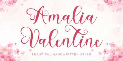 "Amalia Valentine" is a beautiful and cute handwritten font. This font is equipped with uppercase, lowercase, numerals, punctuations, and multilingual support. It is very suitable for valentines, weddings, engagements, invitations, spring, winter, mugs, stickers, banners, branding, posters, and others.
 - Black Combat by Yoga Letter,
$15.00 "Black Combat" is a unique, elegant, and fantastic handwritten brush font. This font is equipped with upper- and lower-case letters, numerals, punctuation, and multilingual support. Perfect for Easter, Spring, Halloween, Summer, logos, banners, posters, branding, stickers, and more.
 - Redfighter by Ditatype,
$29.00 Redfighter is an attention-grabbing display font with a games theme, featuring large letters and a rectangular shape with sharp corners. This font shows large letters that demand attention and make a statement. The generous size of each character ensures maximum visibility and impactful design elements. This design choice allows this font to stand out and grab the viewer's attention with its imposing presence. The rectangular shape with sharp corners in Redfighter adds a sense of structure and strength to the font. The clean lines and defined angles create a visually bold and striking appearance. This unique feature evokes a sense of power and precision, reflecting the intensity and competitiveness found in the gaming world. For the best legibility you can use it in the bigger text. Enjoy the available features here. Features: Stylistic Sets Multilingual Supports PUA Encoded Numerals and Punctuations Redfighter fits in headlines, logos, posters, titles, branding materials, print media, editorial layouts, website headers, and any other projects that aim to create a strong visual impact. Find out more ways to use this font by taking a look at the font preview. Thanks for purchasing our fonts. Hopefully, you have a great time using our font. Feel free to contact us anytime for further information or when you have trouble with the font. Thanks a lot and happy designing.
 - Flowery Drop Caps by Celebrity Fontz,
$15.99The Flowery Drop Caps font is a set of highly ornate block letters with rich embedded flowery designs, perfect for Spring and holiday themes and publications or any text where you want to add some texture, pizzazz, and depth to make your message stand out. This one-of-a-kind font has the feel of a homemade embroidered or quilted design and comes with both upper and lower case letters to give you more design flexibility. (Numbers, special characters, and punctuation are a neutral sans serif typeface and are included for convenience only.) - Vanio by Eko Bimantara,
$24.00 Vanio is a wedge serif font family that crafted with precision, focused on both aesthetic and legibility. The letterforms and other typographic elements are made in a way to achieve optical recognition and fit for various typesetting. Its have a strong serif and spacious width letterforms on the upright styles. Its shown a medium contrast and caligraphic strokes. Its have a moderate vertical heights either at the x-height, caps, ascender or descender. Vanio consist of 10 styles from regular to extrabold with each matching italics. Its contain more than 460 glyphs which support broad latin languages. Also contain several opentype features; Ligature, oldstyle figures, fraction, and other variation of figures.
 - Crake by Narrow Type,
$35.00 Crake is a contemporary high-contrast serif typeface with a distinctive look. It combines organic details with strong geometry shapes. The typeface comes in 5 weights from Light to Bold. Crake has rounded counters of uppercase letters A, B, E, F, P and R which creates an unique and organic character. With different stylistic sets you can change the feel of your design from more organic to more standard. The typeface also offers many discretionary and standard ligatures. Crake is a display typeface with large x-height which works best for headlines or short to medium-length texts. It’s a perfect typeface for branding, editorial design and much more.
 - Fracture by Scholtz Fonts,
$21.00 Fracture is a broken font -- broken into many pieces -- yet it still conveys a powerful and modern message. It is a funky, in-your-face font that has strong overtones of modern rap and hip-hop culture. Its fragmented look brings to mind graffiti, contemporary youth culture, kids-on-the-move. Fracture is a must for movie posters, event posters, CD & DVD covers, clothing ads & swing tags, funky magazines, in fact, any product aimed at the young, trendy market. The font is letterspaced and kerned and has a complete character set (all upper and lower case, numerals and mathematical symbols and a complete set of accented and special characters).
 - Sigillium by ave,
$9.00 Sigillium is a flare serif typefaces, which inspired by early XX centuries sign painting advertising. It has strong historical nature. Letters proportions are very closed to the Roman Capital Letters. Sharp flare serifs endings give special medieval style to the typeface. Sigillium includes: 4 types in Upper- and Lowercases Each style contains more than 250 glyphs which support Latin, Western European, Central European languages (Cyrillic is also included) Files description: regular, carved empty, - not filled 2 styles carved with shadow, - different "light" directions Hope you are enjoying using Sigillium. Please do not hesitate to ask me any questions about the product. (c) Photo credit - Unsplash