10,000 search results
(0.175 seconds)
- Cruickshank ML by HiH,
$12.00 Cruickshank is a decorative typeface from the late Victorian period. The upper case includes several letters with swash strokes, extending well below the baseline, as found in the original design. Alternatives to the swash caps are provided. The lower case contains small caps of simpler design. The face was designed by William W. Jackson and released by MacKellar, Smiths and Jordan Type Foundry of Samson Street, Philadelphia, Pennsylvania in 1886. MS&J was founded originally as Binny & Ronaldson in 1796 and later known as The Johnson Type Foundry. Cruickshank has a strong late Victorian flavor without the extravagance of so many fonts of the period. In its simplicity and clarity, it may be seen as a precursor to the Art Nouveau style that would develop a decade later.
 - Peckham by Los Andes,
$29.00 Peckham, designed by Daniel Hernández, is a contemporary and versatile slab serif of 8 weights (and matching italics)—ranging from an elegant Thin to a heavy Black—with strong serifs that give it a playful look while preserving the overall geometric structure of the font. Peckham comes with the standard Latinotype set of 395 glyphs resulting in a language support for 94% of the languages using the Latin alphabet. The font also includes stylistic alternates (A, R, Y, a) which provides extra versatility. The name of the font reminds us of the city that witnessed the birth of Vincent Figgins (1766). Figgins became known as the type designer who first included slab serif fonts in a commercial catalog. Peckham pays homage to classic typefaces yet looks very contemporary. Digital editing and corrections by Alfonso García.
 - Primavera by Sudtipos,
$49.00 Primavera is a fresh and spirited take on casual handwriting. The usual playfulness and expertise of Angel Koziupa's forms, along with the smooth, crisp outlines of Alejandro Paul, provide a humorous and lively typeface in two styles that fit perfectly on food packaging labels, greeting cards, journals or wherever a design needs to convey freshness, young spirit, and a cool spring breeze.
 - Carmen Sans by StudioJASO,
$26.00 Carmen Sans is a Geometric Sans that expresses modern vigor based on simplicity and clarity. The Hangul font is designed to deliver the same tone as the Latin font with its light curvature and structure, and it is suitable for display purposes by arranging letter heights between the two character sets. With the total of 9 styles, Carmen Sans works seamlessly in a variety of media and omnidirectional graphic designs, from editing to integrated applications for your brand.
 - Carouge Pro by André Simard,
$14.00 Carouge Pro is a contemporary typeface with a classical twist. This duality gives Carouge an energetic and vivid sensibility. Its subtle shapes are highly suitable for all types of documents, including corporate collateral and publicity literature. The fineness of the types provides a pure and elegant style that is highly valued in the fashion and design industry. While extremely legible in small body sizes, its personality comes into full bloom when used in large type sizes. Carouge comprises a wide range of bold fonts, from Ultra Thin to Ultra. The italic companion of the roman type has a split-line allure with a rounded personality. Carouge Pro is available in eight weights from the UltraThin to an Ultra Black. Each weight is also supported by a strong personality cursive italic. “When I designed Carouge, I wanted to create a typeface with a sober appearance and a dash of audacity. Carouge provides a fine balance between two different worlds.” — André Simard Carouge Pro is a contemporary typeface with a classical twist. This duality gives Carouge an energetic and vivid sensibility. Its subtle shapes are highly suitable for all types of documents, including corporate collateral and publicity literature. The fineness of the types provides a pure and elegant style that is highly valued in the fashion and design industry. While extremely legible in small body sizes, its personality comes into full bloom when used in large type sizes. Carouge comprises a wide range of bold fonts, from Ultra Thin to Ultra. The italic companion of the roman type has a split-line allure with a rounded personality. Carouge Pro is available in eight weights from the UltraThin to an Ultra Black. Each weight is also supported by a strong personality cursive italic. “When I designed Carouge, I wanted to create a typeface with a sober appearance and a dash of audacity. Carouge provides a fine balance between two different worlds.” — André Simard
 - Light Metro by Nathatype,
$29.00 Ready to make your branding spark? If you need to create a big, bold logo for your business, work on a poster for an event, or whatever your project may be-then this is the perfect font for you. Light Metro-A Script Font Light Metro is a captive font designed with strong outlines and fat strokes to bring your branding to life and add a touch of vintage, fun, but still stylish. Inspired from pop 1960-1970s. This font features thick and angular letters that easy on the eyes and nice to look while it’s also easy to read. Light Metro becomes more special with extruding version option. Perfect to create amazing headings, logos, menus, social media graphics, and many more. Our font always includes Multilingual Support to make your branding reach a global audience. Features: Ligatures Stylistic Sets Swashes PUA Encoded Numerals and Punctuation Thank you for downloading premium fonts from Natha Studio
 - Gloria Monoline by IM Studio,
$15.00 Gloria Monoline is a text serif with an editorial focus designed by Ikhsan Maulana. The idea for a typography job came from a design school letter-making exercise: Get a pair of scissors and some large sheets of paper, and start cutting. The resulting letters and the act of cutting them from paper inform the type design process, resulting in strong, simple shapes and open, inviting textures. The tone is crisp and straightforward. The classic letterforms, with a playful touch, give the design a personality that is both practical and spontaneous. The text weight is capable of adjusting copies at various sizes to print and render clearly on screen. Its lightest and heaviest weights work best at display sizes. Great care has been taken to save typists time with OpenType features including contextual punctuation and symbols to match case-sensitive, lower-case, and all-caps settings, as well as set images set for each use.
 - MVB Dovetail by MVB,
$79.00 MVB Dovetail is an editorially focused text serif designed by David Sudweeks. The working idea for the typeface came from a design school letter-making exercise: Take a pair of scissors and a few large sheets of paper, and start cutting. The resulting letters and the action itself of cutting them out of paper informed the type design process, producing strong, simple shapes and an open, inviting texture. Dovetail’s tone is crisp and straightforward. Its classic letterforms, set off with a touch of playfulness, give the design both a practical and spontaneous personality. The text weights capably set copy at a variety of sizes for print and render crisply on screen. Its lightest and heaviest weights perform best at display sizes. Care has been taken to save the typographer’s time with OpenType features including contextual punctuation and symbols to fit mixed-case, small-caps, and all-caps settings, as well as figure sets tuned to each use.
 - Boldye by Logofonts,
$10.00 Boldye Font Inspired by the Reebok Logo and Sport typeface style. Boldye are strong on the curves and sharp on the edges of some of the letters suitable for logo projects, branding, posters with sports themes. Easily creates your own logo type with fonts. Boldye has an Open Type feature to access a large selection of unique alternative letters and many ligatures to make it easier for you to create. Boldye can be accessed perfectly on design applications such as Adobe Illustrator, Adobe Photoshop, Corel Draw, Affinity Designer but does not rule out the possibility that it can also be accessed using web-based applications such as kittl, canva, artboard studio and others.
 - Enter Cromix by Sipanji21,
$15.00 "Enter Cromix" is described as a futuristic display font that comes with multiple styles, including bold, italic, and outline. Fonts with a futuristic design often feature sleek and modern letterforms that convey a sense of innovation and cutting-edge aesthetics. The different styles—bold, italic, and outline—provide versatility in creating various typographic effects. The bold style emphasizes a strong and impactful appearance, the italic style adds a dynamic slant, and the outline style creates a distinct and open character structure. "Enter Cromix" is suitable for a range of design projects where a futuristic and dynamic typographic style is desired. Its variety of styles allows for creative exploration in conveying different visual elements within the text.
 - NOH Squadra by OhType!,
$30.00 SQUADRA is a serif typeface with more than 220 characters, framing a perfect union between typefaces of his style and unconventional shots from the calligraphic pen; Its strong and imposing appearance, the pronounced contrast between his strokes and changes in traditional aesthetics provide you with elegance and distinction to differentiate over other types of the same class. Easy modifiable and great graphic content to small and large format SQUADRA is able of generating a clear and direct message, suit almost any topic and perfect for use in posters, logos and editorial headlines. Infinitely versatile typeface that evokes both the beauty and finesse of the plants as power its thorns and its deadly poison.
 - Layfort by Identity Letters,
$29.00 What do you get when you cross Industrial Revolution with Art Déco? The raw force of steam-powered vessels with the panache of dashing streamliners? A sturdy industrial grotesque with a swanky stylized sans? We don't know, but our Layfort is a strong contender. It's a contrasted sans-serif typeface with old-style proportions: varying letter widths create a more vivid texture than your usual contemporary sans, and the true italics are narrower than the uprights. Layfort is elegant enough for fashion, art, and luxury; yet sufficiently sincere for serious business. And at 16 styles & 750 glyphs, it's ready for complex typographic demands (try the round dots at SS09). Let your designs fly!
 - Write Now by Scholtz Fonts,
$15.00 Write Now: Write Now is an elegant, informal, handwritten script font, developed from the designer's handwriting, and carefully crafted to create a flowing, legible image. The large, opulent capitals, with their loose loops and curves create a perfect foil for the more subdued lower case characters, presenting a strong but gentle message . Write Now is perfect for: -- invitations -- advertising material where an informal and personal mood is required -- greeting cards -- menus -- book covers Write Now comes in two styles, Write Now Regular and the delicate Write Now Thin. The font has been carefully letterspaced and kerned. A full character set (all upper and lower case characters, punctuation, numerals and accented characters) is present.
 - Sangect Display by Pista Mova,
$14.00 The display typeface is a modern take on a classic style. While paying homage to old-style type sensibilities, Sangect Display takes the characteristics of serif type and leans into drama and boldness with strong contrast in stroke width, and soft edges. Sangect Display appearance emphasizes elegance and elegance; ideal for loud and proud headlines. Which is included in the file Capital letters Lowercase Number Ligatures Alternative Symbol Multilingual Accents (Uppercase and Lowercase) The download includes the Sangect Display font in an (Open Type Font) file, and as a (True Type Font) file. If you have any questions, or are experiencing technical difficulties with a downloaded file, please send a message and I will be happy to help you!
 - Railham by OhType!,
$25.00 RAILHAM is a slab typeface with more than 330 glyphs including uppercase, lowercase, numbers, small caps, accents, punctuation, currencies, etc. Inspired by the tracks of a railroad, with stems that narrow at the top, Railham typeface, like a train looks to the future without forgetting the fundamentals of a long road, detaining in the detail of every element to form a strong, fast and versatile family. Retaking and uniting essential concepts of typography, rounded serifs with especially wide base, forms and counterblocks that complement together, RailHam typeface neatly adapts to any topic, besides being practical and readily legible in small and large formats, joining a select list of modern slab serif fonts.
 - Tsotsi by Scholtz Fonts,
$19.00Tsotsi, a recent addition to the Scholtz Fonts range, is highly legible, strong, African and contemporary in design. It is a sans serif font, however, the gently splayed terminals to the strokes subtly hint at a serif. It has been designed to be easy on the eye and readable at all font sizes and can be used either as a body (text) font or in headings and larger scale design. The font has an irreverent insouciance which is suggested by the verticals which all vary from true perpendicular by a few degrees, and by the slightly top-heavy nature of all characters - hence the name "Tsotsi" -- a rascal who is very sure of himself (and a little big-headed). Above all, however, the Tsotsi (both the font and the person) has an appealingly cheeky and mischievous style. It includes characters for English, French, Italian, German, and Portugese. all upper and lower case letters, all special characters as well as all numerals and punctuation. The numerals are mono-spaced so that they will line up correctly in columns of figures. The letters of the alphabet are correctly kerned so that they appear correctly in text. - Easter Chalk by Yoga Letter,
$14.00 "Easter Chalk" is handwritten in chalk. This font is very easy to use because it has been specially designed. This font is equipped with uppercase, lowercase, numerals, punctuations, and multilingual support. It is suitable for Easter, summer, spring, back-to-school themes, and others.
 - Kingthings Lickorishe Pro by CheapProFonts,
$10.00 Kevin King says: "When I started this font it was called Pestle... It didn't run - it didn't even walk. At some point I thought, Hmm! Looks a bit like Liquorice! And now... Voila! I remember being able to buy about a yard of Liquorice rolled round a central comfit - how fab! Tuppence worth of sticky afternoon! You could also buy bundles of Liquorice root - which looked like black twigs with bright yellow wood - they left my teeth full of black twiggy bits... The past is a strange Lady - Bless her! This was almost Kingthings Leechy... just another one of my bulbous shiny things - I have always liked letter-shapes with 'bottom', probably a 70's thing, as many a seventies thing did indeed possess it - including the fabulous Chaka Kahn... Oooh, Diva!" ALL fonts from CheapProFonts have very extensive language support: They contain some unusual diacritic letters (some of which are contained in the Latin Extended-B Unicode block) supporting: Cornish, Filipino (Tagalog), Guarani, Luxembourgian, Malagasy, Romanian, Ulithian and Welsh. They also contain all glyphs in the Latin Extended-A Unicode block (which among others cover the Central European and Baltic areas) supporting: Afrikaans, Belarusian (Lacinka), Bosnian, Catalan, Chichewa, Croatian, Czech, Dutch, Esperanto, Greenlandic, Hungarian, Kashubian, Kurdish (Kurmanji), Latvian, Lithuanian, Maltese, Maori, Polish, Saami (Inari), Saami (North), Serbian (latin), Slovak(ian), Slovene, Sorbian (Lower), Sorbian (Upper), Turkish and Turkmen. And they of course contain all the usual "western" glyphs supporting: Albanian, Basque, Breton, Chamorro, Danish, Estonian, Faroese, Finnish, French, Frisian, Galican, German, Icelandic, Indonesian, Irish (Gaelic), Italian, Northern Sotho, Norwegian, Occitan, Portuguese, Rhaeto-Romance, Sami (Lule), Sami (South), Scots (Gaelic), Spanish, Swedish, Tswana, Walloon and Yapese.
 - Fortune Teller by Kitchen Table Type Foundry,
$15.00 Back in the nineties I had a deck of Tarot cards. It was part interest and part curiosity, but I also liked the look of them. My readings were just for fun; I thought it was all a joke, but when people started to return for more readings (because what I had predicted actually happened), I quit. That was way out of my comfort zone! Fortune Teller is a nice brush font. I made it with one of my late father in law’s Chinese brushes and ink. It comes with all diacritics and a set of alternate glyphs. If you buy this font, you will meet with a tall and handsome stranger and you will win the lottery. Guaranteed! Haha!
 - Mifelin by Nathatype,
$29.00 Mifelin is a well-defined serif font. Serifs are small ornaments that appear at the ends of the lines of letters, giving them a neater, more structured appearance. The well-defined serifs in this font create an elegant and professional impression. This serif font has a balanced and harmonious proportion of height and width. The proportions ensure that each letter looks proportional and easy to read. The line of letters in this font has a smoothness and clarity that distinguishes each character. Sharp, clear lines give off a professional and organized impression. This clarity also helps strengthen the legibility of the font in a variety of design settings. This serif font with an elegant look has a classic style that remains relevant in modern designs. Despite having strong roots in traditional typographic design, this font is able to adapt to more contemporary design contexts and give it a touch of elegance and class. Even though it has a touch of elegance, this serif font still prioritizes good readability. Each letter is carefully designed to ensure that the text remains easy to read and understand for the reader. Prominent readability is the hallmark of this font. Enjoy the various features available in this font. Features: Stylistic Sets Ligatures Multilingual Supports PUA Encoded Numerals and Punctuations Mifelin is suitable for any designs that require a formal and official impression. This font is can be used in the design of books, magazines, reports, formal invitations, brand identities, and other design projects that require elegance and professionalism. Find out more ways to use this font by taking a look at the font preview. Thanks for purchasing our fonts. Hopefully, you have a great time using our font. Feel free to contact us anytime for further information or when you have trouble with the font. Thanks a lot and happy designing.
 - Regnum by Artisticandunique,
$10.00 Regnum - Sans serif font family - Multilingual - 24 Style Regnum font family has variable font flexibility, and offers better performance. It has a timeless structure where you can create your modern-elegant or classic design alternatives. Regnum a modern variable Sans serif font family. You will be more free and increase your creativity with the variations you can create in your designs. You can enrich your designs with the combination of strong Black style and Thin style. Its dynamic nature is great for book and magazines, editorial, headlines, websites, logos, branding, advertising and more. This font family can meet your needs in all creative projects, modern and classic. With this font you can create your unique designs. If you have a question, please contact me. Have a good time.
 - Grand Hotel Pro by Stiggy & Sands,
$39.00 Our Grand Hotel Pro finds its inspiration from the title screen of the 1937 film “Cafe Metropole” starring Tyrone Power. This condensed upright connecting script has a classic flair and weight to it that feels subtly tied to Holiday and Bakery themed designs, even though it can work outside that genre. Stylistic Alternates offer a non-swash set of Capitals, and a SmallCaps feature gives this upright script an exciting visual twist. Elegant, reserved, sophisticated, and yet festive all at once. Grand Hotel Pro is a style revival that still finds a strong visual appeal today. Opentype features include: - SmallCaps. - Full set of Inferiors and Superiors for limitless fractions. - Tabular, Proportional, and Oldstyle figure sets. - Stylistic Alternates for less stylized traditional Capitals. - Contextual Alternates for some initial and final forms.
 - Majordomo by J. DeAngelis Design,
$24.00 Majordomo font is a font that was based on a vintage unnamed alphabet I found in an old font book. I traced it and added serifs and weight. Majordomo is a person who speaks, makes arrangements, or takes charge for another. Typically, the term refers to the highest (major) person of a household (domo) staff, one who acts on behalf of the (often absent) owner of a typically large residence.
 - Rocksane Display by Andrey Sharonov,
$30.00 Rocksane Display is a modern hybrid font with fantastic decorative uppercase and strong serif lowercase for impressive and powerful look. This typeface works fine in big sizes and more suits for example in short tittles, logotypes, names, movie posters, books and music album covers. Rocksane includes 84 beautiful uppercase alternates except of basic set. You can easy get it with special combination like A1, A2, A3 etc. (This hot keys works with activated Standard Ligatures option). In addition, there are 11 End-swashes which harmoniously underline the words. You can quickly get it by the same way with combination like _1, _2, _3 up to _11 (underscore+number). This features works fine in Adobe Photoshop or Illustrator. You can use Rocksane for following languages: Danish, Dutch, English, Estonian, Faroese, Finnish, French, German, Hungarian, Icelandic, Italian, Norwegian, Polish, Portuguese, Slovene, Spanish, Swedish, Turkish.
 - Gibeon by Brenners Template,
$19.00 GIBEon Display Serif Family- Basically, it seeks a psychedelic groove and freedom. For its evolved balances, the heights of uppercase(cap) and lowercase(x-) evenly arranged to eliminate the sense of imbalance. Glyphs are designed by reflecting their characteristics to preserve individual originality. The three master styles are complementary to each other, and the It enhances the imagination of designers. Ligatures and Alternates can also help with more natural layout editing. And, enjoy the freedom and groove of Italic Instants!
 - Blackduck by Eurotypo,
$60.00 “Blackduck” font is a typical Gothic, usually named “Blackletter” . This typeface was born with the name of “Textur” and developed from Carolingian cursive. It was used in the middle age as sacred script, became increasingly narrower, his vertical lines were emphasized and his strokes very compacted to save space. Along the time the early German print typefaces derived in others styles that were more readable such as Schwabacher and Fraktur, very popular in Germany and sometimes associated to the identity of the country. The font "Blackduck" was inspired mixing carefully the last two “Blackletters”. We try to joine some characteristics of both to reach good legibility without loosing the strong impact and powerfulness of the shapes. Some minuscules like the “o” “c” “e” “d” are rounded on both sides, while both strokes join in an angle at the top and at the bottom. Some other lower cases are formed by an angular and rounded stroke. This font contains a full set of OpenType features; swashes, stylistics alternates, old style figures (Arabic numeral were carefully shape integrated), ligatures and some extras ornaments were added to help in your design. "Blackduck" includes diacritic signs for Central European languages.
 - Selfie by Lián Types,
$37.00 ATTENTION CUSTOMERS :) There's a new Selfie available, have a look here; Selfie Neue is better done and more complete in every aspect. However, you can stay here if you still prefer the classic version. -But first, let me take a Selfie!- said that girl of the song and almost all of you at least once this year. While some terms and actions get trendy, some font styles do it too. It wouldn't be crazy to combine these worlds, in fact it happens often. Selfie is a connected sans serif based in vintage signage scripts seen in Galerías of Buenos Aires. These places are, in general, very small shopping centres which pedestrians sometimes use as shortcuts to get to other parts of the city. Their dark corridors take you back in time, and all of a sudden you are surrounded by cassettes, piercings, and old fashioned cloth. For some reason, all these shops use monolined geometric scripts. Surely, neon strings are easier to manipulate when letterforms have simple shapes. My very first aim with Selfie was to make a font that would serve as a company to those self-shot pictures that have become so popular nowadays. However, the font turned into something more interesting: I realised it had enough potential to stand-alone. Selfie proves that geometry itself can be really attractive. In this font, elegance is not achieved with the already-known contrast between thicks and thins of calligraphy, but with the purity of form. Its curves were based in perfectly shaped circles which made the font easy to be used at different angles (some posters show it at a 24.7º angle) without having problems/deformities. In addition to its nice performance when used over photographs, the font can be a good option for packaging and wedding invitations. TIPS Adding some lights/shadows between letters will for sure catch the eye of the viewer: Words will look as if they were made with tape/strings; so trendy nowadays. Try using Selfie at a 24.7º angle so that the slanted strokes become perfectly vertical. Having the decorative ligatures feature (dlig) activated is a good option to see letters dance. TECHNICAL It is absolutely recommended to use this font with the standard ligatures feature (liga) activated. It makes letters ligate perfectly and also improves the space between words.
 - Lonsdale by Typodermic,
$11.95 Introducing Lonsdale, the ultimate disconnected script typeface that’s going to take your designs to the next level. With its elegant curves and unique technical quality, Lonsdale is the perfect choice for those looking to add a touch of sophistication to their designs. Partially based on the iconic Parkway Script font produced by Emil Hirt in 1964, Lonsdale combines classic script elements with a contemporary twist. The result is a font that not only looks stunning, but also instills a sense of serenity in your designs. One of the most striking features of Lonsdale is its curved corners, which give it a soft, gentle look that’s sure to catch the eye. Whether you’re designing a logo, a poster, or anything in between, Lonsdale will help you create a design that’s truly unforgettable. So why wait? Add Lonsdale to your font collection today and start creating designs that are as sweet as they are beautiful! Most Latin-based European writing systems are supported, including the following languages. Afaan Oromo, Afar, Afrikaans, Albanian, Alsatian, Aromanian, Aymara, Bashkir (Latin), Basque, Belarusian (Latin), Bemba, Bikol, Bosnian, Breton, Cape Verdean, Creole, Catalan, Cebuano, Chamorro, Chavacano, Chichewa, Crimean Tatar (Latin), Croatian, Czech, Danish, Dawan, Dholuo, Dutch, English, Estonian, Faroese, Fijian, Filipino, Finnish, French, Frisian, Friulian, Gagauz (Latin), Galician, Ganda, Genoese, German, Greenlandic, Guadeloupean Creole, Haitian Creole, Hawaiian, Hiligaynon, Hungarian, Icelandic, Ilocano, Indonesian, Irish, Italian, Jamaican, Kaqchikel, Karakalpak (Latin), Kashubian, Kikongo, Kinyarwanda, Kirundi, Kurdish (Latin), Latvian, Lithuanian, Lombard, Low Saxon, Luxembourgish, Maasai, Makhuwa, Malay, Maltese, Māori, Moldovan, Montenegrin, Ndebele, Neapolitan, Norwegian, Novial, Occitan, Ossetian (Latin), Papiamento, Piedmontese, Polish, Portuguese, Quechua, Rarotongan, Romanian, Romansh, Sami, Sango, Saramaccan, Sardinian, Scottish Gaelic, Serbian (Latin), Shona, Sicilian, Silesian, Slovak, Slovenian, Somali, Sorbian, Sotho, Spanish, Swahili, Swazi, Swedish, Tagalog, Tahitian, Tetum, Tongan, Tshiluba, Tsonga, Tswana, Tumbuka, Turkish, Turkmen (Latin), Tuvaluan, Uzbek (Latin), Venetian, Vepsian, Võro, Walloon, Waray-Waray, Wayuu, Welsh, Wolof, Xhosa, Yapese, Zapotec Zulu and Zuni.
 - Natural Horizon by Mevstory Studio,
$25.00 Natural Horizon is a typeface that has a vintage, bold, clean, simple look. The basic shape of this typeface arranged side by side with simple, unique joints and accents. Perfect for logo, brand and apparel projects. Gatka Typeface Include : Letters Alternates Numeral Multilingual Support We highly recommend using a program that supports OpenType features and Glyphs panels like many of Adobe apps and Corel Draw, so you can see and access all Glyph variations.
 - Spotted Fever - Unknown license

- Square Technocrat by Mans Greback,
$39.00 Square Technocrat is a sharp, geometric font that embodies the essence of structure and modernity. Drawing inspiration from cube-like forms and contemporary architecture, this font family is perfect for designs that require a strong, stable presence. The Square Technocrat font family comes in five weights: Thin, Light, Regular, Bold, and Black, giving you a wide range of options for creating impactful designs that demand attention. The font is built with advanced OpenType functionality and has a guaranteed top-notch quality, containing stylistic and contextual alternates, ligatures, and more features; all to give you full control and customizability. It has extensive lingual support, covering all Latin-based languages, from Northern Europe to South Africa, from America to South-East Asia. It contains all characters and symbols you'll ever need, including all punctuation and numbers.
 - Das Riese by Intellecta Design,
$22.90 Das Riese, a type specimen by the most productive Brazilian type foundry, Intellecta Design, is a mix of victorian and art deco influences. A beautiful display type for tiling with uppercases only. It's shadows and volumes refer to pre-modern age whereas its surface to last century 20's. This heavy sans serif strokes characters have a particular appearance, a parallel line texture that reminds Bifur, typeface created in 1929 by A. M. Cassandre. The sideways absence of volume at some leaning letters right side in addition to the patchy darkness of shadows support its handmade design. A type full of historical references designed to small titles printed in big sizes. It's impossible not to think about posters when you look at Das Riese strong face. - (source Slanted Magazine #8)
 - Magie by Eurotypo,
$48.00 Magie is a handwritten font with a strong casual and expressive character. It has the peculiarity of being able to combine capitals and small letters in the same word or in all capital letters. Containing full OpenType features such as stylistic and contextual alternates, swashes, ligatures, initial and terminal forms, up to seven stylistic sets per letter (in uppercase and lowercase). We also include catchwords and ornaments. Imagine the amount of combinations you might do giving your text freshness and naturalness without equal! Magie has a Central European language support to fit your design. This font may looks beautiful on wedding invitations, greeting cards, logos, posters, labels, t-shirt designs, logos, business cards and is perfect for use in ink or watercolor works, fashion, magazines, packaging and food menus, children's books and more!
 - Maecenas by Dada Studio,
$29.00 Maecenas is an elegant professional. It stands out from other typefaces due to it’s timeless style and versatility. It will add smartness to all texts, regardless of the user’s expectations. In a quick and flashy way it will make an impression on anyone, who requires from his tool character and reliability. Maecenas won’t be lost in the crowd, and thanks to it neither will you. This font, marked by chivalry, is an AUGUST friend for good and bad. Light and bold weights, due to their strong personality, are perfect for display uses. At the same time, Regulars create a harmonious structure that provides excellent legibility in long texts. Maecenas covers all latin languages and cyrillic. It contains a wide set of numerals, small capitals, fractions, ligatures and other OpenType goodies.
 - Black Ridge by ZP Fonts,
$16.00 Black Ridge is a strong and rugged typeface, supplemented by its tall x-height, angled cuts, and quirky curves—all giving it a unique touch of character. It was inspired by the bold, modern, and condensed sans-serif typefaces created by typographic pioneers such as El Lissitszky, Herbert Bayer, and Jan Tschichold of the early twentieth century. This typeface is intended for display headlines and comes with a customary set of Latin characters, including diacritics, accents, symbols, mathematical glyphs, and more. Black Ridge comes in five styles—thin, light, regular, bold, and black—and supports over 80 different languages. Each weight contains a set of alternate glyphs and discretionary ligatures specially designed for better spacing and aesthetic enhancements for the more awkward character pairs such as fi, fl, rv, TY, FT, and more.
 - Horse Belonk by Arterfak Project,
$16.00 Introducing "Horse Belonk" a western style font. Designed well and inspired by cowboy, rodeo, texas, and vintage designs. This font is based on serif form and reversed contrast, featuring strong looks with the spurs in the middle. Horse Belonk is a display font with an additional Extrude style that you can apply to get a 3-Dimensional typographic design. It's bold, brave, and elegant to use on title or headline, poster, flyer, stickers, vintage logos, signboards, packaging, and more! Packed with extra special characters that allow you to create more magnificent designs. Here what you'll get : Uppercase Smallcaps Numbers & punctuation Ligatures Stylistic alternates Catchwords : And, Or, Is, The, By, On, Be, To, Out, End, In, Will, With, Of, No, For, From, At, Am, Pm. Thank you for watching! Cheers
 - Deflower by Yoga Letter,
$15.00 "Deflower" is a quirky and cute font with a floral decoration in each capital letter. This font is equipped with lowercase, uppercase, numerals, punctuations, and multilingual support. It is suitable for spring, Easter, weddings, photography, and so on.
 - Valentine Blackletter by Yoga Letter,
$18.00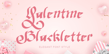 "Valentine Blackletter" is a unique and elegant blackletter font. This font is equipped with uppercase, lowercase, numerals, punctuation, and multilingual support. It is very suitable for Valentine's Day, invitations, weddings, spring, summer, banners, branding, stickers, logos, and others.
 - Danbury by Mans Greback,
$49.00 Danbury is a modern sans-serif typeface. Drawn and created by Mans Greback between 2020-2022, this slanted font has a distinct style and a strong personality. Danbury is a typeface with velocity and power: Use it in a sports campaign, a fresh headline or a cool logotype. The Danbury family is provided in the styles Regular and Bold, Caps and Caps Bold, Small and Small Bold: the perfect setup for a diverse design usage. The font is built with advanced OpenType functionality and has a guaranteed top-notch quality, containing stylistic and contextual alternates, ligatures and more features; all to give you full control and customizability. It has extensive lingual support, covering all Latin-based languages, from North Europe to South Africa, from America to South-East Asia. It contains all characters and symbols you'll ever need, including all punctuation and numbers.
 - Braton Composer by Alit Design,
$14.00 After releasing the Rumble Brave font with a vintage elegant style successful in the market. Now we are launching a vintage font that is plump, looks fat, strong, heavy but still elegant and unique. "Braton Composer typeface" falls into the bold serif font category, but it also has italic options. This impression is perfect for design that has a firm and elegant concept. Braton Composer typeface is very worthy of your collection, because Braton Composer is very unique when combined with swash and alternative of the character options. In addition to "Braton Composer Regular" also has 2 other styles, namely "Braton Composer Rough"and "Braton Composor Stamp Rough". Braton Composer Typeface is perfect for beverage label design project. coffee label. logotype design, badges, classic wedding concept. victorian design concept and so on. gig poster, letterhead, droop cap, titles, and any artworks.
