10,000 search results
(0.071 seconds)
- FrownTown by Typotheticals,
$2.00A basic rounded blockletter font. - Tolstoy by TypeArt Foundry,
$45.00 Eucaliptus Companion with rounded corners.
 - Modern Curves by Matthias Luh,
$5.00 A rounded font; quite thin.
 - Behrensschrift iF Plus by Ingo,
$29.00 Peter Behrens’ renowned art nouveau type from 1902 – with ornaments. Newly revised and neatly digitalized by Ingo Zimmermann In 1902, Peter Behrens (1869–1940), architect, designer and typographer, created a new ”German“ type which became very successful very quickly for the Rudhard’sche Gießerei (foundry which later became Gebr. Klingspor AG) in Offenbach am Main. It served, for example, as the official German type for the world expositions in 1904 and 1910. Behrens himself writes about the development of this type ”...For the actual form of my type, I took the technical principle of the Gothic script, the stroke of the quill feather. The proportions of height and width and the boldness of the strokes of the Gothic letters were also decisive for me in producing a German character. A cohesive character could be hoped for by avoiding all non-necessities and by strictly carrying out the design principle of holding the quill at an angle…“ By the way, when “long s” is activated, the typographically correct “round s” is automatically placed at the end of the word so that you need only pay attention to the correct s on syllable endings within words. When using “long s,” you must ensure the correct use of the rules for the Fraktur font: “round s” is always at the end of the word, also in compound words. For those of you who want to be even more correct, read the corresponding article in >> Wikipedia. Peter Behrens also drew matching ornaments for his typeface – we have likewise carefully revised these decorative touches and arranged them into a font. The "Behrens-Schrift" fits best on all topics that have something to do with art history or the time around 1900.
 - Steel Grrrder by ULGA Type,
$9.00 Steel Grrrder is a robust, industrial-style stencil typeface family consisting of six weights, from light to black, with corresponding italics. Suitable for all kinds of display purposes including posters, film titles, book covers, magazines, advertising, logos, packaging, signage and games design, Steel Grrrder is especially useful where the message needs some serious geometric bite behind it. Steel Grrrder is best categorised as a constructivist sans family. The character shapes are sharp, angular and slightly condensed - it’s a rigid, no-frills, no-curves, mega-metallic design. Legible? Not really. Readable? I think not. In your faceable? Absolutely! This is a tough display typeface, designed to work in the most demanding typographic situations. It won’t buckle under pressure or wilt when the heat’s turned up. Forged from carbon steel and wrapped in a layer of Graphene, Steel Grrrder is unashamedly rugged, a rock-hard pound-for-pound boxer specialising in thumping knockouts. The Steel Grrrrder extended family also includes a six-weight joining script and two display fonts, Groove & Nutjob - all designed to work with each other.
 - South Wind by Ivan Rosenberg,
$16.00 South Wind Font is a handlettered font with 107 ligatures, lot of alternate characters and multilingual support. Is ideal for blog website, instagram, branding, invitations, business cards, weddings and many more. Ligatures list: ab ae al am an ar as at ax ay bb bl cc ch cl ct dd ee ef el en ep er es et ff ft gh ia ic ie il in it iu kt ll of ok ol om on oo op ot ov rr sh sl sm ss st th ts tt Af Ap As Be Dl Em Es Et Eu Ft If Is It Kt Ml Mr Ms Mt Ph Pl Pt Se Sh Sl St Us outh all alt arr ass can cus ell esl etl ett ill obl old oll oth out sim ted South Wind font also include multilingual support for Western and Central Europe. South Wind Font is a set of 542 glyphs, Upper and Lowercase characters with 107 ligatures, numerals, lot of punctuation glyphs, 3 alternates for each lowercase character and 2 alternates for each uppercase character. For access to Stylistic Alternates is required software with glyphs panel like Photoshop, llustrator, Inkscape etc. No special software is required to use Ligatures.
 - Blau by Wilton Foundry,
$19.00 Designed with a hand-chiseled feel, Blau’s sculpted characters add a refined personality to a wide range of brand, corporate, product and service applications. Highlighting the sculpted theme, inkwell treatment variations are prevalent throughout Blau, with several key glyphs that are stenciled for increased legibility. This sturdy, typographic workhorse shines when a slightly unorthodox typographic approach is required — a prime choice for distinctive and dynamic logotype use. The Blau family is available in Light, Light Italic, Regular, Italic, Bold and Bold Italic. The name Blau was chosen to celebrate the color Blue (or Blau in German, Blaauw in Dutch, Bleu French, Blå in Norwegian, Swedish & Danish, Blua in Esperanto, Blár in Icelandic) Blue is nature’s color for water, sky, mountains and glaciers. Blue is embraced as the color of heaven and authority, denim jeans and corporate logos. Surveys in the US and Europe show that blue is the color most commonly associated with harmony, faithfulness, confidence, distance, infinity, the imagination, and cold. In US and European public opinion polls, it is the most popular color, chosen by both men and women as their favorite color. Another very popular Wilton Foundry font in the “blue” family is “Cyan” and “Cyan Neue”.
 - P22 Garamouche by P22 Type Foundry,
$24.95 Think of Garamouche as Garamond's drunken cousin. This font replicates a long lost document ravaged by time and the elements (with a little sloppy printing for good measure.) Unlike the fake bolding option found in software programs, Garamouche Bold is a variant with more appropriate thick and thin features. The "dancing along the baseline" that has made Garamouche a favorite, is also a feature in Garamouche Bold, but the letters align and tilt in on their own terms. Using the two Garamouche fonts together can produce much more expressive results than just hitting "bold". P22 Garamouche Ornaments is a set of 72 ornamental embellishments designed to complement the Garamouche fonts but can be used with almost any layout that calls for historical decoration.
 - Kassena by Scholtz Fonts,
$19.00Gently rounded in shape, Kassena is reminiscent of the round thatched huts of the Zulu people. The triangular motif is inspired by the designs used in the decorative crafts of the Nguni African tribes. - Madisonian by Présence Typo,
$36.00Madisonian has been found in a catalogue of the New York Bruce type-foundry, dated 1859. The lower cases have the feeling of a Bodoni Italic and the initials have a "spencerian" touch. This font did exist originaly in a single weight. The family has been extended with a bold and an engraved version. - Poster Contoured JNL by Jeff Levine,
$29.00 Sheet music for a selection from the 1928 musical “New Moon” had the show’s title hand lettered in a bold sans serif that reflected the upcoming Art Deco movement, along with a contoured outline around the letters. This served as the model for Poster Contoured JNL, which is available in both regular and oblique versions.
 - Hedgehog Hans by Hanoded,
$15.00 Hans My Hedgehog is an old fairytale which was made famous by the Grimm Brothers, when they published it in the early 19th century. Hedgehog Hans font is a fat, rounded and rather cute typeface, which is ideal for children's books and posters. It is highly legible, and comes with extensive language support.
 - Pitkin JNL by Jeff Levine,
$29.00Borrowing from the 1940s, and inspired by printed text found in an old catalog, the slightly imperfect letterforms of Pitkin JNL emulate the hand-lettered look of signs and show cards. - Pekoe JNL by Jeff Levine,
$29.00 Jeff Levine Fonts offers its interpretation of Tea Chest, an Art Deco serif stencil font originally designed in 1939 by Robert Harling for the Stephenson-Blake type foundry. Pekoe JNL is available in both regular and oblique versions.
 - Signage JNL by Jeff Levine,
$29.00 Signage JNL shows the heavy influence of the perennial favorite Futura Black with a couple of minor changes here and there. The design was inspired by a set of British brass stencils for sale in an online auction.
 - immoral - Unknown license

- Superfly - Personal use only

- Rover Pro by Fontforecast,
$24.00 Rover Pro is a hand painted font family that comes in 5 styles: Regular, Bold, Bold Shadow, Bold Rough and Extra. It was designed with retail in mind, but is also perfectly suited for other uses. The flat brush that was used to hand paint all 424 glyphs creates a nonchalant stroke that adds a personal touch and plenty of pizzaz to your design. Combine Rover Pro Bold Shadow with the Bold and Rough styles for more variety and beautiful designs. For extra fun Rover Pro Extra adds another 85 glyphs to play around with. All in all Rover Pro is a smashing painted font family for virtually every project. Rover Pro is PUA encoded. This means that all Rover Pro's characters are fully accessible via Character Map or Font Book (that come with your PC or Mac).
 - Leuk by Wilton Foundry,
$29.00 The Dutch word “leuk" translates loosely to English as pleasant, jolly, funny, witty, clever, nice, sweet, kind, nice, amusing, entertaining, and funny. Leuk, the font, is a small, highly legible font with a witty, sociable personality that engages it’s readers. My challenge in designing Leuk was to find a unique feature to set apart the font without losing the fundamentals of type design. In the process of doing so, I created a virtual font “smile and wink” in the “o” upper and lowercase with integrated stencil-connecting strokes within the “a,e, k, z, o, ß” to reveal Leuk’s calligraphic roots. Legible and friendly, Leuk is designed for use in advertising, brochures, promotion, book cover design, packaging, and the like. The Leuk family consists of Leuk Light, Leuk Light Italic, Leuk Regular, Leuk Italic, Leuk Bold, Leuk Bold Italic, Leuk Black, Leuk Black Italic in Opentype format.
 - Kigo by Prominent and Affluent,
$30.00 Artistic, bold and creatively designed - Kigo Font is the perfect choice for graphic designers who want to add an element of fun to their designs. Inspired by retro sans serif and the beloved shape of a cat, Kigo Font combines classic design with whimsy. With 4 styles including Regular, Round, Regular Italic and Round Italic, this font family offers versatility in every project you undertake. The multilingual support of Kigo allows you to seamlessly incorporate your message in any language without compromising on style or clarity. Perfectly suited for professional use, Kigo Font adds that touch of personality without sacrificing professionalism. Whether it's for branding projects or marketing collateral, let Kigo Font be your go-to choice when looking to create something truly unique. Upgrade your designs today with this playful yet sophisticated font!
 - Homura by Arterfak Project,
$18.00 Homura is a sans-serif display font that is inspired by newspaper headlines and modern typography. It comes in four styles: regular, rounded, slanted, and slanted rounded. This font is condensed, bold, and elegant, with a tight design that includes ink-traps in some sharp corners, giving it a fancy, fun, and minimalist impression. Flexible for various design themes. With its condensed and elegant look, Homura is perfect for creating high impact logos, headlines, and quotes. Homura's versatility makes it a great choice for any project. This font is perfect for large displays or headlines, such as logos, short quotes, stickers, label and posters. What you'll get : Uppercase & lowercase Numbers & punctuation Symbols & multilingual Stylistic alternates Give it a try today and see the difference it can make! Thanks!
 - Oh Sweet Pea by BA Graphics,
$45.00A fun, goemetric, rounded new look. - Milk Made by loryn ipsum,
$12.00 Milk Made | a rounded retro font Milk Made is a fun rounded retro font inspired by mid-century magazine and print advertisements. Perfect for; retro brands, young brands, gen z branding, logos, social media, posters.
 - Taca by Rúben R Dias,
$42.00 Taca is a typeface built around a shape that Portuguese designer Rúben R Dias calls a “squircle” — neither square nor circle. We usually associate the rounded, convex box with the television screens of the 1960s and Aldo Novarese’s classic typeface, Eurostile. But whereas Eurostile is cold and machined, Taca is warm and rugged, as if it was molded from clay or carved from stone. Taca’s organic nature is also derived from another unique feature: rounded crotches at the right angles where perpendicular strokes meet. This subtle finish, along with blunt stroke endings, softens the otherwise rigid skeleton. With such a strong conceptual vision, Taca could be relegated to the bin of experimental designs, severely limited in their application. But that fate is usually born of a less experienced maker. As a teacher, designer, and letterpress printer, Dias is a type user, keenly aware of the functional requirements of good type. Taca is therefore not a slave to its concept, but a working font family, effective in various sizes and environments. Its lettershapes break away from the base shape whenever it makes sense for legibility, while still maintaining the flavor of the design as a whole. That said, a set of squircle-shaped alternates give the user the flexibility to get more stylized if the situation calls for it. Fitting to its functional aims, Taca has many of the features one expects of a proper text font: upper and lowercase figures, case-sensitive punctuation, and Extended Latin language support. The simplicity, openness, and squareness of Taca’s forms also make it an ideal design for the pixel grid of screen displays.
 - BPchubby - Unknown license

- Pixel Grid by Caron twice,
$39.00 Pixel Grid is a font that lets us know that we have entered the digital age. We know about grid systems from the very first computers and electronic LED boards. Pixel Grid offers three types of grid resolution as well as many incarnations of individual segments. It is an electronic game: characters can be animated, overlapped, and played with in different ways. If you need a font that is strictly technical in nature, you can use tried-and-true square and round points. You can save ink by using them on receipts, for example, so the font can be used sustainably. Pixel Grid is suitable for engraving, or it can be used as a stencil. This complete font family aims to gain an extensive selection covering the early digital font style, facilitating the use of the style in professional applications today. Specimen: http://carontwice.com/files/specimen_Pixel_Grid.pdf
 - Sevigne ST by Reserves,
$39.99 Sevigne [sey-vee-nyey] is a highly refined, contemporary geometric stencil, inspired by the ambience of high-end fashion and luxury combined with the raw, utilitarian nature of the stencil. The inclusion of over 130 unique ligatures expand it’s sensibility of alluring, well-balanced letterforms and distinctive style. The stencil marks are atypically placed and vary throughout, giving it a purposely forward presence. Stylistically, as an all-caps typeface, Sevigne exudes a greater sense of harmony and polish due to it’s unicase form where the interplay of a limited amount of characters is the focus. Subtle, considered details are found within individual letters, contrasted by the complex, intersecting forms that make up the various ligatures. With multiple stylistic sets added to the expanded ligatures, individual letters and ligature pairs can be carefully exchanged to fine-tune text settings for a unique custom type solution. Features include: Precision kerning- Expanded set of over 130 Ligatures, including alternates (ae, oe, fi, fl, ffi, ffl, ffj, ff, fh, fj, ft, tt, th, ct, st, oo, og, go, ogo, gog, la, ea, ev, ew, fy, ez, et, oc, ga, do, uv, vu, yu, uy, nn, mm, xy, yx, ao, oa, ac, da, aq, nt, aa, ll, ss, ut, tu, ka, ca, ag, of, off, co, ne, nr, nl, nd, nk, hn, mn, me, mp, al, an, af, ar, ak, ah, ad, ab, and, gg, all, co, ço, he, the, tl, tn, tf, tr, tk, td, tb, te, am, ame, amb, tm, ap, tp, wu, uw, kt, tz, ra, za, mk, xx, yy, vv, ww, ky, fu, oq, cc, cq) Alternate characters (A, G, R, Q, _, $, ®, •, ¶) Slashed zero Full set of numerators/denominators Automatic fraction feature (supports any fraction combination) Extended language support (Latin-1 and Latin Extended-A) *Requires an application with OpenType and/or Unicode support.
 - Zoya by MireyDesign,
$10.00 Zoya is a humanist sans serif typeface, a versatile font family that stands out with it's warm and natural feel. Humanist sans serifs have roots in calligraphy, their round, dynamic, open forms have higher stroke contrast than the other sans serif classifications. Can be used by any organization that wants to appear simultaneously modern, approachable, active and professional. FEATURES Four weights + Bold Outline / Italics / Numbers & Punctuation / Extensive Language Support / Long term support, free features and bug fixes The font family includes 10 fonts Zoya Light - delicate and edgy Zoya Bold - strong but approachable Zoya Regular and Semi Bold are the balance between the two Zoya Bold Outline - engaging + Italics USE Strong capitals and a smooth, open lowercase are effective in a variety of applications. This font is perfectly suited for headlines, posters, branding, packaging, presentations, logo, quotes, titles, magazines headings, web layouts, advertising, invitations, packaging design, books, and nearly any creative design.
 - Aeroblock Layered Graffiti by Sipanji21,
$13.00 Aeroblock is an urban graffiti font characterized by Rounded edges and a bold look. Ideal for music posters, apparel designs, shirts, and streetwear, this font brings a touch of edginess to your projects. The unique style of "Aeroblock" makes it the perfect choice for street style or urban graffiti themes. Whether you want to create a strong and powerful statement or simply add a touch of attitude to your designs, "Aeroblock" is the font for you.
 - St Ryde by Stereotypes,
$- St Ryde is a humanistic sans-serif with a slight touch of a script typeface. The most significant aspect of the typeface is the combined sharp and round treatment of the stroke endings. The complete Ryde Family contains five weights including real matching italics, so you can choose from thin, light, regular, medium and bold. St Ryde has a wide range of characters, including small caps, lining proportional and tabular figures plus small caps figures, too.
 - Gratique by Lemon Studio Type,
$7.50 Gratique is a semi-rounded sans-serif typeface. The curvature of the corners fits perfectly and makes it look so cool. Gratique comes with 3 different font variants, namely medium, bold, and black. Gratique is perfect for headings, typography, branding, mockups, or any other design you need especially for a sans-casual style, it will work really well. FEATURES: - STANDARD CHARACTER SET -Case Sensitive Forms -Denominators -Fractions -Historical Forms -Standard Ligatures -Scientific Inferiors -Subscripts -Superscripts -Multilingual Support, etc.
 - UUeirdie by Ingrimayne Type,
$7.95UUeirdie is weird. The Condensed-Light style was derived from the star-serifed font Asterx by replacing the star serifs with a rounded flare serif. Widening that style resulted in UUeirdie-Regular and the bold was then constructed to complement it. The warped version was a result of play with a font distortion program. Although the glyphs have sharp corners, they do not have straight lines. The UUeirdie faces are rough, irregular, and maybe a bit creepy. - Roklet by Maulana Creative,
$12.00 Roklet is a semi slab serif font. With round bold stroke, fun character with a bit of ligatures and alternates. To give you an extra creative work. Roklet font support multilingual more than 100+ language. This font is good for logo design, Social media, Movie Titles, Books Titles, a short text even a long text letter and good for your secondary text font with sans or serif. Make a stunning work with Roklet font. Cheers, Maulana Creative
 - White Capel by Putracetol,
$24.00 White Capel - Modern Display Font is a bold, distinctive, and thoroughly contemporary typeface that exudes a trendy and up-to-the-minute vibe. Its soft, rounded letterforms lend it a unique and easily recognizable appearance, ensuring it stands out in any design. This font is perfectly suited for a wide range of applications, including logos, quotes, posters, branding, business names, and more. With its modern, sleek aesthetics, White Capel brings a touch of current style to your creative projects.
 - MC Fectron by Maulana Creative,
$16.00 Fectron is a semi round condensed sans serif font. With semi bold stroke, fun character with a bit of ligatures and alternates. To give you an extra creative work. Fectron font support multilingual more than 100+ language. This font is good for logo design, Social media, Movie Titles, Books Titles, a short text even a long text letter and good for your secondary text font with script or serif. Make a stunning work with Fectron font. Cheers, Maulana Creative
 - MC Barjon by Maulana Creative,
$15.00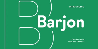 Barjon is a minimal classic contemporary sans serif font. Round Bold stroke, fun character with a bit of ligatures and alternates. To give you an extra creative work. Barjon font support multilingual more than 100+ language. This font is good for logo design, Social media, Movie Titles, Books Titles, a short text even a long text letter and good for your secondary text font with script or serif. Make a stunning work with Barjon font. Cheers, Maulana Creative
 - Stonecrop by Andrew Harper Fonts,
$5.00 Stonecrop is a font unified by bold, imposing lines as well as its use of rounded rectangles as the central stylistic shape. Stonecrop loosely conforms to the monospaced font style, with near-equal widths for all letters and numbers (but not all symbols/punctuation), however it does incorporate kerning for all types of glyphs where appropriate to aid in legibility. A perfect font for usages that demand consistency and precision, while still maintaining a quirky and stylized handwritten effect.
 - House Soft by TypeUnion,
$30.00 House Soft is the curvy, fun little brother of House Sans. Its exaggerated rounded corners give it a playful feel that will bring happiness and joy wherever it’s used. Like its big brother, House Soft is also made up of 100 weights in 5 useful widths (Compressed to extended) that make it a versatile font. From big bold headlines to playful brands House Soft offers the flexibility and uniqueness you and your project deserve. Go soft or go home.
 - Rudge by Adam B. Ford,
$9.00 Rudge is an intentionally rough sans-serif font. It was designed to share the look and feel of many “antique” fonts, although it lacks the standard serif look of those fonts. The corners are slightly rounded, the edges are wobbly, and the kerning is tight. It could be used as a faux “sloppy printing” font or just a more regularized hand-drawn font. It comes in six flavors: Light, Regular, and Bold, with italic versions of each.
 - Little Merry by Astageni,
$15.00 "Introducing Little Merry — the bubbly, round typeface that adds a touch of whimsy to your design endeavors! This fun and friendly script font boasts a bold style, perfect for sparking creativity in your projects. Whether you're crafting T-shirt designs, phone cases, greeting cards, invitations, mugs, or anything else you can imagine, Little Merry is here to infuse your creations with charm. Let your designs come to life with this delightful font and unleash your creative spirit!"


