10,000 search results
(0.109 seconds)
- Sparrowhawk by Device,
$29.00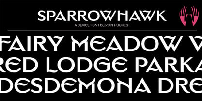 Sparrowhawk, a capitals only titling, evokes a suburban English gentility.
 - Hippie Mojo by Mysterylab,
$18.00 Set the wayback machine for about 1967. Smell the patchouli? Now you can inject just the right dose of swirly-licious mojo into your retro design with this original vintage-styled sixties font. But as with many psychedelic hippie lettering designs, the history reaches back even further; it owes a designer's debt of gratitude to the designs of the Art Nouveau era as well. This is predominantly a uni-case alphabet, but also features a few alternative characters in the lower case – at the full height of the capitals. With an extensive character set and multilingual glyphs, you can use Hippie Mojo to say "Groovy baby" in many languages. Evoke the carefree and tripped-out vibe of the psychedelic era with Hippie Mojo; it's pure retro fun!
 - Popwave by Adam Fathony,
$18.00 Introducing Popwave - a vibrant and playful font pack containing 5 unique fonts that are perfect for adding a touch of modern pop and groovy style to your designs. This versatile font pack includes a boxy font, a boxy rounded font, a script font, a narrow font, and a sans-serif font - providing you with a range of options to choose from. The boxy font has a bold and boxy design that exudes a sense of confidence and strength, while the boxy rounded font features rounded edges that give it a more friendly and approachable feel. The script font is elegant and fancy, perfect for adding a touch of sophistication to your designs. The narrow font is sleek and modern, with a slender design that creates a sense of space and clarity. Lastly, the sans-serif font is simple and clean, making it perfect for adding a modern touch to any design. Each font in the Popwave pack has been carefully designed to create a fun and vibrant style that's perfect for catching the eye. The fonts are playful and modern, with a touch of retro charm that makes them perfect for a variety of projects. The Popwave font pack also supports multiple languages, making it the perfect choice for designers who need to create designs for a global audience. So whether you're designing for print or digital media, the Popwave font pack is the perfect choice for creating modern, fun, and playful designs that are sure to stand out.
 - Diethelm AR by ARTypes,
$35.00 Based on the 10- and 36-point Diethelm-Antiqua types designed by Walter Diethelm and issued by Haas (Münchenstein) 1948-51. DiethelmAR™ series text-size fonts are based on the 10-point designs. Eastern European accents, swash capitals, alternative figures and small capitals are available. The DiethelmARd fonts are based on the 36-point (dreicicero) designs. OpenType fonts are available individually or in two packages: text fonts (with EE accents, small capitals) and display fonts.
 - Bill Poster by Smartfont,
$18.00 A powerful, energetic and exciting condensed typeface. It brings charming curves and satisfying patterns to traditional condensed fonts. It's designed for impact, without sacrificing style or legibility. It looks especially stunning in large scale, although it still carries a punch at smaller point sizes. It's born to be! Ideal for magazine, posters, headlines and pull quotes.
 - Assai by Type Matters,
$23.90 A very heavy headline only typeface which should be typeset at rather large type sizes due to its fine counters. It’s the ideal typeface for building a brick-wall out of letters. Surprise is in the details, so play it loud and big! It’s fun.
 - Grosen by Hurufatfont,
$23.00 Grosen Typeface Family is designed by Oğuzhan Cengiz in the years 2017-2019. It has a grotesque structure that contains humanistic effect. Although it is designed upon the basic geometric structure, it shows own style with expansion that makes a reference to serif at start and finish of round letters. Grosen Typeface Family has fourteen styles with seven weights and theirs real italics. These have advanced OpenType features; like small capitals, case sensitive signs and math symbols, alternative characters (a, g, M, J, &), automated fractions, oldstyle figures, tabular linings, proportional numbers...
 - Bandera Pro by AndrijType,
$45.00 This square serif typeface is a real workhorse. It is a modern tool for text design: extremely legible, pan-european multilingual (Latin, Greek and Cyrillic), well shaped. Bandera Pro has six weights with original italics, alternatives, small capitals and three sets of digits. It catches attention in headlines of posters and magazines or makes reading comfortable in plain texts. Bandera Pro shares main proportions with sans serif Osnova Pro typefamily so ideally can pair it. Bandera is Spanish for ‘flag’. And Bandera is a symbol of Ukrainian fighting for freedom for many years.
 - Ljubljana by Glyphobet,
$19.99 Ljubljana was inspired by art deco lettering seen in Slovenia, Croatia and Romania. It includes the Latin, Greek, and Cyrillic alphabets. It is named after the capital of Slovenia. Ljubljana is unicase, composed of as few basic glyphs as possible. The basic glyphs are shown in black, and the derived or duplicated glyphs in grey. Ljubljana attempts to encapsulate the essence of both upper and lower case designs in a single glyph. It also explores the common origins of the Greek, Latin, and Cyrillic alphabets, using the same glyph in more than one alphabet.
 - MB Narrow by Ben Burford Fonts,
$20.00 MB Narrow is a very compressed display font that comes in three weights. with is full use of the 20 stylistic sets it gives the user a lot of scope to how it look. without using them it has a very rounded and geometric look but with alternates for the Capital A, M, N, V, W, X, Y and the lowercase a, f, g, v, w, x & y you can create a more traditional 'movie poster' look. with standard & discretional ligatures and oldstyle figures there are plenty of opentype features.
 - Glittera by Natural Ink,
$12.00 Glittera Script is a modern calligraphy design, including Regular. This font is casual and beautiful with swash. Can be used for various purposes. such as logos, product packaging, wedding invitations, branding, headlines, signage, labels, signatures, book covers, posters, quotes, and more. Glittera Script includes a change of the OpenType language style, binding and international support for most Western languages. To activate the OpenType Stylistic alternative, you need a program that supports OpenType features such as Adobe Illustrator CS, Adobe Indesign & CorelDraw X6-X7, Microsoft Word 2010 or newer versions. How to access all alternative characters using Adobe Illustrator: https://www.youtube.com/watch?v=XzwjMkbB-wQ Glittera Script is coded with PUA Unicode, which allows full access to all additional characters without having to design special software. Mac users can use the Font Book, and Windows users can use Character Map to view and copy one of the additional characters to insert into your favorite text editor / application. How to access all alternative characters, using Windows Character Map with Photoshop: https://www.youtube.com/watch?v=Go9vacoYmBw If you need help or have questions, please let me know. I am happy to help :) Thank you & Congratulations on Designing! Script is coded with PUA Unicode, which allows full access to all additional characters without having to design special software. Mac users can use the Font Book, and Windows users can use Character Map to view and copy one of the additional characters to insert into your favorite text editor / application. How to access all alternative characters, using Windows Character Map with Photoshop: https://www.youtube.com/watch?v=Go9vacoYmBw If you need help or have questions, please let me know. I am happy to help :) Thank you & Congratulations on Designing!
 - Willow - Unknown license

- D3 Calligraphism - Unknown license

- Fleet Street - Unknown license

- A La Nage - Personal use only

- Prodotto In Cina - Unknown license

- Handtalk - Personal use only

- Joe DiMaggio - Unknown license

- Metropolia by Samuelstype,
$24.00 Say hello to Metropolia! Drawing up the first roughs of this design I was aiming for a slightly asymmetrical feel. I later realized that this gave it a strong art deco influence. A slight tilt brings it a forward movement and a distinct flavour. Designed primarily for headline use, this is not your workhorse font but rather a playful and versatile addition to your font toolbox. A set of alternate capitals will be handy for headline or logo ornaments.
 - 2010 Dance Of Death by GLC,
$30.00 This font was inspired from the medieval Dances of Death patterns, as a modest tribute to the famous engraver Hans Holbein's Alphabet of Death. We have tried to keep the spirit of the time -- its sarcastic humor mixed with its objective and frozen realism. The font, consisting in two complete capital alphabets: Initials and caps, and a lot of separate figures added, is especially improved by strong enlargements, 72 pts and more, and has very good results when printed.
 - Hopferian by 2D Typo,
$28.00 This font has been developed based on the engraving by the German artist Daniel Hopfer (1470-1536) listing the Latin ABC. While creating the font I tried to preserve the archaism and certain imperfection characteristic for the prototype to accentuate its charm. Fanciful convolution on the serif make it a bit fairy-tale like and cheerful. The font is also available with decorated dots as in the original version. All the letters in the font are capital.
 - Scrawl Cursive by Scrowleyfonts,
$45.00 Scrawl Cursive pushes the boundaries of OpenType contextual alternates to present a font which emulates natural, modern, casual handwriting. It includes 2006 glyphs, many of these lower case alternates so that there are minimal compromises when it comes to forming and joining letters naturally. Another unusual feature is that many capital letters also join when preceding lower case letters, which creates a much more realistic flow than is normally achieved. Please view with the contextual alternates option turned on.
 - VLNL Brak by VetteLetters,
$35.00 Brak is the dutch word for ‘brackish’, the mix of fresh and salten sea water found in river deltas and estuaries. Brak is also VetteLetters’ straightforward display font with straight lines and rounded ends, and comes in two weights. It does really well in sea food dishes like fish, lobster, mussels and shrimps. Brak doesn't beat around the bush, it is an all-caps typeface with alternative capital letterforms assigned to the lowercase positions, for a variety of combinations.
 - Bovid by Type Fleet,
$12.00 Bovid ready to clash Following the ancient Adriatic history and natural shapes of the ram horns, Bovid typeface connects sports and tradition in a fearless and reckless way. It empowers players as soon as they put on their jerseys, making them ready to clash for the highest score. Bovid typeface has low contrast and high legibility with priority on numerals. It has capital letters in two sizes and is suitable for sport jerseys, posters, brochures, flags and tickets.
 - VU Milwaukee by VisualizeUnited Fonts,
$65.00 Milwaukee, is a geometric typeface with an embellished-like touch. Designed in 2011, in capital English & Greek characters, including numerals, and basic punctuation marks, as well as CE characters. It was initially inspired by Byzantine and Japanese typography and later from the cityscape of Milwaukee, thus its name. This typeface comes in four weights and is suggested for logos, short titles, social media marketing, book covers, posters, labels and more applications you will choose to go with.
 - Whitley by Arendxstudio,
$18.00 Whitley is a handwritten signature font package with a personal charm. With a style that I feel is the first time being blended with a different brush so it has a natural hand. It includes Whitley Alt weights which have alternative characters, both with capital letters and small that is completely new. Ligatures are available for some lowercase letters (more natural double letters). This can be accessed through software with different devices or glyph panels, e.g. Photoshop / Illustrator.
 - Misses Twiggs by Type Innovations,
$39.00 Misses Twiggs is a contemporary modern serif created by the American type designer Alex Kaczun. It compliments its partner Mister Twiggs and is a perfect marriage of two fonts. Mister Twiggs brings his tall good looks and Misses Twiggs bring her cute little serifs to the relationship. There are absolutely no curves in these elegant typefaces. Both fonts have sharp corners with extra tall capitals and narrow waistlines. Misses Twiggs also comes in 3 flavors: regular, thin and heavy.
 - JP2 by Linotype,
$40.99JP2 has some special roots being inspired by the actual handwriting of Pope John Paul II. Franciszek Otto took this source material and transformed it into a high quality font. The result is a rough, but intelligent, design with letters that slightly bounce along the baseline to mimic typical writing. Their short x-height, long extenders, and unique capital letters make this a very beautiful and distinctive typeface. Try it out for greetings, invitations, or posters! - Erotica by Lián Types,
$49.00 “A picture is worth a thousand words” and here, that’s more than true. Take a look at Erotica’s Booklet; Erotica’s Poster Design and Erotica’s User’s Guide before reading below. THE STYLES The difference between Pro and Std styles is the quantity of glyphs. Therefore, Pro styles include all the decorative alternates and ligatures while Std styles are a reduced version of Pro ones. Big and Small styles were thought for better printing results. While Big is recommended to be printed in big sizes, Small may be printed in tiny sizes and will still show its hairlines well. INTRODUCTION I have always wondered if the circle could ever be considered as an imperfect shape. Thousands of years have passed and we still consider circles as synonyms of infinite beauty. Some believe that there is something intrinsically “divine” that could be found in them. Sensuality is many times related to perfectly shaped strong curves, exuberant forms and a big contrasts. Erotica is a font created with this in mind. THE PROCESS This story begins one fine day of March in 2012. I was looking for something new. Something which would express the deep love I feel regarding calligraphy in a new way. At that time, I was practicing a lot of roundhand, testing and feeling different kinds of nibs; hearing the sometimes sharp, sometimes soft, sound of them sliding on the paper. This kind of calligraphy has some really strict rules: An even pattern of repetition is required, so you have to be absolutely aware of the pressure of the flexible pen; and of the distance between characters. Also, learning copperplate can be really useful to understand about proportion in letters and how a minimum change of it can drastically affect the look of the word and text. Many times I would forget about type-design and I would let myself go(1): Nothing like making the pen dance when adding some accolades above and below the written word. Once something is mastered, you are able to break some rules. At least, that’s my philosophy. (2) After some research, I found that the world was in need of a really sexy yet formal copperplate. (3) I started Erotica with the idea of taking some rules of this style to the extreme. Some characters were drawn with a pencil first because what I had in mind was impossible to be made with a pen. (4) Finding a graceful way to combine really thick thicks with really thin hairlines with satisfactory results demanded months of tough work: The embryo of Erotica was a lot more bolder than now and had a shorter x-height. Changing proportions of Erotica was crucial for its final look. The taller it became the sexier it looked. Like women again? The result is a font filled with tons of alternates which can make the user think he/she is the actual designer of the word/phrase due to the huge amount of possibilities when choosing glyphs. To make Erotica work well in small sizes too, I designed Erotica Small which can be printed in tiny sizes without any problems. For a more elegant purpose, I designed Erotica Inline, with exactly the same features you can find in the other styles. After finishing these styles, I needed a partner for Erotica. Inspired again in some old calligraphic books I found that Bickham used to accompany his wonderful scripts with some ornated roman caps. Erotica Capitals follows the essentials of those capitals and can be used with or without its alternates to accompany Erotica. In 2013, Erotica received a Certificate of Excellence in Type Design in the 59th TDC Type Directors Club Typeface Design Competition. Meet Erotica, beauty and elegance guaranteed. Notes (1) It is supossed that I'm a typographer rather than a calligrapher, but the truth is that I'm in the middle. Being a graphic designer makes me a little stubborn sometimes. But, I found that the more you don't think of type rules, the more graceful and lively pieces of calligraphy can be done. (2) “Know the forms well before you attempt to make them” used to say E. A. Lupfer, a master of this kind of script a century ago. And I would add “And once you know them, it’s time to fly...” (3) Some script fonts by my compatriots Sabrina Lopez, Ramiro Espinoza and Alejandro Paul deserve a mention here because of their undeniable beauty. The fact that many great copperplate fonts come from Argentina makes me feel really proud. Take a look at: Parfumerie, Medusa, Burgues, Poem and Bellisima. (4) Some calligraphers, graphic and type designer experimented in this field in the mid-to-late 20th century and made a really playful style out of it: Letters show a lot of personality and sometimes they seem drawn rather than written. I want to express my sincere admiration to the fantastic Herb Lubalin, and his friends Tony DiSpigna, Tom Carnase, and of course my fellow countryman Ricardo Rousselot. All of them, amazing.
 - Sure thing! "SCRIPT 9" isn't a standard or widely recognized font name that I'm aware of, as of my last update. However, let's dive into imagining what SCRIPT 9 could be, based on what we know about ...
- Coil by Brownfox,
$44.99 Coil feels comfortable like a well-worn pair of shoes. It could easily pass for an assertive industrial European sans serif of the early 1960s with its slight reverse contrast, monotonous proportions, and squared-off curves, if not for its less predictable side. What appears initially as ellipses upon closer inspection turns out to be irregular shapes, closer to an inverted egg than an oval. The s looks topsy-turvy with its higher curve that is larger than the lower. Some terminal strokes overhang the bowl (as in the a), others open flat (as in the Q, the f, the j, and the t). The resulting effect shakes up this seemingly “retro” face just to make it new. Our midcentury recollections are slightly distorted and reinterpreted by this ironic typeface making it fresh while deceptively cozy and familiar. Coil’s high x-height and even texture make it readable even in small sizes despite its tight apertures. Available in four weights with their italics, with two sets of figures, fractions, and alternates for Extended Latin and Cyrillic scripts. Designed by Vyacheslav Kirilenko and Gayaneh Bagdasaryan, 2020-21.
 - Eloise by Wiescher Design,
$39.50 Ever since I first designed Ellida in 2005, that elaborate script in the tradition of the 18th-century English calligrapher George Bickham and the 19th-century American calligrapher Platt Rogers Spencer, I wanted to add a very high contrast cut to the family. I finally did so. But the result looks so much different to Ellida that I had to give it another name, hence "Eloise". Eloise should actually be written with a 'i' that has double dots, but that would be difficult for international use. Eloise is a beautiful first name not only for French girls. Pronounce: Ay-low-eese. If I would have had a daughter, I would have called her "Eloise" (with double dots!). But instead I have two phantastic sons, so I never got the chance to use it. Actually one of my sons discovered it on his little boys sand shovel, it was called Eloise. Your decorative designer with a heart for sand shovels Gert Wiescher
 - 1885 Germinal by GLC,
$38.00 This script font was inspired by a lot of manuscripts, notes and drafts, written by the famous french novelist Émile Zola (1840-1902). Specially, letters and notes from the period he was writting "Germinal" one of his very famous novel (published in 1884-1885) depicting the french minor's life in the past middle of eighteens. It is an elegant pen written type, sometimes connected, sometimes disrupted, but always regular and legible, with many variants, ligatures and contextual alternate glyphs specialy numerous in the OTF version. It is used as variously as web-site titles, posters and fliers design or greeting cards, all various sorts of presentations, menus, certificates, letters. This font, in spite of its small size, supports very strong enlargements as well as small sizes ( the original size was about 22 to 30 pts ). When printed, it remain perfectly legible and elegant from 12/14 pts even if using an ordinary inkjet printer.
 - Erlliesh by Krafted,
$10.00 Looking to give a real signature to your product? Good fonts will make it look pretty, but a great font will make it truly memorable. Introducing Erlliesh - A Stylish Signature Font. From posters and merchandise to web pages and social media, Erlliesh will make you stand out every time. Check it out and see the difference a modern and stylish font makes! What you’ll get: Multilingual & Ligature Support Full sets of Punctuation and Numerals Compatible with: Adobe Suite Microsoft Office Keynote Pages Software Requirements: The fonts that you’ll receive in the pack are widely supported by most software. In order to get the full functionality of the selection of standard ligatures (custom-created letters) in the script font, any software that can read OpenType fonts will work. We hope you enjoy this font and that it makes your branding sparkle! Feel free to reach out to us if you’d like more information or if you have any concerns.
 - Pearly Smiles by RagamKata,
$16.00 "Pearly Smiles," a delightful handwritten font meticulously crafted with love and attention to detail. This font encapsulates the essence of joy and brings a touch of whimsy to your design projects. "Pearly Smiles" embodies the playful nature of handwritten script, with its charming curves and natural stroke variations. Every letter reflects the genuine warmth and sincerity of my personal handwriting, infusing your designs with a sense of individuality and happiness. With its elegant yet cheerful style, "Pearly Smiles" is versatile and perfect for a wide range of creative applications. Whether you're designing logos, branding materials, invitations, greeting cards, or any project that calls for a lighthearted and personal touch, this font will add a touch of enchantment and personality. The meticulously designed letterforms of "Pearly Smiles" ensure both legibility and artistic appeal. Its balanced proportions and thoughtfully crafted characters make it a pleasure to work with, whether on digital or printed mediums
 - Neo Latina by deFharo,
$12.00 Neo Latina is a classic sans serif typography in small caps of square proportions and rectilinear character with the ends of the rounded horns and a semi-stencil design that gives a futuristic aspect and of science fiction. Neo Latina is the right heiress of geometric fonts from the early 20th century inspired by the Bauhaus school and is specially designed for use in any size for both screen and print. Neo Latina is a very versatile typography for graphic design, you can use it in advertising posters, video games, film titles, logos, editorial design, etc. The Commercial version includes: - Two fonts: Regular & Bold - 460 glyphs. Latin Extended-A • OTF & TTF - Neo Latina fonts can be used unlimited for both Commercial and Personal projects. - The download file includes a PDF with the specimen sheet of typography. - OpenType features compatible with: Photoshop, Illustrator, QuarkXpress, Indesign. - OpenType Features: Subscript, Additional languages, Alternate Annotation Forms, Capital Spacing, Denominators, All Alternates, Oldstyle Figures, Superscript, Superiors, Superior letters, Standard Ligatures, Kerning, Extended Fractions, Small Capitals, Historical Forms, Inferiors, Fractions, Localized Forms, Numerators, Ordinals, Discretionary Ligatures, Scientific Inferiors, Slashed Zero. - Bitcoin & Chaos symbol: b# - a#(ligatures)
 - TT Knickerbockers by TypeType,
$29.00 TT Knickerbockers useful links: Specimen PDF | Graphic presentation | Customization options About TT Knickerbockers: TT Knickerbockers is a contrasting pair of fonts that continues our project series dedicated to different cities. The new project is dedicated to New York with its multiculturalism, historicity, creativity, energy, and to its inhabitants. TT Knickerbockers Grotesk symbolizes the monumentality of New York expressed in both its traditional historic architecture and skyscrapers. Energy, constant movement and the round-the-clock life of New York—all this is reflected in our TT Knickerbockers Script. TT Knickerbockers Grotesk is a narrow contrast sans-serif with characteristic elements sending us back to the 19th century. There’s also a reference to antiqua fonts to be noticed in the font: where in traditional antiqua there would be serifs, TT Knickerbockers Grotesk features a straight stroke ending, and traditional drops (finals, tails and ears) are substituted with rounded strokes. In TT Knickerbockers Grotesk you will find unusual characters, stylistic alternatives and ligatures. The following OpenType features are implemented: ordn, case, frac, sups, sinf, numr, dnom, onum, tnum, pnum, liga, dlig, salt, ss01. TT Knickerbockers Script is a bright and at the same time a little restrained brushpen script with a slight touch of aristocracy. TT Knickerbockers Script consists of 967 characters and also contains a huge number of contextual alternatives and ligatures. For all lowercase and uppercase letters of basic Latin and Cyrillic alphabets we have drawn 236 swashes which, depending on the context, can appear both at the beginning and at the end of a letter. Do not forget to enable OpenType support and enjoy all the opportunities that the typeface provides and its built-in features: ordn, frac, case, sups, sinf, numr, dnom, onum, tnum, pnum, calt, swsh, liga. FOLLOW US: Instagram | Facebook | Website TT Knickerbockers language support: Acehnese, Afar, Albanian, Alsatian, Aragonese, Arumanian, Asu, Aymara, Banjar, Basque, Belarusian (cyr), Bemba, Bena, Betawi, Bislama, Boholano, Bosnian (cyr), Bosnian (lat), Breton, Bulgarian (cyr), Cebuano, Chamorro, Chiga, Colognian, Cornish, Corsican, Cree, Croatian, Czech, Danish, Embu, English, Erzya, Estonian, Faroese, Fijian, Filipino, Finnish, French, Friulian, Gaelic, Gagauz (lat), Galician, German, Gusii, Haitian Creole, Hawaiian, Hiri Motu, Hungarian, Icelandic, Ilocano, Indonesian, Innu-aimun, Interlingua, Irish, Italian, Javanese, Judaeo-Spanish, Judaeo-Spanish, Kalenjin, Karachay-Balkar (lat), Karaim (lat), Karakalpak (lat), Kashubian, Khasi, Khvarshi, Kinyarwanda, Kirundi, Kongo, Kumyk, Kurdish (lat), Ladin, Latvian, Laz, Leonese, Lithuanian, Luganda, Luo, Luxembourgish, Luyia, Macedonian, Machame, Makhuwa-Meetto, Makonde, Malay, Manx, Maori, Mauritian Creole, Minangkabau, Moldavian (lat), Montenegrin (lat), Mordvin-moksha, Morisyen, Nahuatl, Nauruan, Ndebele, Nias, Nogai, Norwegian, Nyankole, Occitan, Oromo, Palauan, Polish, Portuguese, Quechua, Rheto-Romance, Rohingya, Romanian, Romansh, Rombo, Rundi, Russian, Rusyn, Rwa, Salar, Samburu, Samoan, Sango, Sangu, Scots, Sena, Serbian (cyr), Serbian (lat), Seychellois Creole, Shambala, Shona, Slovak, Slovenian, Soga, Somali, Sorbian, Sotho, Spanish, Sundanese, Swahili, Swazi, Swedish, Swiss German, Swiss German, Tagalog, Tahitian, Taita, Tatar, Tetum, Tok Pisin, Tongan, Tsonga, Tswana, Turkish, Turkmen (lat), Ukrainian, Uyghur, Vepsian, Volapük, Võro, Vunjo, Xhosa, Zaza, Zulu.
 - Mermer by Jana Orsolic,
$35.00 Mermer font family is a contemporary take on Roman capitals in six weights. The font name is the Serbian word for marble, and the inspiration for its creation comes from chiseled street signs in Istria. With lowercase and Cyrillic added, it gets a broader range of usages. Mermer is bold and versatile, can be both sporty and high fashion, looking sharp in more than 40 languages. Thin is thorny and Heavy feels like a block of concrete. Make it LOUD by setting it in large sizes and choosing Mermer Heavy for posters, magazine headings or logos, or you can make it cosy and friendly setting it smaller in Mermer Regular for menus, book covers, invitations or business cards.
 - Round Block by Motokiwo,
$16.00 Round Block is a techno Sans Serif font. It’s suitable for sports logo, poster, headline, products design, print design, etc. Round Block also support standard multilingual characters.
 - Gryffensee by Catharsis Fonts,
$30.00 Gryffensee is designed to be the Futura of blackletter, combining the time-honored gravity and relentlessness of the Gothic script with the clean, contemporary freshness of the geometric sans. Built from a tightly controlled inventory of lines, arcs, sharp cuts, and OpenType features, Gryffensee was born and raised in the digital age, yet retains the powerful charisma and human warmth of its mediaeval blackletter ancestors. As a result, it excels in a wide range of display settings, logotypes, and short text. Unlike most conventional blackletters, it even handles all-caps usage with grace, and includes an extensive Cyrillic character set (in the Pro version). Apart from a generous range of automatic ligatures and contextual alternates, Gryffensee offers stylistic alternates that allow users to customize its appearance to their tastes. The capital letters |AGHIKZ| come in alternate cuts that trade traditional shapes for increased legibility, while the letter |s| appears in three cuts, each with a unique, distinct flavor. All these options are accessible through OpenType stylistic sets in the main Latin font, Gryffensee Eins. For easy use in applications without OpenType support, we provide two additional Latin fonts (Gryffensee Zwei and Drei) in which these options replace the default cuts. Finally, Gryffensee Pro offers all the functionality of Gryffensee Eins, plus Cyrillic support. My intention to devise a contemporary geometric blackletter was inspired by four hand-painted letters, |ABCD|, in Sasha Prood�s online portfolio. I later found out that he had, in turn, taken those letters from an existing font, Bastard, by Jonathan Barnbrook. Luckily, by that time my project had taken on a life of its own. Gryffensee is an original design that bears only the most superficial resemblance to Bastard. Gryffensee is a mediaeval spelling of the lake Greifensee near which I grew up. It is pronounced [?gri?f?n?se?], or "GRIEF-un-say" in English approximation. This font is dedicated to Simone.


