10,000 search results
(0.079 seconds)
- Sure thing! Imagine if the fonts in your computer decided to throw a costume party. Amongst the sea of letters dressed in their serif and sans-serif finery, one font stands out for its audacity and f...
- Cellga by Alit Design,
$15.00 We want to create a different feel for the stencil font style. Usually stencil fonts are synonymous with military, retro and bold characters, but here we created the Cellga font with an elegant and attractive stencil style for a modern design, combined with a subtle swash. In addition to swash in the Cellga font, there are also many alternative character shapes and unique Discreationary ligatures. So the Cellga font is very worthy of being a font collection on your computer for projects with a unique and charming elegant concept. Sans Serif typefaces such as "Cellga" are very easy to apply to any design, especially those with an elegant, modern and classic, besides that this font is very easy to use both in design and non-design programs because everything changes and glyphs are supported by Unicode (PUA). The "Cellga"contains 623 glyphs with many unique and interesting alternative options. In addition to the regular font, there is also an italic version of the Cellga font. Language Support : Latin, Basic, Western European, Central European, South European,Vietnamese In order to use the beautiful swashes, you need a program that supports OpenType features such as Adobe Illustrator CS, Adobe Photoshop CC, Adobe Indesign and Corel Draw. but if your software doesn't have Glyphs panel, you can install additional swashes font files.
 - FlagDay by Ingrimayne Type,
$8.00 These four variations on letters designed as flags are almost unreadable, but may be of some use as a patriotic display font. The four are all transformations of fonts from the FourJuly group. The solid and outline styles can be layered with the main fonts to easily create multiple-colored letters.
 - Lovagenic by Invasi Studio,
$17.00 Lovagenic is a handmade script font with expressive and organic feels! Comes with ligatures that can be used to add more personality to your projects. Suitable for branding logo, hand lettering, flyers, greeting cards, packaging, or apparel design. This font will never disappoint you if you want to add a handmade touch to your design.
 - Algeron by Jolicia Type,
$19.00 Algeron is a thin serif font with an ethnic feel and a modern twist, many alternates choices so that you can combine according to your style. Give your text some elegance and personality and also you can use discretionary ligatures curves add a unique style Algeron include file : - Full uppercase, lowercase, numbers, punctuation + multilingual letters.
 - Ballmarks by Letterhend,
$19.00 Ballmarks beautiful calligraphy font with swash. This font will add a feminine touch to make your design more soft and beautiful. This font is perfect for wedding invitation, quotes, branding, packaging, etc. What will you get: Including number and symbol. Support Multi Language This font also support PUA Encoded! So, grab your own. Thank You!
 - Brolink by Sarid Ezra,
$13.00 Brolink is a wide bold sans based font with unique lowercase that will make your design looks sci-fi and modern. You can use this font for any purpose, especially to make logotype. You can mix and match the uppercase and lowercase to make your logo more readable. This font also comes with outline style!
 - Manofik by Mans Greback,
$59.00 Manofik is a classic serif typeface. It has round and relaxed retro forms, a comfortable thickness and a stable base. A traditional legible font, the Manofik family sets the authenticity to any project. It could be used for a hamburger logo, a product headline, or a body text that requires that extra bit of personality. This expressive type is provided in four styles: Manofik Regular, Manofik Bold, Manofik Italic and Manofik Bold Italic The font is built with advanced OpenType functionality and has a guaranteed top-notch quality, containing stylistic and contextual alternates, ligatures and more features; all to give you full control and customizability. It has a very extensive lingual support, covering Arabic, Cyrillic, Capital Greek and all Latin-based languages, from North Europe to South Africa, from America to South-East Asia. It contains all characters and symbols you'll ever need, including all punctuation and numbers.
 - Hanstoc Script by Mans Greback,
$69.00 Hanstoc Script is a formal calligraphy typeface. A sporty cursive, this retro lettering works as a cool team logotype or a vintage headline. Drawn and created by Mans Greback in 2022, it has a fresh style and a bold personality. Use underscore _ to make a swash. Example: Baseball_ Use multiple underscores to make different lengths. Example: Beauty____ The Hanstoc Script family consists of four professional styles: Regular, Bold, Italic, Italic Bold; complimenting each other for greater design opportunities. The font is built with advanced OpenType functionality and has a guaranteed top-notch quality, containing stylistic and contextual alternates, ligatures and more features; all to give you full control and customizability. It has extensive lingual support, covering all Latin-based languages, from Northern Europe to South Africa, from America to South-East Asia. It contains all characters and symbols you'll ever need, including all punctuation and numbers.
 - EDB Indians - Unknown license

- Ah, Patron - Personal Use by Shaped Fonts: the font equivalent of that friend who can rock both a tuxedo and a pair of sneakers with equal flair. Imagine a font that has decided to gallantly step out...
- Antoine by Anastasia Kuznetsova,
$19.00 Introducing Antoine — is a vintage retro display typeface. The three font combinations I launched are very compatible if for the victorian classic design concept. As for if the font was worn by itself, without combinations are also brave!! In addition to many get unique character, luxury, brave and elegant. You also have a collection ornament, very suitable if in the gradient. This font is also very easy to use with other design programs or with out design program. Antoine Typeface is perfect for beverage label design project. coffee label. logotype design, badges, classic wedding concept. victorian design concept and so on. gig poster, letterhead, droop cap, titles, and any artworks. Now it’s your time to go crazy and explore the uniqueness of this typeface!! I invite you to familiarize yourself with the preliminary images and hope that you will be imbued with my vision of this creative font, which, I am sure, will be suitable for all the interesting projects you are working on. Fonts can be opened and used in any software that can read standard fonts, even in MS Word. No special software is required to get started. It is recommended to use it in Adobe Illustrator or Adobe Photoshop. Made with love and magic ♡ Thank you for reading it, and do not hesitate to send me a message if you have any questions! ~ Anastasia
 - Option by Vladimir Likh,
$10.00 Option is a modern condensed sans serif. Inspired by geometric architectural fonts. But despite the geometric construction every single letter was build based on optical evaluation. This approach makes Option more organic and lively in a text line. Option was created for wide spaces. Condensed and thin, but extremely sweeping vertically font makes your massage elegance and strong. The font functions great in many sizes and surroundings. The family comes in one weights plus italics. Creating of bold weight is underway. Options supports Cyrillic as well.
 - Alright, let's talk about Cocaine Sans by Chris Hansen. Imagine a font that not only captures your attention but also holds it hostage with its bold, unapologetic style. That's Cocaine Sans for you. ...
- Tuba by Canada Type,
$24.95 Initially commissioned in the summer of 2009 for a popular North American ice cream parlor chain we cannot name, Tuba started with a reconceptualization of a somewhat flawed '72 alphabet idea by Swiss graphic designer Erwin Poell. During the back-and-forth of the custom project, other ideas seeped into the design, mostly from other Canada Type fonts, like Fab, Jonah, Jojo and Teaspoon. The end result was what the client called a "sugar circuit trigger alphabet". This now is the retail version of that project. Tuba's main style is a straight-forward mix of 60s/70s art nouveau ideas and late-70s/early-80s tube aesthetic. The Highlight and Outline styles are almost necessary spinoffs for this kind of typeface. And the all-caps Black style is a nod to the fat font fad of the past couple of years. All styles contain many alternates – so many that each style is almost two fonts in one. Make sure to check out the character sets for a few nice and useful surprises. Life's too short. Seek sweetness. Get gooey.
 - Oh, if fonts were animals in a grand zoo of alphabets, then PANDA, my dear friends, would be the adorable, munching, and utterly irresistible main attraction. Picture this: each letter of PANDA font ...
- SG Ardio by Studio Gulden,
$25.00 Unleash the Bold Brilliance of SG ARDIO: Where Simplicity Meets Courage. With four distinct styles - mini, midi, mindi, and maxi - this display logo font is your key to striking designs, captivating posters, and unforgettable headlines. Elevate your visuals with SG ARDIO today!
 - Brandogram Monogram Typeface by Design A Lot,
$45.00 After months of testing and development, we have managed to put together the Brandogram Typeface, an ultimate tool for monogram design. With the help of this typeface you can easily create a monogram in less than a minute. Thanks to the way we have created and optimised Brandogram, the uppercase letters effortlessly fit together with the small caps that are activated by the lowercase letters. Using the Brandogram typeface you can create unlimited monogram combos with 2, 3 or even 4 letters in some cases. And these are all possible thanks to features like: Multiple letter widths, from condensed to wide; Both sans serif and slab serif letter designs; Up to 24 different designs per letter; All letter variations are available as alternates so you can easily choose your favorite; Accents are available for each letter alternate; Uppercase and lowercase activated letters are constructed to perfectly center and middle align; There are 5 solid ready-made weights; There are another 2 stencil weights that can bring a new touch to your designs. The 7 weights of Brandogram Monogram Typeface: Thin Light Regular Medium Bold Stencil One Stencil Two Each of these weights are thought to express different levels of heaviness. The thicker the weight of the font gets, the less white space will be left between the letters when they are combined, therefore your design gets heavier. The role of the stencil weights is to create depth in the monogram designs. With those you can easily delete the extra overlapping shapes of the letters and create passages between the letters and give an interlocking impression. This typeface combined with your creativity can have no limits!
 - Wingko by Sabrcreative,
$17.00 Introducing Wingko font, a delightful and versatile display sans serif typeface that will elevate your designs with its clean and fun style. Whether you're working on quotes, headlines, crafts, or any creative project, Wingko is here to add a touch of charm and playfulness. With its simple and clean design, Wingko offers a contemporary aesthetic that is both eye-catching and readable. The combination of uppercase and lowercase letters provides creative flexibility, allowing you to experiment with different layouts and styles. The inclusion of numbers and punctuation ensures seamless integration with various design elements. One of the notable features of Wingko font is its multilingual support, making it accessible to a wide range of languages and global audiences. From English to French, German to Spanish, and beyond, your message can be beautifully communicated in different parts of the world. Wingko font is designed with attention to detail, ensuring legibility and visual appeal across different mediums. Whether you're designing digital content, print materials, logos, or social media graphics, this font will captivate your audience and leave a lasting impression. Embrace the versatility of Wingko font and let your creativity soar. Download this clean and fun display sans serif typeface today and infuse your designs with a touch of character and whimsy.
 - Blank Manuscript by Aah Yes,
$14.95Blank Manuscript allows you to produce sophisticated musical scoresheets even on basic Word Processors - anything from simple plain staves to complex full-page orchestral scores of your own design, to write in the notation yourself. The basic stuff is really easy and straightforward, but there's some quite advanced things you can do as well. So Copy and Save these Instructions. • The main stuff is simple and tends to follow the initial letter. Treble, Bass and Alto clefs are on upper case T B A (there are more clefs, below). The 5 Lines for the clefs are on L or l. • A small v will give a small vertical line (like a bar line) and a Big U will give a Big Upright - these can start or end a line or piece. • Time Signatures - type the following letters: Think of W for Waltz and it's easy to remember that 3/4 time is on W. Then from that they go up or down together like this: V=2/4 W=3/4 X=4/4 Y=5/4 Z=6/4 Compound Times are on H I J K like this: H=3/8 I=6/8 J=9/8 K=12/8 Common Time and Cut Common symbols can be found on semi-colon and colon respectively (all begin with Co- ). 2/2 3/2 are on lower case a and b, 7/4 and 7/8 are on lower case c and d, 5/8 is on small k (think POL-k-A) • Flat signs are on the numbers. Flat signs on LINES 1 to 5 are on numbers 1 to 5. Flat signs on SPACES 1 to 5 are on numbers 6 to 0 (space 1 being above line 1, space 5 being above the top line of the stave). Sharp signs are on the letters BELOW the long-row numbers. Which is q w e r t for the sharp signs on Lines 1 to 5, and y u i o p for sharp signs on spaces 1 to 5. Doing it this way means it works the same for all clefs, whether Treble, Bass, Alto, Tenor or any other. Sharp and Flat Signs always go in this order, depending on how many sharps or flats your key signature requires: Treble Clef Sharps t i p r u o e Flats 3 9 7 4 2 8 6 Bass Clef Sharps r u o e t i w Flats 2 8 6 3 1 7 = Alto Clef Sharps o e t i w r u Flats 7 4 2 8 6 3 1 • Guitar Chord Boxes are on G and g (G for Guitar) Upper Case G has a thick line across the top Lower case g has an open top, for chords up the fretboard TAB symbols are available: Six-string Tablature is on s & S for Six. Four-string Tablature is on f & F for Four. (Lower case has the "TAB" symbol on it, Upper Case has just the lines to continue.) Five-string tablature, is on lower case "j" (as in BAN-j-O) and of course L or l will continue the 5 lines. •RARE CLEF SIGNS including Tenor Clef, are on various punctuation marks, i.e. dollar, percent, circumflex, ampersand & asterisk, above the numbers 4 to 8. NOTE: The important symbols were kept on the letter and number keys, which are fairly standard all over, but some of the less important symbols are on various punctuation keys, which in different countries are not the same as on my keyboard. If it comes out wrong on your system, all I can say is it's right on the systems we've tried, and they'll be in here somewhere, probably on a different key. CLOSING THE ENDS OF THE LINES and BAR-LINES is done with the 3 varieties of brackets - brackets, brace and parentheses - Left/Right for the Left/Right end of the line. Parentheses L/R () which are above 9, 0 give a clef with a small vertical upright (the same as a bar line). Brace L/R and Brackets L/R (both on the 2 keys to the right of P on my keyboard) will close off a staff line with tall upright bars. Brace gives a double upright - one thick, one thin. Brackets give a single tall upright. A Big Upright is on Big U, (Big U for Big Upright) and a small vertical line is on small v (small v for small vertical). The Big Upright is the maximum height, and the small vertical is exactly the same height as a stave. And there's a tall upright Bar, on Bar (which is to the left of z on my keyboard, with Shift,) which is the same height as the bar on upper case U but twice as broad. • There's a staff intended for writing melodies, which is a little bit higher up than an ordinary treble clef giving a space underneath to put lyrics in - on m and M for Melody line. Lower case has the Treble Clef on, Upper case M has just the higher-up staff lines with no clef. (Use mMMMMMMM etc.) However this clef will be in the wrong place to put in sharp and flat signs, key signatures and so on, so if you use this clef you'll have to write the sharps, flats and key signature yourself. There's also a clef that's smaller (less tall) than the ordinary clef, but with the same horizontal spacing so it will align with other standard-sized clefs - on slash (a plain clef) and backslash (with a Treble Clef). • There are some large brackets for enclosing groups of staves, such as you'd use on large orchestral scores, on Upper Case N O P Q R, which can aid clarity. N and O on the left, Q and R on the right. P is a Perpendicular line to be used on both sides to increase the height of the enclosure, in this way but with the staff lines in between: N Q P P P P P P O R OTHERS —————————————— • Repeat marks are on comma (left) and period/full stop (right). • Hyphen is left as a sort of hyphen - it's a thin line like a single staff line, with the same horizontal spacing as ordinary staff lines - in case you want to draw a line across for a Percussion Instrument, or a Title or Lyric Line. • Space is a Space, but with HALF the width or horizontal spacing as ordinary staff lines, so 2 space symbols will be the same width as a clef symbol or line. • Grave (to the left of 1 on the long row, or hold down Alt and type 0096 then let go) gives a staff line that is one eighth the width of an ordinary staff line. • If you want manuscript in a clef and key which requires a flat or sharp sign in the space underneath the 5 lines, they’re on = equals and + plus . SYMBOLS • Many of these symbols will only be useful if you have worked out in advance which bars will need them, but they are here in case you've done that and wish to include them. • Symbols for p and f (piano and forte) are on 'less than' and 'greater than' < > (above comma and full stop) and m for mezzo is on Question, next to them. They can be combined to make mp, mf, ff, pp, etc. These signs -- and other signs and symbols like Pedal Sign, Coda Sign and so on -- can be found on various punctuation mark keys, including above 1, 2, 3 in the long row, and others around the keyboard. There's a sort of logic to their layout, but in different countries the keys are likely to give different results to what is stated here, so it's probably best to just try the punctuation and see if there's any you might want to use. (But on my keyboard a Coda sign is on circumflex - because of the visual similarity. Pedal sign is on underscore. A "Sign" symbol is on exclamation mark.) They were only included in case you really need them to be printed rather than handwritten. • However, a Copyright symbol is deemed necessary, and also included are a "Registered" symbol and a TradeMark symbol. They are found in the conventional places, and can be accessed by holding down ALT and typing 0169, 0174 or 0153 respectively in the numberpad section and letting go. • Staff lines with arco and pizz. above are on capital C and D respectively ---C for ar-C-o. • An empty circle above a staff line (to indicate sections by writing letters A, B, C or 1,2,3 inside for rehearsal marks) is on n. The actual signs for an A, B, C and D in a circle above the staff line can be produced by holding down ALT and typing 0188, 0189, 0190 and 0191 respectively and letting go. • The word "Page", for indicating page numbers, is on the numbersign key. • The two quotes keys, (quote single and quote double) have symbols representing "Tempo is", and "play as triplets", respectively. • INSTRUMENT NAMES There's a whole lot of Instrument Names built in (over a hundred) which can be printed out above the clef, and you do it like this. Hold down Alt and type in the given number in the numberpad section, then let go. For Piccolo it's 0130, for Flute it's 0131, Cornet is on 0154, Violin is on 0193, and the numbers go up to over 0250, it's a fairly complete set. There's also a blank which is used to align un-named clefs on 0096. Put them at the very beginning of the line for the best results. Here they are: WOODWIND Piccolo 0130 Flute 0131 Oboe 0132 Clarinet 0133 Eng Horn 0134 Bassoon 0135 Soprano Sax 0137 Alto Sax 0138 Tenor Sax 0139 Baritone Sax 0140 Saxophone 0142 Contrabassoon 0145 Recorder 0146 Alto Flute 0147 Bass Flute 0148 Oboe d'Amore 0149 Cor anglais 0152 Pipes 0241 Whistle 0242 BRASS Cornet 0154 Trumpet 0155 Flugelhorn 0156 Trombone 0158 Euphonium 0159 Tuba 0161 French Horn 0162 Horn 0163 Tenor Trombone 0164 Bass Trombone 0165 Alto Trombone 0166 Piccolo Cornet 0167 Piccolo Trumpet 0168 Bass Trumpet 0170 Bass Tuba 0171 Brass 0172 VOICES Vocal 0175 Melody 0176 Solo 0177 Harmony 0178 Soprano 0179 Alto 0180 Tenor 0181 Baritone 0182 Treble 0183 Bass 0197 (see also PLUCKED STRINGS) Descant 0184 Mezzo Soprano 0185 Contralto 0186 Counter Tenor 0187 Lead 0206 BOWED STRINGS Strings 0192 Violin 0193 Viola 0194 Cello 0195 Contrabass 0196 Bass 0197 Double Bass 0198 Violoncello 0199 Violin 1 0200 Violin 2 0201 Fiddle 0252 PLUCKED STRINGS Harp 0202 Guitar 0203 Ac. Gtr 0204 El. Gtr 0205 Lead 0206 Bass 0197 Ac. Bass 0207 El. Bass 0208 Slide Gtr 0209 Mandolin 0210 Banjo 0211 Ukelele 0212 Zither 0213 Sitar 0214 Lute 0215 Pedal Steel 0216 Nylon Gtr. 0238 Koto 0239 Fretless 0244 KEYBOARDS + ORGAN Piano 0217 El. Piano 0218 Organ 0219 El. Organ 0220 Harpsichord 0221 Celesta 0222 Accordion 0223 Clavinet 0224 Harmonium 0225 Synth 0226 Synth Bass 0227 Keyboards 0228 Sampler 0249 PERCUSSION and TUNED PERCUSSION Percussion 0229 Drums 0230 Vibes 0231 Marimba 0232 Glockenspiel 0233 Xylophone 0234 Bass marimba 0235 Tubular Bells 0236 Steel Drums 0237 Kalimba 0240 OTHERS Harmonica 0246 Mouth Organ 0247 FX 0251 Intro 0243 Verse 0245 Refrain 0248 Chorus 0250 un-named 0096 (this is a small spacer stave for aligning clefs without a name) ALSO copyright 0169 registered 0174 TradeMark 0153 Rehearsal marks 0188-0191 (giving A, B, C, D in a circle, an empty circle is on n ) Clef signs for Treble Bass Alto without any staff lines 0253-0255 An Alphabetic List of all signs: a 2/2 time b 3/2 time c 7/4 time d 7/8 time e sharp sign, centre line f Tab sign for 4-string tab g Guitar Chord Box, no nut h half-width stave I sharp sign, third space up j Tab sign for 5-string tab k 5/8 time l Lines - 5 horizontal lines for a stave m Melody Clef - a standard clef but placed higher up, with Treble sign n Stave with an empty circle above o sharp sign, fourth space up p sharp sign, space above stave q sharp sign, bottom line r sharp sign, fourth line up s Tab sign for 6-string tab t sharp sign, top line (fifth line up) u sharp sign, second space up v vertical line (bar-line) w sharp sign, second line up x Fretboard, four strings y sharp sign, first space up z Fretboard, five strings A Alto Clef B Bass Clef C “arco” above stave D “pizz.” above stave E Double Vertical Lines F Four Horizontal lines (for 4-string tab) G Guitar Chord Box with nut H 3/8 time I 6/8 time J 9/8 time K 12/8 time L Lines - 5 horizontal lines for a stave M Melody Clef - a standard clef but placed higher up, plain N Bounding Line for grouping clefs - top left O Bounding Line for grouping clefs - bottom left P Bounding Line for grouping clefs - Perpendicular Q Bounding Line for grouping clefs - top right R Bounding Line for grouping clefs - bottom right S Six Horizontal lines (for 6-string tab) T Treble Clef U tall, thin Upright line V 2/4 time W 3 / 4 time X 4/4 time Y 5/4 time Z 6/4 time 1 flat sign, first line up (the lowest line) 2 flat sign, second line up 3 flat sign, third line up 4 flat sign, fourth line up 5 flat sign, fifth line up (the top line) 6 flat sign, first space up (the lowest space) 7 flat sign, second space up 8 flat sign, third space up 9 flat sign, fourth space up 0 flat sign, space above stave - Picture this: The Psiphoon BB font, a creation sprung from the whimsical mind at Blambot Fonts - a place where typefaces come to life with personality and pizzazz. Imagine if a comic book, a late-nig...
- Victorian Fonts Collection by Burntilldead,
$14.00 Have you ever imagine to make layered Victorian logo as fast as you blink your eyes? or even make your document and website with victorian classical vibes? Abracadabra! Introducing you opentype font... King Edward and Queen Victoria fonts in one solid package. Very victorian, ornamental, decorative and classical. A solid combination that can bring your design, logo, document, website, etc. back to 1800 decade. Multilingual fonts-family and playful one with 200 alternate characters. Personal & commercial license is included! HOW TO GET ACCESS TO ALTERNATES? Make sure you run an APP or Software that allow you to access Glyph panel. All characters are available through Glyph panel, even more each of the alternate letter has it’s own unicode (PUA) so you can copy/paste from Apple Font Book or Windows Character Map. Total amount of glyphs 1814. OPENTYPE FEATURES - First lowercase (after a capital) and last letter swap automatically. You just need turn on Contextual Alternates. The Victorian graphic Dingbats collection joined together into standard font format (OTF and TTF). Easy to use and great for your decorative document, layout, sign, logo, etc.
 - Chumpsy by PizzaDude.dk,
$17.00 Chumpsy is clumsy - I did my best to make an awkward and bouncy hand-written font that was funky, but still legible. I added 11 slightly different versions of each lowercase letter, which automatically cycle as you type, or you can manually choose the one that suits you the best.
 - Playcute by Patria Ari,
$15.00 Introducing, Playcute - a fun kids display typeface with solid shapes but still fun. With uppercase and lowercase option, you can play different glyph shapes to get the best combination. With this font, you can use it for book and magazine cover, social media, headline, logo, digital products, and more. Thank You!
 - Wacamóler Caps by deFharo is a distinctive typeface that transports you to the heart of a Western adventure with its bold and dynamic design. This captivating display font is remarkable for its playf...
- Clipwave by Typodermic,
$11.95 In a world where typography can often feel stale and unremarkable, Clipwave bursts onto the scene like a futuristic comet streaking across the sky. With its laser-trace letterforms and robot floor cleaner tracking patterns, Clipwave is a quirky, offbeat display typeface that’s sure to make a bold statement. But Clipwave is more than just a pretty face. Thanks to its OpenType ligatures, this font is able to shuffle permutations of alphanumeric characters to create a pseudorandomized effect that adds an extra layer of creativity and dynamism to your designs. Whether you’re looking to create eye-catching headlines, attention-grabbing logos, or just want to inject some personality into your typography, Clipwave is the perfect tool for the job. This font will help you communicate your message in a distinctive, creative voice that’s sure to set you apart from the crowd. So why settle for boring, conventional typography when you can embrace the bold, unconventional spirit of Clipwave? Give your designs the edge they deserve and experience the future of typography today. Most Latin-based European writing systems are supported, including the following languages. Afaan Oromo, Afar, Afrikaans, Albanian, Alsatian, Aromanian, Aymara, Bashkir (Latin), Basque, Belarusian (Latin), Bemba, Bikol, Bosnian, Breton, Cape Verdean, Creole, Catalan, Cebuano, Chamorro, Chavacano, Chichewa, Crimean Tatar (Latin), Croatian, Czech, Danish, Dawan, Dholuo, Dutch, English, Estonian, Faroese, Fijian, Filipino, Finnish, French, Frisian, Friulian, Gagauz (Latin), Galician, Ganda, Genoese, German, Greenlandic, Guadeloupean Creole, Haitian Creole, Hawaiian, Hiligaynon, Hungarian, Icelandic, Ilocano, Indonesian, Irish, Italian, Jamaican, Kaqchikel, Karakalpak (Latin), Kashubian, Kikongo, Kinyarwanda, Kirundi, Kurdish (Latin), Latvian, Lithuanian, Lombard, Low Saxon, Luxembourgish, Maasai, Makhuwa, Malay, Maltese, Māori, Moldovan, Montenegrin, Ndebele, Neapolitan, Norwegian, Novial, Occitan, Ossetian (Latin), Papiamento, Piedmontese, Polish, Portuguese, Quechua, Rarotongan, Romanian, Romansh, Sami, Sango, Saramaccan, Sardinian, Scottish Gaelic, Serbian (Latin), Shona, Sicilian, Silesian, Slovak, Slovenian, Somali, Sorbian, Sotho, Spanish, Swahili, Swazi, Swedish, Tagalog, Tahitian, Tetum, Tongan, Tshiluba, Tsonga, Tswana, Tumbuka, Turkish, Turkmen (Latin), Tuvaluan, Uzbek (Latin), Venetian, Vepsian, Võro, Walloon, Waray-Waray, Wayuu, Welsh, Wolof, Xhosa, Yapese, Zapotec Zulu and Zuni.
 - Astrid Grotesk by Eclectotype,
$40.00 Astrid Grotesk is a normalized version of Schizotype Grotesk. Normalized; not neutralized. Where many neo-grotesks appear cold with their harsh neutrality, Astrid has a warmth, eminating from its (for want of a better word) clunkiness. With the latest update, it becomes a true workhorse, with a range of widths and italics for the normal widths. Astrid Grotesk, while being clearly a neo-grotesk in appearance, has a personality all of its own. Standout characters include the f and t, and the default binocular g, unusual in neo-grotesks. And the right angled terminals on c, e and s. Stylistic sets offer up alternate forms of a, g, y, I, @, dutch IJ, german eszett and l. A full complement of numerals is included: proportional and tabular, lining and oldstyle, plus fractions, subscript and superscript. Note also that the tabular figures are duplexed across weights - very useful when highlighting specific entries in tables. The tabular figures feature also substitutes in fixed width (across all weights) comma and period, so your decimals line up perfectly always. Lastly, case sensitive forms of certain glyphs are included for all-cap settings. This typeface will be useful for corporate identities and branding work. It’s spaced more for text settings in the normal width, and gets more display-optimized as the width decreases, but with careful tracking, all styles can sing at display sizes. Bored of those other Swiss style typefaces? Astrid Grotesk could be the face you need to breathe new life into your designs. Coupled with Schizotype Grotesk, its more eccentric cousin, you've got an unorthodox branding system ready to use straight out of the box.
 - Metanoia by VP Creative Shop,
$20.00 Introducing Metanoia - Display font Metanoia is creative and elegant font with multilingual support. It's a very versatile font that works great in large and small sizes. This font is perfect for branding projects, home-ware designs, product packaging, magazine headers - or simply as a stylish text overlay to any background image. FEATURES Uppercase, numeral, punctuation & Symbol Multilingual support No special software is required to type out the standard characters of the Typeface. Canva friendly Feel free to contact me if you have any questions! Mock ups and backgrounds used are not included. Thank you! Enjoy!
 - Bramz by Ergibi Studio,
$19.00 BRAMS Display Serif Font. This font has unique and sleek letterform, make it great to be used for modern and minimalistic design theme. The unique ligatures on serif makes this typeface cool and stands out rather than the regular serif font, perfectly for headlines, logos, posters, packaging, T-shirts,coffee shops, restaurants, magazine’s headers, signs or gift/post cards,cafe’s and weddings or any type of advertising purpose. BRAMS only comes with an uppercase, Numeral, Punctuation, Ligature, and also Support Multi Language. if you have any Question please Message Me. Thank you ERGIBI STUDIO
 - Roland Bryon by Luhop Creative,
$16.00 Roland Bryon Display Ligature Fashion Serif There's beauty in the plain version Roland Bryon, even without all the extras, for a clean and elegant minimal serif. Any version Roland Bryon brings a touch of luxury and bespoke custom typography to modern logos, websites, social media quotes, wedding branding, and more. Thank you so much for checking out my shop, and please get in touch if you have any questions! Roland Bryon Features Full Set of standard alphabet and punctuation Serif Ligatures alternates PUA Encoded Glyph Chart for easy access Multilingual Characters Luhop creative
 - Mostera by Mega Type,
$17.00 INTRODUCING Mostera is a fun unique display serif font. This font looks sturdy and fun with a retro touch and curves giving it a playful personality. Mostera is a versatile display serif that works in both large and small sizes. This font is suitable for a wide variety of projects such as: headlines, logos, labels, branding projects, weddings, magazines, product packaging, mugs, quotes, posters, and more. Have fun using Mostera!!! I really hope you enjoy it! Feel free to follow, like and share. Thank you so much for checking out my shop!
 - Lostar by Ergibi Studio,
$19.00 LOSTAR Display Modern Font. This font has unique and bold letterform, make it great to be used for modern and minimalistic design theme. The unique ligatures on serif makes this typeface cool and stands out rather than the regular serif font, perfectly for headlines, logos, posters, packaging, T-shirts,coffee shops, restaurants, magazine’s headers, signs or gift/post cards,cafe’s and weddings or any type of advertising purpose. LOSTAR only comes with an uppercase, Numeral, Punctuation, Ligature, and also Support Multi Language. if you have any Question please Message Me. Thank you ERGIBI STUDIO
 - Hautte by Anomali Creative,
$5.00 Introducing Hautte: A multi-faceted Sans Serif Display typeface with more than 100 different styles: An elegant minimal sans serif. The hybrid personality of Hautte There's beauty in the plain version of Hautte, even without all the extras, for a clean and elegant minimal sans serif. Any version of Hautte brings a touch of luxury and bespoke custom typography to modern logos, websites, social media quotes, wedding branding, and more. Thank you so much for checking out my shop, and please get in touch if you have any questions!
 - Delusoid by Flawlessandco,
$9.00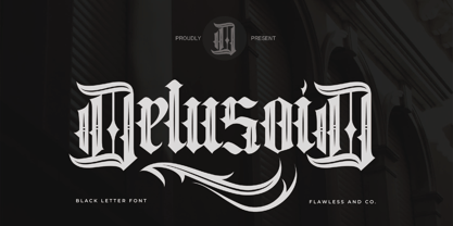 Delusoid, a Blackletter font with an authentic and unique style on each character that gives a bold touch to any design you create. There's some connected letters and some alternates that suitable for any graphic designs such as branding materials, t-shirt, print, business cards, logo, poster, t-shirt, photography, quotes .etc This font support for some multilingual. Also contains uppercase A-Z and lowercase a-z, alternate character, numbers 0-9, and some punctuation. If you need help, just write me! Thanks so much for checking out my shop!
 - Chesterville by Andrew Tomson,
$10.00 Hello, friends! Just this year I went to the United States for the first time. To my surprise, the neighborhoods, streets, and parks that I had only seen in the movies turned out to be true. There is a soul in them. I really enjoyed wandering these endless streets, soaking up this spirit. They feel childishly carefree, as if you were in a movie.Just try this font and understand my feelings. The font will work for almost anything: social media, cards, invitations, announcements. Good luck and love to you!
 - Compania by Letterhend,
$19.00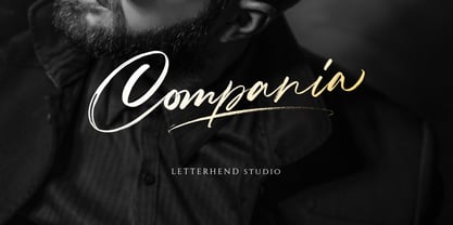 Compania is a luxury signature script. The natural hand writing feel make this font stand out. This font is perfect for logos, magazines, books, greeting / wedding cards, packaging, fashion, make up, stationery, novels, labels or any type of advertising purpose. Features : uppercase & lowercase numbers and punctuation multilingual support ligatures alternates PUA encoded We highly recommend using a program that supports OpenType features and Glyphs panels like many of Adobe apps and Corel Draw, so you can see and access all Glyph variations. Email us to letterhend@gmail.com if you need something! Happy Designing!
 - Barle by Locomotype,
$18.00 Big is beautiful. Barle font has an extremly heavy weight and wide shape. A sans-serif display font that's perfect for large headlines, posters, packaging and any graphic design that requires a font that will stand out to audiences. Barle font has two faces, a standard character and a sliced version which can be accessed through the Stylistic Alternates feature. This font consists of 4 fonts; upright and italic style in the normal version and the outlined version. If you just want to use the sliced version, you just need to purchase Barle Alt.
 - Xmas by Linotype,
$29.99Christmas cookies have already slowly crept onto your local supermarket's shelves -- the Linotype Xmas Fonts just can't wait any longer! Ravishingly friendly and universally applicable: Fuenfwerken -- a design studio from Wiesbaden, Germany -- is proud to present its latest Fun Font Family. Bringing variety to the dry Christmas card genre, these fonts can also be used on posters to spread holiday cheer at home. No limits are placed on your creativity here! The family has three different fonts, each with more than 60 symbols inside: Xmas Story includes the whole figure palette necessary for a classical Christmas story. From a cute little Baby Jesus to the Three Wise Men and woolly Aramaic sheep and everything that one needs to add special flair to a letter to grandma, or to set up a Nativity Scene at home for the kids is included. Customers who aren't searching for a biblical font should check out Xmas Essentials. This font contains typical non-denominational end-of-the-year holiday ornaments, such as snowflakes, decorated Christmas trees, nutcrackers, and stars. Last but not least is the Xmas Modern font. Just as global warming poses severe risks to snowmen, this font will make recipients of your holiday and New Year's cards melt. Glyphs such as Santa Claus riding on a Vespa -- complete with iPod -- speed away from normal, stuffy holiday seriousness, and signal that the Fun Generation has arrived! The best choice, of course, is to treat yourself to all three fonts this Christmas. Then you'll be prepared for every situation. Happy Holidays! - ITC Silvermoon by ITC,
$29.99 ITC Silvermoon was designed by Akira Kobayashi in the style of the advertisements of the 1920s. Art Deco was the artistic movement which marked the years between the two world wars, combining elements of Jugenstil, futurism and east Asian influences. This font carries on in that tradition. The small, high reaching figures with their elegant forms and reserved but distinguishing loops give Silvermoon its unmistakable look. Kobayashi designed this font in two weights, regular and bold. To retain the elegance of the bold weight, the consistent stroke width of the regular weight was exchanged for contrasting strokes. This gives the weight more weight without detracting from its grace. The nostalgic, romantic ITC Silvermoon is best used for headlines and short texts in point sizes of 12 and larger.
 - Sixties Pin Buttons JNL by Jeff Levine,
$29.00 During the turbulent era of the 1960s, the youth of America found various ways to protest against "The Establishment". Whether it was campus unrest, protest songs, sit-ins or other methods, the message was the counter-culture movement. Arising from this disenchantment with traditional social standards, a small but effective means of protest arose that made no sound, yet spoke volumes - the pin button. Statements against the war in Vietnam, free love, drug use and other messages popped up on little metal discs pinned to tee shirts, suspenders, head band and hats. Sixties Pin Buttons JNL recreates twenty-six of these messages in both white on black (upper case keys) and black on white (lower case keys). Blank buttons in both white and black are found on the parenthesis keys.
