10,000 search results
(0.098 seconds)
- Vidocq by Typogama,
$19.00 Vidocq is a single weight typeface designed for use in headlines and titles, inspired by the woodcut styles of the 19th century. Its rounded forms and dark stroke translate into a bold yet friendly appearance coupled with a narrow proportion that let’s it set well in condensed settings. Thanks to an extended character set and wide range of Opentype features that includes arrows and fleurons, Vidocq was created to allow designers to play with various styles while composing layouts.
 - Wild Graf by Sipanji21,
$17.00 "Wild Graf" is an urban graffiti font characterized by sharp edges and a bold look. Ideal for music posters, apparel designs, shirts, and streetwear, this font brings a touch of edginess to your projects. The unique style of "Wild Graf" makes it the perfect choice for death metal or urban graffiti themes. Whether you want to create a strong and powerful statement or simply add a touch of attitude to your designsWild Graf" is the font for you.
 - Lalalo by Cuda Wianki,
$25.00 Lalalo is a casual, modern sans-serif font family based on hand-lettering. It's oval letter shapes provide soft and friendly appearance. Lalalo font is very legible with a warm touch perfectly suited for children books. Lalalo family consists of 6 weights ( Extra Light, Light, Regular, Semibold, Bold, ExtraBold). You can use it with normal fill or outlined. You can mix various colors and stroke widths to gain interesting results. There is also a set of nice frames available.
 - Morris by HiH,
$10.00 Morris is a four-font family produced by HiH Retrofonts and based on the work of the very English William Morris. William Morris wanted a gothic type drawn from the 14th century blackletter tradition that he admired both stylistically and philosophically. He drew from several sources. His principal inspiration for his lower case was the 1462 Bible by Peter Schoeffer of Mainz; particularly notable for the first appearance of the ‘ear’ on the g. The upper case was Morris’s amalgam of the Italian cursive closed caps popular throughout the 12th through 15th centuries, a modern example of which is Goudy’s Lombardic Capitals. The gothic that Morris designed was first used by his Kelmscott Press for the publication of the Historyes Of Troye in 1892. It was called “Troy Type” and was cut at 18 points by Edward Prince. It was also used for The Tale of Beowulf. The typeface was re-cut in at 12 points and called “Chaucer Type” for use in The Order of Chivalry and The Works of Geoffrey Chaucer. Morris' objective is designing his gothic was not only to preserve the color and presence of his sources, but to create letters that were more readable to the English eye. ATF copied Troy and called it Satanick. Not only was the ATF version popular in the United States; but, interestingly, sold very well in Germany. There was great interest in that country in finding a middle ground between blackletter and roman styles -- one that was comfortable for a wider readership. The Morris design was considered one of the more successful solutions. Our interpretation, which we call Morris Gothic, substantially follows the Petzendorfer model used by other versions we have seen, with the following exceptions: 1) a larger fillet radius on the upper arm of the H, 2) a more typically broadpen stroke in place of the foxtail on the Q, which I do not like, 3) inclusion of the aforementioned ear on the g and 4) a slightly shorter descender on the y. We have included five ornaments, at positions 0135, 0137, 0167, 0172 and 0177. The German ligatures ‘ch’ & ‘ck’ can be accessed using the left and right brace keys (0123 & 0125). Morris Initials One and Morris Initials Two are two of several different styles of decorative initial letters that Morris designed for use with his type. He drew from a variety of 15th century sources, among which were Peter Schoeffer’s 1462 Mainz Bible and the lily-of-the-valley alphabet by Gunther Zainer of Augsburg. Each of the two initial fonts is paired with the Morris Gothic lower case. Morris Ornaments is a collection of both text ornaments and forms from the surrounding page-border decorations.
 - Stencil Company JNL by Jeff Levine,
$29.00 A mid-1950s hand lettered ad for Stenso Lettering Guides provided the inspiration for Stencil Company JNL, now available in both regular and oblique versions. The Stenso Lettering Company of Baltimore, Maryland pioneered easy-to-use and inexpensive lettering devices with guide holes for accurate spacing. Originally designed by a school teacher (Ruth Libauer Hormats) around 1940, the company was family run until it was sold in 1962 to Ottenheimer Publishers. They in turn sold the line to the Dennison Manufacturing Company, and it was discontinued in the 1980s after Dennison merged with Avery.
 - Mayari by Lurinzu Studios,
$16.00 “Mayari" is an elegant and expressive display typeface that is inspired by the characteristic and vibes of female warrior in Filipino Mythology named: Mayari. Mayari is the “goddess of moon”. This typeface holds the perfect balance of expressiveness as a display whilst also holds well of being a body type. This typeface is best used when you want to express elegance, class and sophistication in your designs. *This font includes letters, numbers, multi-language, and all essential marks needed. * Two(2) weights are currently available for this typeface: Regular and Italic
 - Type Master by VP Creative Shop,
$39.00 NOTE : If you want any specific ligature included, just write me a message and I will add it with next update :) Type Master is a sophisticated and delicate serif font that exudes elegance in every aspect. With its extensive collection of over 100 ligatures and alternate glyphs, this font offers endless possibilities for creative expression. Additionally, its support for 87 languages ensures that it is versatile enough to meet the needs of any project. Whether you are designing a logo, creating marketing materials, or crafting an editorial layout, Type Master is the perfect choice for adding a touch of refinement to your work. Language Support : Afrikaans, Albanian, Asu, Basque, Bemba, Bena, Breton, Chiga, Colognian, Cornish, Czech, Danish, Dutch, Embu, English, Estonian, Faroese, Filipino, Finnish, French, Friulian, Galician, Ganda, German, Gusi,i Hungarian, Indonesian, Irish, Italian, Jola-Fonyi, Kabuverdianu, Kalenjin, Kamba, Kikuyu, Kinyarwanda, Latvian, Lithuanian, Lower Sorbian, Luo, Luxembourgish, Luyia, Machame, Makhuwa-Meetto, Makonde, Malagasy, Maltese, Manx, Meru, Morisyen, North Ndebele, Norwegian, Bokmål, Norwegian, Nynorsk, Nyankole, Oromo, Polish, Portuguese, Quechua, Romanian, Romansh, Rombo, Rundi, Rwa, Samburu, Sango, Sangu, Scottish, Gaelic, Sena, Shambala, Shona, Slovak, Soga, Somali, Spanish, Swahili, Swedish, Swiss, German, Taita, Teso, Turkish, Upper, Sorbian, Uzbek (Latin), Volapük, Vunjo, Walser, Welsh, Western Frisian, Zulu Ligatures : IS, FO, OD, FA, TY, EX, NN, PI, EY, AY, SS, LL, FU, US, UT, AS, AN, AM, CI, LO, ES, RO, ET, TE, CK, OH, OO, OE, OC, KO, KE, KC, CH, SE, EA, UR, RS, KS, TH, TU, TT, TK, TL, HE, RG, EP, ER, RE, RC, LE, ND, ED, OF, HA, EN, CT, ST, NT, ON, ME, MO, NG, NC, UG, UC, OU, GH, OR, OP, EE, YO, VE, IT, WE, TI, FAS, FAST, CKS, OOD, FOOD, FOO, THEY, HEY, HYP, TYP, OUT, UST, URS, WAS, THE, WES, EST, WEST, ERS, EAST, EAS, LES, ENT, FOR, OUG, OUGH, ERE, TER, YOU, VER, HER, THER, THA, AND, ITH, THI, MENT, WERE, WER, ROM, THE How to access alternate glyphs? To access alternate glyphs in Adobe InDesign or Illustrator, choose Window Type & Tables Glyphs In Photoshop, choose Window Glyphs. In the panel that opens, click the Show menu and choose Alternates for Selection. Double-click an alternate's thumbnail to swap them out. UPDATES : COMING SOON Mock ups and backgrounds used are not included. Thank you! Enjoy!
 - Miedinger by Canada Type,
$24.95 Helvetica’s 50-year anniversary celebrations in 2007 were overwhelming and contagious. We saw the movie. Twice. We bought the shirts and the buttons. We dug out the homage books and re-read the hate articles. We mourned the fading non-color of an old black shirt proudly exclaiming that “HELVETICA IS NOT AN ADOBE FONT”. We took part in long conversations discussing the merits of the Swiss classic, that most sacred of typographic dreamboats, outlasting its builder and tenants to go on alone and saturate the world with the fundamental truth of its perfect logarithm. We swooned again over its subtleties (“Ah, that mermaid of an R!”). We rehashed decades-old debates about “Hakzidenz,” “improvement in mind” and “less is more.” We dutifully cursed every single one of Helvetica’s knockoffs. We breathed deeply and closed our eyes on perfect Shakti Gawain-style visualizations of David Carson hack'n'slashing Arial — using a Swiss Army knife, no less — with all the infernal post-brutality of his creative disturbance and disturbed creativity. We then sailed without hesitation into the absurdities of analyzing Helvetica’s role in globalization and upcoming world blandness (China beware! Helvetica will invade you as silently and transparently as a sheet of rice paper!). And at the end of a perfect celebratory day, we positively affirmed à la Shakti, and solemnly whispered the energy of our affirmation unto the universal mind: “We appreciate Helvetica for getting us this far. We are now ready for release and await the arrival of the next head snatcher.” The great hype of Swisspalooza '07 prompted a look at Max Miedinger, the designer of Neue Haas Grotesk (later renamed to Helvetica). Surprisingly, what little biographical information available about Miedinger indicates that he was a typography consultant and type sales rep for the Haas foundry until 1956, after which time he was a freelance graphic designer — rather than the full-time type designer most Helvetica enthusiasts presume him to have been. It was under that freelance capacity that he was commissioned to design the regular and bold weights of Neue Haas Grotesk typeface. His role in designing Helvetica was never really trumpeted until long after the typeface attained global popularity. And, again surprisingly, Miedinger designed two more typefaces that seem to have been lost to the dust of film type history. One is called Pro Arte (1954), a very condensed Playbill-like slab serif that is similar to many of its genre. The other, made in 1964, is much more interesting. Its original name was Horizontal. Here it is, lest it becomes a Haas-been, presented to you in digital form by Canada Type under the name of its original designer, Miedinger, the Helvetica King. The original film face was a simple set of bold, panoramically wide caps and figures that give off a first impression of being an ultra wide Gothic incarnation of Microgramma. Upon a second look, they are clearly more than that. This face is a quirky, very non-Akzidental take on the vernacular, mostly an exercise in geometric modularity, but also includes some unconventional solutions to typical problems (like thinning the midline strokes across the board to minimize clogging in three-storey forms). This digital version introduces four new weights, ranging from Thin to Medium, alongside the bold original. The Miedinger package comes in all popular font formats, and supports Western, Central and Eastern European languages, as well as Esperanto, Maltese, Turkish and Celtic/Welsh. A few counter-less alternates are included in the fonts.
 - HandVetica - 100% free

- Kinesthesia by Typodermic,
$11.95 Introducing Kinesthesia, the hypermodern typeface that channels the sleek, futuristic aesthetic of liquid crystal displays. With its sharp diamond points and hi-tech letterforms, Kinesthesia is the perfect choice for anyone looking to communicate their message with a cool, technical tone. Whether you’re designing a cutting-edge website, a high-tech advertisement, or a bold logo, Kinesthesia will give your work an unmistakable edge. But what sets Kinesthesia apart from other typefaces on the market? For starters, it offers a wide range of monetary symbols, as well as numeric ordinals, primes, and OpenType fractions. So whether you’re writing a report for work or creating a digital design for a client, you can be confident that Kinesthesia has all the symbols and characters you need to convey your message with precision. And of course, let’s not forget Kinesthesia’s angular design. With its sharp, diamond-shaped points, this typeface is the perfect choice for anyone looking to add a contemporary edge to their work. Available in Ultra-Light, Extra-Light, Light, Regular, Semi-Bold, Bold, and Heavy with obliques, Kinesthesia offers a wide range of weights and styles to suit any design need. So if you’re ready to take your design game to the next level, look no further than Kinesthesia. With its technical aesthetic and wide range of features, this typeface is the perfect choice for anyone looking to make a bold, unforgettable statement. Most Latin-based European writing systems are supported, including the following languages. Afaan Oromo, Afar, Afrikaans, Albanian, Alsatian, Aromanian, Aymara, Bashkir (Latin), Basque, Belarusian (Latin), Bemba, Bikol, Bosnian, Breton, Cape Verdean, Creole, Catalan, Cebuano, Chamorro, Chavacano, Chichewa, Crimean Tatar (Latin), Croatian, Czech, Danish, Dawan, Dholuo, Dutch, English, Estonian, Faroese, Fijian, Filipino, Finnish, French, Frisian, Friulian, Gagauz (Latin), Galician, Ganda, Genoese, German, Greenlandic, Guadeloupean Creole, Haitian Creole, Hawaiian, Hiligaynon, Hungarian, Icelandic, Ilocano, Indonesian, Irish, Italian, Jamaican, Kaqchikel, Karakalpak (Latin), Kashubian, Kikongo, Kinyarwanda, Kirundi, Kurdish (Latin), Latvian, Lithuanian, Lombard, Low Saxon, Luxembourgish, Maasai, Makhuwa, Malay, Maltese, Māori, Moldovan, Montenegrin, Ndebele, Neapolitan, Norwegian, Novial, Occitan, Ossetian (Latin), Papiamento, Piedmontese, Polish, Portuguese, Quechua, Rarotongan, Romanian, Romansh, Sami, Sango, Saramaccan, Sardinian, Scottish Gaelic, Serbian (Latin), Shona, Sicilian, Silesian, Slovak, Slovenian, Somali, Sorbian, Sotho, Spanish, Swahili, Swazi, Swedish, Tagalog, Tahitian, Tetum, Tongan, Tshiluba, Tsonga, Tswana, Tumbuka, Turkish, Turkmen (Latin), Tuvaluan, Uzbek (Latin), Venetian, Vepsian, Võro, Walloon, Waray-Waray, Wayuu, Welsh, Wolof, Xhosa, Yapese, Zapotec Zulu and Zuni.
 - Octin Spraypaint by Typodermic,
$11.95 As a designer, it’s crucial to choose a typeface that not only complements the overall design, but also conveys the intended message. Octin Spraypaint, a typeface that exudes streetwise grit and toughness, is a perfect choice for projects that demand a bold and fearless statement. Octin Spraypaint boasts two distinct styles—sans and serif—each offering three weight options: regular, bold, and black. The sans style offers a sleek, modern aesthetic with sharp, angular lines, while the serif style offers a more classic and sophisticated feel with its clean and sharp serifs. Together, these styles and weights provide designers with the flexibility to create striking headlines that command attention. This typeface is the perfect choice for design projects that demand an edgy and daring look. From police and military themes to sports, prison, construction, and school, Octin Spraypaint is versatile enough to lend its tough appeal to various themes and contexts. Octin Spraypaint is a typeface that offers a distinctive look that’s hard to ignore. It’s ideal for projects that need to convey strength, power, and authority, and its bold, spray-painted style is sure to capture the attention of viewers. With its unique blend of streetwise design and raw power, Octin Spraypaint is a must-have tool for any designer looking to make a bold statement. Check out the rest of the Octin families: Octin Sports, Octin College, Octin Prison, Octin Stencil & Octin Vintage. Most Latin-based European writing systems are supported, including the following languages. Afaan Oromo, Afar, Afrikaans, Albanian, Alsatian, Aromanian, Aymara, Bashkir (Latin), Basque, Belarusian (Latin), Bemba, Bikol, Bosnian, Breton, Cape Verdean, Creole, Catalan, Cebuano, Chamorro, Chavacano, Chichewa, Crimean Tatar (Latin), Croatian, Czech, Danish, Dawan, Dholuo, Dutch, English, Estonian, Faroese, Fijian, Filipino, Finnish, French, Frisian, Friulian, Gagauz (Latin), Galician, Ganda, Genoese, German, Greenlandic, Guadeloupean Creole, Haitian Creole, Hawaiian, Hiligaynon, Hungarian, Icelandic, Ilocano, Indonesian, Irish, Italian, Jamaican, Kaqchikel, Karakalpak (Latin), Kashubian, Kikongo, Kinyarwanda, Kirundi, Kurdish (Latin), Latvian, Lithuanian, Lombard, Low Saxon, Luxembourgish, Maasai, Makhuwa, Malay, Maltese, Māori, Moldovan, Montenegrin, Ndebele, Neapolitan, Norwegian, Novial, Occitan, Ossetian (Latin), Papiamento, Piedmontese, Polish, Portuguese, Quechua, Rarotongan, Romanian, Romansh, Sami, Sango, Saramaccan, Sardinian, Scottish Gaelic, Serbian (Latin), Shona, Sicilian, Silesian, Slovak, Slovenian, Somali, Sorbian, Sotho, Spanish, Swahili, Swazi, Swedish, Tagalog, Tahitian, Tetum, Tongan, Tshiluba, Tsonga, Tswana, Tumbuka, Turkish, Turkmen (Latin), Tuvaluan, Uzbek (Latin), Venetian, Vepsian, Võro, Walloon, Waray-Waray, Wayuu, Welsh, Wolof, Xhosa, Yapese, Zapotec Zulu and Zuni.
 - Meloriac by Typodermic,
$11.95 Introducing Meloriac, the unicase display typeface that combines a pseudo-retro feel with a minimalist design, creating a strong and modern-looking font that has become a reliable staple in the toolbox of today’s graphic designer. Inspired by the classic Futura Extra Bold and Avant Garde Gothic Bold, Meloriac is an extra-heavy tribute that is perfect for tight headlines and logos. Its minimalist design and strong strokes make it stand out and demand attention. The font is versatile, able to convey a variety of messages while maintaining its bold and modern aesthetic. Meloriac is more than just a pretty face; it’s also highly functional. For improved clarity, we recommend tracking it wider (adding more space) on subheadings. The result is a cleaner, more legible display that will make your message pop. Additionally, the font’s OpenType stylistic alternates feature allows access to filled letter variations and an alternative ampersand, giving you even more creative control over your designs. Whether you’re designing a poster, a book cover, or a website, Meloriac’s minimalist design and bold aesthetic make it the perfect font to convey your message with impact. Try it out today and see for yourself why it’s a favorite among today’s graphic designers. Most Latin-based European, Vietnamese, Greek, and most Cyrillic-based writing systems are supported, including the following languages. Afaan Oromo, Afar, Afrikaans, Albanian, Alsatian, Aromanian, Aymara, Azerbaijani, Bashkir, Bashkir (Latin), Basque, Belarusian, Belarusian (Latin), Bemba, Bikol, Bosnian, Breton, Bulgarian, Buryat, Cape Verdean, Creole, Catalan, Cebuano, Chamorro, Chavacano, Chichewa, Crimean Tatar (Latin), Croatian, Czech, Danish, Dawan, Dholuo, Dungan, Dutch, English, Estonian, Faroese, Fijian, Filipino, Finnish, French, Frisian, Friulian, Gagauz (Latin), Galician, Ganda, Genoese, German, Gikuyu, Greenlandic, Guadeloupean Creole, Haitian Creole, Hawaiian, Hiligaynon, Hungarian, Icelandic, Igbo, Ilocano, Indonesian, Irish, Italian, Jamaican, Kaingang, Khalkha, Kalmyk, Kanuri, Kaqchikel, Karakalpak (Latin), Kashubian, Kazakh, Kikongo, Kinyarwanda, Kirundi, Komi-Permyak, Kurdish, Kurdish (Latin), Kyrgyz, Latvian, Lithuanian, Lombard, Low Saxon, Luxembourgish, Maasai, Macedonian, Makhuwa, Malay, Maltese, Māori, Moldovan, Montenegrin, Nahuatl, Ndebele, Neapolitan, Norwegian, Novial, Occitan, Ossetian, Ossetian (Latin), Papiamento, Piedmontese, Polish, Portuguese, Quechua, Rarotongan, Romanian, Romansh, Russian, Rusyn, Sami, Sango, Saramaccan, Sardinian, Scottish Gaelic, Serbian, Serbian (Latin), Shona, Sicilian, Silesian, Slovak, Slovenian, Somali, Sorbian, Sotho, Spanish, Swahili, Swazi, Swedish, Tagalog, Tahitian, Tajik, Tatar, Tetum, Tongan, Tshiluba, Tsonga, Tswana, Tumbuka, Turkish, Turkmen (Latin), Tuvaluan, Ukrainian, Uzbek, Uzbek (Latin), Venda, Venetian, Vepsian, Vietnamese, Võro, Walloon, Waray-Waray, Wayuu, Welsh, Wolof, Xavante, Xhosa, Yapese, Zapotec, Zarma, Zazaki, Zulu and Zuni.
 - De Scripto by Prototype Fonts,
$20.00De Scripto is a flea market-inspired font borrowing letterforms from old letters, postcards and hand written notes. - New Bodoni DT by DTP Types,
$49.00A revival design by Malcolm Wooden of DTP Types Limited with associated Small Capitals and Old Style Figures. - Midtown JNL by Jeff Levine,
$29.00The alphabet that inspired Midtown JNL was found on a page from an old 'how to' lettering book. - Barricade JNL by Jeff Levine,
$29.00 Barricade JNL is Jeff Levine's take on an old favorite that's been around since at least the 1940s.
 - Fountain Service JNL by Jeff Levine,
$29.00Fountain Service JNL was inspired by an exterior neon sign seen in an old photograph from the 1950s. - Oron Koteret MF by Masterfont,
$59.00 This unique font preserves the DNA of old Biblical manuscript, maintaining clear forms and shapes for good readability.
 - Crakos - Personal use only

- Something Fishy - Personal use only

- Option Sans by Cadson Demak,
$29.00 Option Sans is a rework of Anuthin Wongsunkakon's Coupe. The popular font originally sold by T26 has now been humanized. Improved legibility from the original Coup to serve better as fine text font.
 - Assembler by Fonthead Design,
$15.00Assembler is a font designed by Ethan Dunham that has a slightly bouncy, organic feel, but at the same time is mildly cold and angular. Suitable for headlines and single lines of text. - Amusement Ride Stencil JNL by Jeff Levine,
$29.00 Amusement Ride Stencil JNL is based on a hand-cut paper stencil advising the riders to "Hold Onto Your Hats - Don't Stand Up - Let's Go Again!" Available in both regular and oblique versions.
 - Futurism by Artyway,
$19.00 I am pleased to present you an excellent futuristic font "Futurism" in modern graphic style! The font supports the Latin alphabet and Cyrillic alphabet. It is recommended to use it at long intervals between letters, but you can customize it perfectly for your own design, use it to create logos, emblems, posters and posters. Futurism is very stylish, it ideally suited for a space mood, future tech and innovative products! Uppercase and lowercase english letters Uppercase cyr letters Numbers
 - Bravado NF by Nick's Fonts,
$10.00 This growing family of friendly faces is based on the typeface Bravour, designed in 1913 by Martin Jacoby-Boy for the D. Stempel AG foundry in Frankfurt am Main. The wide stance and very large x-height shared by the family members makes them warm and inviting, and equally suitable for use in headlines or text blocks. All versions of this font include the Unicode 1250 Central European character set in addition to the standard Unicode 1252 Latin set.
 - Blastiks by Maulana Creative,
$14.00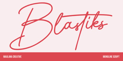 Blastiks is am expressive casual signature script font. With slanted mono-line stroke, fun character with some of ligatures. To give you an extra creative work. Blastiks font support multilingual more than 100+ language. This font is good for logo design, Social media, Movie Titles, Books Titles, a short text even a long text letter and good for your secondary text font with sans or serif. Make a stunning work with Blastiks font. Cheers, Maulana Creative
 - Buntaro by Hanoded,
$15.00 I am reading a great book by David Mitchell, called Number 9 Dream. One of the characters is called Buntaro, so I decided to call my new inky font after him. Like the book, Buntaro is quite unusual: it has no real baseline, comes with some strange characters, feels familiar, but surprises you nonetheless. It was made with a broken bamboo satay-skewer, Chinese ink and a lot of patience. Buntaro comes with a wealth of diacritics.
 - De Bambeet by Zamjump,
$17.00 De Bambeet is a serif font that has a little style compared to other serifs, with multiple languages, alternate and also ligature is quite cool and suitable to be paired in various media like a posters, wedding invitations, craft products, book covers, photography, t-shirts , product packaging and other media. By using De Bambeet, I am sure that your products will look elegant, classic and luxurious. Font Featured : Uppercase Lowercase Numbers Symbols Punctuations Sylistic alternates Discretionary Ligatures
 - Bokar by Pelavin Fonts,
$25.00 I am inspired by imagery that technology has rendered obsolete. I treasure anachronistic packaging and design which has somehow evaded obliteration by focus groups.I especially admire the packaging for A&P coffee brands Eight O'Clock, Red Circle and Bokar whose eccentric yet elegant typography harkens back to an earlier, less complicated era. The font Bokar is my nod of appreciation to those robust and full-bodied blends spared from the bland, tasteless scourge of corporate branding.
 - Cowboy Rhumbahut by Chank,
$59.00Cowboy Rhumbahut is an old-timey script the drips with a twang and tradition that you can practically hear. If you've been wandering the range, searching for the perfect cowboy alphabet for you, you might wanna wrangle up this old-time original. My goodness that's one kooky cowboy font. Now get to work and start makin' something with it, ya lily-livered varmint! - Rigney by Solotype,
$19.95Bill Rigney, an old job printer in my home town, established his shop in 1896, closed it in 1900 to take a steady job, stored the equipment in a large shed, and reopened for business upon his retirement in 1950. What a find! A bonanza of old type! We became good friends and upon his death I bought the type. Bless you Bill. - Cabriolet by JVB Fonts,
$35.50 Cabriolet is a connected geometric script re-interpretation inspired by old chromo emblems of Chevy truck Apache of 1960. With three weight variables, it can be used in logos, games and graphic related to cars, automotive, American, Detroit, Art Deco, 1940, 1950, 1960, vintage, retro, classic and old machines. Can be expandable using underscore for connect words or expanding between letters space.
 - Ballard Avenue by Turtle Arts,
$20.00Ballard Ave is inspired by old vintage signage found in Ballard, Washington, an old neighborhood of Seattle. Ballard Avenue is a protected historical district filled with turn of the century brick buildings that have been converted into quaint shops and independent businesses. This alphabet is based on the antique signage that still exists on the sides of many of these buildings. - Fancy Show Card JNL by Jeff Levine,
$29.00 A playful, casual take on round nib pen lettering was spotted amongst some online scans from an old lettering book. The free-form and stylized shapes of the letters and numbers are reminiscent of old-time show cards, movie titles and signage in vogue around the early 1900s through the 1920s. Fancy Show Card JNL is available in both regular and oblique versions.
 - Thunderbird by Image Club,
$29.99Thunderbird is an old American-style typeface. It is based on the kinds of big wood type that were popular in old Wild West advertising, which is evident through its ornate serifs, and the pointy flares that pop in and out of the centers of each stroke. Thunderbird is an all caps font and is best used in very large sizes. - Trump Mediaeval LT by Linotype,
$67.99 Trump Mediaeval is an Old Face font developed by Georg Trump between 1954 and 1962. All cuts have both normal and old style numbers and their robust characters make them suitable even for inferior paper. Light and legible, the open forms of the lower case letters allow this font to be legible in text with as small a point size as 5.
 - Goodfood by MaGo Fonts,
$9.00 Introducing our stunning Goodfood Font Family, a versatile and delicious sans serif display typeface that is perfect for your most tasteful design projects. With a total of five different weights, this font family offers you ultimate flexibility in creating captivating and impactful designs. Whether you're working on a logo, branding materials, product packaging, or editorial projects, this font family will enhance the overall aesthetic and make your designs stand out. To further enhance creativity, Goodfood Font Family includes alternates and ligatures. These additional characters provide you with ample possibilities to customize and stylize your typography, creating unique and eye-catching designs. By utilizing alternates and ligatures, you can bring a distinctive touch to your headers, titles, headlines, and other important elements of your design. Here's what you can expect from this font family: Five Weights: The font family offers five weights, ranging from Light to Bold. This wide range allows you to experiment with different typographic hierarchies and create visually appealing compositions. Alternates: The inclusion of alternates expands the versatility of this font family. By simply swapping characters, you can create different stylistic variations, giving your designs a fresh and creative look. Ligatures: The font family also includes ligatures, which are special characters that combine two or more letters into a single unique glyph. Ligatures ensure smooth and visually pleasing connections between characters, resulting in a harmonious and cohesive typography. Superior Legibility: While the Goodfood Font Family features elegant and decorative serifs, it doesn't compromise on legibility. The carefully crafted characters and balanced letterforms ensure readability across various sizes and mediums. Extensive Language Support: This font family supports a wide range of languages, allowing you to create designs for global audiences with ease. Whether you're a professional designer looking to elevate your creative projects or an individual seeking a unique font for personal use, the Display Serif Font Family offers an impressive array of options. Add sophistication, versatility, and a touch of uniqueness to your designs with this remarkable font family.
 - Stinger by Zetafonts,
$39.00 Since their first appearance as Italians on the pages of the 1821 William Caslon type specimens, reverse contrast typefaces have been typography's best loved quirky outcasts. Subverting the traditional relationship between thick verticals and thin horizontals made them perfect for eye-catching advertisements. The unexpected contrasts and the thick slabs produced by reverse-contrast serifs became ubiquitous in period posters, and synonymous with wild west and circus iconography. In designing Stinger, the Zetafonts design team composed by Maria Chiara Fantini, Andrea Tartarelli and Francesco Canovaro and orchestrated by Cosimo Lorenzo Pancini decided to marry this subversive tradition with the workhorse approach of modernist sans serif typefaces like Univers, developing a super-family with four widths, each in five different weights, from thin to heavy. This gives the designer a full range of options for type setting, with the Normal and Fit widths providing two different text-sized alternatives, the wide width adding display and titling options and the Slim ready to deal with the space-saving necessities of extremely long texts. True italics have been added developed for all weights and variants, bringing the Stinger family to a total of 40 fonts, with a latin extended + Russian Cyrillic character set covering over 200 languages, and open type features including positional numbers, stylistic sets and alternate forms. In the crowded panorama of contemporary grotesque typefaces, all aiming to stark geometric perfection, Stinger stands out with its bold choices and strong personality. From the calligraphy-inspired terminals in the thin weights to the logo-ready sculptural approach in the heavy weights, each variant manages to look striking without forgetting the readability and flexibility lessons of modern reverse-contrast classics like those designed by Excoffon or Novarese. A variable version is included with the full family, allowing maximum flexibility and control for the designer over the wide range of expression capabilities of the Stinger super family.
 - Lineavec by Typodermic,
$11.95 Introducing Lineavec—the typeface of the future. With its precise, wide, and light design, Lineavec embodies the essence of technology and innovation. This futuristic font will transport your message to the far reaches of space and time, evoking images of vector arcade games, laser beams, and the intricate traces of a circuit board. Lineavec is not just a font, it’s a statement. It’s a symbol of the ever-evolving digital landscape and the unstoppable march of progress. Its sleek and minimalistic design is perfect for a range of contemporary projects, including tech startups, gaming websites, and sci-fi films. So if you want to give your message a sense of interstellar distinctiveness, Lineavec is the font for you. Whether you’re looking to captivate your audience with bold headlines, or to add a touch of sophistication to your brand identity, Lineavec is the perfect choice. Don’t miss out on the opportunity to make your mark on the future—get Lineavec today! Most Latin-based European writing systems are supported, including the following languages. Afaan Oromo, Afar, Afrikaans, Albanian, Alsatian, Aromanian, Aymara, Bashkir (Latin), Basque, Belarusian (Latin), Bemba, Bikol, Bosnian, Breton, Cape Verdean, Creole, Catalan, Cebuano, Chamorro, Chavacano, Chichewa, Crimean Tatar (Latin), Croatian, Czech, Danish, Dawan, Dholuo, Dutch, English, Estonian, Faroese, Fijian, Filipino, Finnish, French, Frisian, Friulian, Gagauz (Latin), Galician, Ganda, Genoese, German, Greenlandic, Guadeloupean Creole, Haitian Creole, Hawaiian, Hiligaynon, Hungarian, Icelandic, Ilocano, Indonesian, Irish, Italian, Jamaican, Kaqchikel, Karakalpak (Latin), Kashubian, Kikongo, Kinyarwanda, Kirundi, Kurdish (Latin), Latvian, Lithuanian, Lombard, Low Saxon, Luxembourgish, Maasai, Makhuwa, Malay, Maltese, Māori, Moldovan, Montenegrin, Ndebele, Neapolitan, Norwegian, Novial, Occitan, Ossetian (Latin), Papiamento, Piedmontese, Polish, Portuguese, Quechua, Rarotongan, Romanian, Romansh, Sami, Sango, Saramaccan, Sardinian, Scottish Gaelic, Serbian (Latin), Shona, Sicilian, Silesian, Slovak, Slovenian, Somali, Sorbian, Sotho, Spanish, Swahili, Swazi, Swedish, Tagalog, Tahitian, Tetum, Tongan, Tshiluba, Tsonga, Tswana, Tumbuka, Turkish, Turkmen (Latin), Tuvaluan, Uzbek (Latin), Venetian, Vepsian, Võro, Walloon, Waray-Waray, Wayuu, Welsh, Wolof, Xhosa, Yapese, Zapotec Zulu and Zuni.
 - Posh by Lián Types,
$49.00 I've always been in love with fat didones. That’s the reason of Posh. In search of something unique, I started this family back in 2013 with the aim of creating the fattest yet readable bodonian typeface in the market: It was a challenge, because roman fonts need generous counters (or what some call white spaces) and taking them to the extreme of inexistence attempted against the construction of many glyphs. Ears, dots, terminals and serifs always need some extra space so I had to find the exact point of boldness to make characters which have those attributes work well in the middle of those which haven't. (1) After a while, I felt I was again ‘in my element’: Big contrasted letters, sexy and elegant curves, and that Lubalinesque feeling that characterise my fonts. (2) Words written with Posh are a explosion of elegance and sensuality due to the fact that its didone attributes were exaggerated. Since it’s full of alternate glyphs, one can change and choose them until a nice block of ‘‘black’’ is achieved. (3) To accompany the regular style, I designed Posh Inline, a font with the same quantity of glyphs than the regular one; an all caps style called Posh Capitals, and also a really playful Italic version. I hope you find this one delicious like I do! This font is dedicated to all who understand letters are not just meant to be read, but also to be appreciated in group and individually. Enjoy it. NOTES (1) In example, it can be easy to design a fat letter ‘n’ with almost no counter, but really tough to make a satisfactory letter ‘s’ with serifs to match that ‘n’. (2) Also, it wasn't my first attempt in fat didones. Take a look at my font Reina, made in 2012. (3) Posters above show many words with ball terminals that seem to dance above and below the words in order to fill those “undesired” blank spaces.


