10,000 search results
(0.048 seconds)
- Beverly Hills by Monotype,
$29.99Beverly Hills is an all-caps display face in the Art Deco style. Its design features dramatically low crossbars, and each letter has a fine inline highlight. The most prominent letters in this typeface are clearly the E, F, G, and K, while the elegantly narrow S is sure to delight. A classy offering like Beverly Hills should only be set very large, either as a magazine headline, a store sign, or on the cover of a fine invitation. If you like Beverly Hills, you make enjoy other high-contrast Art Deco designs in Linotype's library, including ITC Anna, Avenida, Broadway, Jazz, and ITC Manhattan. - Crake by Narrow Type,
$35.00 Crake is a contemporary high-contrast serif typeface with a distinctive look. It combines organic details with strong geometry shapes. The typeface comes in 5 weights from Light to Bold. Crake has rounded counters of uppercase letters A, B, E, F, P and R which creates an unique and organic character. With different stylistic sets you can change the feel of your design from more organic to more standard. The typeface also offers many discretionary and standard ligatures. Crake is a display typeface with large x-height which works best for headlines or short to medium-length texts. It’s a perfect typeface for branding, editorial design and much more.
 - Stencil Package JNL by Jeff Levine,
$29.00 Stencil Package JNL has its design roots in the brand name hand-lettered on the paper sleeves for the short-lived Stencil-It line of lettering guides produced in 1955 as a direct competitor to Stenso Lettering Guides. Formed by Bernie Aronson [a relative of the Libauers who owned the Stenso Lettering Company and who once worked for them] along with a financial partner (noted artist) Sidney Levyne, the company was soon put out of existence by a court action. It re-emerged in 1956 as the E-Z Letter Stencil Company and existed until the 1990s. Stencil Package JNL is available in both regular and oblique versions.
 - Monocto by Lafonts,
$29.00 Monocto is an upright italic, clearly evidenced by the lowercase letters a, e, f, g, i, k, l, v, w, x, y and several capitals. On one hand, the design is inspired by an historical German running hand written with a pen angle of 45°, and on the other, by rational, utilitarian monospace types, similar to those designed for the mechanical typewriter during the Industrial Revolution. As the writing tool touches the paper, a double-square with broken corners is produced, which then, according to ductus, transforms itself into letter components that are either 90°-verticals or 45°-diagonals. The systematic geometry of Monocto offers unexpected design possibilites.
 - Eurostile Unicase by Linotype,
$29.99 Akira Kobayashi modified his Eurostile Next design into a fun unicase version. Ascenders and descenders have been traded in for alternates of letters that all share the same height. The effect is similar to using all caps, although this is quite a bit more quirky. For example, letters like the lowercase a and e are now the same height as their capital versions and the lowercase y has been raised to fit between the baseline and top height. Odd relationships such as these give Eurostile Unicase a fresh and funky feeling. Try using it for headlines and titles, then use Eurostile Next for the body text!
 - Hostetler Fette Ultfraktur Ornamental by Intellecta Design,
$18.90 I digitized and revitalize Hostetler Fette Ultfraktur Ornamental from the classical type specimen book from Rudolf Hostetler. He was a Swiss type designer, author of “The Printer’s Terms” designed by Jan Tschichold, of “Technical Terms of the Printing Industry” (5th edition was printed in 1995), and of "Type: eine Auswahl guter Drucktypen; 80 Alphabete klassischer und moderner Schriften" (Teufen, Ausser-Rhoden: Niggli, 1958). He also wrote "Type: A Selection of Types" (1949, fgm books, R. Hostettler, E. Kopley, H. Strehler Publ., St. Gallen and London) in which he highlights type made by European houses such as Haas, Enschedé, Deberny and Nebiolo. Jost Hochuli wrote his biography.
 - Binner Poster by Monotype,
$29.99Binner was designed by John F. Cumming in 1898 and is an alphabet with a strongly historic character. It takes the reader back to the early part of the 20th century, when typefaces of this kind could be found in advertisements on houses and posters. The robust figures display a marked stroke contrast. Particularly striking are the high middle strokes of the E and F as well as the wavy connecting stroke of the H. The curves of the R and P extend well into the lower third of the characters. With its robust figures, Binner is best used for headlines in middle and larger point sizes. - Pre Code Movies JNL by Jeff Levine,
$29.00 The hand lettered credits from the 1931 melodrama “Safe in Hell” inspired the typeface Pre Code Movies JNL, which is available in both regular and oblique versions. The design is strongly influenced by the popular Art Deco style of thick-and-thin characters and also features rounded corners. The font’s name comes from the early era of talking pictures and the short period before the establishment of the Hays Office in 1934 when Hollywood did not self-censor itself. Many then-taboo topics were exploited on film until Will Hays cracked down on such productions. To read more about Pre-Code Hollywood, visit the Wikipedia link: https://en.wikipedia.org/wiki/Pre-Code_Hollywood
 - PT Banana Split - Unknown license

- Bubble 1 - 100% free

- Albertino - Personal use only

- Strippenzieher - Unknown license

- Pompeii Caps - Unknown license

- QSwitch Ax - Unknown license

- Splendor Pro by RMU,
$35.00 Finally the light version of Wilhelm Berg’s hot-metal classic which had found its way from Schriftguss to Typoart can be released for nowaday’s use.
 - Poster Inline JNL by Jeff Levine,
$29.00 The word "Signs" hand-lettered on the cover of a 1930s instructional book on sign and poster lettering was the basis for Poster Inline JNL.
 - Century New Style by Red Rooster Collection,
$45.00Designed by Les Usherwood. Digitally engineered by Steve Jackaman. This beautiful version of Century Old Style by Les may be superior to any existing versions. - Borba Sans by Edyta Demurat,
$20.00 Borba Sans is based on Borba . It is really readable sans serif typeface which may be used whenever you need a stylish and modern typography.
 - Fishermans Knot by Gleb Guralnyk,
$14.00 Presenting a vintage typeface named "Fisherman's Knot". Its style was inspired by boating knots and old graphics heritage. Thank you and have a great day!
 - Ver Army - Unknown license

- Hoofer by Scholtz Fonts,
$15.00 Light and flexible, slightly retro, casual and readable, Hoofer combines 28 brush script, mono line script and sans-serif styles with ornaments into one Mega-Family. The different styles of the Hoofer Mega-family have been chosen to work together and to harmonize in a pleasing way. The Hoofer Mega-Family of fonts can be divided into three sub-families: Hoofer BRUSH subfamily: An eclectic group of five fonts. These are mainly joined scripts. Hoofer LINE subfamily: Seven mono-line scripts with joined letters in a number of weights, widths and styles. Hoofer SANS subfamily: Sixteen casual, Sans-Serif fonts. They are very readable and in a variety of weights & styles The mood of the Hoofer mega-family is light and flexible, slightly retro, casual and readable. It combines script and many sans-serif styles with ornaments into one Mega-Family. The different styles of the Hoofer Mega-family have been chosen to work together and to harmonize in a pleasing way. The Brush Sub-Family is designed for titling, packaging and display purposes, The Line Sub-Family can also be used for titling, packaging and display, however, it is less “showy”, and conveys an air of informality. The Sans Sub-Family is designed to shine as sub-heads and as body text. The wide range of Hoofline styles gives you, the designer, great flexibility in creating just the mood or impression that you want. Most of the fonts can use one or more OpenType Features. These can be accessed in a number of ways. The reason for this is that the major software producers provide different (and often conflicting) ways of accessing OpenType Features. In some cases such software manufacturers provide NO way of accessing certain OpenType Features. We have tried to remedy this by providing a highly flexible family of fonts. OPENTYPE (these OpenType features are only available in the “otf” fonts and not in the “ttf” fonts.) OpenType features that Hoofer makes use of are: Swashes (Word-Begin and Word-End Features); Alternate Numerals; and True Small Caps. ORNAMENTS In addition the Hoofer family has a font containing 94 ornaments. ALTERNATE NUMERALS You can access two sets of figures (numbers) in Hoofer Sans fonts. Both sets are tabular and lining but they differ in the height (but not the width) of the figures. The height of the alternate figures has been chosen so that they are compatible with the small caps. However, these alternate figures are available in ALL Hoofer Sans fonts, whether they feature small cap fonts or not. Hoofer has all the features usually included in a fully professional font. Language support includes all European character sets, Greek symbols and all punctuation. Opentype features include automatic replacement of some characters and discretionary replacement of stylistic alternatives.
 - Cloister Open Face LT by Linotype,
$29.99Cloister Open Face was designed in 1929 by Morris Fuller Benton as one weight of the Cloister Old Style family. Cloister itself appeared from 1897 with American Type Founders, and later for the typesetting machines of the Linotype, Intertype and Monotype companies. At that time, it was the truest modern industrial revival of the Jensonian Roman. Benton stayed close to the style of his model in both design and spacing. Cloister Open Face has an old-world elegance, and it works well for titling in books and magazines. In 1458, Charles VII sent the Frenchman Nicolas Jenson to learn the craft of movable type in Mainz, the city where Gutenberg was working. Jenson was supposed to return to France with his newly learned skills, but instead he traveled to Italy, as did other itinerant printers of the time. From 1468 on, he was in Venice, where he flourished as a punchcutter, printer and publisher. He was probably the first non-German printer of movable type, and he produced about 150 editions. Though his punches have vanished, his books have not, and those produced from about 1470 until his death in 1480 have served as a source of inspiration for type designers over centuries. His Roman type is often called the first true Roman." Notable in almost all Jensonian Romans is the angled crossbar on the lowercase e, which is known as the "Venetian Oldstyle e."" - Wanderer by FontMesa,
$25.00This font was inspired by the title logo of the TV show The Wild Wild West (season two). The font was named after the train in the TV show. Wanderer is a combination of my Classic Tuscan Rodeo Clown font and a Robust Slab Serif font. Wanderer is available as a stand alone font or with the optional fill fonts. Caution: Use of this font may cause the Wild Wild West theme song to play over and over in your head. Solution: Try temporarily using another FontMesa font such as Rough Riders. - STARSsoft Nika by STARSsoft,
$19.90 Currently, the STARSsoft NIKA font family is represented by two fonts - Bold & Bold Italic. The letters and numbers in the font are shown in such a way that there are no holes in the letters and the entire outline of the font consists of one closed line. The font has both a standard Latin set and an extended one. The font also has Cyrillic support. In addition to the Russian Cyrillic alphabet, the font has support for Ukrainian and Kazakh Cyrillic. In addition to standard character sets, the font has many additional letters with diacritics.
 - Delighted Atmosphere by Java Pep,
$15.00 Proudly present a pretty bouncy font called Delighted. As the name suggests, this font will make your project more enjoyable because it will make your project more beautiful and stand out. Delighted font comes with several alternates, so you can switch on for the alternate, stylistic alternate, and terminal form. This font is perfect for logo font, branding, greeting cards, cut files for quotes, silhouette font design, monogram font, etc. The packages and features Delighted font PUA encoded Multilingual support in more than 30 languages Thanks, and have a nice day
 - Night Train by FontMesa,
$19.95 Night Train is a new font built from the ground up; while Night Train may resemble an old classic wood type there are a few lines that make this font a little more modern setting it apart from other wood type revivals. If you're a railroad enthusiast you're sure to enjoy the steam locomotive graphic located on the less than and greater than keys on all versions of this font, due to the fine detail of this train illustration the best printing results will be at 600dpi or higher on a laser printer. An alternate K and R are within the Night Train fonts, for Win Type1 these alternates are on the left and right bracket keys, for Truetype and OpenType you may access the alternates by using the Character Map in Windows or Adobe Illustrator, for OpenType you may also find them on the stylistic alternates page of the glyph map in Illustrator. There's something new with Night Train that the sign making people will love, for the first time FontMesa is pleased to offer a block shadowed version in four directions. One fill font is all that is needed for all four open faced fonts, you'll need an application that works in layers in order to use the fill font with the open faced fonts, simply place the fill font in its own layer then move it behind one of the open faced fonts of Night Train. The Night Train name has been on my list to use as a font name for a few years, a friend from years ago used to sail his boat in the Mackinac race from Chicago to Mackinac Island, the name of that boat was the Night Train. Watching the 2010 Olympic four man U.S. bobsled team win gold with their sled also called Night Train has inspired me to complete this font.
 - Bradley Texting by Monotype,
$57.99Bradley Texting: a clear, friendly and easily legible calligraphy font, also suited to electronic devices With Bradley Texting, Richard Bradley has published another calligraphic typeface that recalls the style of Bradley Hand and Bradley Type. In this case, however, Bradley has advanced the style with clearer forms for display on electronic instruments and on other formats. Two other font families paved the way to the newly introduced Bradley Texting. In the mid-1990s, Bradley published Bradley Hand, with its rough contours. Since these coarse forms do not cut a good figure in the larger font sizes, Bradley Type followed, with smooth letters. During the development of Bradley Type, the idea for a further font came about ? one in the style of the two other calligraphic typefaces, but with simpler, easily legible forms and suited to electronic devices like mobile phones or tablets. The letters for Bradley Texting began with a marker on paper. Looking back, Bradley describes one of the biggest challenges as having the calm required to draw the relaxed-looking letters repeatedly while still making them fit the general style.The somewhat narrow and dynamically designed letters have round line ends, like those left by a felt-tipped pen. As a hand-written print font, the individual letters are not connected to one another. Nonetheless, they demonstrate the influence of a written font, such as the extended ends and the flowing transitions. Clear forms with open counters and a large x-height guarantee Bradley Texting good legibility in the smaller font sizes. Bradley Texting is also effective under more challenging conditions, such as on mobile phones, e-book readers or tablets; the fonts friendly and lively character comes through. With Regular, Semibold and Bold, Bradley Texting is adequately equipped for use as a headline or text font in various sizes. The selection of characters covers the Western European languages and German typographers will be happy to note the presence of the upper-case ß. Use the dynamic and clear forms of Bradley Texting anywhere you need a friendly character with a personal accent. Bradley Texting is persuasive in the print realm, in advertisements or on posters, as well as on electronic devices. - Elaine Hanks by Sarid Ezra,
$13.00 Elaine Hanks is a fashionable signature that contain lowercase, uppercase, symbol, and also support multi language. There's a lot ligatures in this font. Elaine Hanks also comes with doodle font that you can use to make a logo for branding, beautiful fashion design, suitable for wedding invitation, or handwritten quote. Also already PUA Encoded. Plus 12 Premade logo for you! Foreign Languages Support: ÀÁÂÃÄÅÇÈÉÊËÌÍÎÏÑÒÓÔÕÖØÙÚÛÜÝßàáâãäåæçèéêëìíîïñòóôõöøùúûüýÿ What Will You Get: 30+ Doodle (Ai) 12 Premade Logo (Ai)
 - Q-bo - Personal use only

- Lovelica by PandAE86,
$10.00 Lovelica is a magical handwritten font carefully created with a touch of elegance. It will elevate a wide range of design projects to the highest level, be it branding, headings, wedding designs, invitations, signatures, logos, labels, and much more! Uppercase Lowercase Numeral Punctuation Ligatures Multilingual characters support Thank you and have a nice day ! Dedi T A
 - Bestters Supply by Burntilldead,
$13.00 Bestters Supply is a hand made script font, bold, classic and fun vintage script. Can be used for various purposes such as logos, t-shirt, letterhead, signage, news, shopping bag, posters, badges etc. Bestters Supply comes with Opentype features with 400 glyphs inside. Including alternate characters upper and lower case, ligatures, discretionary ligatures, and multiple language support.
 - Getaliss by Gatype,
$12.00 Getaliss is a casual script font suitable for a variety of projects, such as branding, invitations, merchandise, websites, advertisements, magazines and more. You'll get a full set of lowercase and uppercase letters, numbers and punctuation, multilingual symbols, ligatures, and extra strokes. Please message if you have any questions or concerns, and don't hesitate to say hello. Thank You!
 - Davina by Nirmalagraphics,
$14.00 I made Davina for display purposes and it can be used for logos with a vintage style, for flyers, brochures, leaflets and more. If you like a logo with a semi-vintage style, thick, unique and clean, it means you have to buy and use Davina! This font also has Multi-Lingual support and more than 15 Ligatures.
 - Asteria by RagamKata,
$12.00 Asteria is Retro Display Font. This typeface is perfect for various purposes such as Magazine Title, Poster, Logo, T-Shirt, Sub Title, Business cards, Magazines, Book Covers, Wedding Invitations,Templates Instagram Story Post, Greeting Cards, Quotes, etc. Asteria Features: • Uppercase & Lowercase • Alternates • Numerals & Punctuation • Accented characters • Multilingual Support • Unicode PUA Encoded Thanks and have a wonderful day .
 - Delysha by Letterena Studios,
$9.00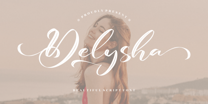 Delysha is a beautiful script font suitable for any projects such as logos, branding projects, homeware designs, product packaging, mugs, quotes, posters, shopping bags, t-shirts, book covers, name cards, invitation cards, and greeting cards. It’s also a perfect fit for labels, photography, watermark, special events, and all your other lovely projects that need a beautiful script taste.
 - Bandiera Del Legno NF by Nick's Fonts,
$10.00 This typeface appeared in the William H. Page Woodtype specimen book as Gothic Tuscan Condensed Reversed—quite a mouthful. Banner elements appear in the brace and bracket positions, and reversed spaces can be found in the underscore and bar positions. Both versions of this font support the Latin 1252, Central European 1250, Turkish 1254 and Baltic 1257 codepages.
 - Farm Bluster by Zeenesia Studio,
$14.00 Farm Bluster is a sweet and friendly handwritten font. Its natural and unique style makes it incredibly fitting to a large pool of designs. perfect for large design project like Tshirt, Advertising, bags, quotes, food , poster, fashion, custom sticker, magazine, and many others. It completed with numbers and punctuation. Multilingual support, and came with PUA encoded.
 - Rolington by Letterena Studios,
$9.00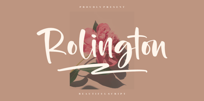 Rolington is a beautiful script font suitable for any projects such as logos, branding projects, homeware designs, product packaging, mugs, quotes, posters, shopping bags, t-shirts, book covers, name cards, invitation cards, and greeting cards. It’s also a perfect fit for labels, photography, watermark, special events, and all your other lovely projects that need a beautiful script taste.
 - Palm Shine by Jafar07,
$14.00 Palm Shine is a beautiful and versatile font with a retro serif design that can be used in many different ways. Its elegant lines and modern look will make your designs stand out while maintaining a classic, timeless feel. It's also extremely versatile - perfect for logos, boho and groovy designs, and even silhouette art and more.
 - Cheap Skit by PizzaDude.dk,
$11.00 It doesn’t take long to see that Cheap Skit is a super legible, easy going font. It is intended to be used where text needs to be clear and legible, but have certain amount of handmade energy. I’d say that products that has something to do with children (toys, clothes, games, posters …) or something organic, recipes, bookcovers …


