10,000 search results
(0.188 seconds)
- Virna by FSD,
$60.00In September, 2003 I was contacted by MTV for the restyling of mtv.it I started from the beginning to work on a radical simplification of its visual elements, to achieve a better usability. It didn't take me so much to realize the basic design I attempted would have called for a notable reduction of the rich imagery distinguishing MTV's visual identity. As a visual aid to help me in this process I designed Virna, a headline "op-art" inspired face with the ability to create both vertical and horizontal ligatures between single words among two text lines, with the same ease of linking letters in handwriting or a linked script typeface. - Junglegym by Atlantic Fonts,
$26.00 Junglegym provides a playful structure for an energetic project. Climb on and see what you can do! Junglegym family includes regular and bold and ensures extra movement with discretionary ligatures, including double letters and a handful of others to keep play lively.
 - If This Be Doomsday by Comicraft,
$19.00 THE END IS NIGH! Judgment Day has come and this planet has been CONDEMNED! Do not conspire to hide what remains of your paltry world from my eyes! Know you not that NONE may thwart my will? Of what import are brief, nameless lives -- to DOOMSDAY?? Death is Certain! Apocalypse is UNAVOIDABLE. At last, my cosmic hunger will be sated, if only briefly! This planet shall SUSTAIN me until it has been drained of all elemental life! SO SPEAKS DOOMSDAY! But do not fret. Even if the Domesday Book has been closed on your planet... your utter destruction is being made available in Font form, I call it IF THIS BE DOOMSDAY, and I will deliver it to you via comicbookfonts.com in Regular, (Roach) Chew and Outline weights. Never let it be said that DOOMSDAY is without mercy. Features: Three weights (Regular, Chew & Outline) with small cap characters and Western & Central European international characters.
 - Amelia Amanda by Sinfa,
$14.00 Amelia Amanda calligraphy script that comes with a very charming fancy character, in the form of results but looks modern, made with inspiration to get a beautiful style and match between one and the other letters. Amelia Amanda belongs to a unique font type, feminine , sensual, clean, glamorous, simple and very charming to look at, due to the unique form of letters and alternative styles that are appropriate for many letters. Classic style is very suitable to be applied in various formal forms such as invitations, labels, restaurant menus, logos, fashion, makeup, stationery, novels, magazines, books, pride greeting cards as well as weddings, packaging, labels and also suitable for all forms of advertising . The Amelia Amanda script is very feasible because it is supported by some charming alternative letters.
 - Series A Signage JNL by Jeff Levine,
$29.00 The basis for Series A Signage JNL is Highway Gothic; a type style design formally known as the FHWA Series. The font was developed by the United States Federal Highway Administration, and originally consisted of only capital letters and figures. Each Letter designation represented a character width from "A" (condensed) to "F" (wide). Due to poor visibility at high speeds, Series "A" was discontinued. At one point lower case characters were added to the various widths of the design, but this typeface revival is based on the original guidelines specified in the 1948 (reprinted 1952) book "Standard Alphabets for Highway Signs" [this was the original name for the FHWA series fonts preceding the eventual name change to Highway Gothic]. Unlike the original, Series A Signage JNL is available in both regular and oblique versions.
 - Buddy by Hackberry Font Foundry,
$24.95 Buddy is the new companion sans for Contenu, the book font family designed for my book on font design design. Originally, I called it Compagnon, but that seemed to pompous. Then I called it Aide, but that was too formal and dry. It's a loose, free, easy to read sans, so when my wife suggested Buddy, it clicked. This is the 4-font Buddy family of Regular, Italic, Bold, & Bold Italic. I made a new, more limited feature set for these fonts due to their designed usage, but there are still small caps, small cap figures, oldstyle figures, numerators, and denominators. The bold is closer to a black, and the italics are only slightly slanted obliques. If you need a strong black in caps, use the small caps of the bold.
 - BB Noname (Pro) by Bold Studio,
$49.00 BB Noname™ (Pro) is intended to imply the appearance of a conventional typeface in a contemporary context. Due to the frequent use in the public service (among other things), the style associates a supposedly objective face. The style is characterized by the proportions, the contradiction of the apparently perfect reduction and the retention of chirographic elements. In addition, the rapid further development of the input devices has meant that existing character sets have been added again and again, regardless of style and technical requirements. With this work, the properties were analyzed, the characteristic features highlighted and summarized in a complete typesetting: Anonymity (procedure), bureaucracy (style by category), convention (shape) and formality (optical corrections). ● 3 Variants: Human, Computer, Interaction ● 20 Stylistic-Sets ● 34 Styles ● 39 OpenType features ● 93 Languages Support ● 35,598 (1,047/Style)
 - PR Agamemnon - Unknown license

- Fateya by Sulthan Studio,
$14.00 Fateya is a handcrafted script font amazing typeface that we created in freestyle for those of you doing work and crafts. This font has a total of 777 Glyphs to make it easier for you to choose a character according to your needs. It's perfect for all kinds of work you do with multiple purposes like logos, wedding invitations, titles, t-shirts, letterheads, signage, labels, news, posters, badges, etc.
 - Thwaites by Eyad Al-Samman,
$20.00 ‘Thwaites’ typeface is fully dedicated to one of my best Canadian friends who I do cherish and value highly. This great and industrious Canadian friend is ‘James Douglas Thwaites’ who lives along with his good-natured family in British Columbia, Canada. For me, James is like a source of inspiration and I do consider him as an ideal in my life. Our strong friendship has started since 1999 and I hope that it will endure just to the last moment of my life. Sometimes I see him as the writer and poet that I learn a lot from, sometimes I see him as a devoted religious minister that I try to understand more about his teachings, and other times I see him as the educator that I strive to imitate verbatim in my life. When I want to talk more about this Canadian friend, I will not be able to give him his due in full. Thus, I will instead mention some excerpts of his biography that he wrote himself saying that: “James D. Thwaites is a self-accomplished man. Having worked in various fields including restaurant management and cleaning, he has achieved his goals of being a full-time teacher, past-time writer, and volunteer religious minister for the Christian Congregation of Jehovah's Witnesses. His personal and academic pursuits have led him to be published in various magazines, newspapers, self-published books, and websites, including his now defunct ‘poetryofthemonth.com’ website. He continues to learn and augment the craft of writing while working primarily in early literacy and delayed literacy learners, teaching reading and literature to a wide age range of students. He views his religious endeavors as an extension of his academic ones. He teaches others both as a public speaker and in one-on-one situations, teaching about the benefits of submission to God and to His teachings. His future goals include expanding his ministry and continuing his writing.” The name ‘Thwaites’ itself comes from Great Britain and originated from the last Viking raids upon England, being an Anglicized version of a Scandinavian term meaning—depending on the source material—either "a place that is difficult to approach" or "a small thicket of trees." Another recitation mentions that ‘Thwaites’ can be described also as an English surname but one of pre 7th century Norse-Viking origins. It may be either topographical or locational, and is derived from the word "thveit", meaning a clearing or farm. As a locational surname it originates from any one of the various places called "Thwaite", found in several parts of Northern England and East Anglia to the south. The various modern spelling forms include Thwaite, Thwaites, Thwaytes, Thoytes, Twaite, Twatt, Twaites, Tweats and Twite. The name, although often appearing unique to outsiders, can often be found within other famous names like Braithwaite, Goldthwaites, or Misslethwaites. With various spellings, some families not including the ‘e’ or the ‘s’ at the end, Thwaites and its derivations—although not exceedingly common—is a name found worldwide. ‘Thwaites’ typeface is simply a sans-serif streamlined, stylish, and versatile font. It is designed using a combination of thick and thin strokes for its +585 characters. Its character set supports nearly most of the Central, Eastern, and Western European languages using Latin scripts including the Irish language. The typeface is appropriate for any type of typographic and graphic designs in web, print, and other media. It is also absolutely preferable to be used in the wide fields related to publication, press, services, and production industries. It can create a very impressive impact when used in headlines, posters, titles, products’ surfaces, logos, medical packages, product and corporate branding, and also signage. It has also both of lining and old-style numerals which makes it more suitable for any printing or designing purposes. ‘Thwaites’ typeface is really the cannot-miss choice for anyone who wants to possess unique artistic and modern designs produced using this streamlined typeface.
 - Matchstick by Fenotype,
$25.00 Matchstick is a hand drawn brush script. Matchstick is packed with loads of ligatures and alternates that help simulate a swift look of a handwriting. This feature is set in Standard Ligatures and it is normally automatically on. Matchstick is a great display brush to be used in writing headlines, packaging, posters or as a logotype. Matchstick works great when paired with strong sans serifs.
 - Airy by ParaType,
$25.00Airy is in fact a very light-minded summer font without any serious design concept. It is a collection of hand-drawn letters that with the help of OpenType features allow you to get a lace texture with mutable structure. Together with the font you also get a bonus — a set of naive pictures that you normally draw on the margins of your sketchbook. - Mally by Sea Types,
$25.00 Mally is a family of humanist fonts, sans serif with 32 styles, variable with 08 normal and condensed weights and their respective italics, with 594 characters in each font, offers alternative characters, was conceived as a variable font encompassing various weights and widths. Characterized by its excellent readability even in the smallest sizes, with a contemporary design it has a wide support of Latin languages.
 - NorB Croquis by NorFonts,
$28.00 NorB Croquis is a handwritten text font witch can be used with any word processing program for text and display use, print and web projects, apps and ePub, comic books, graphic identities, branding, editorial, advertising, scrapbooking, cards and invitations and any casual lettering purpose… or even just for fun! It comes with 12 weights: Normal, Medium, Bold and Cut Tip along with their Italic and Oblique versions.
 - Renard Moderne NF by Nick's Fonts,
$10.00Twentieth Century Poster, designed by Sol Hess for Lanston Monotype in the 1940s, provided the inspiration for this family of faces. Although, historically, the design falls outside the time period normally considered the Art Deco era, its sensibilities are pure Art Moderne. Both versions of this font contain the Unicode 1252 (Latin) and Unicode 1250 (Central European) character sets, with localization for Romanian and Moldovan. - Economica by TipoType,
$19.90 Typography created in Montevideo, Uruguay. The project's development typography Economica covered much of 2007 and received assistance of colleagues from all over Latin America. Economica has four basic versions: normal, bold, italic and bold italic. It was inspired by saving space for publishing texts without loss of height. Includes a comprehensive set of characters that lets you deal with diverse languages in its four variants.
 - Gopher by Adam Ladd,
$25.00 Gopher is a reverse contrast, geometric sans serif typeface in 3 optical sizes ranging — Text, Normal, and Display. With the most subtle contrast,Text works best in smaller type settings while Display is the most dramatic as the contrast has been pushed more to the extreme for an immediate visual impact. Gopher works great in a variety of settings for branding, advertising, posters, magazines, packaging, and more.
 - Talesha by Seniors Studio,
$15.00 Talesha is a high contrast typeface inspired by old style and contemporary fonts. Talesha family consist of 8 fonts: Sans and Serif Font: Normal, Condensed, Slant with 239 glyphs each. Opentype features allow for the implementation of typographic niceties such ligatures and extended language support. Perfectly for elegant branding, web design, magazine design, logo design, headlines, posters, packaging, cards or wedding invitation and more.
 - Fenton by Fatih Güneş,
$19.00 Fenton Font family comes with 6 weights. The design was inspired by (convex) camber. It has a higher lowercase structure than the normal ones. It has a modern, rounded and squared character. Each weight contains 364 glyph. It is a type family which you can use in brand and model names of technological devices, newspaper and magazine ads, jerseys, logos, posters, apps, banners and promo images.
 - NorB Casual by NorFonts,
$28.00 NorB Casual is a handwritten text font which my daily casual writing, it can be used with any word processing program for text and display use, print and web projects, apps and Comic Books, graphic identities, branding, editorial, advertising, scrapbooking, cards, and invitations or even just for fun. This font comes with 16 styles, Light, Normal Bold and Heavy each with their Italic and Condensed version.
 - Quebra by Vanarchiv,
$55.00 Quebra is an extend display sans-serif font family with four widths (Extra Condensed, Condensed, Normal and Expanded) and ten weights, italics versions are available. The main strokes contain small breaks simulating modulated variations on the letterforms, these details are more present on large body sizes. All font versions contain Latin and Cyrillic encoding characters and also ligatures, case-sensitive forms, fractions, oldstyle and finally tabular figures.
 - Brandon Grotesque Condensed by HVD Fonts,
$40.00 Eight years after the initial release of Brandon Grotesque , the typeface has grown into a font family of 48 styles, including a version for small sizes and a space saving condensed version. This type family was completely drawn from scratch with the look and feel of the original normal-width version. Today, Brandon supports at least 116 languages, from Latin based languages to Greek and Cyrillic.
 - Gaude by Trustha,
$19.00 Gaude is a sans-serif typeface. Crafted with care, maximizing neatness in shape. With thickness balancing with negative space. Making it fitting when strung together into words, or sentences. Added with alternative glyphs, to make it more alive. Gaude comes with 3 widths, namely: normal, wide, and expanded. And also a soft version, making it 6 styles. Gaude is perfect for branding, titling, headline, and more.
 - Acaraje by Latinotype,
$39.00 Acarajé is a grotesque font that stands out thanks to its versatility. Its personality blossoms through its particular modulation, which grows with weights; making it a rather jovial typeface that does not abandon the characteristics of more classic grotesques. With two styles available: normal and italic, and a variety of 7 weights that range from "Black" to "Regular", this font offers incredible flexibility for your designs.
 - Bernhard Fashion by Bitstream,
$29.99 This is an American face designed by Lucian Bernhard for ATF in 1929. An extra light face with tall ascenders and stylized bars that extend off to the left. The lower-case sits on the baseline and the much-taller-than-normal capitals have an imaginary baseline that sits about two-thirds of the distance from the real baseline to the bottom of the EM.
 - Vast by ParaType,
$30.00 Vast is a variable sans serif with a range of styles from thin to black and from normal to extra wide. This versatile font family of both of a serious and friendly nature can be used for various purposes, such as text, logos, headings, and branding. Vast was designed by Manvel Shmavonyan with the assistance of Alexander Lubovenko and released by Paratype in 2021.
 - Beagley by Seniors Studio,
$35.00 Beagley Display is a contemporary serif typeface, special designed for printing and advertising. With deliberately tight kerning. Beagley provides a warm and friendly atmosphere. Suitable for logotypes, brands, magazines and editorial. The font contains 6 styles from condensed, normal and expanded, plus matching italics. 250 glyphs include ligatures, discretionary ligatures and a wide range of flexibility for Latin language support for every typographical needs.
 - Magic Bright Script by Typestory,
$10.00 Magic Bright is a stunning and comprehensive duo font (script and serif), ideal for giving your projects a branded but friendly feel. The two included styles can be combined together perfectly but are also beautiful on their own.
 - Mandalika Indonesia Signature by Yoga Letter,
$18.00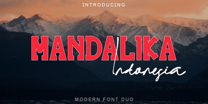 "Mandalika Indonesia" is an elegant and beautiful duo font. This font is equipped with uppercase, lowercase, ligatures, numerals, punctuation, and multilingual support. Very suitable for business branding, social media, logos, banners, posters, branding, stickers, summer, graduation, and others.
 - Mystical Woods by Missy Meyer,
$12.00 Mystical Woods is a script and caps font duo. I went back to the basics for this one -- ink and a brush on paper. I cleaned up the letters enough so that there are no jagged edges, but left enough of the character to keep that inky look -- those are the Rough fonts. Then I went back through again and cleaned the heck out of them, making every line and curve smooth for our cut-crafting friends -- those are the Smooth fonts. Since these two fonts were written together with the same tools and style, you can also mix the script letters in with the caps letters! Each font comes with a full set of standard characters and punctuation, as well as over 300 extended Latin characters for language support. And the script fonts also have 45 double-letter ligatures!
 - Softly Bright by Ditatype,
$29.00 Introducing Softly Bright, a dynamic font duo that effortlessly combines the contrasting styles of sans-serif and brush fonts. The sans-serif component of this font is a testament to clean lines and modern minimalism. Its characters are created with precision and defined strokes, offering a sharp and sleek appearance that exudes professionalism and readability. On the other hand, the brush font in Softly Bright adds an expressive touch to your designs. It embodies the authenticity of hand-lettered strokes, with each character bearing the organic irregularities of brushwork. This brush font retains the proportions of the sans-serif, ensuring that the two styles harmoniously coexist. Softly Bright fits in headlines, logos, posters, flyers, branding materials, print media, editorial layouts, and many more designs. Find out more ways to use this font by taking a look at the font preview.
 - Prushkov by Arrière-garde,
$9.00 Prushkov is the first typeface that I made. Its name comes from the town I lived in at the time. The design was inspired by both geometric typefaces like Futura, and didone fonts like Bodoni. Its aim (perhaps quite bold) is to blend high contrast with mathematical excellence. Prushkov will work well as a display font, both in uppercase and lowercase. It has a wide array of stylistic alternates for all of the capitals and some lowercase glyphs too.
 - Linotype Technical Pi by Linotype,
$40.99The Linotype Technical Pi font includes a variety of characters for technical areas, especially for the field of electrical engineering. Among other symbols are those for AC and DC, certifications, and a number of others which illustrate technical terms, warnings and information. Technical Pi also includes the modern symbols which have become a part of everyday life, like environmental and recycling characters. General characters like fax and telephone symbols complete the symbol palette of Linotype Technical Pi. - Eurotypo Bodoni by Eurotypo,
$48.00 Talking about the numerous types that today bear the name of Giambattista Bodoni are a kind of tribute as much to his reputation as a printer as to his ability as designer and engraver. In fact, all of them tent to be more in the way or style of Bodoni than simply copy of his letterforms. Like many other type designers, we’ve been seduced also to develop our own point of view of his work, nowadays enriched by some features of OpenType format that allows a variety of combinations: standard ligatures, discretional ligatures, stylistic alternates and old styles figures. Whereas the Bodoni serif in the capitals was of the same weight as the thin stroke but joined with a very slight fillet (Bracket) and the lowercase serif were like his French rivals, the Didots, featured straight- edged serifs that were unbracketed. The ascenders and descenders of this new Bodoni are shorter, giving in this way, more space for enlarge x high. Specially designed for editorial design and advertising, can be used in magazines, annual reports and all kind of fine print materials or web pages. The beauty of his letterforms can enrich headlines; this font can also be used as body text for its good legibility and accurate kerning.
 - CHILD & MOMSKY by Rhd Studio,
$15.00 Style and Grace personified - say Child Momsky. This typeface has two main styles, Regular and Italic, that are designed to work elegantly in unison and apart. The serif has a boldy different ' f', which sets it apart from regular serifs.....as Child Momsky likes to stand out from the rest. A regular 'f' is included in its alternates, and a extra font style with a regular f is included for projects that require a more staid elegance. The Italic style is dreamy, sultry and light-footed - a perfect partner for the more serious serif. Use them together or apart for stylish, stand-out type designs and projects. For those of you who do not have access to Opentype Software, such as Canva Users, a separately available 'extra letters' font set will be available for purchase soon. Language Supported : Danish, English, French, German, German (Switzerland), Italian, Low German, Luxembourgish, Norwegian Bokmål, Norwegian Nynorsk, Portuguese, Swedish, Swiss German. Enjoy
 - Heywood by Elemeno,
$25.00Named for Algonquin Round Table wit Heywood Broun, Heywood is bold, but playful. The simplicity of the letters combined with the shifting baseline make this the least formal and most fun of The Algonquin Collection of fonts. - Spoiler by PizzaDude.dk,
$16.00 Now here's a font that won't spoil anything! It's my ALL CAPS brush font with slightly uneven and quirky lines. Just enough to make font look lively and fresh, but not overdoing it. Every letter has 7 different versions, which automatically cycles as you type - and I have added an extra SMALL CAPS for each letter. Exchange every letter here and there with SMALL CAPS, and you will get an even more authentic result!
 - Barito by Authentype,
$14.00 The Barito Serif 9 font is full of cursive typefaces with sharp, bold lines that create an optical illusion that appears to intimidate the reader. Barito serif font comes with many languages like Cyrillic • Greek • Latin and is perfect for designing books, magazines, titles for online advertising media websites and much more. The barito serif font not only comes with 9 weights, but is also accompanied by an italic for complement and confirmation.
 - Beehive by Matt Grey Design,
$29.00 Beehive is an Art Deco inspired display typeface with a unique slant, each word fits below one another neatly, which is perfect for creating stylised titling and logos. Beehive is made to look like a vintage, art deco styled typeface, the font is ideal for branding, posters, band artwork or album covers and endless other uses. Great for titling or medium sized text, made to be as big as possible because of the thin lines.
 - Metropole by Greater Albion Typefounders,
$12.00 Metropole is an exercise in combing the curvaceous lines of the Art Nouveau with the solid character and simplicity of Art Deco. The resulting three display faces combine the spirit of the 20s and of the thirties, creating lively fun display faces for headings, signage and banners. These characterful faces with clear simple outlines are also ideal to lend a distinctive air to your web pages, or to create a distinctive 'house-style' for lettering.
