10,000 search results
(0.011 seconds)
- Century Old Style by Linotype,
$29.99In 1894, Linn Boyd Benton finished a commission for a new text typeface with the American periodical, Century magazine. Century is typical of the neorenaissance movement in typography at the end of the 19th century. Morris Fuller Benton drew a number of versions of the font for the font foundry, American Typefounders, and Century was later taken up by the firms Linotype, Intertype and Monotype. - Catorze27 Style 1 by Scannerlicker,
$22.00 Catorze27 is a typeface inspired by northern Portuguese modernist lettering. Wrought iron is a widely used element on Portuguese architecture and, as such, the typeface started after collecting several photographs of modernist iron signage in several cities in the north of Portugal, specially in Espinho, Porto, Ponte de Lima and Viana do Castelo. As a result, Catorze27 / Style 1 is the first of 3 styles, featuring 570+ glyphs, 7 weights, case-sensitive forms, 2 styles of numerals in 2 sizes, Greek (Monotonic), Cyrillic and supports most of the Latin Unicode ranges.
 - Arabic Ramadan Style by Sensatype Studio,
$15.00 Arabic Ramadan Font is a fancy, unique, and versatile arabic font, that you can combine to get any variations and unique shapes easily just in seconds with choose alternates of them. It is a serif display font with moderate contrast that perfect for moslem branding projects, logo, wedding designs, social media posts, advertisements, product packaging, product designs, label, photography, watermark, invitation, stationery, and any projects, it makes with a high level of legibility. What's Included: Character set A-Z Uppercase & Lowercase Numerals & Punctuation Accented Characters (West Europe) Stylistic alternates Works on PC & Mac Recommended using Adobe Illustrator or Adobe Photoshop. Wish you enjoy our font. :)
 - Modern Brush Style by Din Studio,
$25.00 Modern Brush Style is a font duo combinations of serif and script font to express modern, elegant impressions in your designs. The serif font is characterized by scratches or hooks connecting the letters. On the other hand, script font is designed in brush styles of which letters are interconnected looking similar to a curve writing. You can use this font mixture as a beautiful set or separately as their own lovely characters. Additionally, this font duo has some unique features to enable you to maximize your designs. Features: Stylistic Sets Ligatures Multilingual Supports PUA Encoded Numerals and Punctuations Modern Brush Style fits for various design projects, such as posters, banners, logos, magazine covers, quotes, name cards, headings, printed products, merchandise, social media, etc. Find out more ways to use this font by taking a look at the font preview. Hopefully, you have a great experience using our font. Feel free to contact us if you require more information when you are dealing with a problem. Thank you. Happy designing.
 - Cheltenham Old Style by URW Type Foundry,
$35.99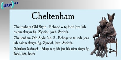
- Nouveau Style JNL by Jeff Levine,
$29.00 Scribner's Magazine was an illustrated periodical published from 1887 to 1939. The 1895 holiday issue “Scribner's for Xmas” had the cover text hand lettered in an Art Nouveau style with spurred serifs. This is now available digitally as Nouveau Style JNL, in both regular and oblique versions.
 - Bruce Old Style by Bitstream,
$29.99This is the Bruce Foundry’s Old Style No.20, which was loosely based on the Miller & Richard Old Style. It was recut at Lanston under Sol Hess’ direction in 1909, and survives as the second text face in the Sears Roebuck Catalogue. - Century New Style by Red Rooster Collection,
$45.00Designed by Les Usherwood. Digitally engineered by Steve Jackaman. This beautiful version of Century Old Style by Les may be superior to any existing versions. - Binny Old Style by Monotype,
$29.99Binny Old Style is based on type designs originally cut in Scotland about 1863. Binny Old Style shows the influence of the types cut by William Caslon but was an attempt to make a modernized version by eliminating some of Caslon's more archaic features. It was cut by some American foundries at the end of the nineteenth century and by Lanston Monotype for mechanical composition, in 1908. Binny Old Style was named after Archibald Binny, a Scotsman who established a type foundry in Philadelphia in 1796. The Binny Old Style font is ideal for small point size settings in newspaper advertisements, catalogues etc. - Cooper Old Style by URW Type Foundry,
$35.99
- Packard Old Style by Red Rooster Collection,
$60.00 Steve Jackaman & Ashley Muir. Packard Old Style is based on lettering drawn by Oswald Cooper for the Packard Motor Company (ATF 1913). The bold weight is credited to Morris Fuller Benton (ATF 1916), but it is highly probable that Benton did the adaptation for both weights. Packard Old Style Pro contains all the high-end features expected in a quality OpenType Pro font.
 - Hess Old Style by Red Rooster Collection,
$45.00 Originally designed by Sol Hess as just a roman and italic for Lanston Monotype, circa 1920-23.
 - Retroline. Retro Style by Luxfont,
$18.00 Introducing color Retro font family. Modern retro design dictates its own rules and graphic techniques - one of which is fonts with outlines. Retroline font family embodies this. 4 fonts with black stroke and white fill, and 4 fonts with only black stroke are perfect for retro illustrations. Color scheme of colored fonts is convenient and easy to recolor in graphics programs. Retroline fits comic illustrations or designs from the 90s Features: 8 fonts in family: - 4 color fonts with fill & outline - 4 fonts with outline only 2 weights of fonts 2 weight of outline Kerning IMPORTANT: - OTF SVG fonts contain vector letters with gradients and transparency. - Multicolor OTF version of this font will show up only in apps that are compatible with color fonts, like Adobe Photoshop CC 2017.0.1 and above, Illustrator CC 2018. Learn more about color fonts & their support in third-party apps on www.colorfonts.wtf - Don't worry about what you can't see the preview of the font in the tab "Individual Styles" - all fonts are working and have passed technical inspection, but not displayed, they just because the website MyFonts is not yet able to show a preview of colored fonts. Then if you have software with support colored fonts - you can be sure that after installing fonts into the system you will be able to use them like every other classic font. Question/answer: How to install a font? The procedure for installing the font in the system has not changed. Install the font as you would install the classic OTF | TTF fonts. How can I change the font color to my color? · Adobe Illustrator: Convert text to outline and easily change color to your taste as if you were repainting a simple vector shape. · Adobe Photoshop: You can easily repaint text layer with Layer effects and color overlay. ld.luxfont@gmail.com
 - HU Life Style by Heummdesign,
$15.00 English HU Life Style is a headline font designed by using curves and straight lines in harmony. The end of the stroke is designed with a rounded diagonal line, and the horizontal stroke is relatively thin, giving a sense of rhythm. It is a font that is thick and large, so it is a good font to be recognized at a glance. There are 1 weights of HU Basic Round : ExtraBold & Italic Cyrillic HU Life Style - это шрифт заголовка, в котором гармонично сочетаются кривые и прямые линии. Конец мазка представляет собой закругленную диагональную линию, а горизонтальный штрих относительно тонкий, что дает ощущение ритма. Это толстый и большой шрифт, поэтому его легко узнать с первого взгляда. HU Life Style имеет 1 толщины: Экстра жирный и курсив Greek Το HU Life Style είναι μια επικεφαλίδα γραμματοσειρά σχεδιασμένη χρησιμοποιώντας αρμονικές καμπύλες και ευθείες γραμμές. Το τέλος της διαδρομής έχει σχεδιαστεί με στρογγυλεμένη διαγώνια γραμμή και η οριζόντια διαδρομή είναι σχετικά λεπτή, δίνοντας μια αίσθηση ρυθμού. Είναι μια γραμματοσειρά που είναι παχιά και μεγάλη, οπότε είναι μια καλή γραμματοσειρά που αναγνωρίζεται με μια ματιά. Υπάρχουν 1 βάρη του HU Life Style : ExtraBold & πλάγια
 - Halimun Script Style by Creatype Studio,
$23.00 Halimun Script Style – a new modern & fresh script with a handwritten and script style makes this font looks elegant, natural, stylish, and perfect for any awesome projects that need handwriting taste. This font is perfect for photography, watermark, social media posts, advertisements, logos & branding, invitation, product designs, label, stationery, wedding designs, product packaging, special events, or anything that needs handwriting taste. Thanks for checking it out, and feel free to message me if you have any questions! say hello by e-mail: creatypestudioco@gmail.com
 - Goldie Old Style by Fenotype,
$25.00 As the name suggests, Goldie is an old-style serif typeface designed for striking headlines. Goldie has strong rounded serifs and a soft touch to it. It suits well to movie titles, novel covers, posters and so on, wherever you need a certain classic feeling and the font itself to act as an illustration. Goldie Old Style is easy to use to create nice strong headlines with character. In addition it’s equipped with 230 interlocking Discretionary Ligatures, Swash Alternates and a selection of common accented characters that are scaled down, so that they match the height of the rest of the font with the accent marks. These smaller accented characters are set in uppercase Stylistic Alternates.
 - Wild Style Basic by Graffiti Fonts,
$14.99Wild Style basic is a simpler version of our Wild Style font with outlined letters on the capital keys and filled letters on the lowercase keys. This font also includes several symbols & foreign language characters. - Goudy Old Style by Bitstream,
$29.99 Inspired by the Froben capitals believed to have been cut by Peter Schoeffer the Younger, son of Gutenberg’s apprentice, this design is neither strictly a Venetian nor an Aldine. The archaic approach and lack of the Aldine model lead us to place the face in the Venetian group. The design owes more to Goudy than to Schoeffer.
 - Versa Old Style by Elsner+Flake,
$35.00 - Companion Old Style by Matteson Typographics,
$19.99 A unique design accurately revived by Steve Matteson in 2021. Frederic Goudy designed Companion Old Style for Women’s Home Companion in 1928. In his own words: “I believe the new letter I showed him, both in roman and italic, is one of the most distinctive types I have ever made. It incorporates features which deliberately violate tradition as to stress and curves, but which are so handled that attention is not specifically drawn to the innovations introduced.” Companion Old Style exudes the style of pre-World War 2 Americana. The unique characteristics are wonderful for greeting cards, wedding announcements and holiday invitations. Companion’s nostalgic letterforms are light hearted and quirky yet highly readable.
 - Amsterdam Old Style by Red Rooster Collection,
$45.00 An original design, loosely based on a typeface from an old wood type specimen book from the turn-of-the-century.
 - Iowan Old Style by ParaType,
$30.00 Iowan Old Style was designed for Bitstream in 1990 by noted sign painter John Downer. Iowan Old Style is a hardy contemporary text design modeled after earlier revivals of Jenson and Griffo typefaces but with a larger x-height, tighter letterfit, and reproportioned capitals. Cyrillic letters were designed by Natalia Vasilyeva in 2016. Iowan Old Style Cyrillic was released by Paratype in 2017.
 - Numbers Style Two by Gerald Gallo,
$20.00 Each style includes 6 fonts of 100 characters each of circle, square, and diamond in positive and negative. For ordering purposes, each style (6 fonts) counts as 1 font.
 - The Best Smile by Olivetype,
$18.00 The Best Smile is a cute, quirky and childish handwritten font. Whimsical and relaxed, this font will brighten up each of your designs. Add it confidently to your projects, and you will love the results. The Best Smile font contains194 glyphs, supporting 66 languages, which includes: Afrikaans Albanian Catalan Danish Dutch English Estonian Finnish French German Italian Norwegian Portuguese Spanish Swedish Zulu. So what’s included: Basic Latin A-Z, a-z, numbers, symbols, and punctuations. Accented Characters : ÀÁÂÃÄÅÆÇÈÉÊËÌÍÎÏÑÒÓÔÕÖØŒŠÙÚÛÜŸÝŽàáâãäåæçèéêëìíîïñòóôõöøœšùúûüýÿžß Thank You. We hope you enjoy our fonts
 - Kingsman Dual Style! by Mindtype Co.,
$25.00 Proudly presenting our latest product: Kingsman! Kingsman is a simple font, comes with alternate characters and some ligatures. This font looks elegant, readable, stylish, and catchy. The fonts are great for products, logos, wedding cards, clothing brand logos, vintage designs and much more.
 - Monotype Old Style by Monotype,
$29.99 Monotype Old Style is a nineteenth century update of Caslon Old Face with characteristics of the moderns built in. Monotype Old Style was recut by Monotype in 1901 from a Stephenson Blake & Company version. The design originated at the Miller and Richard foundry in 1860. In some respects it can be seen as transitional between old style and modern, but the spirit of the old styles predominates. By the turn of the century it had become a successful rival to the moderns. The Monotype Old Style font family is an attractive design which gives a light, airy feel to text.
 - Mixed Capital Style by Intellecta Design,
$23.90 - Numbers Style Three by Gerald Gallo,
$20.00 Each style includes 6 fonts of 100 characters each of circle, square, and diamond in positive and negative. For ordering purposes, each style (6 fonts) counts as 1 font.
 - SMILE PERSONAL USE - Personal use only

- KG Luck of the Irish - Personal use only

- KG Luck Of The Irish by Kimberly Geswein,
$5.00 This quirky handwritten font is unicase and unique. The 4-leaf clover can be accessed via the bar key (|).
 - Sacred Geo Tiling by John Moore Type Foundry,
$39.95 SacredGeo Tiling is a Dingbat font that contains a very varied pattern of classical geometry, to play with them and combining to create beautiful backgrounds, decorating pages, posters, covers, or creating lines, repeated or alternating sequences and very useful for creating frames. Due to the wide range of patterns of possible combinations is nearly infinite number of results, especially if you create different layers of colors or shades and blend them or breaking them to be colored in sections.
 - Floor Tiles JNL by Jeff Levine,
$29.00In the beginning of his typographic design work, Jeff Levine produced a large number of freeware dingbat fonts utilizing very rudimentary font creation software. Although popular in the world of home crafts, there were many issues inherent with those early font files. Jeff has chosen to clean up and update some of these fonts and make them commercially available. PLEASE NOTE: Refer to the license agreement regarding use of Jeff Levine's art-based fonts. Logos and derivative works made from these fonts are not allowed. - Type Tiles JNL by Jeff Levine,
$29.00 Type Tiles JNL is based on a ‘completed’ version of ‘Alpha-Blox’ by American Type Founders, circa 1944. The capitals, lower case and numerals shown in the sample sheet put out by ATF depicted type made with five-high blocks comprised of modular units spaced two points apart. These units could be combined in varying ways to create custom type of varying heights and widths and was available for purchase in both linear (multi-line) and reverse (white on black) formats. Using the 'reverse' model shown on the sample sheet, all of the characters were re-created digitally, and missing punctuation, foreign characters and other glyphs found in a basic computer font were drawn and added. The 'J' and 'T' in the type sample had truncations, so a more complete character was created for each of those letters. For those wanting an unbroken string of words or blank end caps, there is a double column space on the vertical bar key. A single column space is located on the broken bar key for shorter end caps. Type Tiles JNL is available in both regular and oblique versions
 - Ingy Star Tilings by Ingrimayne Type,
$9.00 IngyStarTilings allows one to create a variety of patterns that have stars. Some of them are quite common and others less so. A sample file is available that shows possible patterns that can be constructed with this typeface, including some non-star repeating patterns. As the posters indicate, some of the patterns constructed with the regular version are intended to be multicolored.
 - OL Subway Tiles by Dennis Ortiz-Lopez,
$30.00 - KG Be Still & Know - Personal use only

- Final Frontier Old Style - 100% free

- Scripps College Old Style by Monotype,
$49.00The story of Scripps College Old Style is a heart-warming and inspiring chronicle about a young librarian, a handful of students, a wealthy grandmother, a dedicated educator -- and two eminent American type designers. The story begins in 1938, when Dorothy Drake, the newly hired librarian at Scripps College, a small women's college in southern California, became an impromptu dinner companion of the American type designer Fred Goudy. By the 1990s, the original fonts that Goudy had created for Scripps College in the 1940s had become prized -- but they were seldom-used antiques. Scripps needed digital versions of the metal fonts. This goal posed two immediate challenges: finding a designer familiar with letterpress printing who was skilled at creating digital fonts, and locating the money to commission the designer's services. The first challenge was the easiest to conquer. Sumner Stone was my first and only choice," recalls Kitty Maryatt, the current curator of the Scripps College Press. "I knew he had letterpress experience, was an accomplished calligrapher, and that his typeface designs were simply exquisite. The choice was easy."The second challenge was more difficult. It took the dedication, hard work and tenacity of Maryatt to bring the beautiful Goudy designs into the twenty-first century. While Stone was eager to begin work on the project, the college had no more money for new typeface designs in the 1990s than it did in the1930s. Years of lobbying, cajoling and letter writing were necessary to obtain the college's approval for the design project. Once she had the necessary funding, the design brief posed yet a third challenge. Goudy had provided two sizes of type to the Press: 14 point and 16 point. Which would serve as the foundation for Stone's work? In addition, the Goudy fonts were quite worn. Should Stone use printed samples as his design master, or base his work on the original Goudy renderings? The 14-point master drawings were the ultimate choice, with the stipulation that the finished fonts would provide both a seamless transition from the worn metal versions and a faithful representation of the original Goudy designs. Once the budget and design brief were established, the process of converting the original Goudy drawings into digital fonts took just a little over two months. Stone delivered finished products to Scripps in the fall of 1997. The first official use of the fonts was to set an announcement for a lecture by Stone at Scripps in February of 1998. But the story is not quite finished. Maryatt was so pleased with the new digital fonts, she wanted to share them with the graphic design community. At Stone's suggestion, she contacted Monotype Imaging with the hope that the company would add the new designs to its library. An easy decision! Now Monotype Imaging is part of the story. We are proud to announce the release of Scripps College Old Style as a Monotype Classic font. The once exclusive font of metal type is now available in digital form for designers around the world. " - Cheltenham Old Style SB by Scangraphic Digital Type Collection,
$26.00Since the release of these fonts most typefaces in the Scangraphic Type Collection appear in two versions. One is designed specifically for headline typesetting (SH: Scangraphic Headline Types) and one specifically for text typesetting (SB Scangraphic Bodytypes). The most obvious differentiation can be found in the spacing. That of the Bodytypes is adjusted for readability. That of the Headline Types is decidedly more narrow in order to do justice to the requirements of headline typesetting. The kerning tables, as well, have been individualized for each of these type varieties. In addition to the adjustment of spacing, there are also adjustments in the design. For the Bodytypes, fine spaces were created which prevented the smear effect on acute angles in small typesizes. For a number of Bodytypes, hairlines and serifs were thickened or the whole typeface was adjusted to meet the optical requirements for setting type in small sizes. For the German lower-case diacritical marks, all Headline Types complements contain alternative integrated accents which allow the compact setting of lower-case headlines.


