10,000 search results
(0.025 seconds)
- Cuteness Persimmon by Abo Daniel,
$17.00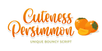 introducing CUTENESS PERSIMMON -unique bouncy script- it is great for branding, packaging, quotes, wedding card, logo, signature, tote bag design, card, banner, and anything craft project. I created some doodles to make this font perfect. you can add underscore twice after a to k. Features: - Uppercase - Lowercase - Numeral - Multilingual - doodles - PUA encoded I hope you love it. regards, Abo Daniel Studio
 - Trisquare by Davide Romito,
$41.00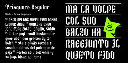 Trisquare is an Experimental Display Typeface, which is inspired by the strokes of the Fraktur alphabet but developed through the composition of triangular and square shapes. It has a particular ancient soul with a digital taste but is not monospaced. Trisquare is good to use for Branding, Signage, Packaging, Advertising, Headlines, Magazines, Book titles, or everything you want to use it for.
 - Upstanding Pro by Multiformis,
$10.99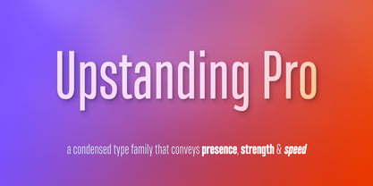 Upstanding Pro is suited for use as a display typeface, but legible enough to be used in small blocks of text (lighter weights), thus providing a lot of flexibility for all kinds of projects. Upstanding Pro conveys presence, strength and speed with the italics, yet conserving certain traces of sobriety and elegance. Want to make a statement? Use Upstanding Pro!
 - MB Picture House by Ben Burford Fonts,
$30.00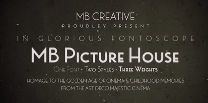 Small caps art deco font inspired by the golden age of Hollywood and childhood trips to the Majestic Cinema. Two styles, each with three weights. Picture House One is sharp and crisp, Picture House Two has a slightly 'Out of Focus' look to it. Both come with extended language support and oldstyle numbers, giving a lot of scope for may uses.
 - Character Sans by Brave Lion Fonts,
$14.00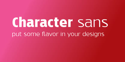 Character Sans is a detail full sans serif typeface in 5 styles. It features all european languages, ligatures, arrows and minuscule numbers. It's characteristic style features are straightened ends and sharp curves. The lighter weights have great white spaces and their width is orientated on the heavier weights. Character Sans was made to have style and not to be uniform.
 - Warm Thanksgiving by Mvmet,
$15.00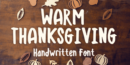 Warm Thanksgiving is a warm and fun font for your thanksgiving day, you can use it for everyday use too for its versatility. Create something with it from regular typing notes, to t-shirts, kids’ book designs, greeting cards, stickers, posters, or anything that needs a casual touch. Fall in love with its incredible style and use it to create lovely designs!
 - Ornata C by Wiescher Design,
$39.50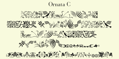 Ornata C is the third of a series of old ornaments that I am trying to save from oblivion. I am not just scanning these, I am completely redesigning the ornaments from scratch, thereby eliminating imperfections. These ornaments have been first designed by a designer named Ben Sussan. The designs date back to about 1910. Your digitizing type-designing savior, Gert Wiescher
 - 99 Names of ALLAH Spiral by Islamic Calligraphy75,
$12.00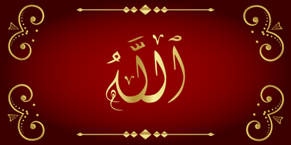 We have transformed the “99 names of ALLAH” into a font. That means each key on your keyboard represents 1 of the 99 names of ALLAH Aaza Wajal. The fonts work with both the English and Arabic Keyboards. We call this Calligraphy "Spiral" because of the spiral like design. The first "Alef" has a "hamzit wasel", this indicates that you can pronounce the names both ways, "AR-RAHMAAN" or "R-RAHMAN". (in the zip file you will find a pdf file explaining the differences in the "harakat", pronunciation and spelling according to the Holy Quran). The "Ye" doesn't have 2 dots at the end of a name, instead we chose to include a small "ye" on the letter "ye". Also, we used the traditional "soukoun" instead of the Quranic "soukoun". Decorative letters used in this calligraphy: "Mim, Aain, Sin, HHe, He, Kaf, Alef & Ye". Purpose & use: - Writers: Highlight the names in your texts in beautiful Islamic calligraphy. - Editors: Use with kinetic typography templates (AE) & editing software. - Designers: The very small details in the names does not affect the quality. Rest assured it is flawless. The MOST IMPORTANT THING about this list is that all the names are 100% ERROR FREE, and you can USE THEM WITH YOUR EYES CLOSED. All the “Tachkilat” are 100% ERROR FREE, all the "Spelling" is 100% ERROR FREE, and they all have been written in accordance with the Holy Quran. No names are missing and no names are duplicated. The list is complete "99 names +1". The +1 is the name “ALLAH” 'Aza wajal. Another important thing is how we use the decorative letters. In every font you will see small decorative letters, these letters are used only in accordance with their respective letters to indicate pronunciation & we don't include them randomly. That means "mim" on top or below the letter "mim", "sin" on top or below the letter "sin", and so on and so forth. Included: Pdf file telling you which key is associated with which name. In that same file we have included the transliteration and explication of all 99 names. Pdf file explaining the differences in the harakat and pronunciation according to the Holy Quran. --------------------------------------------------------------------------------------------------------------------------- Here is a link to all the extra files you will need: https://drive.google.com/drive/folders/1Xj2Q8hhmfKD7stY6RILhKPiPfePpI9U4?usp=sharing ---------------------------------------------------------------------------------------------------------------------------
 - 99 Names of ALLAH Clear by Islamic Calligraphy75,
$12.00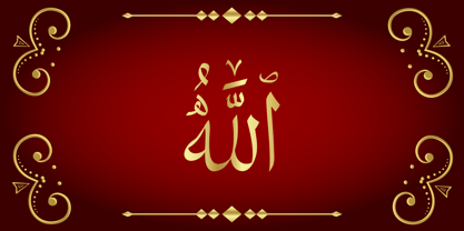 We have transformed the “99 names of ALLAH” into a font. That means each key on your keyboard represents 1 of the 99 names of ALLAH Aaza Wajal. The fonts work with both the English and Arabic Keyboards. We call this Calligraphy "Clear" because of how clear and easy to read the design is. The first "Alef" has a "hamzit wasel", this indicates that you can pronounce it as both "AR-RAHMAAN" or "R-RAHMAAN" (in the zip file you will find a pdf file explaining the differences in the "harakat", pronunciation and spelling according to the Holy Quran). The "Ye" in this calligraphy doesn't have the two dots, nor does it have a decorative "Ye", just like the Holy Quran. Also, we went for the traditional "soukoun" instead of the Quranic "soukoun" & decorative symbols are at a minimum. Decorative letters used in this calligraphy: "Mim, Aain, Sin, HHe, He, Kaf, Tah & Saad". Purpose & use: - Writers: Highlight the names in your texts in beautiful Islamic calligraphy. - Editors: Use with kinetic typography templates (AE) & editing software. - Designers: The very small details in the names does not affect the quality. Rest assured it is flawless. The MOST IMPORTANT THING about this list is that all the names are 100% ERROR FREE, and you can USED THEM WITH YOUR EYES CLOSED. All the “Tachkilat” are 100% ERROR FREE, all the "Spelling" is 100% ERROR, and they all have been written in accordance with the Holy Quran. No names are missing and no names are duplicated. The list is complete "99 names +1". The +1 is the name “ALLAH” 'Aza wajal. Another important thing is how we use the decorative letters. In every font you will see small decorative letters, these letters are used only in accordance with their respective letters to indicate pronunciation & we don't include them randomly. That means "mim" on top or below the letter "mim", "sin" on top or below the letter "sin", and so on and so forth. Included: Pdf file telling you which key is associated with which name. In that same file we have included the transliteration and explication of all 99 names. Pdf file explaining the differences in the harakat and pronunciation according to the Holy Quran. --------------------------------------------------------------------------------------------------------------------------- Here is a link to all the extra files you will need: https://drive.google.com/drive/folders/1Xj2Q8hhmfKD7stY6RILhKPiPfePpI9U4?usp=sharing ---------------------------------------------------------------------------------------------------------------------------
 - Hiragino Sans by SCREEN Graphic Solutions,
$210.00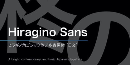 Mindful that Hiragino Sans (Kaku Gothic) would be used in conjunction with Hiragino Serif (Mincho), SCREEN developed a font that anticipated today’s world where most people do their reading on displays and yet still has an orthodox letterform that does not blur when printed on paper. In short, our goal with this font was to create a new concept that responds to the demands of today’s times. This font offers weight variations from W0 to W9 and is extremely versatile. This makes it well-suited to all visual expression media including paper, metallic textures, resins, cloth, television, movies, broadcasting, websites, and electronic displays. One of the design’s strongpoints is that it elides serif on the right side of each stroke, thus delivering more spacious counters and a comfortable appearance. Thanks to this, the typeface not only delivers a contemporary, lively impression same as Latin sans serif typefaces, but also heightens the natural continuity and readability of text whether it is set vertically or horizontally. As a result, it makes it possible to bring a strong appealing power to text. Without a doubt, this is typeface that above else embodies the role of Sans Serif.
 - Fulgate by Flavortype,
$15.00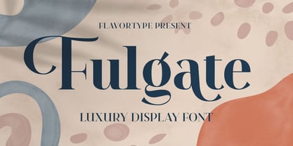 “Luxury in simplicity”. A Family of Luxury Fonts called Fulgate. A Hype of summer themed bring us to expressing a thirsty of creating a product that can help you to choosing a fonts to your creations. Like as we are on the preview above, how the fonts can "stands" within your design. Since Fulgate are created on a 6 weight from Thin, Light, Regular, Medium, Semibold, Bold. You won’t be worried which one to fit to your creative design. Also, You can Mix it up all of it without worrying design collision. Fulgate also comes with opentype features. The one was stand out was Capital Swash, it’s replacing the First letter that typed on Capital. even if you are type with all caps, it still stand out. If you think that all caps are not quite fit, write on with lowercase and turn on the features of Small Caps, a shape of capital but with lower heights. Lowercase also have a few make up with Alternate Characters, just to be noted, not all lowercase characters have an alternates, to keep a luxury feel and avoiding messy. The last are a feature on the numerical, Ordinals, Subscript, Superscript, and Fraction.
 - Ratgohe by Gatype,
$12.00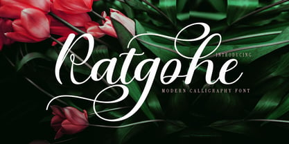 Ratgohe is an elegant script font with a contemporary atmosphere and impeccable shapes, inspired by timeless classic calligraphy. Neither too thin nor too thick, balanced and varied, Ratgohe is designed to enhance the beauty of your project. These designs are used for branding, web and editorial design, print, crafts, quotes, It's great for logos, wedding invitations, romantic cards, labels, packaging, name spelling and more. Ratgohe includes OpenType style alternatives, ligatures, and International support for most Western Languages. To enable the OpenType Stylistic alternative, you need a program that supports Adobe Illustrator CS, Adobe Indesign & CorelDraw X6-X7, Microsoft Word 2010 or a later version. How to access all alternative characters using Adobe Illustrator: https://www.youtube.com/watch?v=XzwjMkbB-wQ Ratgohe is coded with PUA Unicode, which allows full access to all additional characters without having to design any special software. Mac users can use Font Book, and Windows users can use Character Map to view and copy any additional characters for pasting into your favorite text editor / application. How to access all alternative characters, using the Windows Character Map with Photoshop: https://www.youtube.com/watch?v=Go9vacoYmBw
 - Jannson Map by RM&WD,
$35.00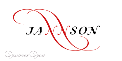 For best results, use of OpenType features is strongly recommend. This font is inspired by Johannes Janssonius, well know as Jan Janszoon o Jan Janssonius (Arnhem, 1588 – Amsterdam, 1664), was a Dutch cartographer, publisher and engraver. Married to Hondius's daughter. He was the author of many masterpieces of cartography of the 1700s like Willem Blaeu and Hondius, famous maps with heavy use of decorations in the letterig to fill the spaces of oceans, seas, lakes and scrolls. Now you can easily recreate not just ancient maps without effort, but you can use this font creatively, to make unique, modern logos, product names, fresh packaging, hip fashion outfits, refined labels, signs, coordinated images ... Hundreds of alternatives to choose from and maybe to combine with other fonts in an original way. One extra font with 27 castles in Janszoon style are also usefull for map, of course, but also for many different creative artworks. Warning: Jannson Map having oversized swashes compared to the normal standards cannot be used with Windows Word because Word does not give the possibility to manage the line spacing professionally. Jannson Map works great with applications like Illustrator, In Design, quark Xpress, mac Text etc ...
 - Many Weatz - Personal use only

- ALCATRAZ - Personal use only

- LOL! - Personal use only

- Beckasin - Personal use only

- Sketchica - Personal use only

- Fangtasia - Personal use only

- Chavenir - Personal use only

- TRUEblood - Personal use only

- Campuni by Identity Letters,
$29.00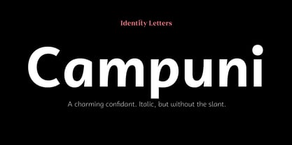 A charming confidant. Italic, but without the slant. Campuni is a sans-serif typeface that can be described as an “upright italic”: its letters are modeled on the handwritten forms of italics—but without the slant. This gives Campuni a contemporary, charming, and trustworthy character. As with most modern sans-serif typefaces, Campuni’s design is based on low-contrast, almost monolinear strokes with a neat and clear appearance. This is where Campuni’s steep and tapered joints come in: with a bit of contrast, they provide the perfect foundation for a steady rhythm between characters—just like you’d find in meticulous handwriting. Careful spacing ensures that this rhythmic character is preserved on the page and on screen, making for a pleasant reading experience. It’s not just the letterforms that gain from Campuni’s calligraphic heritage, though. This typeface is packed with calligraphy-style swash capitals and end swashes on lowercase letters, as well as discretionary ligatures. These are available via OpenType, allowing you to spice up your logo or headline with a hint of calligraphy in a breeze. Despite its flawless legibility in body text, Campuni is definitely eye-catching in display sizes. (Decrease letterspacing for some additional punch.) Besides logo design, Campuni is a great choice for branding, advertising, packaging, corporate design, or even signage and wayfinding. The range of topics that Campuni excels in varies from food, leisure, retail, e-commerce, music, and travel to games, toys, childcare, and family-themed events. Campuni has got an Extended Latin character set, seven sets of figures, case-sensitive forms, arrows, and a few other advanced typographic features—622 glyphs in total. Its eight weights span from Thin to Black.
 - Expedition One by Gustav & Brun,
$6.00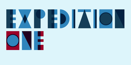 To be independent or to be dependent? The formula “one plus one is one” is here essential for this to work. The different cases, upper and lower is dependent on one another. To give us clarity they have to work together, to be like one the upper and lower cases must work together. Expedition One works best in InDesign or equivalent software. How to use it: write your text in lower case, copy the text frame and ”Paste in Place”, change your lower case text to upper case (you do that under top menu->type->change case). Change colour if you want to and maybe change the blending mode in the effects window to “multiply” makes it even more sparkling. On numbers and ampersand for example, you have to use the glyph window in InDesign to find their second half.
 - DX Rigraf by Dirtyline Studio,
$29.00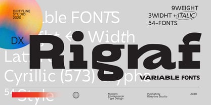 Dx Rigraf is an exciting Modern humanist typeface with contemporary monospace touches. It’s born from strong elementary shapes, with clean circles interwoven with modern cuts and sharp edges. It has been designed as a variable font to give lots of options and access to unique type looks; however it also includes nine weights to give just as much access to creativity to those without access to variable supporting software. Its distinctive character and many variables make it a versatile, stylish workhorse, great for interfaces and design. Dx Rigraf sans serif font family of 9 weights, 3 Style Width with matching italics- 54 styles all in 1 Variable font.
 - Frostbite by Comicraft,
$19.00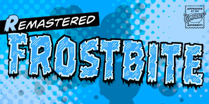 If you're feeling a chill in your bones and the grass is a little crunchy under your feet after looking at this font, you might like to put your feet in warm water when you get home if to stave off a little Frostbite. This remastered font family is a chip off the old block, and will help you thaw out before your skin starts to freeze and flake. We recommend you melt Frostbite cubes in the warm water too to ensure you don't stick to the ice. We also recommend you don't lick the letterforms, as we know our customers are wont to do.
 - Rydhesti by Twinletter,
$14.00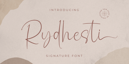 Rydhesti is an enchanting and charming signature font, the beautiful and smooth curves of each letter make this font seem luxurious, clean and beautiful. not only that, this font is equipped with a flexible choice of letters to produce the right words according to your needs. Use it to add an authentic, heartfelt vibe to any design project. This font is perfect for business cards, photography studios, autographs, interior designs, model names, coffee late, travel, weddings, cosmetics, jewelry, social media posts, product packaging, watermarks, special events, or anything else. Start using this font to add an authentic and heartfelt vibe to any design project.
 - Squaripeg by Andy Peat,
$9.00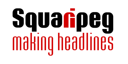 About this font family Squaripeg is a funky square typeface with geometric shapes to create impactful headlines and web banners. This typeface was designed so that it takes up less horizontal space but still has a lot of prominence on the page. Some letters have been combined into one unit to save further space. Features 8 weights (from thin to black) Multi language Ligatures To be able to access alternative fonts, make sure the software you use can support opentype features such as Microsoft Word, Paint, Adobe, Corel draw, Cricut and other applications. Designed and published by Andy Peat. Released April 2022
 - Ghola by TypeClassHeroes,
$17.00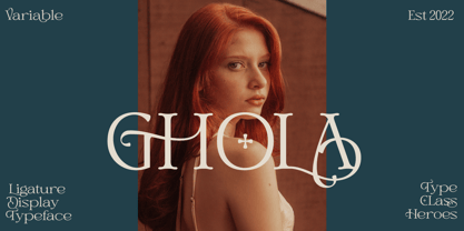 Hello I'm really excited to introduce Ghola, masterfully designed to become a stylish and elegant, this font has the potential to bring each of your creative ideas to the highest level. Combine with ligatures and special alternative glyphs so you can create a lots with layouts and compositions. Ghola brings a touch of luxury and bespoke custom typography to logos, websites, social media quotes, wedding branding, and more. Whats Included? Uppercase & Lowercase Number & Symbol International Glyphs Multilingual support Feature UPPERCASE Lowercase Number & Symbol International Glyphs Alternative Ligature Please get in touch if you have any questions!
 - Modulario by K-Type,
$20.00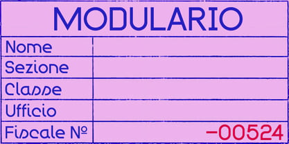 Modulario is a geometric sans with some disturbingly individual features. A few capitals owe a bit too much to Roman proportions. The circular O serves to distinguish it from the zero, and the luxuriously wide W and M are both pointed in the middle, although alternatives to the more contentious letters are available within the font. The lowercase shows a little more handwriting influence than is customary – we are used to seeing a writing-style curve at the base of the l, Modulario extends the influence to the i and a, and also sports a uniquely scripty s.
 - Yuki by Thinkdust,
$10.00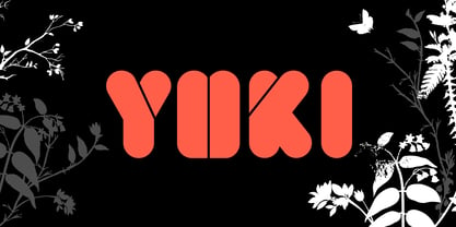 Yuki is a full and rounded font that also manages to be compact, so when you need to make a big impact in a small space and still maintain a friendly feel, Yuki is here to do the job. In two different styles, each with bold alternatives, Yuki’s best function is to grab attention without taking up too much space. The lined form allows it to look even more streamlined in this performance, cutting shapes into more easily digestible pieces, while the bold forms create even more smoothness. Use Yuki for quick, impactful statements without being aggressive.
 - NS Yorkest Poster by Novi Souldado,
$25.00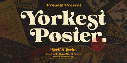 Experience the around-the-world traveling vibes from the past with Yorkest Poster. It was inspired by the vintage retro national travel arts and printings from the 60s and 70s eras back in the day. Comes along with 2 styles (Serif and Script) that would never go wrong to be paired. A pack of Stylistic Alternates features to give a personal touch to your design, and also Swashes to cover your visual needs to be stronger in every appearance. Perfectly fit for logo design, headliner, signage, poster, postcard, title, postage stamp, and a lot of other printing works and stuff.
 - Jollin Family by Creativemedialab,
$14.00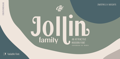 Jollin Family is a pretty, attractive and fashionable sans serif, has ton of alternates that you can use to create a simple but pretty letters. Jollin has 8 weights and 3 Widths and also available in Variable version Jollin Family Variable contain three configurable axes: weights, width, and slant, you can adjust the font axis setting to get the desire size. Jollin Perfect for Heading, logo creation, Advertisements, Christmas, Label, business card, branding and more! Get inspired by its fashionable appeal! to access alternate Adobe Photoshop go to Window - glyphs Adobe Illustrator go to Type - glyphs
 - Amenable by Twinletter,
$12.00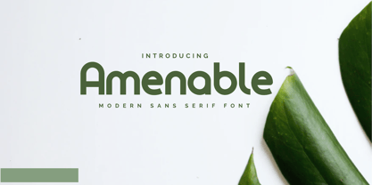 Our latest fonts that save beauty in every word order you write with this font. made by paying attention to detailed geometric and paying attention to the perspective of the eye when reading the text using this font, so we made this font design to appear harmonious and comfortable to read. use this font to create a perfect design. This font is very suitable as text with displays for various kinds of branding, advertisements, posters, banners, packaging, news headlines, magazines, websites, logo design, banners, social media design and of course you can use a lot more.
 - Modica by Monotype,
$25.99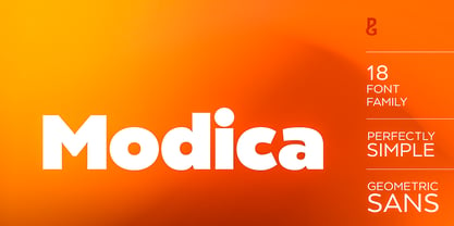 Modica is a strong and agile Geometric Sans type family comprising 18 fonts. This typeface began life as “Meccanica” – a quirky, heavy, engineering typeface, that later evolved into the more conservative “Technica” type family. And now, the typeface has been distilled down to its simplest and most perfect form to become “Modica”. Modica is a nimble typeface that can handle a multitude of applications – everything from body copy to retail fashion to corporate identities... why not put Modica to task today? Key features: • 9 weights in Roman and Italic • Full European character set (Latin only) • 450+ glyphs per font.
 - White Mint by Innire,
$20.00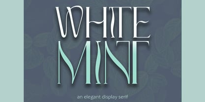 White Mint - is an elegant serif font that combines strict, refined forms and playful elements inspired by natural motifs. This versatile, easy-to-use font is perfect for branding, business card design, wedding invitations, social network pages, and much more. Ligatures will help you create original text that is easy to read at the same time. Multilingual support allows you to use the font not only on Latin glyphs -— Features : - Uppercase and Lowercase - Numerals - Punctuations (OpenType Standard) - Multilingual Characters - Ligatures - Stylistic Alternates for glyphs "I" :) -— If you have any questions, suggestions, or adjustments, be sure to write to me! Thanks for your attention
 - Orpheus by Scriptorium,
$18.00In response to many requests for Morpheus, an idea came to us. Why not make a font that looked a bit like Morpheus, but which had more attractive, more consistent character forms, was rendered cleanly and properly spaced and kerned? We took a look at Morpheus and decided to redo the concept from the ground up, replacing some of the amateurish characters, adding a bit of a Celtic look and feel, developing a set of alternate characters and making sure that the design elements were consistent from letter to letter. The result is Orpheus, a font which has the general look and feel of Morpheus, but is a much more complete and fully realized design. In addition, Orpheus is a fully developed font set, with not only regular and bold versions, but with a special customized italic style and a really neat looking heavy weight rough-outlined variant. - Dez Boulder by Dezcom,
$39.00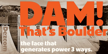 A Bold Display Family in Three Personalities: ego, id, and alter. Dez Boulder works like a character actor, presenting the author’s lines but not with the deadpan delivery of a news reporter. Boulder develops the role, adding meaning through facial expression, gesture, and body language. The Dez Boulder family of display faces acts in a supporting role to give meaning to message and context to content. It is a very bold face, not understated. Each of its three personalities (and their sub-personalities) have a different timbre to speak the nuance of your message in a bold voice. Dez Boulder averages more than 800 glyphs per style with uppercase, lowercase, small caps, proportional lining figures, small cap figures, superiors, inferiors, fractions, stylistic sets, alternates, ordinals, case specific punctuation, and more. It has a full range of diacritics and covers all European languages using the Latin script.
 - Timesquare by Campotype,
$25.00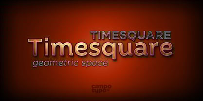 The initial idea of timesquare typeface inspired by Helvetica when presenting the board information on a subway escalator in Time Square, Manhattan, New York. This confirms strength the legend of Helvetica is not lost amid rampant nice fonts in the site. Therefore it should not appropriate that this timesquare fonts come to rival the greatness of Helvetica. Fonts timesquare thrive (since 2008 for self used) of the basic forms of Helvetica to timesquare born in different shapes and sizes. The greatest challenge during development timesquare is both shape similarity to Helvetica directly, as well as to other fonts inspired by Helvetica. Timesquare's main characteristics are the wide character, modern touch and individually, can work well on a wide variety of applications in books, brochures and magazines as well as applications in advertising. This typeface has been developed on the Latin character sets. Hopefully useful.
 - Sebale by Craft Supply Co,
$20.00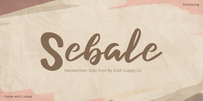 Introducing Sebale – Handwritten Script A Playful Handwritten Script Sebale, a font brimming with delightful whimsy, injects a playful touch into your designs. Charming Whimsy Sebale’s design is not only handwritten but also exudes charming whimsy, making it an ideal choice for a variety of creative projects. Versatile for Creative Endeavors Moving beyond its charm, Sebale’s versatility shines through, allowing it to seamlessly enhance a wide range of design projects. From greeting cards to branding, it offers a wide array of possibilities. Engaging and Memorable Sebale ensures that your content is not only engaging but also incredibly memorable, leaving a lasting and delightful impression. In Conclusion To sum it up, Sebale – Handwritten Script is the font that effortlessly infuses a delightful playfulness into your designs. Its versatility makes it suitable for a broad range of creative endeavors, ensuring accessibility to a diverse readership. With Sebale, your projects will undoubtedly stand out.
 - Mrs Eaves XL Serif by Emigre,
$59.00 Originally designed in 1996, Mrs Eaves was Zuzana Licko’s first attempt at the design of a traditional typeface. It was styled after Baskerville, the famous transitional serif typeface designed in 1757 by John Baskerville in Birmingham, England. Mrs Eaves was named after Baskerville’s live in housekeeper, Sarah Eaves, whom he later married. One of Baskerville’s intents was to develop typefaces that pushed the contrast between thick and thin strokes, partially to show off the new printing and paper making techniques of his time. As a result his types were often criticized for being too perfect, stark, and difficult to read. Licko noticed that subsequent interpretations and revivals of Baskerville had continued along the same path of perfection, using as a model the qualities of the lead type itself, not the printed specimens. Upon studying books printed by Baskerville at the Bancroft Library in Berkeley, Licko decided to base her design on the printed samples which were heavier and had more character due to the imprint of lead type into paper and the resulting ink spread. She reduced the contrast while retaining the overall openness and lightness of Baskerville by giving the lower case characters a wider proportion. She then reduced the x-height relative to the cap height to avoid increasing the set width. There is something unique about Mrs Eaves and it’s difficult to define. Its individual characters are at times awkward looking—the W being narrow, the L uncommonly wide, the flare of the strokes leading into the serifs unusually pronounced. Taken individually, at first sight some of the characters don’t seem to fit together. The spacing is generally too loose for large bodies of text, it sort of rambles along. Yet when used in the right circumstance it imparts a very particular feel that sets it clearly apart from many likeminded types. It has an undefined quality that resonates with people. This paradox (imperfect yet pleasing) is perhaps best illustrated by design critic and historian Robin Kinross who has pointed out the limitation of the “loose” spacing that Licko employed, among other things, yet simultaneously designated the Mrs Eaves type specimen with an honorable mention in the 1999 American Center for Design competition. Proof, perhaps, that type is best judged in the context of its usage. Even with all its shortcomings, Mrs Eaves has outsold all Emigre fonts by twofold. On MyFonts, one of the largest on-line type sellers, Mrs Eaves has been among the 20 best selling types for years, listed among such classics as Helvetica, Univers, Bodoni and Franklin Gothic. Due to its commercial and popular success it has come to define the Emigre type foundry. While Licko initially set out to design a traditional text face, we never specified how Mrs Eaves could be best used. Typefaces will find their own way. But if there’s one particular common usage that stands out, it must be literary—Mrs Eaves loves to adorn book covers and relishes short blurbs on the flaps and backs of dust covers. Trips to bookstores are always a treat for us as we find our Mrs Eaves staring out at us from dozens of book covers in the most elegant compositions, each time surprising us with her many talents. And Mrs Eaves feels just as comfortable in a wide variety of other locales such as CD covers (Radiohead’s Hail to the Thief being our favorite), restaurant menus, logos, and poetry books, where it gives elegant presence to short texts. One area where Mrs Eaves seems less comfortable is in the setting of long texts, particularly in environments such as the interiors of books, magazines, and newspapers. It seems to handle long texts well only if there is ample space. A good example is the book /CD/DVD release The Band: A Musical History published by Capitol Records. Here, Mrs Eaves was given appropriate set width and generous line spacing. In such cases its wide proportions provide a luxurious feel which invites reading. Economy of space was not one of the goals behind the original Mrs Eaves design. With the introduction of Mrs Eaves XL, Licko addresses this issue. Since Mrs Eaves is one of our most popular typefaces, it’s not surprising that over the years we've received many suggestions for additions to the family. The predominant top three wishes are: greater space economy; the addition of a bold italic style; and the desire to pair it with a sans design. The XL series answers these requests with a comprehensive set of new fonts including a narrow, and a companion series of Mrs Eaves Sans styles to be released soon. The main distinguishing features of Mrs Eaves XL are its larger x-height with shorter ascenders and descenders and overall tighter spacing. These additional fonts expand the Mrs Eaves family for a larger variety of uses, specifically those requiring space economy. The larger x-height also allows a smaller point size to be used while maintaining readability. Mrs Eaves XL also has a narrow counterpart to the regular, with a set width of about 92 percent which fulfills even more compact uses. At first, this may not seem particularly narrow, but the goal was to provide an alternative to the regular that would work well as a compact text face while maintaining the full characteristics of the regular, rather than an extreme narrow which would be more suitable for headline use. Four years in the making, we're excited to finally let Mrs Eaves XL find its way into the world and see where and how it will pop up next.


