3,905 search results
(0.014 seconds)
- Caesario by Scriptorium,
$18.00Caesario is Mike Scarpitti's newest font, based on the famous inscriptory lettering on the Trajan column in Rome. After searching through many sources, he turned to the drawings of the original column lettering made by Frederic Goudy in 1936. The superior quality of these drawings combined with the Mike's faithful reproduction of the characters forms make Caesario the best available representation of the style of this famous incription. - Romeo by Font Bureau,
$40.00 David Berlow drew Romeo Medium Condensed during winter of 1990, basing the design on the Estrecha Fina weight of Electra, a spectacular art deco sanserif with an unusually fine condensed series. Carlos Winkow designed it circa 1940 for the Nacional typefoundry of Madrid, the leading typefoundry in Spain. Jill Pichotta drew the ultra-light Skinny Condensed, a digital tour de force released with Medium Condensed; FB 1990–91
 - XMattsAnimals by Ingrimayne Type,
$9.95 Most of the letter keys are from animal drawings done by a six or eight year old child who has now grown up.
 - Bangke by Typefactory,
$14.00 Bangke is a textured brush font with rough and casual letters. It’s great for logos, branding, print projects and any attention drawing headline.
 - Strongloves by FHFont,
$17.00 Strongloves is dry brush, hand-lettered script. It is suitable for design, element design, weddings, events, t-shirt, logos, badges, sticker, and awesome work.
 - Karnak Pro by Red Rooster Collection,
$60.00 Based on the original design by Robert Hunter Middleton. Digitally engineered by Steve Jackaman and Ashley Muir from the Ludlow drawings, circa 1931–1942.
 - Poynter Gothic by Font Bureau,
$40.00 Morris Fuller Benton’s drawings at the Smithsonian show a creative concern for effects of scale on typeface design. Tobias Frere-Jones began with 4pt ATF Franklin Gothic drawings, modifying proportions to mix with Poynter Oldstyle and Benton Gothic, and adjusting ends of the curved strokes of C G S a c e r s to suit news printing conditions. Poynter Gothic Text excels as subheads used with Poynter Oldstyle Text; FB 1997–99
 - Golden Hours by Nirmana Visual,
$29.00 Golden Hours Script is a Natural Brush handwriting modern calligraphy font. Introducing our dynamic dry brush style font, a typeface that infuses your designs with a lively and handcrafted aesthetic. With its bold strokes and rough texture, this font is perfect for creating designs that exude a sense of energy, spontaneity, and authenticity. the appearance of being painted with a dry brush create a unique, hand-drawn quality that sets your designs apart.
 - Whiteboard Modern by Albatross,
$19.95 Whiteboard Modern is a hand-drawn face resembling the flowing motion and freedom of writing in an open space, such as a dry-erase board.
 - Felix Titling by Monotype,
$39.00 An all-caps titling font designed by the Monotype Drawing Office in 1934, based on an alphabet designed by Veronese calligrapher Felice Feliciano in 1463.
 - Crystal Palace - Unknown license

- Renefont by URW Type Foundry,
$39.99 ReneFont is strong, heavy design which looks quite technical. Originally planned as a caps-only, Breil changed his mind and also drew the lower case alphabet.
 - KG Always A Good Time by Kimberly Geswein,
$5.00 Happily-lettered handwriting full of optimism. This handwriting was drawn with a chunky round marker and is bold enough for drawing attention yet still completely legible.
 - Rongjam by Motokiwo,
$15.00 Cool hand drawn font crafted from textured dry brush, this is Rongjam. An all caps typeface that very recommended for outdoor projects, sport, hipster, and youth.
 - iMark by Jonahfonts,
$35.00 IMark is a “drying” marker hand written, felt tip pen font. Usage recommendations include captions, packaging, invitations, cards, posters, ads, greeting cards, book jackets and covers.
 - Art Student JNL by Jeff Levine,
$29.00Art Student JNL is a limited character set font inspired by hand lettering found on the box for a learn-to-draw set from the 1950s. - Afrik by LomoHiber,
$10.00 Afrik is a hand painted font which letterforms were inspired by Proto-Saharan Ancient African writing system and scripts for African languages such as Mande and Vai. Drawing technique I took from Ethiopian Tribe Karo body painting. I drew each letter with my finger using self-made paint from crushed charcoal. Afrik is uppercase font and instead of tall capital letters uses wide. They can be used instead of double letters or just to diversify a typing. Also, I included up to 4 alternate "decorations" for most of the letters which will help you to create unique artwork (use "Contextual Alternates" feature to randomize look automatically). Afrik perfectly fits for posters, clothes design, and any design with a wild ethnic mood. Afrik Features: Handmade pant texture Up to 4 Alternative styles for each letter Carefully tuned kerning If you have some issues or questions, please let me know: lhfonts@gmail.com Hope you'll enjoy using Afrik!
 - Scorpio by Fine Fonts,
$25.00 Scorpio is a font based on lettering Michael Harvey drew for the card “The Sign of The Nudge” which was designed in collaboration with the concrete poet, Ian Hamilton Finlay. The purpose of the card was to prompt those owing monies to IHF, into paying promptly. Michael also used it on some of the many book jackets he designed. As such, it is a condensed design necessary to enable a lot of text to be fitted with a restricted space. Scorpio has both style and verve. It was designed to attract the attention of potential purchasers browsing the shelfs in bookshops. In fulfilling this rôle, it succeeded admirably. In all these respects, it is unquestionably a unique Michael Harvey design. When Michael died in 2013, this font existed as a drawing of the basic upper and lower case letterforms plus numerals. Andy Benedek’s contribution to Scorpio was to digitise the existing letterforms and then create the remaining characters necessary for a modern font.
 - ITC Kendo by ITC,
$29.99 ITC Kendo is the work of British designer Phill Grimshaw, suggesting the dash and verve of quick, sketchy calligraphy, complete with splatters of ink. Grimshaw says he worked deliberately against his own habits to create the forms, drawing the letters with slow deliberation" and a pointed pen. He overloaded the pen with ink and drew on rough paper, "applying a lot of pressure at the beginning of a stroke and easing off towards the terminals. Accidental splashes occurred frequently owing to the nib catching the 'tooth' of the paper." Those splashes were refined into features which enhance but do not overwhelm the characters and carefully worked so as not to leave an obvious white strip of unsplattered space between lines and letters. The initial capitals can be used alone or combined with the lowercase alphabet, and the font includes a full set of f-ligatures and some extra ligatures as well as decorative elements."
 - Stuph by Tail Spin Studio,
$25.00Stuph Light is a collection of drawings pulled from one of the many sketch books Steve Zafarana is always doodling in. Because they are in a font, the drawings can be used in font format or opened and manipulated in vector programs like Freehand or Illustrator. Stuph Light continues to inflict upon an unsuspecting public Steves’ cockeyed outlook on the world that was started with ITC Fontoonies, ITC Gargoonies and ITC Backyard Beasties. Will this lunacy ever end? - Darling Duo Script by Haksen,
$13.00 Darling Duo include two font styles with full set of handwritten style draw for script and cute style letters for sans. Numerals, a large range of punctuation and ligatures giving realistic hand-lettered style. In order to use the beautiful ligatures for script also all uppercase for sans serif, you need a program that supports OpenType features such as Adobe Illustrator CS, Adobe Photoshop CC, Adobe Indesign and Corel Draw. Thanks and have a great day :) Haksen
 - Richie by Monotype,
$29.99 The Richie™ typeface grew out of a lettering experiment inspired by the work of Czech type designer Oldrich Menhart (1897-1962). Menhart’s typefaces were primarily text designs with a strong personal calligraphic influence. Monotype Studio designer, Jim Ford, wondered what a display typeface from Menhart might look like, and began drawing bold script characters with a broad-tipped chisel marker. “It was a familiar but laborious exercise,” explains Ford, “I tried to achieve an authentic – yet controlled – randomness that would serve as the foundation of a typeface.” Ford first drew a large suite of characters using the marker. All the drawings were then carefully adjusted, and scanned. Ford then pieced together a typeface from the best versions of letters, and refined those further. The result is a rugged, somewhat eccentric and playful script built on an obvious hand-drawn foundation. In a world of smooth scripts, the Richie design is heavy, chunky and rough. Its hand-made feel and vigorous rhythm put the power of raw brush lettering into the typographer’s hands. OpenType® fonts of Richie include standard, contextual and discretionary ligatures, in addition to contextual and stylistic alternates, old style, lining and superior figures, plus a large complement of swash characters. The name “Richie”? It grew out of Ford’s original premise for the design. “I wondered what it might it look like if ‘Old Richie’ had designed a heavy display face or script.”
 - Peace Maker by FHFont,
$15.00 Peace Maker is a dry Brush Script Font with hand-lettered style. Suitable for design, element design, wedding, event, t-shirt, logo, badges, sticker, and awesome work.
 - Simpletune by FHFont,
$17.00 Simpletune is handwritten script font with dry brush and signature style. Suitable for design, element design, wedding, event, t-shirt, logo, badges, sticker, and awesome work, etc...
 - Office Doodles by Outside the Line,
$19.00 Fun, little illustrations in line and reverse of what one finds in an office-- or at least my office. See Food Doodles for more matching little drawings.
 - EasyPeasyLemonSqueezy by lgtm,
$25.00 There is an addiction to symmetry. When I draw, when I write, when I take pictures, when I design. So in this font. Best use in Headlines.
 - NorB Architect Pencil Condensed by NorFonts,
$35.00 NorB Architect Pencil Condensed fonts are the fruit from learning architectural lettering books so featuring 7 condensed weights going from Light to Extra Bold version. These Architectural fonts will add a beautiful architectural hand-lettering style to all your CAD project drawings. Architects have always wanted their CAD drawings to look more like they were drawn by hand, rather than by a CAD program. These AutoCAD fonts are the first step in bringing back that “artistic hand-drawn” feel to your CAD drawings or any graphic design project that can use true type fonts. They also can be used with any word processing program for text and display use, print and web projects, apps and ePub, Comics, graphic identities, branding, editorial, advertising, scrapbooking, cards and invitations … or even just for fun!
 - NorB ARCHITECT PENCIL by NorFonts,
$35.00 NorB Architect Pencil fonts are the fruit from learning architectural lettering books so featuring 7 weights going from Light to Extra Bold version. These Architectural fonts will add a beautiful architectural hand-lettering style to all your CAD project drawings. Architects have always wanted their CAD drawings to look more like they were drawn by hand, rather than by a CAD program. These AutoCAD fonts are the first step in bringing back that “artistic hand-drawn” feel to your CAD drawings or any graphic design project that can use true type fonts. They also can be used with any word processing program for text and display use, print and web projects, apps and ePub, Comics, graphic identities, branding, editorial, advertising, scrapbooking, cards and invitations … or even just for fun!
 - Quodlibet Serif by Signature Type Foundry,
$43.00 The new typeface system is based on legibility of Renaissance and Baroque Antiqua. It maintains the quality of drawings without an overpowering historical legacy. The current concept makes the system a universal whole. Abrading of sharp edges which could catch one’s attention leads to a fine rounding of details. In this way, a sans drawing does not look hard and sterile unlike most of its contemporaries. Special attention was paid to every detail of each letter. The professional question of how to incorporate brightening wedges into the dark places of individual strokes’ onsets was resolved by rounded shapes that have their graphic response in the detail of the serifs. Particularly in larger sizes the typeface offers drawing sophistication and dimensional interconnection. Apart from Cyrillic alphabet, the alphabet design includes Vietnamese accents.
 - Quodlibet Sans by Signature Type Foundry,
$43.00 The new typeface system is based on legibility of Renaissance and Baroque Antiqua. It maintains the quality of drawings without an overpowering historical legacy. The current concept makes the system a universal whole. Abrading of sharp edges which could catch one’s attention leads to a fine rounding of details. In this way, a sans drawing does not look hard and sterile unlike most of its contemporaries. Special attention was paid to every detail of each letter. The professional question of how to incorporate brightening wedges into the dark places of individual strokes’ onsets was resolved by rounded shapes that have their graphic response in the detail of the serifs. Particularly in larger sizes the typeface offers drawing sophistication and dimensional interconnection. Apart from Cyrillic alphabet, the alphabet design includes Vietnamese accents.
 - Generous by PizzaDude.dk,
$20.00 Generous is painted with a somewhat dry brush. That's why it looks so authentic! Comes with contextual alternates (7 different versions of each letter!) and multiple language support!
 - R&C by JBFoundry,
$16.00 R&C is totally drawn with a ruler and a pair of compasses. It is advisable for technical drawing. By stacking its eight styles, all combinations are possible.
 - Aspic by Elemeno,
$25.00Aspic was inspired by the handwriting and drawings of Robert Blechman. Although informal, squiggly and even sloppy, Blechman's work communicates a quiet dignity which this font aspires to. - Essence Round by kloeg architecture,
$24.00 This font is especially designed by architects for architect, urban planners, landscape architects, industrial and product designers. It is ideal for the use with line drawings. Because of it's geometric shape it blends in with your drawings. It's adjusted to fit most of the common line width types. It also contains many icons, especially for use in these professions. On top of that you can find many glyphs and icons to create legends and title blocks. More information about kloeg design.
 - Essence by kloeg architecture,
$29.00 This font is especially designed by architects for architect, urban planners, landscape architects, industrial and product designers. It is ideal for the use with line drawings. Because of it's geometric shape it blends in with your drawings. It's adjusted to fit most of the common line width types. It also contains many icons, especially for use in these professions. On top of that you can find many glyphs and icons to create legends and title blocks. More information about kloeg design.
 - Instructor by Chank,
$59.00Introduced as the Chank Font of the Month for May 1998, Instructor was drawn Roger Lootine and fontified by Chank. Roger was an instructor at Art Instruction School. You know the "Draw Tippy the Turtle" ads? That's where Roger used to teach. He also draws a cool comic called Residue. "Roger's got the best handwriting I've ever seen, and you can download it today!" says Chank. "How lucky are you? Way lucky!" Now available in OpenType format for your Personal or Commercial Use. - Rightside by FHFont,
$18.00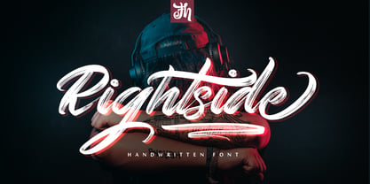 Rightside is a script font designed with a dry brush. The font includes OpenType features. Suitable for element design, events, t-shirts, logos, badges, stickers, awesome artwork, and more.
 - Pepino by Robert Petrick,
$19.95 Pepino is loosely based on the classic font Hobo but Pepino is a completely new and original drawing. The font is bold, fun, casual, easy to set and read.
 - VideoTech by The Northern Block,
$12.80 VideoTech is an 8 font family consisting of 4 weights open and 4 weights closed. A heavyweight typeface that draws inspiration from loading computer games onto the Commodore 64.
 - Albertina by Monotype,
$29.99Albertina was a typeface ahead of its time. It was in the early 1960s when designer Chris Brand, an accomplished calligrapher, aspired to draw a typeface based on the principles of calligraphy. Unfortunately, typesetting machines of that era put many restrictions on designers. Characters had to be drawn within a very coarse grid, which also defined their spacing. Technological limitations meant that italic designs often had to share the same character widths as the romans. Designers were forced to draw italic faces much wider and with more open spacing than what would be typical in calligraphic lettering or hand-set type. Not surprisingly, production of the first Albertina fonts went very slowly. Brand would submit his character drawings, and the Monotype Drawing Office would modify them to be compatible with the company's typesetting equipment. The new drawings would then be sent back to Brand for approval or rework. Most were reworked. The process took so long, in fact, that by the time the face was completed it was once again out of phase with the times: instead of being released as metal type for the Monotype composing machines it had been tailored for, Albertina debuted as phototype fonts for the Monophoto typesetter. The design's first use was for a catalog of the work of Stanley Morison, exhibited at the Albertina Library in Brussels in 1966. Sales of the design were not remarkable. With the advent of digital type technology, Albertina's story took a far happier turn. Frank E. Blokland, of the Dutch Type Library, used Brand's original, uncompromised drawings as the foundation of a digital revival. The Monophoto version had taken a considerable battering from the limitations of Monotype's unit system," recalls Blokland, "but there was no need for me to incorporate these restrictions in the digital version." With the full backing of Monotype and original designer Brand looking over Blokland's shoulder, a new design for Albertina emerged, displaying all the grace and verve of Brand's original drawings. The basic family drawn by Brand also grew into three weights, each with an italic complement and a suite of small caps and old style figures."
