10,000 search results
(0.047 seconds)
- Lazy Dude by Gleb Guralnyk,
$14.00 Hi, introducing a creative bold font Lazy Dude. It's an all caps typeface with smooth curvy shape. Lazy Dude has a wide languages support with west european and cyrillic characters (check out all available characters on previews). Thank you and have a nice day!
 - Dreame Patter by Viswell,
$12.00 Dream Patter is a handwritting font duo, this font comes with two style Script & All Caps. Make your Quotes, Craft, and any design with Dream patter. Dream Patter include : Dream patter - Script (With alternate Lowercase) Dream patter - All Caps Numeral & Punctuation Multiligual Thank you :)
 - Hardlike by Create Big Supply,
$15.00 Hardlike font clean and stamp effect. This font is PUA encoded which means you can access all the glyphs and sweeps easily Features: All Uppercase Numbers and punctuation Multilingual PUA Encoding Full Character Set !"#$%&()*+,-./0123456789:;?@ABCDEFGHIJKLMNOPQRSTUVWXYZ[\]^_abcdefghijklmnopqrstuvwxyz{|}~ ¡¢£¤¥§©ª«®°±²³·¹º»¿ÀÁÂÃÄÅÆÇÈÉÊËÌÍÎÏÑÒÓÔÕÖ×ØÙÚÛÜÝÞßàáâãäåæçèéêëìíîïñòóôõö÷øùúûüýþÿıŒœŠšŸŽž–—‘’‚“”„†•‹›€−
 - Ink Flow by Gleb Guralnyk,
$13.00 Hi, presenting a graffiti style font - Ink Flow. It's a handcrafted all caps font with unique brush stroke shape. This font supports most of the European languages, please check out the screenshot with all available characters. Thank you and wish you a peaceful sky!
 - BrushtipTravis by JOEBOB graphics,
$19.00 Slightly slanted brush tip handwriting script that looks both elegant and streetwise, very suitable for all your poetry, lyrics and memoires. The font comes with a couple of swashes to use as you please and includes all eastern European, Baltic, Scandinavian and Turkish characters.
 - RePublic by Suitcase Type Foundry,
$75.00In 1955 the Czech State Department of Culture, which was then in charge of all the publishing houses, organised a competition amongst printing houses and generally all book businesses for the design of a newspaper typeface. The motivation for this contest was obvious: the situation in the printing presses was appalling, with very little quality fonts existing and financial resources being too scarce to permit the purchase of type abroad. The conditions to be met by the typeface were strictly defined, and far more constrained than the ones applied to regular typefaces designed for books. A number of parameters needed to be considered, including the pressure of the printing presses and the quality of the thin newspaper ink that would have smothered any delicate strokes. Rough drafts of type designs for the competition were submitted by Vratislav Hejzl, Stanislav Marso, Frantisek Novak, Frantisek Panek, Jiri Petr, Jindrich Posekany, and the team of Stanislav Duda, Karel Misek and Josef Tyfa. The committee published its comments and corrections of the designs, and asked the designers to draw the final drafts. The winner was unambiguous — the members of the committee unanimously agreed to award Stanislav Marso’s design the first prize. His typeface was cast by Grafotechna (a state-owned enterprise) for setting with line-composing machines and also in larger sizes for hand-setting. Regular, bold, and bold condensed cuts were produced, and the face was named Public. In 2003 we decided to digitise the typeface. Drawings of the regular and italic cuts at the size of approximatively 3,5 cicero (43 pt) were used as templates for scanning. Those originals covered the complete set of caps except for the U, the lowercase, numerals, and sloped ampersand. The bold and condensed bold cuts were found in an original specimen book of the Rude Pravo newspaper printing press. These specimens included a dot, acute, colon, semicolon, hyphens, exclamation and question marks, asterisk, parentheses, square brackets, cross, section sign, and ampersand. After the regular cut was drafted, we began to modify it. All the uppercase letters were fine-tuned, the crossbar of the A was raised, E, F, and H were narrowed, L and R were significantly broadened, and the angle of the leg and arm of the K were adjusted. The vertex of the M now rests on the baseline, making the glyph broader. The apex of the N is narrower, resulting in a more regular glyph. The tail of Q was made more decorative; the uppercase S lost its implied serifs. The lowercase ascenders and descenders were slightly extended. Corrections on the lower case a were more significant, its waist being lowered in order to improve its colour and light. The top of the f was redrawn, the loop of lowercase g now has a squarer character. The diagonals of the lowercase k were harmonised with the uppercase K. The t has a more open and longer terminal, and the tail of the y matches its overall construction. Numerals are generally better proportioned. Italics have been thoroughly redrawn, and in general their slope is lessened by approximatively 2–3 degrees. The italic upper case is more consistent with the regular cut. Unlike the original, the tail of the K is not curved, and the Z is not calligraphic. The italic lower case is even further removed from the original. This concerns specifically the bottom finials of the c and e, the top of the f, the descender of the j, the serif of the k, a heavier ear on the r, a more open t, a broader v and w, a different x, and, again, a non-calligraphic z. Originally the bold cut conformed even more to the superellipse shape than the regular one, since all the glyphs had to be fitted to the same width. We have redrawn the bold cut to provide a better match with the regular. This means its shapes have become generally broader, also noticeably darker. Medium and Semibold weights were also interpolated, with a colour similar to the original bold cut. The condensed variants’ width is 85 percent of the original. The design of the Bold Condensed weights was optimised for the setting of headlines, while the lighter ones are suited for normal condensed settings. All the OpenType fonts include small caps, numerals, fractions, ligatures, and expert glyphs, conforming to the Suitcase Standard set. Over half a century of consistent quality ensures perfect legibility even in adverse printing conditions and on poor quality paper. RePublic is an exquisite newspaper and magazine type, which is equally well suited as a contemporary book face. - Gianduja by Resistenza,
$39.00 This delicious font family takes its name from the tastiest of Piemonte’s specialities. It has been designed in collaboration with Turin-based calligrapher and artisan Andrea Tardivo. Piemonte soil provides the most delectable hazelnuts, which are the key to creating a mouth-watering chocolate spread called Gianduja. This popular delicacy has a rich graphic history, with lavishly designed packaging. We sought to infuse the sweetness and tradition of Turin’s confectionary into a new font family, reinterpreting Italian models from the first quarter of the last century. All fonts were crafted by hand on paper first and then digitised in a way that retains the handmade quality and aesthetic. This family blends the Turinese touch from the old chocolatiers and the beautifully printed foils they use to wrap each exquisite creation. The extensive display family contains; Gianduja Sans a geometric font based on examples found in Italian art deco era artworks. Gianduja Script has been handwritten with a speedball pen following the standards of “Bella Scrittura” and Gianduja Capitals is a decorative font inspired by the “liberty” lettering signs from Piemonte. To complete the suite we developed an inline Capitals version, a set of icons and decorative elements all with the same handmade characters to perfect partner with each character set.
 - His Embrace by SSI.Scraps,
$27.00 The His Embrace is hand brush font with scratch bold natural textures. it is a rough texture script. your design will look brave, great and powerful. Fall in love with its incredibly versatile style and use it to create gorgeous and timeless designs with Dry Brush, an interesting and unique handwritten brush font. Fall in love with its incredibly stylish look and use it for logos, quotes, invitations, business cards, power point presentations, and more!
 - Laillaland by Tigade Std,
$15.00 Lailaland is a beautiful handwritten font which was carefully created with a touch of elegance. Create a beautiful book cover, eye-catching social media posts, or even cute greeting cards. Fall in love with its undeniably clean feel font for an outstanding designs. It also features a wealth of special features including alternate glyphs and ligatures. Fall for Lailaland's authentic feel and turn your creative ideas into a true piece of art!
 - Decary Sans by Mans Greback,
$49.00 Decary Sans is a new vintage typeface. A sans-serif lettering provided in the styles Light, Regular and Bold, and each weight as Italic. Perfect for a logotype or headline, use this modern retro type to express genuine tradition while keeping the design up-to-date. The font is built with advanced OpenType functionality and has a guaranteed top-notch quality, containing stylistic and contextual alternates, ligatures and more features; all to give you full control and customizability. It has extensive lingual support, covering all Latin-based languages, from Northern Europe to South Africa, from America to South-East Asia. It contains all characters and symbols you'll ever need, including all punctuation and numbers.
 - Gastella Night by Fromletterel,
$12.00 Gastella Night is a handwritten font family consist of script, casual handwritten, and unique all caps font. In other words you can get four styles of fonts at once, all styles in this family is well matched to each other. Gastella Night Script font comes with few ligatures to make it looks more natural, also comes with slant style named Gastella Night Script Italic to make it looks more delicate when used as signature. Gastella Night Regular is a casual handwritten font, so it will be suitable to all kind of design, as tagline, quotes, etc Gastella Night All Caps consist the uppercase only, add this font to beautify your design with it's unique style.
 - Romantic Serif by HansCo,
$15.00 Romantic Serif is a modern and elegant display serif fonts that had a sleek and luxury feel. This font is perfectly into classy moodboards and logos projects. Romantic Sans come with a unique all caps and many alternates and ligature plus numbers, punctuation & multilingual letters. This font is PUA encoded which means you can access all of the glyphs and swashes with ease! Features : uppercase & lowercase ( in All Caps ) numbers and punctuation multilingual alternates PUA encoded We highly recommend using a program that supports OpenType features and Glyphs panels like many of Adobe apps and Corel Draw, so you can see and access all Glyph variations. how to access alternate? : https://hanscostudio.com/tutorial/ Enjoy!
 - Good Faster by Mans Greback,
$59.00 Good Faster is a bold script typeface. In a quirky calligraphic style, this flowing font has a rustic look and soft lines. The Good Faster family consists of four styles: Regular, Bold, Italic and Bold Italic, complimenting each other for the greatest design possibilities. The font is built with advanced OpenType functionality and has a guaranteed top-notch quality, containing stylistic and contextual alternates, ligatures and more features; all to give you full control and customizability. It has extensive lingual support, covering all Latin-based languages, from Northern Europe to South Africa, from America to South-East Asia. It contains all characters and symbols you'll ever need, including all punctuation and numbers.
 - Cesium by Hoefler & Co.,
$51.99 An inline adaptation of a distinctive slab serif, Cesium is an unusually responsive display face that maintains its high energy across a range of different moods. The Cesium typeface was designed by Jonathan Hoefler in 2020. An energetic inline adaptation of Hoefler’s broad-shouldered Vitesse Black typeface (2000), Cesium is named for the fifty-fifth member of the periodic table of the elements, a volatile liquid metal that presents as a scintillating quicksilver. From the desk of the designer, Jonathan Hoefler: I always felt that our Vitesse typeface, an unusual species of slab serif, would take well to an inline. Vitesse is based not on the circle or the ellipse, but on a less familiar shape that has no common name, a variation on the ‘stadium’ that has two opposing flat edges, and two gently rounded sides. In place of sharp corners, Vitesse uses a continuously flowing stroke to manage the transition between upright and diagonal lines, most apparent on letters like M and N. A year of making this gesture with my wrist, both when drawing letterforms and miming their intentions during design critiques, left me thinking about a reduced version of the typeface, in which letters would be defined not by inside and outside contours, but by a single, fluid raceway. Like most straightforward ideas, this one proved challenging to execute, but its puzzles were immensely satisfying to solve. Adding an inline to a typeface is the quickest way to reveal its secrets. All the furtive adjustments in weight and size that a type designer makes — relieving congestion by thinning the center arm of a bold E, or lightening the intersecting strokes of a W — are instantly exposed with the addition of a centerline. Adapting an existing alphabet to accommodate this inline called for renovating every single character (down to the capital I, the period, and even the space), in some cases making small adjustments to reallocate weight, at other times redesigning whole parts of the character set. The longer we worked on the typeface, the more we discovered opportunities to turn these constraints into advantages, solving stubbornly complex characters like € and § by redefining how an inline should behave, and using these new patterns to reshape the rest of the alphabet. The New Typeface The outcome is a typeface we’re calling Cesium. It shares many of Vitesse’s qualities, its heartbeat an energetic thrum of motorsports and industry, and it will doubtless be welcome in both hardware stores and Hollywood. But we’ve been surprised by Cesium’s more reflective moods, its ability to be alert and softspoken at the same time. Much in the way that vibrant colors can animate a typeface, we’ve found that Cesium’s sensitivity to spacing most effectively changes its voice. Tighter leading and tracking turns up the heat, heightening Cesium’s sporty, high-tech associations, but with the addition of letterspacing it achieves an almost literary repose. This range of voices recommends Cesium not only to logos, book covers, and title sequences, but to projects that regularly must adjust their volume, such as identities, packaging, and editorial design. Read more about how to use Cesium. About the Name Cesium is a chemical element, one of only five metals that’s liquid at room temperature. Resembling quicksilver, cesium is typically stored in a glass ampule, where the tension between a sturdy outer vessel and its volatile contents is scintillating. The Cesium typeface hopes to capture this quality, its bright and insistent inline restrained by a strong and sinuous container. Cesium is one of only three H&Co typefaces whose name comes from the periodic table, a distinction it shares with Mercury and Tungsten. At a time when I considered a more sci-fi name for the typeface, I learned that these three elements have an unusual connection: they’re used together in the propulsion system of nasa’s Deep Space 1, the first interplanetary spacecraft powered by an ion drive. I found the association compelling, and adopted the name at once, with the hope that designers might employ the typeface in the same spirit of discovery, optimism, and invention. —JH Featured in: Best Fonts for Logos
 - GoudyThirty-DemiBold - Personal use only

- Cabal - 100% free

- BodoniXT - 100% free

- Nymph - Unknown license

- Blackout - Unknown license

- Overwork - Unknown license

- BEER02-A CROSS - Unknown license

- RunishMK - 100% free

- Inked - Unknown license

- Jurassic - Unknown license

- Howdy - Unknown license

- Klill - 100% free

- Superstar - Unknown license

- Solea - Unknown license

- XperimentypoStripes - Unknown license

- SpeedballNo2SW - Unknown license

- LambadaDexter - Unknown license

- Furioso - Unknown license

- D3 Cubism - Unknown license

- Moderne Fraktur - Personal use only

- Nerfect•Cola by Nerfect,
$15.00Nerfect•Cola was created for all you soda lovers out there. - Publicity Gothic by SoftMaker,
$9.99 Publicity Gothic is an all caps advertising typeface published by SoftMaker.
 - Tree Assortment by Gerald Gallo,
$20.00 An assortment of all types of trees from simple to complex.
 - Berlinatha Abigaila by Letterena Studios,
$9.00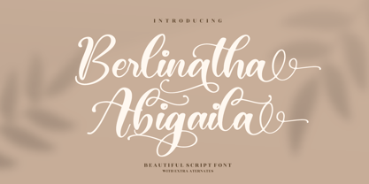 Berlinatha Abigaila is a beautiful script font, suitable for all projects.
 - Hatari by BA Graphics,
$45.00An all-caps swash font great for Headlines, rustic fun design. - Brandywine™ - Unknown license


