10,000 search results
(0.026 seconds)
- Baby Boss by Nirmalagraphics,
$14.00 Baby Boss was inspired by the writing style of my brother who focused on learning to write and read. This font works well for children themed uses and has multi-lingual support.
 - Sonata Allegro by Tamar Fonts,
$35.00 “The Emperor Has Clothes” Like in music — the Allegro Sonata form consists of three main sections—the Exposition (section), the Development, and the Recapitulation — so in regard to this Allegro Sonata font family — there is an Exposition (font), a Development, and a Recapitulation—in which each theme is restated alongside its development material. While the Recapitulation font is perfect for titling and branding, the Exposition is perfect for branding {as demonstrated in the Inspiration Gallery pertaining this font} as well as being a comfortable read in long runs of text. The Exposition rounded, mono-line, with great x height, contemporary—A Synthesis Between Geometric & Hand-drawn—font, is at times geometric and at times hand drawn; in the end it all came down to finding the balance in a typeface between the robustness needed to function as a text face and enough refinement to look good as a display font. Following the Exposition, comes the Development (section), decorative, botanic-like, exuberant and playful font, signifying ABUNDANCE [of possibilities] & BENEVOLENCE—in regard to each theme/character, and to demonstrate—that 'structures' in music, are solid structures—like architecture {contrary to the words of J. W. von Goethe, who said: “Music is liquid architecture; Architecture is frozen music”}, just in some spiritual domain that is far beyond one's physical senses to grasp. Like in my art and music works in which I consider its 'Texture' element of vital importance, so is the case when it comes to type, as apparent in my previous Phone Pro/Polyphony font, as well as in this current Sonata Allegro/Development font. Each glyph has its own uniqueness, and when meeting with others, will provide dynamic and pleasing proximity. And due to the [individualistic] nature of this Development font, just a minimal amount of kerning/pairing were necessary... The development font is an extravagant design that looks best when used at large sizes—perfect for titling, logo, product packaging, branding project, wedding, or just used to express words against some [light or dark] background. Finally, “The (Exposition Font) Emperor Has (the Development Font) Clothes!” As said, there are three fonts/styles altogether in this Sonata Allegro type family, designed with the intention of harmonizing between Latin and Hebrew, which makes it an ideal font for the side-by-side use of Latin and Hebrew characters. However, they are being sold separately (kindly search for “Sonata Allegro Hebrew” on this MyFonts site), so they are economical for those interested just in either one of them. My aim is to shake up the type-design world with a range of distinctive fonts which break away from the generic letterforms, to make your design projects stand out—as a graphic designer, add this font to your most creative ideas for projects. This typeface has [lots of ligatures /] OpenType features, to enhance your designs even more — happy designing! Sonata Allegro Features: · 3 Weights/Styles · Multilingual Support · Proportional Figures & Ligatures While using this product, if you encounter any problem or spot something we may have missed, please don't hesitate to write to us; we would love to hear your feedback—in order to further fine-tune our products. Copyright Tamar Fonts/Hillel Glueck 2022 ALL RIGHTS RESERVED Any unauthorized distribution of my work is strictly prohibited, and will be prosecuted; do the right thing, and do not participate in the piracy of my typefaces; if you appreciate my work, then please pay for it and help me prosper — thank you!
 - Sonata Allegro Hebrew by Tamar Fonts,
$35.00 “The Emperor Has Clothes” Like in music — the Allegro Sonata form consists of three main sections—the Exposition (section), the Development, and the Recapitulation — so in regard to this Allegro Sonata font family — there is an Exposition (font), a Development, and a Recapitulation—in which each theme is restated alongside its development material. While the Recapitulation font is perfect for titling and branding, the Exposition is perfect for branding {as demonstrated in the Inspiration Gallery pertaining this font} as well as being a comfortable read in long runs of text. The Exposition rounded, mono-line, with great x height, contemporary—A Synthesis Between Geometric & Hand-drawn—font, is at times geometric and at times hand drawn; in the end it all came down to finding the balance in a typeface between the robustness needed to function as a text face and enough refinement to look good as a display font. Following the Exposition, comes the Development (section), decorative, botanic-like, exuberant and playful font, signifying ABUNDANCE [of possibilities] & BENEVOLENCE—in regard to each theme/character, and to demonstrate—that 'structures' in music, are solid structures—like architecture {contrary to the words of J. W. von Goethe, who said: “Music is liquid architecture; Architecture is frozen music”}, just in some spiritual domain that is far beyond one's physical senses to grasp. Like in my art and music works in which I consider its 'Texture' element of vital importance, so is the case when it comes to type, as apparent in my previous Phone Pro/Polyphony font, as well as in this current Sonata Allegro/Development font. Each glyph has its own uniqueness, and when meeting with others, will provide dynamic and pleasing proximity. And due to the [individualistic] nature of this Development font, just a minimal amount of kerning/pairing were necessary... The development font is an extravagant design that looks best when used at large sizes—perfect for titling, logo, product packaging, branding project, wedding, or just used to express words against some [light or dark] background. Finally, “The (Exposition Font) Emperor Has (the Development Font) Clothes!” As said, there are three fonts/styles altogether in this Sonata Allegro type family, designed with the intention of harmonizing between Latin and Hebrew, which makes it an ideal font for the side-by-side use of Latin and Hebrew characters. However, they are being sold separately (kindly search for “Sonata Allegro Hebrew” on this MyFonts site), so they are economical for those interested just in either one of them. My aim is to shake up the type-design world with a range of distinctive fonts which break away from the generic letterforms, to make your design projects stand out—as a graphic designer, add this font to your most creative ideas for projects. This typeface has [lots of ligatures /] OpenType features, to enhance your designs even more — happy designing! Sonata Allegro Features: · 3 Weights/Styles · Multilingual Support · Proportional Figures & Ligatures While using this product, if you encounter any problem or spot something we may have missed, please don't hesitate to write to us; we would love to hear your feedback—in order to further fine-tune our products. Copyright Tamar Fonts/Hillel Glueck 2022 ALL RIGHTS RESERVED Any unauthorized distribution of my work is strictly prohibited, and will be prosecuted; do the right thing, and do not participate in the piracy of my typefaces; if you appreciate my work, then please pay for it and help me prosper — thank you!
 - Printers in Marks by Proportional Lime,
$19.99 In the early days of printing it was soon recognized that there was a need to identify the printer and publisher behind the printed work. So these industrious people created marks to identify themselves to clients. This font contains over 160 marks dating back to the early years of printing with the likes of Fust, Ratdolt, Manutius, Caxton, and a whole host of others represented. Some of these printers were very influential and altered the course of history, some merely enabled the broader public to access the classics. Some were imprisoned and others helped foment revolutions. But all were riding the new current of this technology of moveable type that helped transform our world through the enabling of easily exchanging information.
 - Yumo by Thinkdust,
$10.00 Yumo is a new, textured remix of the original 2010 Yume typeface, and has plenty to offer of its own. Angular and blocky, this typeface creates impactful text with a hint of playfulness, expanded upon by its rough finish. There are no extraneous edges to this font because most of them have been subsumed into the characters themselves, so any sharpness it may have from the squared corners is removed by the lack of thin strokes or serifs. Perfect for headlines and large text that wants to stand out, Yumo’s big, bold text will help your message make an impact. Playing with colours on the textured surface only helps to strengthen this effect, so that Yumo will blow people away, whatever you want to say.
 - Xutwef by Twinletter,
$17.00 Say hello to Xutwef, a superhero-style display font that will emphasize the strong and bold message of your projects. Whether in the world of film, gaming, or design, Xutwef is the perfect solution for creating extraordinary and eye-catching looks. With tough and bold characters, Xutwef presents a strong and eye-catching theme. Each letter is filled with inspiring power, taking your project to another level and creating an unforgettable impression on the audience. Xutwef offers not only a bold style but also special features that enhance your creativity. With the available ligatures and alternative characters, you can explore a variety of unique and interesting typography combinations. Apart from that, this font also supports multiple languages, allowing you to present a strong message to an international audience. Join the greatness of Xutwef and let your projects shine. With its incredible superhero style and superior features, this font will amplify your message and create an unforgettable impression. Don’t miss the chance to own Xutwef and turn your every design into an inspiring and impressive masterpiece. What’s Included : File font All glyphs Iso Latin 1 Alternate, Ligature Simple installations We highly recommend using a program that supports OpenType features and Glyphs panels like many Adobe apps and Corel Draw so that you can see and access all Glyph variations. PUA Encoded Characters – Fully accessible without additional design software. Fonts include Multilingual support
 - Canyonlands by The Styled Script,
$27.00 Say hello to chic with the beautiful, modern Canyonlands Script font! This casual, hand-lettered script font is perfect for styling logos, stationery, social media, websites and so much more! Canyonlands was created with multilingual support and over 45 ligatures, allowing you to create a real hand-written look to your projects.
 - Bold Groove by Wasabib Type Foundry,
$17.00 Is a typeface that carries powerfull message in a modern graphic style with ease. it uniquely combines simplicity and sophistication. BOLD GROOVE has everything you need to add creativity and personality to your design while being easy to read. Let Bold Groove impress your viewers and help deliver your message with strong impact.
 - Romania by Motokiwo,
$16.00 This casual script designed to handle modern and minimalist projects. Say hello to Romania, a monoline script font with feminine organic character style that very suitable for a chic logo brand, cosmetic projects, wedding, quotes, and many more. FEATURES: Uppercase & lowercase Numeral & Punctuation Multilingual Support Easy to use in any software and OS
 - Labyrinthus Rounded by Cerri Antonio,
$30.00 Labyrinthus Rounded is a multiline decorative font that works very well for identity logos, posters and 3D-works. It continues the tradition of the precedent Labyrinthus but with a softer rounded impact. It's interesting to note that with it it's possible to play with the multiline concept to create endless overlapping geometric creations.
 - Slapjack by Stephen Rapp,
$49.00 Slapjack is a unique rendition of a broad-edged calligraphic script ideal for packaging, signage, and titling. Its presence is strikingly bold and rhythmic, yet stylishly elegant. With a glyph count well over 700, Slapjack is a fully-featured pro font. Both regular and light weights have contextual and stylistic alternates, stylistic sets, swashes, ligatures, fractions, and Central European language support. Using Adobe InDesign which supports Stylistic Sets allows you to instantly convert your text to a version without baseline connectors for a more streamlined look. These can also be selected via the glyph palette. As a bonus feature, unlike most script fonts, Slapjack is designed to also set well in all caps adding to its versatility.
 - Thick by Good Java Studio,
$15.00 Thick is the perfect font for all your fun designs and also for Halloween decorations. The main font file is equipped with ordinary characters, as well as more than 350 glyphs to support most Latin-based languages. Everything is made with the same brush, and everything is the same size as Thick, so you can be sure they will work well together! It is suitable for you to use in making t-shirt design, quote, label, packaging, logo type, or long writing. Because we have compiled kerning and matrices that are tailored to your needs. Thick feature: - More than 350+ glyphs - Fully coded PUA for full access to all characters - 19 languages support
 - Chandler Mountain by Mega Type,
$19.00 Chandler Mountain is a display font family that is simple but strong, defined by sharp edges with a modern touch. It is designed to exude a sense of strength and toughness as well as optimal readability. Chandler Mountain consists of 9 weights from Regular and Slanted: Chandler Mountain works well in branding, logos, headlines, high fashion, Magazines, Quotes and Posters. The different weights give you full range to explore a whole host of apps, from Television Shows, Youtube Podcasts, tech startups, local events to sporting events. Have fun using Chandler Mountain!!! I really hope you enjoy it! Feel free to follow, like and share. Thank you so much for checking out my shop!
 - Scillienta by Calligraplay,
$10.00 Scillienta is a considered and exacting handwriting font that includes unique ligatures, characters for multiple languages, and a range of mathematical symbols. Inspired by the condensed, small, skinny handwriting traits I have consistently seen in scientists' handwriting, it exemplifies the effort of trying to write neatly when appearance is not the first priority. Scillienta is well-suited to handwritten notes and labels, school work and professional scribbles. It also works well as handwriting on electronic devices such as iPads and other cases in which handwriting might appear less fluid than usual. Scillienta includes 287 glyphs and 17 ligatures to ensure that common double- and triple-letter combinations retain the true-to-life inconsistencies of real handwriting.
 - Skill by Lián Types,
$49.00 DESCRIPTION With Skill I wanted to create something wild. Something that splashed the letters with life. To do this, I knew I'd have to break the barrier between analog and digital, so I took my best brush and started to play. Throughout the years as a type-designer I've met and become fan of many calligraphers. My belief that only a good calligrapher can make good typography (1) has become even stronger. I'm now absolutely sure that only practice improves the skill, especially in this field. So, with this in mind, I started a font which was a challenge for me because sometimes the gap between paper and screen can be gigantic. Skill is another of my attemps (2) to capture the spirit of the pointed brush, its expressiveness, the passions and fears of the artist. This font is about freedom. Freedom everywhere. Movement, velocity, passion. To achieve this, many alternates and ligatures per glyph were designed. Use it on magazines, posters, book covers, music albums, t-shirts, skates, tattoos. NOTES (1) This is mostly referred to script fonts, though text fonts made by designers with a deep calligraphic background have at least to me, an extra charm. (2) See my fonts Live and Indie. TIPS Thanks to Open-Type, the font gives the user the chance to play and get many wonderful results: In example, using the font with “discretionary ligatures” activated will give more life to the written word. Some letters will jump of the base, while others will ligate or not with the following (typical of gestural calligraphy). Adobe Illustrator is recommended. STYLES Skill is the most complete style. It has all the alternates and ligatures that can be seen in the posters and more! Skill Standard is a variant with no decorative glyphs. It has the basic alphabet and some ligatures for better legibility.
 - Thimble Village by Shakira Studio,
$11.30 Thimble Village – Modern Serif Font Is a modern serif font it's a cool modern take on a retro classic, and it's ready to make a lasting impression on your merchandise, quote designs, header text, logos & branding, advertisements and much more. It's packed with plenty of alternates and ligatures to really bring it to life, and give you a wide range of customisation options. Features: · 2 Weights font (Regular,Italic) · Lowercase and Uppercase · Beautiful Alternates & Ligatures · Numerals & Punctuation · Accented characters · Multilingual HOW TO ACCESS ALTERNATE CHARACTERS Open glyphs panel: In Adobe Photoshop go to Window - glyphs In Adobe Illustrator go to Window - Type – glyphs I really hope you'll get pleasure using Thimble Village font and it will be perfect addition to your font collection! Contact me with an inbox message If you have any question. Thank you and enjoy!
 - Kavala by Sohel Studio,
$12.00 Kavala – Modern Serif Font Is a modern serif font it's a cool modern take on a retro classic, and it's ready to make a lasting impression on your merchandise, quote designs, header text, logos & branding, advertisements and much more. It's packed with plenty of alternates and ligatures to really bring it to life, and give you a wide range of customisation options. Features: · 4 Weights font (Regular,Italic,Bold,Outline) · Lowercase and Uppercase · Beautiful Alternates & Ligatures · Numerals & Punctuation · Accented characters · Multilingual HOW TO ACCESS ALTERNATE CHARACTERS Open glyphs panel: In Adobe Photoshop go to Window - glyphs In Adobe Illustrator go to Window - Type – glyphs I really hope you'll get pleasure using Kavala font and it will be perfect addition to your font collection! Contact me with an inbox message If you have any question. Thank you and enjoy!
 - 1543HumaneJenson - Personal use only

- Alpha Flight - Unknown license

- SeoulCaps - Unknown license

- SquircleCirquare - Unknown license

- Katydid JNL by Jeff Levine,
$29.00 Vintage sheet music for a song from the Broadway Musical “Kiss Me Kate” is the inspiration for Katydid JNL. The play’s name was written in a ball-and-line type of lettering which somewhat resembles either 'Tinker Toys' or celestial mapping.
 - Tappatarap by Tural Alisoy,
$17.00 Tappatarap font. 559 glyph, 80+ Languages Set. Multilingual support: Latin basic, Latin Extended, Cyrillic, Central Europe, Turkish, Baltic, Romanian, Euro, West European diacritics Please test your alphabet. If you have any issues, please let me know through email turalalisoy@gmail.com.
 - Sugar Buttons by Supfonts,
$14.00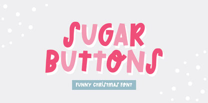 Sugar Buttons is perfect for your holiday projects. Use it for Christmas cards, winter crafts for decor and more! What's inside: - Sugar Buttons Script - Multilingual support - Cricut support If you have any questions, please contact me directly or in instagram @superdizigner
 - TF Wasted Growth by Teenage Foundry,
$19.00 Wasted Growth is a display font with a strong style is back. There are 2 styles, Regular & Blur. Suitable for merchandise designs, covers, posters and others. Features: Uppercase, Lowercase, Numeral, Punctuation & Multilingual. For any questions please contact me 🙂 Thanks!
 - Deco Neue Wilde by Open Window,
$- Deco Neue Wilde is a filter font based on Deco, an original Open Window classic. It sort of speaks for itself but it reminds me of a lava lamp and the countless shapes that you could waste time watching appear.
 - Courant by Hanoded,
$20.00 Courant means "newspaper". Courant font was modeled on 17th century Dutch newspapers and most of the glyphs are authentic. The 'modern' glyphs, like @, $, €, * and several others have been designed by me, as they were not in use in the 1600's.
 - Extra Crunchy by Bogstav,
$18.00 Extra Crunchy is my handwriting when I am eating cookies while drawing! No, it's true! I did eat a whole box of cookies while drawing this font! :) The letters are a bit jumpy, and have no steady x-height, however, your text may look a bit off, but it is clear and legible. Fits perfect for a children's book, a postcard/poster design or something else that needs that extra crunch :)
 - Syrup by Fenotype,
$35.00 Syrup is a friendly, subtly rounded type family combining sans and script styles. It’s aesthetic roots are in the sign painting of the 1950’s but the execution is distinctly modern. The different styles are designed to work well together so you can have multiple levels of typography all with the same feeling and aesthetic. Try combining the styles in different ways for maximum impact. All styles are packed with Opentype features to enable flexible customisation of your design and the font is especially well suited for branding and packaging typography.
 - Merilee by SummitType,
$25.00 Fonts with handwritten characteristics are always an attractive option when creating projects that call for a personal touch. Merilee helps deliver a natural pattern to computer generated text, helping readers feel a more personal attachment to the words in front of them. Merilee includes a full character set (UPPER and lower case), all punctuation, all special characters, Euro symbol, and all Latin Extended-A characters, making this font a perfect match for a variety of creative projects including holiday and kids projects, signs, logo designs, banners and advertisements.
 - Guadalupe by Rodrigo Navarro Bolado,
$32.00 Article to appear on the font family page: According to the Catholic faith, a well known náhuatl story called "Nican Mopohua" (translated as "Here it's narrate") about the Marianas apparitions on the Tepeyac's hill, to the north of the actual Mexico City. After four apparitions, La Virgen de Guadalupe (LVG) told Juan Diego (JD) that he must introduce himself to the first Bishop of Mexico. JD took in his "ayate" some roses (that aren't natives to Mexico's barren territories) and when he dropped them in front of the bishop, the image of LVG appeared in front of him with indigenous features. I’ve worked a lot in this font that appears to came out of nowhere, just like the image of LVG itself, the fact is that I started first sketching some flowers, because I wanted to do something related to this mexican story, so, taking some features from this flowers I started sketching some letters, for example “r” and “i” and the counter forms for some letters like “a” and “o” (that I didn’t use by the way) and the punctuation marks, all inspired by this leaf forms. Lighter weight coming soon! Hope you like it. Any comments: rodrigonabo@gmail.com
 - Salt & Spices Pro by Fontforecast,
$29.00 Salt&Spices Pro is a welcome addition to the ever popular modern calligraphy genre. Digitizing the many handwritten samples into a fully functional connected script was done with great precision, carefully guarding the authentic look and feel of vintage dip pen calligraphy. Salt&Spices Pro is a very versatile 9 font family, consisting of 3 casual styles: Regular, Bold and Shadow. With 587 glyphs each, they offer great flexibility in customizing words and phrases to suit your personal taste. For instance: the appearance of initial and terminal letters can be customized using the glyph pallet. Contextual alternates, Swashes and Stylistic sets give you the ability to replace spaces by 3 alternate connecting spaces or add swashes to initial/terminal letters. Double letter ligatures help sustain the natural flow of handwriting. In addition to the 3 calligraphic family members 3 SmallCaps Sans styles and 3 SmallCaps Serif styles were added. They all have 435 glyphs and match very well because they were designed using the same vintage nib. Each of the styles can add great variation to your designs and they supplement and support each other perfectly. Add exceptional language support to all that and you have the perfect ingredient to spice up even the most demanding design project.
 - TX Signal Signifier by Typebox,
$39.00Eight designers present a set of icons that indicate the fun and fantastic world of signage. Each collaborator's solution represents a completely different interpretations on signage vernacular. Akira Kobayashi's "Subsumption", obscured by foliage, offers a perspective that signs on Japanese roads can be vague and beautiful. M.A.D.'s "People Signs" is a graphical association of people signage with a variety of well known situation symbols. Cynthia Jacquette's "Honest Arrows" are a series of arrows that attempts to honestly tell you how to get from point A to Point B in a big, confusing city. Mike Kohnke's "Road Kill" and the "Bump & Bruise" highlight how signs make for perfect targets when unloading a round of buckshot, and the licking a contruction barrier often endures. Joachim Muller-Lance's "Traffic Blends" places faces on things! Hey, didn't you give your first car a nickname? Cars are alive, you know - they guzzle and smoke all day. Jean-Benoît Lévy's "Inner-State" was inspired while reading the California driver handbook to pass a driver's test. Kevin Roberson's "Tail Lighting" reminds us to drive carefully and not to forget to signal. Diana Stoen's "Drivers Out There" shows us "driver personality archetypes", including the lil'ol lady that everyone tries to avoid. - Ultra System by Set Sail Studios,
$14.00 Introducing Ultra System; A modern exploration of 8 fonts, each carefully designed to naturally compliment one another. With 6 clean sans fonts and 2 textured script fonts, Ultra System gives you a variety of ways to combine and arrange each font, allowing you to create striking & modern typographic designs. This typeface collection consists of 8 fonts; Ultra System Script • A textured, bouncy & flowing marker script font containing upper & lowercase characters, numerals, and a large range of punctuation. Ultra System Script Alt • This is a second version of Ultra System Script, with a completely new set of both upper and lowercase characters. If you wanted to avoid letters looking the same each time to recreate a custom-made style, or try a different word shape, simply switch to this font for an additional layout option. Ultra System Sans • A wide, bold sans font containing uppercase only characters, numerals, and a large range of punctuation. Ultra System Sans Line One • A thick outlined version of Ultra System Sans, pair this with other Ultra System Sans fonts to add emphasis to words or phrases. Ultra System Sans Line Two • A thin outlined version of Ultra System Sans, pair this with other Ultra System Sans fonts to add emphasis to words or phrases. Ultra System Sans Italic • Italic variations are included for all 3 Ultra System Sans fonts. FAQs; Accessing Ligatures • Ligatures are supported by most desktop graphics & text software (not just the fancy ones!), including Photoshop, Illustrator, InDesign, Word, Pages & Keynote. Many programs will automatically have this feature switched on for you, but if you need any help accessing then please feel free to drop me a message. Language Support • All Ultra System fonts support the following languages; English, French, Italian, Spanish, Portuguese, German, Swedish, Norwegian, Danish, Dutch, Finnish, Indonesian, Malay, Hungarian, Polish, Croatian, Turkish, Romanian, Czech, Latvian, Lithuanian, Slovak, Slovenian
 - Qualion Round by ROHH,
$39.00 Qualion Round™ is a soft geometric sans serif with lots of swashes and ligatures, a sibling of successful Qualion™ and Qualion Text™ families. The rounded family is designed by carefully adjusting letter shapes, tapering and ink traps to in order to achieve optimal legibility as well as strong personality. The family is intended to serve in display situations like branding and advertising as well as in paragraph text and user interfaces. Its versatility can be even strengthened by pairing it with Qualion™ or Qualion Text™ families. Qualion Round™ family consists of 10 weights with corresponding oblique styles. It has extended language support, as well as broad number of OpenType features, such as case sensitive forms, standard and discretionary ligatures, swashes, terminal forms, stylistic sets, contextual alternates, lining, oldstyle, tabular figures, slashed zero, fractions, superscript and subscript, ordinals, currencies and symbols.
 - Dupincel by Plau,
$30.00 A typeface for telling stories. After seven years through which Rodrigo Saiani worked on Dupincel, Plau’s team still had months of dedication until found a good way of summing up this typeface. All this effort was rewarded, though, when we came up with a motif that gave Dupincel the grandiosity it deserves. Telling stories is this typeface’s gift because it has the emotion for it, resources for it and the breadth for it. Like all that wasn’t enough, it has the scale for it: optical sizes Small, Medium and Large make Dupincel optimized for stories of every length. From short stories displayed big or long stories on small letters. We don’t want to dictate the types of stories either, anything goes. But if ornaments make a good fit with that story, we will be even more thrilled. In the end, Dupincel makes us want to find new stories to tell.
 - Daily Routines by Fikryal,
$23.00 The “Daily Routines” Handwritten Display Font is a delightful and charismatic typeface that effortlessly captures the essence of casual elegance. With its carefully crafted strokes and artful imperfections, this font exudes a sense of handmade authenticity that is both inviting and versatile. Designed with meticulous attention to detail, “Daily Routines” showcases a harmonious blend of playful curves and well-balanced letterforms, making it a perfect choice for projects that seek to strike a harmonious balance between approachability and sophistication. Its smooth and flowing lines lend a sense of fluidity and ease, evoking a feeling of effortlessness and natural rhythm. The irregularities in each letter lend a unique charm, reminiscent of handwritten notes penned with care. The “Daily Routines” Handwritten Display Font is specifically tailored for projects that demand a warm and friendly touch, such as invitations, greeting cards, product packaging, and branding materials. It easily conveys a sense of personal connection, making it ideal for conveying heartfelt messages or highlighting the human element in design. Whether utilized for digital or print media, this font ensures legibility and readability, even in smaller sizes. Its captivating appearance adds a touch of personality to any text, making it stand out while retaining a sense of tasteful subtlety. Embrace the captivating allure of the “Daily Routines” Handwritten Display Font to infuse your designs with a genuine and endearing character, elevating them to new levels of aesthetic appeal and resonating with your audience on a profound level. If you have any questions please don’t hesitate to contact me follow my Instagram: fkryall Thank you
 - Rifleman by Open Window,
$19.95 What a nice tranquil feeling you get from the wide forms of this font. The air of spontaneity was the most important thing about developing Rifleman. The forms were carefully and slowly constructed and then loosely traced with a paintbrush. Maybe the original drawings will become a font someday but i like to think that they won't for some reason. Surprisingly Rifleman is left to only the bare essential elements, anything that wasn't necessary was left out or removed. The goal was to make it as lightweight as possible to make up for the intricate detail. Rifleman is a surprisingly lightweight font offering lends itself to speedy typesetting!
 - PF Bague Sans Std by Parachute,
$39.00 Bague Sans is an award-winning monoline typeface with a distinct and eye-catching personality. Despite its inspiration from early 20th century geometrics, it diverts from the mechanical rigidity of those typefaces by incorporating humanist characteristics, such as subtle variations in stroke width and open counter shapes with vertical endings. This is a very clean and legible typeface with a warm and well-balanced texture which is ideal for intense editorial use in magazines and newspapers. The most remarkable feature of Bague Sans is its vast array of uppercase alternates and ligatures which truly shine when set at display sizes. This typeface is automatically transformed into a flexible, charming and stylish typeface with strong modern aesthetics. Explore its dual personality, switch from Humanist to Geometric and vice versa by using alternate characters such as the single-storey a and single-storey g. From classic to modern, from excessive to neutral, Bague Sans is a multipurpose typeface which offers enormous possibilities and variations for editorial design, branding and corporate identity while it performs amazingly well on web. This superfamily includes 18 weights from Hairline to Ultra Black with a consistent and well-refined structure. It supports extended Latin such as Central European, Baltic, Turkish, Romanian and includes numerous alternates and ligatures for unlimited text variations. You may also want to check out Bague Sans Pro which supports Cyrillic and Greek as well.
 - Sayso Chic - Unknown license


