10,000 search results
(0.031 seconds)
- Lara by Efe Avcı,
$19.00 Design-wise, it is an elegant, fine-grained font. There are 218 glyphs.
 - Albireo by Cory Maylett Design,
$25.00 Albireo is a typeface for those times when you have more to say than space to say it. It also looks fantastic spread out across the page as though space doesn’t matter. Expertly crafted with a high level of attention to detail, Albireo is an immensely practical and flexible typeface that’s neutral enough to be used almost anywhere a highly condensed, sans-serif face is needed. Despite its down-to-earth functionality, this is a typeface that definitely isn’t lacking in style. It really shines when used for headlines or subheadings in magazines, brochures, posters, newspapers, flyers or on the web. With 42 weights, widths and italics, there’s enough flexibility to make every word fit perfectly. You may buy one font at a time or save money by purchasing packages consisting of the 14 fonts in each width (Extra Condensed, Condensed or Semi Condensed). Save even more by purchasing the entire collection and, in addition to the 42 separate fonts, you'll receive two variable fonts (upright and italic) that cover all the weights, widths and everything in between. So where does the name come from? Well, look upwards at night. Albireo is a binary star in the constellation Cygnus. Through a backyard telescope, Albireo (the star) resolves into two brilliant component stars — one orange and one blue. The beginnings of the typeface were the result of me needing a newspaper feature headline about space exploration. I couldn’t find the right typeface, so I drew my own letters and eventually expanded it out into an entire mega-family. Given its origins, naming it after my favorite star seemed totally appropriate. Check it out. I think you’ll love it. Albireo deserves its place as a shining star in everyone’s font collection. It’s that good — really.
 - Gaslon by Canada Type,
$24.95 Gaslon is a slight reinterpretation and major expansion of a 1973 film type called Corvina Black, originally designed for VGC by A. Bihari. While the original typeface was popular in its own right, there were some things in it that were too quirky to work in the display applications it was intended for. Some of the letter combinations just didn't work to their visual optimum. For example the a and o were too similar, ditto the C and G, the E, F and J were too overwhelming to be set properly within certain display uses. Gaslon eliminates these problems by the inclusion of plenty of alternates for the vast majority of the original letters. In fact, the original a is itself now an alternate to a gorgeous new one. The Gaslon Alt font includes tremendous possibilities for both unicase use, and proper use in conjunction with the main font. This is our true homage to a typeface that had great potential more than three decades ago, but was overlooked by digitizers because of a few quirks it had in film type contexts. Full of curves and invitation, Gaslon ranks very high among the friendliest poster faces ever made. It is ideal for friendly store signs, children book covers, and plenty of other applications. In fact, if you're planning on contributing to a few protests around your neighborhood or city, you would probably be better off using Gaslon to help your sign/placard carry words and slogans that are big but friendly. Nothing beats "DOWN WITH GAS PRICES" set in a nice imaginative mix of the many Gaslon letters. The OpenType version of Gaslon is a single font that contains all the alternates and niceties programmed within features accessible by OT-friendly programs.
 - IMAN RG by LGF Fonts,
$10.00 This type of Richard Gans, has always seemed very striking, despite having the complexity of the sources extrusion, has its own personality, and readability unusual for this type of letters. Use it for composing posters, programs or logos was very common at the time. My father, Antonio Lage Parapar, typographer by profession, who composed the texts, which not only had it for profession, but he liked to do, always he spoke of sources and decorative elements of the type foundry Richard Gans, as well as other foundries, especially those that required the mender of them, exercised creator, many of these types they have already been recovered by professionals and companies with excellent results. I've been surrounded by these movable type, and the occasional catalog unfortunately lost. One of those guys that has always struck me visually speaking was the type IMAN Richard Gans, the typographer and more of German origin arrived in Spain, back in 1874, also a pioneer. This work to revive the type mentioned, as well as create non existing glyphs between documents and parts I've been finding, is and has been a personal pleasure all I want serve as a tribute to my father (of aopodo curiously "Richard"), the only sadness it has not been completed. Richard Gans, arrived in Spain in 1874 as a representative of several European factories. then liaised with journalistic and publishing companies, which led him knowledge required of the first sector art. In 1878 he created a center importer gadgets graphic arts and three years later he created his own type foundry. The first rotary newspaper ABC, very famous and the most advanced of the time, the brand manufactured Richard Gans.
 - Kandidat by Fontroll,
$30.00 Imagine being printer in the early nineteenth century, your stock isn’t the finest, your lead characters are worn out: Voilá Kandidat Rough. But wait, Kandidat isn’t the usual scan-an-old-book,-put-the-glyphs-in-a-font-and-you’re-done-font. Kandidat Rough has a variety of whopping 14 alternates for most characters. Our algorithm changes the letters automatically. All you have to do is turn on Contextual Alternates in your layout app. The algorithm is the best we’ve seen so far, and it’s so good that even same words appear in different forms. And should by coincidence words have the same glyphs, just assign a different Style Set to the first letter, and all other letters in the word will change as well (well, it depends a bit on your software). The mechanism isn’t perfect and maybe we stretched OpenType capabilities a bit over the top, but we yet haven’t seen any better routine for switching letters on the fly. Is it worth to mention that Kandidat Rough not only speaks English, but also German, French, Spanish, Dutch, Danish, Norwegian, Swedish, Croatian, Turkish and most likely some other languages? Maybe. To be sure whether your language is supported, this is the typeset of all letters: ABCDEFGHIJKLMNOPQRSTUVWXYZÀÁÂÃÄÅÆÇÈÉÊËÌÍÎÏÑÒÓÔÕÖØÙÚÛÜÝĆČĐĞ݌ފŸŽ abcdefghijklmnopqrstuvwxyzàáâãäåæçèéêëìíîïñòóôõöøùúûüýÿćčđğıœşšž Apart from that we also included the following punctuation and currency symbols: !"#$%&'()*+,-./:;?@[\]_{|}¡©«®°±¶·»¿×–—‘’‚“”„†•…‹›⁄≠☞ €¢$£¥ This sums up to nearly 3000 glyphs per font, and we have three of them: Regular, Italic and Bold. All neatly kerned. All in all a great repertoire for even the most demanding book or advert jobs with a look of old times. And now imagine you are sick of the rugged print experience Kandidat Rough delivers: go for Kandidat. This is our Scotch-ish ancestor the Rough version was made from. A sturdy, friendly, round, warm friend from the beginning of the nineteenth century. A bit dark, maybe. You will like it. Kandidat has the aforementioned type set plus complete Baltics, Eastern Europe and Cyrillic. Plus a couple of gimmicks like fleurons, stars, circled numbers, arrows, and, and, and… Kandidat Regular additionally has small caps for Latin based scripts (not Cyrillic). The spick and span Kandidat font set also consists of Regular, Italic and Bold cuts. The bold cut is on the very bold side and can nicely be used for headings, whereas Italic is a great companion for Regular. It took us some time and trouble to finish this project, but after all we are very proud of our little feat and hope you will enjoy Kandidat as much as we do. Enjoy!
 - Spleeny by Galapagos,
$39.00A gentle breeze on a warm summer's day. A cozy gathering of friends and family around a crackling fire. The sweet aroma of freshly baked cinnamon bread. A slow walk in the autumn woods, light sparkling down through the multi-colored leaves. Billowing white clouds against a stark azur sky, leisurely floating past the tops of palm trees. What do these idyllic scenes all have in common? A: Most people can never find the time to enjoy any of them. B: These are just some of the things you would never try to describe using a crankish font like Spleeny Decaf GD. Just as ITC Fontoon was designed to be used with the many critters that populate the "Toonie" series of fonts, Spleeny Decaf GD was created by Steve Zafarana for use in the balloned dialogue portions of a new panel cartoon feature currently under development. Spleeny Decaf GD is the first completed font in a family that ranges from the jittery san serif Spleeny Espresso GD to the sedate and serifed Spleeny Asleep GD. Each font in the series appears a little more relaxed and staid than its predecessor. None of them however, will find themselves being used for the text of any legal documents. Spleeny Decaf GD is the perfect font to use when the weight of the message is leaning towards the light and jocular side of things. So remember, if your documents are starting to put you on edge, it may be time to switch to decaf. Spleeny Decaf GD that is. - FS Jack by Fontsmith,
$80.00 a, g, k and y It was a forensic examination by Jason Smith of his existing designs that laid the groundwork for FS Jack. Jason made a list of unique characteristics that would give the sans serif font its typographic thumbprint, which included an unusually large x-height and slightly off-the-wall letters like the lower-case “a”, “g”, “k” and “y”. “I wanted to make something that was slightly uncomfortable,” says Jason, “and in doing so simplify the quirkiness down to a few letters.” Fernando Mello did “the rest of the cooking”, filling the design out and making the additional weights. Tipos Latinos Upon its release in 2010, FS Jack was submitted by Fernando, who is Brazilian, for the esteemed type design biennial, Tipos Latinos, where it was selected as a winner in the Families category. It went on to be selected for type exhibitions throughout Latin America and around the world. “FS Jack is a workhorse,” says Fernando, “but also very ownable and distinctive, and available in a good range of weights, crafted by Jason and I.” Corporate “FS Jack took a couple of years to get noticed and is still fairly underused,” says Jason, “which is good in a way, for our Brandfont clients that have adopted it.” FS Jack was chosen as the signature font for The Shard in London, from its signage down to business cards. Fontsmith also worked with Lloyds Bank to customise FS Jack into a bespoke font for the bank’s updated brand identity – part of Fontsmith’s Brandfont service, which you can read about here. Fat Jack Included in the FS Jack family – just – is FS Jack Poster, the super-heavy weight of the range. “That was a last minute addition,” says Fernando, “after Jason and I started talking about how much we liked Gill KO, a typeface that is almost comically fat.”
 - Barrista by Typodermic,
$11.95 Welcome to our cozy coffee shop! Come on in, take a seat and savor the aroma of freshly brewed coffee. Speaking of coffee, have you seen our new font? Meet Barrista! Its relaxed, curly script perfectly captures the whirling curls of steam rising from a hot cup of Joe. Barrista is not just any font. Thanks to OpenType ligatures, certain letter combinations will automatically be substituted with customer pairings. This creates a natural, relaxed look that’s perfect for our laid-back atmosphere. Imagine jotting down your order in Barrista, watching as our talented baristas create your perfect cup of coffee. As you wait for your order, you can admire the intricate details of Barrista’s flowing script, which is inspired by the art of coffee-making itself. So, come on down to our coffee shop and experience Barrista for yourself. Most Latin-based European writing systems are supported, including the following languages. Afaan Oromo, Afar, Afrikaans, Albanian, Alsatian, Aromanian, Aymara, Bashkir (Latin), Basque, Belarusian (Latin), Bemba, Bikol, Bosnian, Breton, Cape Verdean, Creole, Catalan, Cebuano, Chamorro, Chavacano, Chichewa, Crimean Tatar (Latin), Croatian, Czech, Danish, Dawan, Dholuo, Dutch, English, Estonian, Faroese, Fijian, Filipino, Finnish, French, Frisian, Friulian, Gagauz (Latin), Galician, Ganda, Genoese, German, Greenlandic, Guadeloupean Creole, Haitian Creole, Hawaiian, Hiligaynon, Hungarian, Icelandic, Ilocano, Indonesian, Irish, Italian, Jamaican, Kaqchikel, Karakalpak (Latin), Kashubian, Kikongo, Kinyarwanda, Kirundi, Kurdish (Latin), Latvian, Lithuanian, Lombard, Low Saxon, Luxembourgish, Maasai, Makhuwa, Malay, Maltese, Māori, Moldovan, Montenegrin, Ndebele, Neapolitan, Norwegian, Novial, Occitan, Ossetian (Latin), Papiamento, Piedmontese, Polish, Portuguese, Quechua, Rarotongan, Romanian, Romansh, Sami, Sango, Saramaccan, Sardinian, Scottish Gaelic, Serbian (Latin), Shona, Sicilian, Silesian, Slovak, Slovenian, Somali, Sorbian, Sotho, Spanish, Swahili, Swazi, Swedish, Tagalog, Tahitian, Tetum, Tongan, Tshiluba, Tsonga, Tswana, Tumbuka, Turkish, Turkmen (Latin), Tuvaluan, Uzbek (Latin), Venetian, Vepsian, Võro, Walloon, Waray-Waray, Wayuu, Welsh, Wolof, Xhosa, Yapese, Zapotec Zulu and Zuni.
 - Fluire by Lián Types,
$37.00 MAS AMOR POR FAVOR (1) (more love, please) Fluire means -to flow- in Italian and that’s what this font is all about. The story began when a friend of mine asked for a tattoo with the word -Fluir- (to flow in Spanish). She didn't want a tattoo full of swashes and swirls, like I'm used to doing, but something more fluent, soft and minimal. My very first attempts were more related to copperplate calligraphy but I wasn't even close: I discovered that I needed to forget a little bit about the classic contrast and speed of the engrosser's nib and started playing with a tiny flat metal nib. Letters started to flow, and I immediately thought of turning them into a font. Inspired by the tattoo I created and by other tattoos I saw, I started the journey of what would be a very fun process. The result is a very cute, almost monoline font with a wide range of uses. USES If not used for a tattoo (my first ‘target’), the font delivers amazing results in combination with Fluire Caps: These two need each other, they go together, they talk. I designed Fluire Caps Down and Fluire Caps Up so it’s easier to manage their colors. Also there’s Fluire Caps Down Lines, which has a decorative thin line to add yet another dimension. Use the fonts in magazines, book covers, posters, greeting cards, weddings, lettered walls, storefronts! TIPS Since the font is Open-Type programmed, I strongly recommend using it in applications that support that feature. Also, the font looks way better when -contextual alternates- are activated, but it’s your choice :) Try Fluire, and keep flowing. NOTES (1) The phrase alludes to maybe the most tattooed phrase in Latin America.
 - Bison by EllenLuff,
$38.00 Bison is a sophisticated and strong family of sans serif fonts. Its sturdy uncompromising style is felt through controlled letterforms and modern touches. A balance of hard lines and smooth curves, each font in the family can stand on its own — dynamic and authoritative in its own right. FEATURES Bison includes ten all-caps fonts: Four weights / Italics / Outlines / Numbers & Punctuation / Extensive Language Support Bison Bold - bold and commanding Bison Demibold - the persuasive middleweight Bison Regular - a sturdy midground between light and bolds Bison Light - quiet but confident Bison Outline (Thick and Thin) - edgy and engaging USE Bison works great in any branding, logos, magazines, films. The different weights give you full range to explore a whole host of applications, while the outlined fonts give a real modern feel to any project.
 - Delectables by ITC,
$29.99A former lettering artist at Hallmark Cards, Rob Leuschke now has his own thriving design businesses, Alphabytes and the new TypeSETit. Growing up in St Charles, Missouri, where he still lives, Rob showed great artistic promise at an early age. He earned a BFA in graphic design at the University of Missouri at Columbia. After graduation, his stint at Hallmark Cards gave him the opportunity to learn from and work with some of the best lettering artists in the industry. Rob struck out on his own in 1987 and now boasts a long list of clients from all over the world. Rob has created over 250 custom typefaces, and his work has been exhibited in New York. Ambiance BT is Rob’s first typeface published by Bitstream, with more to follow. - Expectation by Linotype,
$29.99Making a Christmas card takes a lot of work! Finding the right typeface can be tough, too. Have you ever spent hours searching for the right one? Well, in 2003, instead of spending hours searching, German designer Guido Bittner made his own. Expectation was first used on the Christmas card for Bittner's Wiesbaden design studio. This delicate series of letters maintains a handwritten feel, in part because it began as a digitalization of Bittner’s own handwriting. Expectation Swash includes additional swash letters, which can be paired with regular version of Expectation to create superior effects. Perhaps it is already time for you to begin working on next year’s holiday cards. Let these fonts be the starting port for your inspiration! Expectation was a winner in the 2003 International Type Design Contest, sponsored by Linotype GmbH. - monbijoux - Personal use only

- MARVEL HEROES - Personal use only

- Dancing in the Minefields - Personal use only

- KG Heart Doodles - Personal use only

- The Only Exception - Personal use only

- The Great Escape - Personal use only

- Stars From Our Eyes - Personal use only

- KG Hope For A Cure - Personal use only

- DIG DUG - Personal use only

- Bullpen - Unknown license

- KG Mercy in the Morning - Personal use only

- KG Skinny Latte - Personal use only

- DS Supervixen Cyr - Personal use only

- Tucker Handwritten - Unknown license

- KG Sweet N Sassy - Personal use only

- Abduction IV - Unknown license

- Bright Aurora by Mega Type,
$12.00 INTRODUCING Bright Aurora is a fun handwritten font, Mix uppercase and lowercase for a fun and unique look! Bright Aurora is perfect for quotes, t-shirt designs, websites, branding, store brand, kids designs, svg designs, blogs, poster, logos, invitations and more! Have fun using Bright Aurora!!! Feel free to follow, like and share. Thank you very much for checking my store!
 - Mancho by Ahmet Altun,
$-The Mancho Font was completely created by graphic tablet. This font family comes in two weights; regular and bold. They're all capital but lowercase and capital letters are different from each other. The name “Mancho” comes from Turkish Rock Music Singer "Barış Manço". The Mancho font can be a part of your stylish designs with its free and powerful outlook. - Homemade Choco by Tlatous Type,
$19.00 Introducing Homemade Choco by Tlatoustype Homamade Choco is a Monoline handwritten Font. Homemade Choco is a cute, quirky and fresh handwritten font. It is ideal for holiday-themed greeting cards and for any crafting project that requires a sweet, romantic touch. Homemade Choco also multilingual support. Enjoy the font, feel free to comment or feedback, send me PM or email. Thank you!
 - Jesterday by Jelloween,
$19.00 Jesterday is a four weight - light, regular, medium and bold - type family that’s suitable for headlines but works great in informal body-copy as well. Even at a very small size it’s still very much legible. For added fun, Jesterday has been subtly enhanced with OpenType ligatures. Can you spot them? Download the demo version to try Jesterday for free.
 - Xwisth by Allouse Studio,
$16.00 Proudly Presenting, Xwisth a Gothic Handwritten Font that will bring an a classical type. Xwisth is perfect for any titles, logo, product packaging, branding project, megazine, social media, wedding, or just used to express words above the background. Xwisth also come with Multi-Lingual Support. Enjoy the font, feel free to comment or feedback, send me PM or email. Thank You!
 - M Curvy HK by Monotype HK,
$523.99 M Curvy’s design breaks the mould of traditional Chinese characters to construct a brand new style. Referencing a traditional Chinese calligraphic style that is written with the brush suspended in mid-air, the flow between strokes within each character is free and smooth in this typeface. With an even stroke density. M Curvy is legible, gentle, yet stable, combining tradition and innovation.
 - Magide by Issam Type,
$20.00 Magide is a retro and bold serif font typeface. This font perfect for branding, Headlines, Retro designs, logos, invitation, watermark and so much more. Magide typeface comes with Regular, Thin, bold, Black and 2 Outline font styles. Uppercase & lowercase letters, numbers, punctuation, ligatures, alternates and multilingual support. If you have any questions, please feel free to get in touch. Thank you
 - Dorige by Issam Type,
$20.00 Dorige is a modern retro serif typeface for branding, logo design and retro designs, This font comes with joining ligatures that give it a fancy and unique style. Dorige typeface comes with regular, italic, bold and bold italic font styles. Uppercase & lowercase letters, numbers, punctuation, ligatures, alternates Multilingual support. If you have any questions, please feel free to get in touch. Thank you
 - Shadow Party by Balpirick,
$15.00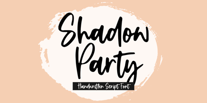 Shadow Party is a Handwritten Script Font. Shadow Party is a flowing handwritten font, described by an elegant touch, perfect for your favorite projects. Fall in love with its incredibly distinct and timeless style and use it to create spectacular designs! Shadow Party also multilingual support. Enjoy the font, feel free to comment or feedback, send me PM or email. Thank you!
 - Rigid Display by Studio Fat Cat,
$20.00 Rigid Display is a sans serif font designed for display needs such as titles, logos, etc. with a different touch. Rigid Display provides 5 weights for its users to have freedom in handling. This fresh font is an alternative that will refresh your font library and also the viewers so feel free to choose it as the main pawn for your project
 - The Goblick by Allouse Studio,
$16.00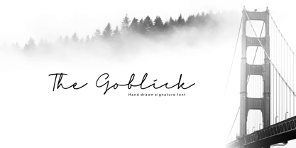 Proudly Presenting, The Goblick a Handdrawn Signature Font. The Goblick is perfect for any titles, logo, product packaging, branding project, megazine, social media, wedding, or just used to express words above the background. The Goblick also come with initial swash and Multi-Lingual Support. Enjoy the font, feel free to comment or feedback, send me PM or email. Thank You!
 - Chenica by Scratch Design,
$9.00 Chenica is an elegant, clean & simple sans serif. It has a sophisticated, minimalist and elegant typeface design. This beautiful font has been designed for projects which are suitable for modern & elegant design, such as branding, magazines, logos, headers, and many more. Shepia includes: Letters Numbers Symbols & Punctuation Multilingual Support Beautiful Ligatures If you have any questions, please feel free to contact us Thanks!


