10,000 search results
(0.021 seconds)
- Bilderberg by Almeera Studio,
$12.00 Bilderberg is a luxurious bold, serif, display typeface. It comes in 2 styles, Regular and Italic, and includes many alternates with swashes that can make your lettering / logotype become more interesting. The clean and neat of a serif combined with the swirl swashes makes this font very attractive. This font fits perfectly for logos and the other various formal forms such as invitations, labels, magazine headers, books, greeting/wedding cards, clothing, branding, product packaging, fashion, make up, quotes, stationery, novels, labels or any type of advertising purpose. Features : 2 styles (Regular and Italic) uppercase & lowercase numbers and punctuation multilingual ligatures stylistic alternates swashes PUA encoded We highly recommend using a program that supports OpenType features and Glyphs panels like many of Adobe apps and Corel Draw, so you can see and access all Glyph variations. How to Access Alternate Characters: Open glyphs panel: -In Adobe Photoshop go to Window - glyphs -In Adobe Illustrator go to Type - glyphs Thanks & Happy designing
 - Nouveau Spur JNL by Jeff Levine,
$29.00 The condensed, spur serif hand lettering for the title on the 1906 sheet music cover of “Gee! But this is a Lonesome Town” inspired Nouveau Spur JNL; which is available in both regular and oblique versions.
 - Snowfall by Elemeno,
$32.00Hand-lettered font, based on the designer's own handwriting. Perfect for indy comics or for lending almost anything a personal touch. - Shalimar by TypeSETit,
$24.95 To be used on its own or combined with Shalimar Swash, this lovely upright calligraphic style has a variety of uses.
 - Mia Mano by Kate Brankin,
$32.00 Based on designer's own handwriting, Mia Mano is a decorative display typeface ideal for headlines, logos, magazines, posters and short text.
 - Menthox by Alit Design,
$19.00 Introducing Menthox Typeface The Menthox font is designed with a script font concept that has a decorative stencil style. Strong characters with stencil styles make Menthox fonts look different and unique from other script fonts. A script typeface like "Menthox" is very easy to apply to any design, especially those with dynamic, relaxed, and retro fashion concepts, besides that this font is very easy to use in both design and non-design programs because all glyps in the Menthox font are supported by Unicode. (PUA). The "Menthox"contains 700 glyphs with many unique and interesting alternative options.
 - North point - Unknown license

- West point - Unknown license

- Hooper dooper - Unknown license

- Changstein - Unknown license

- Vertigirl - Unknown license

- Aaargh - 100% free

- Tom's Handwriting - Unknown license

- Barbarello - Unknown license

- greenbeans - 100% free

- Fishbowl - Unknown license

- Gravity Sucks - 100% free

- Jellodings by Jelloween,
$-Jelloding contains 32 funny & cute dingbats. Comes in TTF, OTF and Windows Postscript format to suit your every need. You gotta love 'em, and they're free too! - Ardalista by Mercurial,
$17.00 Ardalista is lovely script calligraphy made with a touch of sweet, lovely and charming attraction that adds to the impression of a beautiful and elegant. a charming typeface and So beautiful on invitation like greeting cards, sublimation, wedding invitation, branding materials, business cards, quotes, posters, headings, signature, logos, t-shirt, letterhead, signage, lable, news, posters, badges and more What is interesting? Imagine you get a beautiful and very charming font in the design you make. that would be the answer you wanted right now. Ardalista has a script typeface and extra letters that allows you to be more free in designing. What's new? Hey..look at this. besides you get a font with over 150 alternates, ligatures and swashes. let's imagine what you can do with all that. yeah that's awesome. For those with Opentype capable software ( Photoshop CC or any version of Illustrator/ Indesign), Ardalista also comes with Opentype features such as access to all the alternate letters and double letter ligatures. And this Font has given PUA unicode (specially coded fonts). so that all the alternate characters can easily be accessed in full by a craftsman or designer. Don't forget to check out other cool fonts on our store and wait for new fonts. Follow our shop for upcoming updates including additional glyphs and language support. feel free to send me a message, comment, like and share.
 - Tinta Arabic by NamelaType,
$29.00 Tinta Arabic is the sibling of Tinta, with with additional Arabic glyphs for more international fun with the addition of Arabic glyphs; Arabic, Urdu, Kurdish Farsi and Jawi. Basic form for arabic font is refers to the arabic Naskhi style, with a cute shape to harmony with Latin.
 - Moolfy by Stefani Letter,
$14.00 Moolfy is an amazing display font. It is the perfect choice for dog related and anything project! This font is PUA encoded which means you can access all of the amazing glyphs and swashes with ease! It also features a wealth of special features including alternate glyphs and ligatures.
 - Berries by Letterara,
$12.00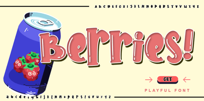 Berries is a cute and sweet handwritten font with an incredibly friendly feel. Get inspired by its playful feel! This font is PUA encoded which means you can access all of the cute glyphs with ease! It also features a wealth of special features including alternate glyphs and ligatures.
 - LGF Avadar by LGF Fonts,
$9.00 Avadar is a typeface with a fine serif of straight lines and an inner line that breaks the glyph in two. The type is indicated for use in large or very large sizes, especially for display graphics; the spacing between glyphs makes the readability of the text increase.
 - Archiva by CozyFonts,
$25.00 Archiva Regular - Archiva Italic - Archiva Bold - Archiva Bold Rounded - Archiva Wide Rounded - Archiva Dropline - Archiva Stencil - Archiva Worn - Archiva Outline is the eighth font family created by American Graphic Designer Tom Nikosey. Tom specializes in lettering, typographic design & illustration for branding and trademarks. New from CozyFonts Foundry. Archiva was designed to maximize limited horizontal space reserved for text, type, or headlines, titles and label wording. The Archiva Family is perfect for Labels, headlines, ads and especially signage. The 9 members of the Archiva Font Family maintain a consistency and likeness to each other in form and dynamics but yet each member of the family has it’s own individual personality. Archiva derived from the word archival or place where records are kept. Archiva is the Greek word for Archive. The x-height and organized glyph consistency enables the user to keep files organized and clean much like an archive. Caps and numbers work extremely well together also. There are over 300 glyphs contained in each of the 9 variations of Archiva© by CozyFonts and they work in over 70 Languages. Please visit my website or Google Tom Nikosey for more info on his illustrious career. CozyFonts is Tom's intro into the world of font design.
 - Dress by Typesenses,
$39.00 Influenced by the ornamented capitals found in late nineteenth century specimens, this layered font was designed to decorate publication covers, labels, stationery or any other piece that needs to be embellished. This family intends to dress any work. Started up by the author’s hand, Dress is a professional work, accurate, well spaced, with ligatures and alternates for uppercases, initials, endings and figures. Each variable contains more than 1200 glyphs with plenty of OpenType features and extensive Western, Central and Eastern European language support. Use professional software that widely support Open Type features. Otherwise, you may not have access to some glyphs. For further information about features and alternates, see the User Guide The main member of this family is the Base font which can be used alone or decorated with the layers: Shade One or Shade Two, Inline One or Inline Two and Outline. In this way, experienced designers will create their own combinations. On the other hand, there are multi-layered fonts that make Dress easier to use: Dress Combo One to Five. Additionally, Dress Deco adorns the beginning and the ending of the words, while the Ornaments decorates the whole design. The family package contains all this thirteen options. Dress matches very well with Limon Script Let’s Dress your work!
 - Ah, Inspector 39! If fonts were guests at a soiree, Inspector 39 would saunter in with the mysterious allure of a noir detective, blending the charm of classic cinema with the intrigue of a whodunit....
- Garine by Kavoon,
$15.00 Introducing our new typeface, Garine - a contemporary, Art Deco-inspired display typeface full of character, quirky ligatures and glyphs to keep your designs fresh. This is a modern Sans font that we recommend using in the following types of work; magazines (titles and layouts), logos and branding, invitations, quotes, blog headers, posters, and advertising. Language Support: Afrikaans, Albanian, Catalan, Danish, Dutch, English, French, German, Italian Norwegian, Portuguese, Spanish, Swedish and Zulu. What's included: Uppercase and lowercase glyphs Punctuation Numbers Multilingual support Unique ligatures glyphs
 - Isaneki by Haksen,
$17.00 Isaneki is a display sans with Japanese style unique completely alternates feel nice balanced. Make the design letter looks incredible. Honestly it works perfectly for headlines, logos, posters, packaging, T-shirts and much more. Recommended to use in Adobe Illustrator or Adobe Photoshop with opentype feature. How to access Alternates Character? Open glyphs panel : In Adobe Photoshop choose tool Window >> glyphs In Adobe Illustrator choose tool Type glyphs If you have questions, just send me a message and I’m glad to help. Have a great day, Haksen
 - Mirantz by insigne,
$32.00 Y’all ready for this? Now starting for Insigne: the new serif Mirantz. This rookie all-star plays a precise game every game, cutting at all the right angles to leave your reader impressed and ready to see more. You can always count on Mirantz to lead with solid mechanics and a clean style, but don’t be surprised when the face keeps it real with a little individual flare and creativity. This personal touch is nothing short of elegance in every appearance. So what makes us love this rookie above the other great players in the field? Contrast, for one. Mirantz brings more contrast to the game than most serifs out there. The serifs on this face have a crisp, sharp wedge that naturally draws the reader’s eye. You can’t help but fall in love with its clean, natural style. Mirantz also features a tall x-height and regular proportions that can play a number of positions on the page and still stay strong through the last half of the copy or even the final period. Mirantz is a solid powerhouse player, containing a complete set of small capitals and nine weights from thin to bold. It can play well both down low and up top with its subscripts and superscripts and can move your reader’s eye easily across the copy with its titling capitals, condensed and extended variants, and open style figures. With its options covering more than 72 Latin-based languages, look for this newcomer to have international success in the near future. It you haven’t set your draft picks for this next round of projects, think hard before passing up Mirantz. A capable serif like this one is a guaranteed asset to any team of fonts. Production assistance from Lucas Azevedo.
 - Harjita by Mantra Naga Studio,
$20.00 Harjita is a Retro Groovy Font inspired by the retro pop style of the 80s-90s by combining a thick serif style and rounded corners so it looks friendly and easy to read. This font is perfect for brand identity needs or other graphic media. This font is also PUA encoded, which means you can easily access all glyphs and opentype features easily. 376 Glyphs 4 Opentype features 9 Ligatures set Support Multilingual for 89 languages We highly recommend using a program that supports the OpenType feature and the Glyphs pane like many Adobe and Corel Draw applications, so that you can view and access all variations of Glyphs. Thanks for your support of our product and using it in your project.
 - Maguire by Sealoung,
$25.00 Introducing Maguire Elegant Typeface Maguire is a Minimalist Modern Elegant font with beautiful ligatures, tons of special alternative glyphs and multilingual support. It's a very versatile font that works great in large and small sizes. Maguire is perfect for branding projects, Logo design, Clothing Branding, product packaging, magazine headers, or simply as a stylish text overlay to any background image. Features: 3 Weights font Uppercase Lowercase Stylistic Alternates & Ligatures Numerals & Punctuation Multiple Languages Supported HOW TO ACCESS ALTERNATE CHARACTERS Open glyphs panel: In Adobe Photoshop go to Window - glyphs In Adobe Illustrator go to Type - glyphs Thanks for checking out our font! I really hope you enjoy using it! If you have any questions I'd be more than happy to answer them, just send me a message!
 - Kowalski2 by GRIN3 (Nowak),
$28.00 Kowalski2 is a decorative, serif, hand-drawn font. It can be used for invitations, greeting cards, posters, advertising, weddings, books, menus etc. The inspiration came from the beautiful font Desire designed by Charles Borges de Oliveira. Kowalski2 Pro is the most complete style, it contains all the alternates and ligatures. To get the alternate glyph just add "+“, ”=" or "*" before the letter in any OpenType savvy application or manually select the characters from Glyph Palette. Kowalski2 Basic has the basic character set with 345 glyphs and no alternates. Kowalski2 A, Kowalski2 B and Kowalski2 C have less glyphs than the Pro one, they only contain some selected alternates and ligatures. Language support includes Western, Central and Eastern European character sets, as well as Baltic and Turkish languages.
 - Arkham77 by Jvne77 Studio,
$20.00 Inspired by the works of Howard Philips Lovecraft (1890-1936), and the city of Arkham lying abroad the Miskatonic River... witth all those witchcrafts secrecy and the infamous Necronomicon. The Elder Ones and the mighty Cthulhu, who lies and not dies within the dephts of the ocean in R'lyeh he's awaiting... arf, anyway this font will well set for posters, detective stories or horror books, pulps and others... *Full western latin language with most diacritics and numbers* Included in this set: - ARKHAM77 Black (More formal display) 560 glyphes - ARKHAM77 Elegante (for a creepiest rendition) 590 glyphes - ARKHAM77 Titles (as its name do not tells, for credits, or simple text) 560 glyphes - ARKHAM77 Extras (Embellish your work with this cool collection of frames and ornaments) +100 glyphes
 - Pretty Boy by Creativemedialab,
$24.00 Introducing Pretty Boy a decorative serif family. This font consists of five weights and an ornament and has many alternative options to arrange to get a very beautiful and charming typography art. Pretty Boy Ornament works great to pair with any fonts too! This decorative serif family is perfect for all sorts of designs like movie, poster, wedding invitations, and also work great for logo, branding, headers or labels. how to access alternate? Adobe Photoshop go to Window - glyphs Adobe Illustrator go to Type - glyphs Others ( Canva, Cricut Design Space, etc ) , open font book (mac) / Character map (PC) - Set to view all Glyphs, copy the glyph that you want from Pretty Boy font and paste. Check out Losta Frida which is a great pair for Pretty Boy.
 - Quarter Braille by Echopraxium,
$20.00 Presentation QuarterBraille (Abbreviated as "QB" thereafter) is a decorative, steganographic and lattice font. Its core design concept is that Braille dots are represented as "quarters of a square"[1]. This is illustrated by posters 1 and 2 (NB: these glyph parts will be called "QB dots" thereafter). The other glyph parts (see poster 3) are purely decorative and meaningless in terms of Braille dots encoding[2]. All glyph parts are meant to generate a wide variety of patterns from horizontal and vertical combinations of glyphs. There is also a graphic convention to differentiate uppercase from lowercase letters with the presence or absence of shape subparts (in the "endings", "quarter of a circle with a ring" and "quarter of a diamond with a small square in the middle") like shown by poster 4. This font is suitable for very short texts (e.g. logos, acronyms, quotes, ambigrams, pangrams, palindromes, etc...) but on the other hand it may be used for steganographic purpose like geocaching as well as fictive alphabets (e.g. Alien/SciFi/Fantasy/Antique civilizations). Posters 1. Font Logo: the displayed text is " Quarter " followed by " Braille". There's a rainbow layer above the text to highlight the "QB dots", this is achieved by A..Z glyphs with "only QB dots" (codes 230..255) 2. Anatomy of a Glyph (L) and "QB Dots" (quarters of a square) 3. Glyphs Parts: Square and Cross (Inverted square), Circle and Inverted Circle (with or without the small circle in the middle), Diamond (with or without the small square in the middle), Inverted Square and Circle, Shape combos, Ending 4. Uppercase vs Lowercase (tiny shape subparts are shown in red) 5. Sample 1: Bathroom sink with QB tiles on the credence 6. Sample 2: Hands knuckle tatoos: "LOVE/HATE"[4] 7. Sample 3: Poker Hand: pocket Aces. It's an Ace of Hearts (Ah) on the left and an Ace of Spades (As) on the right. Like in regular cards, the card value (e.g. Ah) is displayed twice: at the top and rotated by 180 degrees at the bottom. This poster also illustrates that QB could be used to print embossed playing cards with tactile and visual display of card values. 8. Sample 4: Pangram: "Adept quick jog over frozen blue whisky mix" 9. Sample 5: Latin Magic Square: "SATOR AREPO TENET OPERA ROTAS" (NB: for compensation of the 2/3 glyph ratio, letters on each line are separated by a space: "S A T O R", ...). 10. Sample 6: Quote of Mahatma Gandhi: "Learn as if you will live forever, live like you will die tomorrow.". This is also a demonstration of border glyphs combinations. 11. Sample 7: Steganography use case: the text is a sequence of 64 aminoacids (1 Letter notation), this protein was described in a research paper "The complete Aminoacid sequence of an amyloid fibril protein AA of unusual size (64 residues) 1975". 12. Sample 8: Border Glyphs with the provided styles and mixed styles. The words are the same than in poster 9 ("SATOR AREPO TENET OPERA ROTAS"). Despite the 2/3 glyph ratio, the "TENET cross" was achieved by both inserting spaces in horizontally ("T ENE T") and by using the "thin borders glyphs". Notes a. Border glyphs[3] are meant to enhance the esthetics of text samples displayed with QB b. Special characters (e.g. *$()[].,;:&@# ...) are provided and follow the NABCC (North American Braille Computer Code) convention. c. A..Z Glyphs with only the "QB dots" are provided as demonstrated by posters 1 and 2 (A/N: this was very useful to create them). d. Glyph Map: 32..64: Special characters - 161..187: "Thin variant" of Border glyphs, 192..229: Border glyphs, 230..255: A..Z with only the "QB dots" - Codes 176 an 181 are "regular SPACE" (empty glyph). Footnotes 1. There is indeed two shapes which represent the braille dot: the "quarter of a square" and the "quarter of a cross". It's because a cross may be considered as an "inverted square" because the square corners are merged in the center. 2. That's why the SPACE glyph is only made of decorative/meaningless glyph parts (i.e. no "QB dots"). 3. For other fonts with border glyphs, please take a look at my other "decorative Braille fonts" (GoBraille, HexBraille, KernigBraille, StackBraille, MaBraille, DiamondBraille, LorraineBraille). 4. LOVE/HATE knuckle tatoos are inspired by the anthology scene from "The Night of the Hunter" movie (Charles Laughton 1955), it also appearead in "Do The Right Thing" movie (Spike Lee 1989). Disclaimer This font is not appropriate and not meant to print text documents in Braille for the blind readers audience.
 - Norwich Aldine ML by HiH,
$12.00 Norwich Aldine ML is a all-cap typeface with enlarged serifs, designed and produced in wood by William Hamilton Page of Norwich, Connecticut in 1872. Norwich Aldine ML is a fine example of the strength of decorative wood types: large, simple type forms that provide the visual boldness sought by advertisers of the Victorian period. While our marketing has gotten so very sophisticated, there is always a place for a simple, visually strong typeface. Although about 14 miles inland, Norwich, Connecticut lies at the head of the Thames River. The river is both wide and deep, and therefore was not bridged in the early 20th century. Until then, if you wanted to get from Groton on the west bank to the whaling port of New London on the east bank by land, you had to go by way of Norwich. Because of its size, the Thames is navigable all the way from Norwich to New London. Docks were built in Norwich around 1685 and the city became Connecticut’s 2nd largest port by 1800. With the construction of the Norwich & Worcester Railroad in 1835, Page could easily ship his wood type north by rail or south by coastal schooner. Included with our font, Norwich Aldine ML, are two 19th century printer’s ornaments of sailing ships similar to those that sailed up the Thames to Norwich. Reference: Moon’s Handbooks, Connecticut 2nd Edition (Emeryville CA 2004) The family has expanded from one to four fonts: 1. Norwich Aldine ML: the concept font, computer-sharp corners and smooth curves, as we imagine it was designed. 336 Glyphs including some reduced-width alternatives for better letter spacing. 2. Norwich Aldine Worn ML: the way actual wooden type would look after have been used for a while. 332 Glyphs 3. Norwich Aldine Distressed ML: the way the wooden type would look after it had really been used, perhaps abused. Alternatives to the more popular letters reflect the damage that typically occurs on a well-wormn font, with nicks, cuts and scratches and the overall wear that reduces the overall height and leads to uneven inking due to varying heights in the chase. A couple of bullets look like bullet holes. 345 glyphs. 4. Norwich Aldine Cyrillic: Cyrillic includes alll English and Cyrillic letters for MS Windows Code Page 1251, ISO 8859-5 and MacOS Cyrillic. 235 glyphs. We did Cyrillic because is was fun and we felt the basic design cried out for Cyrillic. While obviously subjective, we hope you will agree.
 - Basilisk by Factory738,
$15.00 Basilisk is a futuristic and retro-inspired typeface that works well in any sci-fi space thriller. This one is for you if you like futuristic fonts. The different weights give you a lot of flexibility when it comes to choosing the right typographic color for your project. The available Ligatures and Italic styles offer a wide range of characters to give your project design an unique design. 5 Weights (Light, Regular, Semibold, Bold, Black) 2 Styles (Regular and Italic) Basic Latin A-Z and a-z Numerals & Punctuation Stylistic Ligatures and Alternate glyps Multilingual Support for ä ö ü Ä Ö Ü ... Free updates and feature additions Thanks for looking, and I hope you enjoy it.
 - BellMore by Factory738,
$15.00 Bellmore is a beautiful serif font family with a classic feel to it. The elegant design is the result of combining modern and vintage elements. The different weights give you a lot of flexibility when it comes to choosing the right typographic color for your project. The available Ligatures and Italic styles offer a wide range of characters to give your project design an unique design. 5 Weights (Light, Regular, Semibold, Bold, Black) 2 Styles (Regular and Italic) Basic Latin A-Z and a-z Numerals & Punctuation Stylistic Ligatures and Alternate glyps Multilingual Support for ä ö ü Ä Ö Ü ... OTF file format Free updates and feature additions Thanks for looking, and I hope you enjoy it.
 - Vegapunk by Factory738,
$15.00 The awesome sports font Vegapunk has unique cutouts, a dynamic slant, and gives the impression of power and speed. Ideal for fast-paced sports titles like auto racing, cycling, running sporting events, and automotive game logos and monograms, as well as other dynamic modern or vintage text. A wide variety of characters are offered by the available Ligatures and Italic styles, giving your project design an unique appearance. 5 Weights (Narrower, Narrow, Regular, Wide, Wider) 2 Styles (Regular and Italic) Basic Latin A-Z and a-z Numerals & Punctuation Stylistic Ligatures and Alternate glyps Multilingual Support for ä ö ü Ä Ö Ü ... Free updates and feature additions Thanks for looking, and I hope you enjoy it.
 - Bay Area Nouveau JNL by Jeff Levine,
$29.00 Bay Area Nouveau JNL is an ultra bold, Art Nouveau headline font inspired by hand lettering on the cover of a piece of 1911 sheet music entitled "The Only Pal I Ever Had Came from 'Frisco Town'".


