10,000 search results
(0.021 seconds)
- TX Signal Signifier by Typebox,
$39.00Eight designers present a set of icons that indicate the fun and fantastic world of signage. Each collaborator's solution represents a completely different interpretations on signage vernacular. Akira Kobayashi's "Subsumption", obscured by foliage, offers a perspective that signs on Japanese roads can be vague and beautiful. M.A.D.'s "People Signs" is a graphical association of people signage with a variety of well known situation symbols. Cynthia Jacquette's "Honest Arrows" are a series of arrows that attempts to honestly tell you how to get from point A to Point B in a big, confusing city. Mike Kohnke's "Road Kill" and the "Bump & Bruise" highlight how signs make for perfect targets when unloading a round of buckshot, and the licking a contruction barrier often endures. Joachim Muller-Lance's "Traffic Blends" places faces on things! Hey, didn't you give your first car a nickname? Cars are alive, you know - they guzzle and smoke all day. Jean-Benoît Lévy's "Inner-State" was inspired while reading the California driver handbook to pass a driver's test. Kevin Roberson's "Tail Lighting" reminds us to drive carefully and not to forget to signal. Diana Stoen's "Drivers Out There" shows us "driver personality archetypes", including the lil'ol lady that everyone tries to avoid. - Wild Pen by Corradine Fonts,
$14.95 Wild Pen is a handwritten typeface created through an experimental pen that’s made from recycled plastic bottle. Its spontaneous strokes are very free and allow presence of drops and blots of ink. The complete family consists of five different fonts, which have the same feeling, and allow mixing them to obtain a lifelike, handwritten text. OpenType users may choose Wild Pen OT, which includes not just the five basic sets but also contains many additional alternative characters and some discretionary ligatures. Wild Pen OT is discreetly programmed to mix the five basic sets, randomly, and improve texts with the additional alternative characters—which have, in some cases, more than ten additional letters for each character. Wild Pen contains almost 1200 glyphs to cover many Latin languages (Western and Central European).
 - Hnm by Krown Creative Factory,
$5.00 Hnm is a Geometric Sans Typeface with some bold and round glyphs to give a sense of confidence but also not rigid or strictly its a jovial Happy Typeface It can be used to create a range of design projects like posters, advertising and marketing flyers and even to printed items. It just requires you to use your imaginative strength and your design projects will look more native and even better pass your message. With this typeface you can create a party poster, movie flyer, advertising and marketing posters, it can also be used on branding items, Craft design, book covers, music cover arts, or any purpose of your choice to make your designs have that bold and confident look without looking too serious, feel free to play with this typeface.
 - Chlara Typeface by Krismagraph,
$17.00 Chlara is a Modern Ligature Serif Font. It's soft curves mixed with high contrast glyphs, give it a feminine and masculine quality. It comes with epic ligatures and alternates. Great in layout design for quotes or body copy, best used as a display for headings, logos, branding, magazines, product packaging and invitations. Accessible in the Adobe Illustrator, Adobe Photoshop, Adobe InDesign, even work on Microsoft Word. PUA Encoded Characters – Fully accessible without additional design software. Fonts include multilingual support Image used : All photographs/pictures/vector used in the preview are not included, they are intended for illustration purpose only. Feel free to follow, like and share. Thanks so much for checking out my shop! If you need a custom license or have questions, please email to: krismagraph@gmail.com
 - The Penyet by Twinletter,
$12.00 This font is created with original hand drawn strokes for a relaxed, beautiful and elegant impression. This font also offers beautiful abstract typographic harmony for a wide variety of design projects, including natural handwriting in digital form for designs, quote designs, for social media business designs, advertisements, trademarks, promotional banners, posts, posters, signatures, and all designs require handwriting or whatever design you want. This font is equipped with uppercase, lowercase, numbers, punctuation marks, swhases and several variations on each character including multi-language. This font is best suited for open type friendly applications. How to get alternative glyphs from open type fonts: http://adobe.ly/1m1fn4Y PUA Character Code - Fully accessible without additional design software. We hope you enjoy this font. Feel free to send whatever message you want to convey.
 - Latitude Sans by Stiggy & Sands,
$24.00 An Uber-Black Sans Serif with a Warm Personality Latitude Sans began as a digitization of a film typeface from LetterGraphics known simply as "Free". The original specimen included standard Capitals and Lowercase, Numerals and minimal Punctuation, a bare bones character set. We've fleshed out the Latitude Sans typeface to include a full standard character set, an extended international set, and more so it can be a strong heavyweight sans typestyle. See the last graphic for a comprehensive character map preview. Opentype features include: - Full set of Inferiors and Superiors for limitless fractions. - Tabular, Proportional and Oldstyle figure sets. - Ligatures for a collection of "f" paired sets: fi, fl, ft, ffi, ffl, etc. Approx. 652 Character Glyph Set: Latitude Sans comes with a glyphset that includes standard & punctuation, international language support, and additional features.
 - Combi by AVP,
$25.00 The Combi collection includes Sans, Sans Oblique, a true Italic, Serif, Serif Oblique and a set of Openface capitals. Combi fonts have 5 compatible weights and metrics allowing them to be used in free combination. Inspiration came from Jan Van Krimpen’s 'Romulus' (Enschedé, 1931). In addition to the Roman style, Van Krimpen created a set of open capitals, a simple oblique variant and subsequently, an attractive calligraphic italic, Cancelleresca Bastarda. In addition to Van Krimpen’s idea, Combi has been influenced by features from many faces including Bembo, Melior and Optima. The object was to create a versatile family of body text and titling faces for use in books, magazines and on the web. Glyphs are available for most Latin based languages and all text fonts include small caps, proportional numerals and other Opentype features.
 - Swingset by Twinletter,
$12.00 This font is created with original hand drawn strokes for a relaxed, beautiful and elegant impression. This font also offers beautiful abstract typographic harmony for a wide variety of design projects, including natural handwriting in digital form for designs, quote designs, for social media business designs, advertisements, trademarks, promotional banners, posts, posters, signatures, and all designs require handwriting or whatever design you want. This font is equipped with uppercase, lowercase, numbers, punctuation marks, swhases and several variations on each character including multi-language. This font is best suited for open type friendly applications. How to get alternative glyphs from open type fonts: http://adobe.ly/1m1fn4Y PUA Character Code - Fully accessible without additional design software. We hope you enjoy this font.Feel free to send whatever message you want to convey.Thank you Regards
 - Street Anthem by Colllab Studio,
$17.90 Presenting Street Anthem! A Graffiti Display Font with Extra. This font made with the perfect combination of each character. You can combine with Extra, Mix and Match Uppercase and Lowercase to get a unique combination. It looks original and can be used for all your project needs. Each glyph has its own uniqueness and when meeting with others will provide dynamic and pleasing proximity. This font can be used at any time and in any project. You can see in the presentation picture above, Street Anthem looks unique and Japanese style on design projects. So, Street Anthem can't wait to give its touch to all your design projects such as quotes, graffiti design, poster design, personal branding, promotional materials, website, logotype, product packaging, etc. WHAT'S INCLUDED? 1. Street Anthem • It comes with uppercase, lowercase, ligatures, numeral, punctuation, symbols, ligatures, and Standard Latin Multilingual Support (Afrikaans, Albanian, Catalan, Danish, Dutch, English, French, German, Icelandic, Indonesian, Italian, Malay, Norwegian, Portuguese, Spanisch, Swedish, Zulu, and More). 2. Extra Glyphs • Included 24 Graffiti Dingbats. You can feature all with typing c_1 until c_24. A Million Thanks Colllab Studio
 - Breadley Serif by Ardyanatypes,
$10.00 Breadley Serif It was a continuation version of the previous one (Breadley Sans) that come up with Serif type look, surely including small decorative on the ends of some of the strokes that make it more expressive. Still stunning great with an elegant look and stands strongly on its own as a heading and brand logo. This Serif version of BREADLEY fancier within sexy touch for business utilities use like business card, name sign, uniform as brand elevation, and many more. This serif BRADLEY typeface, obviously fit to embossed as an exclusive brand tag or even decorating your enormous office corner. You can view all of the available characters in the screenshots above, and you can try out the brand new BRADLEY SERIF now for any design matter. Breadley Serif also has five weights, plus an extra superbold weight, Ligatures, small caps, old-style numerals, and other OpenType features Latin and multilingual support A guide to accessing all alternatives can be read at http://adobe.ly/1m1fn4Y Adobe Photoshop go to Window – glyphs Adobe Illustrator go to Type – glyphs Thank you and have a nice day
 - Etrusco Now by Italiantype,
$39.00 Etrusco Now is the revival of a lead typeface originally cast in lead by Italian foundry Nebiolo in the early 1920s. Heavily inspired by the design of the Medium weight of Schelter & Giesecke's Grotesk, Etrusco was, like Cairoli, an early precursor of the modernist grotesque superfamilies: a solid, multi-purpose "work-horse" typeface family that could solve a wide range of design problems with its range of widths and weights. When designing the new incarnation of Nebiolo's Etrusco, the Italiantype team directed by Cosimo Lorenzo Pancini and Mario de Libero decided to extend the original weight and width range to keep this "superfamily" approach. Etrusco Now has twenty-one styles widths in three widths of seven weights each, with matching italics; the original weights for the typeface have been collected in the Etrusco Classic subfamily. Etrusco Now new widths allowed the team to include in the design many nods and homages to other vintage classics of Nebiolo. The lighter weights of the normal width have been heavily influenced by the modernist look of Recta, while the heavy condensed and compressed widths refer to the black vertical texture of Aldo Novarese's Metropol. This infuses the typeface with a slightly vintage mood, making Etrusco at the same time warmly familiar and unexpected to eyes accustomed to the formal and cold look of late modernist grotesques like Helvetica. Contemporary but rich in slight historical quirks, Etrusco Now is perfect for any editorial and branding project that aims to be different in a subtle way. Etrusco Now's deviations from the norm are small enough to give it personality without affecting readability, while its wide range of open type features (alternates, stylistic sets, positional numbers) and language coverage make it a problem solver for any situation. Like its cousin Cairoli, Etrusco is born out of love for lost letterforms and stands like its lead ancestor from a century ago, at the crossroads between artsy craftsmanship and industrial needs.
 - Iso 2.0 - Personal use only

- Devendra by Wooden Type Fonts,
$20.00 A very distinctive style of font, in a kind of art deco style form the '30s. This font is unique in that there are no open, negative spaces in glyphs such as upper and lower case o, or p, or others which would usually have them. Instead the glyphs are solid. The only letters or glyphs which have triangular sides are A and V, X, and Y. This is unusual.
 - Jackal Nest GT by Gartype Studio,
$10.00 Inspired by thin, childly, unique and a bit bold handwriting style, we present to you Jackal Nest, a handwritten font with thin and childly characters that was comes with alternates and multilingual glyphs to help people around world with that unique accent with this font. Jackal Nest is very suitable like as text, cover book, posters, handwritten style, and more.That way easily change the glyphs to make more unique glyphs.
 - Michael Signature by Stefani Letter,
$14.00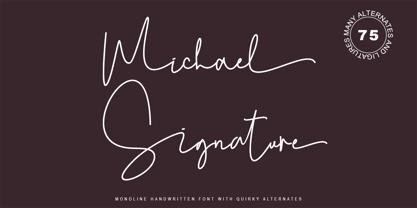 Michael Signature feels just as charming and elegant. This stunning Monoline script font is a stylish homage to classic handwriting. It features a varied baseline, smooth lines, gorgeous glyphs, and stunning alternatives. This font is PUA-coded which means you can access all the amazing glyphs and swashes with ease! It also features many special features including glyphs and alternate ligatures so that it displays natural and original handwriting.
 - Coiffeur by Komet & Flicker,
$15.00 NEW! Includes a set of 54 connecting word character glyphs! COIFFEUR is a bold vintage-style sans-serif display font that works great for logos, packaging, branding, menus, advertising, and posters. The lowercase letter set is a reduced version of the uppercase set for small caps use. In Illustrator, the custom connecting word set can easily be accessed in the "Type → Glyphs" panel and in Photoshop through "Type → Panels → Glyphs Panel".
 - Brushin by Mandarin,
$15.00 Brushin is an handwritten display font inspired by the straightforward rigidness of Grotesque sans-serif fonts. It features two stylistic sets for every glyphs in font so it gives you the choice to not repeat the same glyph design in big titles and/or small statements. The font was designed on paper with a brush and then scanned, vectorised through Photoshop and finally compiled in Glyphs as and OTF font file.
 - Noah by Fontfabric,
$39.00 [Noah PDF Type Specimen] [Download 4 Free Fonts] Noah is more than just another geometric sans. With sharp details and a distinctive arrangement, it further extends the limits of the x-height, providing unparalleled flexibility. The specific structure is paired with normal width proportions, moderate contrast and vertical stress – making Noah well suited for a wide range of typographic purposes. This type family consists of 72 fonts divided into four subfamilies with different x-heights – ranging from Noah Grotesque at the bottom, through Noah and Noah Text, and extending to the highest one – Noah Head. The entire set includes styles from Thin to Black, with matching true italics and supports Extended Latin and Cyrillic scripts in more than 130 languages. The inclusion of terminals with a humanistic flavor and typographic letter alternates, such as the binocular “g” or the geometric “a”, offers a blend of the best aspects of both geometric and grotesque typeface classics. Noah features 4 weights that are available completely FREE. Features: • Over 650 glyphs in 72 styles (Thin to Black) • Extended Latin and Cyrillic scripts for more than 130 languages; • 4 different x-heights; • Normal width proportions; • Moderate contrast and vertical stress; • Geometric characteristics and terminals with humanistic flavor.
 - Paradise Point by Swell Type,
$20.00 Surf's up! Take an unforgettable adventure to the sparkling shores of Paradise Point. Ride our 25 majestic weights, from tranquil tall & thin to thunderous wide & heavy. Expand your horizons with the versatile Variable font to select any spot between. One-of-a-kind activities: Drop in a thrilling Inline weight for stylistic flair. Overlay with the matching Heavy for striking color effects. Discover hidden wonders! Stylistic Alternates will take you to the scenic heights of uppercase in a friendly lowercase style. Or immerse your text in interlocking Discretionary Ligatures for an authentic Tiki Type island experience. Enchanting views: Two versions of each letter and number automatically rotate for a natural, hand-drawn appearance. The Light weights have round ends to simulate a single pen stroke, which matches the center of the Inline weights for a perfect pairing. Explore! If you venture into unknown territory, each weight of Paradise Point contains 775 glyphs for stress-free support of over 200 languages. An all-inclusive getaway: Each weight of Paradise Point includes the features above, and can set readable body text as well as create striking logos and headlines. Use it for restaurant menus, surf and skate brands, or any design project where you want to convey lively, friendly, stress-free fun.
 - Goudy Fancy by Three Steps Ahead,
$-Goudy Fancy was originally released in the 1970s and was not previously available in digital form until revived by Josh Korwin in 2004. This OpenType revival features alternate glyphs, additional new glyphs, as well as automatic ligature substitution. - Memory Square by Beware of the moose,
$16.99Mono Square is a monospaced font, each glyph has the same width. It is based on 25 rectangles so the are some glyphs that needs some effort to read.The font set contains most punctuation marks for normal use. - Lecory by vuuuds,
$16.00 Introducing Lecory Font! Lecory is modern serif font, every single letters have been carefully crafted. This font including beautiful alternate glyph. You can access the alternate glyph via Font Book (Mac user) or Windows Character Map (Windows user).
 - Montez Pro by Stiggy & Sands,
$39.00 Straight from the beauty product ads of the 1960's comes Montez Pro, full of sweeping strokes which lend to a feeling of joy and elegance throughout its letterforms. It is the ideal font for display uses that require a little drama, "joie de vivre" or Joy of Life. The stylings of the standard typeset Montez Pro lend itself to holiday and celebration designs most effectively. And while it is usually a typographic no-no to set a script in all capitals, Montez Pro contains a small caps feature that has specially redesigned capitals that allow an appealing all capitals setting. Montez Pro is loaded with features to give you plenty of customisation options: - Stylistic Alternates offer variations of the L, t, and w-smallcap characters - Small Caps offer tailored back and normalized short capitals - 44 Ligatures to make typesetting more interesting - A Full set of Inferiors and Superiors for Limitless Fractions - Proportional and Oldstyle numeral sets
 - Optimisti by Juliasys,
$26.00 Optimisti is Finnish for optimist – and it’s an optimistic, light-hearted feeling that this trio of handwriting fonts transfuses into all kinds messages and identities. Casual, playful and character-strong as they are, the three of them make a perfect team for headlines, slogans, teaser texts and brand naming. Besides the two original fonts – “Optimisti Smooth” and “Optimisti Sparkling” differing in outline structure and texture – “Optimisti Decor” now joined the game. Optimisti Decor is loaded with a multitude of artful elements that can convey a very festive atmosphere – or, on the contrary, ironically make fun of it. Its features are is especially striking when used in all-caps setting. Use the Optimists separately or together to make a humorous – or serious but always cordial impression in print, on the web, on packaging or even on your shopping bag … All Optimisti fonts have a Western European, a Central European and an Extended Cyrillic character set. They support approximately 100 languages.
 - Sickle by Eclectotype,
$20.00 The Wild West meets Russia and India in this heavy duty display face. Although it's uppercase only, most of the characters vary between the uppercase and lowercase alphabets, so it's easy to give your text a hand-made feel by mixing up your cases. OpenType savvy applications can really exploit the extra features of this font. Engage contextual alternates, and G, C, L and alternate form of E will change when placed before a letter with a crossbar to create some cool effects (see the CK and LE combinations in the poster). There are standard ligatures for ff and FF combinations, and discretionary ligatures for 'and', 'the', 'No', 'Mc' and 'Co'. Engage stylistic alternates for a reversed 3 version of E, and the obligatory backwards R for that faux-Russian effect. Also included in the font is a host of ornaments. This font is perfect for wanted posters, heavy metal band logos, Communist propaganda leaflets and no doubt a load of other things too.
 - Publica Sans by FaceType,
$- Publica Sans is a clean geometric typeface, equipped with a variety of OpenType features to give you all you need for great typography: Alternates, arrows, rare currency symbols, case sensitive forms, various sets of figures and discretionary ligatures. Publica Sans has two sisters: Publica Play and Publica Slab Take a close look at our gallery (especially ‘OpenType Features 1–6’) to discover the versatility of Publica Sans. Alternates Give your typography a certain spin with the variety of alternate letters provided. Currency You need to set prices in exotic countries? No problem: Publica Sans gives you loads of rare currency symbols. Case Sensitive Forms Sometimes you write in all caps and there are some symbols (e.g. brackets) that need some extra treatment to make it look perfect – that’s what case sensitive forms are for. Figures Publica Sans provides 6 sets of figures, like lining, tabular, oldstyle, numerators ... Discretionary Ligatures Ligatures can make your logo or headline look spicy. So there are plenty of them.
 - Intelo by Kastelov,
$25.00 Intelo was created with the single idea of redefining what makes a functional grotesque typeface nowadays. Its large x-height and letterforms with subtle elliptical finish create a distinctive look that can help brands cater to an increasingly design savvy audience. To top it off, Intelo comes in two versions - an attention-grabbing original cut and an additional version with flat endings for a more streamlined effect. The family weights range from thin to extrabold with matching italics making it a versatile choice and perfectly suited for digital applications including web and interaction design as well as printed media such as editorial and corporate materials. When it comes to Opentype features, Intelo is loaded with stylistic alternates, tabular figures, fractions, ligatures, and more. In addition, the font family has an extended language support featuring Western, Eastern and Central European languages. To sum it up, the friendly and inviting letterforms of Intelo came as a solution to the need for more human fonts in our technology-oriented environment.
 - Biargabara Script by IM Studio,
$13.00 Biargabara is a Script font that has various basic lines, fine lines, classic, elegant, modern touches. Can be used for various purposes. if you want to use it for your work, this font can be used easily and simply because there are many features in it to load a lower complete set of letters and include initial letters and terminals, alternatives, binding and support for many languages. Files include: * Biargabara OTF * Biargabara TTF To activate the alternative OpenType Stylistic, you need a program that supports OpenType features such as Adobe Illustrator CS, Adobe Indesign & CorelDraw X6-X7, Microsoft Word 2010 or newer versions And this font has provided PUA Unicode (code-specific fonts). There are additional ways to access alternatives / swash, using Character Map (Windows), Nexus Fonts (Windows), Font Books (Mac) or software programs like PopChar (for Windows and Mac). If you need help or advice, please contact me via email "ikhsanm240@gmail.com" Thank you!
 - Kapture by Stiggy & Sands,
$39.00 There are script typefaces that embody sensuality, and our Kapture typeface is now amongst that collection. From its thin weighting to its effortlessly flowing strokes, and a visual rhythm between quick and slow movements, Kapture truly captures a romance in letterforms. Stylistic Alternates offer a change-up set of Capitals, while the Contextual Alternates feature plays with intro and final lowercase letterforms to visually mix things up a bit. Elegant, fashionable, sophisticated, sensual, and celebratory all at once. Kapture is a typestyle that finds itself at home in any design where a refined yet modern script is required. Kapture is loaded with features to give you plenty of customization options: - Stylistic Alternates for a collection of alternate Capitals - Contextual Alternates for alternate starting and ending lowercase letters - 110 Ligatures to make typesetting more dynamic - Ornaments to place before and after words or phrases for even more flair - A Full set of Inferiors and Superiors for Limitless Fractions - Proportional and Oldstyle numeral sets
 - Publica Slab by FaceType,
$- ‘Publica Slab’ is the serifed sister of Publica Sans and Publica Play – packed with subtle open type features, tabular options, rare currencies signs and symbols and arrows, ‘Publica Slab’ provides everything you need for big design tasks like signage, corporate design and magazine design. Take a close look at our gallery (especially ‘OpenType Features 1–6’) to discover the versatility of Publica Slab. Alternates Give your typography a certain spin with the variety of alternate letters provided. Currency You need to set prices in exotic countries? No problem: Publica Slab gives you loads of rare currency symbols. Case Sensitive Forms Sometimes you write in all caps and there are some symbols (e.g. brackets) that need some extra treatment to make it look perfect – that’s what case sensitive forms are for. Figures Publica Slab provides 6 sets of figures, like lining, tabular, oldstyle, numerators ... Discretionary Ligatures Ligatures can make your logo or headline look spicy. So there are plenty of them.
 - Cobbler by Juri Zaech,
$30.00 Cobbler is a friendly type family in six weights. With proportions of geometric type, Cobbler is a contemporary sans on the inside and an ultra soft display typeface on the outside. Not a single sharp corner and only a hand full of straights make Cobbler extra warm and huggable. In fact, the few straight horizontal lines give the typeface the stability of a workhorse while keeping the gooey playfulness that characterizes Cobbler so much. And to make all this even more fun, there is a pile OpenType features built in. For example loads of Discretionary Ligatures that make capital letters interlock left and right – just fun! Or automatic fractions, case sensitive punctuation and contextual alternates – for serious typesetting. Cobbler works great for branding, packaging, editorial or any display application – and it comes with an expansive character set that covers Underware’s Latin Plus and with it over 200 languages. Furthermore Cobbler is manually kerned and auto-hinted for crisp display on screen also in small sizes.
 - Moving Headlines JNL by Jeff Levine,
$29.00 For decades, visitors to Times Square could look up and read the up-to-the-minute news flashes that moved across a giant electric sign on the face of the old New York Times Building (now known simply as One Times Square). According to Wikipedia's article on OneTimes Square: "On November 6, 1928, an electronic news ticker known as the Motograph News Bulletin (colloquially known as the "zipper") was introduced near the base of the building. The zipper originally consisted of 14,800 light bulbs and a chain conveyor system; individual letter elements (a form of movable type) were loaded into frames to spell out news headlines. As the frames moved along the conveyor, the letters themselves triggered electrical contacts which lit the external bulbs (the zipper has since been upgraded to use modern LED technology)." An example of this was seen in the 1933 Warner Bothers film "Picture Snatcher" starring James Cagney. This example inspired Moving Headlines JNL.
 - Marjac by Jeremia Adatte,
$29.00 Marjac is an angular and upright script typeface that is directly inspired by handwriting. It is created after "Jacno", a typeface designed in 1948 by French type and graphic designer Marcel Jacno. This unique bold design later inspired other typeface designers to create brush script typefaces like Roger Excoffon’s "Choc". You will also notice it has a "unicase" feel, sharing some lowercase letters in the capital letters. It is recommended to use it for any packaging designs related to quality hand-made products, advertising, web, film title sequence design, posters, magazines and book jackets. Marjac is loaded with an extended character set, supporting Central, Western and Eastern European languages. It has plenty of cool OpenType features like a fun automatic brush underline feature or newly-designed secret alternate letters (like capital A). Kerning and spacing (+ than 25,000 kerning pairs) have been meticulously made-to-measure to this specific brush typeface. Beautiful hand-made arrows and other symbols were created to accompany letters.
 - Bandoengsche by Gumpita Rahayu,
$14.00 Bandung is home to numerous examples of Dutch colonial architecture, most notably the tropical Art Deco architectural style. This typeface was adapted from the finest Art Deco landmarks and signage in Bandung, Indonesia and strongly added native elements of traditional Art Deco typefaces style. The main character is an example of a harmonious mixture between West and East architectural styles, repackaged into the Art Deco type design. With two different styles, it comes as regular and Deco styles, the regular style is constructed with all caps setting, with some different characters between uppercase and lowercase. The Deco style uses more stripes in the right shapes, it was naturally inspired with the most common art deco typefaces. The additional Opentype Features loaded in this typeface; some stylistic alternates, accessible catchwords in the discretionary ligatures, and the art deco ornaments, This typeface is highly usable with large scaling size and will fit with posters, movie titles, and signage designs.
 - Hyper Turfu by Bisou,
$10.00 Made in La Chaux-de-Fonds (Switzerland), HyperTurfu was born during the shooting of “The Return of Hyperturfu Xpress 2”. A GoPro on a lego electric train, meters and meters of rails, an empty industrial space, loads of puppets, paper, cardboard, pizza boxes, lights, hot glue and a bunch of friends preparing a one shot scene for a month. The title of the movie was made out of lego pieces, painted with golden spray and hanged over the rails. It was the first inspiration for this awsome superbold font. HyperTurfu is thought from ground up to give a strong impact. It’s gothic retro science fiction 80’s style makes it best suitable for metal music albums or posters. As the “Banco” font it works perfectly with short texts for advertisement, bar, cofee shops concert places or even fancy hairdresser. Just hang it over a pet shop and see what cool animals will come in.
 - AM Godina by Errea Type,
$10.00 Godina was born from the interest in learning and deepening in the basic forms and how they are combined to compose a typographic system. The name, a tribute to the town of La Almunia de Doña Godina, the town for which the author of the typography connects. La Almunia is a crossroads in the typography designer's travels, a link between his family and friends. It combines the scent of a straight and modular typeface with sinuous and curved shapes, which make it a fun and playful typeface.
 - Cowboy Junk by PizzaDude.dk,
$15.00 Cowboy Junk is my loose handmade impression of what would happen if the wild west crashed into grafitti! The letters are loose and jumpy and the terminals are kind of exaggerated to give that firce impression of handcraft! So, better get up early and leave this town, 'cos there’s only room for one sheriff in this here town, and that is Cowboy Junk! Comes with contextual alternates, which means that the font will automatically cycle through the 5 different versions AS YOU TYPE! Yieeehaaar!
 - Berling Nova by Linotype,
$29.99Swedish designer Karl-Erik Forsberg created the original Berling typeface in 1951. Owned by Verbum in Sweden, Berling was completely redesigned and released in 2004, under the name Berling Nova. Forsberg (1914–1995) is considered one of Sweden’s most masterful graphic designers, and his original Berling has come to be seen as possibly the most definitive Swedish typeface. But a redesign was necessary in order to secure that the spirit of Berling would survive in the digital age. Linotype, the distributor of the original Berling™ , provided its collection of source materials to the designers working on Berling Nova. Additionally, Akira Kobayashi — Linotype’s Type Director — lent them his advice as their project advanced. Berling Nova is available in two optical sizes: Text and Display. The original Berling was a classic Renaissance roman face, with fine terminals and sharp, beak-like serifs. If one looks at Berling’s old lead type proofs in the smaller type sizes, it is clear that these had a fuller and more readable form than in later digital versions. So, in order to help return the new Berling Nova to its original splendor, both the base forms and the serifs were softened and inflated. In the text version, the x-height has been increased a bit (by 4%), the diagonal axis is less apparent, and special glyph ranges, such as those for small caps and old style figures, have been included in the font’s character sets. The display version still has the unmistakable “Berling” character that displays Forsberg’s mastery. Berling Nova is well suited for longer text passages in books, publications, and magazines. This typeface fulfils all the demands that one can make on a legible newspaper typeface. Access to both text and display versions are important to the demanding typographer. This is the first time since the typeface was digitalized that it is possible to use it in order to create truly beautiful and functional typography in all type sizes. - Hello My Love Pro by Debi Sementelli Type Foundry,
$39.00 “Hello My Love” is a font love story. Inspired by my own long and happy marriage of 35 years, it was created to celebrate love! A classic hand-lettered script with a modern and fresh feel, it fits beautifully with current designs and yet is sure to stand the test of time. Made with invitation designers in mind, the Hello My Love Pro script font includes a total of 1985 glyphs plus a BONUS FONT, Hello My Love Ornaments! It has 91 hand illustrations including frames, florals and design elements. As a result, you will be able to create a variety of designs to highlight your special project. It’s especially well-suited for invitations for branding weddings and other special occasions! And it supports 129 languages! The font is loaded with features: Stylistic and Contextual Alternates, Swash Caps, Standard and Discretionary Ligatures, Beginning Swashes for lower case letters, Cross-less t and f that can be combined with a flourished letter to avoid clashing plus 3 ampersands, small word art "and" & "No.", Roman Numerals, Ordinals and Fractions. This font was created to make designing easy. Need to convert upper case letters into Roman numerals throughout a guest list? Just turn on contextual alternates in Open Type capable programs and presto, the caps become Roman! Want a variety of letter choices? There are 215 stylistic alternate upper cases and 259 stylistic alternate lower cases as well as 69 ligatures to give you plenty of options. You can choose from swashes in 4 different styles and 3 different lengths resulting in unique beginning lower case letters. Works for Cutting Machines! No special software is required to use Hello My Love. All of my fonts have been specially coded for PUA (Private Use Area) so you can access all of the swashes and alternates using Character Map (PC) or Character Viewer (Mac) or with any number of apps including PopChar. If you would like to purchase PopChar at a special discount email me and I will send you the link. For Microsoft Word users, you can easily access the Stylistic and Contextual Alternates and the Roman Numerals through the Typography feature. (Microsoft Word 2010 and later) For more details about how to use my fonts, check out my video tutorials on my YouTube channel: https://www.youtube.com/user/Letteringartstudio/videos
 - Tipófila - Personal use only


