10,000 search results
(0.054 seconds)
- Dot Soon NF by Nick's Fonts,
$10.00Based on Alan Dempsey's design for Letraset in the 70s Pinball, these dots will add dash to any headline. All versions of this font include the Unicode 1250 Central European character set in addition to the standard Unicode 1252 Latin set. - Soon by Fathom Collection,
$8.00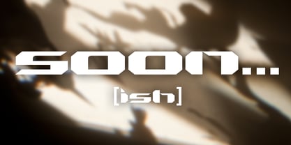
- Dot by T-26,
$19.00 - Snoodle Toons NF by Nick's Fonts,
$10.00Lettering on a menu from a Pennsylvania hotel, circa 1930, provided the inspiration for this happy-go-lucky take on the alphabet. Lowercase letters are variants of the uppercase and kerning has been applied to every possible letter combination, so feel free to double-clutch the shift key to create a truly handlettered feel with this font. Both versions of this font include the complete Latin 1252 and CE 1250 character sets, with localization for Romanian and Moldovan. - Harvest Moon NF by Nick's Fonts,
$10.00The letterforms for this unusual display face were inspired by a 1930s ad for Tanguy Crepes, by an uncredited artist. Due to the ornate nature for this font, it has a limited character set, but does include all letters, numbers and punctuation for the Unicode 1252 Latin and 1250 Central European character sets. - Thai Foon NF by Nick's Fonts,
$10.00One in the series of fonts celebrating the Halcyon Days of Handlettering. Thai Foon, a fun-loving, freewheeling script, is based on a font presented in the book "Lettering of Today" (today being 1933), by W. Ben and Ed C. Hunt. - Dot To Dot by A New Machine,
$9.00 This font is for parents and educators that want to easily be able to print out the alphabet in order to have their child or student then trace them. This eliminates the need for creating the dotted lines by hand and lets the user type out exactly what letters they need instead of relying on pre-made charts. The font is upper and lowercase letters and numbers only - no punctuation. Comes in Regular and Guides (get both for the same price as one) which draws guidelines with the letters. Best when used at a large point size.
 - Bon Mot NF by Nick's Fonts,
$10.00What’s the good word? This elegant, stylish typeface, based on an early twentieth-century Barnhart Brothers & Spindler release, named simply "Engravers Upright Script". Based on French ronde letterforms, this version is bolder—which makes it suitable for text settings, even at smaller sizes—and has more pronounced stroke contrast—which makes it suitable for headlines. Versatile, handsome and charming, this typeface is an invaluable addition to any type repertoire. Both versions of the font contain the complete Unicode 1252 (Latin) and Unicode 1250 (Central European) character sets, with localization for Romanian and Moldovan. - Hot LBaltimore NF by Nick's Fonts,
$10.00Patterned after cheap neon signage, this face has class, all of it low. Uppercase only, the lowercase positions are filled with an assortment of cheesy neon graphics, intended to be used at twice the point size of the caps. Named after a 70s TV show about a hotel with a defective neon sign. Both versions of this font contain the Unicode 1252 Latin and Unicode 1250 Central European character sets, with localization for Romanian and Moldovan. - Hemilk Soons by Maulana Creative,
$15.00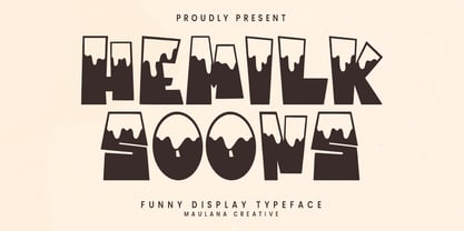 Hemilk Soons funny display typeface. Heavy stroke, fun character with a bit of ligatures. To give you an extra creative work. Hemilk Soons funny display typeface support multilingual more than 100+ language. This font is good for logo design, Social media, Movie Titles, Books Titles, a short text even a long text letter and good for your secondary text font with script or serif. Make a stunning work with Hemilk Soons funny display typeface. Cheers, Maulana Creative
 - DT Stoner Toon by Dragon Tongue Foundry,
$10.00 Inspired by early cool cartoon fonts, early rock and hippie posters, I created this casually organic 'DT Stoner Toon' font. Please use with contextual ligatures turned on when possible. These letters like to adapt to their neighbours. 60's 60s artdeco artnouveau cartoon cartoonesque Cartoon Font cartoonish cartoony casual contextual cool cool font cool typeface dots fun fun font gigposter hippie hippy joined party poster poster font poster typeface rock poster spots spotted Stoned Stoner stones theater poster toon wet with dots written
 - Sion - 100% free

- MOON - Unknown license

- Somn by Mix Fonts,
$13.00 Mix Somn is the perfect font for adding charm to your children’s products. Its thin, tall, and dainty style is both stylish and legible, making it perfect for labeling baby clothes, toys, and other items. The digitally handwritten sans serif font was created with an iPad Pro and Apple Pencil, using the Poppy Brush from my Procreate Brush Bundle. Its delicate strokes and sweet, soft appearance make it the perfect choice for any project you might find in your little bundle of joy’s nursery. Mix Somn includes the following characters: ABCDEFGHIJKLMNOPQRSTUVWXYZ abcdefghijklmnopqrstuvwxyz 0123456789 !@$#%^&*() `~♥M• ÷+=[]:;’”,.\|/?{}<>“”‘’-–—_…©®™«»°¡¿₱¢€£¥ ÁÀÂÄÃÅĂĄÆĆČÇÐÉÈÊËĘÍÌÎÏŁŃÑÓÒÔÖÕØŐŒŚŠȘȚÚÙÛÜŰÝŸŹŽŻÞ áàâäãåăąæćčçðéèêëęíìîïłńñóòôöõøőœśšșțúùûüűýÿźžżþ
 - Spoon by Dharma Type,
$19.99 Spoon is a fresh and contemporary sans-serif that can be used in wide range of project. Its skeleton of letterform is geometrically-based and minimal but the body was designed with a touch of humanistic outlines as though they were handwritten. This not only make the font clean, legible and functional, but also make it possible to give natural, friendly and soft impressions. Spoon comes in seven weights with matching italics and includes diacritics for most European in each weight.
 - Koons by SAMUEL DESIGN,
$19.00 The name of this font is KOONS, which is inspired by an artist we respect very much. The font style is optimistic and positive, with pop art features. The lines of the font are highly geometric, preserving the original combination of strokes. In terms of details, on the basis of sans serif fonts, it is equipped with detailed and fun serif details. All treatments are done to ensure that this typeface remains highly recognizable, but also has attractive details and taste.
 - Toons by Bohloul Arabic Type Design,
$30.00 A very cheerful font. This font is very thick and suitable for use in children's games or animations. With this font, write very attractive, happy and comic titles and use it easily in graphic works. The design of this font looks sloppy and messy, but when you write your own text or title, while each letter is messed up, the text is completely connected.
 - Dot Font - Unknown license

- Fortuna Dot - Unknown license

- Display Dots - 100% free

- DS Dots - Unknown license

- 3x3 dots - 100% free

- 3x3 dots - 100% free

- Poison Dots - Unknown license

- Patterns & Dots - Unknown license

- 5x5 Dots - 100% free

- Zekton Dots - Unknown license

- Matrix Dot by Fonthead Design,
$9.00 - Kontext Dot by Elster Fonts,
$20.00 Imagine a font that is easier to read the smaller it is – or the further away the text is. There are already many rasterised fonts, I wanted to take it to the extreme and use as few dots as possible. The result is a typeface that lives up to its name. Each individual circle makes no sense on its own; individual letters are only recognisable in the context of all associated circles, individual letters are most likely to be recognised in the context of whole words. Attached to a building wall, text would be readable from a great distance and become increasingly difficult to decipher the closer you get to the building. Placed on the ground or on a large flat roof, text would only be readable from a higher building, an aeroplane or - depending on the size - in Google Earth. Kontext has old style figures, superscript numerals, case-sensitive questiondown and exclamdown and an alternative ampersand, 390 glyphs at all. Use the same value for font size and line spacing to keep the lines in the grid, or change the line spacing in 10% steps. Change the spacing in 100-unit increments to keep the grid. The numbers in the family- and style-names refer to the (ca.) grey value of the respective background and the font itself. Kontext Dot 00-33 has e.g. a white background (0%) and 33% grey value. Kontext Dot 66-33 has a 66% background and 33% grey value. »Positive« styles (first number smaller than the second number) have kerning, »negative« styles (first number bigger than the second number) can have none.
 - Dot Script by Cruz Fonts,
$32.00 A display typeface built with dots for use at large sizes. It is smooth and elegant. Great for titles, headlines, advertising, music, toy products and cosmetics with a youthful flavor.
 - Hebrew Dot by Samtype,
$34.00 Beautiful font to use in Book covers and Posters.
 - Barchowsky Dot by Swansbury,
$17.00Swansbury, Inc. provides handwriting instruction to all ages, accompanied by two exemplar fonts, Barchowsky Fluent Hand.otf and Barchowsky Dot.otf. The basis for the design of the characters is the italic of the Renaissance. With the advantage of contextual alternates, Barchowsky Fluent Hand automatically joins lowercase letters so it can be used in any venue where a clean and elegant appearance of handwriting is desired. The fonts allow maximum instructional flexibility. Aside from their use in lesson plans, educators can customize pages for specific student interests, studies and needs. Included are all math symbols that one typically encounters in school curricula. Nan Jay Barchowsky, designer of this font, believes that children should hone their handwriting skills as they learn all subjects, reading, math, history and foreign languages. Both fonts support all Western European languages and Turkish. Barchowsky Dot is for young children or others who need remediation. The letterforms are identical to those in Barchowsky Fluent Hand. Used at a large point size open dots appear within the lines that form the characters indicating where one should start each stroke in a letter or number. Once formations are learned Barchowsky Fluent Hand can be used with the contextual alternates turned off until students are ready to write in the joined-up manner of a true cursive. Specifications: The technology for fonts that automatically join letters, or allow them to be unjoined is relatively new. At present, both fonts work on Windows XP with Service Pack 1 or later (or Vista), using AbiWord, a free word processor (go to abisource.com). They also work well with InDesign 2. Currently there is an unknown factor in later versions of InDesign for Windows that disallows joining. Macs completely support the fonts using InDesign 2 and later, PhotoshopCS and IllustratorCS. If you do not have these applications, there is an inexpensive word processor for Macs. - Linotype Dot by Linotype,
$29.99Linotype Dot is part of the Take Type Library, featuring the winners of Linotype’s International Digital Type Design Contest. Designed by Lucy Davies, the figures are composed of a combination of white and black dots and the contrast makes the font look like points of light and darkness. The general impression of Dot lies somewhere between ornamental and technical. It combines well with sans serif and calligraphy fonts. - HGBGalaxo Dot by HGB fonts,
$23.00 Galaxo Dot is a sister to Galaxo Line. HGB Galaxo is a tribute to Othmar Motter (1927–2010), the Vorarlberg graphic artist and typeface designer, who designed very individual and perfectly crafted typefaces in the 1970's and later. (Motter Ombra, Motter Tectura ...) From a Motter sketch of 5 letters for a logogram, I derived a simplified letterform and developed all the necessary characters. Working on these glyphs and delving deeper into Motter's letterforms, the respect for the accuracy with which he drew his letters (in ink) grew more and more. The spiral resembles the shape of a galaxy, hence the name Galaxo. The font is suitable for retro, poster and logo design.
 - Arco Dot by Okaycat,
$29.95 The Arco Dot font features an exciting texture of dots in matching complimentary styles, making cool designs easy! Arco Dot features extended characters, and contains West European diacritics & ligatures. Highly suitable for international environments & publications. Arco Dot pairs well with Arco Web and Arco Crayon from Okaycat fonts.
 - Dot Grid by Essqué Productions,
$35.00 A font that can be used to simulate old dot-matrix style printing, older receipts, or even as marquee light lettering. Includes extended Latin diacritics, Roman Numerals, and Greek, Hebrew, and Cyrillic Alphabets.
 - Laser Dots by Etewut,
$17.00 Laser dots display font is based on sans serif. Use it in your design be it cards, outside commercial, web or product adds and laser cuts. It has foreign characters so you may use your mother language.
 - More Dots by Beware of the moose,
$9.99 It is not really a font, they are more icons. Based on a grid of seven circles al 127 possibilities – filled an unfilled. Use it decorative or just for fun.
 - Dotted Weekend by GarageFonts,
$39.00 - Oo Boodlio Doo NF by Nick's Fonts,
$10.00Bongo drums at the ready! Freeman Craw's archetypal beatnik typeface Ad Lib provided the inspiration for this indubitably eccentric excursion in coolsville typography. Both versions of the font include complete Latin 1252, Central European 1250 and Turkish 1524 character sets, with localization for Moldovan, Romanian and Turkish.


Page 1 of 250Next page