10,000 search results
(0.048 seconds)
- Daiquiri by Wiescher Design,
$39.50 Daiquiri is a revival of a handlettered font in two weights, from an ad for Puerto Rico Rum dating back to the forties or fifties. I found the ad on a French antique market on my last visit for Mardi Gras in Nice. The ad read "Breeze through the heat, be a Daiquiri fan". That's why they had this "fan" in the illustration! Did they want you to rotate like a fan when you had enough Daiquiris? Or did they just do it for that little "Jeu des mots"? Anyway I found the handlettering very pretty, so I took those few letters and made a whole font out of them. I think Daiquiri has that touch that brings those happy and uncomplicated times back when advertising was still fun. I started something like 20 years later in advertising and things had gotten more stringent. We already had to satisfy those marketing guys with their scholarly attitude. They have taken all the fun out of the job, for the creators as well as for the consumers. I would like to see more uncomplicated ads like this again, yours Gert Wiescher
 - Carla Pro by RMU,
$35.00 Carla Pro is a lively, legible, and partly joining broad-nib script font. I named it after a favourite colleague, in my hot-metal time, who set on the Linotype next to mine.
 - TXT Menu Item by Illustration Ink,
$3.00Add some personality to scrapbooks, greeting cards, invitations, announcements, signs, menus, restaurant themes, and more. The thick, brush-stroked lines of Menu Item lend unique character to the letters of this cool font. - Oyange by Stringlabs Creative Studio,
$29.00 Oyange results out of a stunning pairing of a brush pen that makes it look incredibly endearing and authentic. Use this gorgeous and unique script font to bring any DIY project to life!
 - Rosarian by Laura Worthington,
$29.00 Rosarian celebrates the grace of the pointed brush, flowing expressively from thick, rounded downward strokes to thin, delicate hairlines to create graceful and unique letterforms. Contextual alternates help Rosarian look convincingly hand-lettered, while stylistic alternates allow you to customize Rosarian into a less formal, unconnected script. See what’s included! http://bit.ly/2bIG4Pc *NOTE* Basic versions DO NOT include swashes, alternates or ornaments These fonts have been specially coded for access of all the swashes, alternates and ornaments without the need for professional design software! Info and instructions here: http://lauraworthingtontype.com/faqs/
 - Junglegym by Atlantic Fonts,
$26.00 Junglegym provides a playful structure for an energetic project. Climb on and see what you can do! Junglegym family includes regular and bold and ensures extra movement with discretionary ligatures, including double letters and a handful of others to keep play lively.
 - Mango Crush by Pen Culture,
$19.00 Proudly present "Mango Crush - A Retro Serif Font" Mango Crush is a retro serif font with smooth curve. You can fell the groovy and sweet of this font in every shape of letter, this font also has a beautiful ligature and alternate , so you can create your design more stunning. Mango Crush perfect for any kind design project like branding, logo design, invitation, cricut project, embroidery also you can use it in canva / procreate. I really hope you enjoy it – please do let me know what you think, comments & likes are always hugely welcomed and appreciated. More importantly, please don’t hesitate to drop me a message if you have any issues or queries. Thank you
 - Loose Pen by Pedro Teixeira,
$14.00 Do you suffer from OCD? Then this font is perfect for you. Or maybe not. Sometimes I like confusion, chaos, imperfect things, because I can often see beauty in them. In this font I drew the letters with a pen and or with just the index finger on a tablet, completely free, without improvement. The chaos ensuing. As if I was rushing notes just for me. Then, without changing the design any further, but to make the chaos minimally legible, I decided - look at this madness! - to organize the chaos. In other words, I aligned metrics and kerning, and the end result was this. I hope you like it and that it is very useful for you. Cheers.
 - Sevastian by Adam Fathony,
$12.00 S E V A S T I A N - Seven Layered Fonts Sevastian Typefaces are coming for help the artist who want to create 3D lettering without special effects. Also you can use with different color, different style, and different combinations using 7 layer I've made. Font Naming are important for you to generate where at the top and where at bottom. Sevastian made it so easy because there is a number before the name like Sevastian - 01 inner until Sevastian - 07 3D Shadow. It means, the lowest number are must on top of them. As you can see on the display image I've been made, I use random combinations. So you can experiment what do you like most.
 - Halvan by driemeyerdesign,
$35.00 HALVAN –a striking type with half-serifs The Halvan font family comes in 5 styles from Roman to Bold, Italic and a Small Caps Version. Each version includes old style figures and lining figures. It is a versatile type and can be used in a wide range of circumstances.
 - MBF Reute by Moonbandit,
$42.00 Introducing MBF Reute, a cutting-edge font that redefines modern typography. With its squared, minimalist design, this typeface strikes a perfect balance between rounded warmth and sharp precision. Clean lines and a contemporary aesthetic make MBF Reute the go-to choice for a sleek and versatile visual language.
 - Colorado by Juliasys,
$- Nature is fond of stripes. Animals have them, plants have them and the rainbow has them. Besides being beautiful, stripes in nature have various origins and functions. But only Homo sapiens gave them symbolic meaning. In the American flag, the 13 stripes symbolize the 13 colonies that declared independence from Britain. In the French “Tricolour” flag, they represent Paris and the king of France. And in Russia’s “Georgiyevskaya lenta,” they symbolize the death and resurrection of St. George, the dragon-slayer. The font family COLORADO , named after the beautifully striped Colorado potato beetle, can be used to construct all kinds of symbolic or just beautiful messages. And thankfully, you need no OpenType diploma to do this. To get your texts multi-striped and multicolored, follow this simple procedure: Write the message with one of the COLORADO fonts and apply a color. Then copy and paste in place, and apply a second font and color. Repeat this again if wanted – and the masterpiece is done. COLORADO ’s language support covers about 100 languages. It has a Western European, a Central European and an Extended Cyrillic character set.
 - Fighting Words by Comicraft,
$19.00 Hulk mad. Hulk so mad, Hulk broke font. Puny Comicraft no like mashed up font! Hulk no care. Hulk like to talk like Hulk has mouth full of marbles. Hulk smash! Get FightingWords and Hulk promise not punch your lights out.
 - If This Be Doomsday by Comicraft,
$19.00 THE END IS NIGH! Judgment Day has come and this planet has been CONDEMNED! Do not conspire to hide what remains of your paltry world from my eyes! Know you not that NONE may thwart my will? Of what import are brief, nameless lives -- to DOOMSDAY?? Death is Certain! Apocalypse is UNAVOIDABLE. At last, my cosmic hunger will be sated, if only briefly! This planet shall SUSTAIN me until it has been drained of all elemental life! SO SPEAKS DOOMSDAY! But do not fret. Even if the Domesday Book has been closed on your planet... your utter destruction is being made available in Font form, I call it IF THIS BE DOOMSDAY, and I will deliver it to you via comicbookfonts.com in Regular, (Roach) Chew and Outline weights. Never let it be said that DOOMSDAY is without mercy. Features: Three weights (Regular, Chew & Outline) with small cap characters and Western & Central European international characters.
 - Knock Type by sugargliderz,
$20.00 KnockType is based on the concept of braille notation in Japanese. It does not support braille notation in other languages. KnockType is not necessarily aimed at facilitating “braille transcription”. It is designed so that someone who understands the grammar of “braille transcription” can instantly transliterate into braille text that was previously transcribed to kana characters, etc. In addition, it allows ink characters to be converted to braille using OpenType features. It is recommended for use in applications that are compatible with OpenType features. If they are not compatible, KnockType is “simply a kana font”. To be a little more specific, it is assumed that KnockType will be used in Adobe’s InDesign and Illustrator applications. If you don't have them, you will not get satisfactory results. Four types of font are available. There are “hasBox&Line”, “hasnotBox&Line”, and the reversed font of each. When displayed on a convex surface, the assumption is that they will be used mainly for printing applications. When displayed on a concave surface, the assumption is that they will be used mainly for writing on braille boards, etc. By printing, you can get a rough idea of the dot positions. It is more effective to match them to the grid size of the braille board.
 - Quayside by Eclectotype,
$40.00 Quayside is a deliciously thick and bulbous baseball script, with a wealth of OpenType features. Features include: Contextual alternates - I would suggest having these on by default; they make letters connect more smoothly (uppercase letters like M and H, which are normally non-connecting for all-caps purposes, connect to lowercase letters. The swash variant of J, and all o and b characters connect to any e character at a lower junction for a smoother join). Contextual alternates also make sure special end-forms of lowercase letters are used at the ends of words. Ligatures - A nice collection of useful ligatures which make the text flow smoother. Swash - Gives you more exuberant capitals. Not recommended for all-caps usage! The swash function also gives a variation of the ampersand and turns # into a nice numero symbol. Oldstyle Figures - lining figures are default but with the flick of a switch in OpenType savvy applications, you get expressive oldstyle figures. Quayside is a versatile typeface. Depending on the mood you're after, it can easily be retro or modern, fun or (fairly) serious. I'm often pleasantly surprised by the wide variety of uses my fonts get put to, and I can't wait to see what you do with this one!
 - Linotype Maral Armenian by Linotype,
$104.99Linotype Maral is based on an historic Armenian typeface which was originally designed by Henrik Mnatsakanyan. Hrant Papazian has revieved and digitized this four weight type family . Armenian keyboard drivers for Mac OS 9 (and under) as well as for Windows are included when any of the Linotype Maral fonts are purchased. These drivers must be installed before the fonts may be used properly. Linotype Maral will not function properly under Mac OS X, unless you are using the OpenType-format version, which does not work under OS 9! The Linotype Maral family includes four fonts: Linotype Maral Regular, Linotype Maral Oblique, Linotype Maral Bold, Linotype Maral Bold Oblique. The Armenian language is written with its own script. This script and its language are written and spoken in the Republic of Armenia and by the Armenian Diaspora. The Armenian alphabet first appeared around 406 A.D. Its creation is attributed to St. Miesrop Mashtots (died 441), but it is most likely an independent modification and extension of the Greek alphabet created by Gregorian denomination.* * (Source: The book Schrift- und Buchkunst, by Albert Kapr [Leipzig: 1982], references Quadra della storia letteraria della Armenia by Ph. Lukias Somal for this information) - Mashq by Arabetics,
$29.00 The Mashq script is the oldest documented Arabic Jazm calligraphy style. It was invented by the early Muslims in the Arabian cities of Mecca and Medina, exclusively for writing the Quran and other Islamic religious texts. The Mashq style employed complex ligature and multi-level baseline rules, and therefore it went through a continuous simplification process. Around the time period Mashq was developed, the early Arab Muslims experimented with another short-lived Mashq-like style with heavily slanted vertical stems, which closely resembled the common Ḥijazi style. This style is commonly referred to as the Ma’il (slanted) style. Eventually, the early complex Mashq style was replaced as the main Islamic Arabic script, by a more simplified Mashq-derived calligraphy style that was developed in the city of Kufa, modern day Iraq, which was commonly referred to as Kufi. The Kufic style became the official Arabic script style for centuries before it was replaced by the more developed Naskh, the modern Arabic script style used today. The Mashq font family by Arabetics includes three styles of Mashq. The first is Mashq regular, which closely follows the script style of Musḥaf ‘Uthman (currently displayed in the Topkapi Museum in Turkey) with only the initial and final Haa’ baselines shifting. The second is Mashq Maail, which emphasizes the features of the Ma’il style shared with Mashq. The third is Mashq Kufi, which closely follows the script style in an adequate sample from the Quran manuscripts of the Bergstraesser Archive. All three fonts include two styles, with and without Tashkeel (dots). The Mashq and Mashq Kufi fonts include two more styles, with and without Harakat (soft vowels), and Hamza. Only three soft vowels are implemented along with their Tanween (double) forms. The Sukoon vowel is the default shape before inserting a soft vowel. Hamza was treated as a vowel in the Mashq and early Kufi manuscripts. Kashida is a zero width character. In the Mashq fonts, inserting one Kashida before the final ‘Ayn glyph group will trigger alternative shapes. In the Mashq Kufi fonts, inserting one Kashida (or two) before the final Yaa’, ‘Ayn, and Ḥaa’ glyph groups will trigger alternative shapes. The Mashq font family by Arabetics was designed to be as compatible as possible with the Arabic keyboard and Unicode alphabet used in computers today. Calligraphic variations were implemented only when they marked significant and permanent script features.
 - Mountisa by Lemonthe,
$15.00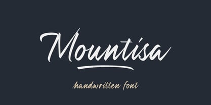 Mountisa is a script font with a dynamic and energetic style. It’s perfect for signature, stationery, photography, social media posts, product packaging, greeting cards, and every other design that needs a unique and striking font.
 - Olio by Little Fonts,
$15.00 Olio is a chunky geometric sans serif typeface. The bold version takes inspiration from classic geometric fonts like Futura and works well when creating clean, balanced typography. The inline version is the same font with a stylish and decorative stripe effect to each character. Olio inline is a nod towards graphic design champion Lance Wyman and his typographic treatment for the iconic Mexico 68 Olympic identity. Although both versions are designed in reference to great (timeless) graphic design from the past, they have a contemporary finish making them suitable for any design purpose or application.
 - Bend by Juri Zaech,
$30.00 Bend is a contemporary ribbon type family. Unlike most typefaces of that genre Bend is a sans serif. It is the top view angle and the characteristic stripes that create an elegant illusion of volume. A prominent feature of Bend is the ascending baseline. Simply rotating the text element by 14 degrees reveals the 3D effect and Bend's full potential. Bend comes in two widths and with three different layers for chromatic results. As a display typeface Bend likes to be set in big sizes and short sentences.
 - Chella Lyfe by Chella Lyfe,
$25.00 Features: Chella Lyfe Print: Uppercase letters, numbers, & extended punctuation We Offer Non-English support for the international designer as well Same stroke thickness with each font, so you don't need to make any time-consuming adjustments to get it looking right! This is such a fun new display font, perfect for creating quotes, logos, or just adding a hand-written touch to any project! While other fonts usually take some size adjusting to look just right, The ChellaLyfe variations in stroke thickness for upper and lower case fonts, so you can so it can display creativity and life in every stroke! Each font also has alternates for each letter, so when you type uppercase or lowercase for each font, the letters will change slightly. For example, tying in all caps with the Script font will connect each letter, whereas typing all lowercase will disconnect each letter.
 - Thang by Fenotype,
$30.00 Aint’ nuthin but the Thang. Thang is a street cred script family with big initial caps and tight flow. Thang is great for flashy headlines or as a logotype. Thang family comes with three weights. Thang Extras is a pack of strokes and dots that can be used to decorate your texts typed with Thang. Thang Extras can also be combined with Thang letters for custom Swash. Thang is packed with several OpenType features: keep on Standard Ligatures and Contextual Alternates for smooth flow. Try Swash, Stylistic or Titling Alternates for alternate characters to create customised lettering works. Check out Glyph Palette for even more alternate characters and go wild the Thang.
 - Brightland by Pixesia Studio,
$23.00 Introducing Brightland - Condensed Sans Serif Font Brightland is a condensed sans serif font that comes in four distinct styles - solid, solid italic, line, and line italic. This versatile font is perfect for use in a wide range of design projects, including branding, advertising, and packaging. Its clean, modern aesthetic makes it suitable for use in a variety of settings, and its four different styles allow you to create a wide range of looks. The solid style of Brightland is straightforward and uncomplicated, making it perfect for use in headlines and titles. The solid italic style adds a touch of flair, while the line style is light and airy. And the line italic style is perfect for creating a more playful, imaginative look. FEATURES - All Caps - Numbering and Punctuations - Multilingual Support - Works on PC or Mac - Simple Installation - Support Adobe Illustrator, Adobe Photoshop, Adobe InDesign, also works on Microsoft Word Hope you Like it. Thanks.
 - Minnak by Esintype,
$18.00 Minnak, as a whole geometric display type is our take on Square Kufic (Makili) style Latin script fonts, comes in eleven weights with linear progression. It is an Uniwidth typeface at the core. From Hairline to Black, all multiplexed weights take up the same space in width and can be used interchangeably. Supports wide range of Open Type features, with many stylistic alternates in 12 context. Minnak is also have a close relation with pixel fonts, because in spite of its based on Makili forms, it all started as a pixel font in the drawing stage before further steps came into play. The key difference between Minnak and Makili style is that the latter must have the exact square counters with no diagonal strokes, and any other components of a letterform must conform to be proportional. Such style-specific requirements determine the overall dimensions of the glyphs and therefore, there can be only minor differences between the typefaces. In Minnak, counters are rectangular because of its narrow and condensed proportions, but the Makili form influence is still manifest. This impression is best confirmed with Medium weight where negative spaces and stem thickness are equal. Contrast and virtually no optical correction were presented, as characteristic of its genre had to have equal horizontal and vertical line thicknesses. As per the minimal and authentic look of the type, all glyphs are drawn as straight or only as 45-degree diagonal strokes. The representation of the ‘diagonalless’ approach is preserved by stylistic alternatives, making its similarity in visual aesthetics clearly visible. Marks and punctuation is another feature that doesn’t follow the strict rules of the origin style. Although not a pixel font, all building parts of the glyphs in Minnak share the same unit precision as they are designed with pixel equivalents in mind. Even space characters are designed to match glyph widths, meeting the demands of certain typesetting or multi-line lettering compositions. With its Pseudo Ancient and Runic alternates, extention parts and ornaments included in all weights, Minnak is suitable for branding, logo and monogram designs, the screen titles and headlines, packaging, posters, book covers and more, where it shines at big sizes. Its pixel font-like appearance makes it a significant choice for the modern compositions. Thanks to mostly uniform width design, it is possible to use Minnak also as a system for lettering. This feature can be used as vertical fitting of the letters between the lines. As a casual expression in Turkish, “Minnak” is one of the seven typeface designs in Esintype's ancient scripts of Anatolia project, Tituli Anatolian series — representing Seljuk period in the medieval Anatolia and their tradition of architectural stone ornamentation.
 - LT Eat - Personal use only

- ideoma LINER - Personal use only

- Featured Item - Personal use only

- Toonish - Personal use only

- Carousel - Unknown license

- Planet TriColore - Personal use only

- Havelseen - 100% free

- The Beetles - Unknown license

- Verve - Unknown license

- Deco Pimp - Unknown license

- pehuensito - Unknown license

- Spin Cycle 3D OT - Unknown license

- Yurine Overflow - Personal use only

- Komika Text - Unknown license

- Prussian Brew - Unknown license


