10,000 search results
(0.068 seconds)
- Dez Boulder by Dezcom,
$39.00 A Bold Display Family in Three Personalities: ego, id, and alter. Dez Boulder works like a character actor, presenting the author’s lines but not with the deadpan delivery of a news reporter. Boulder develops the role, adding meaning through facial expression, gesture, and body language. The Dez Boulder family of display faces acts in a supporting role to give meaning to message and context to content. It is a very bold face, not understated. Each of its three personalities (and their sub-personalities) have a different timbre to speak the nuance of your message in a bold voice. Dez Boulder averages more than 800 glyphs per style with uppercase, lowercase, small caps, proportional lining figures, small cap figures, superiors, inferiors, fractions, stylistic sets, alternates, ordinals, case specific punctuation, and more. It has a full range of diacritics and covers all European languages using the Latin script.
 - Old Friend by Eotype,
$14.00 OldFriend is multipurpose and unique display font. This font can give your designs a playful and friendly impression. You can use this font for retro, vintage and urban designs. This font comes with alternative style and ligature features which are suitable for various projects such as logos, product labels, posters and many more.
 - Floro by Andinistas,
$29.95 Floro is a typographic family with 3 members designed by Carlos Fabian Camargo. Its idea combines medieval ideas, grotesque, stencil and grunge for T-shirts, stickers, advertising material design. More specifically the concept of Floro join several DNAís coordinating X height, ascendant, descendant and wide, in which proportions and adaptive optics were determined to inject great visual impact when composing titles. Its forms and counter forms have imperfections controlled with vitality and consistency. Floro is useful for ranking words and phrases with corroded edges and creases between the lines of his letters. In that vein, Floro refers to improvised design, deletion and copying. For that reason, its determinants seem stencil patterns that attract the attention of the reader. Its inaccurate decisions were planned that way, in which the type of contrast seems made with a flat tip and the amount of contrast between thick and thin is medium. Its sizes, regular and italic shine by their systematic wear and terminations sometimes in pointed forms resembling medieval darkness. In short, we can say that Floro comes from the miscegenation of Gothic calligraphy texture, foundational calligraphy and some refinements of gothic writings with italic sans-serif ideas of late 19th century. Even with the blur appearance, floro has ideal proportions to pile for horizontal and vertical areas when composing titles with striking looks and robust. And finally, floro dingbats are related shields and stamps, to accompany the written resulting useful at the level of visual support and hierarchical.
 - Condemned by Grype,
$16.00 Condemned is a light destructive sans typeface created from an old damaged ATF Specimen Book from 1912, and looks reminiscent of poorly transferred rub off type. It contains a complete alternate core character set for a subtly randomized look. Here's what's included with Condemned: 684 glyphs - including Capitals, Lowercase , Numerals, Punctuation and an extensive character set that covers multilingual support of latin based languages. (see the 5th graphic for a preview of the characters included) Contextual Alternates that auto-switches between Capitals & Alternate Capitals, Lowercase and Alternate Lowercase, as well as Numerals and Alternate Numerals for visual randomness. To access the Contextual Alternates feature, you will need to be using software with Opentype compatibility otherwise you can access the alternate glyphs via a Glyphs panel. Stylistic Alternates feature that swaps all standard Capitals, Lowercase, and Numerals with their Alternates Alternate Capitals and Lowercase are complete with all international accented characters Font is provided in TTF & OTF formats. The TTF format is the standard go to for most users, although the OTF and TTF function exactly the same. Here's why Condemned is for you: You're into legible but distressed typestyle that imitates a random distress to it You love condensed gothics, and want to pair them with a distressed condensed gothic You're a fan of old Letraset/Transfertype rub off lettering You're recreating weathered military ephemera and want a typeface with some tooth to it You just like to collect quality fonts to add to your design arsenal
 - Assox by Alit Design,
$15.00 Introducing assox Typeface. This font is inspired by the design styles of the 70s. The style is funny, groovy, classic, not serious but has aesthetic and unique value, besides that the assox font is very easy to remember and becomes the image of a design. assox is very good for being your font collection because this font is very unique and easy to apply to any media that has a design concept that is not so serious, groovy, classic, funny and unique. Besides that, it can be used for the design of t-shirts, posters, sign boards, and social media needs. Features: A-Z Character Set Numerals & Punctuations (OpenType Standard) Stylistic Alternates Multilingual
 - Palagio by Din Studio,
$25.00 The art of accumulation. If we can give you many options then why not? Palagio is a sans serif font package that will delight you. A font family that projects simple, warm, yet modern style. Palagio comes with 7 different weights. It is versatile enough to be used as title, body or button text. Features: Multilingual Supports Numerals and Punctuations PUA Encoded It is perfectly used for branding, logos, social media quotes, stickers, posters, vintage designs, wall art, merchandise, social media, and many more. Get more inspiration by seeing the preview. Thank you for purchasing premium fonts from Din Studio. If you have any further questions, don't hesitate to contact us. Happy Designing.
 - Deja Vu by Anmark,
$13.00 I’m pleased to introduce my handwritten ink font Deja Vu. Deja Vu comes in two styles: Ink and Clean. Deja Vu Ink is a splatter ink font. Each uppercase and lowercase letter has unique ink splashes. This decorative style is perfect for logotypes, branding projects, tattoo, packaging, social media, signatures, headers and many more. Deja Vu Clean is an elegant feminine script font. Use this modern font for invitations, cards, packaging, social media, signatures, quotes, magazines and more. You can use it for long texts or short phrases. Modern calligraphy uppercase letters are ideal for monograms and logos. Both styles have a full set of lowercase alternates. I hope you'll enjoy it!
 - Lost and Foundry by Fontsmith,
$15.00 Breaking the cycle of homelessness We are partnered with The House of St. Barnabas, a private members club in Soho Square, whose work as a not for profit charity aims to break the cycle of homelessness in London. Each purchase (of the family pack) comes with a one month membership to The House and 100% of the proceeds from sales of fonts go directly to the charity to help their essential work. This unique collection of 7 typefaces is based on the disappearing signs of Soho, at risk of being lost forever due to the ever changing landscape of the area. By re-imaging the signage as complete fonts, we have rescued this rich visual history from the streets and present the typefaces into a contemporary context for a bright optimistic future. FS Berwick Thanks to its humble tiled origins, this Egyptian serif type maintains a uniform character width, creating the irregular letter proportions found in the final alphabet. Broad-shouldered, the bracketed serifs firmly ground the font, whilst its extreme hairlines become a necessity due to the uniform width. Of note is the upside down ‘S’, to be found on the original sign on Berwick Street. Perhaps due to its ceramic origins, there is a surprising ‘slippiness’ to its final appearance. FS Cattle Cattle & Son is best described as a wide, but not overly extended, grotesque-style sans serif, showing a uniform width and carrying a robust strength to its form. Whilst lightly functional overall, the purposeful diagonal legs of the ‘K’, ‘R’ and the tail of the ‘Q’ add an urgency to its appearance. The reduced size of the ampersand gives away Cattle & Son’s hand-painted origins, and the oblique compacted ‘LTD’ found on the original sign is also included in the final set. This beautiful sign is tucked away under an arch in Portland Mews, sheltering from the weather. Perhaps this is why it has lasted so long. FS Century This somewhat elongated set of Roman capitals was originally rendered in paint circa 1940, but its roots trace back to the Trajan Column in Rome. Witness the slightly unbalanced ‘W’ and the painter’s hand is revealed. Century’s flared serif style is extremely short, sharp and bracketed. The ‘M’ is splayed and has no top serifs. Century has a uniform appearance of width, probably due to its sign-written origins. Yet is elegant, classic and exudes sophistication. FS Charity A true Tuscan letterform, the original is located on The House of St. Barnabas in ceramic tiles and was revealed in all its broken glory in 2014. FS Charity retains the option of using these incorrect characters (try typing lowercase in the test drive above and compare with the more uniform uppercase characters). FS Charity features fishtailed terminals on its strokes, a curious branched ‘T’ and the ‘S’ displays tear-drop ends to its serifs. Almost uniform in width, the ‘A’, ‘M’ and ‘W’ are the widest characters in this set. FS Marlborough The elongated Marlborough features diagonal terminals to some characters and numerals. Also retained is the space-saving contracted ‘T’ glyph from the original sign, while the ‘R’ features a distinctive wedge-shaped leg. Highly individual in this form, similar signage appears around Soho, but featuring a variety of widths in their design. FS Portland The sister type to Cattle & Son, Portland is oblique rather than italic. The serifs are not overly long, yet still enhance its rather rigid cap height and baseline appearance. Its ‘A’ has a top serif, the ‘M’ is square and the ‘G’ foregoes any spur. Particularly delightful is the open ampersand. Numerals align to encourage the horizontal flavour of the oblique style. Overall, Portland is both confident and graceful. FS St James A lineal Continental style, St James also displays a true sense of ‘Londoness’ in its titling form, perhaps influenced by early Underground signage. Irregular letterforms display a continental flavour, particularly evident in its Deco style ‘W’, ampersand and numerals. The rather high cross bar in the ‘A’ is also reflected in the raised middle strokes of the ‘M’. Noteworthy are the distinctive unions found on all of the characters and the additional small caps. The original lettering is still located on Greek St.
 - Cordially Yourz by Outside the Line,
$19.00 Cordially Yourz is a bouncy, witty little font. Sometimes there are no caps, or there are only caps… there is no real baseline… it is a headline font but can be used sparingly as body copy. I wouldn't set a whole book in it but a paragraph could be fun. And fun is what this little font is all about. Cordially Yourz can be seen in the 2012 Typodarium Page-A-Day Calendar on 5-29-2012.
 - Boatman by YdhraStudio,
$20.00 Boatman Font – 3 Styles + Extras We introduce our new font called Boatman. Boatman is a (All Caps) vintage display font inspired from classic whiskey labels, vintage labels and sing painting. Boatman comes with 3 styles (Regular, Outline and Stamped) that extends the possibilities when you design something. Boatman also has the Stylistic Set. With the Stylistic Set, Boatman gives you so many options to create something awesome. Mix and match the alternate characters to add an attractive message to your design. Furthermore the Boatman includes a Set of Ornament Labels which perfectly complement text compositions. You can see it on my presentation examples. Boatman is great for Logotype, Branding Design, Logo Design, Badges, Digital Lettering Arts, T-Shirt/Apparel, Headline, Posters, Magazine, Signs, Advertising Design, and any vintage design needs. Boatman Features : - All Caps Characters, Punctuation, Numerals. - Opentype Feature such as Stylistic Set. - Fully accessible without additional design software. - Includes a range of multilingual characters. - Ornament Labels You can access all those alternate characters by using a program that supports OpenType features such as Adobe Illustrator CS, Adobe Indesign & CorelDraw X6-X7. Guides to access all alternates glyphs : http://adobe.ly/1m1fn4Y
 - Manteiga by Plau,
$49.00 Julia Child once said: the secret to great french cooking is butter, butter, butter. Thus, we present to you Manteiga - butter in Portuguese! - a typeface for heart-melting, word-spreading goodness. The idea we had was to play with brush lettering - a style we love - and go as far as we can with the shapes of the letters while finding balance between positive and negative space. We wanted biiiig personality. And small inconsistencies - the ones that add texture and life to lettering. We left extensive OpenType features and technical stuff aside for a moment, adding later only what we thought was necessary, like different shapes for the Q, a and g - for example. All caps setting was something we wanted from the beginning. In text case, the x-height is rather short for a brush script, and this lends a quirky voice. Spacing is ultra tiiiiight so don’t go too small, but make it as big as you want! Ah! And there are some fun dingbats thrown in for good measure.
 - Acuta by Anatoletype,
$27.00 Acuta is a new all-purpose text serif with a good readability and a contemporary, robust look thanks to its low-medium contrast. The differences between thicks and thins are less strongly marked than in oldstyle text faces; yet the diagonal stress needed to facilitate reading is partly provided by the letter shape itself: sharp angles and italic construction give the right dynamism to the text. Acuta becomes very distinctive as a headline, while its big x-height makes it suitable for texts at rather small sizes too. The family consists of seven weights & correspondent italics, with a large character set. The Book and Medium weights, relatively close to each other, can both be used as “plain” weight depending on the size of the text, background color or backlighting. Small caps, oldstyle and tabular figure alternates, superiors and inferiors and ligatures are available in all styles through OpenType features. The real italics include unobtrusive swash alternates to emphasise the written feeling. Please find a specimen of Acuta (PDF) in the Gallery section.
 - Amarone by Monotype,
$29.99 Amarone is a spiky calligraphic display typeface with some old fashioned flavour. It was designed by Carl Crossgrove, and includes an extensive set of swash caps which allow for extra drama where needed. Crossgrove wrote each of Amarone's letters by hand using pen and rough paper, and has retained some of this visual texture in the final digital design. The typeface works well at small sizes, but when used at larger sizes this texture comes to the fore. Amarone's elegant, formal character can be modified with its swash caps, which allow the typeface to move from prim and ordered to wildly expressive. Amarone lends itself well to packaging, posters and editorial usage – or in any environment where designers need to evoke times gone by. The Amarone font features an extensive character set with support for over 130 languages, and a range of OpenType typographic features including ligatures, initial and terminal forms, figures, fractions and swashes.
 - Apollonius by Typogama,
$25.00 Apollonius is a high contrast, display typeface designed by Michael Parson. Packed with Opentype features, this single weight font offers a whole range of options that designers can explore and play with to create stunning layouts.
 - Normies by Gassstype,
$25.00 Introducing NORMIES It's Sans Display Typeface is a Textured Natural Style and Authentic Classy Style, this font is great for your creative projects such as watermark on photography, You can activate 9 Alternate glyphs OpenType panel.
 - Koumon by Muksal Creatives,
$8.00 Koumon is modern family of Display fonts. Koumon has 8 families font, starting from the small thin to the largest black. This typeface is versatile and can be used successfully in magazines, posters, branding, websites, etc.*
 - Waves Killer by Forberas Club,
$16.00 Introducing Waves Killer by forberas, This font born to be a Halloween Project. But still can be made as a display font, and still suit your other fun project. Your review and response are most welcome.
 - Crossell by Emboss,
$35.00 Crossell is a display typeface inspired by linoleum cuts and old comic strips. It comes in three weights and can be purchased solo or as a family. Take it home and give it a spin today.
 - Krakenstein by Gassstype,
$29.00 Hello Everyone, introduce our new product Font Krakenstein This Is Horror Display Font.This is a Textured Natural Style and classy style with a clear style and dramatic movement. You can activate 10 Alternate glyphs OpenType panel.
 - Orange Pumpkin by Letterafandi Studio,
$14.00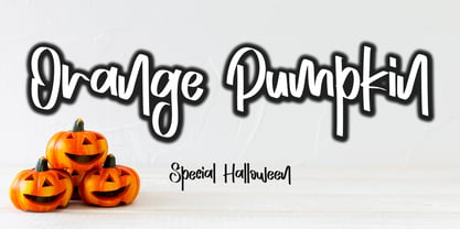 Orange Pumpkin is a handwritten display font. It is perfectly suitable for any Halloween-related project or crafty idea! This font is PUA encoded, which means that you can access all of the glyphs with ease!
 - Cake Zombie by Forberas Club,
$16.00 Introducing Cake Zombie by forberas, This font born to be a Halloween Project. But still can be made as a display font, and still suit your other fun project. Your review and response are most welcome.
 - Snob by Juraj Chrastina,
$39.00 Snob is a high-contrast display face with a touch of luxury. It represents a classy typeface with a fashion magazine style. You can easily combine Snob with Ambassador, which was the base for creating Snob.
 - Lucky Skirt by Ali Hamidi,
$10.00 Lucky Skirt is a bold, fun, and playful display font. Its well-rounded and slightly chunky characters make this typeface an extremely versatile one! It can elevate the look of almost any of your beautiful creations!
 - Spooked by Gassstype,
$29.00 Hello Everyone, introduce our new product Font SPOOKED This Is Horror Display Font.This is a Textured Natural Style and classy style with a clear style and dramatic movement. You can activate 8 Alternate glyphs OpenType panel.
 - Burkey by Muksal Creatives,
$10.00 Burkey is modern family of Display fonts. Koumon has 8 families font, starting from the small thin to the largest black. This typeface is versatile and can be used successfully in magazines, posters, branding, websites, etc.*
 - Aviano Silk by insigne,
$22.00 A premier product from insigne, the powerful Aviano redefines its classic lines for the contemporary elegance of Aviano Silk. This modern development of a timeless font, part of insigne's annual tradition in adding to the Aviano family, was elected the clear leader in a poll of insigne design's social media followers. Aviano Silk refers to the smooth flowing feel that the negative space gives the font. This particular example is sort of a hybrid between the stencil and a centerline. It has a certain amount of velocity to it. Extended characters lend formality and a sense of wealth and power. Due to the modifications required for the new look, the Silk family cannot work as an overlay for Aviano, though it pairs nicely with it. There are also 12 Aviano families that work well with Silk. Aviano Silk is particularly suited to high-end luxury applications and especially branding projects. Use Aviano Silk to lend refinement and luxurious elegance to your design.
 - Risus LCB Dingbats - Unknown license

- Wayang Jawa by Yoga Letter,
$25.00 "Wayang Jawa" is a blackletter font with the theme of Indonesian culture. This font is equipped with uppercase, lowercase, numerals, punctuation, and multilingual support. It is suitable for the promotion of Indonesian culture, logos, Javanese script, wayang performances, reog, jathilan, and other cultures.
 - Nomarch by Scriptorium,
$24.00Nomarch is a charming new Art Nouveau font based on samples of poster lettering from the beginning of the twentieth century. The relatively bold weighting of the characters makes Nomarch particularly good for use in large sizes for titles on posters and flyers. - Centrale Sans Inline by Typedepot,
$19.00 A humanist design typeface incorporating elements from the more rationally constructed grotesque typefaces. Its characteristics are relatively large x-height and open apertures. The overall effect suggests approachability without the sentimentality carried by some of the more authentic humanist designs – contemporary and precise.
 - Vermilion by Hanoded,
$15.00 Vermilion is one of those colors that are neither/nor. It's an ancient hue, in between red and orange and I kind of like the name. Vermilion font is a hand written, narrow and tall typeface which comes with extensive language support.
 - Fatimah by Goodigital13,
$20.00 feel and use it to create gorgeous wedding invitations, beautiful stationary art, eye-catching social media posts, and cute greeting cards perfectly macth for desgign with valentine theme, any product like book cover, t-shirt, branding, promotion, social media post, quotes, wedding, photography and more.
 - Antagonist - Personal Use - Personal use only

- Zacatecas 1914 - Personal use only

- Tabarra Shadow - Personal use only

- Qebab Shadow FFP - Personal use only

- Sports World - Unknown license

- HEX Font - Personal use only

- Plakative Grotesk - 100% free

- Gemina - Personal use only


