10,000 search results (0.07 seconds)
  1. Yoshi's Story game text BRK - Unknown license
  2. Modeled on the writings chiseled in stone in the second century B.C., Syntax™ Lapidar is an energetic, spirited typeface designed by Hans Eduard Meier in 2000. Linotype Syntax Lapidar Text and Linotype Syntax Lapidar Serif Text have five weights each, with both cap and lowercase letterforms. Lapidar Display and Lapidar Serif Display also have five weights each, with mostly all cap letterforms and many alternates. It's a terrifically fun and inventive family, and if you look closely, you can see the resemblance to the more modern and restrained Syntax™ relatives. Great for menus, artist books, travelogues, or advertising - and if used very sparingly, it could add just the right element of lapidary significance to corporate documents.
  3. Times New Roman Small Text by Monotype, $67.99
    In 1931, The Times of London commissioned a new text type design from Stanley Morison and the Monotype Corporation, after Morison had written an article criticizing The Times for being badly printed and typographically behind the times. The new design was supervised by Stanley Morison and drawn by Victor Lardent, an artist from the advertising department of The Times. Morison used an older typeface, Plantin, as the basis for his design, but made revisions for legibility and economy of space (always important concerns for newspapers). As the old type used by the newspaper had been called Times Old Roman," Morison's revision became "Times New Roman." The Times of London debuted the new typeface in October 1932, and after one year the design was released for commercial sale. The Linotype version, called simply "Times," was optimized for line-casting technology, though the differences in the basic design are subtle. The typeface was very successful for the Times of London, which used a higher grade of newsprint than most newspapers. The better, whiter paper enhanced the new typeface's high degree of contrast and sharp serifs, and created a sparkling, modern look. In 1972, Walter Tracy designed Times Europa for The Times of London. This was a sturdier version, and it was needed to hold up to the newest demands of newspaper printing: faster presses and cheaper paper. In the United States, the Times font family has enjoyed popularity as a magazine and book type since the 1940s. Times continues to be very popular around the world because of its versatility and readability. And because it is a standard font on most computers and digital printers, it has become universally familiar as the office workhorse. Times?, Times? Europa, and Times New Roman? are sure bets for proposals, annual reports, office correspondence, magazines, and newspapers. Linotype offers many versions of this font: Times? is the universal version of Times, used formerly as the matrices for the Linotype hot metal line-casting machines. The basic four weights of roman, italic, bold and bold italic are standard fonts on most printers. There are also small caps, Old style Figures, phonetic characters, and Central European characters. Times? Ten is the version specially designed for smaller text (12 point and below); its characters are wider and the hairlines are a little stronger. Times Ten has many weights for Latin typography, as well as several weights for Central European, Cyrillic, and Greek typesetting. Times? Eighteen is the headline version, ideal for point sizes of 18 and larger. The characters are subtly condensed and the hairlines are finer."
  4. Binary X 01s BRK - Unknown license
  5. PR Nouveau Ornaments 01 by PR Fonts, $10.00
    This is a set of ornaments inspired by the art nouveau style. Frames, corners, rules and flowers are included.
  6. PR Hallow Doodles 01 by PR Fonts, $10.00
    This font is a collection of ornaments and drawings suitable for Halloween themed materials. There are bats, singly and in swarms, owls, dead trees, spiders and webs, as well as calligraphic ornaments with a decidedly creepy bent. Most of the characters in this font were drawn on a napkin with a felt marker, and the resulting ragged texture was very suitable to the Halloween subject matter. Where the same stroke is repeated in one glyph, the contours have been edited to minimize obvious repetition. Use it for your Halloween party invitations and posters. Combines well with: PR Bramble Wood 1, PR Bramble Wood 2, PR Hallow Doodles 02, PR Cauldron, PR Swirlies 01, PR Swirlies 05.
  7. PR Xmas Doodles 01 by PR Fonts, $10.00
    This font includes elements of snowy landscapes, holly borders, bells, candles, reindeer, and tree ornaments.
  8. PR Swirlies 01 Frames by PR Fonts, $10.15
    This font is a collection of simple calligraphic ornaments suitable for invitations, gift tags, and anything that can benifit from a "spoonful of sugar" visually. The frames font uses the same calligraphic elements as PR-Swirlies-01, but has them combines in ways which form an elliptical cartouche. Many of the elements can be used in a modular way to create frames of varying length.
  9. Tannenberg Fett - Personal use only
  10. Jolgoria in Town - Personal use only
  11. Big In America - Unknown license
  12. In A Flash - Unknown license
  13. Children in Need - Personal use only
  14. Made in Space - 100% free
  15. Prodotto In Cina - Unknown license
  16. Life in Space - 100% free
  17. Life in Space - 100% free
  18. In My Closet - Unknown license
  19. Life in Space - 100% free
  20. Life in Space - 100% free
  21. KR In Memory - Unknown license
  22. Alice in Wonderland - Unknown license
  23. In his hands - Unknown license
  24. Symphony in ABC - Unknown license
  25. Radios in Motion - Unknown license
  26. Charles in Charge - Unknown license
  27. Winter in Gotham - Unknown license
  28. In a Jar by Latinotype, $29.00
    In a Jar is a display typeface based in hand lettering. Inspired by the grandmother's kitchen, its colors, forms, smells and the new way for rescue this old things. Designed for use in short text and big sizes is perfect for brand design, headlines, labels, greetings cards and all kind of things related to kitchen and foods. In a Jar is a sweet little family that include alternates, compounds words, ligatures plus a serie of dingbats and ornaments very cute to compliment and accentuate the handmade design. Try and enjoy all fun in a jar! Designed by Coto Mendoza with technical support of Luciano Vergara.
  29. Holiday In Paradise by Senekaligrafika, $12.00
    “Holiday In Paradise” is a playful handwriting font special for summer display, that puts a smile on your project and will inspire you to create something fun and memorable. “Holiday In Paradise” will help you to create special and touching typographical design for holiday projects, for every day or the happiest day in life, happy birthday cards, baby shower, greeting card, headings, flyer, product packaging, book cover, printed quotes, logos, and many more. It is really universal and modern font. The owner of endless possibilities!
  30. In Shipment JNL by Jeff Levine, $29.00
    In Shipment JNL is modeled after lettering made from an industrial stencil cutting machine - generally used for marking shipping and inventory information on boxes. Limited character set.
  31. Moonlight In Tokyo by Epiclinez, $18.00
    Moonlight In Tokyo is an authentic signature script font. This handwritten beauty is suitable from high-end sophisticated branding to simple memorable Instagram quotes.
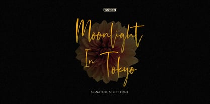
  32. Nouveau Never Dies by Intellecta Design, $13.90
    Nouveau Never Dies is a compreensive family of ornaments from Art Nouveau era.
  33. Lost in space by Gleb Guralnyk, $13.00
    This futuristic typeface "Lost in space" is a geometric vintage font with multi-lingual support.
  34. Emily In White by Juliasys, $59.00
    She did not live to experience her breakthrough as a poet, but today she is considered one of the pioneers of literary modernity – the American lyricist Emily Dickinson (1830–1886). She left behind a life’s work of manuscripts on scraps of paper, note pads and letters – and a last wish, that these were to be burned. Emily’s younger sister Lavinia did not fulfill her wish – and thus preserved the ingenious manuscript-objects for posterity. For Julia Sysmäläinen, designer of the award winning Kafka type family FF Mister K, Dickinson’s manuscripts were an inspiration and a source for creating her new typeface “Emily In White”. Emily In White – named after Emily Dickinson’s preference for white clothes – captures the most filigree letterforms of the poet’s multifaceted writing style. With hundreds of alternates and ligatures and a complex OpenType feature code it manages to revive the lively sequence of single and connected glyphs of a delicate handwriting which has been described as “breezing” and “reminding of bird tracks”. Emily in White is available in three weights designated I, II and III. For each weight, there is an associated Swashes font. See the PDF in the Gallery section for details. Language support Western and Central European, over 1800 glyphs.
  35. Fall in Love by Namara Creative Studio, $20.00
    Bold and stylish calligraphy script font with modern touch give authentic, charismatic & confident font choice for a range of design projects. Such as logotype, t shirt design, product packaging, stylish signature, business branding and promotional campagin. Add it to your most creative ideas and notice how it makes them come alive! Fall in love with its incredibly distinct and timeless style and use it to create spectacular designs!
  36. Believe In Me by PizzaDude.dk, $20.00
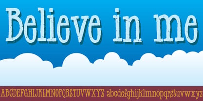
  37. Brush In Space by Gassstype, $25.00
    **Brush in Space** - Handwritten Brush font with a natural Rough style and comical type. Crafted manually with love and passion, This font is great for your next creative project such as logos, printed quotes, invitations, cards, product packaging, headers, Logotype, Letterhead, Poster, Label, Game project and etc.
  38. Weather In October by Wildan Type, $10.00
    Weather in October is a handwritten font. The letters are classy and unique. Use Weather in October to get a more elegant look This font is perfect for quotes, headings, blogs, invitations and more! This purchase includes Regular,Italic, Movement, and Hollow Style You will be able to use this font in ANY program!
  39. Milan In Paris by Mevstory Studio, $25.00
    Milan in Paris is a powerful and elegant display typeface, constructed to maximize use of horizontal space. Built from hand sketches drawn over several years, Milan in Paris eight weights span an elegant Thin to a vibrant Heavy, with accompanying obliques.Milan in Paris makes a strong impression in print, headlines, video, and social media – whether paired with a contrasting typeface or on its own.
Looking for more fonts? Check out our New, Sans, Script, Handwriting fonts or Categories
abstract fontscontact usprivacy policyweb font generator
Processing