5,603 search results
(0.029 seconds)
- Grid Hero by PizzaDude.dk,
$16.00 100.000 years ago years ago, a group of mad scientists from the far away planet ZyrXX, encountered the earth and just waited to conquer the planet. Their masterplan was to use electronic brain waves to manipulate our minds. Sounds cheesy and comic, right? Well, that is the true story about this font. The font was built using a grid (hence the name!) and all I had in mind, was a mixture of old sci-fi movies and computer graphics from the 80ies. I did my best to recall and re-create this - I will let you be the judge to decide whether I succeeded! :)
 - Rocky by NJ Studio,
$19.00 Hi...Thank for your visit :) Rocky modern sans font. It features tall characters that will take your projects to the next level! This font is PUA code which means you can easily access all the glyphs that are full of sans! It also features many special features including glyphs. font designs that are made for various vector designs, printing such as digital wedding blogs, online shops, social media, while printing can be used in the field of product clothing, accessories, bags, pins, logos, business cards, watermarks and many others ... so it can make your product look sans and attractive, and also Multilingual support!!! Happy design ...
 - Happy Friday by Mix Fonts,
$9.00 HAPPY FRIDAY is a font that looks ahead to the long weekend. This typeface is cute and clean, but with an undercurrent of sickening sweetness. The font turns up the volume on your social media posts, making them stand out from the crowd. Along with HAPPY FRIDAY MIX, an adorable set of dingbats made up of doodles and swashes, this font pair is perfect for your marketing collaterals and your at-home DIY projects. MIX HAPPY FRIDAY comes with the following glyphs: ABCDEFGHIJKLMNOPQRSTUVWXYZ abcdefghijklmnopqrstuvwxyz 0123456789 !@#$%^&*()`~♥✿•· ÷×+−±≈=≠≥≤[]<>:;’”,.\|/?{}“”‘’-–—_ …‚„©®™‹›«»°¹²³ªº¡¿₱¢€£¥½¼¾¶§№† ÁÀÂÄÃÅĂĀĄÆĆĈČÇÐĐÉÈÊËĖĒĘĜĤIÍÌÎÏĪĮĴŁŃÑŇ ÓÒÔÖÕŌŐØŒŔŘŚŜŠŞȘŤȚÚÙÛÜŮŬŪŰŲẂẀŴÝŶŸŹẐŽŻÞẞ áàâäãåăāąæćĉčçðđéèêëėēęĝĥıíìîïīįĵłńñň óòôöõōőøœŕřśŝšşșťțúùûüůŭūűųẃẁŵýŷÿźẑžżþß MIX HAPPY FRIDAY MIX (Dingbats) comes with the following glyphs: ABCDEFGHIJKLMNOPQRSTUVWXYZ abcdefghijklmnopqrstuvwxyz 0123456789 !@#$%^&*()
 - Hyperdrive by Comicraft,
$19.00 If you're about to make the jump into hyperspace, buckle up and engage your R2 unit with our new font release, HYPERDRIVE! Ten years in the making, we've spent almost as much time developing these characters as George Lucas spent developing his! Co-created by Starkings & Roshell (HYPERDRIVE, not George), this font is guaranteed to keep TIE fighters off your tail and will always come in useful if you get menaced by phantoms or attacked by clones. So sit back, relax and enjoy the flight -- but don't forget; let the Wookiee win! Remastered Hyperdrive includes new letter shapes, 200+ connecting letter combos, improved spacing & kerning and support for Western & Central Europe.
 - Prima Script by Wiescher Design,
$24.00 »Prima Script« was designed especially for use in Menus and Cook-books. One of my sons is a chef in Munich and he was always bugging me to make a new font for his menus. I already designed one for him »Konstantin« but he likes to have new stuff every couple of years what I understood. So here is the new »Prima Script« (that’s what he said when he first saw the font). To give it more usability I made alternate initials and end letters as well as medieval cyphers. Then I did a couple of swashes and a handdrawn Sans font to complete the set. Have fun!
 - Road Race Extra by Craft Supply Co,
$19.00 Road Race Extra Font Family includes 4 Style Fonts. It can be used to create almost all types of design projects like print materials. Just use your imagination and some graphic design set in Extras, your project will become more alive and look great than ever with one of the Road Race Extra font. You want to make a greeting card or a package design, or even a brand identity, craft design, any DIY project, book title, wedding font, pop vintage design, retro design or any purpose to make your art / design project look pretty and trendy? Feel free to play with all the patterns and shape!
 - Black Ruby by NJ Studio,
$19.00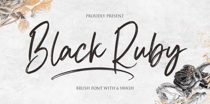 Hi...Thank for your visit :) Black Ruby a handwritten brush font. It features ligatures characters that will take your projects to the next level! This font is PUA code which means you can easily access all the glyphs that are full of brush! It also features many special features including glyphs. font designs that are made for various vector designs, printing such as digital wedding blogs, online shops, social media, while printing can be used in the field of product clothing, accessories, bags, pins, logos, business cards, watermarks and many others ... so it can make your product look brush and attractive, and also Multilingual support!!! Happy design ...
 - Chopsee by TypeUnion,
$35.00 Chopsee is a fun, fluid, versatile font family of 8 weights and matching italics designed by Dan Jones for TypeUnion. The font aims to encompass movement and fluidity with its accentuated curves and terminals. The raised x-height creates more synergy between the lowercase and uppercase characters thus enhancing the visual appearance. The family of 8 weights & italics means you have plenty of usage options whether digital, branding or print - Chopsee black is perfect for that new brand idea you have, while the lighter weights provide a subtle support to clean layouts whether it’s call out text on a website or in print applications such as posters or magazine layouts.
 - Master of Magic by NJ Studio,
$19.00 Hi...Thank for your visit :) Master of Magic a magical script font. It features ligatures characters that will take your projects to the next level! This font is PUA code which means you can easily access all the glyphs that are full of magic! It also features many special features including glyphs. font designs that are made for various vector designs, printing such as digital wedding blogs, online shops, social media, while printing can be used in the field of product clothing, accessories, bags, pins, logos, business cards, watermarks and many others ... so it can make your product look beautyful and attractive, and also Multilingual support!!! Happy design ...
 - Brush Effect by NJ Studio,
$19.00 Hi...Thank for your visit :) Brush effect a handwritten brush font. It features ligatures characters that will take your projects to the next level! This font is PUA code which means you can easily access all the glyphs that are full of brush! It also features many special features including glyphs. font designs that are made for various vector designs, printing such as digital wedding blogs, online shops, social media, while printing can be used in the field of product clothing, accessories, bags, pins, logos, business cards, watermarks and many others ... so it can make your product look brush and attractive, and also Multilingual support!!! Happy design ...
 - Freehouse by Device,
$39.00 Freehouse is a reinterpretation of the well-remembered Watney’s logo, a brewery and pub chain infamous for its poor quality beer and brutalist decor. In Design Research Unit’s corporate guidelines from 1966 the font is described as Clarendon Bold Expanded — however, this is not the case. Clarendon has square serifs, whereas the Watney’s font is rounder and friendlier. A fixture of the British high street landscape for decades, this digitisation adds a full international character set, numbers, punctuation and many other characters that did not exist in the original. A distressed version that evokes rough print on a wet beermat has also been developed.
 - Back To Teacher Outline by NJ Studio,
$19.00 Hi...Thank for your visit :) Back to school (Outline & Inline) a simple handwritten font. It features fun characters that will take your projects to the next level! This font is PUA code which means you can easily access all the glyphs that are full of simple! It also features many special features including glyphs. font designs that are made for various vector designs, printing such as digital wedding blogs, online shops, social media, while printing can be used in the field of product clothing, accessories, bags, pins, logos, business cards, watermarks and many others ... so it can make your product look simple and attractive, and also Multilingual support!!! Happy design ...
 - Oak Street by Three Islands Press,
$39.00 There's a little restaurant in an old house on a sidestreet in town (Rockland, Maine, USA) called Cafe Miranda. The staff is friendly, the setting intimate, and the appetizer a basket of hot bread fresh from a brick oven. Its ample menu features such entries as "Quasi-Cassoulet" and "Gentle Sole." It's among my favorite local places to dine out. But the menu got photocopied once too often, and Cindy's personable handlettering got faded and broken. So I took matters into my own hands. And here's what I delivered to the newly computerized folks at the little restaurant on Oak Street. You, too, can travel in rather heavy felt-tip style.
 - The Flash by NJ Studio,
$19.00 Hi...Thank for your visit :) the flash a signature font with beginning and ending swash. It features ligatures characters that will take your projects to the next level! This font is PUA code which means you can easily access all the glyphs that are full of swash! It also features many special features including glyphs. font designs that are made for various vector designs, printing such as digital wedding blogs, online shops, social media, while printing can be used in the field of product clothing, accessories, bags, pins, logos, business cards, watermarks and many others ... so it can make your product look swash and attractive, and also Multilingual support!!! Happy design ...
 - Handel Slab by URW Type Foundry,
$35.99 Handel Slab, designed by Ralph M. Unger, is a new offering which ideally enhances and extends the existing Handel Gothic family. Even so, Handel Slab can very well be used on its own. Obviously, Handel Slab is closely based on Handel Gothic, which was designed by Don Mandel in the mid 1960s and which has been popular and successful amongst users from day one. Even today, it is a futuristic sans serif, and it is used for a wide range of typographic tasks, for example in computer games. Handel Slab provides a perfect enhancement to Handel Gothic, and the combination of both families offers more flexibility to designers and typographers.
 - Road Race by Craft Supply Co,
$19.00 Road Race Font Family includes 4 Style Fonts. It can be used to create almost all types of design projects like print materials. Just use your imagination and some graphic design set in Extras, your project will become more alive and look great than ever with one of the Road Race font. You want to make a greeting card or a package design, or even a brand identity, craft design, any DIY project, book title, wedding font, pop vintage design, retro design or any purpose to make your art / design project look pretty and trendy? Feel free to play with all the patterns and shape!
 - Brownstone Slab by Sudtipos,
$59.00 Alejandro Paul’s Brownstone Slab is based on his own popular, award-winning, Brownstone Sans typeface. Like the original Sans, Brownstone Slab is a 21st-century design, influenced by the Victorian decorative motifs of the ironwork and carved decorations of New York City row houses. Brownstone Slab’s sturdy serifs make it slightly more masculine and solid than its predecessor. As with Brownstone Sans, Brownstone Slab includes character sets for Latin-based languages, including Western and Eastern European, Baltic, Turkish, Maltese, Celtic and Welsh. It includes over 1500 glyphs, including small capitals, swash characters, alternates, and ligatures, in both Light and Thin weights. Ornamental frames are provided in all weights.
 - Red Tape by Wiescher Design,
$39.50 Red Tape is three fonts that were designed by sticking letters together with red tape. It makes for a wonderful makeshift set of fonts. And I really enjoyed sticking those letters together. Of course I did it on screen using bits and pieces of scanned red tape. Just use it as you like, I won't give you any red tape in how to use the fonts. »Red Tape« is since February 2012 on permanent display in the »German National Library« – next to the likes of »Bodoni«, »Garamond« and »Helvetica« – being part of the exhibition about type through the ages. Your (now a little famous) unproblematic type designer, Gert.
 - Jacky Brushes by NJ Studio,
$19.00 Hi...Thank for your visit :) Jacky Brushes all caps textured brush typeface. It features ligatures characters that will take your projects to the next level! This font is PUA code which means you can easily access all the glyphs that are full of brush! It also features many special features including glyphs. font designs that are made for various vector designs, printing such as digital wedding blogs, online shops, social media, while printing can be used in the field of product clothing, accessories, bags, pins, logos, business cards, watermarks and many others ... so it can make your product look brush and attractive, and also Multilingual support!!! Happy design ...
 - Jantze by Fontosaurus,
$19.95The Jantze font is a project undertaken by Dan Bailey of Fontosaurus and Michael Jantze, creator of the nationally-syndicated comic strip, The Norm. All their royalties from the font will go to The Lance Armstrong Foundation. For those that have been living under a rock for the last five years, Lance is a professional bike racer that overcame advanced testicular cancer to not only come back to his sport, but to dominate its premiere event, the Tour de France. In climbing to the top of his sport, he has become a legend among cyclists and a beacon of hope for those battling cancer and their families. His foundation provides financial grants to researchers working to improve our odds against the disease, individuals stricken with cancer, and survivors of the disease that are advocates for survivorship issues in their communities. Michael Jantze and Dan Bailey would like you to consider the quote from Ralph Waldo Emerson that brought us to this project: "The purpose of life is not to be happy. It is to be useful, to be honorable, to have it make some difference that you have lived and lived well. We hope that you will help us help Lance Armstrong's legacy be more than that of just sports legend. We hope that you will help those that may someday help you as much as we hope that you will never have to suffer the ravages of cancer. We hope. - Copperplate New by Caron twice,
$39.00 Imagine America in the 1930s. A gangster flick with Al Capone, a crime novel featuring Philip Marlowe. Our hero in a fedora sits in a classy bar, orders a double bourbon, lights a cigar and eyes the evening paper. He turns the pages, reading about a bank heist over on Third Avenue, a scandal involving a baseball player, a small ad for a general practitioner and a large spread about a famous law firm. What do the bottle of booze and the majestic facade of the bank have in common? The elegant baseball uniform and trustworthy attorneys? - Copperplate Gothic - When Frederick William Goudy created his legendary typeface in 1901, it went on to literally become the symbol of early 20th century America. Tiny serifs, characteristically broad letterforms, and particularly bold titles decorated calling cards at 6-point size, enormous bronze-cast logos, newspaper headlines, restaurant menus and more. This was the golden age of Copperplate, lasting up until the arrival of die neue Typografie and monospaced grotesques in the 1960s. Then the typeface almost completely disappeared. It made a partial comeback with the advent of the personal computer; digitizations of varying quality appeared, and one version even became a standard font in Adobe programs. This may have played a role in Copperplate later being used in DIY projects and amateur designs, which harmed its reputation. Copperplate New has been created to revive the faded glory of the original design. Formally, the new typeface expands the existing weight and proportional extremes. The slight serifs are reduced even further, making the typeface sans-like at smaller point sizes and improving readability. In contrast, at large point sizes it retains all of its original character. Decorative inline & shadow styles have been added and both have been created in all five proportions, making it easy to adapt the typesetting to the format you need. Despite these changes and innovations, Copperplate New remains true to Goudy’s original design and represents a snazzy way to evoke a golden era in American culture. Specimen: http://carontwice.com/files/specimen_Copperplate_New.pdf
 - Blog Script by Sudtipos,
$39.00 Technology is making it so that we’re all connected without the need for the physical-presence kind of being connected. That is strange, fascinating, and has a certain magnetism that is very difficult to resist. What’s at stake is no less than the transformation of centuries of human behaviour, and that’s part of the fascination. But while our existence morphs and we rush headlong into our socially minimalist future, we use our present culture to helplessly signal our nostalgia about our past. We know what our future will be missing, and we’re already full of nostalgia about it, but we know that what little we can do about isn’t going to affect the outcome that much. So, almost in full hindsight now, the DIY implosion of the past few years must have really been a reaction to our technological dis/connection. In typography, the minimalist future is already here, with something as austere as the sans serif having become the preferred expression of progress and fortune, both part of the connected isolation we are undergoing. But when physical interaction must take place, like coffee shops and gin joints, our organic alphabets ride high and mighty. That sense of human heritage — elegance and exuberance in our writing, the use of flaws to charmingly brand our own individualism — keeps turning up in all kinds of places, most unexpected of which is the digital world. The overall message seems to be that we’re still creative, imaginative, and unique. In the digital world, on blogs where we write about our puny music and fashion preferences, we’re just articulating this individualism of ours, this third domain of existence our future seems eager to dismiss. These were the thoughts behind Blog Script, the second collaboration between Carolina Marando and Alejandro Paul, after their successful stint with the Distillery set of fonts. This typeface comes in two weights, alternates for most letters, and a strong aesthetic rooted in individuality and freedom of spirit. Use it to be alone together, to tell the world that we’re still human, for now.
 - Certainly! Gondola SD is a charming and distinctive font designed by Steve Deffeyes that seems to transport you to another time and place, reminiscent of narrow Venice streets and serenading gondolie...
- Hisham by Linotype,
$187.99Hisham is a modern Arabic headline face, designed by the Lebanese calligrapher, Ahmed Maged, originally for Linotype-Hell Ltd. The Hisham design has a distinctive style with a strong baseline, relieved by strategic cut-away effects, which is counterbalanced by the bold vertical strokes and some strong diagonals. This somewhat compact font adds a new style to the range of Linotype’s Arabic headline fonts. This OpenType font includes Latin glyphs from Optima Extra Black, allowing users to set text in both most Western European and Arabic languages without switching between fonts. Hisham incorporates the Basic Latin character set and the Arabic character set, which supports Arabic, Persian, and Urdu. The font also includes tabular and proportional Arabic, Persian, and Urdu numerals, as well as a set of tabular European (Latin) numerals. - Montecatini Pro by Louise Fili Ltd,
$35.00 Montecatini takes its cues from the elegant Stile Liberty travel posters of Italy in the early 1900s. In its successful first release by Louise Fili Ltd in 2017, the typeface introduced distinctive ligatures typical of the time when Art Nouveau emerged as a worldwide phenomenon. Now Montecatini has been expanded into 24 alluring styles, spanning 6 weights and 4 widths. With the addition of these new styles, Montecatini has a dynamic capacity for comprehensive use and pairing. Everything looks better in Montecatini, from book jackets to monograms to packaging and logos—and the wide selection of ligatures, weights, and widths makes copyfitting a delight. Montecatini Pro’s ligatures are setup as contextual alternates. If you would like to try out Montecatini Pro’s ligatures or learn more about the font, please visit: https://www.louisefili.com/montecatini-pro
 - ZT Kloftel by Khaiuns,
$10.00 ZT Kloftel has three variants of handwriting with different auras and also gets one variant of icons with a sketch style, this helps add depth to the art of handwriting. ZT Kloftel Stalle is a well-matched and Beautiful Style with natural lines, with a very large difference between uppercase and lowercase letters, and can produce a very natural writing style. ZT Kloftel Wortugo with a wider groove, with a messier concept, it also has its own uniqueness, such as children's writing which is suitable for branding explanations, or graffiti explaining your designs. ZT Kloftel Zlamora with a small and chubby style exudes a relaxed aura, perfect for vintage branding or your sad sunset caption I hope you have fun using ZT Klotin Thanks for using this font ~ Khaiuns X zelowtype
 - Scriptissimo by Wiescher Design,
$39.50 Scriptissimo is, as the name says, very much of a script! It is in the best American tradition. A script that could have served for writing the Constitution with, if only they would have had computers at that time. Scriptissimo consists of three different scripts that are meant to be used together. One is the script with the more or less plain characters. Two is the version for characters to start a word with. Three is the cut that has the characters for the end of a word. Ligatures is used for, well, ligatures and some glyphs like Ltd., GmbH, and so on. Scriptissimo is a very elegant and versatile script. It can be used for chocolate bars as well as stock certificates. I really enjoyed designing it. Yours scriptissimo, Gert Wiescher
 - Eclectic Web by Altered Ego,
$45.00STF Eclectic Web is the ultimate web design dingbat tool - with 80 icons designed for creating e-commerce, navigation, and interface designs. Use it as a starting point in your favorite vector program, or use the icons as is - they are optimized for sizes down to 20 point and anti-alias beautifully in all of the major applications (any smaller than that and you're on your own…) Shopping carts, directional arrows, buttons galore! It's like a pinata in font format, surprises for everyone! This font includes: a new button, order, buy, and close buttons, home, security, email, search, and a host of other icons and images to make designing your next website a breeze!. Most of the icons are shown Available in Mac and PC formats, in TrueType and Postscript formats. License it today! - Lunatica by André do Carmo Gonçalves,
$29.00 Lunatica Display is a single weight, all capitals, slanted typeface ideal for titles and headlines due to its strong presence. It is constructed in a very modular fashion, stepping away from some typographic conventions, while keeping the form of its characters familiar and easily recognisable. This typeface is heavily inspired on the aesthetics of the space related sci-fi movie genre, specifically on the movie Moon (2009), directed by Duncan Jones and starring Sam Rockwell, from where it also picks up the inspiration for the name “Lunatica”. It was first designed as a branding exercise, thought to be the official typeface of Lunar Industries Ltd. — the company through wich the movie exists and unfolds. You can use Lunatica Display in more conventional contexts like branding but also in more experimental and futuristic-looking ways.
 - As of my last update in April 2023, I should mention that the details about the font named "St Charles" by OMEGA Font Labs might not be as widely known or discussed as those from major font foundries...
- Austin Antique by HiH,
$10.00 “More is better” may have been the motto of Richard Austin of Austin and Son’s Imperial Letter-Foundry on Worship Street at Finsbury Square in London when he designed and cut his Antique typeface. The year it was created is uncertain, but it is known to have appeared in a specimen book produced in 1827. At first glance, the upper case letters of Austin Antique look very much like Figgins Antique. But, upon examination, one will note that the Austin face is much darker. In general, the letters designed and cut by Richard Austin have fatter strokes, larger serifs and smaller counters -- more metal and less daylight. The premise was that the darker the letter, the more attention an ad using the typeface would receive. In old pictures of London and Paris one may see walls crowded with posters and “bills” -- competing for the attention of the passerby. Morris and Updike aside, the early nineteenth century marked the beginning of a commercial as well as industrial revolution. Patterns of commerce were changing. With new methods of marketing came the need for new typefaces to support the new methods. Foundries found the display types were very profitable and competed most energetically and creatively for the trade. There was a lot of trial-and-error. Some ideas faded away. Others, like the Antiques or Egyptians, were refined and developed. From them came the Clarendons that were to prove both popular and long lasting -- because they worked. Their job was to sell goods, not please the aesthetic sensibilities of the critics. They did their job well. Austin Antique has a full Western European character set, plus the following ligatures: ct, st, fi, fl, ff, ffi and ffl. Tabular numbers. Surprisingly readable.
 - Gaffer by Typadelic,
$9.95 Gaffer is a simple little font! The backward slant, large x-height and short ascenders/descenders give the font a casual handwritten look. I’ve included some extra ligatures (ffi, ffl, ff, ks, tt, tf, ft, st) which will substitute automatically when used with OpenType savvy applications. Use Gaffer for projects where you need a casual look: on the web, scrapbooking, greeting cards, emails or a letter to a friend. Where would *you* use Gaffer?
 - Yaro by VladB,
$24.00 Yaro is a modern sans serif geometric font, includes upper and lower case characters, Latin, Cyrillic, Latin Extended symbols and other. The Yaro family consists of 20 fonts, divided into 4 subgroups (according to the type of style - St, Op, Rg, Cut, Bl), and have the 4 types of thickness in each subgroup. Yaro fonts will be useful in developing a brand, creating posters and other graphic products, and for word processing.
 - Pietra LP by LetterPerfect,
$39.00 Pietra is a Baroque-inspired, all-majuscule type design, based on the massive five-foot tall mosaic lettering high above the floor in St. Peters in Rome. The font includes two sets of capitals: full sized, proportioned on the actual lettering; and small capitals, scaled vertically to capture the foreshortened effect of viewing the lettering from the floor. It was designed by Garrett Boge in 1996. Pietra is part of the LetterPerfect Baroque Set.
 - 21 Cent by Letterhead Studio-YG,
$45.00 21 Cent - not Century or Clarendon. This is an original font family designed from scratch. 21 Cent is named after a magical coin that brings good luck. And well, in honor of the 21st century, of course. 21 cent family is used in the almanac of the State Hermitage Museum, St. Petersburg, Russia. All members of 21 Cent family include the expanded character set of with support of Cyrillics, Central European and Baltic languages.
 - 99 Names of ALLAH Spiral by Islamic Calligraphy75,
$12.00 We have transformed the “99 names of ALLAH” into a font. That means each key on your keyboard represents 1 of the 99 names of ALLAH Aaza Wajal. The fonts work with both the English and Arabic Keyboards. We call this Calligraphy "Spiral" because of the spiral like design. The first "Alef" has a "hamzit wasel", this indicates that you can pronounce the names both ways, "AR-RAHMAAN" or "R-RAHMAN". (in the zip file you will find a pdf file explaining the differences in the "harakat", pronunciation and spelling according to the Holy Quran). The "Ye" doesn't have 2 dots at the end of a name, instead we chose to include a small "ye" on the letter "ye". Also, we used the traditional "soukoun" instead of the Quranic "soukoun". Decorative letters used in this calligraphy: "Mim, Aain, Sin, HHe, He, Kaf, Alef & Ye". Purpose & use: - Writers: Highlight the names in your texts in beautiful Islamic calligraphy. - Editors: Use with kinetic typography templates (AE) & editing software. - Designers: The very small details in the names does not affect the quality. Rest assured it is flawless. The MOST IMPORTANT THING about this list is that all the names are 100% ERROR FREE, and you can USE THEM WITH YOUR EYES CLOSED. All the “Tachkilat” are 100% ERROR FREE, all the "Spelling" is 100% ERROR FREE, and they all have been written in accordance with the Holy Quran. No names are missing and no names are duplicated. The list is complete "99 names +1". The +1 is the name “ALLAH” 'Aza wajal. Another important thing is how we use the decorative letters. In every font you will see small decorative letters, these letters are used only in accordance with their respective letters to indicate pronunciation & we don't include them randomly. That means "mim" on top or below the letter "mim", "sin" on top or below the letter "sin", and so on and so forth. Included: Pdf file telling you which key is associated with which name. In that same file we have included the transliteration and explication of all 99 names. Pdf file explaining the differences in the harakat and pronunciation according to the Holy Quran. --------------------------------------------------------------------------------------------------------------------------- Here is a link to all the extra files you will need: https://drive.google.com/drive/folders/1Xj2Q8hhmfKD7stY6RILhKPiPfePpI9U4?usp=sharing ---------------------------------------------------------------------------------------------------------------------------
 - 99 Names of ALLAH Clear by Islamic Calligraphy75,
$12.00 We have transformed the “99 names of ALLAH” into a font. That means each key on your keyboard represents 1 of the 99 names of ALLAH Aaza Wajal. The fonts work with both the English and Arabic Keyboards. We call this Calligraphy "Clear" because of how clear and easy to read the design is. The first "Alef" has a "hamzit wasel", this indicates that you can pronounce it as both "AR-RAHMAAN" or "R-RAHMAAN" (in the zip file you will find a pdf file explaining the differences in the "harakat", pronunciation and spelling according to the Holy Quran). The "Ye" in this calligraphy doesn't have the two dots, nor does it have a decorative "Ye", just like the Holy Quran. Also, we went for the traditional "soukoun" instead of the Quranic "soukoun" & decorative symbols are at a minimum. Decorative letters used in this calligraphy: "Mim, Aain, Sin, HHe, He, Kaf, Tah & Saad". Purpose & use: - Writers: Highlight the names in your texts in beautiful Islamic calligraphy. - Editors: Use with kinetic typography templates (AE) & editing software. - Designers: The very small details in the names does not affect the quality. Rest assured it is flawless. The MOST IMPORTANT THING about this list is that all the names are 100% ERROR FREE, and you can USED THEM WITH YOUR EYES CLOSED. All the “Tachkilat” are 100% ERROR FREE, all the "Spelling" is 100% ERROR, and they all have been written in accordance with the Holy Quran. No names are missing and no names are duplicated. The list is complete "99 names +1". The +1 is the name “ALLAH” 'Aza wajal. Another important thing is how we use the decorative letters. In every font you will see small decorative letters, these letters are used only in accordance with their respective letters to indicate pronunciation & we don't include them randomly. That means "mim" on top or below the letter "mim", "sin" on top or below the letter "sin", and so on and so forth. Included: Pdf file telling you which key is associated with which name. In that same file we have included the transliteration and explication of all 99 names. Pdf file explaining the differences in the harakat and pronunciation according to the Holy Quran. --------------------------------------------------------------------------------------------------------------------------- Here is a link to all the extra files you will need: https://drive.google.com/drive/folders/1Xj2Q8hhmfKD7stY6RILhKPiPfePpI9U4?usp=sharing ---------------------------------------------------------------------------------------------------------------------------
 - 99 Names of ALLAH Attached by Islamic Calligraphy75,
$12.00 We have transformed the “99 names of ALLAH” into a font. That means each key on your keyboard represents 1 of the 99 names of ALLAH Aaza Wajal. The fonts work with both the English and Arabic Keyboards. We call this Calligraphy "Attached" because the "alef" and "lam" are attached together. The first "Alef" has a "fatha", this indicates to pronounce the first letter. So instead of saying "R-RAHMAAN" you say "AR-RAHMAAN" (in the zip file you will find a pdf file explaining the differences in the "harakat", pronunciation & spelling according to the Holy Quran). You will also notice that the decorative letters in this font are bigger than usual, we also used the traditional "soukoun" instead of the "Quranic soukoun" & we were a little bit more generous than usual with the decorative symbols. Decorative letters used in this calligraphy: "Mim, Aain, Sin, HHe, He, Kaf, Alef, Tah & Saad". Purpose & use: - Writers: Highlight the names in your texts in beautiful Islamic calligraphy. - Editors: Use with kinetic typography templates (AE) & editing software. - Designers: The very small details in the names does not affect the quality. Rest assured it is flawless. The MOST IMPORTANT THING about this list is that all the names are 100% Error Free, and you can use them with your eyes closed. All the “Tachkilat” are 100% Error Free, all the "Spelling" is 100% Error Free, and they all have been written in accordance with the Holy Quran. No names are missing and no names are duplicated. The list is complete "99 names +1". The +1 is the name “ALLAH” 'Aza wajal. Another important thing is how we use the decorative letters. In every font you will see small decorative letters, these letters are used only in accordance with their respective letters to indicate pronunciation & we don't include them randomly. That means "mim" on top or below the letter "mim", "sin" on top or below the letter "sin", and so on and so forth. Included: Pdf file telling you which key is associated with which name. In that same file we have included the transliteration and explication of all 99 names. Pdf file explaining the differences in the harakat and pronunciation according to the Holy Quran. --------------------------------------------------------------------------------------------------------------------------- Here is a link to all the extra files you will need: https://drive.google.com/drive/folders/1Xj2Q8hhmfKD7stY6RILhKPiPfePpI9U4?usp=sharing ---------------------------------------------------------------------------------------------------------------------------
 - The Black Box - Personal use only

- Kristen Curly - Personal use only


