10,000 search results
(0.029 seconds)
- Midnight Glamour by Typestory,
$10.00 Midnight Glamour is an incredibly elegant and versatile duo font (script and serif). Whether you’re looking for fonts for Instagram or calligraphy scripts for DIY projects, this font will turn any creative idea into a true piece of art!
 - Roundhead by Solotype,
$19.95A surprisingly modern looking condensed sans serif issued by Mackellar, Smiths & Jordan foundry in 1887. Its narrow width makes it useful for long copy headlines. Designed by the freelance type cutter Charles Beeler who did many fonts for Mackellar. - Nifty Script by URW Type Foundry,
$49.99 The “Ultimate Script”? Not yet, but we’re working on it! Just think: Loads of ligatures, contextual variations and stylistic alternates, coupled with easy use…Just what you’ve been looking for all this time? Well, here it is with all of its typographic power. The perfect partner for you: Technically adept, but still good-looking! What more do you want? Die „Ultimative Schreibschrift“? Noch nicht, aber wir arbeiten dran! Man denke nur an: Mengen an Ligaturen, kontextbezogenen Varianten und stilistischen Alternativen, gekoppelt mit leichter Handhabung…Genau das, was Sie die ganze Zeit gesucht haben? Na denn, hier ist es in all seiner typographischen Mächtigkeit. Die perfekte Partnerin für Sie: Technisch versiert, aber auch gut aussehend! Was wollen Sie mehr?
 - Eurolayeee - Unknown license

- KlausBFraktur - 100% free

- bubble - Unknown license

- Intermediate JNL by Jeff Levine,
$29.00 The letters and numbers of a home movie titling kit from circa the 1950s or 1960s called the Magna Tech Titler Number 312 were die-cut from cardboard with a magnetic backing and were styled after Futura Bold. The user of this set composed the desired title or phrase onto a metalized board and the result was photographed with their 8 or 16mm camera. Because the dies of the characters were handmade, very slight variations in the shape and stroke width of the lettering would occasionally occur. These variations were incorporated into the design of the digital type face. Intermediate JNL is available in both regular and oblique versions.
 - RMU Herkules by RMU,
$25.00 At the end of the 19th century, the fin de siècle, both Bauer and Berthold released ‚Herkules‘, a heavy Art Nouveau font for ads and posters. This font was carefully redesigned and makes it a great font in Jugendstil surroundings and a splendid partner of the Carlsbad font family.
 - Crop©Bats AOE - Unknown license

- Little Knight by Almarkha Type,
$22.00 Little Knight is a Fun Slab font that will make your designs look unique and fun. It’s perfect for labels, quotes, posters, DIY projects, branding, packaging, greeting cards, websites, photos, photography overlays, signs, window art, scrapbooking, tags and so much more!
 - Alterline by Rockboys Studio,
$19.00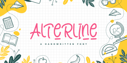 Alterline is a cute & playful font that will make your design looks modern, unique, and fun. Perfect for labels, quotes, posters, DIY projects, branding, packaging, greeting cards, websites, photos, kids photography, signs, window art, scrapbooking, tags, and so much more!
 - Kenzomaru by Almarkha Type,
$29.00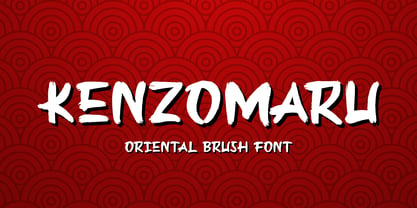 Kenzomaru is a Oriental Brush font that will make your designs look modern, unique and fun. It’s perfect for labels, quotes, posters, DIY projects, branding, packaging, greeting cards, websites, photos, photography overlays, signs, window art, scrapbooking, tags and so much more!
 - Terranova NF by Nick's Fonts,
$10.00 Another Dan X. Solo find, prosaically named Earth, provided the pattern for this family of futuristic fonts with a strong retro vibe. Both flavors of this font feature the 1252 Latin, 1250 Central European, 1254 Turkish and 1257 Baltic character sets.
 - Wella Atimbo Cyrillic by Ira Dvilyuk,
$18.00 The Wella Atimbo Cyrillic font is a handwritten calligraphic signature script font. It is the font pair with will be the best option for branding, logos, wedding invitations, social media, packaging, business cards, DIY projects, social media, and many others.
 - Bella Ciao by Almarkha Type,
$23.00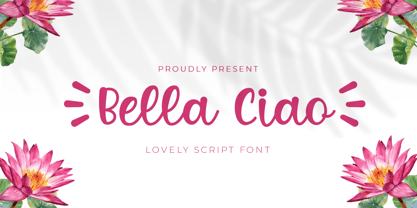 Bella Ciao is a Lovely Script font that will make your designs look unique and fun. It’s perfect for labels, quotes, posters, DIY projects, branding, packaging, greeting cards, websites, photos, photography overlays, signs, window art, scrapbooking, tags and so much more!
 - French Stencil Sans JNL by Jeff Levine,
$29.00 French Stencil Sans JNL is another typeface based on vintage French tin/zinc stencils. Slightly rounded corners and a "hand-cut" look add an interesting and charming variation that breaks away from the "standard" design of other metal stencil sets.
 - AZ Grampa by Artist of Design,
$25.00 AZ Grampa font was inspired from old content type on vintage tins. This font utilizes an "old look" to the line work which is designed to have a "worn feel" to it. Ideal for use as content text in you design.
 - Therestone by Almarkha Type,
$23.00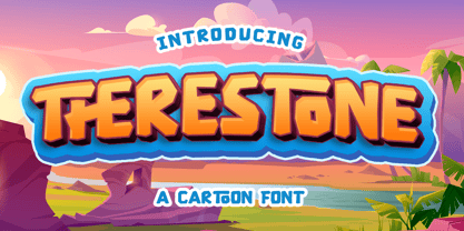 Therestone is a Cartoon Display Font that will make your designs look modern, unique and fun. It’s perfect for labels, quotes, posters, DIY projects, branding, packaging, greeting cards, websites, photos, photography overlays, signs, window art, scrapbooking, tags and so much more!
 - Bindweed by Solotype,
$19.95From an old wood type owned by a San Francisco printer. Wood types were customarily given somewhat generic names (Antique Tuscan) or, more frequently, numbers to identify them. Our clients liked colorful, easily-remembered names better, and so did we. - Romeline by Almarkha Type,
$22.00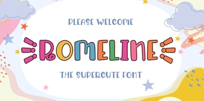 Rameline is a Supercute Display font that will make your designs look modern, unique and fun. It’s perfect for labels, quotes, posters, DIY projects, branding, packaging, greeting cards, websites, photos, photography overlays, signs, window art, scrapbooking, tags and so much more!
 - Chick Chack by Almarkha Type,
$23.00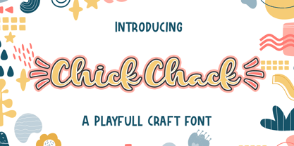 Chick Chack is a Playful Craft font that will make your designs look unique and fun. It’s perfect for labels, quotes, posters, DIY projects, branding, packaging, greeting cards, websites, photos, photography overlays, signs, window art, scrapbooking, tags and so much more!
 - Billstone Signature by Nathatype,
$29.00 Are you ready to make your branding stand out? Do you dream of creating headings that stand out and inspire creativity, imagination, modernity, and endless fun? Looking for an elegant and stylish font? We've got what you want. Billstone Signatture- A Siganture Font Billstone Signatture is a soft and sweet signature typeface, with characters dancing along the baseline. Designed primarily as a captivating font that has a casual and elegant touch. Can be used for various purposes such as logos, wedding invitations, headings, t-shirts, letterheads, signage, labels, news, posters, badges etc. Our font always includes Multilingual Support to make your branding reach a global audience. Features: Ligatures Stylistic Set Swashes PUA Encoded Numerals and Punctuation Thank you for downloading premium fonts from Din Studio
 - Konsens by Hubert Jocham Type,
$39.00 Germany has a strong heritage of industrial typefaces. These fonts seem like being constructed by engineers. The shapes seem to be built with circles and squares. DIN Mittelschrift is one very famous example, or the font on the old German car number plates. Since the Romain du Roi we know that it is tricky to draw a geometrical typeface. For optical reasons you have to go away from circles and lines with exactly one weight. Therefore the aim is not to construct a typeface but to draw it the way it seems constructed finally. The design of a typeface is like stage production. Like heavily made up actors the characters of a typeface must be exaggerated to work well. Particularly in small sizes.
 - KonsensSten by Hubert Jocham Type,
$39.00 Germany has a strong heritage of industrial typefaces. These fonts seem like being constructed by engineers. The shapes seem to be built with circles and squares. DIN Mittelschrift is one very famous example, or the font on the old German car number plates. Since the Romain du Roi we know that it is tricky to draw a geometrical typeface. For optical reasons you have to go away from circles and lines with exactly one weight. Therefore the aim is not to construct a typeface but to draw it the way it seems constructed finally. The design of a typeface is like stage production. Like heavily made up actors the characters of a typeface must be exaggerated to work well. Particularly in small sizes.
 - Halloween Monoline by Letterafandi Studio,
$8.00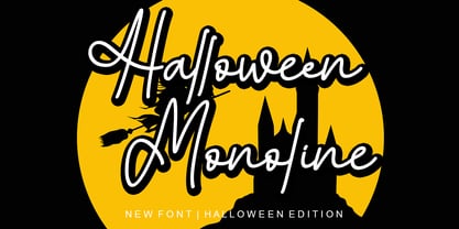 Halloween Monoline is a Script Monoline font by Letterafa Studio. It has flowing letters that will give your designs a unique and sweet look. Halloween Monoline font is perfect; logos, greeting cards, a package design, a brand identity, craft design, any DIY project, book title, wedding invitation, packaging, and more.
 - Evil Laughter by Hanoded,
$10.00 I am working on my Halloween font collection and realised I did not have a ‘blood drip font’. So, I bought a second hand typewriter and typed all the glyphs. Then I made the blood drips using syrup, paper and gravity! The result is a halloween font with a twist!
 - Cry Wolf by Hanoded,
$20.00 When I was a kid, I loved the story of The Boy Who Cried Wolf. I thought it was pretty stupid of the boy to trick the villagers into believing wolves are attacking his flock of sheep. But I also thought it was a bit sad that the sheep are eaten by a wolf in the end. I didn’t really feel sorry for the boy (he really was stupid), nor the wolf (he just does what he is supposed to do in life), but I did feel sorry for those poor sheep. I guess this is what disinformation leads to in the end. Cry Wolf is a bit of a scary font: it was made with a really old and battered brush, using Chinese ink and some quality French paper. It has a slight tilt to the right and I added some inky splatter for dramatic effect. Use Cry Wolf for your book covers, product packaging and headlines; use if to spice up you invitations and your halloween posters. Comes in a slightly tilted Regular style and an outright Italic style.
 - Finest Vintage by Din Studio,
$20.00 Choosing fonts for design projects can be a daunting task because there’s thousands of fonts out there all over the web that you could use. Here it is. A font that can add touch of magic whether you’re looking to create a big, bold logo for your business, work on a poster for an event, or whatever your project may be. Finest Vintage-A Retro Script Font Finest Vintage is a beautiful font, employing the iconic bubble style with strong outlines and fat strokes. This font features thick and angular letters that easy on the eyes and nice to look while it’s also easy to read. It is well suited for making your logos really stand out. The font comes with a range of multilingual glyphs and is one of those bubble fonts styles that’s hard to take your eyes off. Finest Vintage becomes more special with extruding version option. Perfect to create amazing headings, logos, menus, social media graphics, and many more. Our font always includes Multilingual Support to make your branding reach a global audience. Features: Ligatures Stylistic Alternates Swashes PUA Encoded Numerals and Punctuation Thank you for downloading premium fonts from Din Studio
 - Automobile - 100% free

- messaround - Unknown license

- Crack - Unknown license

- Saphire by Yumna Type,
$16.00 Saphire is a elegant handwritten font with a natural and unique design will make your project more beautiful. The font is suitable for your branding project, printing, logos dan wedding. Included: Saphire (OTF) Features: Standard Ligatures Stylistic Sets Multilingual Support PUA encoded Numeral and Punctuation by Yumnatype
 - LGF Besitos Square by LGF Fonts,
$18.00 BESITOS is a deconstruction INSPIRED on a sans serif type, in which the weights of the source did not mark the width of the letter but the lines that compose it is made in two variants according to their lines end up at right angles or curves.
 - LGF Besitos Round by LGF Fonts,
$18.00BESITOS is a deconstruction INSPIRED on a sans serif type, in which the weights of the source did not mark the width of the letter but the lines that compose it is made in two variants according to their lines end up at right angles or curves. - The Gallery by Stringlabs Creative Studio,
$25.00 The Gallery is a unique monoline script font. It features gorgeous swashes and ligatures that make this script incredibly versatile. Whether you’re looking for fonts for Instagram or calligraphy scripts for DIY projects, The Gallery will turn any creative idea into a true piece of art!
 - Moulin Rouge by Solotype,
$19.95This came from a shop near Munich, Germany, and was a very poor proof with no font name on it. Never did identify it. When we cleaned it up, we liked it pretty well. We think it is typical of some early twentieth century art nouveau fonts. - Pinktart by Yumna Type,
$16.00 Pinktart is a lovely handwritten font with a natural and unique design will make your project more beautiful. The font is suitable for your branding project, printing, logos dan wedding. Included: Pinktart (OTF) Features: Beautiful Ligatures Alternate Multilingual Support PUA encoded Numeral and Punctuation by Yumnatype
 - Spellcaster by Comicraft,
$19.00 Raven hair and ruby lips, it may have been a trick of the light but I'm sure sparks flew from her fingertips. I definitely heard echoed voices in the night, of a restless spirit on an endless flight. If I remember correctly she held me spellbound in the night, with dancing shadows and firelight. Yes, I think I did see a crystal ball on the table, showing the future, the past and I did drink the potion she offered me, when I really should have gotten out of there fast. And that's my story and I'm sticking to it, your honor. It was that girl with the white hair, I'm telling you. She has my wallet too.
 - Contype by Wiescher Design,
$39.50 Once I had a young, very eager and interested designer in my employ. We got into talking about where our letterforms come from and the habits in perception we are used to. He did not quite believe me. So I said, let's try to design a typeface where everything is just the opposite of what we are used to. We really had a hard time, our habits crept up on us all the time. But after a couple of weeks we finally finished this typeface and wanted to call it crazytype, but my young apprentice who did most of the manual labor said Contype sounded crazier. So it became Contype and it's really crazy, with a small asian touch to it. Yours very crazy Gert Wiescher
 - BeBop - Unknown license


