10,000 search results
(0.017 seconds)
- Lightmorning - Unknown license
- KG Keep Your Head Up - Personal use only
- Aircloud - Personal use only
- Turban Hey NF by Nick's Fonts,
$10.00The “Moorish arch” treatment of certain letters on a 2001 book on Dutch design, executed by René Knip, provided the inspiration for this exotic unicase typeface. The font also includes arabesque designs in the brace, florin and section mark positions. Both versions of the font include 1252 Latin and 1250 CE (with localization for Romanian and Moldovan) character sets. - Holofernes NF by Nick's Fonts,
$10.00The raw emotional energy of German Expressionism is evident in this font, based on Judith Type, designed by C. H. Kleukens in 1923. This version takes its name from the Biblical character who lost his head to the original font’s namesake. Both versions of the font include 1252 Latin, 1250 CE (with localization for Romanian and Moldovan). - Five And Dime NF by Nick's Fonts,
$10.00A font with a strong architectural feel, inspired by those great commercial emporiums of a bygone era. To cap the crossbars, use [brackets] to enclose uppercase letters, {braces} to enclose lowercase letters, and the upright bar | between upper- and lowercase letters. Both versions of the font include 1252 Latin, 1250 CE (with localization for Romanian and Moldovan). - Engel Stabenschrift NF by Nick's Fonts,
$10.00This elegant unicase uncial face is based on a work by German type designer Ernst Engel from 1927.This typeface masterfully combines Art Deco sensibilities with medieval letterforms, and is suitable for both text and headline use. Both versions of the font include 1252 Latin and 1250 CE (with localization for Romanian and Moldovan) character sets. - Ingvaeonic Oldestyle NF by Nick's Fonts,
$10.00The pattern for this classic typeface was originally called "Viking Oldstyle", from the 1909 H.C. Hansen Type Foundry catalog. To enhance its weathered look, the inside corners have been rounded to simulate ink buildup on metal typeforms. Both versions of the font include 1252 Latin and 1250 CE (with localization for Romanian and Moldovan) character sets. - Vidalia Sunshine NF by Nick's Fonts,
$10.00A single line of type, identified as "Ornamented No. 5" and spelling out "ROPE ONIONS", from the 1888 MacKellar, Smiths & Jordan specimen book provided the pattern for this whimsical face. Offbeat yet elegant, graceful yet bold, it’s a natural choice for distinctive headlines. Both versions of the font include 1252 Latin, 1250 CE (with localization for Romanian and Moldovan). - Keynote Speaker NF by Nick's Fonts,
$10.00This curious little gem is patterned after a typeface named "Bloomsbury", released by P. M. Shanks & Sons, Ltd. of London in the 1920s. Its gentle curves and somewhat quirky construction combine to create a warm and friendly, if slightly offbeat, antique charm. Both versions of the font include 1252 Latin, 1250 CE (with localization for Romanian and Moldovan). - Tiny Bubbles NF by Nick's Fonts,
$10.00Here’s another gem pulled from the pages of one of the many editions of Pen and Brush Lettering by the Blandford Press. Cascading bubbles add a somewhat 70s feel to a distinctly Deco font, and provide its name as well. Both versions of the font include 1252 Latin, 1250 CE (with localization for Romanian and Moldovan). - Day Tripper NF by Nick's Fonts,
$10.00An undeniably Art Deco font with some unexpected twists and turns, this typeface is based on a design originally called "Dignity Roman", a product of the fevered imagination of the rather unconventional 30s lettering artist Alphonse E. Tripp. Both versions of the font include the 1252 Latin and 1250 CE character sets (with localization for Romanian and Moldovan). - Paper Caper NF by Nick's Fonts,
$10.00This typeface is an amalgam of two cut-paper typefaces, as presented by Margaret Shepherd in her book, Calligraphic Alphabets Made Easy. Also included are a glue bottle at the bar position, and round-edge scissors at the dagger and double-dagger positions. Both versions of the font include 1252 Latin, 1250 CE (with localization for Romanian and Moldovan). - Bleecker Street NF by Nick's Fonts,
$10.00This late Victorian typeface flirts with Art Nouveau sensibilities, as evidenced by the graceful curves and the decorative crossmembers in several of the uppercase letters. The result is a font that combines simple, understated elegance with a no-nonsense, workmanlike stance. Both versions of the font include 1252 Latin, 1250 CE (with localization for Romanian and Moldovan). - Keepon Truckin NF by Nick's Fonts,
$10.00Baby Fat, designed by Milton Glaser in 1964, saw a lot of action during the psychedelic poster phase. This little dumpling is based on that workhorse, and takes its name from a phrase that also got around a lot in the 60s. Both versions of the font include 1252 Latin, 1250 CE (with localization for Romanian and Moldovan). - Tara Bulbous NF by Nick's Fonts,
$10.00This new and improved version of this chunky classic by Paul Carlyle and Gus Oring includes the lowercase letters not found in earlier versions. Use it to add a little—or a lot of—panoramic panache to your next project. Both versions of the font include 1252 Latin and 1250 CE (with localization for Romanian and Moldovan) character sets. - Decimosexto NF by Nick's Fonts,
$10.00This typeface family includes Spanish Roman letters and “Griffo” style italics, both hand-drawn by Francisco Lucas in Madrid, 1577. The letters, sometimes slightly mismatched in size or off the baseline, capture the look and feel of sixteenth-century printing. Both versions of the font include 1252 Latin, 1250 CE (with localization for Romanian and Moldovan). - Chez Nous NF by Nick's Fonts,
$10.00This delightful semiscript is based on an offering from a 1930s specimen book from the Mergenthaler Linotype Company, originally called, simply, "Card Italic". Elegant without being stuffy, it is equally “at home” announcing anything from formal occasions to casual get-togethers. Both versions of the font include 1252 Latin, 1250 CE (with localization for Romanian and Moldovan). - Haut Relief NF by Nick's Fonts,
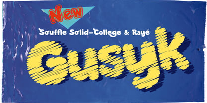
$10.00Based on the typeface Sculpture, designed by Charles Allen in the 1960s for Photolettering, this font is an intriguing exercise in implicit letterforms, using cast shadows to suggest, rather than delineate. Both sublime and subliminal, it’s an excellent choice for commanding headlines. Both versions of the font include 1252 Latin, 1250 CE (with localization for Romanian and Moldovan). - Souffle by Eurotypo,
$48.00Souffle fonts are carefully hand-drawn made, with different letter shapes, full of ligatures, and stylistic alternates that will provide great flexibility for your designs. They come in three versions: Solid, College and Rayé (rough sketched); Including diacritics for CE languages. They fit perfect for logos and packaging design, posters, children books and many other purposes. - Kunstgewerbe NF by Nick's Fonts,
$10.00J. M. Bergling called the inspiration for this typeface “modern”—at least, it passed for modern in 1914. Its bold, sinuous forms and unusual decorative treatment suggest stained glass of a certain era, and so its name is German for “Arts and Crafts”. Both versions of the font include 1252 Latin, 1250 CE (with localization for Romanian and Moldovan). - Veru Serif - Unknown license
- TwoBeers - Unknown license
- ticker - Unknown license
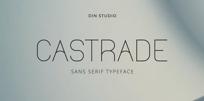
- Castrade by Din Studio,
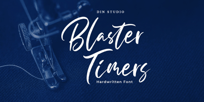
$29.00 - Blaster Timers by Din Studio,
$29.00 - creatures - Unknown license
- push - Unknown license
- Apollo9 - Unknown license
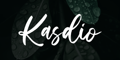
- Kasdio by Din Studio,
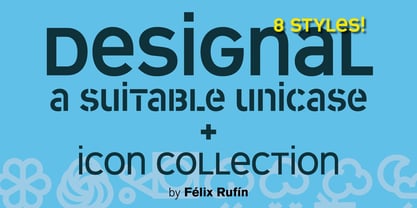
$29.00 - Designal by Type-Ø-Tones,
$40.00 - Groove Thang NF by Nick's Fonts,
$10.00An interesting, unusual and righteously funky variation on the classic “Barnum” style of lettering, this typeface was originally named "Dado". As any woodworker knows, dado is also the name of a slot ploughed, chiseled or cut in wood: in other words, a groove thang. Both versions of the font include 1252 Latin and 1250 CE (with localization for Romanian and Moldovan) character sets. - Kirschwasser NF by Nick's Fonts,
$10.00An unannotated photocopy tucked inside the leaves of an old lettering book yielded this unusual and exuberant Art Deco face. The caps feature a simple “bubbly” pattern that makes this offering pack a punch, not unlike the German cherry brandy for which it is named. Both versions of the font include 1252 Latin, 1250 CE (with localization for Romanian and Moldovan). - Kandinsky NF by Nick's Fonts,
$10.00While strolling through the Phillips Collection in Washington, DC, I came across a delightful painting by Wassily Kandinsky entitled “Succession”. Many of the forms seemed to me typographic so, of course, a font followed, and this is it: wild, wacky and delightfully different. Both versions of the font include 1252 Latin and 1250 CE (with localization for Romanian and Moldovan) character sets. - Boxcar Willie NF by Nick's Fonts,
$10.00Based on a typeface originally called "Seven Flare", this offering has a warm, slightly naive grace and a casual nostalgic charm. In addition, kerning has been applied to all possible letter combinations, so that you can mix the upper and lowercase letters in any combination you please. Both versions of the font include 1252 Latin, 1250 CE (with localization for Romanian and Moldovan). - Sis Boom Bah NF by Nick's Fonts,
$10.00An old favorite from the venerable Letragraphica series, named Yankee Shadow and designed by Tony Geddes, provides the pattern for this sporty font. For this version, the outlines have been beefed up, and the shadow has been moved in an easterly direction. Both versions of this font include the complete Latin 1252 and CE 1250 character sets, with localization for Romanian and Moldovan. - Cerulean NF by Nick's Fonts,
$10.00An offering from Barnhart Brothers & Spindler’s Catalog No. 9 from 1907, with the rather prosaic name of "Lining Gothic No. 71", inspired this non-nonsense and surprisingly ageless face. As versatile as it is simple, this typeface is a stylish choice for heads and subheads. Both versions of the font include 1252 Latin, 1250 CE (with localization for Romanian and Moldovan). - Iraan NF by Nick's Fonts,
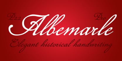
$10.00A refreshing stars-and-stripes treatment, suggested by lettering artist Francisco Gonzales, combined with the letterforms of an old ATF typeface named "Rodeo", produced this delightfully novel font, suitable for patriotic occasions. Named for a small Texas town, which pronounces its name "Eerie-Ann." Both versions of the font include 1252 Latin, 1250 CE (with localization for Romanian and Moldovan). - P22 Albemarle by IHOF,
$39.95P22 Albemarle is a smooth reworking of the popular rough textured Roanoke font. The texture change gives this style a much more elegant effect, yet retains its skilled capturing of historical handwriting. Albemarle Pro features at least one alternate for all Caps and many lower case characters. The Pro font also features a full CE character set and more with over 600 glyphs. - Magic Lantern by Nick's Fonts,
$10.00One in the series of fonts celebrating the Halcyon Days of Handlettering. Magic Lantern is a caps and small caps font based on an untitled design by Samuel Welo, whose Studio Handbook for Artists and Advertisers appeared in six editions between 1927 and 1960. Both versions of the font include 1252 Latin, 1250 CE (with localization for Romanian and Moldovan).


