10,000 search results
(0.204 seconds)
- ITC Panache by ITC,
$29.99Typefaces, like most other works of art, provide a small window into the personalities and sensibilities of the artists who create them. ITC Panache not only provides this window, it is also aptly named. Mr. Edward Benguiat the dreator of ITC Panache, has all the dash, verve (and panache) hinted at in the design, Creative, capable and prolific, Ed Benguiat has drawn hundreds of exciting and popular typeface designs. Benguiat's design goal was to create a sans serif typestyle that is versatile, utilitarian - and distinctive. We think he has succeeded admirably. ITC Panache's three weights mix exceptionally well to complement each other or provide emphasis where necessary. Extensive testing at text sizes and design fine-tuning has produced a typeface family which is remarkably homogenous and consistent in color. Text set in ITC Panache is inviting without dissapointment. It is exceptionally easy to read, even in long text blocks of copy or small point sizes. When set in larger sizes or used for headlines, ITC Panache's character traits becomes more apparent and pronounced to the reader. They help to create graphics with distinction and style. Big or small. a little or a lot. it's hard not to use ITC Panache well. If you could pigeonhole ITC Panache, it would probably be classified as a stressed sans", but this would not completely describe, or do justiceto, the design. There is a slight contrast in stroke weight, which becomes more pronounced as the familiy weight increases; but there is a more to distinguish ITC Panache from ather sans serifs. Perhaps most obvious is its high waist and correspondingly slight condensation of the top half of the "round" capitals. Both of these traits link ITC Panache with the sensuous forms of art nouveau creations. In contrast are the typicall old style "e" found in designs like Cloister and ITC Berkeley Old Style, and the two storied "g" common to the early 20th century sans serif designs. The capital "A" even has the cupped top found in Caslon designs. Part of the beauty of ITC Panache is that all of these seemingly unrelated desig traits are melded into a design of exceptional continuity." - Wood Nouveau JNL by Jeff Levine,
$29.00 The hand cut wood type which was the inspiration for Wood Nouveau JNL conjures up images of the artistic period between the Victorian Era and 1920s Moderne, as well as the hippie counterculture active in the later part of the 20th Century. During the late 1960s and early 1970s, rock posters, fliers, store signs and other printed ephemera of "the love generation" borrowed heavily from the Art Noveau style in both art and typography. An Alphonse Mucha-inspired flower girl could adorn a concert poster that also combined both vintage wood type and hand-lettered elements. Although this particular type design might well have preceded the actual start of the Nouveau period, the softer, rounder lines of each character lent themselves well to this emerging style.
 - La Taqueria by Sudtipos,
$39.00 Mexico’s storied culture is one of the most recognizable today. Its amazing vibrant art and delicious foods have made the leap to influence many parts of the world in recent years. This proud, intense and diverse identity was the inspiration behind La Taqueria, a set of four fonts that express different characteristics of Mexican pop culture. The heavy and spicy, the light and gentle, the constant dynamism, all come together with one rhythm to produce an explosion of personality. Just like its predecessors Distillery and Scrapbooker, the La Taqueria set contains down-to-earth alphabets perfect for chalkboard art and handmade design. All the fonts include alternates and ligatures, providing plenty of variation for that spontaneous appearance everyone is looking for these days.
 - Quick by Pen Culture,
$15.00 Quick is modern elegant serif typeface. this font perfect for branding, logo design, product packaging, magazine headers, and so much more. I really hope you enjoy it - please do let me know what you think, comments & likes are always hugely welcomed and appreciated. More importantly, please don't hesitate to drop me a message if you have any issues or queries. Thank you
 - Beach Fool by PizzaDude.dk,
$19.00 People might consider me a fool - they might even consider me a fool on the beach...because I take a swim in the ocean, even in the wintertime! Beach Fool is a simple but yet very strong headline font. It has its roots in both grafitti and comics, which makes it really powerful for graphical expressions that needs an extra punch!
 - Violetdays by Illushvara,
$12.00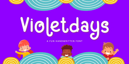 Hello, Present a new font Violetdays a handwritten font special for the kids theme promotion. Violetdays is perfect for product packaging, branding project, magazine, social media, wedding, or just used to express words above the background. Enjoy the font, if you have any question don’t hesitate to contact me comment or feedback, send me PM or email. Happy Designing! Thank you, Bayu Suwirya
 - Hoodoo U NF by Nick's Fonts,
$10.00This roly-poly romp through the alphabet is based on Jürgen Riebling's irrepressible Mr. Big from the 1970s. Big, bold, bubbly and a little brash, it's a natural choice for happy headlines. Both versions contain the complete Latin 1252, Central European 1250 and Turkish 1254 character sets. - Reslaby by Letterayu Studio,
$19.00 Reslaby is a Vintage Slab Serif font that will make your designs look unique and fun. It's perfect for labels, quotes, posters, DIY projects, branding, packaging, greeting cards, websites, photos, photographic overlays, signs, window art, scrapbooking, tags and more! What's Included : + Standard glyphs + Web Font + Multilingual Accent + Works on PC & Mac + Simple installations Accessible in the Adobe Illustrator, Adobe Photoshop, Adobe InDesign, even work on Microsoft Word. PUA Encoded Characters - Fully accessible without additional design software. Fonts include multilingual support Image used : All photographs/pictures/vector used in the preview are not included, they are intended for illustration purpose only. Thank You
 - Berghan by Craft Supply Co,
$15.00 Berghan is a modern grotesk sans serif features thick and thin contrast details for contemporary nuances. It can be used to create almost all types of design projects like print materials. Just use your imagination and your project will become more alive and look great than ever with this typeface. You want to make a greeting card or a package design, or even a brand identity, craft design, any DIY project, book title, wedding font, pop vintage design, retro design or any purpose to make your art / design project look pretty and trendy? Feel free to play with this typeface!
 - Fluffenhaus by astroluxtype,
$20.00 Fluffenhaus is a vintage bold retro-font, the glyphs are soft serve ice cream, sorta Cooper Black after to much party. A fun playful look that suggests the 1960's and 1970s rock posters and cereal box art as well. Fluffenhaus is a fat bold font, apply to projects that need an attention grabbing headline that expresses the fun of the information being convened. Tightly spaced in the metric, suggested uses would be for it to be used BIG and then bigger. Fluffenhaus is a groovy beautiful and tuned into the psycho-fab of the now!
 - Psychomachy by Gassstype,
$27.00 Hello Everyone, introduce our new product Font Psychomachy Handmade Scary Font with ligature and Multilanguage support.Introducing of designs look modern, unique and fun. It’s perfect for labels, quotes, posters, DIY projects, branding, packaging, greeting cards, websites, photos, photography overlays, signs, window art, scrapbooking, tags and so much more!our new product that inspired by Street Tagging, graffiti style with a fun theme very good for graffity poster, flyer, childrenbook, cartoon, comic etc . That is has charming, authentic and relaxed characteristic more natural look to your text You can activate 15 Alternates glyphs and 10 Ligatures glyphs OpenType panel.
 - Rovey by Craft Supply Co,
$15.00 Rovey is an all caps handwritten serif font. It can be used to create almost all types of design projects like print materials. Just use your imagination and some graphic design set in Extras and your project will become more alive and look greater than ever with Rovey. You want to make a greeting card or a package design, or even a brand identity, craft design, any DIY project, book title, wedding font, pop vintage design, retro design or any purpose to make your art / design project look pretty and trendy? Feel free to play with this fonts!
 - KG I Need A Font by Kimberly Geswein,
$5.00 A neat handwritten font in 2 styles- one with hearts and one without hearts.
 - P22 Hieroglyphic by P22 Type Foundry,
$24.95Hieroglyphs were a pictorial alphabet used in Ancient Egypt from 3100 BC to approximately 300 AD. This font set features over 250 different phonetic and decorative hieroglyphics, complete with an extensive translation chart. P22’s Hieroglyphic font adapts one of the world’s most ancient forms of art and communication for today’s technology. Note: This is not an automatic word translator. It is a font set. It is used just like any other font and does not require special software skills. - Aglaia by Wildstripe,
$19.00 Aglaia is an elegant geometric sans serif typeface that comes in three weights. Designed in part inspired by Art Deco, but with a modern minimalist approach that makes it a versatile and excellent contemporary display font for titles, editorials and short texts. Font features: Uppercase & Lowercase Numerals, Punctuation & Symbols Alternates & Ligatures Multiple Languages Support (Latin characters + Diacritics) How to access Alternate Characters: The alternate characters can be accessed via the glyphs panel in your favorite software. Or with OpenType features turned on.
 - Bluenote Demi by Wiescher Design,
$39.50 Bluenote is a font based on Franklin Gothic condensed. In the 60s and 70s the record label Blue Note published all those classic jazz records of my youth. Someone at their arts department cut letters to ribbons and designed wonderful record covers with those fragmented glyphs. I recently had a look at my music collection and rediscovered these letters. Being a hard-working type designer I couldn't resist the challenge, here is the result from your dilligent designer Gert Wiescher
 - Grafilone by Linotype,
$29.99Linotype Grafilone is part of the Take Type Library, which features winners of Linotype’s International Digital Type Design Contest. In creating his font, Bo Berndal combined elements of the constructed and Art Deco styles. Slender and angular, Grafilone is mechanically exact and coolly resesrved. A distinguishing characteristic is the combination of angular and sloping strokes, which give the font a dynamic feel. Grafilone is particular good as a headline font and for initials when combined with constructed sans serif fonts. - Cherrious by Cooldesignlab,
$12.00 Cherrious is a soft and sweet handwritten font. Fall in love with the original feel and love-shaped swash character. This font is perfect for creating beautiful wedding invitations, beautiful stationery art, eye-catching social media posts, Logos, Brands, and cute greeting cards. This display font is the perfect choice for creating original and extraordinary designs. This font is PUA coded which means you can easily access all the heart themed glyphs ! It also features many special features including glyphs and alternate ligatures.
 - Chicago Eskimo - Personal use only

- Crazy Beaver - Unknown license

- Headshop - Personal use only

- Rivanna - 100% free

- Amsterdam Graffiti - Unknown license

- PF Mellon by Parachute,
$35.00 PF Mellon is a modernist variable grotesque with mixed roots. Its unconventional aesthetic is the product of an exploration into the art of emphasizing titles, headlines and text in captivating and unpredictable ways. Contrary to conventional practices of highlighting text with heavier weights, PF Mellon proposes an intriguing new scheme based on striking and attention-grabbing compositions of narrow and extended letterforms- even when set in lowercase. Part geometric and part grotesque, PF Mellon’s expressionist alphabet and extravagant style challenge conventions of visual culture in an Art Deco-like manner. PF Mellon’s rebellious idiosyncrasy takes its cues from the eccentric personality of our popular PF Venue, an earlier geometric sans serif characterized by its daring combinations of non-uniform structures. PF Mellon’s basic design skeleton was influenced by nineteenth and early twentieth century condensed sans serif typefaces such as Stephenson Blake's Grotesque No.77 and ATF’s Alternate Gothic, adding an extra contrast to the thickness of strokes. PF Mellon is also available as a variable font format which you may request it free of charge from Parachute® once you purchase the whole type family.
 - Ysadora by Autographis,
$39.50 Ysadora is a very elaborate script with high contrast and big swings.
 - Texas Hero by Three Islands Press,
$39.00 It occurred to me years ago that the graphic arts community might find useful a digital typeface that mimicked the classic look of nineteenth-century handwriting. Conveniently, my mother then still volunteered at the Center for American History at the University of Texas at Austin, my hometown. She made copies of the letters of a few famous Texans -- Houston, Austin, Travis, Burnet, Rusk. Thomas J. Rusk’s penmanship caught my eye as the most accessible of the bunch. I hadn't realized at the time what a challenge it'd be to render a realistic-looking script face, but the result has, in fact, filled a niche.
 - Neatly Said by Mili + Wise,
$12.00 Introducing Neatly Said - sweet & versatile font family. Packed with hand-drawn letters, stylistic alternatives, and ligatures. Perfect for writing out uplifting quotes for instagram posts, wall art or greeting cards. It will also be there for you if you need to design some charming packaging or branding. Suitable for short and sweet quotes, as well as longer meaningful paragraphs. Designed and kerned with care and love to make using it a breeze. Neatly Said is packed with lovely features: many stylistic alternates for uppercase and lowercase ligatures multilingual support with accented characters for international designers Contact me with your order number to receive the illustrations: monika.torun@gmail.com
 - Celtic Nova by Kaer,
$18.00 Hi! Celtic Nova font is available. The font is presented in regular and color versions. This is a new classic Celtic font with spirals and knots. Celtic Nova font is perfect for printing of graphic arts, posters, packaging and t-shirts. The font is given in regular and colored versions. *You can use color fonts in PS since CC 2017, AI since CC 2018, ID since CC 2019, QuarkXPress since 2018, Pixelmator, Sketch, Affinity Designer Since macOS 10.14 Mojave, Paint.NET Windows only.* *Please note that the Canva doesn't support color fonts!* You'll get: * A-Z letters * Numbers If you have any questions or issues, please contact me: kaer.pro@gmail.com Best, Roman.
 - Vaudevillian JNL by Jeff Levine,
$29.00 The place for a family to be entertained by comedians, dancers, acrobats, animal acts, singers and just about any other acts that fit the bill at the time was the vaudeville theater. Prior to radio becoming the major source of entertainment for the American public, popular songs were introduced on the stages of these entertainment venues. One such song from 1916 with a World War I patriotic sentiment was "A Yankee Doodle Boy Is Good Enough for Me". The sheet music featured the title hand lettered in Art Nouveau style. This became the design source for Vaudevillian JNL, available in both regular and oblique versions.
 - Seabright Monument by Device,
$39.00 During a ‘type walk’ at the 2007 AtypI conference in Brighton, typographer Phil Baines pointed out what he considered to be a particularly egregious example of over-decorative art nouveau lettering on a war memorial. This made me determined to use it as the basis for a font. Released in Opentype, it now features ligatures, swashes and alternates. It’s not certain if the curved top bars on the E and F are a feature of the original design or due to climbers using them as footholds, but I incorporated them anyway. It has recently been used for invitations and supporting print material for formal charity dinners at the House of Lords.
 - Maternal by Sohel Studio,
$15.00 Maternal is Modern Display Font. This typeface is perfect for an headlines, classy editorial design, magazine, fashion brand , cosmetic brand, fashion promotion , modern advertising design, invitation card, art quote, home decoration , book/cover titles, special events, and much more. Maternal Features: · Uppercase & Lowercase · Alternates & Ligatures · Numerals & Punctuation · Accented characters · Multilingual Support · Unicode PUA Encoded If you want the SVG version please contact me. While using this product, if you encounter any problem or spot something we may have missed, please don't hesitate to drop us a message. We'd love to hear your feedbacks in order to further fine-tune our products. Thanks and have a wonderful day .
 - Gilliany by Pen Culture,
$17.00 Gilliany is modern signature font that with a neat handwriting style, the shape of each letter and ligature has its own characteristics that are suitable for a variety of needs. Gilliany come with full set of uppercase and lowercase letters, multilingual symbols, numerals, punctuation and 71 ligatures. I really hope you enjoy it - please do let me know what you think, comments & likes are always hugely welcomed and appreciated. More importantly, please don't hesitate to drop me a message if you have any issues or queries. Guides to access all alternates glyphs : http://adobe.ly/1m1fn4Y Please fell free to contact me if you have any question Thank you
 - RF Marshall by Magpie Paper Works,
$18.00 RF Marshall was inspired by an 1883 tombstone, tucked away in a pioneer cemetery. The 4-sided marker is sparsely adorned with homespun carvings of a handprint, two tulip poplar leaves, and these words: "RF Marshall died 1883 Aged 72 years." The font faithfully reproduces the stone's hand-carved lettering and artwork, as well as artwork from other 18th and 19th century American headstones. It was drawn with calligraphy nibs dipped in walnut ink and delights in a range of end uses including period films, rustic decor, Halloween decorations, historical logos and branding, and on the pages of children's books.
 - Scholz Secession by HiH,
$8.00 We named this font Scholz Secession. Fin-de-siecle Vienna, Austria is the source of this Jugendstil design from Schriftgiesserei Eduard Scholz. The original release was under the name Reklameschrift Secession. Most of the curve strokes look like commas to me. The letters are as soft and plump as the comforter on the bed I slept on in a Salzburg B&B many years ago. I was traveling with a college buddy and our next stop was Vienna. There a kind, young student named Hanna and her boyfriend took us under their wing. One of the places Hanna proudly showed us was Otto Wagner’s Majolika Haus, built in 1898, and only about 8 blocks from Secession Hall. Hanna explained to us that the style was called Jugendstil and represented Art Nouveau as interpreted within the framework of their culture. I even took a picture. After all, memories are part of who we are. Figures are old-style for text use. This font would not be my first choice for a spread sheet. Included are German ligatures ch (alt-0123) & ck (125), two period ornaments (135, 175) and lower case o and u with Hungarian long umlaut (215, 247)). A very likeable and easy-to-use font.
 - Buck by Here East Fonts,
$16.00 BUCK HEAVY is an extremely monumental, architectural and brutal unicase font, designed for maximum visual and emotional impact. Use it in big and really big scales. It's great for headlines, prints, branding, editorial and websites — everything that strives for being really bold, vibrant and super strong and masculine.
 - St Mika by Stereotypes,
$25.90 St Mika is big, black and beautiful. A little bit clumsy, Mika has his very own style of serifs and letterforms, making him very unique. If you want to yell or scream at someone, Mika is not your partner. This typeface is more about harmony and big letters.
 - ITC Bolthole by ITC,
$29.99I fell in love at the age of twelve in Wales, recalls Bernard Philpot. "My father brought me to a small graveyard in the Welsh hills to show me two headstones carved by the great Eric Gill. I instantly fell in love with the beauty of the carving and the perfection of the letterforms. I still go back to marvel at these works of art." However, the ITC Bolthole™ design, Philpot's first commercial typographic endeavor, is quite unlike the works of Eric Gill that first captured his heart. Bolthole is a craggy sans serif with a definite grumpy attitude. It's not terribly legible, and, if more than a few words are set in the design, it's not very readable. To round out its cranky personality, Bolthole does not like to be set in small sizes. Like Cheez Whiz® and bullfights, you either love or hate this typeface. But whichever emotion dominates, there is no denying that Bolthole has a personality to be reckoned with - one with ample magnetism to ensure reader attraction. If used to set brief blocks of display copy, the typeface makes a powerful statement. Bolthole was originally designed to complement a whimsical ad for the Royal Society for the Prevention of Cruelty to Animals. As Philpot recalls, "although the ad didn't win any awards, the type attracted some very positive comments for its original look and feel." Philpot studied graphic design and typography at the London School of Printing, and soon after graduation found himself working in a large advertising agency in London. According to Philpot, "After designing type for everything from packaging to ads, I thought it time to convert one of my designs into a complete font - and Bolthole was born." ITC Bolthole could very well be the Shrek™ of typeface design - which might not be such a bad thing." - Snobjury - Unknown license

- Narziss Pro Cyrillic by Hubert Jocham Type,
$59.90 Since Mommie, I gradually got more into swirly ornaments. The massive contrast in the neoclassic style is perfect for thin swirly extentions to the characters. Even in an upright typeface. Narziss is very elegant in big headlinesizes. Use it only very big. What was the inspiration for designing the font? spencerian calligraphies and neoclassic contrast What are its main characteristics and features? Narziss is very elegant in very big sizes. The Regular version is without any ornament. The Drops version has some character like the e and the k that are more unique. The Swirls version has got carefully added swirls, that come out of the basic stroke and flow into other characters. Usage recommendations: Big headlines in magazines, brochures and invitations
 - Cortair by Letterhend,
$15.00 Cortair is an organic font duo with natural vibes! Contain two fonts, Sans and Serif with Rough and Stamp Style. You can use this font for every project. Suitable for branding logo, hand lettering, or apparel design. We hope you enjoy the font, please feel free to comment if you have any thoughts or feedback. Or simply send me a PM or email me at letterhend@gmail.com


