5,683 search results
(0.033 seconds)
- Dance Band JNL by Jeff Levine,
$29.00 Sheet music for the song "I'm the One That Loves You" has the title hand lettered in a narrow, Art Deco-influenced sans serif, which is now available digitally as Dance Band JNL in both regular and oblique versions. The 1937 composition was popularized by Tommy Dorsey and Sammy Kaye.
 - Freaky Prickle by ParaType,
$25.00Freaky Prickle script was written using ink and various wooden sticks and digitized/ Autor’s target was to create the spontaneous, light, flying script with dynamics and energy at the same time. Upright and cursive styles are available. The type was planned for use as headline in fiction and display matter. - Dust Serif - Personal use only

- Portada by TypeTogether,
$35.00 For everyone wishing for a modern serif that’s as clear and readable as a sans in restrictive digital environments, meet Portada by Veronika Burian and José Scaglione. Sans serifs are commonly used on small screens to save space and carry a modern tone. Serifs may appear fickle and unsteady, pixel grids change from one product to another, and space is at a premium. Portada now provides a serif option for these restrictive digital environments, putting that old trope to rest. The screen has met its serif match. Portada was created from and for the digital world — from e-ink or harsh grids to Retina capability — making it one of the few serifs of its kind. Portada’s text and titling styles were engineered for superlative performance, making great use of sturdy serifs, wide proportions, ample x-height, clear interior negative space, and its subservient personality. After all, words always take priority in text. It’s not all business, though. Portada’s italics contain an artefact of calligraphy in which the directionality of the instrokes and the returning curves of the outstrokes give the family a little unexpected brio. Yet even the terminals are stopped short of flourished self-absorption to retain their digital clarity. When printed these details are downright comforting. Portada’s titling styles enact slight changes while reducing the individual width of each character and keeping the internal space clear. Titling italics have increased expressiveness across a few characters rather than maxing out the personality in each individual glyph. Digital magazines, newspapers, your favourite novel, and all forms of continuous screen reading benefit from Portada’s features. This family can also cover many of the needs developers have: user interface, showing data intensive apps on screen, even one-word directives and dialogs. And, as a free download, an exhaustive set of dark and light icons is included to maintain Portada’s consistent presence, whether as a word or an image. The complete Portada family (eight text styles, ten titling styles, and one icon set) is designed for extensive, clear screen use — a rare serif on equal footing with a sans.
 - Else NPL by Linotype,
$29.99At first glance, Else may seem to be similar to many of the Century typefaces, with its prominent figures and sturdy alphabet. But when Robert Norton, of Norton Photosetting Ltd., designed Else in 1982, he added a bit of flair to that basic model. Note the bowl of the g, the splayed legs of the M, the sharply curved G and J, as well as the leading strokes of v and w and both of the graceful ampersands. - Quara by Delve Fonts,
$39.00 Quara is a typeface that takes its cues from cutting edge technology and new gadget lust. Quara enjoys short downloads on the web, long walks on mobile devices, and romantic dinners by LED light. An avid gamer (esp. MMORPG) and science fiction fan, Quara longs to be the first font in space and have its pixels scattered among the stars. Designed by Delve Withrington in 2009, this slightly rounded square sans has a generous x-height and low contrast.
 - Humanism by Prominent and Affluent,
$30.00 Inspired by the urban typography, which later led to a grotesque style. It can be used for bold editorial statements graphic heavy prints or just as a simple logo. This new type will definitely make your designs stand out and unique. Its robust, strong and contemporary form makes it perfect for any project that needs the extra strength. Humanism is available from A to Z in the regular and italic style, developed in an urban style.
 - Ombres by Typephases,
$25.00 Very close thematically and in style to the rest of our “whimbats” (the Absurdies, Bizarries, Illustries, Genteta and Whimsies series), the Ombres contain a number of peculiar silhouettes and illustrations of people that range from cute to scary, with everything in between. Ombres offers152 pictures in 3 files. These imaginary characters were produced with different techniques: quick pencil sketches, ink, watercolour, though once digitized and simplified to bring them into the font files there is little apparent difference. The silhouettes, rather than flat shadows are more dimensional in their look, because they have been digitized retaining the original brushwork or pencil strokes of their source drawings. Some of them remind of the venerable tradition of metal stock cuts from vintage type foundries. The digitized results are quite different, but the energetic nature of the subjects has been mantained. Their vectorial file format means you can use them at any size with no loss of quality. Every Ombres dingbat offers ready-made images for a variety of creative projects. They can be used as they come or easily customized in any graphics program. At small sizes they are ideal spot illustrations with a whimsical touch; at large sizes they can bring a whole page, a spread or even a big poster to live.
 - Linotype Punkt by Linotype,
$29.99 Linotype Punkt, from US designer Mischa Leiner, is part of the TakeType Library, chosen from the entries of the Linotype-sponsored International Digital Type Design Contest 1999 for inclusion on the TakeType 3 CD. This font, from US designer Mischa Leiner is available in three weights, light, regular and bold. The basic forms are those of a robust sans serif, however the figures are composed of evenly placed dots, hence the name Punkt, the German word for dot. This distinguishing characteristic lets this font look as though it appears on a background of light. One other unique trait of this font is the nature of the three weights. The figures of each weight have exactly the same measurements, the same width, breadth, etc. The only variable measurements are those of the individual dots making up the forms, making the bold weight much darker than the light while retaining the same outer contours. Linotype Punkt should be used in larger point sizes, as when it is too small the dots blur together and rob the font of its 'light'. The font is therefore best for headlines in large and very large point sizes.
 - The Black Shapes by Intellecta Design,
$15.90 The Black Shapes" are a collection of decorative single forms good to use as background of graphic design projects, like covers of books, headpieces at books and magazines, cd-covers, and many others.
 - Megahunt by Stringlabs Creative Studio,
$25.00 Megahunt is a Script Font with Modern Brush Style. The Megahunt font made with digital brush pen strokes that making this font look authentic. This font is perfect for fashion brand, wedding invitation, business card, logo brand, signature, and then calligraphy. This Font contains Classy, Elegant, Creative, Cool and has a Unique Concept.
 - Flimsy by Bogstav,
$17.00 Flimsy is 100% handmade, but digitally remastered. I removed some blobs here and there, but kept enough of the original handmade line in order to make the Flimsy stand out as an organic and powerful ALL CAPS font! I've also added 5 slightly different versions of each letter, along with multilingual support!
 - Glitch by Roman Polishchuk,
$30.00 Glitch is an accentuated modern typeface. It emphasizes the digital identity of your product. More often than not, pixel fonts look rough. Glitch has a more elegant, subtle shape, improving perception. Gitch is suitable for crypto projects, programmers, and game design. It also has its place in printing, web design, and media.
 - Devilish by Celebrity Fontz,
$24.99 Devilish is a digital revival of 2 decorative lettering sets. The uppercase letters are based on characters from the end of the 18th century, and the lowercase letters are based on characters from the 19th century. The letters are made up of light-hearted devilish figures engaged in playful and mischievous activities.
 - Brushstroke by Gatype,
$14.00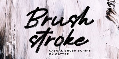 Brushstroke is a unique textured brush font, because this brush font is made digitally. contemporary approach to design, and has underlines and also has several ligatures. Suitable for use in title designs such as tittle books, stationery designs, quotes, branding, logos, clothing, invitations, greeting cards, t-shirts, packaging designs, posters and more.
 - Nouveau Nights JNL by Jeff Levine,
$29.00 The deep well of creativity that is the era of the hand lettered sheet music title page brings forth Nouveau Nights JNL. Re-drawn from a period example of the 1920s, this titling font perfectly captures the warm "human" look of pen and ink lettering, long before the advent of "perfect" digital type.
 - Public Notice JNL by Jeff Levine,
$29.00Public Notice JNL is based on a wood type alphabet originally shown in George Nesbitt’s 1838 catalog as “Gothic.” The image sample used for a model had only the basic A-Z characters, an ampersand and an exclamation point, so numbers and additional characters were designed and added to the digital version. - Nouveau Dreams JNL by Jeff Levine,
$29.00 The 1910 sheet music for “In All My Dreams I Dream of You” had the title hand lettered in an eclectic sans serif that typified the free form Art Nouveau movement of the time. The lettering was recreated digitally as Nouveau Dreams JNL, and is available in both regular and oblique versions.
 - Lidia by ParaType,
$25.00 The decorative title typeface was designed at Polygraphmash type design bureau in 1967 by Iraida Chepil. It is a decorative variant ('open', or 'engraved') of classical serif typefaces. For use in magazine headlines, title and display typography. The revised and completed digital version was designed for ParaType in 2005 by Victor Kharyk.
 - Pyragy by Belli Creative,
$9.00 Pyragy is a display font with a classical vibe. It has beautifully crafted nine swashes. It’s genuine, interesting, and perfectly fits different design works, such as posters, book or album covers, digital spaces, or any other media. It supports various Latin-based languages and comes with powerful open-type and true-type features.
 - Aligarh by NamelaType,
$23.00 Aligarh is a semi-slab serif font formed with a smooth rounded bracket whose edges end with unique shapes, an exploration of combining unique styles in a typefaces. Designed to be used in a variety of media both print and digital media. 18 fonts built from 9 sizes and supported by open types.
 - Stage Production JNL by Jeff Levine,
$29.00 A 1935 piece of sheet music entitled “(There’s A) Little Picture Playhouse in My Heart” had its movie-themed title hand lettered in a condensed Art Deco style with a few interesting character variations. The resulting digital type design is Stage Production JNL, which is available in both regular and oblique versions.
 - Cordel by Tipos do aCASO,
$23.90Cordel is the first digital typeface created by the founder of Tipos do aCASO in 1998. Its design refers to the unique woodcuts features used to illustrate the covers of old cordeis, pamphlets of Brazilian northeastern popular poetry. This unicase font presents irregular widths and spacing, a caricature of those woodcut graphics. - Serif Formal Oblique JNL by Jeff Levine,
$29.00 An advertisement in a 1936 issue of “The Film Daily” for the movie “Mr. Deeds Goes to Town” had much of its copy set in an extrabold typeface similar to the Beton/Stymie/Karnac group of slabserif designs. This is now available digitally as Serif Formal JNL in both regular and oblique versions.
 - Oksana Sans Narrow by AndrijType,
$33.00 Oksana Sans Narrow is a space-saving addition for Oksana Sans Roman faces. In six weights from Thin to Heavy it works well in long as in short texts. Supports Western, Central, Baltic Latin and European Cyrillic codepages. Old-style digits, some ligatures, alternative characters and Ukrainian hryvnia sign are also included.
 - Peanut Crumble by Balpirick,
$15.00 Peanut Crumble is a Handwritten Font. Whether you’re using it for crafts, digital design, presentations, or making greeting cards, this font has the potential to become your favorite go-to font, no matter the occasion! This font only has allcaps letters. Enjoy the font! Feel free to comment or feedback! Thank you!
 - Wide Chamfer JNL by Jeff Levine,
$29.00 Inside the pages of an untitled sign painting textbook (circa 1902) was an example of the classic chamfered sans serif alphabets used by tradesmen of the time. This version was wider than most, and perfect for a digital version called Wide Chamfer JNL, which is available in both regular and oblique versions.
 - Movie Matinee JNL by Jeff Levine,
$29.00 A 1926 trade ad for the silent comedy “The Nut-Cracker” starring Edward Everett Horton has the film’s title hand lettered in a decorative bold sans serif design complete with highlight lines and accent dots. This festive type face is now available digitally as Movie Matinee JNL in both regular and oblique versions.
 - Valkyrie Brush by Gatype,
$18.00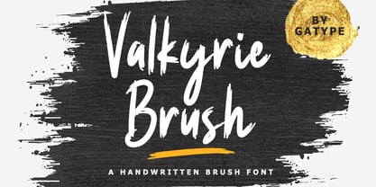 Valkyrie Brush is a unique textured brush font, because this brush font is made digitally. contemporary approach to design, and has underlines and also has several ligatures. Suitable for use in title designs such as tittle books, stationery designs, quotes, branding, logos, clothing, invitations, greeting cards, t-shirts, packaging designs, posters and more.
 - Belle Script by melifonts,
$- Belle Script is the first in a new series of melifonts, created entirely digitally using a pen tablet. A hybrid of script and print, it combines structure and elegance and makes for a stylishly clear typeface. Belle Script is the perfect font for a letter to a friend, printed labels, or graphic logos.
 - Eurasian Stencinitials JNL by Jeff Levine,
$29.00Eurasian Stencinitials JNL are modeled from a set of crudely die-cut Old English capital letter stencils that were made in Japan in the Early 1960s. The interesting treatment of the letters (with a slight hint of Japanese calligraphy) has some added bamboo plants for balance and decoration in this digital version. - Patient by Garisman Studio,
$22.00 Patient was born in the modern era which was inspired by the letters found in various print and digital media. Comes with a modern and futuristic style that will rock your great design! It is suitable for you to use in logotype designs, posters, typography, t-shirts, tickets, and other modern designs.
 - Boom Amorita by Beary,
$15.00 Embrace the power of 'Boom Amorita' to transform your designs into captivating visual stories. Whether you're crafting logos, posters, invitations, or digital content, this font effortlessly blends modern aesthetics with timeless elegance. With 'Boom Amorita' at your fingertips, every project becomes an opportunity to create something extraordinary, reflecting the essence of your creativity.
 - Moonlit Walk JNL by Jeff Levine,
$29.00 Another variant to the ever-popular Art Deco sans lettering with solid centers (no counters) was found in the hand-lettered title on the cover of the 1933 song "There's A Ring around the Moon". This became the basis for the digital typeface Moonlit Walk JNL, available in both regular and oblique versions.
 - Superstar Grotesk by Not Bad Typeface,
$30.00 Superstar Grotesk is a free interpretation of the first Cyrillic versions of Royal Grotesk and Akzidenz Grotesk, later the "Roublennaya" typeface is the same irremovable pop artist who lingered in the top of the typographic charts until the digital era, and formed the image of the Cyrillic alphabet in the 20th century.
 - Millinery JNL by Jeff Levine,
$29.00 One of the type samples showcased in the 1907 Barnhart Brothers & Spindler specimen book was named “Sterling”; a spurred serif Art Nouveau design. This is now available digitally as Millinery JNL in both regular and oblique versions. An old fashioned term for a once plentiful business, ‘millinery’ is a women’s hat shop.
 - Newspaper Publisher JNL by Jeff Levine,
$29.00 The Logansport, Indiana Pharos-Observer dated June 12, 1917 had the following headline running across its front page: “American Steamer Sunk by German U Boat”. The condensed slab serif typeface used to set that headline has been recreated digitally as Newspaper Publisher JNL, and is available in both regular and oblique versions.
 - P22 Zebra by IHOF,
$24.95Zebra was originally designed by Karlgeorg Hoefer in 1965 for the Stempel foundry in Germany. This unique font was designed as a two-color script face and is now available digitally for the first time. The P22/IHOF release presents six separate fonts based on the original painted drawings and Stempel proofs. - Art Materials JNL by Jeff Levine,
$29.00 The cover of the 1930s-era “Catalog of Artists’ Materials” from Ernst H. Friedrichs, Inc. (New York) has the words “Artists’ Materials” hand lettered in a stylized Art Deco sans serif type style. This unique design is now the digital font Art Materials JNL, which is available in both regular and oblique versions.
 - Electrical Tape by PBinns,
$20.00 Electrical Tape is a mono-case display type. The idea came from generating custom letters using pieces of electrical tape. The over all design was then influenced by the graffiti subgenre as well as a hint of constructivist influence. Recommended applications of the font are for display purposes as well as digital media.
