10,000 search results
(0.021 seconds)
- Gerdingan by Twinletter,
$14.00 Introducing our newest Font, the name Gerdingan fonts are made with a script model that is intended to write beautiful names, and beautiful words and sentences of course with typography harmony. This font also offers beautiful abstract typography harmony for a wide variety of design projects, including natural handwriting in digital form for designs, quote designs, for social media business designs, advertisements, trademarks, promotional banners, posts, posters, signatures, and all designs require handwriting or whatever design you want. This font is equipped with uppercase, lowercase, numbers, punctuation marks, swhases and several variations on each character including multi-language. ================================================== This font is best suited for open type friendly applications. How to get alternative glyphs from open type fonts: http://adobe.ly/1m1fn4Y PUA Character Code - Fully accessible without additional design software. do not hesitate anymore start using this font. and Feel free to send any message you want to convey.
 - Eurostile Next Paneuropean by Linotype,
$50.99Eurostile Next is Linotype's redrawn and expanded version of Aldo Novarese's 1962 design. This new version refers back to the original metal types and to its mid-century modern aesthetic of squarish characters and subtle curves. Eurostile Next brings back the gentle curves, which were lost in other digital versions, therefore regaining the spirit of the original design and its somewhat softer demeanor. The family has been greatly expanded, now consisting of five different weights: ultra light, light, regular, semibold, and bold. Along with the regular width, all weights also have extended and condensed versions. Stylistically, Eurostile Next is well suited for designs in the fashion of the 50's and 60's, yet it still has a remarkably new and contemporary feeling. Its numerous variations and typographic features are invaluable for projects ranging from extensive corporate branding to one-off posters and from large signage to small print text. - Soundboy by Kustomtype,
$25.00 Soundboy is an ode to Elvis Presley and his music. The font was drawn by hand from a number of images from the Blue Hawaii film and finished to perfection. The digitization was done with great care and the font was also provided with a number of extras such as ligatures. Soundboy is a playful and translatable font that at first sight has already caught everyone with a spontaneous and broad smile. Logos, house styles, magazines, covers, vinyl records, book covers, t-shirts, house styles and all kinds of other graphic expressions will look a lot happier. This font is more than welcome in this sour society. The packaging makes the consumer buy and Soundboy certainly contributes to that. Don't wait for someone else to get it in your area, the best designs deserve the most beautiful fonts. Enjoy the "Soundboy font", it will never let you down.
 - Alta Mesa by FontMesa,
$25.00Alta Mesa is a revival of an old type design from the 1800's that was sold by most of the type foundries in the US and Europe of that time period so it is difficult to know the foundry of origin. New with this version are the fill fonts and plain styles, the fill fonts may be used as stand alone fonts, however the letter spacing is much wider, the plain versions are recommended if you desire a solid black weight. The regular Fill font is in registration with the Regular and Open versions while the Fill L font is in registration with the L and Open L versions. This was a very charming font in its time which was heavily used on old billheads and letterheads. We're pleased to bring this type design, which hasn't been used for over 100 years, into the digital world today. - Entestats by Typephases,
$25.00 Nearly a hundred human heads, in three dingbat files. The whole series comes from the sketchbook: the original ink drawings were then digitized and refined to create vector outlines. Rather than perfectly smooth, geometrical shapes, the Entestats, like their close relatives in the Capsbats series, the Entestats retain a handmade look and feel. The Entestats are ready-made illustrations, though of course they will appreciate being enriched with colours, textures, an imaginative layout... and use them for a variety of projects. Use them small, as spot illustrations or as big as a whole page or page spread. The Entestats and their kin, the Capsbats, are a terrific resource for presentations, packaging, logos, brochures and advertisements, to name a few applications. The book 1000 Heads is a compendium of the drawings featured in the Capsbats and Entestats and it gives a glimpse of the limitless applications of this collection.
 - ITC Flora by ITC,
$40.99ITC Flora is the work of Dutch designer Gerard Unger, and is named for his daughter. He started by doing calligraphy experiments with felt-tip and ballpoint pens, and developed these drawings into a formalized script typeface. Swiss typographer Max Caflisch advised the Dr.-Ing Rudolf Hell GmbH technology firm to add a new round-nibbed script face to their Digiset type library, and in 1984, Flora was released by Hell. Unger used a chancery cursive skeleton in this design, which imparts grace and movement. Flora was also intentionally designed to be simple and sturdy, and with its minimal variation in thick/thin stroke ratio, it worked well on the early digital typesetting machines. In 1989, the International Typeface Corporation released the font. ITC Flora continues to work well on current printers and typesetters, and it has an enduring popularity for uses that range from short text passages to display headlines. - Informative by Latinotype,
$39.00 Informative is a typeface consisting of a whole family of sans fonts and a collection of thematic pictograms. This combination of two different types of communication reflects the current need for using text and images as means of conveying information in a complementary way. The family comes with a text version of 7 weights (with matching italics)—Thin, Light, Regular, Medium, SemiBold, Bold and Black, and includes 7 thematic icons sets which allude to elements related to alimentation, city, energy, people, politics, sports and work. Each set contains 88 glyphs and includes both outline and black versions. The text font contains a set of 423 glyphs that support 207 different languages. Informative is a clean, simple and versatile typeface well-suited for a wide range of graphic design and visual communication projects. This font has especially been designed for infographics, maps and digital applications.
 - Eckhardt Poster Text JNL by Jeff Levine,
$29.00 Eckhardt Poster Text JNL continues Jeff Levine's series of sign painter-oriented fonts, named in honor of his good friend Albert Eckhardt, Jr. (who ran Allied signs in Miami, Florida from 1959 until his passing). Sign painters are the true heroes of lettering, for they make the alphabet and style fit the job. Printers and layout artists were constricted by metal and wood type; that is until photo lettering, then digital type opened up unexplored territories in design possibilities. There is a unique charm (and nowadays pretty much a lost art) to hand-lettering word copy in a way that draws the eye like an arrow to a target. Even a simple sanserif such as Eckhardt Poster Text JNL can have the effect of that hand lettering when applied to posters and pages with plenty of white space and matching type designs of the period.
 - Lemonite by Typotheticals,
$3.00 Lemonite (Regular and Expanded) is a self examination in whether, after five years without attempting to design any new fonts, I was still capable of creation. Lemonite is the result, and even though its plain, it showed me I could still work. I have made two of the face free to anyone who wishes to have a look, so please feel free, no obligations, to take them and use them if you have a use. Why so long ? Well, we do age, and with age comes the usual benefits, like Glaucoma and a touch of Arthritis in the old digits, and that's made computer work a little… interesting for me over the past couple of years. Anyway, if you don't find my humble offering of any use, please search the fontbase on Myfonts, and you will sure to find a suitable font from one of the fantastic designers there.
 - Archie by Canada Type,
$39.95 Archie is a wide attention-grabber based on a simple geometric alphabet drawn in the early 1930s by Dutch calligrapher and lettering artist Martin Meijer. This digital family expands considerably on the original letters, adding biform shapes, small caps, italics across the board, and support for many Latin-based languages. Archie's eye-catching forms are meant for clear, seamless and strong message delivery. In its upright styles, strong vertical strokes emphasize the sense of confidence and importance, and in its italics, that emphasis is further affirmed by a natural sense of urgency. This kind of alphabet is perfect for display typography aiming at the glance-and-go crowd. When used properly and placed prominently, no eye can escape it. The basic Archie family is comprised of six basic fonts, while the Pro set combines all three uprights in one font and all three italics in another.
 - Valtoria - Personal use only

- Sketchbook - Unknown license

- Meleo by Alexis Luengas,
$1.00 Meleo is a semiserif consisting of 10 fonts with a few original quirks but still very legible at both text and display sizes. Since its conception, the aim was a balance of uniqueness and functionality. The typeface owes its energy to the slight suggestion of calligraphic crafting and humanist structure. But it also breaks the rules: a small x-height and a whimsical uppercase with resemblance to the lowercase may render Meleo more friendly than a conventional (semi-)serif. Titles and texts of moderate length, like those found on websites, flyers and packaging, are the natural habitat of Meleo, but it may as well thrive under different settings. Meleo supports most of western-european latin languages which are included in the ISO-Adobe character set.
 - Power Breakfast by Hanoded,
$15.00 I am a firm believer in the fact that breakfast is the most important meal of the day. So, for the last 10 years (ever since I became a father), I have been serving my family a healthy breakfast. I live in The Netherlands, so the main portion of breakfast is bread, but I try to serve something ‘nice’ every day. Like strawberries, yoghurt with banana and brown sugar (not too much sugar!), oatmeal porridge or granola. I myself like Indonesian fried rice (nasi goreng) for breakfast, but I am afraid my kids won’t eat that in the morning… Power Breakfast is a handmade display font. Yes, it is wobbly, yes, it is uneven, but that’s what’s so darn good about it!
 - Southern Belle by Angie Makes,
$12.00 Southern Belle, a cute little handdrawn font with a ton of character and a slow, southern drawl, was inspired by sweet tea and southern blossoms. Its uppercase letterforms would be a great fit for logos, envelope addresses, and more! This Southern Belle font features repeating borders, and a ton of cute little doodles. (try using + + +, = = = , and _ _ _ to see borders repeat). To access all of the characters in this font, we recommend using the glyphs panel in Adobe Illustrator. This font works best in open type aware software. Comes as an .otf font file. NOTE: To access all of the cute extras in this font that are not accessible from your keyboard, you will need software with open type glyph capabilities such as ADOBE ILLUSTRATOR or ADOBE INDESIGN.
 - Weaving by Ingrimayne Type,
$9.00 Weaving is a family in which the letters fit together so that wavy lines separate them both horizontally and vertically. It creates this effect by alternating letters on upper-case keys with those on lower-case letters and this alternating is done automatically in applications that support the OpenType feature of contextual alternatives (calt). (The upper-case can be used alone but it unlikely that the lower-case characters could be used by themselves.) The family is a thinner and condensed version of the typeface Woven, but in condensing it, the tessellation properties that a were in Woven are lost. It is a decorative display face but because there are few typefaces similar to it, it is hard to predict what uses it may have. Be creative!
 - Slash Roller by Colllab Studio,
$19.00 "Hi there, thank you for passing by. Colllab Studio is here. We crafted best collection of typefaces in a variety of styles to keep you covered for any project that comes your way! Introducing, Slash Roller, it marks a new era in graffiti font. The slashing zig zag tape gives it an authentic DIY feel. The slashed tape is prominent but not overdone, adding an interesting layer to the blocky rough letters. Slash Roller is an attempt to create a lettering style that seems like it was made with a spray can and a brush, but keeps the appearance of a slightly imperfect and distorted typeface. It looks like the work of a vandal, but the slashed typography is actually intentional. A Million Thanks Colllab Studio www.colllabstudio.com
 - Polydot by Christoph Reichelt,
$16.00 Polydot is an experimental Font, built following its own rules. It has interesting letter shapes, making it a perfect choice for creative packaging and magazine design. At the same time it makes a beautiful, neat but vivid text pattern when used in smaller sizes: Use it for children’s books, food and beverage, cosmetics or health topics. Each Glyph is based on at least one dot on the body line, and has up to two more on the lower case level and the ascender level. Since they have the same size and are on the same height on all letters, no matter what weight and shape, these dots give a strong structure to the typeface, allowing for dynamic and easy letter shapes, inspired by brush strokes. It’s not a hand font but it has the dynamics of one. It has no serifs but provides the structure and readability of a roman type. It has an extensive choice of weights, but it’s characteristic dots have the same size and it has the same tracking through all weights. Try it, it’s special.
 - Mr. Jenkins by Lindstrom Design,
$13.00 Mr. Jenkins is designed to fill the void between the crazy, wacky and reckless comic style fonts, and the standard boring but very readable sans-serif typefaces. It makes for a distinctive bold headline, but is also quite legible at small sizes. It’s just off kilter enough to not take itself too seriously. A deceptively care-free font, each character was carefully drawn. The spacing and kerning of each letter and letter combination were painstakingly considered. Particular attention was paid to maintaining consistent optical weights and a spontaneous appearance. Mr. Jenkins is inspired heavily by humanist sans-serif faces such as Myriad and Lucida Sans, with its open apertures, and low contrast but almost calligraphic line weights. The lowercase a is single story in the italic face, but two story in the regular face. It contains uncommon features amongst many “quirky” fonts, including a full set of latin accented characters, lining and proportional figures, math symbols, standard fractions, foreign currency marks, contextual alternates, and even a few ligatures.
 - Galvantur Grand by Ivangard Studios,
$10.00 Galvantur Grand is an uppercase-only display font, intended to be used for attention demanding titles and headers, or generally any form of text that needs to take center stage. An offshoot of the Galvantur font, Galvantur Grand takes things one step further towards the extreme, to really give your design projects that special flair. Characterized by the double lines and negative space between them, this powerful font can make any form of text stand out strongly. The multiple styles included can further help customize your designs and projects, to get the perfect feeling you're going for. Comes in 7 different styles - Regular, Oblique, Light, Light Oblique, Outlines, Light Outlines and Oblique Outlines. To get an idea of the various styles, please check out the images or use the preview field to type in text. Galvantur Grand supports Latin and Cyrillic based languages. IMPORTANT: This is an uppercase-only font. Typing out lowercase characters will look exactly like typing out uppercase ones. Furthermore, it is recommended that this font is used with bigger sized text.
 - Groovy 3D Caps JNL by Jeff Levine,
$29.00 It all started with a simple idea back in 1998: do a digital version of a "lost" 70's typeface, and make up the missing letters that were not present in the only available example Jeff Levine had to work with. Jeff wasn't yet doing his own digital font creation, so he hooked up with Brad Nelson who owns a small foundry called Brain Eaters Fonts. Together, they collaborated on "Action Is"- a freeware font named after the source of the type example. This was a title page for a commemorative photo album of images from the 60's TV music show "Where the Action Is", formerly hosted by Jeff's employer at the time, singer-writer-producer Steve Alaimo. The free font took off like a rocket, being released just at the peak of the 60’s/70’s retro craze in the late 1990’s, and it was EVERYWHERE! It showed up on TV shows, packaging and web design -- and was even spotted on signage used on the side of a major amusement resort’s retro-themed hotel. From that point on, Jeff kept getting requests for a version with a lower case. Although they shared the copyright in the freeware version, Brad Nelson gave Jeff his blessing to re-work and take Action Is into the realm of commercial type. Newly improved and re-released as Groovy Happening JNL, it became one of Jeff's better selling type designs. A simplified, yet similar font was issued called Groovy Summer JNL. Now, after about a decade, Jeff had decided to clean up the 3-D (drop shadow) version that was originally freeware with many minute design flaws and re-release it commercially. Groovy 3D Caps JNL is an all-caps, limited character set font which ties in well with the previous releases, yet retains itís 1960s-1970s era charm. The font flag art is courtesy of Barbara D. Berney and is used by permission.
 - Dellena by DM Studio,
$20.00 The Dellena Handwritten Font is a captivating and versatile typeface that combines the charm of natural handwriting with a contemporary aesthetic. With its flowing letterforms and clean, legible design, this font offers a wide range of creative possibilities for your projects, from branding and invitations to social media graphics and more. Features: Handwritten Elegance: Dellena Handwritten Font exudes the elegance and authenticity of a handwritten script. Its graceful letterforms offer a personal and human touch to your designs, making it ideal for projects that require a blend of elegance and approachability. Clean and Legible Design: Despite its handwritten style, this font maintains excellent legibility. Each character is carefully crafted to ensure readability at various sizes. Whether it's in print or on a digital screen, your text will remain clear and accessible. Versatile Application: This font is incredibly versatile and well-suited for a variety of design projects. Use it for branding, invitations, social media posts, blog headlines, and more. Its adaptability makes it suitable for both personal and professional use. Uppercase and Lowercase Letters: The font includes both uppercase and lowercase letters, providing creative flexibility for your designs. You can mix and match cases to create visually appealing typography that suits your project's needs. Punctuation and Symbols: In addition to the alphabet, Dellena Handwritten Font includes a comprehensive set of punctuation marks, numerals, and common symbols. This ensures consistency and ease of use when incorporating the font into your design projects. Easy to Install and Use: Installing and utilizing the Dellena Handwritten Font is straightforward. It is compatible with both Windows and Mac operating systems and can be easily integrated into popular design software, including Adobe Photoshop, Illustrator, and InDesign. Elevate your designs with the elegance and versatility of the Dellena Handwritten Font. Let its flowing letterforms and clean design add a touch of personal and human connection to your projects. Whether you're crafting branding materials, invitations, or digital content, this font offers a stylish and readable solution for your typographic needs.
 - Maiers Nr. 8 Pro by Ingo,
$27.00 A handwritten ”font for technicians“ from ca. 1900. Very geometrical, rigid forms borrowed from the typical characteristics of Jugendstil / Art Nouveau. This script is found in an old magazine which was issued sometime in the years shortly before WWI. The original copy, produced by means of a galvanized plate, is just 7 centimeters wide. It served as the model for technical professions in which, at that time, the captions of drawings were still done by hand. ingoFonts has not only digitized this beautiful typeface, we have also extended it to a whole family. In »Maier’s Alte Nr. 8« special attention was given to ensure the ”uneven“ edges, typical of handwritten script, remained effectively noticeable even in the digitized form. As a result, this ”technical“ font retains a handmade touch, while »Maier’s Neue Nr. 8« is the clean version with exact contours. The Art Nouveau forms, which are characteristic for the period of origin around the turn of the century around 1900, look especially pretty. The high degree of abstraction also seems strange in Maier's No. 8, especially when the age of the original is known. It is generally assumed that it was not until the Bauhaus in the late 1920s that such "modern" typefaces were created. Maier's No. 8 is a generation older! So many of today's supposedly "ultramodern" typefaces look quite old in comparison. In addition to the original two weights, Light and Bold, the Maiers Neue Nr. 8 got a regular and a extra-bold weight. Furthermore, the Neue is also available in italics. Although this is only a slanted version, unlike common practice, it is inclined to the left. Maier’s Nr. 8 Pro is suitable for all European languages. It includes ”Latin Extended-A,“ for Central and Eastern Europe incl. Turkish, and even Cyrillic and Greek, too. The font includes several stylistic alternates as well as a number of ligatures.
 - Thalweg by Ani Dimitrova,
$35.00 Thalweg serif typeface is a project focused on the digitalization and development of the Thalweg font. The font was originally designed in 1993 by the Bulgarian artist Ivan Kyosev. In 2018 Ani Dimitrova began the revival of the Thalweg font and converted the drawings into a digital form. The existing set of characters required some necessary expansions such as the development of capital letters, alternative symbols and many other functions. Furthermore, some additional weights were developed which aimed to make the font more complete. Thalweg was completed in 2020 with 16 weights ranging from Thin to Black with extra drawn italics and small caps versions, each style containing more than 1100 glyphs. The font comes with an extended coverage of the Latin, Cyrillic and Greek Scripts. All of the weights are specifically equipped for complex, professional typography with Open Type Features. These features include: Small Caps, Ligatures, Discretionary Ligatures, Superscript, Subscript, Tabular Figures, Old-Style Figures, Circled Figures, Arrows, Matching currency symbols and fraction. The Thalweg serif typeface is a perfect choice for body text, branding design, web design, editorial design and more. Ivan Kyosev (1933-1994) was one of Bulgaria’s most famous artists whose work influenced several generations of bulgarian designers. He was born on February 5, 1933, in the city of Burgas. In 1957 he graduated in illustration at the National Academy of Art in Sofia led by Prof. Iliya Beshkov. Mr. Kyosev was a member in the management of the “Graphics and Illustration” section in the Union of Bulgarian Artists, member of the UBA board, artist in the publishing houses “September” and “World”. Together with Boris Angelushev, he worked on the layout design of the “Literary Front” newspaper. Furthermore, in 1963 - 1964 he was the main artist in the publishing house “Prosveta”. Ivan Kyosev excelled in the field of illustration, book design and library layouts in various genres (classics, children's literature, poetry, journalism, memoirs, etc.). He is also the author of many fonts.
 - Paralucent by Device,
$39.00 Paralucent is versatile all-purpose modern sans. Available in seven weights, from Thin to Heavy, and in two widths each with corresponding italics, it avoids some of the more eccentric calligraphic quirks of Akzidenz or Helvetica or the cool precision of Univers for an elegant, functional, yet warm design. There are two additions to the core 28-weight family: a three-weight stencil set, and a four weight text family. The text weights have been adjusted for use at small point sizes, and feature more open character shapes, looser inter-letter spacing for improved readability, and lining numerals for use in listings and tables. Several core ideas inform Paralucent’s design. Prime attention has given to the negative space between characters, giving a more even “colour”, especially in text. For example, the J, L and T have shorter arms than comparable sans typefaces, while the M and W are wider. The A has a lower bar, opening up the interior counter. An unusually high lower-case x-height again helps to give a more even colour and improve legibility. Care has been taken to rationalise repeated elements like the tails on lower-case letters, or the Q and the “ear” of the g. Typographic design solutions that are consistent across all these features add more stylistic cohesion. ‘Ink traps’ are exaggerated incisions used to open up a letter's narrower internal angles, which can become clogged with ink, especially in small point sizes. Now largely redundant due to the high quality of modern print, they are still sometimes used as a stylistic quirk or design feature. Now that digital fonts are often reversed or outlined, or enlarged to enormous sizes, these can also lead to unexpected or obtrusive results. Paralucent takes these inevitable digital manipulations into account, and adds optical corrections without resort to ink traps. The family has been picked up by many UK and US publishers, featuring heavily in magazines like Loaded, Heat and TV Quick, as well as high-end coffee-table photography books and gallery websites. A perennial Device bestseller.
 - Report School by Typodermic,
$11.95 Report School is a geometric sans-serif typeface that was inspired by student handwriting practice worksheets. But don’t worry, it’s not just a copy of those worksheets. Report School is designed to be easily readable, with legible letterforms that make it perfect for use in educational materials. You might be wondering what makes Report School different from other school-oriented geometric sans-serif typefaces. Well, for starters, it’s designed with readability in mind. While other typefaces might prioritize pure geometry, Report School puts legibility first. That means that when you use Report School, your readers will have an easier time reading your text. And speaking of easier reading, Report School has some features that are designed to make things even more legible. For example, instead of using straight quotes for inches, feet, or degrees, you can use primes. And Report School has regular primes, double primes, and triple primes, so you can choose the right one for your needs. Plus, the numerals in Report School are tabular, which means they’re vertically aligned for easier math equation alignment. But that’s not all! If you’re using OpenType savvy applications like InDesign, Illustrator, or Photoshop, you can access even more features. For example, you can use the stylistic alternates feature to access the letters “I” and “J” with no serifs, as well as a straight lowercase “q”. And if you’re looking for something a little different, you can check out Report School’s rounded version, called Report, or a version with casual strokes, called Sweater School. If you’re looking for a typeface that’s easy to read, but still has some personality, look no further than Report School. It’s the perfect choice for any educational materials that need to be both legible and stylish. Most Latin-based European writing systems are supported, including the following languages. Afaan Oromo, Afar, Afrikaans, Albanian, Alsatian, Aromanian, Aymara, Bashkir (Latin), Basque, Belarusian (Latin), Bemba, Bikol, Bosnian, Breton, Cape Verdean, Creole, Catalan, Cebuano, Chamorro, Chavacano, Chichewa, Crimean Tatar (Latin), Croatian, Czech, Danish, Dawan, Dholuo, Dutch, English, Estonian, Faroese, Fijian, Filipino, Finnish, French, Frisian, Friulian, Gagauz (Latin), Galician, Ganda, Genoese, German, Greenlandic, Guadeloupean Creole, Haitian Creole, Hawaiian, Hiligaynon, Hungarian, Icelandic, Ilocano, Indonesian, Irish, Italian, Jamaican, Kaqchikel, Karakalpak (Latin), Kashubian, Kikongo, Kinyarwanda, Kirundi, Kurdish (Latin), Latvian, Lithuanian, Lombard, Low Saxon, Luxembourgish, Maasai, Makhuwa, Malay, Maltese, Māori, Moldovan, Montenegrin, Ndebele, Neapolitan, Norwegian, Novial, Occitan, Ossetian (Latin), Papiamento, Piedmontese, Polish, Portuguese, Quechua, Rarotongan, Romanian, Romansh, Sami, Sango, Saramaccan, Sardinian, Scottish Gaelic, Serbian (Latin), Shona, Sicilian, Silesian, Slovak, Slovenian, Somali, Sorbian, Sotho, Spanish, Swahili, Swazi, Swedish, Tagalog, Tahitian, Tetum, Tongan, Tshiluba, Tsonga, Tswana, Tumbuka, Turkish, Turkmen (Latin), Tuvaluan, Uzbek (Latin), Venetian, Vepsian, Võro, Walloon, Waray-Waray, Wayuu, Welsh, Wolof, Xhosa, Yapese, Zapotec Zulu and Zuni.
 - Space Marine - Unknown license

- Vera Humana 95 - Unknown license

- regularJoe by JOEBOB graphics,
$49.00 A handwritten but very clean and organized font that's a little bold and a little slanted. Soon to be followed by its evil twin: irregularJoe.
 - Entourage by Hanoded,
$15.00 Entourage is a sweet little font - rounded, quirky and cute. Entourage will shine on product packaging, posters and websites. Comes with an ‘entourage’ of diacritics.
 - Disclaimer JNL by Jeff Levine,
$29.00Disclaimer JNL is a narrow, ultra-compact sans serif design that's perfect for fine print clauses or anywhere space is limited - but word copy isn't. - Kachong by ZetDesign,
$13.00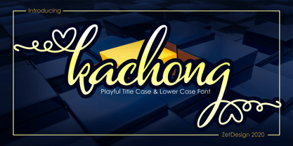 Kachong is a cute and elegant handwritten font with an incredibly friendly feel. It features gorgeous swashes and ligatures that make this script incredibly versatile.
 - SafetyPinned by Ingrimayne Type,
$14.95 The characters in SafetyPinned are composed of interlocked safety pins. The typeface lacks true lower-case letters but rather has two sets of capital letters.
 - LD Appliqué by Illustration Ink,
$3.00LD Appliqué is overlayed with a unique design resembling a decorative sconce, a cutout design, or an ornamented stitch. Check out this very unique font! - Vienna Woodtype by XTOPH,
$25.00 This font is based on real prints made out of a linocut. The glyphs were handprinted, then scanned and then turned into a computer font.
 - Hello Arsenio by Figuree Studio,
$18.00 Say hello to Hello Arsenio font. Made with love and joy. Kids look, so it will make your design more beautiful, cute, fun, and colorful.
 - Hearts And Swirls Too by Outside the Line,
$19.00 48 whimsical hearts and swirls, some solid, some line but lots of little graphics for your Valentine needs. Many ways to say "I Love You".
 - Fig Bun by PizzaDude.dk,
$20.00Fig Bun is a slightly curly font with a cute attitude. When used in CAPS only, Fig Bun is is suitable for text in comics! - dearJoe 2 by JOEBOB graphics,
$19.00 DearJoe 2 is the second of four handwritten scripts by JOEBOB graphics. A complete character set with numbers and most (but not all) special signs.
 - Cattapilla by Typadelic,
$14.95 How cute can you get? Cattapilla's open type version has extra ligatures and stylistic alternates, perfect for scrapbooking, greeting cards, announcements or any creative project.


