10,000 search results
(0.036 seconds)
- Maine by Fenotype,
$25.00 Maine is a modernized book antiqua consisting of six styles and matching italics. Maine's cuts are from Light to Extrabold, of which Regular and Slightly Bolder Book are especially suitable for longer texts. Thanks to its clear features and high x-height, Maine creates a beautiful and legible body text. Maine gives a professional, no-nonsense impression and it’s best used in editorial, books, magazines and everywhere where you can use many different styles and sizes of the same typeface. Go dignified with Maine.
 - Pixel Grid by Caron twice,
$39.00 Pixel Grid is a font that lets us know that we have entered the digital age. We know about grid systems from the very first computers and electronic LED boards. Pixel Grid offers three types of grid resolution as well as many incarnations of individual segments. It is an electronic game: characters can be animated, overlapped, and played with in different ways. If you need a font that is strictly technical in nature, you can use tried-and-true square and round points. You can save ink by using them on receipts, for example, so the font can be used sustainably. Pixel Grid is suitable for engraving, or it can be used as a stencil. This complete font family aims to gain an extensive selection covering the early digital font style, facilitating the use of the style in professional applications today. Specimen: http://carontwice.com/files/specimen_Pixel_Grid.pdf
 - Scriptuale by Linotype,
$29.00The Scriptuale family, which contains eight styles, is a contemporary upright calligraphic face. Designed by German designer Renate Weise in 2003, this family of typefaces speaks to the present, while at the same time reflecting on a lyrical past. The letterforms of the Scriptuale family are romanticized, they reference German calligraphic styles from the 19th and early 20th Centuries. For instance the design of Scriptuale's uppercase strays from the canon of classical proportion into romantic idealism. While the C and O are drawn according to the ancient quadratic proportions - almost twice as wide, optically, as the E or the L - the letter A is wider than would be expected, and the D narrower. These subtle differences introduce a different rhythm into text set in Scriptuale than Italic styles of calligraphy may offer. Scriptuale's Gs merit special notice: both the upper and lower case G lunge slightly forward, further enhancing the dynamic quality of the text. Also unique in Scriptuale's design is the lowercase width: the letterforms appear slightly condensed; they have large x-heights to compensate for this. In a delightful twist, the number 2's beak has been closed by drawing it full-circle, back into the stem: this references a style of letter design that was practiced, among other places, by artists from the old Klingspor foundry in Offenbach Germany. Typefaces constructed there easily captured the zeitgeist of the romantic period, but are less calligraphic than Scriptuale (e.g., Rudolf Koch's Koch Antiqua). A semi-serif face (like Prof. Hermann Zapf's Optima or Otl Aicher's Rotis Semi), some of Scriptuale's letters have serifs (D), and some do not (A). And although both the B and the E normally have the same "structure" on their left side, Weise has drawn them differently in Scriptuale. These strengthen the calligraphic-like quality of the family. Traces of the pen are easy to see in Scriptuale's design; it is a thoroughly calligraphic face. The eight typefaces in the Scriptuale family include Light, Regular, Semi Bold, and Bold weights. Each weight has a companion italic. Scriptuale is similar to one other contemporary calligraphic family in the Linotype portfolio, Anasdair , from British designer - Zagore by NoCommenType,
$30.00 Zagore (zɑːgɔːrɛ) is the name of a beautiful place in Bulgaria. There is no contrast between horizontal and vertical stems, typical for geometric fonts. The typeface is built under strict rules and logic, by using the stroke as skeleton for each glyph. Although the structure of the font remains the same, there is a noticeable visual diversity throughout different styles. Middle weights suggest paragraph use, while the ones at the extremes are more suited for display text. The typeface offers support for Basic Latin, Latin-1 Supplement, Latin Extended-A, Greek and Coptic, Cyrillic, and Cyrillic Supplement Unicode ranges. Included OpenType features are localized forms, to suit multi-language designs, tabular and proportional lining, basic ligatures, and extra symbols.
 - Mrs Lollipop by Hipopotam Studio,
$20.00 Mrs Lollipop is a hand drawn narrow typeface designed for one of our books. You can layer different styles over the background style to achieve lots of colorful effects. Check out the manual for details. Mrs Lollipop has upper and lowercase characters with up to three alternate glyphs. Build in OpenType Contextual Alternates feature will automatically set alternate glyphs depending on frequency of appearance of the same character (even in web font but only in HTML5 browsers). The script doesn’t throw random glyphs. It has lines, frames, hearts, stars, ladybird and two rabbits.
 - FS Shepton by Fontsmith,
$80.00 Handy Andy Andy Lethbridge had only just completed his graphic design BA at the University of Portsmouth when he was spotted by Jason, who’d seen Andy’s exquisite hand lettering at his degree show and on Instagram. Keen to push the handwritten theme further, having recently launched a digitally-created, chalky script font (FS Sammy), Jason offered Andy a job and the chance to develop a suite of more stylised, truly hand-drawn fonts. Andy duly got out his pads, pencils and pens, and started experimenting with styles and textures. Magic followed. Imperfection perfected Most ‘handwritten’ typefaces are created entirely digitally. Not FS Shepton. From the start, the intention was to create a collection of alphabets of similar character but different texture and style – 100% hand-drawn and purposely imperfect, with the kind of inconsistent, organic shapes and textures of market stall signs, dashed off in chalk or paint. FS Shepton Regular, drawn with a wet brush pen, is solid with a rough outer edge and a casual but controlled feel. The dry brush used to create FS Shepton Light gives it more inner texture and a more formal, slanted, calligraphic style. FS Shepton Bold, drawn using a wider, looser dry brush pen, has a woody grain in the middle of its broad strokes and greater solidity where the brush moves more slowly. Fresh as a daisy Think of FS Shepton not as a family of three weights of the same font so much as a collection of three fonts penned by the same author. All of them – the light, regular and bold – were created independently as display fonts that offer something different to labelling, packaging, point-of-sale and advertising. Lovingly crafted by hand, they’re a good match for products and settings that share the same artisinal qualities: organic foods, drinks and healthcare products, as well as premium chocolate, coffee and condiments.
 - Schuss Sans CG Poster Extrabold by typic schuss,
$33.00 Schuss Sans CG Poster Extrabold 1 upright OTF Font Latin extended, Cyrillic and Greek. Specially developed for headline poster display sizes. A Sans Serif Extrabold Headline-Font in addition to the Schuss superfamily. The heights are optimized for big sizes, different to the text fonts of the Superfamily Schuss. The character set is slightly different to the non poster styles too, but comparable to Schuss Sans CG Poster Black. No italic, no additional figures, no tabular figures, no small Caps. But with maximum manual kerning. Ligatures: fi, fl, ff, ffi, ffl. No special OpenType features.
 - Manchester Condensed by Vástago Studio,
$23.90 Every day we are faced with designing on small screens and new formats; This is where condensed fonts have great potential, as they make the most of tight spaces in big headlines. Manchester Condensed is a typeface family designed by Vástago to be applied in large headlines in different formats, such as web, editorial or packaging. Just to mention a few. Different Manchester weights enhance performance at large type sizes, providing hierarchy and imposing style with its elongated shapes. Its use in capital letters is remarkable and fits perfectly into very precise diagramming spaces.
 - Portsmouth Second Fleet by Open Window,
$19.95 Portsmouth Second Fleet is the rag tag, wild bunch companion to Portsmouth. It is a strong, sturdy typeface with historical character. Its inspiration comes from the height and strength of the wooden tall ships that sailed into port in their day. With caps and small caps, this typeface is great for headlines or subheads for design projects that need a historical or retro feel, such as from the 1940s and earlier. Two different styles that can be layered allow for different colored drop shadows, outlines and fill for even more customization.
 - IMars by Artyway,
$14.00 Introducing the IMars Font - the future of typography is here! This sleek and modern font is the perfect addition to your design arsenal. Its clean lines and minimalist elegance make it ideal for contemporary, sci-fi, and space-themed designs. But that's not all - the versatility of the IMars Font also makes it the perfect choice for branding, adventure, and music projects. With its cutting-edge design, this font will bring your projects to the next level. Whether you're creating a stunning sci-fi movie poster or a sleek and stylish brand identity, the IMars font has you covered. So why wait? Get creative and try different styles and kerning combinations to find the perfect look for your project. Embrace the future of typography with the IMars font today! Try different styles and experiment with kerning for best results.
 - Graffiti Youth by Nirmana Visual,
$22.00 Inspired by Graffiti style Design, with 2 Style : Regular & Shadow Graffiti Youth offers beautiful typographic harmony for a diversity of design projects, including logos & branding, social media posts, advertisements & product designs.
 - Graffiti Boldy by Nirmana Visual,
$19.00 Inspired by Graffiti style Design, with 2 Style : Regular & Shadow Graffiti Boldy offers beautiful typographic harmony for a diversity of design projects, including logos & branding, social media posts, advertisements & product designs.
 - Graffiti Urban by Nirmana Visual,
$17.00 Inspired by Graffiti style Design, with 2 Style : Regular & Shadow Graffiti Urban offers beautiful typographic harmony for a diversity of design projects, including logos & branding, social media posts, advertisements & product designs.
 - 1651 Alchemy by GLC,
$38.00 This family is a compilation created from a Garamond set in use in Paris circa 1651, but similar to those, eroded and tired, that were in use during centuries to print cheap publications, as well as in Europe than in America, and from a large choice of printed symbols—all specially redrawn—used for alchemical, pharmaceutical and astrological books, covering 1550 to late 1800s period. Each alphabet is doubled by a slightly different one, and a special OTF encoding allows to give an irregular effect with never the same twin letters in a single word. The Normal style is enriched by small caps, and the Italic style by Swashes. A lot of symbols, too, are given twice with differences. This font may be used with our calendar specialized 1689 Almanach.
 - Asteric Vintage by BlackLotus,
$12.00 Asteric Vintage is a retro-vintage font family with an amazing set of ornaments. It comes in 3 different styles: Regular, Rough, Display, and also presents 26 beautiful and luxurious ornaments . The Rough Style has a characteristic that resembles rust on each character, thus creating results that seem strong and hard. The Display Style is very suitable for display, every work created with it becomes luxurious, wrapped in a classic atmosphere. The Regular Style is a style that has a clean character but still carries a classic scent that is thick and unique. This style is very suitable for use in magazines, books, newspapers, etc.
 - Gemsea by Product Type,
$17.00 With Gemsea Fonts, you open the door to a world of limitless creativity. A display theme that celebrates the power of the ocean, bringing a strong, bold, and fun touch to any of your projects. Gemsea is the perfect solution for projects that require a unique theme. From epic films to stunning games and unforgettable streaming events, this font offers durability and appeal in various languages. Stunning Features: Five different family styles: Regular, Blur, Engrave, Outline, and 3D. This gives you the flexibility to create a variety of nuances in your designs. It supports multilingual so that you can connect with a global audience without restrictions. Gemsea creates not just projects, but unforgettable works of art. Get the Gemsea Font now and bring the magic of the ocean into your designs!
 - Popfun by Surotype,
$20.00 Popfun is a display typeface with playful taste. It comes in two different styles, normal and extrude paired with a mono style, this font fits perfectly. Really playful font to make it easier for you creative work such as — branding, film titles, packaging, advertising, posters, and web or app.
 - Bloque by Corradine Fonts,
$19.95 Bloque is a heavy slab font family which contains six fonts. It has three layers for both roman and italic styles, including an inline and a shadow versions to make different color combinations
 - Spoonbill by Scriptorium,
$12.00In 1916 the Prang company - still famous for their excellent pens and pencils - commissioned Thomas Woods Stevens to hire the best calligraphers of the era to hand letter sample pages with different Prang pens and in a variety of styles. The resulting book is a font maker's dream, a collection of period lettering samples perfect for making new fonts. One of the sample pages shows off the look of the Spoonbill pen with a set of classic art deco style letters by Charles Earley. This sample is the basis for our Spoonbill font, which includes a full character set, plus character variations for nesting and overlapping, and a small selection of decorative border characters in the art deco style. - Ceramika by Santi Rey,
$25.99 Ceramika is a modern tribute to Old Style typefaces. This design is inspired by the letterforms of the serif faces found in history books from the beginning of the 20th-century. Its sturdiness and generous X-Height makes it bold and compact; while the high-contrast strokes and recognisable shapes makes it extremely readable. All this makes Ceramika a really versatile font, perfect for logos, headlines and even body copy. It comes in 6 different weights and 2 styles — Standard and Italic.
 - Skyscraper by Fontop,
$12.00 Introducing the new serif and sans serif typeface SKYSCAPER. Inspired by NY city this elegant, simple, yet distinctive styles look great in posters, leaflets, books, magazines, presentations as well as logos and blog posts. The font also has two additional styles with different design of serifs. What is included in the pack of font family: Skyscraper Condensed Skyscraper Condensed Serif One Skyscraper Condensed Serif Two The font family is Latin multilingual and has uppercase letters, lowercase letters, numbers and basic punctuations.
 - Mogena by Kulokale,
$20.00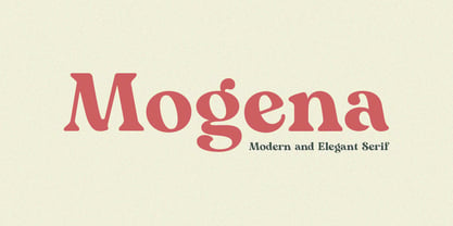 Mogena is a modern and elegant serif. It has a unique and different style and will give your design a friendly and expressive look. Mogena is perfect for many different projects such as logos and branding, invitation, stationery, wedding designs, social media posts, advertisements, product packaging, product designs, label, photography, watermark, special events or anything. We hope you enjoy the font and have fun! Thank You.
 - Hamuel Nine Five by LightHouse,
$49.00Hamuel Nine Five was inspired by two sources, both with few letters, and different styles. The first one was a fresco in the el-Transito Synagogue, Toledo, built in 1357 by order of Samuel Abulafia, treasurer to the king of Castile. The second one was a mezuzah cover, Morocco, 19th century. Hamuel Nine Five is an OpenType/TTF Unicode font. - Jadey by Graphicfresh,
$14.00 Jadey - The Classical Serif Font We tried to make different fonts. With a touch of the ethnic past. So that this font looks more classic and modern. Measuring each letter reminds us of the past in some works in Indonesia. Although it looks classic, this font is perfect when combined with today's design styles. Have fun being creative with this font.
 - CF Santiago by Contrafonts,
$28.00 This alphabet has only capital and small caps. With several alternative characters (A, R, Y) in different style groups. The capitals are even more flexible, with alternatives for Uncial inspiration. In addition to ligatures symbols and various groups of numbers. Of course we use Opentype for a expanded use in modern software for layout and graphic design. Compatible with mac and PC.
 - Another Stencil JNL by Jeff Levine,
$29.00 With a large variety of stencil fonts contained within the Jeff Levine Fonts library, Another Stencil JNL is simply another stencil design added to this growing collection. Modeled from a lettering guide manufactured in the 1970s, the style is influenced by Franklin Gothic, but has enough differences in the shapes of the stencil characters to be considered a cousin to that classic design.
 - Stonecross by Scriptorium,
$18.00People are always asking us for chiseled-stone style fonts, so we thought we'd give them what they want, but with a slightly different spin. Stonecross has the look of classic Celtic uncial lettering as it would look if it was cut in stone, with some fanciful variant character forms and the nicks and chips which give it the look of stone. - Suidae by vve.type,
$49.99 Suidae is a fat font family, combined from 3 different style. It's fresh, friendly, fun and full of surprises waiting for you to be discover!. It is also a great mix of boldness and cuteness, so it definitely captures attention while keeping the minimal form of letters. Plus, Suidae is an effective font family for creating amazing headlines, logos & posters with a custom-made feeling.
 - Monoplan by Plantype,
$30.00 Monoplan is a versatile monospaced sans serif typeface. Minimal shapes and straight sides are definitive features of the typeface. Tables, headers, code blocks, signages or other small informative texts are the standard places where Monoplan shines. Different alternatives such as square dots, alternate /a /y /6 /9, coverage of 94 Latin languages, various Opentype features, and 5 styles expand the usage area of Monoplan.
 - SK Boncuk by Salih Kizilkaya,
$9.99 SK Boncuk is a very special font family I designed for my pet. Bead is a very smart and special rabbit. It can understand all commands and do whatever is said. It is very lively and fun in his daily life, but also monotonous. For this reason, I designed a fun font for him, with a single weight but with surprises. This font represents Boncuk's fun but monotonous life. SK Boncuk offers full support for the Latin alphabet and includes all the typographic elements you will need. This font family consists of 8 different fonts and 3288 glyphs and it supports hundreds of different languages thanks to the characters it contains.
 - Tribal Dragon - Personal use only

- Ruthless Wreckin TWO - Personal use only

- Goth Stencil Premium - Personal use only

- DorovarFLF-Carolus - Unknown license

- Arcade Fire - Unknown license

- Shot - Unknown license

- Persian Grunge by Si47ash Fonts,
$19.00 The only Persian Arabic font featured on Behance [Graphic Design / Typography] Published in multiple books including New Illustration With Type and DesignAndDesign Vol. II Carefully and meticulously designed by selecting, choosing, vectorizing and editing so many different Persian and Arabic calligraphic scripts and old typefaces glyphs forms to create this one of a type [pun intended!] font. And if it's not enough, it's got patterns, textures, artistic elements, ornaments, in a grunge and dirty style. But it not over yet! Persian Grunge [Dirty] font has two styles: Dirty and Neat. Not only the Neat style is cleaner, but also a lot of same glyphs are different from the Dirty style. This Arabic grunge font is a great choice for all graphic designers, typographers and visual artists. Your posters, banners, artistic typographic projects are gonna be awesome with these fonts! Shahab Siavash, the designer has done more than 30 fonts and got featured on Behance, Microsoft, McGill University research website, Hackernoon, Fontself, FontsInUse,... Astaneh text and headline font which is one of his latest designs, already got professional typographers, lay-out and book designers' attention as well as some of the most recognizable publications in Arabic/Persian communities.
 - Karol Sans by Type-Ø-Tones,
$60.00 Karol Sans is the perfect companion for Karol, without being a literal translation of it. It has its own personality and offers a wider range of six weights and their italics which gives it added versatility. It has all the indispensable OpenType features for a text typeface like Small Capitals, different sets of figures, fractions and many others. The character set supports Latin, Central European, Baltic and Turkish languages.
 - Bronze Script by Mans Greback,
$59.00 Let Bronze Script take you back. Back to the golden age of vintage when hand drawn scripts appeared in every form of publication. A different time when everything moved slower, lettering was done with expertise, and every detail awarded care and attention. In our age of cold digital creations, you can rest assured that Bronze Script will give you that tailor made flare only a nostalgic font can offer.
 - Victorina by John Moore Type Foundry,
$35.00 Victorina is a fantasy sans letter or display, inspired by the Victorian letters whose stylistic influence dominated the scene graph of the nineteenth and twentieth century. Victorina has a perfect structure of rigorous geometry. Victorina comes in several versions in both Black and Condensed, in italics with a varied repertoire of styles, besides providing small caps and ornaments. Victorina lets you work fine fantasy headlines when they overlap in layers of different styles. Victorina is a letter designed to recreate, with a contemporary vision, the spirit of those days of the industrial revolution and the early days of modernism.


