10,000 search results
(0.05 seconds)
- Crafter Pieces by Putracetol,
$28.00 Crafter Pieces - Multi-Style Font is a truly unique font that offers multiple styles within a single typeface. With a total of 8 different styles accessible through alternate characters, this font provides versatility and creative options for various design applications. From super bold and stencil to thin, slab, serif, sans-serif, sport, and postage stamp styles, Crafter Pieces is a font that can be applied to any design and suit any theme or style. Each style can stand on its own or be combined with others, making it a perfect choice for branding, logos, posters, quotes, books, magazines, headlines, and more. The versatility of Crafter Pieces is truly exceptional, as it allows you to experiment with different styles within a single font. The availability of 8 distinct styles in one typeface opens up a world of possibilities for your creative projects. Whether you need a super bold look for a striking poster, a stencil style for an edgy branding design, or a thin font for an elegant quote, Crafter Pieces has it all. With Crafter Pieces - Multi-Style Font, your design possibilities are endless. Whether you're working on a modern or vintage theme, an edgy or elegant concept, this font will be your go-to choice, offering a wide range of styles to suit every project and creative vision.
 - Golden Ticket by E-phemera,
$12.00Golden Ticket is a digitization of hand-drawn poster lettering by Otto Heim from 1925. The regular style is meant to be used on its own, but the other three styles are meant to be used one on top of another in three different colors to create a 3D effect. For best results, put the base style on the bottom, with the fill style directly on top of that in a different color, and the highlight style directly on top of that in a third color. - Stereonic by Mint Type,
$30.00 Stereonic is a geometric display sans influenced by Art Deco style. Its 38 fonts across 5 weights offer the possibility to convey numerous moods and styles typical for different decades. As the name suggests, the music posters were considered as the perfect application for this typeface, however using it in magazines and other editorial will definitely add more style. A variety of included ligatures and alternatives will also make Stereonic a perfect choice as the base for logotypes.
 - Mary Roman by Yuanchen Jiang,
$30.00 A set of typeface that combine detail features from different style of serif typeface originally designed for screen use.
 - Pesto Fresco Italic by Resistenza,
$29.00 Pesto Fresco Italic is a new version of Pesto Fresco handwritten lettering system, a font family built of 27 styles. Overlapping Pesto Fresco Italic Regular with any of the other decorative styles you will get different graphic effects, so just choose the one that fits best with your layout. This font can be used for different purposes from packaging design to web design.
 - Zebramatic by Harald Geisler,
$14.99 Zebramatic - A Lettering Safari Zebramatic is a font for editorial design use, to create headlines and titles in eye-catching stripes. Constructed to offer flexible and a variety of graphical possibilities, Zebramatic type is easy to use. The font is offered in three styles: POW, SLAM and WHAM. These styles work both as ready-made fonts and as patterns to create unique, individualized type. The font design’s full potential is unleashed by layering glyphs from two or all three styles in different colors or shades. Working with the different styles I was reminded of the late Jackson Pollock poured paintings—in particular the documentation of his painting process by Hanz Namuth and Paul Falkernburg in the film Jackson Pollock 51. In Pollock’s pictures the complex allure arises from how he layered the poured and dripped paint onto the canvas. Similar joyful experience and exciting results emerge by layering the different styles of Zebramatic type. Texture In the heart of the Design is Zebramatics unique texture. It is based on an analog distorted stripe pattern. The distortion is applied to a grade that makes the pattern complex but still consistent and legible. You can view some of the initial stripe patterns in the background of examples in the Gallery. Zebramatic POW, SLAM and WHAM each offer a distinct pallet of stripes—a unique zebra hide. POW and WHAM use different distortions of the same line width. SLAM is cut from a wider pattern with thicker stripes. The letter cut and kerning is consistent throughout styles. Design Concept Attention-grabbing textured or weathered fonts are ideal for headlines, ads, magazines and posters. In these situations rugged individuality, letter flow, and outline features are magnified and exposed. Textured fonts also immediately raise the design questions of how to create alignment across a word and deal with repeated letters. Zebramatic was conceived as an especially flexible font, one that could be used conveniently in a single style or by superimposing, interchanging and layering styles to create a unique type. The different styles are completely interchangeable (identical metrics and kerning). This architecture gives the typographer the freedom to decide which form or forms fit best to the specific project. Alignment and repetition were special concerns in the design process. The striped patterns in Zebramatic are carefully conceived to align horizontally but not to match. Matching patterns would create strong letter-pairs that would “stick out” of the word. For example, take the problematic word “stuff”. If Zebramatic aligned alphabetically, the texture of S T and U would align perfectly. The repeated F is also a problem. Imagine a headline that says »LOOK HERE«. If the letters OO and EE have copied »unique« glyphs - the headline suggests mass production, perhaps even that the designer does not care. Some OpenType features can work automatically around such disenchanting situations by accessing different glyphs from the extended glyph-table. However these automations are also repeated; the generated solutions become patterns themselves. Flip and stack To master the situation described above, Zebramatic offers a different programmatic practice. To eliminate alphabetic alignment, the letters in Zebramatic are developed individually. To avoid repetition, the designer can flip between the three styles (POW, SLAM, WHAM) providing three choices per glyph. Stacking layers in different sequences provides theoretical 27 (3*3*3) unique letterforms. A last variable to play with is color (i.e. red, blue, black). Images illustrating the layering potential of Zebramatic are provided in the Gallery. The design is robust and convenient. The font is easily operated through the main font panel (vs. the hidden sub-sub-menu for OpenType related features). The process of accessing different glyphs is also applicable in programs that do not support OpenType extensively (i.e. Word or older Versions of Illustrator). International Specs Zebramatic is ready for your international typographic safari. The font contains an international character set and additional symbols – useful in editorial and graphic design. The font comes in OpenType PostScript flavored and TrueType Format.
 - LTC Goudy Extras by Lanston Type Co.,
$24.95 A set of over 50 ornaments, connecting borders, flourishes and decorative motifs originally designed by Frederic Goudy throughout his career. Many of these designs were used by Goudy at his Village Press and offered by his Village Foundry in the 1920s. The styles range from complex title page illustrations to simple linking borders, but all have the unique Goudy style. This set is completely different from the Goudy Ornaments found in the P22 Goudy Aries Set.
 - EFCO Colburn by Ilham Herry,
$15.00 Colburn is a squarish typeface inspired by lettering found on vintage tins, Colburn is a display typeface that captures the essence of nostalgia while offering modern versatility. Colburn's variable font technology ensures seamless transitions between different styles, empowering you to create dynamic and harmonious compositions. From packaging and posters to websites and branding materials. PDF SPECIMEN
 - Karlout by Raditya Type,
$16.00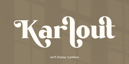 Karlout - elegant retro serif display with an artistic touch. Specially designed for vintage, retro, elegant projects, perfectly suitable for creating simple, lifestyle designs such as logos, title, packaging, and more. It is ideal for high impact headlines. The available style alternatives offer a number of different characters that give your logo or business card a unique look.
 - Freshman - 100% free

- Fontanesi - Unknown license

- Graffiti Treat - Unknown license

- Keith by Talbot Type,
$19.50 Keith is a striking and playful display font. Mix and match the different shadow styles, to create a variety of different looks and effects. There are four different shadow effects, along with a fill and an outline variation. Keith features a full upper and lower case character set and an extended set of accented characters for Central European languages.
 - Basis by MADType,
$19.00 Basis is a bitmap font family which is happy being used at both small and large sizes. Designed as a 9 point bitmap face for the web, it offers different styles than most normal bitmaps. The stencil style can be used for display purposes, while the SmallCaps lowercase is great for website navigation menus.
 - Data Error Vert AOE Pro by Astigmatic,
$24.00 The Data Error Vert AOE Pro family is another spinoff of my Data Error AOE Pro family. Quite simply, it takes on a slightly different feel than the original pin matrix grid by stroking across all vertical glyph lines. The vertical lines break up the readability somewhat of the original grid and lend a more tech vibe to the family. Check out the range of posters created to see the various Capitals, Lowercase, smallcaps and varying styles that the family has to offer and how it both differs from and compliments the original Data Error AOE Pro family.
 - Mortised Capitals by Intellecta Design,
$28.90 A decorative display font featuring many different styles of flourishes and ornaments. Great for a vintage antique feel.
 - Mortised Ornaments by Intellecta Design,
$24.90 A decorative display font featuring many different styles of flourishes and ornaments. Great for a vintage antique feel.
 - Mortised Fleurons by Intellecta Design,
$21.90 A decorative display font featuring many different styles of flourishes and ornaments. Great for a vintage antique feel.
 - Meguro Sans by GT&CANARY,
$27.00 Meguro Sans has a modern-styled boxy shape that achieves clean, industrial yet friendly style lends itself well to brand building. Its mono-line oriented and very high X-height ensure that it is extremely legible and creates a strong impression. Meguro Sans is Sans serif version of Meguro Serif. The Meguro sans font family is comprised of 10 styles with 5 different weights from light to black, along with matching italics offering possibilities for use in web, print, package and sign design, all with the goal of building an established look for brands in wide range of industries.
 - curlyJoe by JOEBOB graphics,
$19.00 CurlyJoe is a fast, informal handwritten font. A bit in the line of the dearJoe series, with a different style of caps.
 - Squadzone by DePlictis Types,
$29.00 SQUADZONE it’s a young & sportive unicase style font, having both uppercase and a few smallcase alternating letters that gives it a unique look. It’s geometric anathomy of the letters may have two different types of endings or detail: straight and sharp cut out angles at 45 degrees. This offers a few alternatives in headlines or even logotype purposes that are realy encouraged to use for.
 - I am online with u by Pisto Casero,
$19.00 The "Line" style of "I am online with u" font family was inspired by the idea of the digital connection of two people living in different parts of the world. Later on this idea was expanded, including different styles such as "Dashed" or "Dotted", which built the font family taking the initial idea to another level and keeping the connectivity concept alive. This typeface works best when used in big sizes.
 - PODIUM Soft by Borutta Group,
$39.00 PODIUM Soft is variations of PODIUM Sharp typeface designed in 2019. Family consist of 13 styles from ultra compressed to extra expanded. Main purpose of this project was idea to make hybrid between different modular and geometric woodtypes that I found in old polish specimens: Rex, Blok, Bacarat etc. Thanks to big range of different styles, PODIUM will be perfect choice for visual identities, posters and display usage.
 - Gang by Ani Dimitrova,
$39.00 Gang is a 2 - style display font family designed by Ani Dimitrova. Both weights contain a set of extended Latin and Cyrillic, as well as all sorts of open type features: standard ligatures, proportional figures, numerals, arrows, matching currency symbols, and fractions. In both styles, the font is well-suited for large headlines, word emphasis, and different types of advertising. The fonts' wide proportions make them a perfect choice for screen usage. This style palette offers a flexible range for display typography. The Gang type family is ideally suited for magazines, branding, posters, as well as web and screen design, and more.
 - Kinoble by Jehoo Creative,
$19.00 Kinoble is a font that combines the clean look of sans-serif with a touch of handwriting for a natural feel. It comes in different weights, from regular to black, and has an italic style for added variety. This makes it suitable for various design purposes, from subtle to bold. Whether you need it for titles, logos, or any kind of display text, "Kinoble" adds a modern twist while staying easy to read. It's like a versatile tool in your design toolbox, offering a unique blend of style and clarity.
 - FT Brush by Fenotype,
$14.95 FT Brush is a calligraphy style font family of three members - light, regular & bold. Combine different cuts for vivid outcome.
 - Syrup by Fenotype,
$35.00 Syrup is a friendly, subtly rounded type family combining sans and script styles. It’s aesthetic roots are in the sign painting of the 1950’s but the execution is distinctly modern. The different styles are designed to work well together so you can have multiple levels of typography all with the same feeling and aesthetic. Try combining the styles in different ways for maximum impact. All styles are packed with Opentype features to enable flexible customisation of your design and the font is especially well suited for branding and packaging typography.
 - WT Volkolak by Wraith Types,
$50.00 Volkolak is the ultimate serif-sans-grotesque tribrid, its numerous cuts will give you many options represent a typesetter's dream! Designed as one, it offers a serif, a contrasted sans serif and a grotesque style. The numerous typesetting options offered this way gives it a ton of usability and functionality in many different mediums, editorial design, books, magazines, posters, visual identity, web design... You won't find a project in which you can't use this true workhorse superfamily!
 - Lucifer Sans by Daniel Brokstad,
$29.00 Lucifer Sans is a modern sans serif font rooted in Scandinavian geometry and minimalism, mixed with a healthy dose of black metal and irreverent attitude. Harsh vertical cuts and angles throughout the font creates a very strict and hard look, that can either be amplified or loosened up through its stylistic sets. Lucifer Sans family contains 162 font, 9 different weights and width, plus italics. In addition there are 3 different stylistic sets. This creates substantially diverse set of characters for contrasting against another and makes it a versatile font for different formats. Style 01 takes on an almost hand drawn style, while Style 02 enhances the geometric aspects of the font further. Style 03 uses only the rounded letter 01 without the hand drawn variations.
 - Eletric Lady by RM&WD,
$49.00 Electric Lady in a light script with a great amount of different possibilities. With Electric Lady font family you can to turn on various features (Ligatures, Stylistic Alternates, Contextual Alternates, Swashes, 3 completely different Stylistic sets) to auto swap out letter sets with alternate versions. - More than 3,000 glyphs - 100 different numbers shapes - 110 different ornaments In the Extra 2 style, you'll find many different standalone words, kitchen icons, menu icons, swashes, and extra fun characters!
 - Beauty One by Attype Studio,
$15.00 Introducing Beauty One, a stylish monoline script style font. This beautiful script font offers your personal touch to your latest art project with fresh, curvy and beautiful look. Beauty One offers is perfect for many different project such as logo, branding, invitation, flyer, posters, social media posts, advertisements, product packaging, product designs, label, photography, special events or anything that need monoline script taste.
 - Stylish Title JNL by Jeff Levine,
$29.00 The cover title for the July, 1935 issue of Harper’s Bazaar magazine was hand lettered in a condensed, squared slab serif design with a few stylized characters. This is now available as Stylish Title JNL, in both regular and oblique versions. For many years, each issue of the magazine had its title rendered in different type styles; offering many unique variations to coincide with that month’s cover art.
 - Soft Fleurons by Intellecta Design,
$21.95 Soft Fleurons is a dingbats/decorative display font featuring many different styles of flourishes and ornaments. Great for a vintage antique feel.
 - Tonus by Hurufatfont,
$29.00 Tonus Super Family; It is a family of five character styles built on the same skeleton. The entire Tonus Family is built on the skeleton of the "sans" family, it is the only family where five different styles are presented together. All families have an equal number of characters. It has rich opentype features. It inspires designers for different and creative applications such as brand building, periodicals, packaging, and social cultural event designs.
 - Wonders Graf 3d Graffiti by Sipanji21,
$15.00 "Wonder Graff" is a graffiti font that features 3 different layers and multiple font styles. With these layers and font style variations, you can create intriguing effects in your design. The use of layers and font styles allows you to achieve more complex and creative looks. Fonts like "Wonder Graff" are often used in street art, posters, or designs that want to emphasize bold and energetic typography. With different layer and style options, you have greater control over the appearance of your text and can customize it to fit your design concept.
 - Sinyal by Linecreative,
$14.00 Sinyal is an oblique style condensed font, and in a very different style from the others. Its weight excels in posters, social media, headlines, magazine titles, clothing, large print formats - and anywhere else you want it to be seen. Inspired by design styles that are popular today, and this is the answer to all the needs of every idea that you will pour in this modern era. Sinyal offers you: Sinyal- A clean Bold italic font including Upper & Lowercase characters(ALL CAPS), Ligatures Character Supports Multi linguage (Latin Western Europe), Numbers and Punctuation
 - Enter Cromix by Sipanji21,
$15.00 "Enter Cromix" is described as a futuristic display font that comes with multiple styles, including bold, italic, and outline. Fonts with a futuristic design often feature sleek and modern letterforms that convey a sense of innovation and cutting-edge aesthetics. The different styles—bold, italic, and outline—provide versatility in creating various typographic effects. The bold style emphasizes a strong and impactful appearance, the italic style adds a dynamic slant, and the outline style creates a distinct and open character structure. "Enter Cromix" is suitable for a range of design projects where a futuristic and dynamic typographic style is desired. Its variety of styles allows for creative exploration in conveying different visual elements within the text.
 - Karisans by The Type Fetish,
$20.00 Karisans is a hand drawn, layerable sans serif font. By layering the various styles differently the user can achieve many different effects.
 - Ruthless Wreckin ONE - Personal use only

- The Roseberry by me55enjah,
$8.00 Introducing The Roseberry, a classic handmade serif. The Roseberry is a handmade serif display typeface, inspired by classic western poster. Imperfect lines and edges lead us to a classic look. In 3 different kind of style, The Roseberry can simply give a vintage vibe on your design. Features: * 3 different style: Roseberry Solid, Outline & Codet. * All caps, numbers and punctuation.


