10,000 search results
(0.08 seconds)
- Sign Maker JNL by Jeff Levine,
$29.00In 1948, Joseph Struhl pioneered an innovative do-it-yourself sign kit for retail merchants. Die-cut letters and numbers made from flexible sheets of vinyl with the ability to adhere to smooth surfaces by static electricity; his "Magic Master Interchangeable Sign Kits" became a great success. Jeff Levine has paid tribute to this innovative method of in-store advertising with Sign Maker JNL. Because of their die-cut shapes, the design style of the static cling letters have unique characteristics. Companion fonts (based on other Struhl sign kits) are Cling Vinyl JNL and Cling Vinyl Clear JNL. - BLT Balfour by Black Lab Type,
$12.00 BLT Balfour : Art Deco Revival Font Balfour is a modern Art Deco typeface revival. Built from historic references in architecture during this time period, Balfour exudes class and elegance, yet still honors the style with unapologetic bold geometric forms. Pay close attention to the letterforms B and R, and how their extreme x-heights play off of the elongated strokes of C, D and G. Unique features throughout the character set make it less predictable and more unique than any Art Deco typeface before it. The geometry of this typeface plays from one letter to the next. Fill and Outline styles work well in headlines, logos and large type. The Line style is effective at all sizes and can be used in combination with other styles to achieve visual hierarchy.
 - Dokument Pro by Canada Type,
$29.95 Jim Rimmer aptly described his Dokument family as a sans serif in the vein of News Gothic that takes nothing from News Gothic. Building on that internal analysis, Dokument Pro is the thoroughly reworked and expanded of the original main set released in 2005, with different widths still in the pipeline. This new version updates Jim’s work to six Pro weights and their italic counterparts, each of which takes advantage of OpenType stylistic sets to introduce different degrees of graduation from gothic to humanist. Dokument Pro is now a unique text sans family, with an adaptable personality suitable for the kind of edgy, uncompromising corporate and media typography that just tells it like it is, instead of having to resort to the common contemporary luring and baiting tactics. Dokument Pro’s range of weights, styles and features (over 775 glyphs per font, built-in small caps, alternates galore, and support for over 45 Latin languages) allows for multi-application versatility and clear, precise emotional delivery. This is the kind of straight-shooter sans that should be in every designer’s toolbelt. For more details on the fonts' features, text and display specimens and print tests, consult the Dokument Pro PDF availabe in the Gallery section of this page. 20% of Dokument Pro’s revenues will be donated to the Canada Type Scholarship Fund, supporting higher typography education in Canada.
 - Strokes by Favorite Fonts,
$17.00 The "Strokes" font family presented here has several styles: regular, italic, bold and bold italic. The font supports the alphabet consisting of Latin letters and symbols, Cyrillic, Tatar. The composition of the font "Strokes" includes graphemes from uppercase and lowercase letters, numbers, standard characters. The originality of the font lies in its name. The "Strokes" font is made up of many intersecting lines, forming rounded sans-serif letters, but at the same time smooth and easy to read, which will fit perfectly into your composition. The unusualness and attractiveness of the font makes it noticeable among the texts that surround us everywhere. This property is convenient to use on signs, logos, corporate identity, product packaging. The decorativeness of the font is eye-catching and will add important accents to your work.
 - Yaty by Mans Greback,
$59.00 Yaty is a relaxed and spontaneous script font. With its long descenders, bold capital letters and genuine style, this typeface fits perfectly for a down-to-earth logo or headline, emitting familiarity and friendliness. The font contains ligatures and support for an extensive range of world-wide languages.
 - Training Film JNL by Jeff Levine,
$29.00 The title card “Airplane Hydraulic Brakes” in the beginning of a WWII armed services training film had the words "hydraulic brakes" hand lettered in an Art Deco slab serif style. This served as the model for Training Film JNL, which is available in both regular and oblique versions.
 - Senistia by GuseType,
$12.00 Senistia is a decorative serif font with condensed and elegant glyphs characteristics. This font can be used in a various of designs such as posters, magazines, logos, headlines, brands & identities, and more. Feature: - Kerning - Alternative Style and Ligature - Uppercase and Lowercase Letters - Numeral - Punctuation and Symbols - Multilingual Supports
 - Industrial Poster JNL by Jeff Levine,
$29.00 A 1917 informational poster for shipbuilders during World War I detailing the importance of their governmental work was hand lettered in a style closely resembling Cooper Black, yet retaining its own look and feel. This inspired Industrial Poster JNL, which is available in both regular and oblique versions.
 - Parekraf by Nirmana Visual,
$17.00 Parekraf is a natural Handwritten typeface, with 2 style : Regular & italic. full set of lowercase and uppercase letters, numerals and punctuation, multilingual symbols. Very suitable for the title, logo, typography, clothes, magazines, brochures, packaging and much more for your design needs, making your designs more modern and professional.
 - Cabazon by Parkinson,
$30.00 Cabazon is an informal blackletter inspired by handlettering samples from many sources, and various time periods. Works by Rudolf Koch and Friedrich Heinrichsen are reflected, as well as the work of showcard lettering artists Ross George and Samuel Welo. Medieval manuscript samples were also helpful in developing this style.
 - St Mika by Stereotypes,
$25.90 St Mika is big, black and beautiful. A little bit clumsy, Mika has his very own style of serifs and letterforms, making him very unique. If you want to yell or scream at someone, Mika is not your partner. This typeface is more about harmony and big letters.
 - Astro Jack by FHFont,
$19.00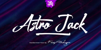 Astro Jack is script font with a hand-lettering, brush style and OpenType features. It is suitable for design, element design, weddings, events, t-shirts, logos, badges, stickers, and awesome work. Features Of The Font: - All Standard Character, Symbol, Multi-lingual Support, Ligature, Stylistic Set, and Swashes. - PUA Encode
 - Sherley by Putracetol,
$12.00 Introducing Sherley, a new elegant script font, lovely and sweet. Sherley is perfect for styling logos, stationery, wedding event, invitation, quote, social media, websites and so much more! Sherley comes with Opentype feature and a lot of alternates to help you make great lettering. Also supports multi language.
 - Refhdisav by Twinletter,
$17.00 Regards! Get to know Refdisav, a classic serif font that’s ready to add a magical touch to your design projects! With an elegant classic modernism theme, this font is the perfect choice to give any creation a timeless, classic feel. Rephdisav comes with an alluring elegance and a captivating serif style. Each letter is designed with great attention to detail and perfect proportions, creating an impressive and professional impression. In every project, Rephdisav is able to exude a classic modernist charm that is so charming. Not only that but Rephdisav is also equipped with great features such as ligatures and alternative characters that give flexibility in experimenting with interesting and unique letter combinations. You can easily create designs that are creative and different from the others. Apart from that, Rephdisav also supports multilingualism, allowing you to easily reach an international audience and broaden the scope of your designs. Whatever language you use, Rephdisav will be a loyal partner who is ready to give beauty and perfection to every design. With Refdisav, you can create works that depict the luxury and timelessness of classic modernism. Show an elegant, professional, and classic style in every touch of your design. Don’t miss the chance to own this eye-catching classic serif font. Rephdisav will be a bridge to satisfaction and beauty in your design projects. What’s Included : File font All glyphs Iso Latin 1 Alternate, Ligature Simple installations We highly recommend using a program that supports OpenType features and Glyphs panels like many Adobe apps and Corel Draw so that you can see and access all Glyph variations. PUA Encoded Characters – Fully accessible without additional design software. Fonts include Multilingual support
 - gAbAcHiTA FFP - Personal use only

- Grandheron Sans by André Simard,
$11.99 If you are looking for a font with very good readability, even with its square appearance and condensed design, Grandheron is for you. You should find attractive the design of some glyphs like those one: a,f,k,l,v,y and also AJKMNVXY to name a few. Grandheron could be use as well in small size as in huge size. You will certainly like its Thin or Light font which give an awsome effect for titles, subtitles, caption for magazines related to fashion, architecture or even cultural in general. You could easily mix Grandheron with serif typeface as Harfang Pro. There is no limit to create great designs with this large typeface family, so enjoy!
 - Quiel by Ardyanatypes,
$15.00 QUIEL is a font inspired by modern and retro styles blended with elegance. With its dynamic shape, this font is suitable for any design to showcase a stylish, retro, or classic ambience. With nine available weights, QUIEL can easily be adjusted to suit various design preferences. The advantages of QUIEL are not only in its appealing appearance but also in its flexibility in terms of language. This font supports multiple languages, making it easy to use in different countries and languages. Furthermore, QUIEL comes with ligatures and alternate styles, which can enhance the visual appeal of your designs. The inclusion of alternative fonts also provides a range of options for combination. QUIEL is highly suitable for branding projects and various design needs, such as business cards, name tags, advertisements, posters, invitations, branding, logos, magazines, merchandise, and presentations. The unique modern letterforms of QUIEL allow for interesting combinations with various other font types. With its diversity and flexibility, QUIEL is the perfect choice to elevate the visual aspect of your designs, providing an elegant and captivating touch.
 - Terrapin by Missy Meyer,
$12.00 Introducing Terrapin! I named this after listening to a song called "Terrapin on a Tightrope." Considering the fact that a terrapin is a kind of turtle, it makes that song title seem pretty harrowing! This font has heavy roots in one of my favorite lettering styles. It's rough, scrappy, and likes to do its own thing. It has a full uppercase and lowercase set, numbers, punctuation, and lots of extended Latin characters for language support. It also includes alternate versions of 17 lowercase letters. Where Terrapin really shines is in the ligatures. I've written separate two- and three-letter combined forms for some of the most common letter combinations, and a few uncommon ones to boot. There are almost 100 ligatures in here, all PUA-encoded so everyone can access them (and also coded so if your software does automatic ligature replacement, they'll pop right in).
 - Chekos by Authentype,
$11.00 Chekos is a feminine type face designed to be elegant and modern. Its clean, simple style makes it perfect for any project. Chekos comes in 9 weights: Light, Regular, and Bold. Each weight has five different styles. Chekos was created by designer Ekayasa. She wanted to create something that would be both beautiful and functional. Her goal was to make a typeface that could be used for everything from headlines to logos. Chekos is available in OpenType format and includes stylistic alternates, ligatures, and swashes. It is free for personal use and commercial licensing options are available upon request.
 - Density by Alandya TypeFoundry,
$15.00 Density Heavy Slab Serif Features a smooth slab serif and a wide surface that makes it especially suitable for horizontal and lengkungan compositions. This is a front view, best used at larger sizes when weight and impact are desired. It's classic with a modern edge and most importantly packed with different styles, and ligatures Density is a heavy slab serif that comes with regular, oblique, outline, outline slanted, rough, rough slanted, extrude and extrude slanted style. this font is perfect for every project. suitable for branding logo, badge design, or apparel design. This font also comes with multilingual support.
 - Menthox by Alit Design,
$19.00 Introducing Menthox Typeface The Menthox font is designed with a script font concept that has a decorative stencil style. Strong characters with stencil styles make Menthox fonts look different and unique from other script fonts. A script typeface like "Menthox" is very easy to apply to any design, especially those with dynamic, relaxed, and retro fashion concepts, besides that this font is very easy to use in both design and non-design programs because all glyps in the Menthox font are supported by Unicode. (PUA). The "Menthox"contains 700 glyphs with many unique and interesting alternative options.
 - Matthia by Linotype,
$29.99Linotype Matthia is part of the Take Type Library, which features the winners of Linotype’s International Digital Type Design Contest from 1994 to 1997. Dieter Kurz designed Matthia as a slender, flowing brush font. Its characters are in a handwritten style yet stand almost straight, making Matthia a mixture of reserved and lively, of static and dynamic. The font is reminiscent of advertisement typefaces popular in the 1950s and extremely versatile, suitable for short texts in small point size or headlines on posters. - Coldfield JNL by Jeff Levine,
$29.00Coldfield JNL is the revival of an old wood type font from Jeff Levine. Clean and easily readable at different point sizes, it is an excellent companion to Twelve Oaks JNL and Ingomar JNL. - Wood Island by WAP Type,
$20.00 Inspired by traditional ethnic feel and visuals. Great for fun and casual thematic visuals, games, logos, branding, products, campaigns, events, seasonal promotions, traditional concepts, explore different sides of your brand using wood island font.
 - FS Silas Slab by Fontsmith,
$80.00 Slab-like sibling Why stop at sans? Rather than leave FS Silas Sans as an only child, the team wanted to extend the family, and create a complete system for brands and editorial. Unsure what the result would be, the team started experimenting with a slab serif version. ‘We didn’t know how it would turn out, but we really liked it and wanted to take it further. A fresh angle ‘We stuck with the angular theme of the sans by drawing angled slab serifs,’ says Phil Garnham, ‘as opposed to the square serifs that slab fonts usually have. That created an inner dynamism in words and sentences on the page, and a very distinctive, crafted character, like a Victorian soul in a contemporary body.’ These crafted touches include details such as the angled ascenders on the ‘i’ and ‘l’, while characters such as the ‘y’, with its abruptly-ending descender, add a mark of distinction. A perfect pair Silas Slab, like its sibling, offers a clear-cut range of five weights, from the elegant Thin to the monumental ExtraBold. Put it together with Silas Sans and you have the full complement, capable of performing the full range of tasks, above the line and below, in headlines, body copy and logotypes, B2B and B2C. Keep them together; they don’t like it when they’re apart.
 - Sketchnote by Delve Fonts,
$29.00 The Sketchnote typeface was born of necessity: designer Mike Rhode needed a series of hand-drawn fonts to illustrate and produce his book, “The Sketchnote Handbook.” Because of its origin, this typeface was designed to be practical and convey the human character and quirks of his normal handwriting and hand-drawn lettering. The family is comprised of five fonts: Sketchnote Text in Regular, Bold, and Italic, the somewhat compressed and bold Sketchnote Square for headlines, and the playful Sketchnote Dingbats. Sketchnote Text is a casual script with a slightly bouncy baseline. In order to mimic the differences present in natural handwriting, OpenType features are built-in that automatically switch between multiple versions of each letter or number. In total, over 240 alternates in each of the text fonts are employed, making for a more authentic appearance. The warm texture of Sketchnote is the result of actual ink-spread on paper captured in the scans of written letterforms and was intentionally left intact during the digitization process to preserve that feeling. Rhode created Sketchnote Square as a display type to complement Sketchnote Text. Drawn instead of written, the letters often have neat little happenstance voids within the strokes. Sketchnote Dingbats features a selection of icons, rules, and arrows to provide some functional and fun tidbits, handy for bringing additional life to any design.
 - Wakerobin by Monotype,
$50.99 Wakerobin takes its charming swagger from the hand-painted billboard, poster and signage lettering of the mid-19th century. These showy styles did everything they could to stand out from the background cacophony of advertising, with signwriters using sharp and high contrast serif letters, squared block shapes, or art nouveau forms to grab the attention of passersby. Wakerobin embraces the spirit of these letterforms, bringing these various styles together in one typeface - as if users had their own sign painter on hand. Just as lettering artists had to adapt to a variety of sizes - from wide streetcar lettering to compressed forms that squeezed into narrow Victorian windows - the variable version of Wakerobin scales up and down in width to fit whatever environment the user’s working in. The static fonts come in three widths and five weights. As well as its adaptability, Wakerobin is bursting with vintage flavour, making it hard to ignore. Its distinctive, spiky serifs would be right at home on food and drinks packaging, as well as shop windows, adverts, and any other place that calls for some typographic showmanship. It performs particularly well in busy environments, or anywhere with a lot of visual noise - just as its historic predecessors did. And while Wakerobin is first and foremost a display typeface, it’s surprisingly elegant when used at text size, or in the lighter end of the weight spectrum.
 - Wakerobin Variable by Monotype,
$209.99Wakerobin takes its charming swagger from the hand-painted billboard, poster and signage lettering of the mid-19th century. These showy styles did everything they could to stand out from the background cacophony of advertising, with signwriters using sharp and high contrast serif letters, squared block shapes, or art nouveau forms to grab the attention of passersby. Wakerobin embraces the spirit of these letterforms, bringing these various styles together in one typeface - as if users had their own sign painter on hand. Just as lettering artists had to adapt to a variety of sizes - from wide streetcar lettering to compressed forms that squeezed into narrow Victorian windows - the variable version of Wakerobin scales up and down in width to fit whatever environment the user’s working in. The static fonts come in three widths and five weights. As well as its adaptability, Wakerobin is bursting with vintage flavour, making it hard to ignore. Its distinctive, spiky serifs would be right at home on food and drinks packaging, as well as shop windows, adverts, and any other place that calls for some typographic showmanship. It performs particularly well in busy environments, or anywhere with a lot of visual noise - just as its historic predecessors did. And while Wakerobin is first and foremost a display typeface, it’s surprisingly elegant when used at text size, or in the lighter end of the weight spectrum. - Polias by Esintype,
$23.00 Polias is an all-caps uniwidth typeface inspired by an ancient inscription carved on a monoblock stone in hybrid characters — between no-contrast linear sans to low-contrast flared serif. The inspiring inscription is the dedication by Alexander the Great, discovered in the Temple of Athena Polias in the ancient Ionian city of Priene. Stanley Morison mentioned this inscription in one of his lectures: “The distinctive feature of this inscription consists of a consistent thickening towards the ends of perpendiculars and horizontals.” … “We have not the right to say that the serif was invented for Alexander the Great's inscription, only that this is its first datable appearance.” The letter proportions are almost identical to the original, but the stroke features have been reinterpreted and characterized. Serif-like nodes at the end of the strokes are subtle extensions that serve to accentuate rather than break its monoline elegance. With an analogy, they are not flowers, but like blooming buds. Polias is a flared sans typeface which is closer to sans-serif forms on the spectrum between sans and serif. It’s especially light looking by design to convey rather thin and white typographic color of its original monumental look. It comes in eight weights and a variable font, scaled from Thin to Bold. It is multiplexed, so the weights do not affect text lengths. Light weights are closely based on the actual carving of the inscription. Thicker weights can be used on smaller typesettings to compensate for the weight difference of larger letters’ strokes, and to keeping the monoline appearance of the entire text block intact. This method can be used for any purpose, such as setting a hierarchy between the lines or to justify their lengths. Some of the original letterforms have been preserved and stylistic alternatives such as Ionic four-bar Sigma, dotted Theta, palm Y are provided as open type feature. Some of the other ancient forms, such as the three-bar Sigma (S), the pointed U, were also added for both the Greek and Latin scripts. Polias is preferable for big type settings such as logos and headlines as a modern representation of perennial classical forms. Its a fine fit for product branding, movie posters, book covers, packaging materials, and more, which require an epic look to attracting attention with a distinctive elegance. Polias can be considered for distinctiveness wherever Roman Capitals work. As a noun, Polias is one of the epithets of Athena / Minerva, and in this case referring to her role as the protector of the city of Priene. Polias is one of the seven typeface designs in Esintype's ancient scripts of Anatolia project, Tituli Anatolian series.
 - Polias Varia by Esintype,
$140.00 Polias Varia is an all-caps uniwidth variable weight typeface inspired by an ancient inscription carved on a monoblock stone in hybrid characters — between no-contrast linear sans to low-contrast flared serif. The inspiring inscription is the dedication by Alexander the Great, discovered in the Temple of Athena Polias in the ancient Ionian city of Priene. Stanley Morison mentioned this inscription in one of his lectures: “The distinctive feature of this inscription consists of a consistent thickening towards the ends of perpendiculars and horizontals.” … “We have not the right to say that the serif was invented for Alexander the Great’s inscription, only that this is its first datable appearance.” In Polias Varia, the letter proportions are almost identical to the original, but the stroke features have been reinterpreted and characterized. Serif-like nodes at the end of the strokes are subtle extensions that serve to accentuate rather than break its monoline elegance. With an analogy, they are not flowers, but like blooming buds. Polias Varia is a flared sans typeface which is closer to sans-serif forms on the spectrum between sans and serif. It’s especially light looking by design to convey rather thin and white typographic color of its original monumental look. It comes in eight weights and a variable font, scaled from Thin to Bold. It is multiplexed, so the weights do not affect text lengths. Light weights are closely based on the actual carving of the inscription. Thicker weights can be used on smaller typesettings to compensate for the weight difference of larger letters’ strokes, and to keeping the monoline appearance of the entire text block intact. This method can be used for any purpose, such as setting a hierarchy between the lines or to justify their lengths. Some of the original letterforms have been preserved and stylistic alternatives such as Ionic four-bar Sigma, dotted Theta, palm Y are provided as open type feature. Some of the other ancient forms, such as the three-bar Sigma (S), the pointed U, were also added for both the Greek and Latin scripts. Polias Varia is preferable for big type settings such as logos and headlines as a modern representation of perennial classical forms. Its a fine fit for product branding, movie posters, book covers, packaging materials, and more, which require an epic look to attracting attention with a distinctive elegance. Polias Varia can be considered for distinctiveness wherever Roman Capitals work. As a noun, Polias is one of the epithets of Athena / Minerva, and in this case referring to her role as the protector of the city of Priene. Polias (family) is one of the seven typeface designs in Esintype’s ancient scripts of Anatolia project, Tituli Anatolian series.
 - Funky Choky by Alit Design,
$19.00 Introducing “Funky Choky” Font: A Bubble Dynamic, Modern, and Funky Typeface Funky Choky is a captivating font that combines the essence of bubble dynamics with a modern and funky style. Its unique design exudes energy and playfulness, making it perfect for projects that require a fresh and vibrant look. This typeface features rounded letterforms with soft edges, giving it a friendly and approachable feel. The bubbly contours of each character create a sense of movement and liveliness, capturing attention and adding a touch of whimsy to any design. With its modern twist, Funky Choky brings a contemporary edge to traditional bubble fonts. It embraces clean lines, sleek curves, and a balanced composition, making it versatile for a wide range of applications. Whether you’re designing a logo, branding materials, advertising campaigns, or social media graphics, this font will add a dynamic and eye-catching element to your project. Funky Choky also offers a wide range of glyph variations, including ligatures, alternates, and stylistic sets, allowing you to customize and experiment with different letter combinations. This versatility empowers you to create unique typographic compositions that truly reflect your creative vision. Embrace the spirit of modernity and funk with Funky Choky font. Elevate your designs, stand out from the crowd, and infuse them with a sense of joy and energy. Let this captivating typeface be the perfect tool to express your creativity and make a memorable impact. Language Support : Latin, Basic, Western European, Central European, South European,Vietnamese. In order to use the beautiful swashes, you need a program that supports OpenType features such as Adobe Illustrator CS, Adobe Photoshop CC, Adobe Indesign and Corel Draw. but if your software doesn’t have Glyphs panel, you can install additional swashes font files.
 - Kodiak by Borges Lettering,
$45.00 Kodiak was designed by 40+ year sign painting veteran, Brian Grant, and is loosely based on the works of many great sign painting masters. Brian and Charles Borges de Oliveira teamed up to bring this beautiful sign painters classic to the digital age. Kodiak retains the warmth of a hand lettered font without being stiff and mechanical. Great for period style lettering to modern day logos. With over 160 alternates and 10 ornaments you are bound to find the right look for your next design!
 - Cacographie by Nantia.co,
$12.00 The Cacographie Calligraphy Font is a signature decorative font with which you can achieve a handwritten-type lettering feeling. Cacographie Calligraphy Font it's a multilingual lettering font with Greek (of course), Latin character set, and diacritics. This calligraphy style is perfect for your modern graphic design needs. This font has a really nice flow so you use it in a large text if you want to give them a touch of personality. It can be used on social media content, for branding or packaging.
 - Bielik by Hotniedog Studio,
$10.00 Bielik was created for a comic book that I’m working on. Main goal was to achieve random character of texts, so I made three glyphs for every letter, even for diacritics. Firstly I was drawing using brush pen with ink, so thickness of letters was really various. I decided to implement this style into a font. So that is how Bielik came into the world. This is good choice for comic books, children books, display designs and much more. Bielik is a polish word for Haliaeetus albicilla.
 - Anggelica Merona by Aldedesign,
$16.00 Introducing Anggelica Merona is a heavenly and light handwritten font with amazing characters. It will put a romantic spin on any design idea. This is a font which has a unique hand lettering brush style and it looks naturally handmade. This font is best used for your design project that has the concept of fun, girly, romantic and elegant. Can also be applied to the design of a logotype, header website, wedding logo, romantic design, make some lettering a quote, t-shirt design etc.
 - Tuxedo Stencil JNL by Jeff Levine,
$29.00 The sheet music for the 1934 tune "Two in A Dream" had the title hand lettered in a bold type style that utilized some stencil and some solid lettering. Following through on the stencil portion of the design, Tuxedo Stencil JNL was created in both regular and oblique versions. The 1930s were the era of elegant supper clubs and night spots, and it was not unusual to find gentlemen all decked out in formal wear for an evening on the town, hence the font's name.
 - Dr066 by 066.FONT,
$9.99 Dr066 is a display font that simulates the appearance of typewritten text. Each letter in Dr066 has been carefully designed to resemble the effect you get with a typewriter. This effect adds a sense of nostalgia to the text, as if it were from a bygone era, adding an authentic charm to the designs. Dr066 retains its varied and extravagant style, giving the text a lightness and a certain nonchalance. Its distinctive and daring letters make it ideal for projects that strive for a unique look.
 - Maracatu by Bruno de Aviz,
$5.00 The family of Tipografia Maracatu was born in 2020 when we could not leave the house because of the coronavirus epidemic. I had no idea how it would turn out. I just wanted to draw letters. When I finished the regular version, I thought it looked a lot like the art and music from the Northeast of Brazil, and that is why I came up with the name Maracatu. Maracatu is a musical-style original from the Northeast of Brazil. After I had the font style and the Regular version, I thought it would be nice to have Bold and Light.
 - Craft Roman by Baseline Fonts,
$24.00From scrapbooking to intensive graphic design applications, Craft Roman is a wonderful choice for charming and lighthearted communications. Craft Roman is based on Speedball and signpainter books from the 1920s and 30s, and reminiscient of the style of some of the lettering accompanying Mary Engelbreit artwork. Craft Roman is perfect for capturing the feel of vintage posters and retro stylings dating back to simpler times or handworked arts & crafts projects- even elementary school and childhood art. Extended character sets and intensive kerning provide foreign language support for many regions, plus bonus glyphs for quick stylistic flair. - Artes by Greentrik6789,
$19.00 Proudly present, Artes groovy layered display font. Inspired by bubble letters in graffiti art and retro style design, it produces a display font with a fun style that is perfect for the design needs of posters, flyers, covers, titles, logos, packaging, t-shirts, branding and various needs that require a unique display font. Activate the Contextual Alternates feature so that the shape of the character changes according to the shape of the character in front of it, and Activate the Stylistic Alternates feature to change the number characters into bubbles that you can use as additional elements in your design.
