10,000 search results
(0.208 seconds)
- Bright Cherry by Sibelumpagi,
$16.00 Bright Cherry is a handwritten calligraphy typeface with a natural style of brush lettering. It comes with the alternates glyph and multilingual support. Bright Cherry is perfect for many different projects such as logos & branding, invitation, stationery, wedding designs, social media posts, advertisements, product packaging, product designs, label, photography, watermark, special events or anything.
 - Tinkerer by Ingrimayne Type,
$9.00 Tinkerer, TapedUp, and Rumpled are based on the template I used for several letterbat fonts—fonts made of wrenches and bolts, hammers, or paper clips. TapedUp can be thought of as a font made from masking tape, and Rumpled is the same design but the tape pieces are wavy. Tinkerer is the same design but with elements that resemble what might happen if one constructed letters from Tinker Toys. All are caps only, but some of the shapes on the lower-case keys differ from the corresponding shapes on the upper-case keys.
 - Karlout by Raditya Type,
$16.00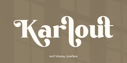 Karlout - elegant retro serif display with an artistic touch. Specially designed for vintage, retro, elegant projects, perfectly suitable for creating simple, lifestyle designs such as logos, title, packaging, and more. It is ideal for high impact headlines. The available style alternatives offer a number of different characters that give your logo or business card a unique look.
 - Zeitung Pro by Underware,
$50.00 Zeitung is a sans serif family which works equally well on print and web. First of all: Zeitung is a sans serif made according to contemporary standards: 8 weights, romans and italics, all equipped with small caps. Lots of OpenType features, like uppercase punctuation or 5 figure styles to make sure any of your mathematical or financial charts, tables and diagrams look cool. Zeitung’s typographic palette focuses on utility and legibility, but in the farthest corners you’ll discover a rich array of flavours: punchy black weights, fashionable thin styles, carefully hand crafted true italics, distinct small caps. But Zeitung has more to offer. Its optical sizes offer the best style for each size of your text. Zeitung fonts are devided to two optical families: Zeitung Standard and Zeitung Micro. Zeitung Standard works great in most sizes, while Zeitung Micro fonts are specially made for very small sizes in print and web. Zeitung Micro fonts are perfectly legible in web, where the same technical font styles have to survive in many environments, from older browsers to most up to date mobile screens. Next to that: the lightest weights also function as grades, because they share the same metrics. This can be very handy for selecting the optimal weight for your specific situation, especially on screens or when type is printed by a newspaper press. Letters are rendered in many various ways on different screens. Maybe the interface of your next app requires a different grade than your latest website? Zeitung allows you to change the weight of your text without any further consequence for the design. That is a welcome relief during the design process. Zeitung will help to bring your message across in many different circumstances, from large text in print to small type on screens.
 - Americain by Hanoded,
$10.00 Americain is a retro-style font, which was based on a single headline from a thirties advertisement. The letters are all caps, but there's a little difference between 'upper' and 'lower' case. Americain is ideal for headlines and posters.
 - Antea by Wiescher Design,
$39.50 Antea is named after "Antaeus" the giant of Libya in Greek mythology, son of Poseidon and Gaia (mother earth), whose wife was Tinjis. He was extremely strong if he stayed in contact with the earth, but once lifted into the air he became weak and liquid. So is this font, strong if grounded and weak if floating in the air. I will in due course add different weights for different purposes. Your designer of very mysterious fonts, Gert Wiescher
 - Nomenclatur by Aronetiv,
$9.99 The font was created under the influence of German tabular inscriptions. Especially, DIN font influenced on Nomenclatur graphic. It adds clarity and conciseness in the font. Nomenclatur is intended for use in architectural and design topics. It is also intended for a set of instructions and manuals. The font has the aesthetics of the Bauhaus and other constructivist movements. Characters of font are designed with high intelligibility, which makes it well readable in a small size. The lowercase letter "l" has a tail, so as not to confuse it with the capital letter "I", which has serifs. It avoids confusion in words like "Illinois". The font is well suited for the design of signs and navigation texts. A wide selection of styles allows you to design complex typography. The font family includes 15 styles. The font family has a variable font with two axes of weight and width. The font contains a set of alternative characters that will allow you to create different moods. The font contains Western European Latin and standard Cyrillic. The font has more than 3,600 kerning pairs configured. The font contains beautiful ampersand.
 - XIntnl Morse Code by Ingrimayne Type,
$6.95I designed a Morse-Code font in the mid 1990s, but when I decided to update it, I found enough problems with it to completely redo it. I hope I got all the mistakes out. There are two fonts in the package. One of them shows the letter key with the Morse Code equivalent. - Footloose by BA Graphics,
$45.00 Footloose was a work in progress when its original designer, my friend and colleague Bob Alonso, passed away. Back then just 14 lowercase letters were designed so far. Several years have since gone by, but lately I took on the task of developing Bob’s design into a full-fledged font. The distinctive style of his supplied letterforms provided much inspiration. In blocks of short text there is a dynamic that communicates much verve and vigor, owing in part to gracefully curving lines and high contrast of stroke weight. I guess you could say that this project has been a sort of “passing on of the baton”; and I trust that Bob would have been pleased with the outcome.
 - Fruitcake Fanatics by Bogstav,
$18.00 I have had the name "Fruitcake Fanatics" in my mind for quite some time now...but I needed a font that suited the name...then one day...actually last Wednesday, I was playing around with some letters (which eventually would turn out to be this font!) and suddenly it struck me: I got the letters for my Fruitcake Fanatics font! Another story could be - what does the name mean?! Well, to tell you the truth, I don't know - but what I do know is that the font is playful and unpredictable and loads of fun!
 - Vtg Stencil Italy No. 2 by astype,
$29.00 The Vtg Stencil fonts from astype are based on real world stencils from several countries. The Italian stencils that I chose as a model for this font are roughly based on classic French stencil letters. Please compare the figures (numbers) with their French counterparts. However, the Italian stencils are made with a different production technique. The design of the letters is clearly not punch-cut into the plates, maybe they are drilled, milled or etched. Details such as the serifs look bold and clumsy, and when using the stencils as they are meant, with viscous sign paint, smaller details easily fade away. So I took my freedom to design a font close to the original design but adding several typographic tweaks to let it shine, hoping to get closer to the intended design idea of these Italian stencils. Enjoy the vintage!
 - Synth2 by Pasternak,
$15.00 The font has a truly futuristic nature. It perfectly conveys the atmosphere of technology and futurism and it's the best choice for sci-fi and hi-tech topics and pictures. The font letters are unrounded, it's build is very simple and straight. The font includes 7 styles: thin, extra light, light, regular, medium, bold, and black. With the variety of font widths, there is the ability to make different combinations in graphic or web design projects as well. Carefully kerned letters look well in paragraphs and titles. Special attention to uppercase headings. The font counts 477 glyphs for each style. The thin style is free to use.
 - Freshman - 100% free

- Fontanesi - Unknown license

- Graffiti Treat - Unknown license

- Santanelli by Pisto Casero,
$19.00 Santanelli is a rounded all caps display typeface. It is intended to be used in posters, editorial headlines and logotypes. It comes in three weights: Thin, Medium and Bold. Each letter has been designed with two different styles or flavors: decorative and clean. You can access each of them by typing uppercase and lowercase respectively. These two styles fit perfectly when combined within the same word or message.
 - ITC Abaton by ITC,
$29.00 ITC Abaton, by Argentinian designer Luis Siquot, is an exercise in geometry and simplification. “It is done,” says Siquot, “with few elements, with modules of only straight lines (horizontals, verticals and diagonals of almost 45 degrees). Drawing the I and the O, I got the basic elements, and so started the fight between strict geometry and optical impression, until I obtained the rest of the characters.” The basic rectangular form is characterized by wedge-shaped serifs, almost like caps on the heads and feet of the letters. “Abaton has the 'spirit' of 19th-century faces used on money bills or postage stamps, but the realization is totally different,” Siquot explains. Abaton is a “shaded” typeface of caps and slightly smaller caps, upright and slightly condensed in form. Although the letterforms are legible at small sizes, the shading tends to clog up if it gets too small, so Abaton is happiest as a distinctive display face.
 - Solo Print by PizzaDude.dk,
$11.00 Solo Print mimics letters that had a close encounter with a slightly bad copy machine, The 5 different versions of each letter makes it even more realistic!
 - Bfrika by Holland Fonts,
$30.00Bfrika is an 'Africa inspired' typeface and a contribution for the typographic issue 'National Typographica' of I-Juici Magazine, in South Africa. This geometrical decorative design represents bold simplicity, directness and rythm. The name evolved from text for the spread in the magazine. The B replaces the A. Africa be free. Bfrika. The concept behind Bfrika is to generate an unpredictable visual rhythm in an attractive decorative presentation. Filling up the white space around the letters accentuates form over function, thus creating an interference of visual impressions with its legibility. This visual rhythm is amplified by its redundancy in a text, only pausing at a break or a word space. Based on the concept of separate printing forms in letterpress, Bfrika Two Tone and Bfribat Two Tone separate the letter from the outside form in two fonts. Placing two text frames exactly on top of each other and assigning each part of these font to a frame in a different color, offers a quick way to add color. Originally Bfrika was designed for I-Jusi magazine #17, National Typografika, South Afrika 2001. Bfribat and both two tone fonts were created for Building Letters, a fund raiser for orphanages in Kenya and Uganda (www.buildingletters.org) and are also available for Mac and PC at www.hollandfonts.com and will be distributed in 2004 through associated foundries. - Cretina by Supfonts,
$17.00 Cretina is amazing clear lettering font, every single letters have been carefully crafted to make your text looks beautiful. With lettering script style this font will perfect for many different project ex: quotes, blog header, poster, wedding, branding, logo, fashion, apparel, letter, invitation, stationery, etc. FEATURES: Cretina OTF & TTF Multilingual support Alternates / Swashes / Ligatures Thanks for looking. Check out my blog: instagram.com/media.lab.co pinterest.com/dmitriychirkov7
 - Sweet Case by Bogstav,
$17.00 Handmade with an organic feeling. You have 6 different versions of each letter to choose from + multilingual support!
 - HeummSwifthongcha142 - Unknown license

- Keith by Talbot Type,
$19.50 Keith is a striking and playful display font. Mix and match the different shadow styles, to create a variety of different looks and effects. There are four different shadow effects, along with a fill and an outline variation. Keith features a full upper and lower case character set and an extended set of accented characters for Central European languages.
 - Hamuel Nine Five by LightHouse,
$49.00Hamuel Nine Five was inspired by two sources, both with few letters, and different styles. The first one was a fresco in the el-Transito Synagogue, Toledo, built in 1357 by order of Samuel Abulafia, treasurer to the king of Castile. The second one was a mezuzah cover, Morocco, 19th century. Hamuel Nine Five is an OpenType/TTF Unicode font. - Jadey by Graphicfresh,
$14.00 Jadey - The Classical Serif Font We tried to make different fonts. With a touch of the ethnic past. So that this font looks more classic and modern. Measuring each letter reminds us of the past in some works in Indonesia. Although it looks classic, this font is perfect when combined with today's design styles. Have fun being creative with this font.
 - Another Stencil JNL by Jeff Levine,
$29.00 With a large variety of stencil fonts contained within the Jeff Levine Fonts library, Another Stencil JNL is simply another stencil design added to this growing collection. Modeled from a lettering guide manufactured in the 1970s, the style is influenced by Franklin Gothic, but has enough differences in the shapes of the stencil characters to be considered a cousin to that classic design.
 - Stonecross by Scriptorium,
$18.00People are always asking us for chiseled-stone style fonts, so we thought we'd give them what they want, but with a slightly different spin. Stonecross has the look of classic Celtic uncial lettering as it would look if it was cut in stone, with some fanciful variant character forms and the nicks and chips which give it the look of stone. - Poultry Sign by Ingrimayne Type,
$5.95 While searching through microfilm of an old, 1932 newspaper, I stumbled on the word "Poultry" written with trapezoidal letters. I did not recall seeing lettering like this and it inspired me to design a typeface that could produce a similar result. Poultry Sign has two widths each with three weights giving the family six styles. It is monoline, monospaced, and all caps. The letters on the lower-case keys reverse the trapezoid of those on the upper-case keys. The designer's expectation is that the most common use for this typeface will alternate upper-case and lower-case keys, and to make this effect easy, included in the font is a contextual alternatives (calt) OpenType feature that automatically produces this result if your word processor supports this feature. To get text with all letters with big bottoms or all letters with with big tops, this feature must be turned off. The spacing of the letters is identical within each width so the styles can be layered to produce bi-colored or tri-colored letters. There is a second set of numbers that can be accessed with an OpenType stylistic alternative. Also accessible with OpenType stylistic alternatives are variations of letters T, N, L, Y, and V.
 - Booer by Product Type,
$18.00 Introduce the Booer Font Express Your Creativity with a Powerful and Modern Gaming Style. Booer display is a font that reflects the power and style of the gaming world in a sharp, modern package. Booer is the perfect solution for a variety of projects that require a unique theme, whether it's a film, game, or streaming event. Her bold and exciting style provides room for creativity to flourish. What Makes Booer Special: Powerful Gaming Style, Booer Design exudes power, capturing the essence of the gaming world. Each letter is a statement of dominance and modernity. Two Style Families: The Booer font offers two different style families: Regular and Italic. This advantage allows you to adapt your designs to various contexts, whether requiring a strong presence or an elegant touch. Multilingual Support: Booer Font supports multiple languages, allowing you to connect with a global audience easily. Enhance your designs and make an impact with Booer Fonts. It's not just a font; it's a gateway to a bold, modern, and compelling visual world. Download Font Booer now and experience the thrill of creating unforgettable designs!
 - Dirrrty by Hanoded,
$20.00 The Three Degrees had a song called 'Dirty Ol' Man'; Christina Aguilera danced around to the tune of 'Dirrrty' and my three kids leave everything that way after they have finished their meals, so I guess I really had no other option than to call this font: Dirrrty. Dirrrty is a brush font I painted in one go. It is quite dynamic, with some serious grunge in it. Dirrrty is all caps, but upper and lower case differ and can be interchanged. Comes with with a truly disgusting amount of diacritics.
 - Pisang Manis by Hanoded,
$16.00 Pisang Manis means ‘sweet banana’ in Bahasa Indonesia. I don’t think this particular combination is used in everyday life, but it sounds nice. Pisang Manis is based on an older font of mine, called Pisang, which I created in 2013. It looks similar, but it is a different font altogether. Pisang Manis is a ‘Tall & Thin’ display font, ideally used for product packaging, websites and book covers.
 - D-block A by AType,
$19.95The history of this font is those. Once I assorted the old children's books which have stayed from times of my childhood. On one of them I have seen a trade mark of a printing house consisting of two Russian letters "L" and "B". From they were begun also with my font. And though finally from these letters a little that remained, elements of these letters can be seen in font D-block B. - Spikle by Valentino Vergan,
$14.00 Spikle is a unique mixed display typeface that is very eye catching. Spikle contains a mix-up of different uppercase letters from different typestyles, these distinct letter combinations will make your next project really standout. Spikle is perfect for creative project such as: branding, logos, quotes, titles, product packaging and much more.
 - Analog Script by Mans Greback,
$69.00 Drawn and created by Mans Greback in 2022, this lettering has a distinct style and a strong personality. Use underscore _ anywhere in a word to make a swash under the word. Example: Wonder_woman Use multiple underscores for different swashes. Example: Love______letter Write # or ¤ after any letter to make a swash version. (Download required.)
 - Nora Halim by Beary,
$12.00 Introducing the elegant Nora Halim! Nora Halim is a Scrip font, every single letters has been carefully crafted to make your text looks beautiful. With modern script style this font will be perfect for many different project ex: photography, watermark, quotes, blog header, poster, wedding, branding, logo, fashion, apparel, letter, invitation, stationery, etc.
 - Noodle Monoline by WAP Type,
$15.00 Noodle monoline script, Script is modern calligraphy script font, every single letters has been carefully crafted to make your text looks beautiful. With modern script style this font will perfect for many different project, example: invitations, greeting cards, posters, name card, quotes, blog header, branding, logo, fashion, apparel, letter, stationery and more!
 - Westonia by Gatype,
$17.00 Westonia Script is modern script font, every single letters have been carefully crafted to make your text looks beautiful. With modern script style this font will perfect for many different project ex: quotes, blog header, poster, branding, logo, fashion, apparel, letter, invitation, stationery, etc. Westonia Script including alternate glyph and beautiful swirl.
 - Basis by MADType,
$19.00 Basis is a bitmap font family which is happy being used at both small and large sizes. Designed as a 9 point bitmap face for the web, it offers different styles than most normal bitmaps. The stencil style can be used for display purposes, while the SmallCaps lowercase is great for website navigation menus.
 - Data Error Vert AOE Pro by Astigmatic,
$24.00 The Data Error Vert AOE Pro family is another spinoff of my Data Error AOE Pro family. Quite simply, it takes on a slightly different feel than the original pin matrix grid by stroking across all vertical glyph lines. The vertical lines break up the readability somewhat of the original grid and lend a more tech vibe to the family. Check out the range of posters created to see the various Capitals, Lowercase, smallcaps and varying styles that the family has to offer and how it both differs from and compliments the original Data Error AOE Pro family.
 - Specta Retro Script by Identitype Co,
$20.00 Specta Typeface Inspired by Retro style and combination with Hand Lettering style. I'm made with personality touch every single curve. I hope this can make inspire you from your work. and a very bouncy baseline It has a perfectly paired complimentary marker font , and a super handy set of bonus Swash. Ideal for logos, handwritten quotes, product packaging, header, poster, merchandise, social media & greeting cards.


